You can define your own remote form controls using JSON and JavaScript, and use them on JavaScript Remote forms in your web and mobile applications. Using the same technique, you can wrap ready-made JavaScript components, available from any third-party, opening up endless possibilities for new controls to use in your Omnis Studio web and mobile apps.
This method of creating JavaScript components provides an alternative to creating external components using C++ and our JavaScript SDK, which is the current method used for creating JavaScript external components. It also means you only need to understand JSON and JavaScript, together with our JavaScript interfaces on the client, in order to create and use JSON defined JavaScript controls, either in your own web or mobile apps, or to provide to the wider Omnis community. There are a number of JSON components on our GitHub site: https://github.com/OmnisStudio, for example, Omnis-Signature (for signing documents) and Omnis-FiveStars (star rating component).
Having created a JSON defined component using the JSON Control Editor, the component will appear in the Component Store in the JSON Components group. You can drag the component onto your JavaScript remote form and set its properties using the Property Manager.
The design mode rendering of the JSON controls on a remote form is very basic, and does not reflect the actual control as it might appear on a remote form at runtime, although this is not a problem for some controls that do not require a visual interface.
A JSON control is defined in a JSON file, called a JSON Control Definition (JCD) file, which you can create or edit using any text or JSON editor – if you are very familiar with JSON you may like to create the JCD using an editor. Alternatively, you can create JSON controls (create a JCD file) using a tool available under the Tools>>Add Ons menu, called the JSON Control Editor.
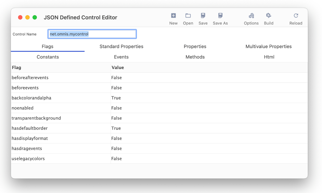
The JSON Control Editor contains a template control that has all the necessary properties to create a basic JSON control. The editor allows you to set the properties for the control under each tab. To create a component, you edit the properties, click on Save, click on Build to build the control, and then click on Reload to load the component into the Component Store (the Build and Reload options will also prompt you to save if changes have been made). The New button removes any changes you have made to the default template and allows you to start again. In order to setup the properties and methods for your control you will need to refer to the JSON definitions later in this section.
The name of the control must be unique, so you will need to change the Control Name in the editor (or just accept the default name if you are testing the editor). The default control name is prefixed with ‘net.omnis’ to show the preferred naming convention, but you should change this to your own company name, e.g. com.mycompany.mycontrol1, or use any appropriate naming convention. If you do use a dot in the control name, Omnis converts it to underscore, since dots cause an issue with the Omnis notation.
The following tabs are available to set the properties of the control:
Flags
allows you to set whether or not events are enabled, whether or not the control has a transparent background, whether or not drag events are enabled, and so on
Standard properties
an array of standard properties supported by the control, in addition to the basic properties such as name
Properties
an object defining the control-specific properties of the control; the name of each member of the properties object is the name of the control property, without the leading $, e.g. id, type, etc.
Multivalue properties
allows you to set up a control to have multiple values for certain properties
Constants
an object defining the constants for the control, e.g. value, desc, etc.
Events
defines the events that the control generates (in addition to those specified by the flags member) and including the standard events such as evClick; the name includes the “ev” prefix
Methods
specifies the client-executed methods that the control provides; the method name includes the “$” prefix
Html
specifies how the initial HTML sent to the client for the control is generated
The ‘Options’ item on the editor toolbar allows you to set custom JavaScript variable prefix for properties.
The Save option places the JSON control file in html/controls folder. The Build option places the JavaScript file for your control in the html/scripts folder in your development tree. It also prompts you to include a reference to the JavaScript file for the control in the jsctempl.htm file, which will ensure that the control is available for testing any remote forms that contain the new control. The Build option adds update markers and lets you update the JavaScript file if the markers already exist.
When you have built a JSON control you need to restart Omnis for it to load. After restarting Omnis, the control will appear under the JSON Components tab in the Component Store ready to use in your remote forms. When you deploy your app, you need to place the JSON and JavaScript files in the corresponding folders in your Web Server tree, and check that they are referenced in the html page containing your remote form.
You could open the ‘control.json’ file created in the JSON Control Editor when you build the control from the template: this file will show you the typical structure of the JSON file required to define a new component.
When using ready-made JS components, that you have obtained from a third-party, you need to add the .js file(s) to the html/scripts folder in the Omnis tree, and any other CSS and image files required for the control need to be put in the appropriate folder(s). You will also need to add any properties, methods, and events in your JS control to the JSON definition file via the JSON Control Editor. There is a tech note on the Omnis website that describes the process of using a ready-made JS component in Omnis:
You will also need to refer to the JavaScript Control Reference in the JavaScript Component SDK docs which you can find here.
This section describes the different properties that can be defined in the JCD file for the control and edited under the separate tabs in the JSON Control Editor (or when editing separate members using a text editor).
There is a new folder in the Omnis tree, html/controls, which contains a sub-folder for each JSON control you have defined. The names of these sub-folders are not critical, but it makes sense to use the same name as the control name.
The JSON Control Editor will create html/controls folder when you build your first control, otherwise if you are building your own controls you will need to create this folder (note this is not to be confused with the ‘htmlcontrols’ folder that contains controls that can be loaded in the oBrowser object).
There is a new external component named ‘jsControls’ in the jscomp folder, which handles all JSON defined controls. It loads and validates the controls at startup. All controls which pass validation are loaded into the new JSON Components group in the Component Store. If a control fails validation, jsControls opens the trace log, and adds a message to indicate there is a problem with the control. The exact problem can be found in a file called control_errors.txt in the control’s folder.
Each control must have a unique name. This is defined in control.json (see below), and you should use a convention similar to Java except that Omnis uses underscore rather than a dot, e.g. net_omnis_control1 could be the name of a control (using dots causes issues in the Omnis notation).
Each JSON control folder must contain a file named control.json containing a JSON object defining the control; the JSON file must be called control.json. The members of this object are defined in the following sections.
The control folder should also contain an image file which is used for the control icon in the Component Store, and when rendering the control on the remote form design window. This can be an SVG file (with the .svg extension) which can be themed. Alternatively, you can use PNG files (with the .png extension), but in this case, you need to provide all possible sizes including 16x16, 16x16_2x, 48x48 and 48x48_2x.
The name member is mandatory, and it specifies the name of the control; it becomes the external component control name. It is also used to create the JavaScript control class name, as ctrl_<name>. For example:
"name": "net_omnis_control1"In this case the JavaScript control class would be ctrl_net_omnis_control1.
The flags member is mandatory. It is an object that allows certain features of the control to be configured. Each member of flags is optional, and defaults to false if it is omitted. Valid members are:
beforeafterevents and beforeevents (are mutually exclusive)
indicate if the control supports either evAfter and evBefore, or just evBefore respectively. If both are omitted, the control supports neither event (see also the events member)
backcolorandalpha
indicates if the control has backcolor and backalpha properties.
noenabled
indicates if the control does not have the enabled property.
transparentbackground
indicates that the control has a transparent background, and does not have backcolor and backalpha properties. Must not be used with backcolorandalpha set to true.
hasdefaultborder
indicates if $effect for the control can have the value kJSborderDefault.
hasdisplayformat
indicates if the control has date and number format properties.
hasdragevents
indicates if the control has drag events (see also the events member).
uselegacycolors
a Boolean, it is automatically set to True when loading existing JSON controls so the existing colors are used. The flag defaults to False for all new controls which means they can use theme colors
For example:
    "flags": {

        "beforeafterevents": true,

        "backcolorandalpha": true,

        "noenabled": true,

        "hasdefaultborder": false,

        "hasdisplayformat": true,

        "hasdragevents": true

},The standardproperties member is optional. It is an array of standard properties supported by the control; inclusion in the standardproperties member means the control will have the property. These are over and above the basic properties that apply to all controls e.g. active, name, etc.
Valid members of the standardproperties array are: “dataname", “effect", “bordercolor", “borderradius", “linestyle", “font", "textcolor", "align", “fontstyle", “fontsize", “horzscroll", “vertscroll", "autoscroll", “dragmode”.
For example:
    "standardproperties": [

        "dataname",

        "effect",

        "bordercolor",

        "borderradius",

        "linestyle",

], The properties member is mandatory. It is an object defining the control-specific properties of the control. Each member of the properties object is itself an object that contains members that describe the property. The name of each member of the properties object is the name of the control property, without the leading $. Valid members of each property object are:
id
The identifier of the property. A positive integer. This is mandatory, and it is a critical field in that Omnis stores this value in the copy of the object saved in the class, in order to identify the property. This means you must not change id values after you start to use the control on a remote form. id must be unique for all properties for the control. When jsControls loads the control, it will validate property id uniqueness. It usually makes sense to start numbering your properties at 1.
desc
The description of the property. A character string. This is mandatory, and is used by the IDE, for example, as the property tooltip in the Property Manager. Double quote and backslash characters are escaped when saving desc items
tab
An optional member. A character string that identifies the Property Manager tab to be used for the property. Defaults to the Custom tab if omitted. Otherwise, it must have one of the following values: custom, general, data, appearance, action, prefs, text, pane, sections, java or column.
type
A mandatory member. A character string that identifies the type of the property. This can be one of the basic types (number, integer, character, boolean or list) or a specific type (color, dataname, font, icon, pattern, fontstyle, linestyle, multiline, set, or remotemenu).
runtimeonly
An optional member. A boolean which is true to indicate that the property is a runtime only property. Defaults to false if omitted.
findandreplace
An optional member. A boolean which is true to indicate that the property is searched by find and replace. Defaults to false if omitted.
extconstant or intconstant
Optional members. A boolean which is true to indicate that the property is constrained to a range of constants defined by this control (extconstant), or by the Omnis core (intconstant). They are shown in the Property Manager. They can be used for both integer type properties, and set type properties; in the latter case, the first member of the range must be a constant that has the value zero, and represents the empty set. You must define either extconstant or intconstant, so they cannot both be set to true.
constrangestart and constrangeend
These members must be present if either extconstant or intconstant is true. In the case of intconstant, they are integer constant idents that specify the range of constants - you can see the idents for core constants in the $constants group in the notation inspector. In the case of extconstant, these are the names of constants defined by this control; the members of the range are the constants starting with constrangestart, and ending with constrangeend, in the order they occur in control.json. Note that when used with a set, the constant values need to correspond to the bit mask used to represent the set. If intconstant is selected, a constant name such as kPlain entered into constrangestart or constrangeend is converted to its ident value.
min and max
These members are optional, and only apply when the type is integer. They specify minimum and maximum values for the property.
initial
This member is optional. It can be used to specify an initial value for the property. For number types, it can be a floating point number. For character types, it is a character string: double quote and backslash characters are escaped when saving. For integer types, it is an integer. For boolean types it is a Boolean: values of ‘true’ or ‘kTrue’ are overridden with 1. The initial value is used, for example, when dragging a new copy of the control out of the Component Store (provided that a copy of the control is not already stored in the Component Store).
editreadonly
An optional member. A boolean which is true to indicate that the property is a read-only property. Defaults to false if omitted.
For example:
     "properties": {

        "headercolor": {

            "id": 1,

            "desc": "The header color of the control",

            "type": "color",

            "tab": “appearance”,

            "initial": 255

        },

        "headericon": {

            "id": 2,

            "desc": "The header icon of the control",

            "popuptype": "icon",

            "tab": "appearance"

        },

        "rangeofexternalconstants": {

            "id": 3,

            "desc": "Range of external constants",

            "type": "integer",

            "extconstant": true,

            "constrangestart": "kNetOmnisControl1Range1",

            "constrangeend": "kNetOmnisControl1Range3",

        }

}The multivalueproperties member is optional. It allows you to set up a control to have multiple values for certain properties. It is an object with members as follows:
itemlistproperty
This is mandatory. When a control supports properties with multiple values, the properties are stored in a list. Each row of the list contains the set of properties for a particular tab or column. We call the tab or column (or something else) an item. This property must have type list, and it is automatically hidden from the property manager.
itemcountproperty
This is mandatory. It is the name of an integer property defined by the properties member, that can be set to specify the number of items in the item list. You can specify a max value for this property in order to restrict the number of items, otherwise it is restricted to no more than 256 items.
currentitemproperty
This is mandatory. It is the name of an integer property defined by the properties member, that identifies the current item displayed in the property manager, and to which property changes apply to multi-value properties.
moveitemproperty
This is mandatory. It is the name of an integer property defined by the properties member, that can be used to move the current item to a new position in the item list.
properties
This is mandatory. It is an object that specifies the properties that have multiple values, and where they are stored in the list. Each member must be the name of a property in the main properties object; the value of each member is the list column in the item list where the property value is stored. It is important not to change the column number once you have started using the control.
For example:
     "multivalueproperties": {

        "currentitemproperty": "curitem",

        "itemlistproperty": "itemlist",

        "moveitemproperty": "move",

        "itemcountproperty": "itemcount",

        "properties": {

            "mvprop1": 1,

            "mvprop2": 2

            }

        }

} The constants member is mandatory. It is an object defining the constants for the control. Each member of the constants object is itself an object that contains members that describe the constant. The name of each member of the constants object is the name of the constant. Valid members of each constant object are:
value
The value of the constant. An integer. This is a mandatory member.
desc
The description of the constant. A character string. This is mandatory, and is used by the IDE for example as the tooltip in the catalog.
group
The catalog group to which the constant belongs. This is optional. By default, all constants defined for the control belong to the group “RF:jsControls-<control name>”. You can use this member to replace the control name with something else. All constants occurring after the constant with the group specified belong to this group, until a new group is specified (if any).
For example:
    "constants": {

        "kNetOmnisControlHeaderColor": {

            "value": 123,

            "desc": "The description of this constant"

        },

        "kNetOmnisControl1Range1": {

            "value": 3,

            "desc": "Range constant 1”,

               “group": “Ranges"

        },

        "kNetOmnisControl1Range2": {

            "value": 5,

            "desc": "Range constant 2"

        }

}The events member is optional. It specifies the events that the control generates (in addition to those specified by the flags member, i.e. before, after, and drag events). Each member of the events object identifies an event. The name of each member is the name of the event, including the “ev” prefix. Certain standard events can be specified: evClick, evDoubleClick, evTabSelected, evCellChanges, evHeaderClick and evHeadedListDisplayOrderChanged. Valid members of each event object are:
id
Must not be specified for standard events. Otherwise, this is mandatory, and is the positive integer id of the event. This id must match the event id you use in the JavaScript implementation of the control, and must be unique within the context of this control.
desc
Must not be specified for standard events. Otherwise, this is mandatory, and is a text string describing the event.
parameters
The event parameters of the event. This is an array. Each array member is an object with members as follows:
name
This member is mandatory. The parameter name. Do not include the p character prefix - Omnis will add this. Note that if you use re-use an event parameter name, then the remaining members of this object are ignored, and overridden by the original definition of the parameter - the first control (or Omnis core) using a name sets the type and description of that parameter.
type
This member is mandatory. The data type of the parameter. integer, character, boolean or list.
desc
This member is mandatory. A text string describing the parameter.
For example:
   "events": {

        "evNetOmnisControlOpened": {

            "id": 1,

            "desc": "The event sent when the control opens",

            "parameters": [

                {

                    "name": "name",

                    "type": "character",

                    "desc": "The name event parameter"

                },

                {

                    "name": "name2",

                    "type": "integer",

                    "desc": "The second event parameter"

                }

            ]

        },

        "evClick": {

            "parameters": [

                {

                    "name": "zname1",

                    "type": "character",

                    "desc": "The zname1 event parameter"

                },

                {

                    "name": "zname2",

                    "type": "integer",

                    "desc": "The zname2 event parameter"

                },

                {

                    "name": "horzcell",

                    "type": "character",

                    "desc": "the horz cell event parameter"

                }

            ]

} The methods member is optional. It specifies the client-executed methods that the control provides. Each member of the methods object identifies a method. The name of each member is the name of the method, including the “$” prefix. Valid members of each method object are:
id
This is mandatory, and is the positive integer id of the method. It must be unique within the context of this control. It is used internally by the Omnis core.
desc
This is mandatory, and is a text string describing the method.
type
This is mandatory. The return type of the method. integer, boolean, character or list.
parameters
This member is optional. It is an array describing the parameters of the method. Each member of the array is an object with the following members:
name
This is mandatory. The name of the parameter. Omnis will insert a data type character at the start of this name.
desc
This is mandatory. A text string describing the parameter.
type
This is mandatory. The data type of the parameter. integer, boolean, character or list.
altered
Optional. A boolean, default false. If true, the parameter is marked as one that will be altered.
optional
Optional. A boolean, default false. If true, the parameter is marked as optional.
For example:
    "methods": {

        "$mymethod1": {

            "id": 1,

            "desc": "This is my method",

            "type": "integer",

            "parameters": [

                {

                    "name": "p1",

                    "type": "character",

                    "altered": true,

                    "desc": "The parameter p1"

                },

                {

                    "name": "p2",

                    "type": "integer",

                    "desc": "The parameter p2",

                    "optional":true

                }

            ]

        }

}The html member is mandatory. It specifies how the initial HTML sent to the client for the control is generated. It is an object with members as follows:
template
Mandatory. A character string that is a template for the inner div of the control. For example: <div %o %s data-props='%p' data-mvprops=‘%m’></div>:
jsControls replaces %o with the JavaScript client attributes for the client element, which includes the id attribute of the client element: this element must be specified.
jsControls replaces %s with the style attribute for the div, based on the normal Omnis processing and the properties the control supports.
jsControls replaces %p with the control properties that are not multi-value. %p is replaced with a JSON string, representing an object, where each member of the object is named by the property name, with value of the property value. The value may have been mapped by Omnis to what the client will require, for certain property types such as color and icon. The client JavaScript can use this string to create an object containing its property settings.
jsControls replaces %m with the multi-value control properties. %m should be omitted if the control does not use such properties. %m is replaced with a JSON string, similar to %p, except that it is an array of objects, with an array entry for each multi-value item.
extrastyles
Optional. A string of length up to 255 characters of extra style attributes to include in the style attribute replacing %s in the template, e.g. “margin:2px”.
padding
Optional. An integer used to set padding (in pixels) in the style attribute replacing %s.
relativeposition
Optional. Boolean, default false. If true, the style attribute replacing %s includes position relative rather than absolute.
nowrap
Optional. Boolean, default false. If true, the style attribute replacing %s includes white-space nowrap.
For example:
    "html": {

        "template": "<div %o %s data-props='%p' data-mvprops='%m'></div>",

        "extrastyles":"margin:1px;"

    }
The resulting inner div for the control looks like this:
<div style='position:absolute; top:0px; left:0px; height:106px; width:88px; font- family:'Times New Roman',Georgia,Serif; font-size:12pt;font-weight:bold; font- style:italic;text-align:right;color:#00FFFF; overflow-x:auto; overflow-y:auto;margin:1px;'data-backgroundcolor='#555555; rgba(85,85,85,1.0000)' data-dragmode='1' data- effect='1' data-linestyle='1' data-bordercolor='16711935' data-props='{"headercolor":"#FF0000","headericon":"icons/datafile/omnispic/001663n16.png? 46", "rangeofinternalconstants":14, "rangeofexternalconstants":5, "headerpattern": 1, "headerfontstyle":4, "headerlinestyle":7, "headermultiline":"Lots of text entered like this\rwith multiple\rlines\r", "headerset": 13, "headerremotemenu":"NewRemoteMenu", "headerfont":"Courier New,Monospace"}' data- mvprops='[{"mvprop1":1,"mvprop2":false,"mvprop3":""}, {"mvprop1": 2,"mvprop2":true, "mvprop3":"NewRemoteMenu"}, {"mvprop1": 2,"mvprop2":true,"mvprop3":"aaaa"}]'></div>Note that it is important to use single quotes around the attributes in the template, since JSON includes double quotes. jsControls escapes any single quotes in the JSON it inserts into the place-holders as \u0027.
The customtabname member is optional. If specified, it is the name of the custom properties tab for the control shown in the Property Manager.
When you have created a JSON control and added it to your Omnis tree, you can add the supporting JavaScript file to the remote form template in the HTML folder (the JSON Control Editor will do this automatically). To do this, you can add:
<script type="text/javascript" src="scripts/ctl_net_omnis_mycontrol.js"></script>to the scripts section of the jsctempl.htm file (in the html folder) so the control is always included in the test HTML page for your remote form; it also needs to be included in the HTML page serving your deployed web or mobile app.