By David Swain
Polymath Business Systems
What an oversight! In all the years I have been presenting sessions on graphing at international Omnis conferences, I have not approached that subject here in Omnis Tech News - until now. Too bad, too - because the Graph component (which still ships with Omnis Studio 4.x, although it is no longer "supported") offers an awesome array of configuration features for the developer.
The Graph2 component that was introduced with Omnis Studio 4.1, as compared with the original Graph component, can be covered in much less space (as there is much less to talk about), so this is a good time to address this subject. Still, this component will require two or three substantial articles for adequate coverage.
This component did not benefit from the feedback of a beta test cycle, so there are still a few issues with it of which the developer should be made aware. But I have developed workarounds for some of those issues, which we will cover later in this article. And yes, any issues I have encountered have been reported to the Omnis development team and now have fault or enhancement request numbers, so expect to see the faults resolved (and maybe some important enhancements added) in short order. In the meantime, we all have work to do, so hopefully this article will help you with that.
Since the original Graph component offers a number of critical features that Graph2 does not (in its current release), brief explanations of some of these will also occasionally pop in here. So while the Graph2 component is the major focus of this article, the overarching subject is the graphing of data. To that end, let's begin with a few basic concepts...
A graph is a means to make large sets of data more meaningful to the viewer. Most people cannot discern trends or make good comparisons by staring at groups of numbers - that's a very rare and practiced ability. Our use of numbers is much more of a contrivance than is our use of pictures to convey meaning, although it does have its advantages. But we can see and judge relative sizes of lines and objects, relative positions of dots and slopes of lines very easily and naturally. These abilities have evolved in us over the eons and have helped us and our ancestors to cope and to survive. Drawing pictures has long been a means we have used for conveying quantitative information. In fact, the first written numbers were simply pictures of sticks, then bundles of sticks, then stacks of bundles of sticks, and so on until the magnitude of the numbers our ancestors began to deal with made this system too unwieldy.
But number systems like we use now are much more reliable and easier for performing numerical operations. So we store data in this form and then convert it into images whose relative sizes can be very precisely controlled when we want to analyze collections of those numbers. We use different kinds of images to represent different kinds of data most effectively (see below).
A graph, then, has a numerical basis. We collect the data we wish to plot into a list variable with the proper structure for our desired graph type. In the most basic terms, a graph in Omnis Studio is simply another way of viewing the information held in a list variable. So in a sense, we can consider the Graph2 component to be another type of list display field.
We can apply a list variable to a graph object in one of two ways with Graph2: We can assign the name of the list variable as the $dataname property value for the Graph2 object or we can build up the graph image a layer at a time, assigning a list value to each layer using the various $addxxxlayer() methods. We will focus on the first of these techniques in this article and deal with the second technique in the next issue of Omnis Tech News.
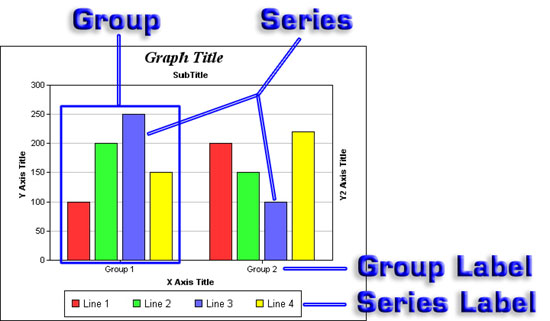
There are some basic terms that we use to discuss the data elements for a graph. While each type of graph may have its own unique structure, these terms are still applicable to all the graph types that Graph2 offers. Let's use a Bar graph as an example:
The data that is associated with the framed collection of bars in the illustration above is an example of a Group. A Group is a category of data represented by a column in the data list for the graph. There are two Groups in this graph. Some kinds of graph require multiple columns to define the data for a single Group. For example, an XY Scatter plot requires both and X value and a Y value for each point, so each Group requires two columns. A Box Whisker plot requires five columns per element (first and third quartile, minimum, maximum and median values) in its most complete form. A second Group would require an additional five columns.
Any set of bars of the same color in the graph above belong to the same Series. A Series is a set of data represented by a line in the data list for the graph. There are four Series in this graph. We add more Series to a graph by adding more lines to its data list. Each Series has a value for each Group.
Graphs that can contain multiple Groups generally have some way of labeling them. In the Graph2 component, a Pie graph can have only one Group, so there is no group label. In an XY Bar graph like the one above, the Groups are labeled along the X axis.
There is a $columnheadings property that is shared by all major graph types. By default, the labels for the various groups on a graph are given as the names of the columns containing the group values in the list variable named in the $dataname property. But we can specify the name of a list or row variable in $columnheadings and provide group labels that might display more nicely (containing space characters, for example). If a list variable is used, its first line must contain these heading strings. Also keep in mind that a column in the data list is labeled by a column in the column headings list that has a column number that is one unit lower. For example, the second group in a graph takes its values from the third column in the $dataname list (the first column is for the Series label), but gets its Group label from the second column of the $columnheadings list. We will see some illustrations of data lists and column headings row variables in the example further on in this article. Use of the $columnheadings property is optional, but is generally a good idea.
Graphs that contain multiple Series generally label them using a Legend. The text of a Series label is given in the first column of the line in the data list for that Series. Each label is associated with a color, pattern and/or marker shape that identifies elements belonging to that Series in the graph itself. If there is only one Series in a graph, there is usually no need to label it as the graph title probably includes that description. There would also be no need for a Legend.
There are many other terms we could explore as well that deal with layout elements for a graph, such as grid lines, tick marks, etc. But since Graph2 does not allow us any control over these elements, there is no need to discuss them.
The Graph2 component offers us three families, or major types, of graph. These main categories are XY, Pie and Polar graphs. To set which major type we wish to use, we assign a value to the $majortype property of the Graph2 object. We can use either special constants for this purpose or the simple numeric values they represent. Our choices are: kG2xy (0), kG2pie (1) and kG2polar (2). We can set these values at design time using the Property Manager or dynamically through notation at runtime. But for most graph types, this does not fully specify the kind of graph we will get.
XY and Polar graph families also offer an array of minor graph types. We specify which one we want to use by assigning a value to either the $minorxytype or $minorpolartype property. On the surface it would seem that these are separate properties, but a quick experiment (setting $minorpolartype to 4, which would be out of range for a polar graph, while $majortype equals kG2xy and then redrawing the graph) demonstrates that these are just two aliases of the same graph property. Still, matching the major type and the type of minor type that that we use to set up a graph may help us in some logical way. So if we want to create an XY Scatter plot, we would usually set the $majortype property value to kG2xy and the $minorxytype property value to kG2xyScatter (or the numeric equivalent of 2). There is only one basic type of Pie graph available with Graph2, so no minor type needs to be specified.
In design mode, the major and minor type properties are found under the Prefs tab of the Property Manager. When we select a major graph type here, Omnis Studio changes the name of the minor type property as well as the list of constants from which we can select the minor graph type. If we select kG2pie as the value for $majortype, the minor type property item disappears from the Property Manager. Nearly all other properties specific to the graphing function of Graph2 appear under the Custom tab. More on those in a minute...
The many types of XY graph (Bar, Line, Area, Scatter, Box Whisker, High/Low/Open/Close and Candlestick) vary significantly in both their appearance as well as the way their data list must be structured. The common thread with this family is that they all use a rectangular X and Y axis frame. Polar plots all use a circular frame with a radial value axis. Groups on a Polar graph require two columns each. The first is the Radial Magnitude value and the other is the Angular value. While at first glance it might seem that the four types of Polar chart (Polar Line, Polar Area, Spline Polar Line and Spline Polar Area) could have just as easily been handled by providing just two Boolean properties (which we might call "usesplines" and "fillarea"), there is more to it that meets the eye. The real reason for the different minor graph types for the different frame types is the ability we have been given to add "layers" to a graph. Pie graphs in Graph2 do not have layers, so they do not have minor types. We will explore this feature in next month's article.
We choose a specific type of graph based on the kind of data we need to represent. If we want to show relative portions or fractions of a whole, we are best off to use a Pie chart (especially since we do not have a Stacked Percentage bar or area graph option with Graph2 as we do with the original Graph component) since it is easier for humans to perceive and appreciate the significance of fractions of a circle rather than fractions of a line, a box or some other shape. On the other hand, if we want to show relative magnitudes, the XY Bar graph is an excellent choice because humans are adept at comparing magnitudes of items stacked next to one another. If we wish to show data that exhibits change of some property across changes of some other state (time, composition, etc.), we would choose an XY Line or Area chart because humans have an innate and experiential appreciation for variation in direction and steepness of slope of profile lines above a horizon. If we want to compare such change profiles for multiple items when their curves might overlap, we are limited to an XY Line plot because one area might obscure our view of another on an XY Area plot.
Polar graphs are used to plot points that are part of a cycle of some kind. We use a special system called polar coordinates for determining where each point is placed on the graph. Polar coordinates have two dimensions: a magnitude and an angle component. A typical example is the plot of a trajectory or flight path on a radar screen where we would plot distance and angular direction from the radar dish at different points in time (time not being a dimension of the graph in this case). The results of the annual frog jumping contest at the Olde Town Days festival in my town could also be represented by a Polar graph - either the simple magnitude of the final frog distance in the alloted time or the plot of each hop by each frog. But there are many other kinds of data that could be plotted in this way that are not associated with physical angles and distances. For example, we could use this to plot temperature by time of day or high and low temperature by day over the range of a year. For this last item, we could then superimpose a plot of distance from the sun and/or sun angle at midday on the temperature plot to further explore the relationships among these measurements and the affect they might have on the temperature. Polar graphs in the Graph2 component can only use actual angles from 0 to just under 360 (actually mod(angle,360) is plotted for angle), so data that is not strictly angular (like time of day, day of year or some other cyclic parameter) must be reduced to a range of 360 units to use this graph type in its current incarnation.
Of course, besides being more appropriate or less appropriate for different types of data, each graph type also has certain requirements for the form of the data - that is, the structure of the list variable containing the data for the graph must follow specific guidelines for the graph to be properly generated.
Different types of graph require different data structures in the associated list variable. The section on the Graph2 component in the Omnis Programming manual on pages 516-540 gives all the details for each graph type - and we have already mentioned a few of them above.
The simplest graphs we can generate using the Graph2 component are Pie graphs and single parameter (only one Group) XY Bar graphs. For such charts, the associated list variable must contain two columns. The first column holds the name of the Series (which is used as the Series Label) and the second column holds the one and only Group value for that Series. A Bar graph then displays a different bar for each Series and the height of each such bar is determined by the value in the second column, using the same standard of measurement so that we can accurately judge the relaitve heights of the bars. A Pie graph sums all the values of all the Series and represents that by a circle. That circle is then divided into wedges or radial sectors called slices by determining the fraction of 360 degrees that the value of each Series represents using a formula like:
360*value/sum->series angle
Of course, the Graph2 instance performs all of this arithmetic for us. That is the point of having a graphing component instead of building it in our code using more primitive elements.
Now let's see what other kinds of choices we need to make when preparing to graph some data...
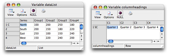
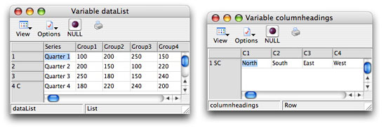
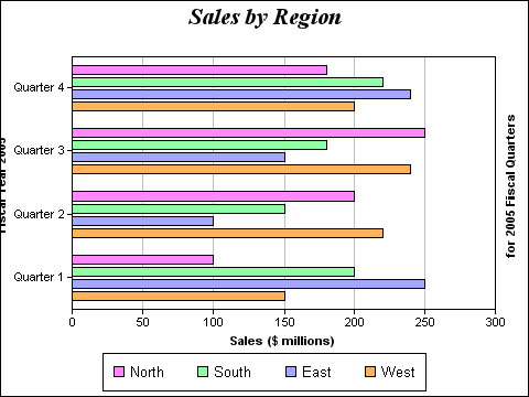
Suppose we want to graph quarterly sales data for the four geographic regions of our retail chain. There are a number of ways we might want to look at this same batch of data, there are a number of ways we might configure our list variable and there are a few chart types we might use. Let's say that we have built our quarterly sales data for the fiscal year into a list where we set the Quarters of the fiscal year as the Groups and the Regions as the Series. We have also set up a column headings row variable to hold more presentable Group names. The contents of these variables look like this:
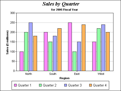
If we want to compare sales by region for each quarter, we can best view those relationships using a bar graph built from this data like this:
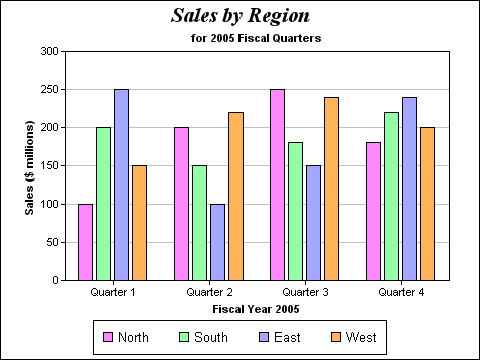
Notice that the Groups are clustered and labeled along the X axis and that the Series are labeled in the Legend and are tagged by color. If we can train ourselves to perceive only one color, we can see how sales for one region vary by quarter. But this is as difficult for most people as is visualizing data point magnitudes by looking at the raw data, so we must find another way to see this relationship if it is important to us.
If we want to better see the sales trends for each region across the four quarters, a line graph makes this a little more clear:
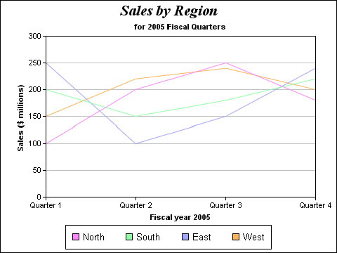
Each region is now represented by a single line rather than four bars mixed in with many other bars. The rise and fall of quarterly sales for any given Region is much easier to see this way, even thoughall four Regions are still represented here. This is because we can see the slope of the line that follows the sales trail for that Region.
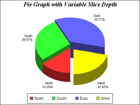
If we are more interested in the percentage of sales for a given quarter, a pie graph might give us a better feeling for this relationship:
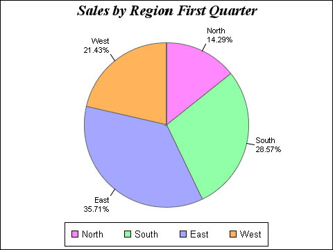
Now we can see the relative proportions of regional sales for a Quarter. In fact, the default label for each slice displays the Region (Series) name (making the Legend somewhat redundant here) and the percentage of sales represented for that slice. The Graph2 component also gives us a tool for specifying other information, or other formatting, for the slice labels. We will discuss that later in this article.
But what if we want to see how the quarters compare region by region in bar graph form? We would need to transpose our data so that the role of Series and Group is switched:
and then build another bar graph:
Same figures - different configuration! This graph focuses on each region and lets us see the relative magnitude of quarterly sales on a regional basis. Here we are not so much comparing the Regions, but comparing the Quarters for each Region. We could also view this in percentage form for the first Region (Group now) in Pie graph form:
The process of transposing the data to achieve this different view is a lot of work with Graph2 because this component does not allow us to swap the Series and Group information in the plotting of the data like the original Graph component did. Graph2 does have a property named $swapxy for XY graphs, but all that does if we switch it on is to turn the XY graph element on its side. Here is what the very first graph from this example looks like when $swapxy is set to kTrue:
Notice that even the subtitle has been rotated to the righthand Y axis and that the Group labels have pushed the axis title off the left side. We have no control over this with Graph2 other than to perhaps make those Group labels a bit shorter. This is more like the behavior of the $horizontal property of the original Graph component. The old $swapseriesandgroups property of the original Graph component actually replots Groups as Series and Series as Groups without our having to transpose our data list.
So much for the data configuration side of the Graph2 component. Now let's explore some other presentation options. There are a number of properties that allow us to further enhance our Graph2 graphs.
When the Graph2 component is placed on a Window or Report Class, it has the usual basic properties of a field, so we can position it, size it and give it various borders and edge float properties, etc. It supports drag and drop operations. It also has a $dataname property under the General tab of the Property Manager that must contain the name of the list variable whose contents are to be represented in the graph. All other properties specific to the Graph2 component are found under the Prefs and Custom tabs in the Property Manager. These (along with $dataname) are also the properties for the non-visual Graph2 component (which we can use for generating graph images using the component's $snapshot() method - more on this later). These properties, plus a few methods found under the Methods tab, encompass the entire control we have been given over the operation and display of this component.
The Prefs tab presents the major and minor graph type properties, as well as a property named $legendpos, which is used to determine the position of the legend area on those graph types that support it. (I have not managed to get a legend to appear on a Polar chart, for example.) The position chosen for the legend determines the position and size of the graph area within the boundaries of the component. If we choose kG2legendManual (5) for the value of this property, no accommodation for the legend is made by the other graph elements - so we have to find an area on the Graph2 component surface (usually an empty area of the graph itself) where the legend will not obscure or be obscured by other graph elements.
The legend is the only element of the Graph2 object whose location we can control. And the only other aspect of the legend we can control is whether it is configured horizontally or vertically. The $legendx (integer), $legendy (integer) and $legendvert (boolean) properties are only used by Graph2 when $legendpos is set to kG2legendManual. (For comparison, the original Graph component allows us to both position and size the Main title, Subtitle, Axis titles, Series and Group titles, Footnote, Legend, and even the graph Frame itself. In fact, the Graph component allows us to specify the font separately for each text element, while Graph2 gives us no ability to specify a font for any Graph2 element - not even for the Graph2 object as a whole.) But there are other properties as well.
In fact, there are sixteen basic properties shared by all graph types (three of which we mentioned in the previous paragraph), although not all of these properties actually apply to all of those for which they are exposed in the Property Manager. We can group them as Title properties, Axis properties, Background properties, and two others that comprise their own groups: $columnheadings (already mentioned above) and $3d.
Let's dispense with the Background properties first. There are five such properties: $backgroundcolor, $backgroundbordercolor, $backgroundraised, $wallpaper and $bordercolor. So far, none of these has any effect on either the Mac OS X or the Windows XP platforms on which I have tried them. These problems have been reported and they have been assigned fault reference numbers - and I suspect that they will be among the first fixes to be made. $backgroundraised takes positive and negative integer values which will make the background appear raised or inset respectively. $wallpaper holds the pathname to a graphic used as a backdrop to the graph. The other properties mentioned here take color values.
We can assign a few title strings for a Graph2 graph. $maintitle, $xaxistitle and $yaxistitle are exposed in the Property Manager for all major graph types, although the axis titles only really apply to XY graphs. The same is true for the $xaxisfontangle, $yaxisfontangle and $xlabelfontangle properties. The titles all accept string values and the font angle properties all accept integers. The only negative value used by the font angle properties is -1, which is used to indicate the default angle. Other negative values are considered "invalid" and are ignored. If a valid angle other than -1 is specified, it is used as a counterclockwise angle from the horizontal. So the equivalent of the default angle for the X axis title is 0, but for the Y axis title is 90. (There is no property for changing the angle of the Y2 axis label - but there are also no dual-Y graph types available using Graph2, so this title would usually be left empty anyway.)
Finally there is the $3d property. When the value of this property is switched to kTrue, XY Bar, Line and Area graphs, as well as Pie graphs, are given a pseudo-3D appearance:
For XY graphs, we have no control over the "depth" of the 3D effect. For a Bar graph, like the one shown here, this is not much of a problem because the risers do not overlap. But if Line or Area graphs have more than one Series, the "depth' of the graph is split among them and becomes virtually unnoticeable when there are more than two Series sharing the space. Pie graphs do have depth control when $3d is switched on.
Polar graphs have no additional properties specifically for that major type. But XY graphs have 5 additional properties (and we have already discussed $swapxy) and Pie graphs have 16 additional ones. We can't go into too much detail in this one article, but here are some important points:
There are two additional titles available for XY graphs: a Subtitle and a Y2 Axis title. These are populated using the $subtitle and $y2axistitle properties respectively.
We can also switch either axis to the opposite side of the graph from its default position using the $xaxisontop and $yaxisonright properties. These both have Boolean values and are set to kFalse by default.
I just can't cover all of these here in any detail. This article is already getting very long! Many of my favorite Pie graph properties come into play when the $3d property is switched on, so let me focus on those.
Switching on $3d automatically displays the Pie graph in its default tilted position and thickness (depth). We can adjust the angle of tilt (which defaults to 45 degrees when $tilton is set to a value of kFalse) and the depth of the pie (which defaults to a value of 17 when set to a value of zero) and we can even switch to a different 3D mode.
Setting the $tilton property value to kTrue activates the $tilt property. This property allows us to specify a tilt angle for the pie with which we will (hopefully) be happy. The "normal" tilt mode shortens the vertical axis of the pie circle to make it appear to be tipped backward. The "shadow" mode leaves the pie face fully circular and extends the thickness of the pie behind it as though that were a shadow from a light shining on the face of the pie. We enter this mode by setting the $shadow property value to kTrue. If $tilton is also kTrue, the value of $tilt determines the angle of the shadow.
We can also "explode" one or more slices from the pie. We do this using the $slicemove() method. This method can use as many as three parameters. It determines which slices, if any, will be separated from the main pie and how far they will be removed. The first parameter determines the radial distance a moved pie slice will travel when the method is executed. If only the first parameter is supplied, the first slice (the slice representing the first Series) is moved by default. The second parameter allows us to specify which slice is to be moved. If a third parameter is supplied, the second parameter is the first slice and the third parameter is the number of the last slice in a range of slices that are moved as a group.
We can even assign variable depths to our pie slices by using the $depthcolumn property. This property takes an integer value and allows us to specify a column within the data list that contains slice-by-slice depth values. We can use the same column (column 2) as the Group values that determine the pie divisions or we can designate a completely different column. For the best results, we should try to limit the maximum depth values to around 100.
Unlike the other graph types, Pie graph data points (slices) have labels associates with them. There are a couple of properties we can use for moving Pie graph labels to a different position along the center radius of the slice to which they belong. If we switch on the $labelposon property, we can assign a number to the $labelpos property that Graph2 will use to relocate the slice labels. A value of zero puts the labels right at the outer edge s of the pie. A positive number in $labelpos moves the label further away from its slice and a negative number move it into the slice.
To aid in associating labels and slices, we can cause lines called feelers to appear by switching the $showfeeler property value to kTrue. With this switched on, we can further enhance the feelers by adjusting their width ($feelerwidth) or their color ($feelercolor).
But the best Pie graph label feature - and the most vexing one for developers who haven't figured out the error in the manual - is our ability to have control over the contents and format of the labels. We use the $labelformat property for this. This property recognizes special "tags" that represent various bits of information about a pie slice. It appears that this feature might become available for other types of graph as well, since the manual goes on for pages about it, but right now this feature is only exposed for Pie graphs.
Pie graph labels have four pieces of information: the sector number, the Series label text, the value represented by the slice and the percentage represented by the slice. We can use the reserved words "sector" (also "dataSet"), "label" (also "dataSetName"), "value" and "percent" respectively for these items - but we have to put them inside the proper delimiters for this to work. The manual says the reserved words are to be enclosed in parentheses (known as "brackets" in the UK), but dogged determination has discovered they must be enclosed in braces (or "curly brackets"). So if we want to see the value of our slices and indicate that they represent thousands of dollars, we would include this string within the $labelformat property value:
'${value} K'
For numeric values, we can also add up to four parameters within the tag to indicate number of decimal places, thousands separator, decimal character and negative sign character. The word 'value' is separated from these single-character parameters by the "pipe" or "vertical bar" character. Any trailing parameters that we do not wish to specify can be omitted. So if we are happy with the default thousands separator, decimal and negative sign characters but want the values rounded to one decimal place, we would use:
'${value|1} K'
If we want our labels to be split onto multiple lines, we must inject a line feed character (chr(10) or kLf - not a carriage return) into the $labelformat value. As we can see from the examples above, we can add any other characters we want outside the curly brackets. The "percent" tag only returns a number, so if we want to include "%" to indicate this number is a percentage value, we must add that character to the string:
'{percent}%'
Hopefully, this section has saved you hours of frustration...
When we make changes to items on an Omnis Studio window, we often have to redraw those items to have the change take effect. The Graph2 component also contains the $redraw() method, which can be used to update a Graph2 field after a simple property change is applied. But sometimes a change, such as changing the major or minor graph type or changing the contents of the data list for the graph, requires that the graph be completely reconstructed. We do this using the $dispose() method. This method takes no parameters and yields no return value - it just does its job.
Occasionally, the $dispose() method by itself does not appear to do the complete job. It may recast the graph, but the Graph2 field still needs to be redrawn. I have not thoroughly characterized when this is necessary, but I have seen cases when a $redraw() was definitely required after a $dispose() in order to refresh the graph image.
The Graph2 component has an interesting and very workable way of dealing with the colors associated with its component elements. It stores a color table within the Graph2 object and uses an Omnis list variable to give us a means of modifying this color scheme. There are currently some quirks with this system - especially on the Mac OS X platform - but I have found a way to work around most of them. There are only a few issues on the Windows side.
There are two methods we use to to communicate with the built-in color table for the Graph2 object. We use the $getcolors() method to retrieves a list of color values, each of which is designated for a specific use within the Graph2 object. We can then modify any or all of those color values within the retrieved list and use the $setcolors() method to send the updated color set back to the Graph2 object as a group. Simple enough! So what are the issues?
First, the color values stored in this list do not conform to the way Omnis Studio uses color values. An rgb value is constructed in a specific way, but the Graph2 component expects the colors it receives to be constructed in a different way. Basically, the red and blue values are reversed in the Graph2 color value calculation. So to assign colors to elements of this component, we must deconstruct our rgb values, swap the red and blue components from the way we normally set such colors (think bgr() instead of rgb()), and assign them in the altered form. We can manage this with a bit of cleverness.
I built a simple method that I named $swaprb. It requires a single parameter named pColorValue of Long integer type, which is the color value to be converted for use with the Graph2 component. Here is the code, then we will analyze it:
If pColorValue<0 ;; Omnis color constant value

   Calculate pColorValue as truergb(pColorValue)

  End If

  Calculate redValue as mod(pColorValue,256)

  Calculate greenValue as mod(int(pColorValue/256),256)

  Calculate blueValue as int(pColorValue/65536)

  Quit method rgb(blueValue,greenValue,redValue)
The Graph2 component also cannot use the values stored in Omnis Studio color constants, such as kRed, so we must first use the truergb() function to convert these to standard Omnis Studio rgb values. (We can recognize color constant values because they are all negative numbers.) We then deconstruct the color value into its component parts. The redValue, greenValue and blueValue variables are all local variables of Long integer type. Once this is done, we simply return a converted value using the rgb() function, but swapping the positions of the red and blue parameters.
If we use a color picker pushbutton to select a color to update an element in our colorList extracted from the Graph2 component, the method line that performs that change would look something like this:
Calculate colorList.3.1 as $cinst.$swaprb($cobj.$contents)
We would then update the Graph2 object (referred to in my code by the item reference graphObjRef) by executing:
Do graphObjRef.$setcolors(colorList)
This all works great on the Windows platform - once we have sorted out the rgb value problem. There is an additional issue on the Mac OS X platform, though...
When we use the $getcolors() method on Windows, we recieve into the list variable set as the return variable a list value with one Long integer column and 40 lines. The first three lines represent the background color (which I have been unable to modify so far), the basic line color (which applies to all lines on the graph except the frame of a Pie graph and grid lines on XY and Polar graphs) and the basic text color (which applies to all text on the graph) for the Graph2 object. The next four lines are "reserved for future use" (quote from the manual). The eighth color is the one dynamically assigned by the currently selected series (but I have not yet seen how to change or use it). The other 32 lines of this list, beginning with line nine, are the colors assigned to the various series elements, beginning with Series 1. This means that we can graph up to 32 series before the Graph2 component begins repeating series colors. Heere is a graph with 36 series:
Notice how the final four bars repeat the colors of the first four bars. We are not likely to go to such extremes often!
On Mac Os X, we get an entirely different response from the $getcolors() method. On that platform, it returns a list 242 lines long - and almost entirely filled with zeros! So if we were to perform a color element change the way the manual suggests:
Do graphObjRef.$getcolors() Returns colorList

  Calculate colorList.3.1 as $cinst.$swaprb($cobj.$contents)

  Do graphObjRef.$setcolors(colorList)
every element on the list whose color is controlled in this manner turns black! My interim solution to this problem was to retrieve the default color list from a Graph2 object on the Windows platform and the save it into the $userinfo property of some item. (I chose the window class with which I was working). I then use this as my starting point rather than retrieve the color list from the Graph2 component.
This situation will not last forever. Once it gets fixed, we can simply lift out our conversion method call (although we may still need to convert color constant values) and go back to retrieving the color list directly from the component.
The Graph2 component, like the Graph component, allows us to create a picture value that contains an image of the graph using a method named $snapshot(). If this method is used without parameters, the resulting image is exactly the same size as the Graph2 object from which it is spawned. But we can specify two parameters - width and height of the resulting image respectively - to yield a graph image of any size we wish. With the original Graph component, scaling works wonderfully. We get a resulting image that has exactly the same elements and sub-elements as the original - even if we specify parameters that yield a different aspect ratio. This is because the Graph component has an internal, virtual coordinate system that applies to all of its sub-components - so everything within a Graph object scales appropriately.
Graph2 graphs simply do not scale, as such. The title, axis titles, pie labels and legend areas remain the same absolute size, no matter how large or small the snapshot specifications. Only the graph itself grows or shrinks - but the graph image does not simply scale either. It is redrawn in a new size and shape given the new overall size of the graph image minus the fixed-size items in the picture. This may effect the upper boundary value of the axes of an XY graph - which may, in turn, affect the way these axes are divided by grid lines.
So, a word of warning about using the $snapshot() method with the Graph2 component: do some experimenting to make certain that the results you get will be acceptible.
I don't want to appear to be strongly against the use of the Graph2 component. Far from it! I feel that this tools adds a number of useful features to our development kit. What I feel strongly about is that it is not a replacement for the original Graph component. Both the Graph2 and the original Graph components have their strong and weak points. It is great that they are still both supplied with Omnis Studio! Here is a brief and non-comprehensive summary of when I prefer to use one component over the other:
I prefer to use the original Graph component when I need:
Next time we will examine some of the more dynamic features of Graph2. Specifically, we will look at the methods we can use to add layers to a graph and the events that Graph2 recognizes. We will also consider the way our users are intended to interact with a Graph2 object to drill down into the underlying data. There is still much to explore!
I hope this article has been useful to you!
| © 2006
Copyright of the text and images herein remains with the respective author.
No part of this newsletter may be reproduced, transmitted, stored in a
retrieval system or translated into any language in any form by any means
without the written permission of the author or Omnis Software. Omnis® and Omnis Studio® are registered trademarks, and Omnis 7™ is a trademark of Omnis Software UK Ltd. Other products mentioned are trademarks or registered trademarks of their corporations. All rights reserved. |