Chapter 12—Window Programming
Window programming, Window classes and Window components are required for developing desktop or thick client applications only, and are therefore hidden in some editions of Omnis Studio, including the Community Edition. To create web or mobile apps, you need to create Remote forms using JavaScript component.
This chapter describes how you design window classes (forms), including the different programming techniques you can use in window classes, as well as Window methods, Field styles, Format strings, Input masks, Drag and drop, and creating your own HTML components for window classes.
The SQL Form Wizard lets you create a form (window class) that contains fields that map directly to a SQL class in your library, which lets you display or enter data on your SQL server database. Before you can use a window wizard you must create the Schema or Query classes necessary for SQL, or you can create a new one in the wizard.
For SQL forms you need to select the Session to be associated with the new window. The SQL Form Wizard creates a window class based on a schema or query class; each separate field on the new window maps to a schema column, which in turn maps to your server database.
To create a new window using a wizard
Select your library in the Studio Browser
Click on the Class Wizard option, then click on the Window option
Select the SQL Form Wizard and click on the Create button
When you finish in the Form Wizard the new window class is opened ready for you to modify or open directly. To modify your window, you need to edit its properties. You can also add new window objects from the Component Store, and you can add methods to the window class or the objects on the window.
There is an Omnis Form Wizard which creates a window based on an Omnis file class, but this should only be used in legacy apps that use Omnis datafiles, and not for new applications. This wizard is only available when the Datafiles option is enabled in the IDE Options in the Studio Browser.
Window Design Task
When testing a window class (using Ctrl/Cmnd+T, or the Test button in the Studio Browser, or via the context menu for a window class) Omnis switches to an instance of the design task, or the startup task if there is none.
There is an item in the config.json, tryDesignTaskWhenTestingWindow in the “ide” section, to control this behavior. When true (the default), Omnis looks at the design task name, and if it is the same as the startup task name, switches to the startup task, as in previous versions. If however, the design task name is different, Omnis switches to the first instance it can find of that task, but if there is none, it switches to the startup task as in previous versions.
When tryDesignTaskWhenTestingWindow is false, the behavior is the same as for previous versions: when testing a window, Omnis switches to the startup task of the library containing the window.
Window Methods
The following methods can be called within a window instance (open window) either via $cwind, $cinst or $iwindows.window-instance-name, in addition to the standard methods $canclose, $close, and $redraw.
| $bringtofront() |
$bringtofront([bRestoreIfMaximized=kFalse]) brings the window instance to the front. If bRestoreIfMaximized is kTrue, also restores the window to its previous size and position if it is currently maximized
e.g. Do $iwindows.wTest.$bringtofront(kTrue) |
| $beginanimations() |
$beginanimations(iDuration [,iCurve=kAnimationCurveEaseInOut]) after calling this, assignments to some properties are animated for iDuration milliseconds by $commitanimations()
See Object Animation |
| $commitanimations() |
$commitanimations() animates the relevant property changes that have occurred after the matching call to $beginanimations() |
| $maximize() |
$maximize() maximizes the window instance |
| $minimize() |
$minimize() minimizes the window instance |
| $sendevent() |
$sendevent(iEvent [,eventParameters...]) sends event iEvent (an ev... constant value) to the object with eventParameters passed as name,value pairs, for example $sendevent(evClick,'pLineNumber',2). Returns kFalse if the event is discarded
See Event & Control Methods |
| $showmessage() |
$showmessage(cMessage [,cTitle, iOptions=kMsgOK]) displays a message using the specified cMessage,cTitle and iOptions (a sum of kMsg... constants).Returns true for OK or Yes,false for No or cancel.Use msgcancelled() to check for cancel
See Window Messages |
| $showtoast() |
$showtoast(cMessage,[cTitle, iStyle=kToastSuccess, iStack=kToastStackTopRight, iTimer=4000, bClearStack=kFalse]) displays a toast notification using the title and message using the style
See Toast Messages |
Window Animations
Certain properties of window instances can be animated using the $beginanimations() and $commitanimations() methods, including $alpha, $left, $top, $width, and $height. So for example, when closing a window you could fade it out by setting $alpha under animation before closing it, or similarly you could enlarge a window under animation as you open it to create more impact (window animations work in a similar way to objects animations, which are described here: Object Animation).
Field Styles
If you are going to deploy your application on more than one platform, the objects in your application should use suitable text and font properties for each platform. You can achieve this using Field Styles. A field style is a style definition, similar to an HTML or document style, that you can apply to a window, remote form or report object. You can specify different appearance properties for all the supported platforms in Omnis, including Windows and macOS. Each field style contains:
A set of Boolean flags, each of which identifies whether or not a particular standard property belongs to the style. The standard properties supported are: $align, $backcolor, $backgroundtheme, $backpattern, $bordercolor, $effect, $fontname, $fontsize, $fontstyle, $forecolor, and $textcolor.
Custom properties. These are properties that are not in the set of possible standard properties. If the style contains custom properties, it can only be applied to a single type of object.
For each platform, a set of property values. Each set contains a value for each standard property belonging to the style, and a value for each custom property.
Field Style Properties
The field style for an object is stored in its $fieldstyle appearance property; note that not all objects support the $fieldstyle property. Window objects also have the $fieldstylefocused property to allow you to style an object when it gets the focus, allowing you to override certain properties when a field has the focus such as the font style or color.
Creating Field Styles
You can create as many field styles as you like. They are stored in the #STYLES system table in the System Tables folder in a library. Having set up the styles in the style system table, you can copy the table to any library and use its styles throughout your whole application. When you copy an object from one library to another, its field style is also copied automatically, but only if there is not already one with the same name in the destination library.
To view the field styles system table
The #STYLES system table contains a number of styles that are applied to standard fields in Omnis by default. The icon in the left-hand column of the Styles grid indicates the control to which the custom properties in the style belong.
Printing styles
You can print a list of styles in the #STYLES system class by right-clicking on the class and selecting the Print Class option. The report shows a complete list of properties for each style in the #STYLES table.
Defining Field Styles
The Styles dialog lists all the styles in the current library. To define a style, you first select the standard properties that belong to the style. Then you set the values of these properties, for each platform.
To define a new style
Click in the first empty line in the table and enter a name and description for the style
With “All platforms” selected in the right-hand list, open the Property Manager, or bring it to the top (press F6/Cmnd-6)
Set the $has… properties to kTrue, for each standard property to be included in the style. Note that the $hascustom property is only relevant when you are using custom styles, and it cannot be modified; custom styles are discussed below.
For example, if you want a style to set the font name and size only, enable only the $hasfontname and $hasfontsize properties.
Go back to the Styles dialog and select a platform from the list on the right
Bring the Property Manager to the top and enter a value for each property belonging to the style, e.g. set $fontname, $fontsize, and so on; the properties are located under the Text and Appearance tabs in the Property Manager
Repeat this process for each platform
When you have finished, click on OK in the Styles dialog
You can change an existing style by clicking on its name in the Styles dialog, selecting a platform, and editing its properties in the Property Manager.
Custom Styles
You can customize a style by dropping additional properties into the style.
To add a property to a style
Open the Styles dialog, by double clicking on #STYLES in the Studio Browser
Select a control on a design window
Drag a property from the Property Manager, and drop it on to a style name in the Styles dialog
Alternatively, from the Property Manager:
- You can right-click on a property name and select the "Add To Style As Custom Property..." option and select the style name from the popup, after which the #STYLE system table can be opened
Note that multi-value properties, such as the column properties in a data grid, cannot be assigned to custom styles. In this case, the "Add To Style As Custom Property..." option will be disabled, and attempting to drag to the #STYLES window will fail.
When you add a property to a style, as above, this will set the $hascustom property of the style to kTrue. You can use the Property Manager to assign a value to the property, for each platform, in the same way that you assign values to the standard style properties.
Once you have added a property to a style, the style is linked to that type of control. You can no longer assign this style to controls of a different type.
You can remove the custom properties from a style by Right-clicking on the style in the Styles dialog, and selecting “Remove Custom Properties”.
Listing custom styles
The $customlist() method returns a single column list containing the names of the custom properties of the style for any given platform. For example, the following method returns a list of custom properties for the style called Custom under Windows:
Do $clib.$fieldstyles.Custom.$platforms.kMSWindows.$customlist() Returns myList
Applying a Style to an object
The field style for an object is stored as a property. You can set this under the Appearance tab in the Property Manager.
Open your window, remote form or report class
Click on an object and view its properties in the Property Manager
On the Appearance tab set the $fieldstyle property to the required style; the current style (if any) is selected in the dialog by default
The properties that you have enabled using the has... properties, and the custom properties if present, will override the properties in the object. For example, if you have set $hasfontname and $hasfontsize in your style definition, these properties will apply to an object with that $fieldstyle, whereas the other text properties will remain unaffected. Once you apply a field style to an object you can no longer set the properties belonging to the style; these become disabled in the Property Manager.
The library preference $styleplatform controls which set of platform characteristics defined in the style is used on the current machine. This defaults to the current platform.
Field Styles Notation
The Omnis notation allows you to manipulate field styles. The notation allows you to:
Assign custom style properties
Query custom style properties
Add custom style properties
Remove custom style properties
Assign all properties of a style
Assign all properties for a platform
Assigning custom style properties
To assign custom style properties you use the notation:
omnis Do $clib.$fieldstyles.StyleName.$platforms.kMSWindows.$thepropertyname.$assign(TheValue)
Querying custom style properties
To query custom style properties you use the notation:
Calculate TheValue as $clib.$fieldstyles.StyleName.$thepropertyname
Adding custom style properties
To add custom properties to a style you use the $add() method passing in a reference to the property of a window object or remote form object.
Set reference objectProperty to $clib.$windows.WindowName.$objs.ObjectName.$thepropertyname.$ref
Do $clib.$fieldstyles.StyleName.$add(objectProperty)
Note: The style will be linked to the object type, and additional custom properties can only be added if they belong to the same object type.
Removing custom style properties
You cannot remove individual custom properties from a style. You have to remove all custom properties at one time. To remove custom properties from a style you calculate the $hascustom notation to kFalse.
Do $clib.$fieldstyles.StyleName.$hascustom.$assign(kFalse)
Assigning all properties of a style
You can assign all properties of a style from another style in a single statement. You do this by setting up two item references to the two styles, and calculating one style from another.
Set reference srcStyle to $clib.$fieldstyles.TheSrcStyleName
Set reference dstStyle to $clib.$fieldstyles.TheDstStyleName
Calculate dstStyle as srcStyle
You can assign the properties of a style for a single platform from another style, or from a different platform from the same style. To do this you set up two item references referencing the platforms of the styles, and calculate one from the other.
Set reference srcStyle to $clib.$fieldstyles.StyleName.$platforms.kMacintosh
Set reference dstStyle to $clib.$fieldstyles.StyleName.$platforms.kMacOSX
Calculate dstStyle as srcStyle
Copying styles
The $copystyle() method enables you to copy styles between libraries (or the same library). $copystyle(rItem[,cNewName]) copies the style to rItem, which is an item reference to the library, and renames the style if cNewName is supplied. The method returns kTrue if successful. For example:
omnis Do $clib.$fieldstyles.TestStyle.$copystyle($libs.TargetLib,"myNewStyle")
copies the TestStyle from the current library to TargetLib and renames it to myNewStyle. If the new name is not supplied, the original name is maintained. If the style already existed under that name, it will be overwritten.
Using the style() function
In addition to using field styles for styling fields or text in your windows, you can use the style() function which can insert one or more style characters or “text escape” characters (represented by an Omnis constant) into a text calculation. Note you can also use text escapes and the style() function in text and fields in reports. You can use the style() function in the calculation of the following window fields or objects:
Text object and Text type of Shape field (in the text itself, must be enclosed in square brackets)
Headed List Box
Combo box (list portion only)
Plus the following window components when their $styledtext property is enabled:
The syntax of the function is:
style(style-character[,value]) `
Valid constants for the style-character are listed under 'Text escapes' in the Constants pane of the Catalog (press F9, click on Constants, then 'Text escapes'). The following constants are available:
| kEscAdjustPos |
Changes the position of the text using x.y value |
| kEscAngle |
Rotates the text using the value kAngle0, kAngle90, or kAngle270 |
| kEscBmp |
Inserts an image specified by icon ID in value (you can include icon size constant, e.g. 1756+k16x16) |
| kEscColor |
Changes color of text specified by rgb() value or a color constant under the Colors group in the Catalog |
| kEscCTab |
Inserts a Center tab at the specified pixel position in value |
| kEscLTab |
Inserts a Left tab at the specified pixel position in value |
| kEscRTab |
Inserts a Right tab at the specified pixel position in value |
| kEscStyle |
Changes the style of the text using a font style constant or sum of constants |
Depending on the style character, you may also need to specify a value, which can be a numeric value or a constant, such a color constant. In its simplest form you can add the style() function to the text property of a text label, for example, the following text added to a text label will display an ‘info’ icon in front of the text (note the use of square brackets to evaluate the function):
[style(kEscBmp,1010)] Note:
You can use this function to format the columns in a headed list box field (added to the list definition for the headed list), for example, you could insert an icon by specifying its Icon ID, change the text color, or italicize the text in a particular column. The following example formats the columns in a headed list box by giving lCol1 a blue spot icon, lCol2 is red and lCol3 is italic:
Do con(lCol1,style(kEscBmp,1756),kTab,lCol2,style(kEscColor,kRed),kTab,lCol3,style(kEscStyle,kItalic))
Note that the alignment escapes (kEscCTab, kEscLTab, and kEscRTab) are not designed to work with the headed list box. The headed list box method $setcolumnalign() can be used to set the alignment of a column. The constants kEscAngle, and kEscAdjustPos cannot be used in lists or grids.
A format string is a set of characters or symbols that formats the data in a field for display, regardless of how the data is stored. The string is stored in the $formatstring property for the field. An input mask formats data as you enter it into a field, and is stored in the $inputmask property. On a window, only the Masked Entry Field allows a formatting string or input mask. When a user enters data into a field controlled by an input mask, Omnis rejects any text that does not conform to the format you’ve specified in the mask. Report data fields also support format strings.
To enter a format string for a field, you need to specify the type of data represented in the field, that is, its $formatmode: this property can be Character, Number, Date, or Boolean. You can enter a format string manually or use one from the dropdown list in the format string dialog: the default formats in this dropdown are stored in the appropriate system table.
To format a text field, you have to set its $formatmode property to Character. Character format strings have one or two sections. The first section contains the value display format; the second section contains the format to display for NULL or empty values. When you click on the $formatstring property, a dialog appears that lets you select a format. The dialog is the same for all the different formats.
You can enter a format directly into the Text Display Format field, either from the keyboard or using the buttons in the dialog. Alternatively, you can click on the down arrow in the Text Display Format field and select a format from the #TFORMS system table. The character formatting strings for the current library are stored in #TFORMS. You can edit #TFORMS by double-clicking on it in the Browser.
You can use the following symbols in character formats:
| @ |
represents a single character or space |
| & |
represents a single character but not a space |
| U |
forces all characters in the field to upper case |
| L |
forces all characters in the field to lower case |
| < |
fills placeholders from left to right for left adjustment of the field; must be leading characters in field |
| X |
truncates the value if it exceeds the format length. It truncates the front of the string; use the sequence <X to truncate the end of the string |
| P |
character fill; Px fills the front of the string with the character x to make the string the required length |
| ; |
section separator |
| @ |
ANT |
adder |
Antelope |
|
| U |
ANT |
ADDER |
ANTELOPE |
|
| L'Text: '& |
Text: ant |
Text: adder |
Text: antelope |
|
| Px&&&&&&&& |
xxxxxANT |
xxxadder |
Antelope |
|
| <Px&&&&&&&& |
ANTxxxxx |
adderxxx |
Antelope |
|
| X&&&& |
ANT |
dder |
lope |
|
| <X&&&& |
ANT |
adde |
Ante |
|
| &;'Null text value' |
ANT |
adder |
Antelope |
Null text value |
To format a numeric field you have to set its $formatmode property to Number. Number formats can use the following symbols in a format string.
| 0 |
zero; displays a digit; displays leading or trailing zeros for the format length; rounds to number of decimal places |
| # |
a digit as for 0 but does not display leading or trailing zeros |
| ? |
a digit as for 0 but displays a space for leading or trailing spaces for the format length |
| . |
decimal placeholder |
| % |
percentage placeholder |
| E-, E+, e-, e+ |
displays the number in scientific notation |
| $, -, +, (, ) |
display exactly as you type them in |
| P |
character fill; Px fills the front of the string with the character x to make the string the required length |
| ; |
section separator |
| D |
D (or d) can be used in place of . forcing Omnis to add at most the decimal places specified in the format, with no trailing zeroes and no trailing decimal point |
The Numeric format string contains up to four sections: which format positive values, negative values, zero or empty values, and NULL values respectively. An empty format section consisting of two contiguous semicolons will cause the positive format section to be used. Additionally, if the format string contains less than four sections, the positive section will be used for the unspecified sections. Null values will only be formatted using the NULL section.
| 0 |
1234 |
-1234 |
0 |
|
| 0.0 |
1234.5 |
-1234.5 |
0.0 |
|
| #,##0.00 |
1,234.47 |
-1,234.47 |
0.00 |
|
| #,##0;(#,##0)[red] |
1,234 |
(1,234) |
0 |
|
| 0;(0);'Zero';'Nil' |
1234 |
(1234) |
Zero |
Nil |
| 0.00E+00 |
1.23E+03 |
-1.23E+03 |
0.00E+00 |
|
| +Px#,###,###;-Px#,###,### |
+xxxx1,234 |
-xxxx1,234 |
+xxxxxxxxx |
|
The number formatting strings for the current library are stored in #NFORMS. You can edit #NFORMS by double-clicking on it in the Browser.
To format a date field you have to set its $formatmode property to Date. The display formats of all date and time fields are controlled by date format strings. #FD is the date format string which is used to display short dates, #FT is the date format string which is used to display short times, and #FDT is the default date format string which is used to display long dates.
Date format strings contain twenty special characters that denote the positions where the string displays the year, month, day, hour, minute, second or hundredths of second. All other characters in the date format string display unchanged (note, for example, the colons in the sample strings below). The Date codes item on the Constants tab in the Catalog contains a list of all the special date format characters. There are options to display the hour in 24 or 12 hour format with an AM/PM position.
N is the character for displaying minutes; M and m indicate the month.
Using the date and time of 20 minutes past 1 p.m. on the 12th of January 1994, a date time value displays as:
12 JAN 98 13:20 if #FDT is 'D m Y H:N'
12 JAN 98 1:20 PM if #FDT is 'D m Y h:N A'
12th 01 1998 13:20:00.00 if #FDT is 'd M y H:N:S.s'
The date formatting strings for the current library are stored in #DFORMS. You can edit #DFORMS by double-clicking on it in the Browser.
To format a boolean field you have to set its $formatmode property to Boolean. Format strings for boolean fields contain up to three sections: the first formats True values, the second formats False values, and the third formats NULL or Empty values. You can use the following formatting symbols:
| t |
displays “T” or “F” for true or false values |
| T |
displays “True” or “False” for true or false values |
| y |
displays “Y” or “N” for true or false values |
| Y |
displays “Yes” or “No” for true or false values |
| 1 |
displays “1” or “0” for true or false values |
| O |
the letter “O”; displays “On” or “Off” for true or false values |
| T |
True |
False |
|
| 'True';'False' |
True |
False |
|
| T;Y;'Null Boolean' |
True |
NO |
Null Boolean |
The boolean formatting strings for the current library are stored in #BFORMS. You can edit #BFORMS by double-clicking on it in the Browser.
Input masks control the format of data entered by the user. The input field for a field is stored in its $inputmask property. When you click on the $inputmask property, a dialog appears that lets you select a mask.
You can enter a mask directly into the Input Mask field, either from the keyboard or using the buttons in the dialog. Alternatively, you can click on the down arrow in the Input Mask field and select a mask from the #MASKS system table. The input masks for the current library are stored in #MASKS, which you can edit by double-clicking on it in the Browser.
An input mask can contain a number of characters together with literal display characters. The literal characters are presented to the user when the mask is used for data entry in order to provide context to the surrounding mask placeholder characters. The mask characters can either consist of placeholders or mask control characters. Placeholders are replaced by user characters of the appropriate type during data entry.
You can use the following mask placeholders:
| # |
any digit |
| @ |
any character |
| a |
any letter |
| A |
any uppercase letter |
| n |
alphanumeric |
| N |
alphanumeric, upper-cased |
| "ABC" |
any character from list, i.e. either A, B or C |
| "A-D" |
any character from A to D inclusive |
Mask control characters control how the mask is presented to the user and how the data is saved to the underlying field. You can use the following control characters:
| ^ |
stores literal characters in underlying field |
| \C |
displays next character literally |
| >C |
uses following character to prompt user |
| >> |
displays default prompt characters |
By default, the underscore character is used at data entry to represent placeholder characters yet to be entered. You can configure this character on a per placeholder basis using the '>' symbol. When the character sequence '>>' occurs at the start of the input mask, the default numeric prompt will be a hash sign; other placeholders are displayed as an ampersand.
The following table contains some example input masks, together with the string that is initially displayed to the user and an example value that can be entered to satisfy the mask.
| (###) ###-#### |
(___) ___-____ |
(717) 321-8745 |
| >>(###) ###-#### |
(###) ###-#### |
(717) 321-8745 |
| aa ## ## ## a |
__ __ __ __ _ |
xy 12 34 56 z |
| >>aa ## ## ## a |
@@ ## ## ## @ |
xy 12 34 56 z |
| >?AA >*## ## ## >?A |
?? ** ** ** ? |
XY 12 34 56 Z |
| E\nter digit # |
Enter digit _ |
Enter digit 1 |
| >>aaaaaaaa |
@@@@@@@@ |
Antelope |
| >>aaaaaaaa |
@@@@@@@@ |
Baboon |
| >?"0-5" |
? |
4 |
Note in the above example “E\nter digit #” you need to add a \ before the “n” character to force it to appear rather than it being interpreted as an alphanumeric placeholder.
By default, literal characters occurring in the input mask are simply used to aid data entry. They are not saved to the underlying variable or field. Therefore, when performing queries on the saved data the user must remember not to search for the literal characters. In the first example above, the string '7173218745' would be saved. To show this data correctly, you must add a display format to the entry field.
To enable the user to save literal characters to the underlying variable field, you can put a circumflex character '^' in the input mask. In the first example above, an input mask of '^(###) ###-####' would cause the string '(717) 321-8745' to be saved. In this case it would be inappropriate to place a display format on the associated entry field.
The text, number, Boolean, and Date format groups are represented in the Omnis notation in their own notation groups, and stored as part of the library preferences, lib.$prefs:
$textformats
group of text formats
$numberformats
group of number formats
$booleanformats
group of Boolean formats
$dateformats
group of data formats
The standard group notation applies to these groups including $makelist(). Each line in these groups has the $text property containing the corresponding the format.
The following examples load a format from each respective group and format a string using the format() function:
Calculate mask as $clib.$prefs.$textformats.4.$text
Calculate strvar as '01728652200221'
Calculate fmtStr as format(mask,strvar)
Calculate mask as $clib.$prefs.$numberformats.4.$text
Calculate numvar as 1589663
Calculate fmtStr as format(mask,numvar)
Calculate mask as $clib.$prefs.$booleanformats.4.$text
Calculate boolvar as kTrue
Calculate fmtStr as format(mask,boolvar)
Calculate mask as $clib.$prefs.$dateformats.4.$text
Calculate dat as #D
Calculate fmtStr as format(mask,dat)
Remote masked entry fields
The different values for $formatstring and $inputmask are stored in a range system tables (#TFORMS, #NFORMS, #DFORMS, #BFORMS for Character, Number, Date, Boolean formatting strings, and #MASKS for input masks). Omnis stores the property value as an index into the appropriate system table. This means that changing the entry in the system table changes the format/mask stored and used by the object. For remote form masked edit fields, this does not apply, rather the mask or format is stored with the object, and a change to the system table on the Server at runtime will not affect the remote masked entry field.
Drag and Drop
Drag and drop is a powerful feature that lets the user copy data and objects from one field to another, or from one window to another. For example, in a human resources application you could build a list of employees and allow the user to select certain employees and drag them onto a print button to print those employee details; in a stock control system, the user could add items to a dispatch note by dragging the items from a stock list into the dispatch window; and so on.
The drag and drop capabilities of a field are properties of the field itself. Windows also have some drop properties. You can set these properties under the Action tab in the Property Manager, or you can use the notation. The field properties are
$dragmode
sets whether or not the data or whole object is dragged and/or duplicated: includes kNoDragging (the default), kDragData (drags the data only), kDragDuplicate (drags a copy of the object), kDragObject (moves the object without copying)
$dragrange
limits the scope of where a field can be dragged to: includes kRangeAll (can be dragged anywhere in the application), kRangeTask (within the current task), kRangeSubwindow (within a subwindow if the field is in a subwindow), kRangeWindow (within the current window only)
$dragiconid
sets the icon for the object while it is being dragged
$dropmode
determines what types of object or objects the field will receive: includes kAcceptAll (all types of Omnis control, but not system files), kAcceptButton, kAcceptComboBox, kAcceptDroplists, kAcceptEdit, kAcceptGrid, kAcceptList, kAcceptNone, kAcceptPicture, kAcceptPopMenu, kAcceptOperatingSystem
For a field which is not in a subwindow, kRangeSubwindow is equivalent to kRangeWindow. The drag range is ignored when the drag mode is kDragObject since a field can be moved only within its own window or subwindow.
Drag and Drop Events
Having set the drag and drop properties of fields and/or windows, you need to write event handling methods for these objects to handle events when dragging and dropping occurs. Drag and drop actions generate four events, in the order
evDrag
the mouse is held down in a field and a drag operation is about to start, the event parameters are: pEventCode, pDragType, pDragValue. It is sent to the field being dragged.
evCanDrop
a drag operation has started to test whether the field or window containing the mouse can accept a drop, the event parameters are: pEventCode, pDragType, pDragValue, pDragField. It is sent to the field might receive the drop.
evWillDrop
the mouse is released at the end of a drag operation, the event parameters are: pEventCode, pDragType, pDragValue, pDropField. It is sent to the field being dragged.
evDrop
the mouse is released over the destination field or window at the end of a drag operation, the event parameters are: pEventCode, pDragType, pDragValue, pDragField. It is sent to the field being dropped on.
evDragFinished
sent to the dragged field after a drag and drop operation has been completed or cancelled. Its only event parameter is the event code
If a field can accept the object or data that you are currently dragging onto it, it will become highlighted and the appropriate event messages are sent to the field. Depending on the drag and drop mode, evDrag and evWillDrop are both sent to the dragged field, and evDrop is sent to the drop field. For the kDragObject and kDragDuplicate modes, the move or duplicate is not performed if you discard the evDrop message.
The event parameters are
pDragType
the drag mode of the field being dragged
pDragField
a reference to the field being dragged
pDragValue
the object or data being dragged: text, numbers, list data, and so on
pDropField
a reference to the destination field
All the drag and drop events supply pDragType and pDragValue event parameters. Initially pDragType contains the drag mode of the field being dragged, but you can change it in any of your event handlers. If pDragType is changed by evDrag, the subsequent evCanDrop, evWillDrop and evDrop will see the changed value, but changing it does not affect the drag mode. To avoid confusion with built-in drag operations it is recommended that your drag types are all greater than 1000.
Using Drag and Drop
Consider a window in which the user selects a substring of text in one field fDrag and drags it onto another text field fDrop, which will then highlight the inserted string. First you must set the drag and drop mode of the fields, either in the Property Manager or using the notation
Do Win1.$objs.fDrag.$dragmode.$assign(kDragData)
Do Win1.$objs.fDrop.$dropmode.$assign(kAcceptEdit)
You must also set up a variable name in the $dataname property for each field, perhaps String1 and String2.
You can trap the events in the field methods, but it may be more convenient to handle them all in the window $control() method, in the case when all the fields in the window have consistent drag and drop handling. The code line
Quit event handler (Pass to next handler)
at the start of each field method will pass all events to the window $control() method. In the window $control() method, you can add event handlers to detect the drag and drop event messages evDrag, evDrop, evCanDrop, and evWillDrop, with the following structure.
On evDrag
On evDrop
On evCanDrop
On evWillDrop
The evCanDrop event is sent frequently during a drag operation, so this handler must be short and efficient: it should not do anything to change the appearance of the user interface, such as displaying a message or opening or closing a window.
You could choose to handle evDrop only, which provides the value of the dragged substring in the parameter pDragValue, and ignore the other events. When the mouse is released over the fDrop field, triggering evDrop, you can use the mouseover() function to return the position of the mouse pointer in the text string. The $mouseevents library preference must be turned on for your library to send and receive mouse events. You can also use the string functions con() and mid() to insert the dragged string into the fDrop field at the right place. You can highlight the inserted substring using the properties $firstsel and $lastsel.
On evDrop
Calculate Pos as mouseover(kMCharpos)
Calculate String2 as con(mid(String2,1,Pos),pDragValue,mid(String2,Pos+1,len(String2)-Pos))
Do $cobj.$firstsel.$assign(Pos)
Do $cobj.$lastsel.$assign(Pos+len(pDragValue))
Redraw (Refresh now) {fDrop}
Another frequent use of drag and drop is moving selected lines between lists. Consider two fields lDrag and lDrop that use the list variables List1 and List2. lDrag should have its $multipleselect property set and a drag mode of kDragData, and lDrop should have its $dropmode property set to kAcceptList.
When the drop occurs, pDragValue has a copy of List1 and not just the selected lines: these can be merged with List2 and removed from List1.
On evDrop
Set search as calculation #LSEL
Set current list List2
Calculate iList as pDragValue
Merge list iList (Use search)
Set current list List1
For each line in list (Selected lines only) from 1 to #LN step 1
Delete line in list
End For
Redraw lists (All list)
Having merged the dragged lines into List2, you can sort the list.
Alternatively, you might wish to insert the line or lines at a specific place in List2. In this case, you need to use the Insert line in list command to insert each required line at the mouse pointer position in List2 using the mouseover(kMLine) function
Set current list List1
Calculate InsertPoint as mouseover(kMLine)
For each line in list (Selected lines only,Descending) from 1 to #LN step 1 \
Load from list
Delete line in list
Set current list List2
Insert line in list {InsertPoint}
Set current list List1
End For
Redraw lists (All list)
A drag mode of kDragObject can be useful to give users the chance to rearrange fields on a window.
Operating System Files
You can drop external system files onto window class fields. For example, you can drop a file into a node in a tree list. Note that any folders are included in the list of dropped objects, with a size of zero.
There is an example app to demonstrate system file drag and drop on the Omnis GitHub repo at: https://github.com/OmnisStudio. Search for Omnis-SystemDrop. The same app is available in the Samples section in the Hub in the Studio Browser.
Notes for existing users
Support for dragging and dropping operating system files and file data (in the thick client) was simplified and improved in Studio 10.2. The old-style Windows file drag and drop is no longer supported, but can be enabled using the “classicwindowssystemdragdrop" item in the “windows" section of config.json.
Drop mode
To accept dropped files or file data from outside Omnis, $dropmode for a field must be set to kAcceptOperatingSystem. Note that kAcceptAll does not include system files (kAcceptOperatingSystem); kAcceptAll means accept drops from all types of Omnis control.
Drop mode flags
Window controls that have the $dropmode property (as well as the thick client window itself) have a $osdropflags property to control what is dropped (data or files). This is the combination of a number of constants that can be used to specify what is dropped:
kOSDROPincludeData
If set in $osdropflags, pDragValue will include the data for objects dropped from the operating system if the data is available and kOSDROPwithoutDataIfOsDropLimitExceeded allows.
kOSDROPfilesOnly
If set in $osdropflags, objects dropped from the operating system must all be files. Note that on macOS, data provided by file promises may not be accepted, because the file containing the data may only become available when dropping the object(s).
kOSDROPwithoutDataIfOsDropLimitExceeded
If set in $osdropflags, $clib.$prefs.$osdroplimit can be exceeded (in which case data is not included in pDragValue for evDrop)
On conversion, objects that were set to kAcceptFileData are now set to kOSDROPincludeData.
Drop data limit
The library preference $osdroplimit ($clib.$prefs) sets the maximum number of bytes of dropped data that can be included in pDragValue for evDrop when $osdropflags contains the flag kOSDROPincludeData; it defaults to 100000000 (100MB). The setting kOSDROPwithoutDataIfOsDropLimitExceeded specifies if evDrop still occurs when the limit is exceeded.
Note that combining kOSDROPincludeData and kOSDROPwithoutDataIfOsDropLimitExceeded with a suitable drop limit provides a good way of accepting files of arbitrary size (where the data is too large to be read into the drag value) and also accepting other non-file objects.
Note that if you change $osdroplimit, any windows relying on its value need to be closed and re-opened.
Event Parameters
There have been some changes with the parameters for the evDrop event: pDragType was previously set to kDragFiles but is now set to kDragOperatingSystem. While kDragFileData is renamed to kDragOperatingSystemData_OBSOLETE, and resolves to the same value as kDragOperatingSystem.
The pDragValue list uses the same column names as previous versions (for compatibility), and has an additional column called isfile, a Boolean, which is true if the dropped object is a file.
Notes that filedata is always a binary value containing the contents of the object, and filesize is a 64 bit integer.
When dropping email from macOS Mail, pDragValue has the same content (with these additional columns) as previous versions.
File extension (macOS)
For mac OS, when a file is dragged a fourth column pFileextmac has been added to the pDragValue parameter which returns the macOS file extension, or is empty if the data is from an unknown application.
Toast Messages
Toast messages are small notification type messages that that can be “popped up” in your application to alert the end user about something. You can open toast messages in your desktop apps, via a window instance ($cinst) using the $showtoast method.
There is an example app called Toast Messages in the Samples section in the Hub in the Studio Browser. The same app is available on the Omnis GitHub repo at: https://github.com/OmnisStudio; search for Omnis-Toasts.
Toast Properties and UI
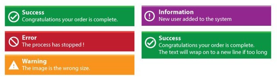
Toast messages have a title, message and an icon, and can be positioned in the top-left, top-right, bottom-left, or bottom-right relative to the Omnis application window (not the desktop) under Windows, or the whole screen on macOS. They will close automatically after 4000 ms or a specified time.
Toast messages are non-modal, and therefore they are outside the scope of other Omnis window stacks and do not interfere with evToTop message processing, nor do they change the end users current window or current focused object.
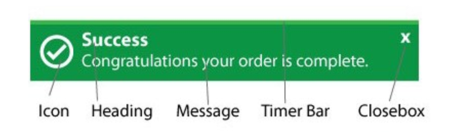
They have the following UI layout:
The following are some example toast messages:
Toast messages have close boxes so they can be dismissed before the default time expires. They have a set of predefined colors and default width with the option to override these colors by setting some new appearance theme settings. The message box has a progress timer bar to show how long remains before the message box is dismissed.
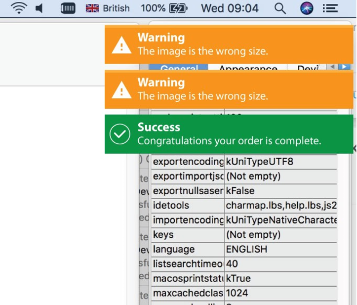
Toast messages can be stacked up to 6 levels deep. When a message is manually closed or expires, it is removed from the stack and other on-screen messages adjust keeping a stacked appearance.
Showing Toast Messages
Toast messages are opened in the context of the current instance (window or object instance) using the $showtoast() method, which has the following parameters.
- $cinst.$showtoast( cMessage [, cTitle, iStyle=kToastSuccess, iStack=kToastStackTopRight, iTimer=4000, bClearStack=kFalse, cContext=’’] ) adds a new toast to a stack.
| cMessage |
the message text; must be supplied |
| cTitle |
Title text, or leave empty ‘’ for no title |
| iStyle |
kToastSuccess (the default), kToastError, kToastWarning, kToastInformation |
| iStack |
the position of the message stack relative to the application window or screen on macOS, a constant: kToastStackTopRight (the default), kToastStackTopLeft, kToastStackBottomRight, kToastStackBottomLeft, kToastStackCenter |
| iTimer |
number of milliseconds the toast will be displayed (default is 4000, as set in the ‘toast’ section of the appearance.json theme file) |
| bClearStack |
if kFalse (the default) new toast messages are stacked with previous messages, otherwise if passed as kTrue, all previoustoasts in the stack will be cleared |
| cContext |
text passed into $toastnotificationclicked when the content of the toast is clicked (blank by default): see below. |
For example:
$cinst.$showtoast('Success','Congratulations your order is complete', kToastSuccess )
$cinst.$showtoast('Error','Problems with your con.', kToastError, kToastTopLeft )
Note: Attempting to add a toast to the same stack with an identical title and message will reset the existing toast timer and not add a new toast.
Notification Clicks
The startup task method $toastnotificationclicked() method allows you to determine when a toast notification message has been clicked. The $showtoast() method has an optional parameter pContext, which can be passed into $toastnotificationclicked when the content of the toast is clicked, and after querying pContext your code could take some specific action, such as opening a window.
If you return kTrue from $toastnotificationclicked, the toast is closed immediately. $toastnotificationclicked is not called if clicking the toast close box.
Toast Message Colors
You can override the default colors of the four toast styles, the onscreen delay, and the default width in the ‘toast’ section of the appearance.json file.
toast

{

  toastsuccessbackgroundcolor : color,

  toastsuccesstextcolor : color,

  toastsuccessicon : number,

  toasterrorbackgroundcolor : color,

  toasterrortextcolor : color,

  toasterroricon : number,

  toastwarningbackgroundcolor : color,

  toastwarningtextcolor : color,

  toastwarningicon : number,

  toastinformationbackgroundcolor : color,

  toastinformationtextcolor : color,

  toastinformationicon : number,

  toastdefaultdelay: 4000,

  toastdefaultwidth: 400

}
Example
The following example code opens different toast messages:
If (toastType>kToastInformation)
  Calculate toastType as kToastSuccess
End If
Calculate type as toastType
Switch type
  Case kToastSuccess
    Calculate title as "Success"
    Calculate message as "Congratulations. Logon complete."
  Case kToastError
    Calculate title as "Error"
    Calculate message as "Sorry your details are incorrect. Please check your deails and try agin."
  Case kToastWarning
    Calculate title as "Warning"
    Calculate message as "Please check your settings"
  Case kToastInformation
    Calculate title as "Information"
    Calculate message as con('Great news. All formst have been submitted, saved and has passed ',      style(kEscBmp,1613),' You can now move on to the next level. ')
End Switch
Calculate toastType as toastType+1
Window Messages
The $showmessage() method opens a message in a window instance, which you can use as an alternative to the OK message command (this is similar to the $showmessage() method which is available in remote form and remote task instances). The $showmessage() method is also available for menu, toolbar, report, object, and table instances. The method has the following definition:
- $showmessage(cMessage[,cTitle,iOptions=kMsgOK])
displays a message using the specified cMessage, cTitle and iOptions (a sum of kMsg... constants). Returns true for OK or Yes, false for No or cancel. You can use msgcancelled() to check for cancel.
The supported constant values are:
| kMsgOK |
Display an OK message (the default) |
| kMsgYesNo |
Display a Yes/No message |
| kMsgNoYes |
Display a No/Yes message |
| kMsgCancelButton |
Add a cancel button to the message |
| kMsgIcon |
Display an operating system specific icon with the message |
| kMsgSoundBell |
Sound the bell when the message is displayed |
If you mix kMsgYesNo, kMsgNoYes and kMsgOK, kMsgYesNo has precedence over kMsgNoYes. kMsgNoYes has precedence over kMsgOK.
HWND Notation
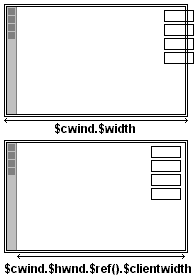
All window instances and their objects, except background objects, have the $hwnd and $framehwnd properties. In addition, window instances have the $toplevelhwnd property. These three properties all identify child windows or parts of a window. Each window object has a $framehwnd, which is the outermost enclosing child window of the object. Each window object also has an $hwnd, which is the child window which typically contains the main information displayed by the object. $hwnd is always contained in $framehwnd, and in many cases $hwnd and $framehwnd are the same child window.
For example, in the following field $hwnd is not the same as $framehwnd: $hwnd refers to the client window excluding the title window, and $framehwnd refers to the frame window.
For a window instance, $toplevelhwnd is the outermost enclosing child window of the window instance, that is, it corresponds to the complete window, including title bar and sizing border, if present. $framehwnd of an open window instance is the window contained in the $toplevelhwnd; it excludes the window title bar and sizing borders. $hwnd of an open window instance is contained in $framehwnd, together with the window menu bar, toolbar and status bar, if present. For example, when you use the notation
Do $cwind.$hwnd Returns lvNumber
$hwnd, $framehwnd, and $toplevelhwnd return a number. The number is a unique identifier that represents the child window.
$hwnd, $framehwnd, and $toplevelhwnd can also return an item reference to the child window, for example
Set reference myRef to $cinst.$hwnd.$ref
For $hwnd and $framehwnd, the item reference supports the following properties: $left, $top, $width, $height, $clientleft, $clienttop, $clientwidth, and $clientheight. $toplevelhwnd supports the following properties: $left, $top, $width and $height.
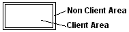
A child window can have a client area and a non-client area. The non-client area of the window can contain features such as the window border and scroll bars. Sometimes the non-client area is empty, such as in a borderless entry field with no scroll bars. Consider an entry field with a 2 pixel inset border. Its client area sits inside the non-client area, as follows.
The entry field with a 2 pixel inset border may be 100 pixels wide and 50 pixels high. The client area would be 96 pixels wide and 46 pixels high. Therefore
$width = 100 $clientwidth = 96
$height = 50 $clientheight = 46
$top and $left are the coordinates of the child window, relative to the child window which contains it (in the case of $toplevelhwnd, these coordinates are relative to the area in which Omnis displays window instances).
$clientleft and $clienttop are the coordinates of the client area of the child window. These always return the value zero.
The properties of $hwnd and $framehwnd are not assignable. For $toplevelhwnd, $left, $top, $width and $height are assignable.
Screen Size
There is a property of $toplevelhwnd, called $screen, that allows you to track the location and dimensions of the screen, as the window changes position. This could be useful if, for example, a window in Omnis is located on a second monitor and you want to determine its width and height in order to resize or reposition the window.
The value of $left, $top, $width and $height of the screen can be obtained by creating an item reference to this property, e.g.
Set reference toplevelitemref to $cwind.$toplevelhwnd.$ref
Set reference screenref to toplevelitemref.$screen.$ref
This is only implemented for macOS and Windows. Other platforms (Linux) will return (0,0,1,1) for (left, top, width, height).
macOS
The screen dimensions on macOS will take account of the menubar and position of the dock and only return the visible screen area. This can be controlled using the excludeDockFrom$screen item in the ‘macos’ section of config.json, which is true by default, which means the $screen property excludes a visible macOS dock from its coordinates.
Windows
Under the Windows OS all Omnis windows are contained within the main Omnis window. Therefore, on Windows the identifier for a window’s screen will be the screen containing the main Omnis window.
If the main Omnis window is displayed across multiple screens then the identifier for the screen is that screen which contains the largest area of the main Omnis window. The screen properties will provide the area of the main Omnis window which intersects the visible area of the screen.
Using HWND
Sometimes it is important to know the exact size of the client area. For example, if a window has a toolbar on the left and you want to create controls right-justified down the right edge f the window, $cwind.$width would not be good enough, as it includes the width of the toolbar. This would cause you to add controls (using $add ) too far to the right.
In the first example you call $add() to add objects and the $left for the objects would be the width of the window less the $width of the objects you are adding. As $width included the toolbar space, the objects would be added too far to the right.
In the second example, using the $hwnd of the window, you get the exact width excluding the toolbar width, allowing you to right justify the controls correctly.
Enter Data Mode
You can place window instances in enter data mode on a case-by-case basis. A window instance has the $enterable attribute; if true, the window is in enterable mode. Enterable means the window is in ‘enter data mode’ so data can be typed into the entry fields and any OK and Cancel buttons are enabled. Normally windows with modeless enter data are always enterable and other windows are enterable when there is an executing Enter data command on the method stack. When you set $enterable to kTrue for a window instance it is never changed automatically by Omnis at an Enter data command, therefore
Do $cinst.$enterable.$assign(kTrue)
in the $construct() method of the window is equivalent to putting the window in modeless enter data mode.
It is possible to go into enter data mode without the top window (or any window) being enterable. Sometimes this might be desirable, but beware Omnis provides no protection against this situation.
If a window is not enterable for Enter data it is also not enterable for Prompted find.
Enter data and close boxes
For all versions of Omnis Studio up to and including 10.22, when closing a window, the Enter Data command was left on the command stack if not duly processed. To cancel the command correctly, you had to use the standard OK or Cancel buttons or catch the window close event and execute a command such as Queue Cancel to terminate the Enter Data command.
In Omnis Studio 11, a change was made such that the close box automatically cancelled the Enter Data command, but this change could potentially break legacy applications. In revision 39959, Omnis Studio 11.2 reverts to the 10.2x behavior.
The configuration item enterDataCancelOnWindowClose, in the ‘defaults’ section of config.json, controls if Enter Data mode is cancelled when a window closes. This is set to false by default, which is the recommended state. Any code in Studio 11 that used the above anomaly should be modified to process the Enter Data command correctly when closing a window.
The deferUserWindowClosure item, also in the ‘defaults’ section of config,json, has been set to false in this revision as this was causing some windows to ghost during a closing process.
Floating Edges for Windows and Fields
Window classes and all field types have the $edgefloat property which affects how the object is resized and/or moved when its container window/field is resized. The default value of $edgefloat is kEFnone. For a window class, the $edgefloat property affects how the edge or edges of the window are resized or repositioned when the main Omnis application window is resized, or when the monitor resolution is changed. For fields and other objects, the $edgefloat property affects how a field is resized or moved when its container window is resized. You can apply $edgefloat properties to fields within other container fields, such as a tab pane or shape field, in which case their floating edge or positioning properties are relative to the area within the container field.
The $edgefloat property for a window class or field can have one of the following settings (an Omnis kEF… constant):
| kEFall |
All the edges of the window/field can float; this means the window or field will move as the main Omnis window or container window/field is resized; in effect, the window or field will remain fixed relative to the bottom-right corner of its parent window or field |
| kEFbottom |
The bottom edge of the window/field will move with the main Omnis window or container window |
| kEFleftRight |
The left and right edges of the window/field will move with the main Omnis window or container window; the width of the window/field will be unchanged |
| kEFleftRightBottom |
The left, right, and bottom edges of the window/field will move with the main Omnis window or container window |
| kEFnone |
No floating edges; the window/field is unaffected when you resize the main Omnis window or container window |
| kEFright |
The right edge of the window/field will move with the main Omnis window or container window |
| kEFrightBottom |
The right and bottom edges of the window/field will move with the main Omnis window or container window |
| kEFrightTopBottom |
The right, top and bottom edges of the window/field will move with the main Omnis window or container window |
| kEFtopBottom |
The top and bottom edges of the window/field will move with the main Omnis window or container window; the height of the window/field will be unchanged |
In addition, you can set a field’s $edgefloat property to one of the kEFposn… or positioning constants which affect how a field is positioned (and resized) relative to the edge of its container window class or container field, such as a tab pane.
| kEFposnBottomToolBar |
Places field at the bottom of the window or container field |
| kEFposnClient |
Field resizes to fit the area that is available around the field |
| kEFposnHorzHeader |
Places field in the horizontal header or top of the container field or window |
| kEFposnJoinHeaders |
Field is located where the horizontal and vertical headers meet |
| kEFposnLeftToolBar |
Places field at the left-hand edge of the window or container field |
| kEFposnMainHeader |
Places the field in the main header of the container field or window |
| kEFposnMenuBar |
Places the field at the top of the window or container field; such a field will be placed above fields with kEFposnTopToolBar and kEFposnHorzHeader |
| kEFposnRightToolBar |
Places field at the right-hand edge of the window or container field |
| kEFposnStatusBar |
Places field in status bar position at the bottom of the window |
| kEFposnTopToolBar |
Places field at the top of the window or container field |
| kEFposnVertHeader |
Places field in the vertical header or left side of the container field or window |
Note that some of these positioning constants take precedence over others. For example, a field with kEFposnMenuBar will always be positioned at the top of a window or container field. If you add a field with kEFposnTopToolBar positioning it will appear under a field with kEFposnMenuBar positioning, if there is one, otherwise it will appear at the top of the window.
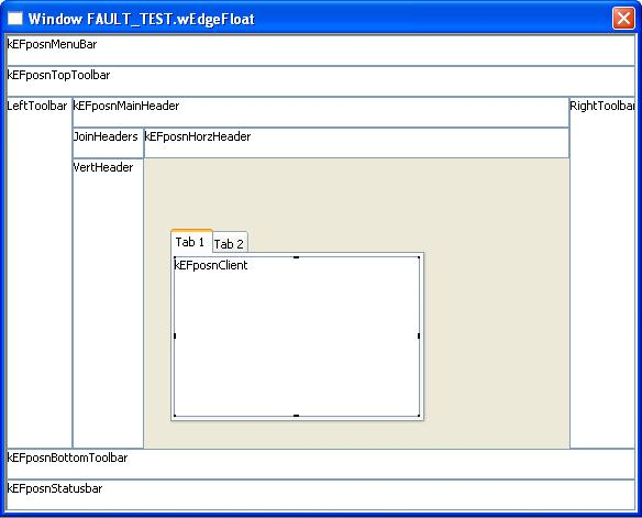
The following window shows the different kEFposn… settings for fields within a window class. Fields within a container field, such as a tab pane, behave in the same way. Note the kEFposnClient setting will make the object expand to fit the available area in the window or container field.
Window Minimum Size
The $minwidth and $minheight properties allow you to set a minimum width and height for a window. This can be useful if you want to stop the end user making a window containing many floating fields too small, to preserve its layout, for example.
$minwidth and $minheight are the minimum values to which the $width or $height properties of a window can be set, either programmatically or by the user resizing the window. A value of zero (the default) means that no minimum is specified.
Creating a right floating window
The following example shows how you can use $edgefloat, in conjunction with some code in the $construct() method of a window, to create a window that will attach itself to the right-hand side of the main Omnis window (or desktop under Mac OS), even when the Omnis window is resized. Set $edgefloat to kEFleftRightBottom, and use the following code in the $construct() methods of the window.
Set reference item to $cinst.$toplevelhwnd.$ref
Calculate item.$left as $root.$modes.$width – item.$width
Calculate item.$top as 0
Calculate item.$height as $root.$modes.$height
If you resize the Omnis window (under Windows), or change the monitor resolution (Mac OS), the window remains attached to the right-hand side.
Window Fonts
If you are developing an application for a cross platform environment, you may want to set up the system font tables to allow the fonts used in your application to map correctly across the different platforms. There is a system font table for window classes and report classes for each platform supported in Omnis.
The fonts in the window font table will appear in the $font property for window objects. So even if you are developing an application for a single platform, you may still want to edit the window font table to add fonts to those already available for window objects.
| #WIWFONTS |
Window font table for Windows OS |
| #UXWFONTS |
Window font table for Unix |
| #MXWFONTS |
Window font table for macOS |
To view the window fonts system table
Use the Browser Options dialog (press F7/Cmnd-7 while the Browser is on top) to make sure the system tables are visible in the Studio Browser
Double-click on the System Tables folder
Double-click on #WIWFONTS or the window font table for your platform
The #WIWFONTS system table contains a list of fonts that are available in Omnis by default. Each row in the font list displays the corresponding font for each platform supported in Omnis. To change the font mapping, replace the name of a font either by typing its name or selecting it from the list of fonts. To add a font, click in the next available line in the font list and add the name of the font. Add a font name for each platform.
The font table editor loads or creates a font table for each platform (corresponding to each column in the editor) and allows you to edit them all simultaneously. Therefore when you edit the window font table for the first time, and click OK to finish editing it, a new system table is added to your library for each platform supported in Omnis, other than your current platform.
Window and Font Scaling
Computer monitors are increasingly available in a variety of screen resolutions, therefore your applications must be capable of scaling to fit different display devices. There are some library preferences to control the scaling of windows and fonts for applications displayed on monitors that have a different resolution from the standard 96 DPI for PCs or 72 DPI for Macs.
$designdpi
The DPI of the monitor which the library was designed on. This will default to 96 for PCs or 72 for Macs, if it is currently not set. This value is used to scale the application accordingly when $designdpimode is on. For example, if you have an application that was designed on a 120 DPI machine, you should set $designdpi to 120. When such an application is opened on a 96 or 72 DPI monitor, and $designdpimode is on, the windows and fonts will scale down.
$designdpimode
Turns designdpi mode on or off, one of three values: kDPIoff (the default) no scaling occurs, which equates to the behavior of previous versions of Omnis Studio; kDPIframeOnly means that window and control frames will be resized, but not fonts; kDPIall specifies that all window and object frames, as well as fonts, are scaled.
When you assign these preferences you must close and reopen your library for them to take effect.
Note that the $left, $top, $width and $height of windows and objects are also affected as appropriate when $designdpimode is on and an application is scaled.
You can scale menu and toolbar fonts when using design DPI scaling. Specifically, window menus and window toolbars, under Windows, scale using the design DPI preferences and settings for the library.
There are some entries in the config.json file that can be used to control scaling of menus and toolbars for cases where Omnis cannot easily determine a library to be used as the source of the scaling settings. These entries are:
defaultMenuDesignDPIMode and defaultMenuDesignDPI
in the "windows" section (these only apply on the Windows platform: note that menu items are never scaled on macOS)
windowToolbarDesignDPIMode and windowToolbarDesignDPI
in the "ide" section
dockingAreaDesignDPIMode and dockingAreaDesignDPI
in the "ide" section
The syntax for these entries is
the mode entries: "kDPIall", "kDPIoff" or "kDPIframeOnly"
the DPI values: 3 comma separated DPI values
This corresponds to the syntax of the library preference (even in the case of menus where only the Windows platform value is used). Typically, you would set these to the same value as those in the library preferences.
Background Themes
Background themes allow you to specify the Aqua theme for the background of an object. $backgroundtheme is a new property of a window object, window background object, a window, and some remote form objects and allows you to set the background theme. It can have the following values:
| kBGThemeNone |
No background theme; you can use the other background properties of the object ($forecolor and so on) |
| kBGThemeParent |
parent object theme; if this results in kBGThemeNone, the object uses the parent’s appearance properties |
| kBGThemeWindow |
window background theme |
| kBGThemeContainer |
container background theme (usually kBGThemeWindow) |
| kBGThemeTabPane |
tab pane background theme |
| kBGThemeTabStrip |
tab strip background theme |
| kBGThemeControl |
control background theme |
| kBGThemeMenubar |
menu bar background theme |
| kBGThemeMenu |
menu background theme |
Note that if you use this property on platforms other than macOS, the background will be filled with the following system colors:
kBGThemeWindow
kBGThemeContainer
kBGThemeTabPane
kBGThemeTabStrip |
kColor3DFace |
| kBGThemeControl |
kColorWindow |
kBGThemeMenubar
kBGThemeMenu |
kColorMenu |
Since $backgroundtheme uses sensible values for platforms other than macOS, you can use the theme to obtain good cross-platform results. The following are some additional recommendations:
Always set the window’s theme to kBGThemeWindow.
When designing windows using container objects such as scroll boxes, in order to create sizeable panes, set the container’s theme to kBGThemeParent, unless there is a good reason for the container to use a different background.
For label background objects set the background pattern to transparent (pattern 15).
When using edit fields as labels, set $backgroundtheme to kBGThemeParent and set $effect to kBorderNone.
Theme Fonts
Theme fonts allow you to specify a font from the current Aqua theme. They are only available on macOS. You can use Theme Fonts in the $fontname property of a Field Style. The following Theme Fonts are available:
| ThemeLabel |
ThemeMenuItem |
| ThemePushButton |
ThemeMenuItemMark |
| ThemeApplication |
ThemeMenuItemCmdKey |
| ThemeSystem |
ThemeWindowTitle |
| ThemeEmphasizedSystem |
ThemeUtilityWindowTitle |
| ThemeSmallSystem |
ThemeAlertHeader |
| ThemeSmallEmphasizedSystem |
ThemeViews |
| ThemeMenuTitle |
|
Note that not all theme fonts on macOS support text underline.
Window Style
You can set the style or type of a window using the $style property. The window $style can be one of the following: kDialog, kNoframe, kPalette, kSimple, or kTitle (the default).
Window Title Colors (macOS)
On macOS, you can use the coloractivecaption and colorinactivecaption items in the ‘system’ section of appearance.json to set the colors for window title bars. If either of these is set to kColorDefault, the system default colors are used.
In addition, the macoscaptiontextappearance item in the ‘system’ section of appearance.json specifies the text color for captions (the window title); this is an integer: 0 system default, 1 dark text, 2 light text.
Drawer Windows (macOS)
Drawer and Sheet windows are available under macOS only. In general, their behavior is ignored under the other platforms and they behave like standard windows. For example, you can specify that OK message boxes are opened as sheet windows: under macOS they will open by overlaying the parent window, but under all the other platforms they will open as normal by popping up over the top of the current window.
A drawer is a window that slides out from a parent window and while open remains attached to the parent window. For example, in an appointment calendar application a drawer window could pop out from the main window to display details about each appointment. In Omnis, drawer windows behave in the standard way as defined by the macOS operating system.
When you open a window from inside the current window, the parent window, you can specify that the child window is opened as a drawer either at the top, bottom, left, or right of the parent. The drawer position is selected as one of the window position constants when using the $open() method.
On evClick
Do $clib.$windows.wDrawer.$open('*',kWindowDrawerDefault)
Window instances have the property $isdrawer which tells you whether the instance is a drawer window or not.
Sheet Windows (macOS)
Window classes have the property $usesheets which enables sheet windows under macOS; on other platforms, windows are opened as normal. If this property is kTrue, and the Window is the top most window (excluding palette windows), any message boxes, such as standard OK and Yes/No messages, and file selection dialogs will be opened as a sheet window in the top window. In this case, message and file selection sheet windows are application modal, that is, the user cannot click on any other Omnis windows while the sheet window is open.
It is also possible to open user windows as sheet windows, by using the constant kWindowSheet with the $open() method. In the following example, the sheet window is opened after and in the context of a parent window:
Do $clib.$windows.w1.$open('wMyParentWindow',kWindowNormal)
Do $clib.$windows.w2.$open('wMySheetWindow',kWindowSheet,$iwindows.wMyParentWindow.$ref,parm1,parm2,..)
The sheet window will be attached to the specified parent window.
If $clickbehind is kTrue, it will be possible to click on other Omnis windows with the exception of the parent window. If $clickbehind is kFalse, the sheet window becomes application modal (open user windows only) and it will not be possible to click on other Omnis user windows.
Window instances have the property $issheet which tells you whether the instance is a sheet window or not.
Simple Style Windows
The $growbox property is assignable for simple style windows ($style = kSimple), as this controls whether the window has a sizing border. This will allow you to make simple style windows look more alike on macOS and wWindows.
For a window with $style set to kSimple, irrespective of the setting of $growbox, you can always resize the design window. On Windows, there is a wider sizing border in design mode, even if $growbox is kFalse. When you open the window, the open window is only resizeable if $growbox is true, and on Windows it only has a wider sizing border in this case.
The net effect is that for kSimple style windows with $growbox kFalse, there is no wide sizing border on either platform for the open window, making them appear more alike.
Palette Windows
It is recommended that you do not use Palette type windows under macOS due to various constraints with window ordering and their conflict with the window “bringtofront” mechanism in Omnis. You can use one of the other window types, by setting the $style property of the window, such as the kSimple type.
Window Transparency
Window classes now have the $alpha property which sets the transparency of the window and all its controls (an integer from 0 to 255, with 0 being completely transparent and 255 opaque). In addition, the majority of the Window class components have the $alpha property which means you can set the transparency of individual window components.
Note $alpha was available for window classes in versions prior to Studio 8.1 but for macOS only.
Disabling the Focus on Fields
Most window fields have the $disablefocus property which specifies whether or not a field gets the focus when the user tabs through the fields in a window. This is useful, for example, with fields that do not show the focus, such as the trans button: setting $disablefocus to kTrue still allows the user to click on the button, but prevents tabs appearing to go nowhere.
Lookup Windows
In the situation where there may be limited space on your window for a large list field, therefore you might want to place the list on a separate lookup window. You can force such a window to open when the user needs to look up the data, and close it as soon as a line is chosen. As a further refinement you can allow the user to enter some data directly into a field and not popup the window, or if the field is left empty popup your lookup window containing a list of possible choices.
An entry window wBookings for the BOOKINGS file, for example, might have the foreign key BkCuId to the primary key CuId in the CUSTOMERS file. The BkCuId field method will check if the code entered by the user is valid and allow the user to choose from a list of customer names if it is not. The important point here is that method execution must be held up until the user has made a choice. These are the methods to implement this: they will be described together since they interact.
On evAfter
Do CheckCustCode Returns Valid
If not(Valid)
Open window instance {wCustList}
Enter data
Close window instance wCustList
Calculate BkCuId as CuId
Redraw { BkCuId }
Queue set current field {BkCuId}
Queue tab
End If
Quit event handler (Discard event)
The Customers List window wCustList is a Simple or NoFrame style window filled by a list box. The list is defined and built as the window opens. There’s no need to show CuId in the list box but it must be in the list.
Set current list cCustList
Define list {CuId, CuLname, CuCountry}
... build list from Omnis or SQL dat
On evDoubleClick
Load from list
Queue cancel
Quit event handler (Discard event)
When wCustList opens, the list is built. At this point Enter data is necessary to halt execution of the method until the user has chosen from the list. When the list box receives a double-click, Load from list transfers the list line data to the CRB. Queue cancel now terminates the enter data state so that execution resumes and closes the window. BkCuId is set from CuId entered from the list and the field is redrawn. The cursor will still be in BkCuId so Queue set current field and Queue tab can be added to place the cursor at the next field in the tabbing order.
This enter data state is needed whether or not the parent window has $modelessdata set.
Timer Methods and Splash Screens
A splash screen makes a more friendly introduction to an application than presenting the user with a blank screen and a menu bar. It involves opening an introductory window, usually called wAbout, from the $construct() method in the startup task of your library. You can keep the About window on screen either for a predetermined time or until the user clicks on it. The wAbout window contains a button area field to detect clicks and the following methods
Set timer method (8 sec) {Timer Control}
On evClick
Do method Close Window
Clear timer method
Close window {wAbout}
Do method Close Window
When the $construct() is called, the Set timer method command sets a time delay in seconds and nominates a method, called Timer Control, which is run at the end of the delay. The Timer control method then calls Close Window which clears the timer and closes the window. If the window has been clicked on before the end of the delay, the button area method calls the Close Window method which closes the window immediately.
The button area should have its $noflash property set to kTrue to avoid flashing when the user clicks on it.
Pictures
You can place button area fields over a graphic, which you can paste onto your window or load into a Picture field. If the library preference $sharedpictures is set to kSharedPicMode256Color or kSharedPicModeTrueColor, pictures are converted to a format accepted under Windows or macOS. The recommended shared picture mode is kSharedPicModeTrueColor. kSharedPicMode256Color is provided for backwards compatibility with earlier versions of Omnis Studio.
Window Status Bars
A window status bar is an area at the bottom of a window in which you can display data, text, help messages, progress or thermometer bars, and so on; for example, there is a status bar at the bottom of the Studio Browser. A status bar is a property of the window itself which you enable in the Property Manager. You can set how many panes should appear in the status bar, and the size and style of each pane.
To enable a window status bar
Open your window in design mode
Click on the background of the window to show its properties, or press F6/Cmnd-6 to bring the Property Manager to the top
Set the hasstatusbar property to kTrue
Click on the Appearance tab in the Property Manager and set the statusedge property: it can be flat (the default), plain, inset, or chisel border style
To set the number of panes in the status bar and their style you need to edit the properties of the status bar in the Property Manager.
To set the number of panes in the status bar
- Click on the status bar and bring the Property Manager to the top
The panecount property specifies the number of panes in the status bar. The helppane property specifies the pane in which any help messages should appear, held in helptext for menu lines, for example. On the Text tab you can set the font and fontsize properties for the whole status bar.
To change the properties of individual panes you should click on the pane and edit its properties in the Property Manager.
To change the properties of a pane
- Click on a pane in the window status bar and click on the Pane tab in the Property Manager
You can change the pane’s border, alignment, and width in pixels. The sizing property sets the pane to fixed or elastic when the window is sized at runtime. The minimum size of an elastic pane is the size of the pane in design mode: it cannot be made smaller in runtime.
The height of the status bar changes to accommodate the status bar font size with a two-pixel buffer above and below. In design mode you can change the width of a pane by dragging the handle that appears in the selected pane.
Every window instance contains the $statusbar property containing the window status bar in runtime. The $hasstatusbar property lets you hide and show the status bar at runtime. The $statusbar property also contains a group $panes containing the panes in the status bar numbered consecutively from the left. For example, pane 2 is $iwindows.WindowName.$statusbar.$panes.2. Each pane has width, text and appearance properties which you can set at runtime. For example
Set reference Pane1 to $cinst.$statusbar.$panes.1
Set reference Pane2 to $cinst.$statusbar.$panes.2
Set reference Pane3 to $cinst.$statusbar.$panes.3
Do $cwind.$statusbar.$panes.$remove(Pane3)
Do Pane2.$text.$assign('Click Save button to save your work')
Do Pane3.$sizing.$assign(kElastic)
Do Pane1.$hasborder.$assign(kFalse)
The $align property for a pane specifies whether to position the pane either after the previous left-hand pane or before the right-hand pane.
Progress Bars
In runtime, you can make a pane into a progress bar by enabling its isprogress property. If you want to view the properties of the status bar in runtime you can view it in the Notation Inspector under $iwindows. The properties of the status bar on a window instance are
min and max
sets the minimum and maximum value for the progress bar
isprogress
enables the pane as a progress bar
value
sets the current value on the progress bar
When $isprogress is set, $min and $max default to 0 and 100 respectively, but if you set them after setting $isprogress, your values will override the default settings. For example, to set $max for the second pane:
Do Pane2.$isprogress.$assign(kTrue)
Do Pane2.$max.$assign(200)
The defaults for $min and $max are useful for percentages, for showing the percentage completed for an operation. The following method sets up a progress bar in the second pane and uses the default values for $min and $max:
Set reference Pane1 to $cinst.$statusbar.$panes.1
Set reference Pane2 to $cinst.$statusbar.$panes.2
Do Pane1.$hasborder.$assign(kFalse)
Do Pane1.$text.$assign("Doing Loop")
Do Pane2.$isprogress.$assign(kTrue)
Do Pane2.$backcolor.$assign(kRed)
Calculate Pane2.$value as Pane2.$min
Repeat
Calculate Pane2.$value as Pane2.$value+1
Until Pane2.$value>=Pane2.$max
Do Pane1.$text.$assign("Ready")
Do Pane2.$isprogress.$assign(kFalse)
You can add an icon or picture from the USERPIC.DF1 data file or #ICONS to the progress bar, either from the Property Manager or with a command. For example, to have a show of hands as your bar add the line:
Do Pane2.$iconid.$assign(1072)
As a further refinement, you can add a ‘% Done’ message to the progress bar using the current $value of the pane inside the loop.
Repeat
  Calculate Pane2.$value as Pane2.$value + 1
  Calculate Pane2.$text as con(rnd(((Pane2.$value/Pane2.$max)*100),0),"% Done")
Until  Pane2.$value = Pane2.$max
Calculate Pane2.$text as "Finished!"
True Color Shared Pictures
Omnis Studio supports true color (24 bit) shared pictures. These are implemented using the free source for PNG and ZLIB.
PNG or “Portable Network Graphics”, is a standard picture format, with a portable free source code implementation. ZLIB is a compression library, which also has a portable free source code implementation. You can find out more about PNG at: www.w3.org.
The $sharedpictures library preference has three values, which can be set using the following constants:
kSharedPicModeNone
do not use shared pictures.
kSharedPicMode256Color
use the 256 color shared pictures from earlier releases.
kSharedPicModeTrueColor
use true color shared pictures.
If you use shared pictures, you should use true color since this will probably result in smaller stored images, and more realistic colors.
The data file browser has a hierarchical menu from which you can choose no shared pictures, the old 256 color shared pictures, or true color shared pictures; this affects how pictures are converted when reorganizing.
Window picture fields and background pictures have the $cachepicture property, which defaults to kTrue. When kTrue, and a shared picture is displayed, Omnis keeps both the shared picture data, and a copy of the decompressed native OS picture - this uses more memory but results in faster drawing.
The reorganize data command has a new checkbox which only applies when the convert to shared option is checked. It indicates convert to true color shared pictures.
The Edit>>Paste From File dialog allows direct pasting of PNG files.
Note that conversion of images to true color loses color depth, unless you convert on a machine running in true color mode.
- pictconvto(Character SrcFormat,Binary Src,Character DstFormat)
Converts the supplied binary data (with or without our internal header) from the supplied source format to the supplied destination format (on macOS, all bitmap data formats are supported, including PNG, TIFF, BMP, JPEG, and GIF). For example:
Do pictconvto("PNG",myPngData,"JPEG") Returns myJpegData
- pictconvfrom(Character SrcFormat,Binary Src)
Converts from the raw data and the specified format to a picture value, which can be used in various Omnis fields. For example, the following code lets you read a JPEG file from disk and display it:
ReadFile (“C:\MYFILE.JPG”) returns myJpegData

Do pictconvfrom("JPEG",myJpegData) Returns myJpegData

Redraw {JPEG_CONTROL}
- pictformat(Binary Src)
Returns a character string which contains the format of the picture data supplied. For example:
Do pictformat(myJpegData)
- pictconvtypes()
Returns a single column list, which contains all the picture conversion types registered with Omnis. The values are: CS24, PNG, BMP, JPEG
The picture formats are as follows:
CS24
Omnis colour shared picture format (16 million colours) , including the internal Omnis header.
PNG
PNG format (Raw, as written on disk)
JPEG
JPEG format (Raw, as written on disk)
In the following example, the 24 bit colour shared images in the background picture objects of a remote form class are converted to PNG.
Set reference fref to $root.$libs.THIN.$remoteforms.rfBooks.$bobjs
Set reference curBOBJ to fref.$first
While curBOBJ
If curBOBJ.$objtype=kBackpicture
If pictformat(curBOBJ.$picture)="CS24"
Calculate picture as curBOBJ.$picture
Calculate pictPNG as pictconvto("CS24",picture,"PNG")
Calculate curBOBJ.$picture as pictPNG
End If
End If
Set reference curBOBJ to fref.$next(curBOBJ)
End While
Save class {THIN.rfBooks}