Chapter 3—JavaScript Components
The Component Store contains over 40 ready-made components for use in Remote Forms and the JavaScript Client. The components are arranged in functional groups in the Component Store, including a group for Buttons, Containers, Entry Fields, and so on. The JavaScript components are listed in this chapter in alphabetical order, starting with the Activity Control, and are listed in the table below in their respective groups.
You can create your own JavaScript components using JavaScript and C++: see the JavaScript Component SDK online doc which has a tutorial and component reference. Alternatively, you can create your own custom JavaScript components, defined using JSON, which will appear in the JSON Components group in the Component Store: these are described in the JSON Components chapter.
Example Apps and Code
There is an example app for most of the JavaScript components under the Samples option in the Studio Browser. Open these apps to examine the remote forms and look at the code behind each component: you can double-click on a JavaScript component in design mode to see its code methods in the method editor.
In addition, the Applets option in the Studio Browser has several sample web apps that use many of the JavaScript components, including a Contacts app, a Holidays app, and a Webshop app which has a product catalog and a prototype shopping cart.
Example apps are featured in the Omnis Apps Gallery on the Omnis website, available here: www.omnis.net/app-gallery
or you can view all the Omnis Components in the Omnis Components app on the Omnis website.
JavaScript Components
The following components are available in the Component Store, arranged here in their respective groups.
| Favorites |
 |
See Favorites |
Contains any controls marked as Favorite |
| Buttons |
 |
Button Control |
Standard pushbutton which reacts to clicks |
|
 |
Check Box Control |
Check box for on/off values |
|
 |
Floating Action Button |
A round button that pops up a list of actions when tapped or hovered over |
|
 |
Radio Button Group |
Displays a group of radio buttons for exclusive selection |
|
 |
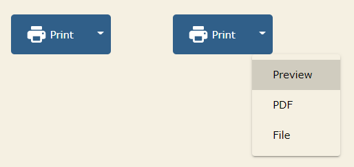
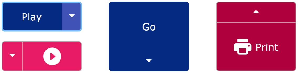
Split Button |
A button with a droplist of alternative options |
|
 |
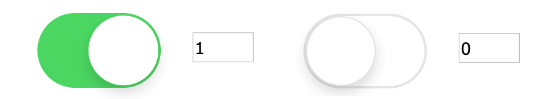
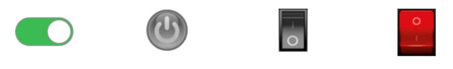
Switch Control |
Allows on/off selection; you can specify an icon for on/off state |
|
 |
Trans Button Control |
Interactive button with alternate hover image |
| Containers |
 |
Paged Pane |
Can contain fields & other objects on multiple panes |
|
 |
Scroll Box |
Allows you to group other controls with the option to display a scroll bar if the content does not fit |
|
 |
Tab Pane |
A compound object containing a Tab bar and Paged pane |
| Entry Fields |
 |
Entry Field |
Standard edit field for data entry or display |
|
 |
Rich Text Editor |
Rich text editor allowing end users to edit and format text |
| Labels |
 |
Label Object |
Basic label object |
| Lists |
 |
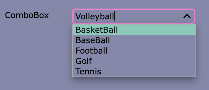
Combo Box Control |
Field combining entry box and droplist |
|
 |
Complex Grid |
Grid which can display all types of data and formatting |
|
 |
Data Grid Control |
Simple grid for text and numerical data display |
|
 |
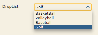
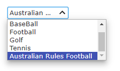
Droplist Control |
List that drops down when clicked |
|
 |
List Control |
Standard list field for displaying list variable data |
|
 |
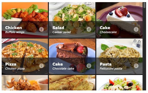
Tile Grid |
Displays a scrollable grid of tiles which can be configured to show images, text and buttons |
|
 |
Tree List Control |
List for displaying hierarchical data or list of options |
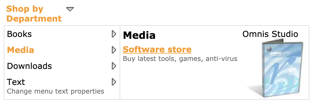
| Media |
 |
Camera Control |
Allows the end user to capture images, scan QR codes or barcodes |
|
 |
File Control |
Allows end users to upload or download files |
|
 |
Html Object |
Object to display HTML content |
|
|  |
Markdown Object |
Object to display Markdown content |
|
 |
Picture Control |
Standard field for displaying images |
|
 |
Video Player |
Plays a YouTube or other hosted video |
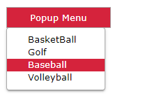
| Menus |
 |
Popup Menu Control |
A menu that pops up when clicked |
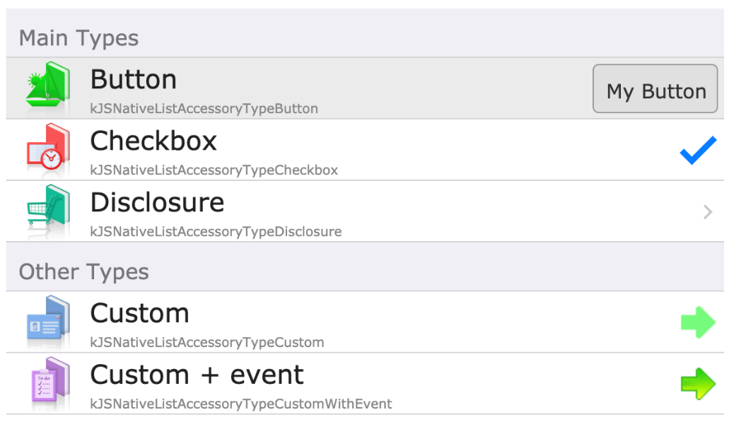
| Native |
 |
Native List |
List control with platform dependent appearance |
|
 |
Native Slider |
Slider control with platform dependent appearance |
|
 |
Native Switch |
Switch control with platform dependent appearance |
| Navigation |
 |
Html Link |
Control opens an external link or jumps to another control |
| Navigation |
 |
Hyperlink Control |
List containing hyperlink style options |
|
| |
Hyperlink Control |
List containing hyperlink style options |
|
 |
Navigation Bar Control |
Navigation bar with page selection |
|
 |
Navigation Menu Object |
Dropdown menu with hierarchical options |
|
 |
Page Selector |
Allows selection of page pane using touch |
|
 |
Segmented Bar |
Navigation control with different buttons or “segments” |
|
 |
Tab Bar Control |
Multiple tabs to control selection of page pane |
|
 |
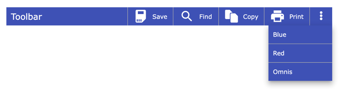
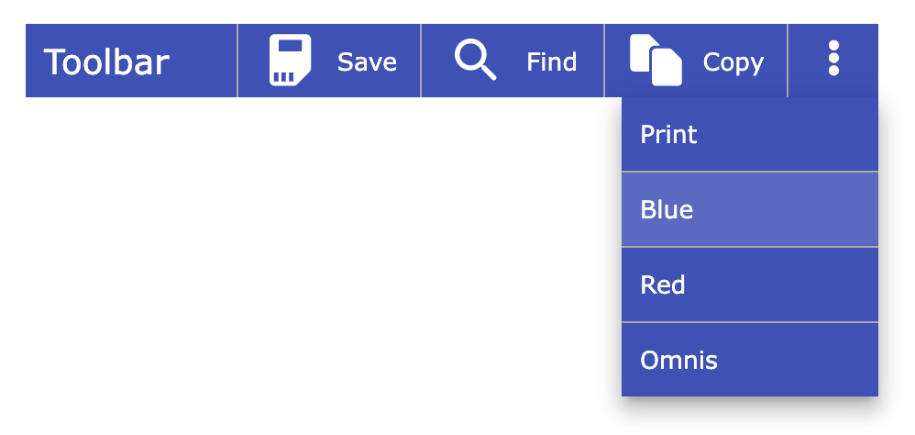
Toolbar Control |
Toolbar with custom buttons (icons and text), auto overflow and optional side menu |
| Other |
 |
Activity Control |
Animated image to display during a long process or Omnis Server activity |
|
 |
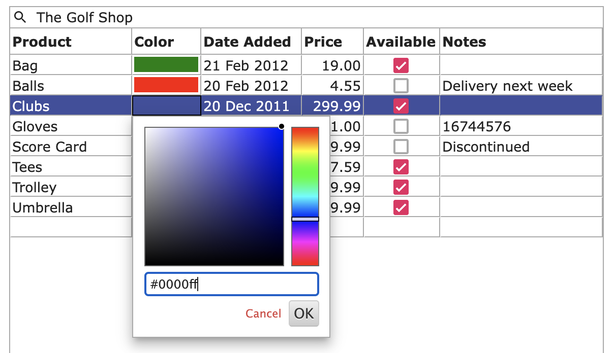
Color Picker |
Allows the end user to select a color from a color palette, or RGB, HSL, or HEX number |
|
 |
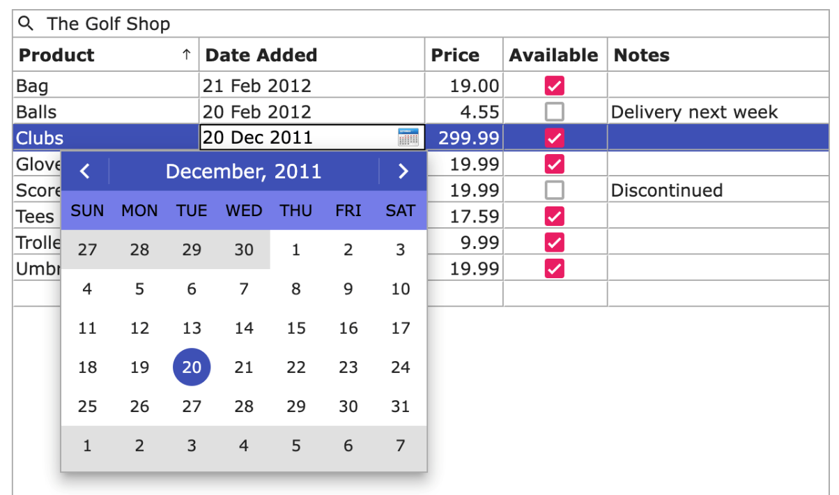
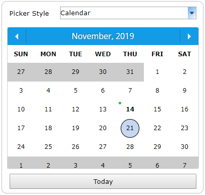
Date Picker Control |
Date picker with touch selection |
|
 |
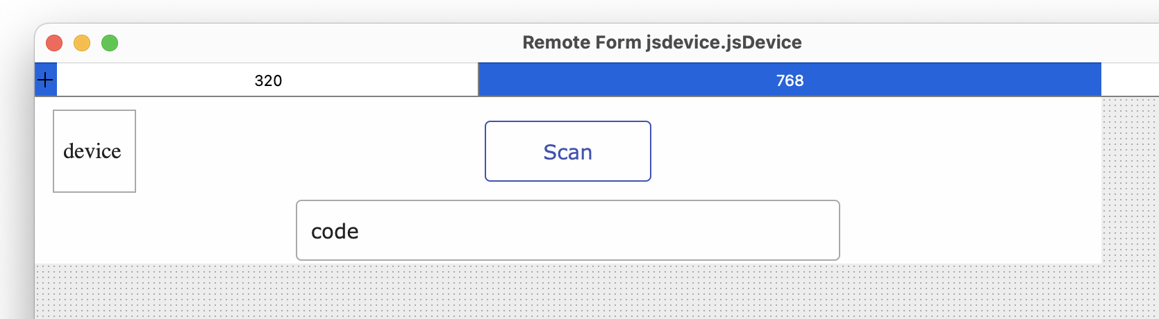
Device Control |
Allows access to hardware and services on a mobile device using the JS wrapper |
|
 |
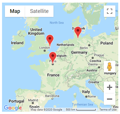
Map Control |
Displays a Google map for specified location(s) |
|
 |
Progress Bar Control |
Shows progress of server process or calculation |
|
 |
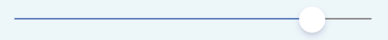
Slider Control |
Slider component for setting values |
|
 |
Timer Control |
Timer object triggers an event at a specified interval |
| Shapes |
 |
Background Shape |
Object you can set to Rectangle, Line, Triangle, or Image |
| Subforms |
 |
Subform Control |
Allows you to display another remote form class as a subform in the main form (or you can create a subform set) |
|
|  |
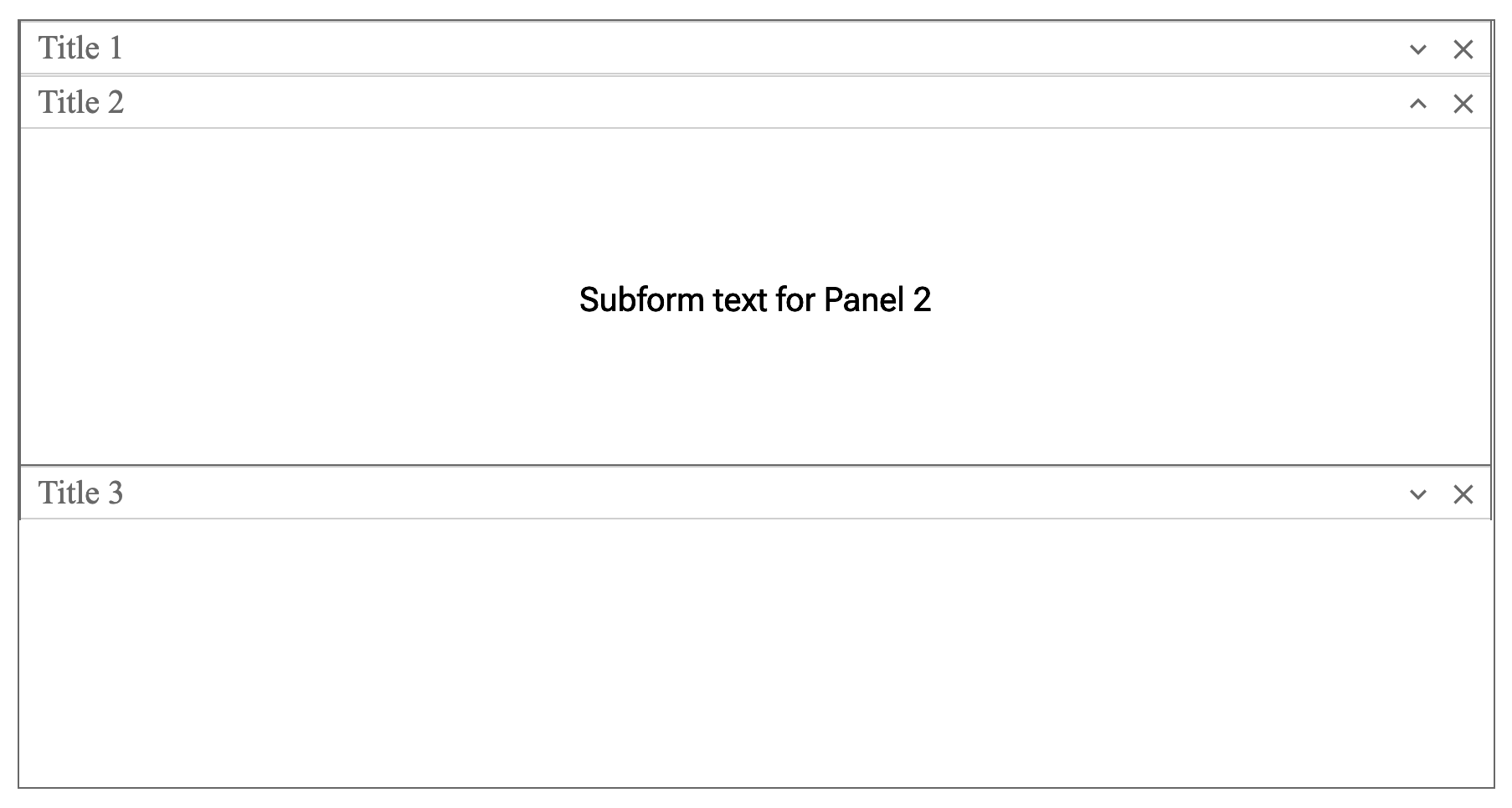
Subformset Panel |
Displays a number of exapandable subforms in a vertical panel |
| Visualization |
 |
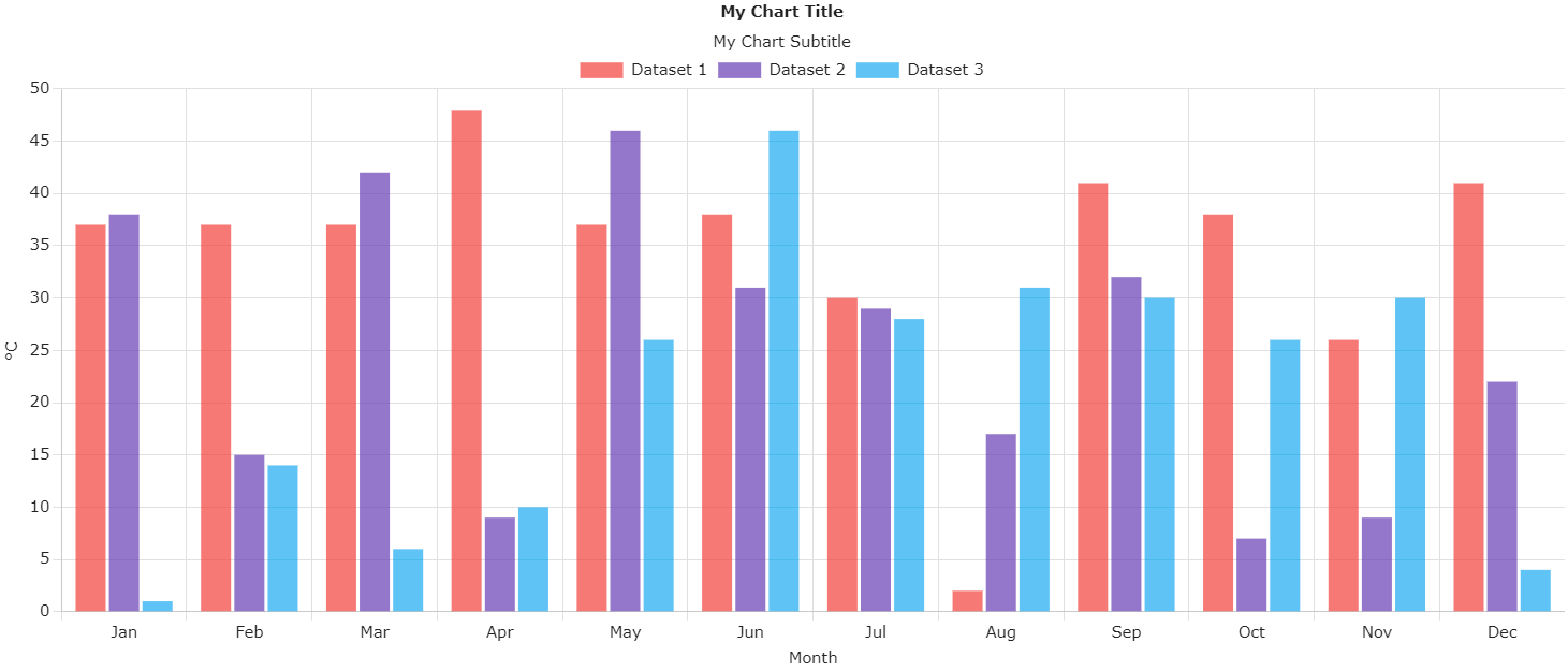
Bar Chart Control |
Displays a bar chart based on a list of values |
|
 |
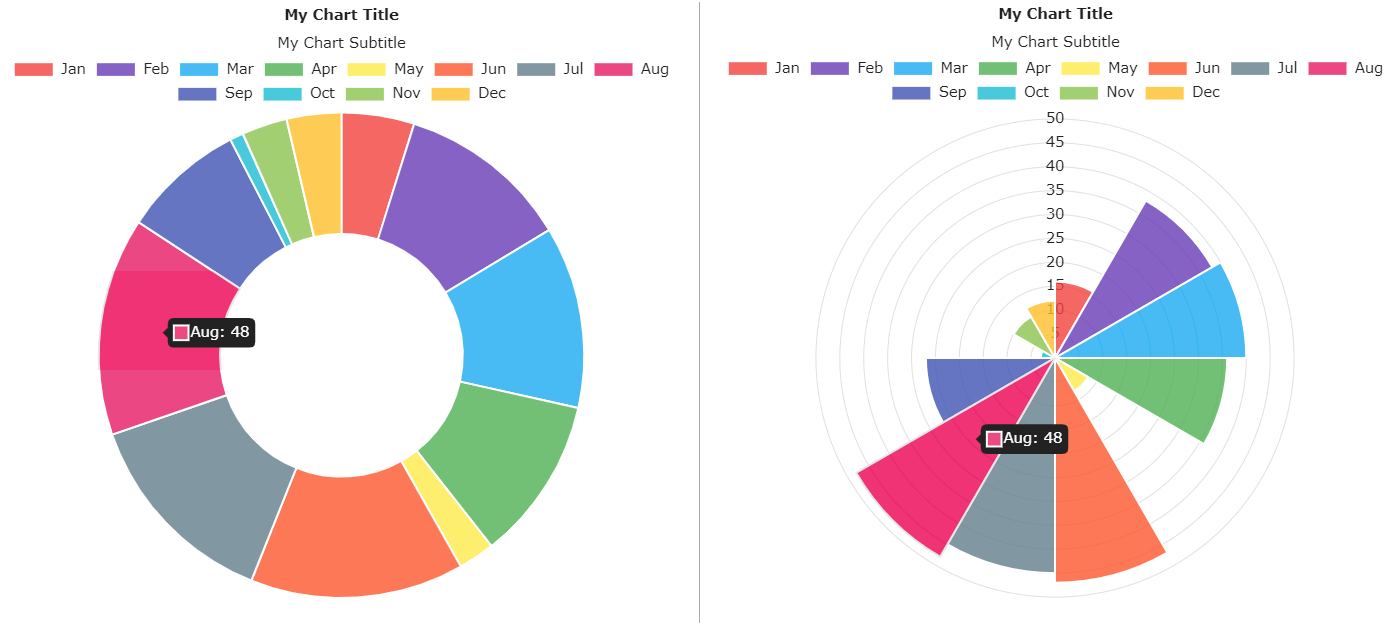
Chart Control |
Displays different chart types including Line, Bar, Radar, Pie, Doughnut, Polar Area, Scatter and Bubble |
|
 |
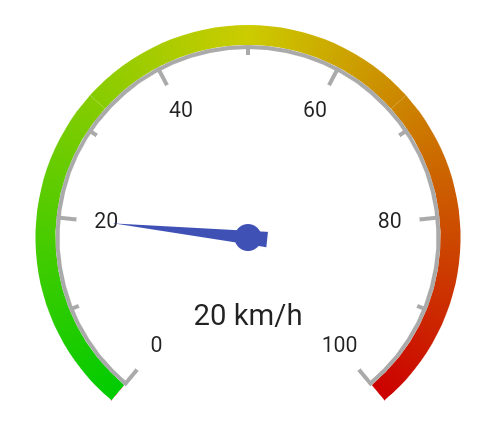
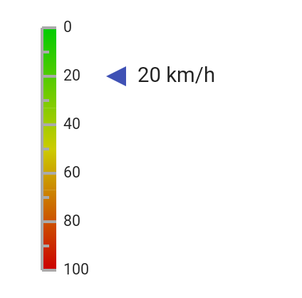
Gauge Control |
Displays numerical values on a circular or linear scale |
|
 |
Pie Chart Control |
Displays a pie chart based on a list of values |
Favorites
The Favorites group contains any components that you have marked as ‘Favorite’; it is shown initially with a Star icon and grayed out. To add a favorite, Right-click on the icon for the component in a sub-menu and select the Favorite option. Adding components to the Favorites group makes it easier or quicker for you to select any controls that you use constantly. To remove a component from the Favorites group, right-click on the component in its original group and deselect the Favorite option.
Creating JavaScript Components
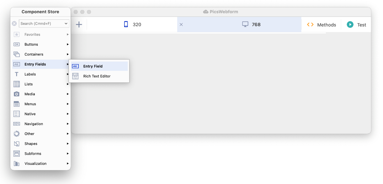
To create or add a JavaScript Component to a remote form, you need to open the Remote form in design mode. The Component Store will open automatically docked to the left side of the Remote form editor. If for some reason the Component Store is hidden (maybe it is undocked and behind another window), you can bring it to the top, by pressing the CStore button on the main Omnis toolbar, or by pressing the F3 key on Windows or Cmnd-3 on macOS. The following screenshot shows a Remote form in design mode, and the Entry fields group in the Component Store.
You can configure the appearance of the Component Store by Right-clicking on it and selecting various text options from the context menu. You can show or hide the text for the group or components, and you can select 1 or 2 column mode. You can also set the Docking mode, either Auto, Left, Right, or No docking.
Layout breakpoints
Before adding any JavaScript components to your remote form, you may want to change the current Layout Breakpoint or add a new one. A new remote form has two breakpoints 320 and 768 pixels, and you are advised to add components to the larger breakpoint first and then rearrange or resize the components on the smaller breakpoint (the 768 breakpoint is selected by default). You can Right-click on the background of a remote form and choose Copy Layout From Breakpoint to copy the position and size of components from one breakpoint to the current breakpoint.
Adding a new JavaScript component
To select a component, and add it to your Remote Form, you can do one of the following:
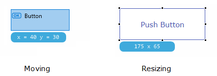
Click on the main group icon to open the sub-menu popup, then click and drag a component icon from the sub-menu, and drop it onto the form or window; as you drag the component out of the Component Store, the outline of the component is shown allowing you to place it precisely in the form or window.
Click and drag the icon shown in the main group to create a component of that type; for example, you can drag the Button icon from the Buttons group to create a button, which is initially the default icon in that group (note the group icon/default component will change as you select different components).
Double-click an icon in the main group or any sub-menu popup to add a component of that type; in this case, the component is added to the center of the form or window (double-clicking is not supported for report classes).
Press Return to add the currently selected component to the design window (not supported for report classes).
Alternatively, you can use the keyboard to select a component:
- To use the keyboard, press F3 to put the focus on the Component Store, use the Up or Down arrow keys to select a main group, press the Space key to open the sub-menu popup for the group, then use the Arrow keys to select a component, and press the Return key to add the component to the center of the form or window; you can use the Esc key to deselect/close a sub-menu popup.
The most recently selected group is highlighted in a color, while the icon for the most recently chosen component from any sub-menu popup is shown as the initial/default icon for the group; therefore, as you select different components from different groups, the initial or default icons will change. For example, if you previously chose a Combo box from the Lists group, the Combo box icon is shown in the main Lists group, and you can then drag or double-click the Combo box icon from the Lists group without opening the sub-menu to create a Combo box in your form.
You cannot place an unlimited number of objects on a Remote form class. The object limit is 8191 for a Remote form, including objects on subforms, although in practice the limit is likely to be less due to platform limitations.
Copying Components
In design mode, you can use the standard Copy/Paste menu options in the Edit menu, or Ctrl-C and Ctrl-V keyboard options, to copy and paste a component on the same form. Alternatively, you can hold down the Ctrl key on Windows or the Alt/Option key on macOS, then click and drag a component to a new position on the form to make a copy of the component.
You can also drag a component from one remote form and drop it onto another remote form to make a copy of a component (for forms with the old kLayoutTypeScreen layout type, the forms must be set to the same value of $screensize to copy objects in this way).
Component Properties
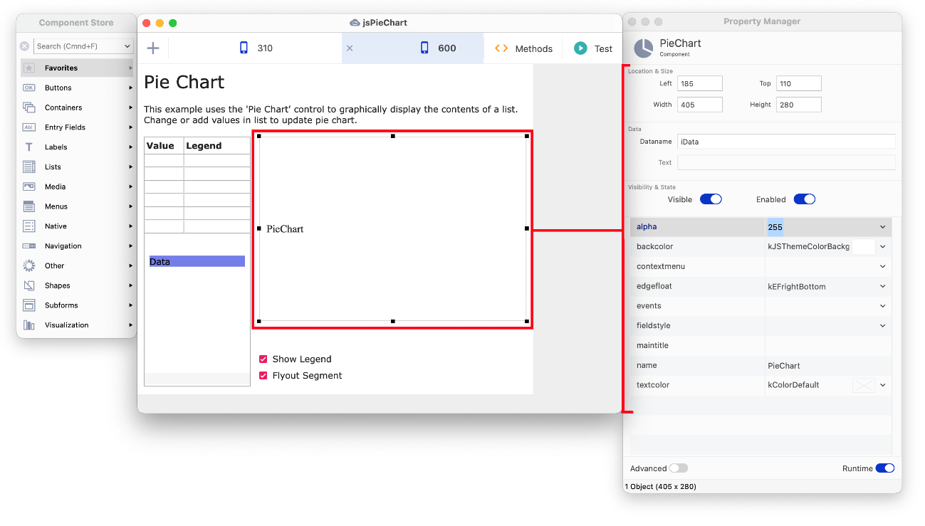
You can set the properties for the component using the Property Manager; if the Property Manager is hidden, press F6 on Windows or Cmnd-6 on macOS to open it or bring it to the top. The following screen shot shows the Pie Chart example app (available under the Samples option in the Studio Browser), with the JavaScript Pie Chart component selected; the Property Manager on the right shows the properties of the currently selected object.
Dataname for JavaScript Controls
The variable specified in the Dataname ($dataname) property of a JavaScript component must be an instance variable, or in some cases a column in a row instance variable in the form VarName.ColumnName. The Property Manager will display an error message if you try to assign an invalid $dataname property. (This applies to $dataname as well as other similar properties such as $listname which require a variable.)
You can create variables in the Variable panel of the Method Editor (click on Methods in the Design bar at the top of a remote form to open the Method editor), or you can type the name of a variable into the Dataname field in the Property Manager, press the Return key and define the variable in the 'Create Variable' dialog. See Variables for more information about declaring and naming variables (i.e. variables cannot have the same name as internal method names or function names).
Naming JavaScript Controls
When you create a component in your remote form, a name is generated automatically and assigned to the $name property of the component (shown at the top of the Property Manager). This is usually in the format <remoteformname>_<component-type>_<number>, such as ‘rftest_edit_1001’ for an edit control on a remote form called rftest. However, you can enter your own name for a component which may better describe the object within the context of your form; for example, an edit field to allow the end user to enter their first name could be named Firstname. You can change the Name ($name) of a component by clicking on the Pencil icon next to the Name at the top of the Property Manager, or by editing the name in the $name property under the General tab in the Property Manager.
The name you assign to an object does not have to conform to any convention other than any conventions you may like to use in your forms or the application to identify different objects. However, the name of a component (the value of $name) is used in the Omnis notation and throughout your library to refer to the object. Therefore, you should not use spaces and try to use alphanumeric characters only for object names to avoid any possible conflicts in your code. For example, an object name should not include the dollar sign ($) since this would cause a conflict when you reference the object using the Omnis notation which prefixes property and method names with the dollar sign.
Numeric Object Names
The Property Manager does not allow all numeric names to be assigned to $name. The Property Manager validates the value assigned to $name for remote form objects (as well as remote menu, report, schema, menu, toolbar and window class objects). The validation is applied when the name starts with a digit, and the remaining characters cannot all be a digit or the following characters "+-.".
This is controlled by the allowNumericObjectNames item in the ‘ide’ section of config.json. You are not recommended to allow numeric object names, as there can be clashes between names and idents, and notation strings of the form ...$objs.[lName] (where lName is a variable containing the name of an object) will fail to locate the object if lName is an integer, since Omnis will treat lName as an ident rather than a name.
It is possible to assign a numeric name to $name for a component in your code using the notation, but this is not recommended. If you do this, a warning will be added to the trace log, and in this case, you should change your code to not assign numeric names.
Using $edgefloat and Component Resizing
The “floating edge” ($edgefloat) capabilities for JavaScript components allow the components to be resized automatically when the end user resizes their web browser window or when the layout changes on a breakpoint. The $edgefloat property can be set to one of the kEF… constants which determines which edges of the component, if any, will “float” or reposition automatically when the browser window is resized. The possible values for $edgefloat are:
kEFall and kEFnone
All or no edges float
kEFbottom
Bottom edge only floats
kEFleftRight
Left and right edges float; in effect, the component floats to the right or left and does not resize
kEFleftRightBottom
Left, right and bottom edges float
kEFright and kEFrightBottom
Right edge only floats, or Right and bottom edges float
kEFtopBottom
Top and bottom edges float; in effect, the component floats up or down and does not resize
kEFrightTopBottom
Right, top and bottom edges float
kEFcenterLeftRight, kEFcenterTopBottom, kEFcenterAll
means the Left & Right edges float, or the Top & Bottom edges float, or All edges will float, and the control will also be centered horizontally and/or vertically within its parent
kEFbottomAndCenterLeftRight
the bottom edge of the object will float or move up or down, while the object stays centered horizontally in the form (a combination of kEFbottom and kEFcenterLeftRight)
kEFrightAndCenterTopBottom
the right edge of the object will float or move to the right or left, while the object stays centered vertically in the form (a combination of kEFright and kEFcenterTopBottom)
kEFleftRightAndCenterTopBottom
the control floats with the right edge of its container, and remains centered vertically (a combination of kEFleftRight and kEFcenterTopBottom)
kEFtopBottomAndCenterLeftRight
the control floats with the container's bottom edge, and remains centered horizontally (a combination of kEFtopBottom and kEFcenterLeftRight)
kEFposn… positioning constants
all edgefloat constants prefixed with kEFposn… will reposition the control in the specified region of the screen; as you select one of these constants in design mode the control will snap to the chosen region, and when the form is resized at runtime the control will “stick” to this region; the kEFposnClient constant stretches the control to fit the available area within its parent or subform
You can store a different setting of the $edgefloat property for each component, for each different layout breakpoint. When setting $edgefloat in the Property Manager in design mode, you can set the value of $edgefloat for a component on all breakpoints by holding the Control key when selecting the $edgefloat value.
The setting of $edgefloat for a component is used to resize the component (or not if set to kEFnone) when the form or container field is resized at runtime, and when one or more of the following occurs:
When the component is in a subform and the subform is resized (that is, its size at runtime is different to the size of the subform class)
When applying a different mobile device size while running in a mobile device custom wrapper
When the component is in a resizable subform in a subform set and the subform is resized
Centering Objects
There are some kEF… contstants to control how objects are centered relative to the remote form or parent: kEFruntimeLeftRightCenter, kEFruntimeTopBottomCenter and kEFruntimeAllCenter. They are only applied at runtime, and in this case, their behavior is identical to kEFleftRight, kEFtopBottom or kEFall respectively, except that the offset is divided by two, to keep an object or a number of objects centered within the parent.
In addition, the Align context menu for the remote form editor contains options to allow you to center objects vertically, horizontally (or both) in their parent.
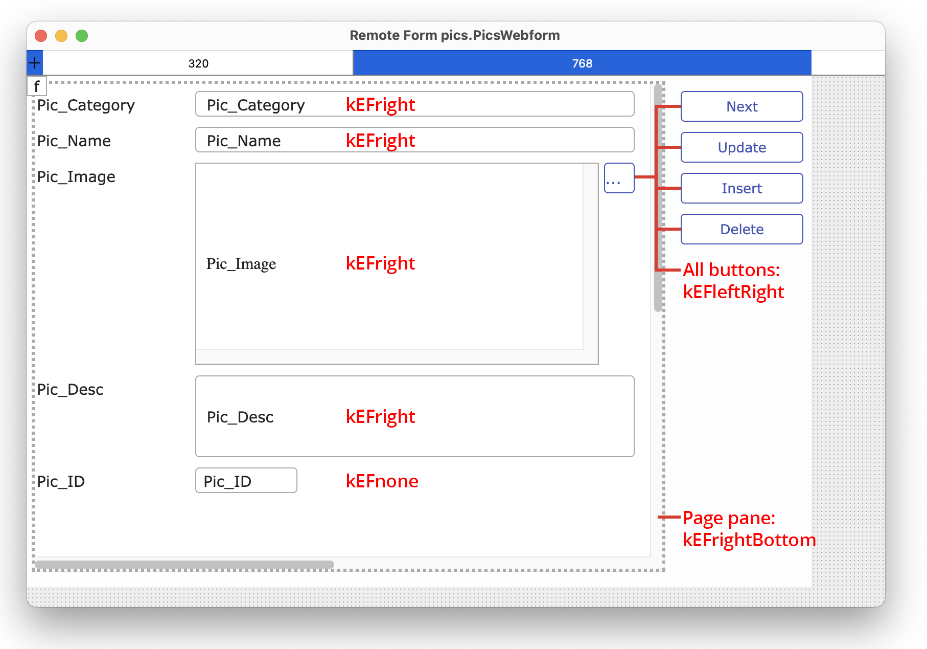
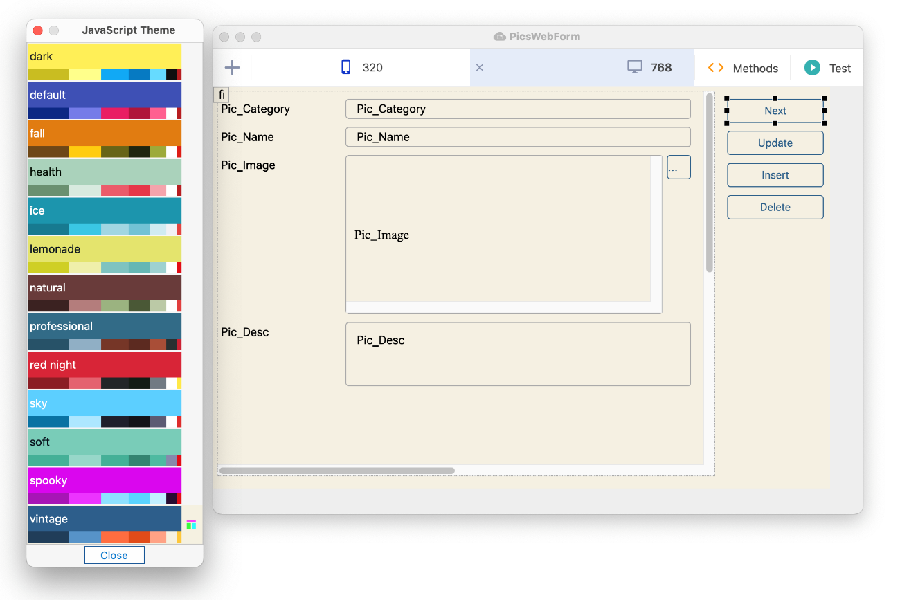
To understand what kind of edgefloat properties you can use, you can look at the PicsWebForm in the Pics2.lbs available in the tutorial download (or in the ‘welcome/tutorial/final’ folder); or you could create your own remote form using the form wizard. The PicsWebForm remote form was created using the SQL Remote Form wizard and uses edgefloat properties to control the floating edge behavior of the controls. The form has two layout breakpoints, 768 and 320, and the edgefloat properties is set differently for some of the controls on each breakpoint. The following image shows the layout for the 768 breakpoint, and the $edgefloat setting (a kEF.. constant) for each control is shown in red.
The PicsWebForm uses a Page pane containing all the data controls, e.g. Pic_Category, Pic_Name, etc; the $edgefloat property of the Page pane is set to kEFrightBottom to ensure it stretches across to the right and down as the form is resized in a browser window or is displayed on different sized tablet screens.
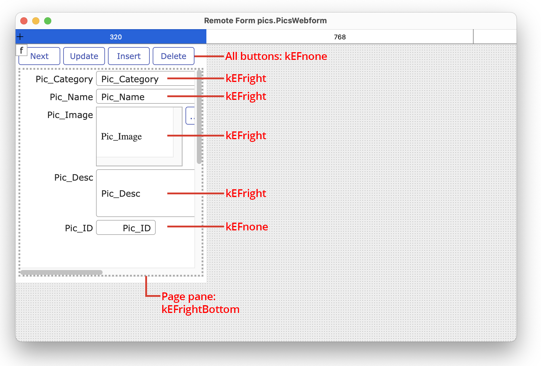
The $edgefloat property for most of the controls inside the page pane is set to kEFright, so the right edge “floats” or stretches to the right, but the bottom edge is not resized; the ID field has no floating edges so it keeps its size. The $edgefloat property for the push buttons on the right of the form is set to kEFleftRight (i.e. both left and right edges), which means the buttons will “float” from right to left horizontally, but they will not resize or move vertically. The combination of all these edgefloat settings on all of the controls, means that the push buttons keep to the right-hand edge of the browser window or device screen, while the data controls will resize to accommodate any screen or device size. Now examine the layout for the 320 breakpoint:
The push buttons on the 320 layout breakpoint are positioned at the top of the form and their $edgefloat property is set to kEFnone, so they will not move or resize as the form is resized. The $edgefloat property for the data controls is set to kEFright so their right edges will stretch to accommodate different phone sizes (widths), from 320 pixels upwards.
As the form is resized, on a web browser window or is displayed on a larger device screen, the controls will resize to fill the screen, until the next breakpoint is reached, which in this case is a screen or device width of 768 pixels, and the layout for that breakpoint is loaded.
Draggable Component Borders
End users can resize some JavaScript components dynamically at runtime in their web browser by dragging the border of the component. When the end user’s mouse is over the edge of a component that can be resized, the cursor changes to indicate that the border can be dragged and resized.
To allow this functionality, JavaScript components have the $dragborder property, which only applies when a component has its $edgefloat property set to one of the kEFposn… constants (other than kEFposnClient or kEFposnJoinHeaders). If $dragborder is set to true, and you have set $edgefloat as above, the end user will be able to resize the component in the browser by dragging the border of the component with the mouse.
You can store a different setting of the $dragborder property for each component, for each different layout breakpoint, therefore components on the same form could be resizable for web desktop browsers and not for mobile devices. When setting $dragborder in the Property Manager in design mode, you can set the value of $dragborder for all layout breakpoint values by holding the Control key when selecting the $dragborder value.
The appearance of the drag border area is defined by the styles div.omnis-db-vert and div.omnis-db-horz in core.css, which can be modified by overriding them in user.css.
You can set the formatting for Date and Time type data for some of the JavaScript components including Edit controls, Combo boxes, Data grids, Droplists, Hyperlink lists and standard Lists. These components have the properties:
$dateformatcustom
a date-time format string using the characters described below (e.g. D m y, the default); alternative formats can be provided separated by |. If $dateformat is kFormatCustom, and the data is of type 'Date Time', this property is used to format the data. If empty, it defaults to the format set using the client command 'setcustomformat'
$dateformat
the format used to display 'Date Time' data, a kJSFormat... constant as follows:
| kJSFormatNone |
No format |
| kJSFormatTime |
Default time format for client locale |
| kJSFormatShortDate |
Default short date format for client locale |
| kJSFormatShortDateTime |
Default short date and time format for client locale |
| kJSFormatMediumDate |
Default medium date format for client locale |
| kJSFormatMediumDateTime |
Default medium date and time format for client locale |
| kJSFormatLongDate |
Default long date format for client locale |
| kJSFormatLongDateTime |
Default long date and time format for client locale |
| kJSFormatFullDate |
Default full date format for client locale |
| kJSFormatFullDateTime |
Default full date and time format for client locale |
| kJSFormatCustom |
Use the custom format in $dateformatcustom |
The following standard date formatting characters are supported for $dateformatcustom:
| A |
AM/PM |
| D |
day (12) |
| d |
day (12th) |
| E |
day of year (1..366) |
| H |
hour (0..23) |
| h |
hour (1..12) |
| M |
month (06) |
| m |
month (JUN) |
| N |
Minutes |
| n |
month (June) |
| s |
hundredths |
| S |
seconds |
| V |
day of week (Fri) |
| w |
day of week (Friday) |
| y |
year (1989) |
| Y |
year (89) |
Some additional characters are supported for Date/Time formatting for the JavaScript Client components only, as follows:
| j |
day with no leading zero (6) |
| P |
month with no leading zero (6) |
| K |
hour with no leading zero (0..23) |
| k |
hour with leading zero (1..12) |
| a |
am/pm |
| O |
timezone offset (+01:00) |
The date codes are listed on the Constants tab in the Catalog (F9) under “Date codes” (some are not JS client) and "Date codes (JavaScript Client only)".
When the client connects, the server sends it the date formats, day names and month names for the client locale (the server reads these from ICU). If you assign $ctask.$stringtablelocale in $construct of your remote task, the server sends the client the formats and so on for the assigned $stringtablelocale locale.
Date Initialization
Local Date variables in client methods with no initial value set are initialized to an empty string, i.e. representing an empty date (from Studio 10.22 onwards), whereas previously they were initialized to 'undefined'. Setting a Date variable to 0 on the client now sets the date to 31 Dec 1900, whereas previously it was set to today's date. To set a date to today's date, you should use #D.
All JavaScript controls that can display number data have the property $numberformat, which specifies how Number and Integer data is formatted or displayed in the control. The JavaScript controls affected include the Edit Control, Combo box, Data grid, Droplist, Hyperlink list and standard List control. The formatting is used when the control displaying the data does not have the focus, that is, the formatting is only applied when the end user tabs or clicks away from the number field.
The $numberformat property uses a single % format tag for the number followed by one or more elements, for example, the number format %.2F displays a number with 2 decimal places with a thousand separator. The following elements are available (in this order):
An optional "+" sign that forces to precede the result with a plus or minus sign on numeric values. By default, only the "-" sign is used on negative numbers.
An optional padding specifier used for padding (if padding is required). Possible values are 0 or any other character preceded by a '. The default is to pad with spaces.
An optional "-" sign, that causes the string to left-align the result of this placeholder. The default is to right-align the result.
An optional number that says how many characters the result should have. If the value to be returned is shorter than this number, the result will be padded.
An optional precision modifier consisting of a "." (dot) followed by a number, specifies how many digits should be displayed for floating point numbers. When used on a string, it causes the result to be truncated.
A type specifier that can be any of the following:
| % |
display a literal "%" character |
| b |
display an integer as a binary number |
| c |
display an integer as the character with that ASCII value |
| d |
display an integer as a signed decimal number |
| D |
as above but include thousand separators |
| e |
display a float as scientific notation |
| u |
display an integer as an unsigned decimal number |
| f |
display a float as is |
| F |
as above but include thousand separators |
| o |
display an integer as an octal number |
| s |
display character(s) after the s specifier as a string |
| x |
display an integer as a hexadecimal number (lower-case) |
| X |
display an integer as a hexadecimal number (upper-case) |
| %.1F%% |
12.34 |
12.3% |
| %sh |
12 |
12h |
| %e |
1234 |
1.234e+3 |
| %X |
1234 |
4D2 |
Decimal and Thousand Separators
Numbers will be displayed using the default decimal and thousand separators specified by the language set in the client’s browser, so you do not need to do anything to display the correct decimal and thousand separators for a client. However, you can override the default separators by changing the thouChar and dpChar items in the jOmnis client object: you can do this using JavaScript in the $init method for a JavaScript form, for example:
JavaScript: jOmnis.thouChar = ".";
JavaScript: jOmnis.dpChar = ",";
You can enable automatic scrolling for Edit controls, Lists, Tree lists, Hyperlink controls, Pictures and Html controls by enabling the $autoscroll property. If this property is kTrue for the control, and the client is not a mobile device, the client automatically displays scrollbar(s) when not all of the content in a field is visible.
Setting $autoscroll to kTrue changes $horzscroll and $vertscroll to kFalse, and in doing so means you cannot set $horzscroll and $vertscroll. By default, $autoscroll is enabled for Edit controls, Lists and Tree lists, while for Hyperlink controls, Pictures and HTML controls $autoscroll is set to kFalse.
Note that in addition to controlling scroll bars, Data Grids and Lists have the $vscroll and $hscroll properties which allow you to scroll a grid or list vertically or horizontally at runtime in the client browser: the numeric value of these properties is either column or row offset for grids, or the row number for lists.
You can apply a shadow to various lists, grids, and containers to indicate that they have scrollable content – the shadow will appear on the relevant edge of the control to show that there is more content that can be scrolled, either in a vertical or horizontal direction.
There are two scroll shadow properties: $scrollshadowwidth indicates the width (depth) of the shadows in pixels – a zero value (the default) means there are no scroll shadows; $scrollshadowcolor is a color value including alpha (opacity), selected using the alpha color picker.
The following JavaScript components support scroll shadows: List Control, Native List, Data Grid, Complex Grid, Droplist, Combo Box, Edit Control, Picture, Paged Pane, Scroll Box, Tile Grid, Tree List, and Subform control.
The following JavaScript components support scroll shadows: List Control, Native List, Data Grid, Complex Grid, Droplist, Combo Box, Edit Control, Picture, Paged Pane, Scroll Box, Tile Grid, Tree List, Subform, and Markdown control.
Component Borders
The borders of JavaScript components are drawn within the bounds of the control, for both Windows and macOS, and have the same dimensions for both platforms. The color is controlled using $bordercolor.
Most JavaScript components can have rounded borders by specifying the corner radius in pixels in the $borderradius property; for buttons this is $buttonborderradius (single value only). To set all the corners of the object to the same radius you can enter a single value, or to specify the radius for different corners you can use the syntax "n-n-n-n" which follows the same rules as CSS 3 rounded border syntax. The order for the radius parameters is top-left, top-right, bottom-right, bottom-left. If bottom-left is omitted the top-right value is used, if bottom-right is omitted the top-left value is used, if top-right is omitted the top-left value is used.
Control Classnames
All JavaScript controls have a base class name to allow you to control the appearance of controls using CSS, to allow you to apply a consistent appearance for each type of JavaScript control. (Note that from Studio 10.2 onwards you can use JS Themes to manage the colors for controls on a remote form.)
The classnames listed below can be added to the ‘user.css’ and CSS properties applied to the classname to control the appearance of each type of control. Note these classnames are contained in the JavaScript controls by default and if they are added to the user.css are applied to the control automatically, that is, these classnames do not need to be included in the $cssclassname property of a control to be applied (this property is used to apply your own custom style names, see below).
| ‘Frame’ element for all controls |
omnis-[control]-frame |
|
| Activity Control |
omnis-activity |
|
| Background Control |
omnis-background |
|
| BarChart Control |
omnis-barchart |
|
| Button Control |
omnis-button |
|
| Checkbox Control |
omnis-checkbox |
|
| Combo Box Control |
omnis-combo |
The dropped list has “ctrl-drop-list” assigned.
If ($cssclassname) the opened items list will be assigned the class of the first class in $cssclassname suffixed with ”-dropped-list” |
| Complex Grid |
omnis-complexgrid |
omnis-complexgrid-header and omnis-complexgrid-hheader for header and horizontal header areas.
Each row has omnis-complexgrid-row and either ‘odd’ or ‘even’ depending on their line number.
If ($cssclassname) the header/hheader will have class $cssclassname+”-header” and “-hheader” |
| Date Picker Control |
omnis-date |
|
| Data Grid Control |
omnis-datagrid |
|
| Droplist Control |
omnis-droplist |
The dropped list has “ctrl-drop-list” assigned.
If ($cssclassname) the opened items list will be assigned the class of the first class in $cssclassname+”-dropped-list” |
| Edit Control |
omnis-input |
|
| File Control |
omnis-file |
|
| HTML Object |
omnis-html |
|
| Hyperlink Control |
omnis-hyper |
|
| Label Object |
omnis-label |
|
| List Control |
omnis-list |
|
| Map Control |
omnis-map |
|
Menu - used for context menus,
popup menus and tab menus |
omnis-menu |
omnis-menu-main for containing <div> omnis-menu-table for table <div> omnis-menu-row for row <div>
omnis-menu-cellcheck for check or icon element in the menu
omnis-menu-celltext for the text element
omnis-menu-cellcascade for the cascading menu element
Popup and tab menus will implement If ($cssclassname) the opened items list will be assigned the class of the first class in $cssclassname+”-opened-menu” |
| Native List Control |
omnis-nativelist |
|
| Native Slider Control |
omnis-nativeslider |
|
| Native Switch Control |
omnis-nativeswitch |
|
| Navigation Bar Control |
omnis-navbar |
|
| Navigation Menu Object |
omnis-navmenu |
|
| Page Control |
omnis-pagectl |
|
| Paged Pane |
omnis-pagedpane |
|
| Picture Control |
omnis-picture |
|
| Popup Menu Control |
omnis-popup |
Also contains the classes from omnis-menu as it uses this object for the menu element of the control. |
| PieChart Control |
omnis-piechart |
|
| Progress Bar Control |
omnis-progress |
|
| RadioGroup Control |
omnis-radio |
|
| Rich Text Editor Control |
omnis-rich |
|
| Segmented Control |
omnis-segmented |
|
| Slider Control |
omnis-slider |
|
| Subform |
omnis-subform |
|
| Switch Control |
omnis-switch |
|
| Tab Control |
omnis-tabs |
Also contains the classes from omnis-menu as it uses this object for the menu element of the control. |
| TransButton Control |
omnis-trans |
omnis-trans-text
To address text element of a trans button. |
| Video Control |
omnis-video |
|
For example, to add CSS styling to all the Edit controls in your remote forms you could add the following CSS to the user.css file in the ‘html/css’ folder in the main Omnis folder: in this case, the base classname .omnis-input is used with the properties 2px solid grey border and a 6px radius.
.omnis-input {

  border: 2px solid grey;

  border-radius: 6px;

}
Custom CSS Styles
You can create your own CSS classes or styles (in addition to the base class names listed above) and apply them to the objects in your web and mobile apps, allowing you to have more control of the styling, coloring, and overall design of your apps.
CSS classes for Controls
All the JavaScript components have a property called $cssclassname which allows you to apply your own CSS class to the component. You can add the CSS classes to a file called ‘user.css’ which is located in the ‘html/css’ folder in the main Omnis Studio folder. A style can be applied to a control by setting its $cssclassname property to the name of a style. The properties you define for each style in user.css must be flagged as !important to override the JavaScript Client inline styles.
$cssclassname adds the classes listed above to the client element in all JavaScript controls, and adds the same classes to the frame element with the "-frame" suffix.
When you deploy your application on the Omnis App Server, you must put your custom ‘user.css’ file in the ‘html/css’ folder on the server.
Component Transparency
The majority of the JavaScript components have the $alpha and $backalpha properties which allow you to set the transparency of the foreground and background colors of the component.
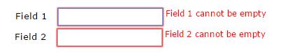
It is possible to display form errors either to the right or under controls in a remote form. This makes it easier for end users to fill out forms in your web and mobile applications by providing them with helpful tips if they make a mistake in the form. The errors appear on the form as a text field either under a control, or to the right of a control, so you need to design your remote forms to allow space for the error text. The style of the error text and the outer HTML of the control containing the error are controlled in CSS which you can change if required.
$errortext
All JavaScript Client controls have the $errortext property which contains the text to be displayed when there is an error in the field or control. The initial value of $errortext when a form is constructed is empty.
The $errortext property is only supported for subform controls when they are not scrollable, i.e. when $vertscroll & $horzscroll are both kFalse and the subform class is not responsive.
$errortextpos
The $errortextpos property specifies the position of the error text set using $errortext. The value can be one of:
kJSErrorTextPosUnder
The error text is positioned under the control, the default.
kJSErrorTextPosRight
The error text is positioned to the right of the control.
kJSErrorTextPosHidden
hides the error text, so just the control outline indicates that there is an error (default is a red border). This might be useful where there is limited space to display the error text in the remote form, but you still want to show the end user that there was an error
Note that Omnis stores a separate value of $errortextpos for each screen size. As a shortcut when designing a form, you can hold the control key down when assigning $errortextpos, in order to assign the value to all screen sizes.
$errorline
$errorline is a runtime property of the JavaScript Complex Grid control, used when assigning $errortext to an object in the row section of a complex grid. The line number to which $errortext will apply.
The client command “clearerrors” allows you to clear all error text messages for the form:
Do $cinst.$clientcommand("clearerrors")
equivalent to assigning $errortext to empty for all controls on the form which have error text.
Changing the appearance of error text
The following CSS classes control the appearance of the error text and border. These classes are stored in the core.css, which can be modified by overriding them in user.css.
Field List
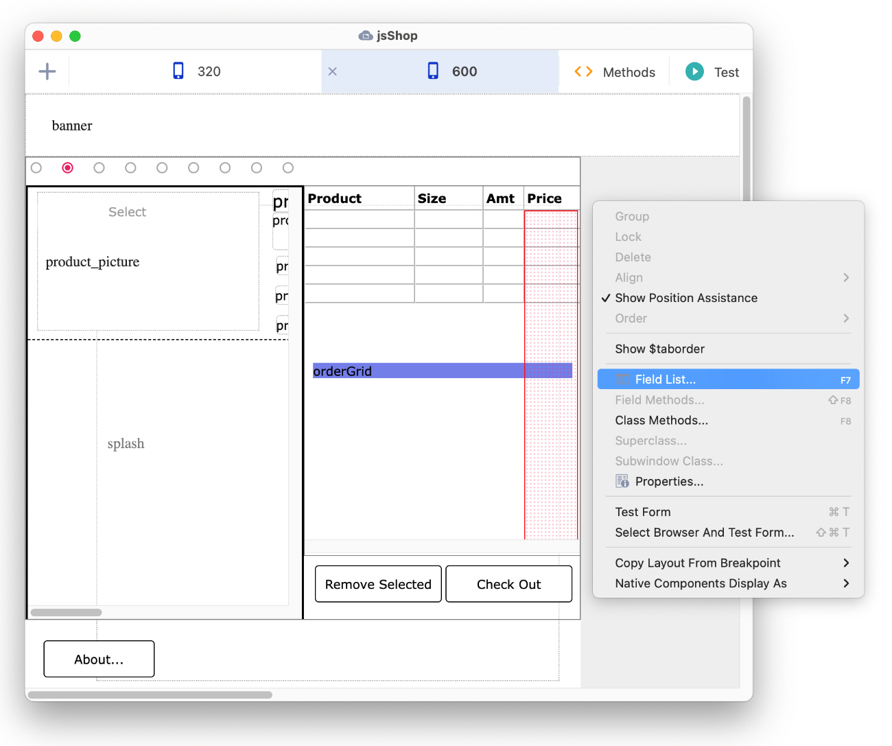
The Field List provides a list of all the components on a remote form, including all those controls in container fields, and is often useful if you need to select a specific component which is partly obscured or hidden in the form, or is hidden deep inside the object hierarchy. To open the Field list, select the Field List option from the form or component context menu (Right-click to open), or press the F7 key.
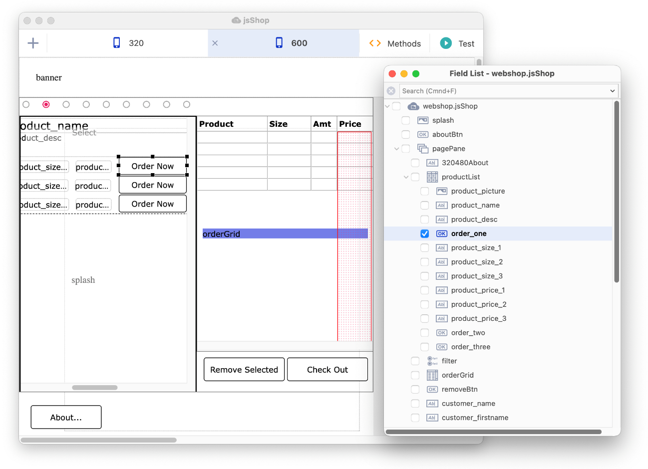
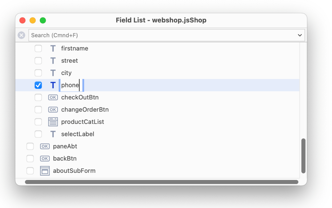
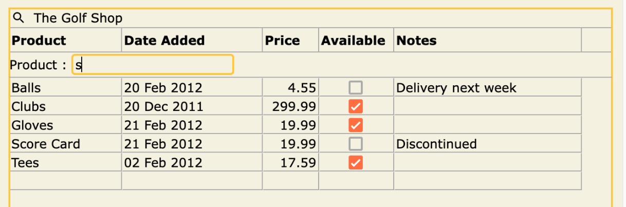
The currently selected component is checked in the Field list, expanding the tree nodes and scrolling the list if necessary. Conversely, you can open the Field List and check a component name in the list to select it in the form. For example, in the following screenshot, the Order Now button has been checked in the Field List and the corresponding control is selected in the remote form, scolling the design screen if required to locate the control.
When the focus is on the Field List, you can use the arrow keys to navigate up and down the list and use Space bar to select a control, as required. The Shift-Space keypress allows you to select (or deselect) multiple, discontinuous controls in the list.
The Field list can be useful if you need to select the background of a form, for example to set its properties in the Property Manager, but the form is completely filled with components and no form background is available to click on, as can be the case for mobile forms. To select the form in this case, you can open the Field List and check the form name at the top of the list (which will deselect any components), or if you click on any individual component, then shift-click it to deselect it, the focus will be returned to the form background and its properties will be shown in the Property Manager.
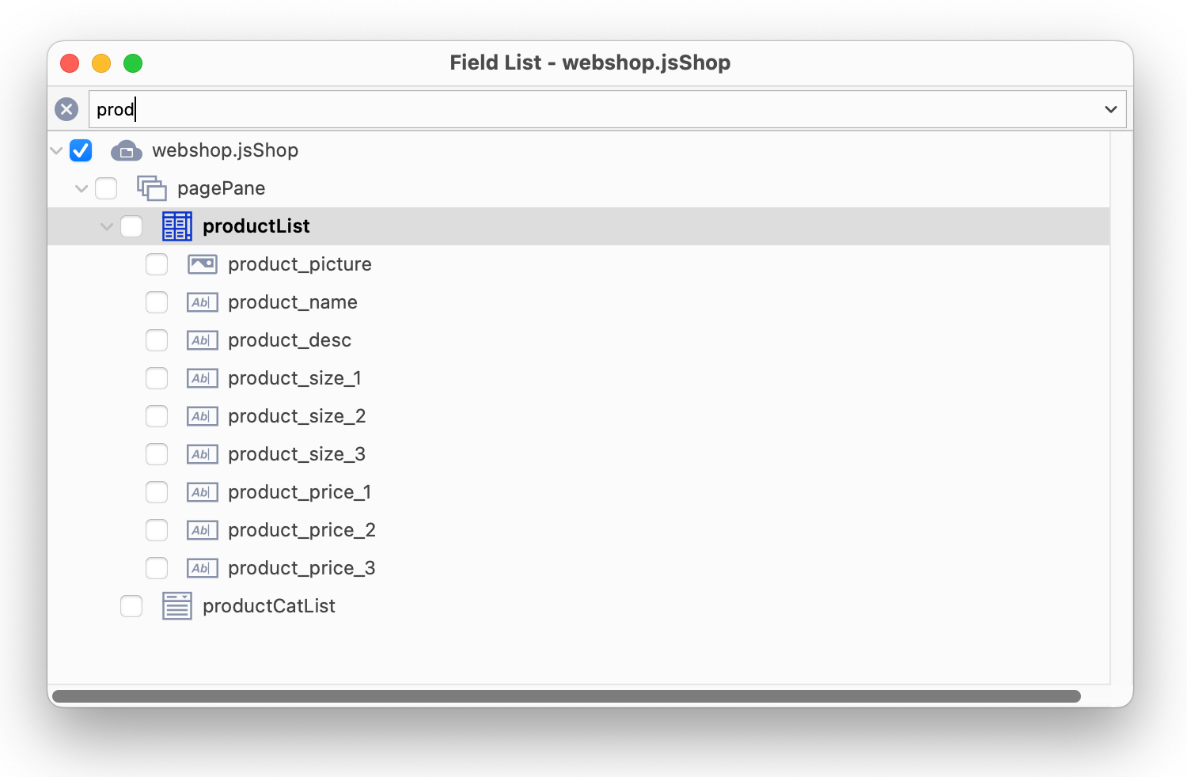
Searching the Field List
The Search at the top-left of the Field List is useful if your remote form contains many nested objects, or you want to search for objects with a specific prefix. The search looks for items containing the search string. The following shows all objects in the Field list containing the string ‘prod’.
Renaming Objects in the Field List
You can rename a component or background object directly in the Field List, either using the Rename option in the Context menu, or by clicking into the selected line, or by selecting the line and pressing Return to select the existing name. The $name property for the object in the form is updated automatically.
When you rename an object on a remote form (using the Property Manager or Field List), Omnis searches for any properties using the old name, and replaces them with the new name, including properties such as $arialabelledby and $linkedobject.
Component Events
Most of the JavaScript components report events which you can handle in a special method called an “event method” which is inserted behind the component. The event method for a component must be named $event. For example, when the end user clicks a button, an evClick is generated which you can trap in the $event method for the button; this method could contain code to display a message, call another method or determine some other action depending on the code in the event method itself. Most of the components contain a template $event method with a code stub for you to use as a starting point to handle the event.
Enabling Events
To report an event, the event must be enabled for the component. Many of the components have their events enabled by default, but for some you may need to enable specific events in the $events property for the component.
To enable an event
Select the component and open the Property Manager (press F6)
Click on the $events property in the Property Manager to drop down the list of events for that component (the property will show “No Events” when no events are selected)
Check (enable) the events you wish to trigger for this component
You can select multiple objects of the same type and specify the events for all of the objects at the same time. For example, you can select a number of check boxes and enable the evClick event under the $events property to enable the event for all the selected check boxes.
Editing Event Methods
If you double-click a component in design mode, the Method Editor will open displaying the method for that individual component. For components with events, the $event method will be shown automatically. For example, if you double-click on a button, the Method Editor will open displaying the $event method containing the code On evClick; you can add more code after this line to be run when the end user clicks the button. See the example code for each component for example $event methods.
For some components, the $event method may not contain any template code including the On event command, but you can add you own. You will need to enter the On command and select the appropriate event code (a constant beginning ev) from the Helper window in the Code Editor.
Event Method Validation
Omnis validates the event codes you have entered when adding or editing On event commands in the Code Editor. Therefore, Omnis will check to see if the event code is valid for the current object, and if not, it will flag it as an error.
If the event is not specified in the $events property, Omnis will add it to $events automatically when editing a method named $event in a non-inherited object (Omnis displays a temporary status bar message when it does this).
You can turn off this validation using the validateEventsForOnCommand entry in the methodEditor group of config.json; set it to false to turn off event method validation.
Standard Field Events
Most JavaScript fields or controls report the evBefore and evAfter events, which are triggered when the focus is about to enter or leave the control, respectively. Note that for edit controls, if the data does not change then an evAfter is not triggered as the focus leaves the control.
You can use the On event command to detect events in your event handling methods, and for most controls the $event method will contain a template event handling method into which you can add your own code. For example, in the $event method for an Edit control you could use the following commands to detect the evBefore or evAfter event.
On evBefore
On evAfter
Buttons and all the list type JavaScript controls report the evClick event, as well as evBefore and evAfter; and some list types also report the evDoubleClick event. For example, the Data Grid control reports evDoubleClick which you could detect and initiate a search based on the content of the grid line clicked on.
evAfter event queue
When an event is being executed in the JavaScript client, such as a click on a button, a transparent overlay is applied to the whole remote form, to prevent user interaction anywhere else in the form and to maintain the Omnis event ordering. If the user clicks on this overlay, the click will be prevented, although most events happen almost instantaneously so in this case the overlay is not displayed.
For evAfter events that show the overlay, Omnis shows a feedback effect at the point of the click when the overlay prevents the click, to make it clear to the user that their click was not registered. The feedback effect is a No Entry icon, with “bubble” animation, that appears and disappears directly after the user click. In this case, the click will be queued and will fire once the overlay is removed.
Unfortunately, Firefox does not treat the active state of elements in the same way as other browsers. As such, it was not possible to implement these changes for that browser.
Drag Border Event
All JavaScript controls report the evDragBorder which is triggered when the border is dragged – the event is reported to the control containin the border being dragged and any that share the border area being dragged. When it is triggered it could mean that the end user has resized the field (and therefore other fields in the same parent have resized) using the drag border.
Component Icons
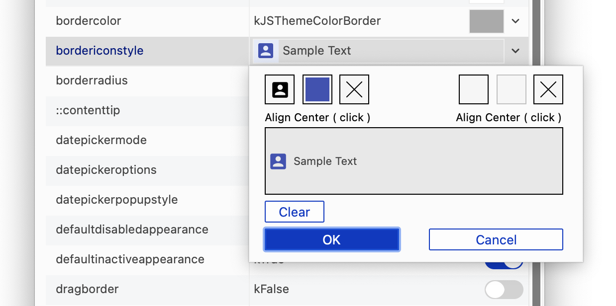
Some of the JavaScript Controls, such as the Button control, allow you to add an icon to create a better appearance and UX for your apps. Such controls that support icons have the $iconid property which allows you to specify an icon image file to be used for the control.
You can use SVG image files for JavaScript component icons, as well as PNG image files (supported in versions prior to Studio 10.2). You can use SVG image files in an icon set, alongside an existing icon set containing PNG files, and these will appear in the Select Icon dialog when you assign an icon to a JS component.
In addition to single component icons, you can add notification or ‘Icon Badges’ to JS component icons to provide additional information, such as a number count: see Icon Badges.
Selecting an icon
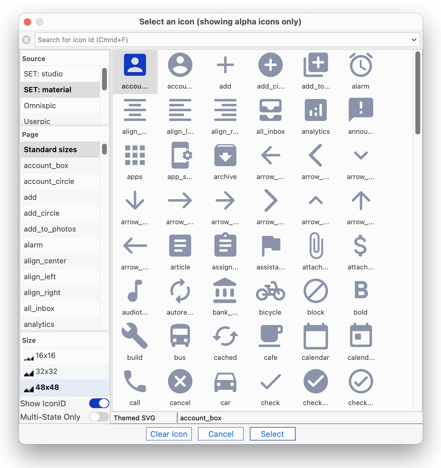
You can assign an icon to a JavaScript Component by setting its $iconid property in the Property Manager under the Appearance tab: when you click on the dropdown menu for the $iconid property the Select Icon dialog opens, allowing you to select an icon image from those available in Omnis.
When you first open the Select an Icon dialog you should see the ‘material’ icon set from which you can select an icon; the 48x48 icon size may be selected under the Size list, but you can select a different icon size, including 16x16 or 32x32, or you can set a custom size. When specifying $iconid in the Property Manager, the id edit field allows you to enter the size of an SVG icon by entering iconid+wxh, e.g. to set an alarm icon with a width of 22 and height of 33, you can enter alarm+22x33.
When you select an icon, the icon set name is added to the icon name using the format iconsetname.iconname, where iconsetname is the name of the icon set containing the icon. This avoids any conflict where different icons with the same name may exist in different icon sets. For example, to reference an icon called ‘archive’ in the ‘material’ iconset, the full name material.archive is used and Omnis will identify the icon in the correct iconset. This format of naming icons does not apply when using the old PNG icons with numeric icon IDs.
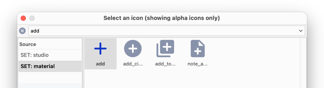
Searching for an Icon
You can scroll the list of material icons to find an icon you need, or you can enter a search string into the Search box to filter the list. For example, the following screenshot shows the 48x48 material icons and the search ‘add’.
You can add your own icons to the Select Icon dialog by adding your own icon set; see below. You should use scalable SVG icons for your web and mobile applications, which will be displayed correctly in high definition on phones, tablets and HD monitors. In most cases, you should add your own icon set, tailored to the unique functionality or style of your application, and for all new applications you are advised to use SVG images for icons.
You can use the icons in the ‘studio’ icon set but these are PNG image files and may not lend themselves to your application, so you are advised to source your own SVG icons.
IMPORTANT: You should not use any icons listed under ‘Omnispic’, ‘Userpic’, ‘#ICONS’, or ‘IPHONECONTROLS’ since these only contain low definition or non-alpha image files and are only present for backwards compatibility for older applications.
Icon sets
SVG icon image files must be stored in an icon set, which is a sub-folder of the ‘iconsets’ folder in the main Omnis tree (do not use the ‘icons’ folder which contains the legacy icon datafiles, such as Omnispic). Note that an icon set cannot be named ‘datafile’, ‘lib’, ‘studio’, or ‘studioide’ since those names are already in use and would cause a conflict.
In order to use any icons in an icon set, you need to add the icon set name to the $iconsets library preference, which is a comma-separated list of icon sets for the library. Once you have added an icon set to $iconsets for a library, the icons will appear in the Select Icon dialog, prefixed SET. (Note this library preference was called $iconset in versions prior to Studio 10.2 and only allowed a single icon set to be used.)
Icon Search Order
Icons can potentially be stored in various locations in Omnis including the ‘studio’ icon set, as well as any icon sets you have added, plus the various icon data files used in older versions of Omnis: this may become an issue where duplicate icon names or IDs exist across the different locations, so Omnis employs a specific ‘icon search order’ that determines how icons are located and displayed. If an icon with the same name or ID is included in another folder, after an icon has been found, it is ignored in subsequent folders and an error is written to iconsetlog.txt. You should therefore avoid having the same icon names, IDs, or icon set names in multiple folders to avoid any potential confusion. Omnis looks in the following icon sets or datafiles in this order:
1. The icon set(s) specified in the $iconsets library preference, in the order listed in the property
2. #ICONS for the library, if used (would only be the case for older applications not using SVG or HD PNGs)
3. User icon datafiles (other than Omnispic and Userpic), if used; this is for legacy apps only
4. The ‘studio’ icon set, under the ‘iconsets’ folder
5. Omnispic or Userpic (.df1 files located in ‘icons’ folder), if used
When using a web server for deploying your web or mobile application, any icon sets used in your library must be placed in the ‘html/icons’ folder in the web server tree, even if they are in one of the other folders in the Omnis Server tree.
During SCAF generation (for the serverless client), the Omnis Server now passes all the files for all icon sets in $iconsets to the serverless client library.
SVG Icons
SVG images are vector based and are inherently scalable, therefore a single SVG file can provide multiple sizes for icons: in practice, an SVG icon will scale to fit the icon area available in a control, such as a button (unless you fix its size, see below). By contrast, PNG images have a fixed size and therefore you have to create a separate image file for each icon size or resolution you wish to support and place all the separate files in an icon set in the Omnis tree. In addition, a single SVG image will have a much smaller file size than mulitple PNG files, giving your app a smaller footprint on the client.
On macOS, SVG icons only render in the thick client when using macOS 10.13 or later.
On Windows, SVG icons only render when using the Windows 10 Creators Update or later. In general, support for SVG in Windows is more limited than on macOS, for example, Windows does not support classes in SVG files – read here about Windows SVG support:
https://docs.microsoft.com/en-us/windows/win32/direct2d/svg-support
SVG icon sets
Google provides a large set of SVG icons in its Material design scheme, which are issued under the Apache License Version 2.0:
(https://fonts.google.com/icons?icon.set=Material+Icons)
You are free to use these in your Omnis applications with the proper attribution in your product licensing.
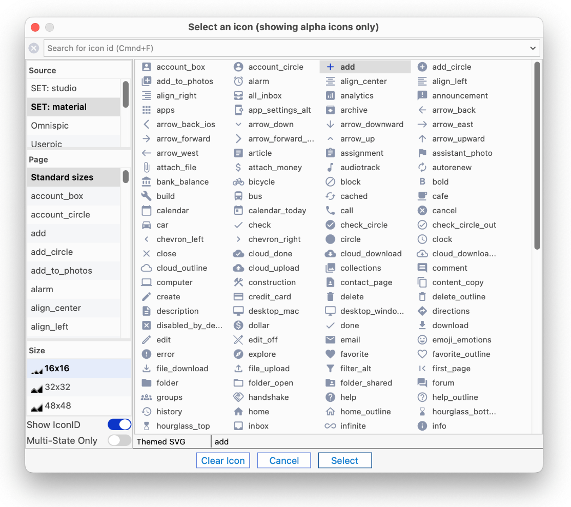
We have selected over 100 of the Material icons (from the “black rounded” style) and placed them in an icon set folder called ‘material’ under the ‘iconsets’ folder in the Omnis tree. The material icon set will appear in the Select Icon dialog by default, and you are free to use these in your applications; the following screenshot shows some of the material icons, with the 16x16 size selected.
These material icons have been ‘themed’ using the Omnis SVG Themer tool and therefore support JS Themes. You could download other icons from the Material website and add them to this folder, if required, or create your own new iconset, and use the SVG Themer tool if you want them to support themes (in the Tools>>Add Ons menu). See the Themed Icons section about how to theme icons.
In addition to the 'material' iconset, there is the 'feather' iconset. To use the feather icon set, you need to add the name ‘feather’ to the $iconsets library property (via the Property Manager), after which the feather icon set will be available in the Select an Icon dialog alongside the existing icon sets including material.
The feather iconset contains over 200 SVG icons which are suitable for a broad range of business use cases – they have been 'themed' using the SVG Themer tool and therefore support JS Themes. The icons in the feather iconset are issued under the MIT License. You are free to use them in your Omnis applications with the proper attribution in your product licensing.
Using SVG Icons
If a JavaScript component can support SVG icons (and most do), then the icon names of any SVG icons will appear in the Select Icon dialog when you assign the icon via the Property Manager and the Select Icon dialog (if a component does not support SVG icons, then they are not shown in the Select Icon dialog).
In general, SVG icons are supported by any controls that previously required an icon, including the following classes or features:
Remote Form class components (JavaScript Client controls), including buttons, menus, toolbars, lists, tabs, check boxes
Styled text, including styled text on reports sent to the Omnis PDF report destination
The background icon for the main Omnis window on the Windows platform ($root.$prefs.$backgroundiconid)
The $componenticon class property
You should note the following for JS controls only:
Some JS controls use background-image CSS, so when using an SVG image, it will not always scale as expected if the aspect ratio in the SVG is fixed, and the desired dimensions of the background-image do not have the same aspect ratio.
JS Popup menu and JS Navmenu controls have hot iconid properties – in this case, the hot and equivalent non-hot iconid properties must either both use SVG or both use PNG
Creating SVG Icons
You can create your own SVG icons, or you may be able to acquire a set of icons from a third-party, either paid-for or for free (subject to the appropriate licensing). SVG image files must be saved with the .svg file extension (see naming below) and should be placed in an icon set in the ‘iconsets’ folder in the Omnis tree, and the icon set name needs to be added to the list of icon sets in the $iconsets preference in your library.
From our testing, we found that Adobe® Illustrator® allows you to export vector images in SVG format, and on the export to SVG options dialog you can select the ‘Inline Style’ option to ensure classes are not used in the output SVG. There are many other image editors that can output SVG.
SVG icon file names
The base icon ID of an SVG icon is the name of the SVG file, without the file extension, and converted to lower case, up to a maximum of 32 characters. The naming restrictions for SVG icons are as follows:
The base icon ID must not represent an integer (the icon ID had to be an integer for PNGs, but does not have to be for SVG image files)
The base icon ID must not contain the characters + # , ; = ? (plus, hash, comma, semicolon, equals, or question mark); note + is used to add a size restriction, see below
An icon ID or name can now be either an integer or a string, and integer icon IDs work exactly as they did before (the naming of PNG icon images remains the same).
You cannot use the same file name with different case in an icon set folder, plus it’s always good practice to make icon IDs or names unique across different icon sets, since the icon with the first instance of a specific icon ID or name is used.
Any errors related to the naming requirements are written to the icon set log file, which is in the folder logs/iconsets, in the data part of the Omnis tree.
Multi-state SVG Icons
If you want to include icons for different states of a control (for example, checked, highlighted, and checked highlighted for a check box control), you can include separate SVG files with a suffix in their name:
For example, SVG files for a check box could include the files: checkbox.svg (for the unchecked icon), checkbox_c.svg, checkbox_h.svg and checkbox_ch.svg (for the different states). These 4 files all result in a single icon with id ‘checkbox’, and Omnis will select the correct SVG file according to the state of the checkbox.
Fixed and Custom Icon Sizes
An SVG icon will always expand to fit the available space within a control, but it is possible to fix or restrict the size of an icon by adding size information to the end of the icon ID name. The size information has the syntax +<w>x<h> where <w> is the integer width and <h> is the integer height. For example, an SVG icon ID could be any of the following:
testsvg (unrestricted size)
testsvg+16x16 (restricted to 16x16, for example, for a menu)
testsvg+32x48 (restricted to 32 wide x 48 high)
When selecting an SVG icon, the size list includes the configured sizes from config.json, and the current size of the icon, in addition to the standard sizes and kDefSize. There is a + button in the heading of the size list that allows you add a new size. There is an option on the dialog to add the new size to config.json.
The ‘customSizes’ item in the ‘svg’ section of config.json allows you to add other sizes. The size list in the Select Icon dialog will show any other sizes specified in the config.json file:
  "svg": {

  "customSizes": \[

    "256x256",

    "64x64",

    "128x128"

  ]

}
When a custom size is selected in the size list for a full page SVG icon, in addition to the + button, there is a - button which you can use to remove the size from the list, and optionally remove it from config.json.
Omnis uses the default width and height specified in an SVG file to determine the aspect ratio of the icon image. To obtain this, Omnis looks for the width and height attributes of the svg element in the SVG file and uses these if present. If width and height are not present, Omnis uses the viewBox attribute of the svg element to determine the aspect ratio. In this case, you can add a size using the + button in the Select Icon dialog, and use the Keep Aspect Ratio option, to fix the aspect ratio.
Icons for Lists
Certain controls, such as the Icon Array, use a list column to contain an icon ID. To make use of SVG icons, this column needs to be defined as Character. Where you use a mixture of SVG icons and existing PNG icons, the icon IDs can be specified as strings or integers as appropriate.
Icon Caching
You can control the cache size for all icon sets (using PNG and SVG icons) in config.json using the maxCachedIconSetBitmaps entry. This is an integer, which defaults to 1000 bitmaps. If Omnis needs to create a new bitmap for an icon from an icon set, and the current number of cached bitmaps is at this limit, Omnis will free up the least recently used bitmap.
Assigning a URL for images
When you set the $iconid of a JavaScript control you can also assign a URL. In server methods, if the value being assigned is a character value that contains a “/” character then Omnis treats it as a URL generated by the iconurl function (meaning that it can contain alternative icon files for the different client resolutions, and also that the server will pick the correct icon for the client resolution).
In client methods, if the value being assigned is not an Icon ID (a literal integer or integer + icon size constant) then Omnis treats the value as a URL generated by the iconurl() function on the server, and the client picks the correct icon for its resolution.
You could generate the required URLs with iconurl() in the $construct() method of your remote form, and store them in an instance variable list which could then be used in client executed code to assign the correct image to each object.
Exporting Icons from an Icon Datafile
You may want to use some existing icons located in an Icon Datafile and either add to or replace some of them with higher resolution versions. To enable you to export existing icons as separate files, there is a tool in the Tools>>Add Ons menu, called the ‘JS Icon Export’ tool, which is available in the ‘Web Client Tools’ dialog (scroll to the bottom of the list of Web Client tools). The ‘JS Icon Export’ tool will export all the icons in a selected Icon Datafile and place them in a folder in the ‘iconsets’ folder, applying the correct image file names. The $iconid property of a control will now reference the external image file in the icon set and not the icon datafile image, since Omnis looks in the iconset folder for the library before any icon datafiles. The Icon Export tool will only export icon images that support Alpha, i.e. the icon page containing the existing icon(s) must be set to Alpha.
Icons Folder Name
Apache often redirects a URL with "/icons/" to the /usr/share/apache2/icons folder, and you would then need to place all the icons for your app in that folder. Therefore, if you deploy your web or mobile app to an Apache server, you may want to rename the ‘icons’ folder in Omnis by editing (adding) an entry in the Omnis configuration file (config.json). The "iconsFolder":"omnis_icons" configuration item in the server group of config.json defaults to "icons" if omitted or is empty, so you can change the name by adding your own value. You are recommended to use the same value for development and runtime, since the folder name is stored in the HTML for each remote form class.
PNG Icons
From Studio 10.2 onwards, you are advised to use SVG images for component icons, although you can still use PNG images. In this case, you should create PNG image files that are 16x16, 32x32, or 48x48 pixels either at a standard pixel density suitable for displaying on standard monitors, or image files that are 1.5 and 2 times the size, suitable for displaying on phones and other HD devices. When your app is displayed on different devices and screen resolutions, Omnis will display the correct icon size and resolution.
PNG Image File names
Each PNG image file within an icon set must conform to the following naming convention:
<text>_<id>_<size>_<state>_<resolution>.png
<text> is a string, i.e. the name of image, which must not contain underscore. This string is used in the icon picker dialog when you set an object’s $iconid in the Property Manager so it should describe the icon. Icon files that are the same image, but different resolutions should have exactly the same <text> name.
<id> is the positive integer id to be used as the icon id. It can be in the range 1 to 10000000. Icon files that are the same image, but different resolutions should have exactly the same <id>.
<size> is the CSS pixel size of the image, i.e. the resolution independent size of the image, meaning that for all resolutions of the same image this has the same value.
The value of <size> has the form <width>x<height>, where the values 16x16, 32x32 and 48x48 are special values since they correspond to the standard icon sizes supported by Omnis.
- <resolution> is the factor by which the pixel density is greater than a standard monitor and is one of the following:
“_2x” for HD devices such as the Retina display
“_15x” for some devices e.g. certain Android phones that have a 1.5x pixel density.
an empty string is the default and is for standard resolution devices, equivalent to _1x
Any files (or folder names) that do not conform to the naming conventions are ignored.
Note that the image file names are case insensitive and they must be unique across all platforms and file systems (that is the case of file names is ignored).
If you are unsure about the file naming for PNG icons, you can examine the icons in the ‘iconsets/studioide’ folder.
PNG Check Boxes Icons
You can use PNG images for check box and radio button icons, using the following naming:
- <state> is the checked, highlighted, or normal state of the icon for multi-state icons and can be one of the following:
an empty string for the normal state of the icon
"c" is the checked state of the icon
"h" is the highlighted state of the icon
"x" is the checked highlighted state of the icon
PNG Image Scaling
You do not have to create an icon PNG image for all resolutions, although it would be advisable to do this for the best appearance. Omnis will use an icon image closest to the resolution being referenced, scaling as appropriate, and as with all image scaling it is better to force Omnis to scale an image down rather than scale it up. In this case, you may like to provide the highest possible resolution image for your icons and allow Omnis to scale the images down to display an icon for lower resolutions, but the scaling may produce unexpected results.
When the JavaScript Client connects, it sends its resolution to the Omnis App Server. This allows the server to use the appropriate icon when setting iconid properties in server methods.
Non-standard PNG image sizes
You can create PNG images with a size other than the standard sizes (16x16, 32x32, 48x48) by creating the image at a non-standard size and including the image size in the file name when the file is saved. For example, you can create an image 100x200 pixels and name it something like “mygraphic_1688_100x200.png”, and you can create a high resolution version at 200x400 pixels and name it “mygraphic_1688_100x200_2x.png”. (This is the equivalent of an ‘Icon Page’ in older versions of Omnins.)
Icon Data files and #ICONS
NOTE TO EXISTING USERS: The method of storing icons in #ICONS or an Icon data file (such as Omnispic) and assigning the numeric Icon ID ($iconid) to controls will continue to work, but this is only useful for icon images that are 16x16 pixel (or 32x32 for high def). In this case, if you run your application on an HD display and your library uses an icon data file or #ICONS, Omnis will try to use a 32x32 icon (if it exists and the icon page is marked as containing 32x32 icons), in place of the corresponding 16x16 icon. If a 32x32 image does not exist in your icon data file or #ICONS, the existing 16x16 image will be used which may have a very poor visual appearance on newer screens and devices. In order to support high definition 16x16 icons you will need to create a new version of each image at 32x32 pixels and import each one into the icon data file or #ICONS into the 32x32 section on the same icon page using the same icon IDs.
If you have used 32x32 or 48x48 pixel icons in your libraries (in #ICONS or an Icon data file), and you wish to display them on HD displays, then you will need to adopt the use of icon sets, which support icon images up to 96x96 pixels, that is, 2x the largest 48x48 icon size. Note that icons in an icon set will take precedence over icons in #ICONS, Omnispic or Userpic in the icon search order.
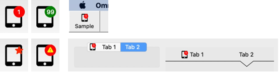
Icon Badges
You can add notification badges or ‘Icon Badges’ to JavaScript component icons to provide additional information, such as a number count, or to alert the end user, in order to enhance the UI in your applications. (Note you can also apply icon badges to Window class component icons.)
Icon badges are additional icons or notifications that can be added to any JavaScript component icon, that is, a badge can be added to any control that supports icons, such as Push buttons, Toolbar buttons, Menu items, or Tab bar tabs. The following screenshot shows some examples, including button icons, toolbar icons, and tabbar icons.
When assigning to $iconid for a JavaScript component, you can use the iconidwithbadge() function to assign an icon badge or number count notification and its properties. Therefore, when an icon ID uses an SVG icon name, iconidwithbadge() allows you to append additional values to the SVG name to define a badge to be added to the main icon. The syntax is:
iconidwithbadge(svgIcn, count_or_secondary_icon [ , badge_options, backcolor, icontextcolor ] )
The parameters are:
svgIcn
the ID of the primary icon for the object / toolbar object
count_or_secondary_icon
the count to be displayed on the badge, or the ID of a smaller secondary icon
badge_option
kIconBadgeAlignTop, kIconBadgeAlignBottom, or the default is the position set by the OS, also kIconBadgeBackgroundHide, see below.
backcolor
the color of the badge, the default is kJSThemeColorSecondary
icontextcolor
the color of the count, or secondary icon, the default is kJSThemeColorSecondaryText
For example, the following lines of code set up icon badges for buttons:
Do $cinst.$objs.button.$iconid.$assign(iconidwithbadge( 'tablet_mac', 9 ))
Do $cinst.$objs.button.$iconid.$assign(iconidwithbadge( 'tablet_mac+32x32', 9 ))
Do $cinst.$objs.button.$iconid.$assign(iconidwithbadge( 'tablet_mac', 99, 0, kDarkGreen, kWhite ))
Some Omnis objects used fixed icon sizes, such as menu items or tabbar tabs, therefore when applying a badge to these objects you cannot supply an icon size for the primary icon as the size will be fixed by the object, for example:
Do $imenus.NewMenu.$objs.Item.$iconid.$assign(iconidwithbadge( 'tablet\_mac', 9 ))
When using iconidwithbadge() in a client-executed method, the SVG parameters must be URLs, which can be generated with iconurl() in server-executed code.
The default icon badge background colour is kJSThemeColorSecondary, while the count or secondary icon is kJSThemeColorSecondaryText (for window class controls the colors are the standard OS colors).
Badge Options
The constants kIconBadgeAlignTop and kIconBadgeAlignBottom can be used in the badge_option parameter in iconidwithbadge() to specify the position of the badge. Omitting this or passing 0, Omnis will use the default position for the OS – by default, macOS will draw a badge at the top right of an icon, and Windows at the bottom right.
The constant kIconBadgeBackgroundHide allows you to hide the default colored circle badge when used with a secondary icon. If the badge has a count and not an icon, the badge background is always drawn and this option ignored. For example:
$iconid.$assign(iconidwithbadge( 'tablet\_mac', 'star', kBadgeIconHideBackground, kDefault, kRed ))
Tab panes and Tab strips
To set an icon badge on a tab pane or tab strip, you can use a new method $settabinfo() – this allows you to alter a tab name or icon at runtime without first changing the current tab. The syntax is:
$settabinfo(** *tabnumber*, *cap*, *icon* )
The parameters are:
tabnumber
a valid tab from 1 to $tabcount
caption
the new tab caption or empty to leave caption untouched
icon
the icon for the tab; you can use iconidwithbadge()
The new iconidwithbadge() function can be used to specify the icon badge. For example:
Do $cinst.$objs.tabpaneorstrip.$settabinfo( 1, '', iconidwithbadge( 'tablet\_mac', 1 ) )
Component Fonts
The font for all JS controls is set using the $font property. The Roboto Flex font is the default font for all JS components (in new libraries), including Entry fields and labels. Roboto is a Google font and included in the folder html/fonts; its use is subject to the Apache License Version 2.0: https://www.apache.org/licenses/LICENSE-2.0
The "system-ui" font is also available for most controls and uses the Operating System's default font, so changes between platforms. This may be useful if you are designing a mobile app to run in the wrappers, giving your app a more native look.
The $fontstyle and $fontsize properties sets the font style or weight, and font size, respectively. This includes semi-bold (kSemiBold) if the font supports it (Roboto does). Using both kBold and kSemiBold causes an extra bold font style to be used.
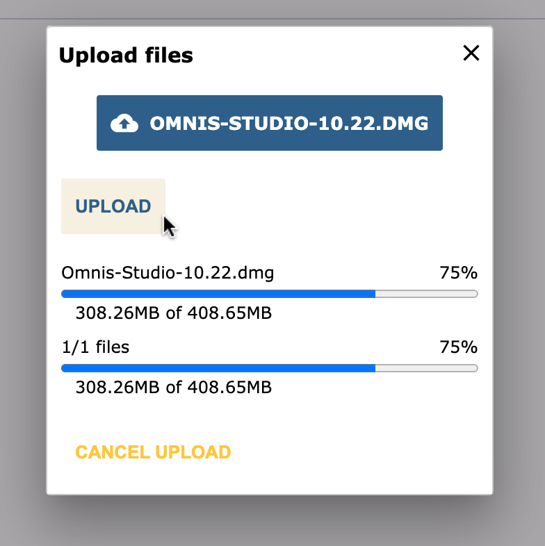
Uploading Files
Omnis Studio supports file uploads to the server using the dedicated File Control. The control can be configured so that files can either be selected from a standard Upload dialog, or dragged from the operating system and dropped onto the control in a remote form. For more information, see the File Control section.
File upload can also be achieved by dragging and dropping files onto any control whose $dropmode property is set to include kAcceptOperatingSystem. In this case, you need to process the dropped files, including the upload, as this is not handled automatically. In practice, this mechanism is only suitable for smaller files (as the whole file is loaded into the browser memory, where there are restrictive size limits), and in general file uploads should be handled with the File Control. For more information, see the Drag and Drop Files section.
A note on file sizes: While the maximum upload size of the file (or batch of files) can be limited via the properties of the File Control, drag-and-drop uploads onto other controls may be restricted by external factors, including browser memory, server-side limits and network speeds.
Drag and Drop
Drag and drop for the JavaScript Client provides the ability for end users to drag data from one JavaScript control in a remote form, and drop that data onto another JavaScript control. In addition, end users can drag files from their operating system and drop them onto a JavaScript control within a remote form displayed in their web browser.
IMPORTANT NOTE: Support for drag and drop in JavaScript remote forms is limited to desktop browsers only, including Chrome, Edge, Firefox, and Safari – drag and drop is not supported in mobile browsers. Also note dragging and dropping data only applies from one control to another control within the same instance of a JS Client app. You cannot drag data between JS Client apps in different browser windows.
Drag and Drop Data
To drag and drop some data, the end user can click and hold down the pointer over some data in a remote form control, such as an entry field or list line, then drag the highlighted data onto another control and release the pointer when the target control is highlighted. To enable drag and drop, the $dragmode and $dropmode properties must be set in the relevant JavaScript controls.
A number of events are available to allow you to process the data associated with dragging and dropping. These events and their parameters work in a very similar manner to those for the drag and drop mechanism in the thick client, with the addition of the pDropId, pDropColName and pDragDataType parameters (see under Events).
Drag and Drop Example
There is an example library demonstrating how you can Drag and Drop images between JavaScript controls, and the library allows image files to be dropped onto a control from the desktop. The example library is called JS Drag and Drop and is available under the Samples option in the Studio Browser, or in the Omnis Components app on the Omnis website.
Dragging Data
Dragging data is limited to certain data-bound JavaScript controls and is not possible for all types of JavaScript controls. JavaScript client controls that support dragging data will have the $dragmode property. This can be set to either kNoDragging or kDragData.
Note that the $dragiconid property used in the thick client is not supported for drag and drop in the JavaScript client, for a number of technical limitations in various browsers. The dragged image is typically an image of the dragged element created by the browser, using the content of the element when the drag starts – the client performs various temporary adjustments to the element to make the dragged image correspond to the dragged data as appropriate.
Dropping Data
A drop can occur on any JavaScript control, but remotes forms do not accept drops. You can specify that a control can accept dropped data by setting its $dropmode property. When a control can accept some data, the JavaScript client highlights the destination control. For JavaScript client controls, $dropmode can be one of the following constants:
kAcceptControl
Data from a JavaScript client control can be dropped onto this control.
kAcceptFiles
Files dragged from the system (desktop) can be dropped onto this control; this would allow you to upload the file, for example, which is described in Drag and Drop Files
The List, Tree list and Data grid controls have the $hiliteline property, indicating that data can be dropped on a specific list line or tree node rather than the entire control. This also means that rather than highlighting the entire control, the client highlights the current destination line or node when a drop can occur.
The Data grid has an option kJSDataDropCells in the $celldraganddrop property. When this is set to true the current destination cell is highlighted instead of the row.
Drag Scrolling
When the end user is dragging data, they can scroll a destination control vertically by placing and holding the pointer near the bottom or top of the control. This is useful with long lists, grids or tree controls, when the $hiliteline property is enabled.
Drag and Drop Events
In order to process a drag and drop procedure, you have to handle some events in the $event method in the source and target controls. The drag and drop events must be enabled as required in the $events property for a control.
- evDrag
The client sends evDrag when the user attempts to start a drag. evDrag must be executed in a client-executed $event method, and it has the following event parameters:
| pDragType |
Always set to the value kDragData |
| pDragValue |
Described in the Drag Values section below |
| pDragDataType |
The Omnis data type of the dragged data, e.g. kCharacter, kList, etc |
| pDragRow |
The row of the Complex Grid from which the drag occurs. Zero if the control does not belong to a complex grid |
| pDragId |
The identifier of the area of the control from which the drag has occurred. Either a line number or ident, or zero if the control is not list-based. In the case of a list-based control with multiple lines selected, the value is in the form of a list of line numbers |
| pDragCol |
Data grid only. The column number of the cell from which the data has been dragged. Zero for other controls |
If you use Quit event handler (discard event) during evDrag, you prevent the drag from starting.
Since it is not always convenient to mark $event for a control as client-executed, the client provides an alternative mechanism. You can implement a client-executed method named $drag for the object, with two parameters (type Var): pDragType and pDragValue. $drag returns true if the drag is allowed, false if not.
The client first attempts to call $drag. If $drag exists and returns true or false, then the drag starts or is not allowed to start respectively. If $drag does not exist, or does not return a value, Omnis sends evDrag if it is selected to execute in $events, and if $event is client-executed.
The drag will only fail to start if $drag executed and returned false, or if evDrag was sent and discarded by Quit event handler.
Data grids, Lists and Tree controls may select a line or node when the drag starts. This will result in a click event being sent just before $drag is called or evDrag is sent. If the click is sent to the server, it will execute in parallel with evDrag or $drag.
evDragFinished
The client sends evDragFinished when the user has finished a drag (released the pointer). It has no event-specific parameters. evDragFinished can be server or client executed.
evCanDrop
The client sends evCanDrop when the pointer is over a control that can accept a drop of the current drag type (kDragData or kDragFiles). evCanDrop must be executed in a client-executed $event method, and it has the following event parameters:
| pDragType |
kDragData if data is being dragged from a control, or kDragFiles if a file or files are being dragged from the system |
| pDragValue |
Described in the Drag Values section below. Note that if pDragType is kDragFiles, this is empty during evCanDrop, since information about the files being dragged is not provided by the browser |
| pDragField |
If pDragType is kDragData, this contains the name of the field from which data is being dragged. If pDragType is kDragFiles, this is empty |
| pDropId |
The identifier of the area of the control over which the drop is to occur. Either a line number or ident (when $hiliteline is true), or zero if the control is not list-based (or $hiliteline is false) |
| pDropRow |
The row of the complex grid on which the drop is to occur. Zero if the control does not belong to a complex grid |
| pColNum |
For data grids, the column number of the cell in which the data will be dropped |
| pDropColName |
For data grids, the name of the list column on which the drop is to occur |
| pDragDataType |
The Omnis data type of the dragged data, e.g. kCharacter, kList, etc |
If you use Quit event handler (discard event) during evCanDrop, you prevent a drop on to the current control and pDropId combination.
Since it is not always convenient to mark $event as client-executed, the client provides an alternative mechanism. You can implement a client-executed method named $candrop for the object, with four parameters (type Var): pDragType, pDragValue, pDragField and pDropId. $candrop returns true if the drop is allowed, false if not.
If pDragField=$cobj.$name
  Quit method kFalse
End If
The client first attempts to call $candrop. If $candrop exists and returns true or false, then the drop is allowed or not allowed respectively. If $candrop does not exist, or does not return a value, Omnis sends evCanDrop if it is selected to execute in $events, and if $event is client-executed.
The drop will only be denied if $candrop executed and returned false, or if evCanDrop was sent and discarded by Quit event handler.
- evWillDrop
The client sends evWillDrop when a drop occurs over a control and drop id combination for which which a drop is allowed according to the can drop processing. The client sends evWillDrop to the control being dragged - therefore, evWillDrop is not sent when dragging files from the system. evWillDrop can be server or client executed. It has the following event parameters:
| pDragType |
kDragData |
| pDragValue |
Described in the Drag Values section below |
| pDropField |
The name of the control where the data is being dropped |
| pDropId |
The identifier of the area of the control over which the drop is occurring. Either a line number or ident (when $hiliteline is true), or zero if the control is not list-based (or $hiliteline is false). |
| pDropRow |
The row of the complex grid on which the drop is to occur. Zero if the control does not belong to a complex grid |
| pColNum |
For data grids, the column number of the cell in which the data will be dropped |
| pDropColName |
For data grids, the name of the list column on which the drop is to occur |
| pDragDataType |
The Omnis data type of the dragged data, e.g. kCharacter, kList, etc |
Quit event handler with discard event has no effect on evWillDrop.
- evDrop
The client sends evDrop when a drop occurs over a control and drop id combination for which a drop is allowed according to the can drop processing. evDrop can be server or client executed. It has the following event parameters:
| pDragType |
kDragData if data is being dragged from a control, or kDragFiles if a file or files are being dragged from the system. |
| pDragValue |
Described in the Drag Values section below. |
| pDragField |
If pDragType is kDragData, this contains the name of the field from which data is being dragged. If pDragType is kDragFiles, this is empty. |
| pDropId |
The identifier of the area of the control over which the drop is occurring. Either a line number or ident (when $hiliteline is true), or zero if the control is not list-based (or $hiliteline is false). |
| pDropRow |
The row of the complex grid on which the drop is to occur. Zero if the control does not belong to a complex grid |
| pColNum |
For data grids, the column number of the cell in which the data will be dropped |
| pDropColName |
For data grids, the name of the list column on which the drop is to occur |
| pDragDataType |
The Omnis data type of the dragged data, e.g. kCharacter, kList, etc |
Quit event handler with discard event has no effect on evDrop.
The following $event method is behind an image control and processes the dropped data (this is available in the example library).
On evDrop
If pDragType=kDragData
If pDragField='LeftImage'
Calculate iLeftImage as iRightImage
Calculate lBase64 as mid(pDragValue,pos(',',pDragValue)+1)
Calculate iRightImage as binfrombase64(lBase64)
End If
Else
Calculate lLine as 1
Calculate iRightImageIdent as pDragValue.[lLine].4
Do $cinst.$clientcommand(
'readfile',row(iRightImageIdent,'iReadFileBin',kTrue))
End If
Drag Values
This section describes both the controls for which data can be dragged, and the drag values generated for each drag.
Combo box
pDragValue is the selected text dragged from the current selection in the entry field component of the combo box. To drag text, you must click and hold the pointer somewhere in the selection before dragging.
Data grid
The default value for pDragValue is a list. For a single select data grid, the list has one line, containing the list line being dragged. For a multiple select data grid, the list contains the selected lines being dragged.
If the $celldraganddrop data grid property is set to kJSDataDragCells then pDragValue is the contents of the dragged cell, and not the whole row of data.
Entry field
pDragValue is the selected text dragged from the current selection in the entry field. To drag text, you must click and hold the pointer somewhere in the selection before dragging.
List
pDragValue is a list containing the list line being dragged.
Picture
pDragValue is a character string containing the URL of the picture being dragged. If the picture is populated using a variable and $mediatype, the URL is a data URL.
Rich text
pDragValue is the selected text dragged from the current selection in the entry field component of the rich text control; note that this is the plain text without any formatting. To drag text, you must click and hold the pointer somewhere in the selection before dragging.
Tree list
The tree only supports dragging when it is in dynamic mode (i.e. when $datamode has the value kKSTreeDynamicLoad). pDragValue is a row containing information about the node being dragged. The row has 3 columns:
| ident |
The ident of the node |
| tag |
The tag of the node (a character string) |
| text |
The node text |
If the $hiliteline property is kTrue for a tree control, and the dropmode indicates that the tree is a potential drop target, the client will expand a node when the pointer enters it while dragging.
Tab control
The tab control contains some special logic that allows you to switch tabs while dragging, if this is the functionality you require. For can drop, it sets pDropId to the tab number of the tab under the pointer (or it sets pDropId to the current tab number if the pointer is over an area of the control which is not a tab). To switch tabs, implement a client-executed $candrop method for the tab control which executes:
 Calculate $cobj.$currenttab as pDropId
 Quit method kFalse
Drag and Drop Files
In addition to dragging and dropping data from one control to another, end users can drag files from their desktop and drop them onto a JavaScript control in a remote form in their browser. In order for the control to accept a dropped file its $dropmode property must be set to include kAcceptOperatingSystem.
File Drop Events
Events associated with dropping files largely reflect data drop events. The notable differences are:
- The value of pDragType is kDragFiles when a file is being dropped.
- When a file is being dropped the pDragValue parameter is only populated for the evDrop event. It takes the form of a list of the files dragged from the system, with columns defined as follows:
| name |
The file name. Note this is just a name, not the path to the file |
| type |
The MIME type of the file if this was determined by the browser before passing it to the drop event |
| size |
The size of the file in bytes |
| ident |
An integer, unique in the context of the client, that identifies this dropped file. You can use this with the client commands described in the later section about processing files |
For more information on event parameters see Drag and Drop Events section.
Processing Dropped Files
There are two client commands that allow you to process dropped files, using the $clientcommand method.
- closefile
The client records file idents (and their JavaScript File objects) in a table. Use closefile to remove the table entry and release resources. You should really do this for every ident passed in the drag value to evDrop, unless you use readfile which removes the table entry after reading the file.
The row passed to the closefile client command has a single column, which is the ident of the file to remove from the table. If you pass a row where the ident is zero, the client removes all entries from the table.
- readfile
The readfile client command allows you to read the contents of a file identified by its ident. After attempting to read the file, the client removes the ident from the table, so a call to closefile is not required.
The row passed to readfile has the following structure:
row(ident,instance variable name,base64)
The columns are as follows:
| ident |
The unique identifier of the file |
| instance variable name |
The name of an instance variable in the form used to call $clientcommand, that will receive the contents of the file. Note that this is a character string containing the instance variable name, not the instance variable itself |
| base64 |
A Boolean. If true, the file is read as base64; otherwise the file is read as text. Set to true if it is not a text-based file |
The JavaScript FileReader which the client uses to read the file operates asynchronously, so a call to readfile starts the file reading process. When the file read is complete, the client calls the client-executed method $filereadcomplete in the form used to call $clientcommand. $filereadcomplete has two parameters:
| ident |
The unique identifier of the file |
| error text |
Empty if the file was read successfully, meaning that the named instance variable has been populated with the file contents (either as text or base64-encoded text).
If not empty, some text describing why the file read failed. |
Reading Multiple Files
Since the upload process is sequential, each file in a batch can only be read after the previous read operation has completed and $filereadcomplete has been invoked.
For example, when rendering a batch of image files into a Picture control within a Complex Grid, a list-type instance variable can be used to store metadata and content for each file as $filereadcomplete is triggered. This list preserves the information for previously read files.
The instance variable holding the file contents is reused for each read operation and is therefore reassigned when readfile is called for the next file in the batch. Storing the contents in the list during $filereadcomplete ensures that data from earlier files is not overwritten.
Files dragged from system
For file dragging, pDragValue is only populated for evDrop. It is a list of the files dragged from the system, with columns defined as follows:
| name |
The file name. Note this is just a name, not the path to the file. |
| type |
The MIME type of the file if this was determined by the browser before passing it to the drop event. |
| size |
The size of the file in bytes. |
| ident |
An integer, unique in the context of the client, that identifies this dropped file. You can use this with the client commands described in the later section about processing files. |
Drag and Drop for Thick Client
evCanDrop, evWillDrop and evDrop for the thick client have the pDropId parameter. This is significant when $hiliteline for the control is true, and contains the id of the location in the control where the drop would occur or is occurring, e.g. the list line for a list.
Copying data
The end user can copy data in any control and have the output of a client executed method called $clipboardcopy placed on the system clipboard instead of the control’s default copy output. For example, if a selected row in a data grid is copied the default behavior is for the copied row to be returned as tab-separated values. In this case, you could add a $clipboardcopy client method to the grid control to handle the clipboard content so that it returns the selected row in an appropriate format, such as a HTML list.
The $clipboardcopy method can return character data or a list. If returning character data, the MIME type defaults to "text/plain". If it is a list, column 1 must be the MIME type and column 2 must be the content. For example:
Do lList.$define(lMime,lContent)
Do lList.$add("text/plain",con(iDatagridList.C1," ",iDatagridList.C2))
Do lList.$add("text/html",con("<ul><li>",iDatagridList.C1,"</li><li>",iDatagridList.C2,"</li><ul>"))
Quit method lList
The most relevant format from a list output (for example plain text or HTML) will be used for the context into which you are pasting.
Side Panels
A Side Panel is a vertical panel that can be displayed down the left or right side of a remote form (like a sidebar), containing clickable options, such as a menu of options or other content. Side panels are a common UI element in dashboard style designs and allow you to create a more interactive UI for your web & mobile apps. Note that there is not a separate side panel component, instead many existing JavaScript controls can be marked as a side panel by setting the $sidepanel property of the control to kTrue.
A Side Panel will pop out on the left or right side of a form automatically, when the end user hovers their pointer over the left or right edge of the form. Alternatively, a side panel can be opened and closed manually using a button. When a side panel is opened it is animated, so when activated, it will slide in or out.
In practice, it would normally make sense to use a container object, such as a Paged pane, Subform, or Scroll Box as a side panel since you can then add other controls to the container which the end user can interact with. Alternatively, a Tree list could be switched to a side panel which would function as a Navigation bar for your web app.
There is an example app called JS Side Panels under the Samples option in the Studio Browser, that demonstrates the basic behavior of side panels.
Panel Mode Property
The $sidepanelmode property determines the panel mode, that is, how or when the panel is popped out; the mode is set using a kSidePanelMode… constant, as follows:
kSidePanelModeNone
the default mode meaning the side panel will not pop out automatically when the end user hovers over the edge of the form, but the $showpanel method can be used to show the side panel (e.g. executed behind a button)
kSidePanelModePush
the side panel pops out automatically when the end user hovers over the edge of the form and “pushes” or moves the other controls and content on the remote form either to the right or left
kSidePanelModeCover
the side panel pops out automatically when the end user hovers over the edge of the form and “covers” the other form content, i.e. the panel is placed over the top of the other controls and content on the remote form
Panel Mode Method
You can use the $showpanel() method to show or hide a side panel, when $sidepanelmode = kSidePanelModeNone; the method must be executed on the client.
- $showpanel(iAction, [iMode=kSidePanelModeAuto] )
Performs an action (iAction) on a side panel object, one of the following:
kSidePanelActionHide hides the side panel.
kSidePanelActionShow shows the side panel.
kSidePanelActionToggle either hides or shows the side panel depending on its current state.
The panel mode (iMode) is optional and only applies when iAction is kSidePanelActionShow; if omitted, the default is kSidePanelModeAuto which uses the setting in the $sidepanelmode property, either kSidePanelModePush or kSidePanelModeCover
For example, you could set the $sidepanelmode property to kSidePanelModeNone (i.e. the panel will not pop out automatically), and use the $showpanel() method behind a button to pop it out, as follows:
On evClick
Do $cinst.$objs.panel.$showpanel(kSidePanelActionToggle,kSidePanelModePush)
Side Panel Events
The following events are reported by a component when it is enabled as a side panel.
| evWillShow |
Sent at the start of the animation when the side panel is about to open |
| evShown |
Sent at the end of the animation when the side panel has finished opening |
| evWillHide |
Sent at the start of the animation when the side panel is about to close |
| evHidden |
Sent at the end of the animation when the side panel has finished closing |
evWillShow and evWillHide can only be executed on the client. This is so the events can be discarded, if required, which will prevent the panel from being shown or hidden.
Tab Order
The $order component property determines the Tab Order for the controls within a remote form, that is, the order in which remote form controls receive the focus as you press the Tab key. The value of $order for each control is assigned automatically as you add controls to a form in design mode, starting at 1 and increasing by 1 for each control (note the $order values do not change if you move or rearrange the controls on the form). You can change the $order value of a control to change its tab order: when you change the value of one control, the $order value of other controls on the form will be adjusted in sequence automatically.
When you tab into a container, such as a page pane, the tab order takes you through all of the fields in the container, before tabbing out of the container.
The $startfield remote form property specifies which field in a remote form will get the focus when the form is opened, overriding the control with its $order property set to 1; $startfield takes the field number as specified in the $order property of the control. Note this property may have an impact on accessibility, insofar as the field specified in $startfield may not be the first field on the form, thereby going against most accessibility practice.
Remove from Tab Order
The $removefromtaborder property allows you to remove a control from the tab order. If $removefromtaborder is true, the control is not included in the tab order for the remote form, except for Complex grids which cannot be removed from the tab order. If a control does not have this property, it is always excluded from the tab order, i.e. it cannot be tabbed to.
Design tab order
All JS components have a $taborder read-only property in design mode which shows the resolved tab order within the form, taking into account container fields, such as paged panes or complex grids. The context menu on a remote form has a "Show $taborder" option, so that you can see the value of $taborder for all controls on the form. You can still alter the tab order of the controls in a form by modifying $order for each control.
Next Tab Object
All JS components have the $nexttabobject property which allows you to override the default tab order, set by the $order property for all the controls in a remote form. The $nexttabobject property allows you to specify the name ($name) of the control you want the focus to jump to after the current object, overriding the tab order set by $order. You can specify the row when setting the $nexttabobject property to a complex grid child.
You should not overuse this property, as it does incur some overhead by setting up additional event listeners.
Accessibility
Omnis Studio supports the Web Content Accessibility Guidelines (WCAG 2.0) which will help to make your applications more accessible, primarily for people with disabilities. These guidelines have been adopted by many government agencies and guarantee an acceptable level of access to information and services via websites and applications for people with disabilities. You can read the following pages to gain a basic understanding of the WCAG requirements:
https://www.w3.org/WAI/standards-guidelines/
The WCAG implementation in Omnis Studio calls on the ARIA specification, which according to W3.org is “Accessible Rich Internet Applications (ARIA) defines a way to make Web content and Web applications more accessible to people with disabilities. It especially helps with dynamic content and advanced user interface controls developed with [various web technologies],” which includes technologies such as the JavaScript Client in Omnis Studio.
In practice, most JavaScript components have ARIA compliant properties which you can use in your web and mobile apps to support end users with disabilities. These properties will be read automatically when the screen reader capabilities are enabled in the end user’s browser or mobile device.
ARIA Properties
Most JavaScript controls have a set of basic ARIA and other accessibility properties which are interpreted by the screen reader in the browser. The ARIA properties in Omnis map closely to their equivalent ARIA attributes in HTML.
Several of the JavaScript controls have the following ARIA properties, while some other controls have additional properties (listed below). These properties are designed to work in a similar way as their equivalent ARIA attributes in HTML.
$arialabel
the text for the aria label, which is used when a text label is not visible on the form. If there is a label for the control, use the $arialabelledby property instead
$arialabelledby
the name of a control to act as a label for this control; for example, you could enter the name of a label object to link it to the control. A value in $arialabelledby will override the value in $arialabel; you can use a comma separated list of controls to assign multiple controls as labels for the component
$ariadescribedby
the name of a control used to describe this control: similar to $arialabelledby, but could be used to provide more information or a longer description about the control; you can use a comma separated list of controls to assign multiple controls as labels
In versions prior to Studio 11, $arialabelledby and $ariadescribedby took a space separated list of controls. When converting libraries from 10.2 or earlier, or importing a library from JSON, spaces in $arialabelledby and $ariadescribedby will be replaced with commas.
You should note that JavaScript controls now have an $active property which works alongside $enabled allowing you to make controls active, inactive, enabled, or disabled, which helps you control accessibility and tab order in your remote forms.
Image Based Controls
You can assign an Alt text value to image-based controls, such as Picture and Activity, using the $alttext property:
- $alttext
a short text to describe the appearance or function of an image, and equivalent to the “alt” attribute in HTML; this property is relevant for controls that contain an image or have a significant visual appearance, such as the Picture and Activity controls.
Page Panes and Landmarks
So-called “Landmark Roles” in standard accessibility guidelines allow you to identify different areas of a form to allow screen readers to describe the structure of the page to end users. You can define Landmarks in your JS remote forms using Page panes and by assigning the appropriate value to the $landmark property for each pane: the options for $landmark correspond to the same keywords used for landmarks in the accessibility guidelines (Main, Navigation, Banner).
- $landmark
specifies a role to make the page pane an ARIA landmark region, a kLandmark… constant with kLandmarkNone as the default.
The Landmark options are:
| kLandmarkMain |
A “Main” landmark which identifies the primary content of the remote form |
| kLandmarkNavigation |
A “Navigation” landmark which identifies an area containing navigation type control or list of links used for navigation |
| kLandmarkBanner |
A “Banner” landmark which identifies an area usually at the top of the form, possibly containing logo, company or application name and search box |
| kLandmarkContentinfo |
A “Contentinfo” landmark which typically identifies common information at the bottom of a form |
| kLandmarkComplementary |
A “Complementary” landmark which many contain supplementary information or further links, such as a sidebar |
| kLandmarkForm |
A “Form” landmark which identifies an area containing a number of input controls or other form controls |
| kLandmarkSearch |
A “Search” landmark which typically would contain a Search field and button |
| kLandmarkNone |
No landmark definition |
Label controls
You can link a Label control to a specific Edit control, or you can tag a label as one of the HTML header types, using the following properties:
$labelfor
links a label to a control. If you use this with some controls such as the Edit control, the linked control will get the focus if the label is clicked. It can be used in addition to $arialabelledby.
$tagtype
can be used to set a label’s HTML tag type to one of the header types (<h1> etc.) which would allow the end user to navigate to different sections of a form: the default value is kJSLabelTypeLabel, which is a standard untagged label, and the other values include H1 to H6 for the header types.
Control text
If a control has some text assigned (e.g. a button), the screen reader will read out the text by default, therefore it is not always necessary to assign the ARIA properties to describe such controls. For example, the text for a Button control will be read by the screen reader, if no ARIA properties are specified, however the value in $text will be overridden if you specify $arialabel or $arialabelledby.
Content tips
The Edit control has the $::contenttip property which is a text string which is displayed in the edit field when it is empty and before the end user has entered any text. This can be used in addition to the ARIA label properties, to help label the edit controls on your forms: note it is good practice to add labels to all the edit controls on your form to help with accessibility, so do not rely solely on content tips to describe edit controls.
Keyboard Accessibility
As well as the ARIA properties, the behavior when using various keys to navigate a remote form, or inside more complex controls, has been improved. For example, when the end user presses the Tab key, the focus will jump from one control to another in a remote (web) form, or for complex items such as a Tab bar, the Tab key will put the focus inside the control and the arrow keys can be used to move from one element to another. In addition, the Arrow keys can be used to interact with controls, such as dropdown menus, while Enter and Spacebar can be used to select options or items. The Page Up/Down keys can be used to scroll a form or long list which has the focus.
The following table summarizes what keys end users can use in which JS remote form controls:
| Tab |
Tab to next field (previous with Shift + Tab) |
All controls.
More complex controls such as datagrid and complex grid will tab to the next field within the control while editing |
| Arrow Keys |
Move within list a control |
List based controls such as List, Droplist, Combo box, Datagrid and Datepickers |
Page Up
Page Down |
Move by multiple lines up or down |
List based controls such as List, Droplist, Combo box, Datagrid, Complex Grid |
Home
End |
Move to the start or end of a list |
List based controls.
Complex grid requires Ctrl to be pressed |
Ctrl + [
Ctrl + ] |
Move to next/previous in more complex controls |
Complex grid: move to next/previous line
Subform sets: move to next/previous subform in set |
Accessibility and tabbing order
For increased accessibility in your applications, you should carefully consider the tab order of the controls in your forms. In general, it is good practice to make the tab order run consecutively, that is, from one control to the next in a logical order: this could be from left to right starting at the top of the form, but the exact order may depend on the specific functions of your app. The tabbing order of the controls in the form is also used by the screen reader to “read out” or describe the contents of the form, so it’s important how you specify the tabbing order of the fields in your form.
With the ARIA labels specified and the correct tabbing order defined, the end user can navigate the controls on a form from the keyboard, and, in addition, the screen reader can describe each control or area of the form page in turn.
Consider the following JavaScript remote form. In the first image, as the end user tabs to the First Name edit field, the field border will highlight, the screen reader will say aloud: “First name, Edit text”, and if there is a value in the field, as in this case, it will read that as well: “First name, Peter, Edit text”.
Using the Tab key, the end user can move from one control or area of the form to another. Successive tab presses will enter the Tab bar at the top of the form, then the Right and Left Arrow keys can be used to move along the Tab bar, and the Return key can be used to select a tab. Once the tab is selected, the screen reader will describe the item selected: “Careers / Education Experience, Tab selected, 2 of 4”.
JS Themes
You can apply a consistent set of colors to JavaScript components on a remote form by selecting colors defined in a theme – underlying a theme is a set of CSS styles which are applied to controls at runtime on the client. Omnis has a number themes which you can use to style your JS client applications: a default theme, which provides an effective and pleasing UI across all JS controls and devices, and a range of different color themes, such as the dark theme, which provides an alternative set of darker colors.
When designing a remote form, you can change the current theme in the JS Theme Select dialog by pressing Ctrl-J/Cmnd-J, or select the JavaScript Theme option from the View menu (you can edit a theme from here by Right-clicking on a theme or background of the dialog and selecting the Open JavaScript Theme Editor option). To select a theme, click on the theme preview and close the dialog. The selected theme is applied to the current remote form and to all the remote forms in your library since the theme is an Omnis-wide preference. The following screenshot shows a Remote form with the ‘vintage’ theme selected.
The current theme is stored in the Omnis root preference, $javascripttheme (in $root.$prefs), which is set to the default theme initially, and controls which theme is used to render themed colors for all remote forms in design mode (but you can set or change the theme on the client using the ‘settheme’ client command; see later).
Selecting Colors
When you select the color for a JS control, you can choose a theme color from the color palette in the Property Manager, under the Theme color button (the default, on the left) in the color picker toolbar. For example, select a button, click on the Text tab in the Property Manager and click on the color palette for $textcolor.
The color setting for most properties, such as $textcolor, is set to kColorDefault, which means the appropriate color from the current theme is used. If a text color property is set to kColorDefault, and it sits on an element with a background color which comes from a themed color constant, the text will be rendered in the associated <theme color>Text color. For example, if a button’s $buttoncolor is set to kJSThemeColorPrimary and its $textcolor is set to kColorDefault, the text will be rendered using kJSThemeColorPrimaryText.
The colors defined in a theme and shown on the color palette have corresponding color constants, whose names begin kJSThemeColor, as follows:
| kJSThemeColorBackground |
kJSThemeColorPrimary |
| kJSThemeColorBackgroundText |
kJSThemeColorPrimaryDark |
| kJSThemeColorBorder |
kJSThemeColorPrimaryDarkText |
| kJSThemeColorDialog |
kJSThemeColorPrimaryLight |
| kJSThemeColorDialogText |
kJSThemeColorPrimaryLightText |
| kJSThemeColorDialogTitle |
kJSThemeColorPrimaryText |
| kJSThemeColorDialogTitleText |
kJSThemeColorSecondary |
| kJSThemeColorDisabled |
kJSThemeColorSecondaryDark |
| kJSThemeColorDisabledText |
kJSThemeColorSecondaryDarkText |
| kJSThemeColorError |
kJSThemeColorSecondaryLight |
| kJSThemeColorErrorText |
kJSThemeColorSecondaryLightText |
| kJSThemeColorFocusedRow |
kJSThemeColorSecondaryText |
| kJSThemeColorFocusedRowText |
kJSThemeColorSurface |
| kJSThemeColorNeutral |
kJSThemeColorSurfaceText |
| kJSThemeColorNeutralText |
|
| kJSThemeColorWindowChrome |
|
The kJSThemeColorWindowChrome theme color is used to color the window surround, including the status bar, the 'unsafe area' (around any notch etc), and the address bar if the JS client is displayed in a browser app on a mobile device.
This color is unique in the JS Theme Editor, in that you can clear its value to set it to the Default color, that is, no color will be applied to the window surround.
Note that on Android, this does not take effect if you are using a dark theme on your device.
Theme Editor
You can create JS themes, or modify an existing theme using the JS Theme Editor, available under the Add-Ons > Web Client Tools menu option and select JavaScript Theme Editor.
The editor provides a preview of the current theme on the right side of the editor screen, and you can click on an area or text item within the preview to view or set its color (you can also set colors by clicking in the list on the left).
The colors in a theme are categorized as Primary and Secondary, plus there are specific color for errors, borders, dialogs, and so on. The primary colors are used throughout your application and set the general tone or style of the theme, while the secondary colors provide an accent to certain parts of the UI.
Creating a new theme
To create a new theme, you can duplicate an existing theme and make any changes to the copy. To do this, open the Theme Editor, select a theme from the dropdown list or use the default theme (selected initially by default), click on Save as and give the new theme a name – then change individual colors and use the Save option to save any modifications. The Set theme option sets the $javascripttheme preference to the theme currently shown in the editor. If you make any modifications to the current theme, all open remote forms will be updated automatically.
A theme is stored as a .json file and an associated .css file in the ‘html/themes’ folder. When deploying your application, the themes folder and its contents must be copied to the corresponding location on the Omnis App Server.
When designing the colors in a new theme, you may want to follow the guidance provided by the Google Material design system, which may help you create a theme containing colors which complement one another and provide maximum useability and accessibility across different platforms and devices. Google provides a Material Color Tool which you may find useful to create a set of complementary colors for the dark/light variants.
Themed Icons
Omnis supports the use of SVG images for component icons. SVG icons can be “themed” which means an icon will be tinted using the control’s text color as specified in the current JS theme (the ‘fill’ color in a themed SVG file is set to the text color from the theme). This allows a single themed SVG icon file to be used with different themes and its color is set automatically.
Omnis includes an icon set named ‘material’ which contains over a 100 themed SVG icons. The material icon set is located in the ‘iconsets’ folder and if you have used any of the icons in your app the icon set needs to be copied to the Omnis App Server when deploying your application.
The following are examples of a single icon from the material icon set with different color themes applied (note the icon is rendered using the button text color):
SVG icon files can be ‘themed’ using the SVG Themer tool available under the Tools >> Add Ons menu option (or on the window toolbar for macOS). You can open an SVG file, preview it using one of the test colors (note the preview colors are not saved to the file), and save it using the Export button. If you export the themed file to the same folder using the same file name you will be prompted to overwrite the original file.
To theme and export a batch of SVG icons, you can open a number of SVG image files in the Themer tool, make a selection from the list or select all the files (using Ctrl/Cmnd-A), then adjust the Set Fill Color and Set Stroke Color options as required, and click Export to theme and export all the files.
IMPORTANT: note that when exporting a batch, any files in the destination folder with the same name as the exported files will be overwritten automatically without a prompt to overwrite the files, so you may want to place the exported themed files in a separate folder if you wish to retain the original SVG image files.
The SVG Themer tool converts a standard SVG image file into an Omnis themed SVG file format: specifically, the first element in the root svg element in the original file is converted to a ‘g element’ with fill="var(--om-tint-color)" and id ‘omTheme’ which reference the color from the current theme. The Image Data tab shows the source for the converted SVG file which you can edit if required, although the converter should convert the SVG file as necessary.
Like other SVG icon files, any themed SVG icons need to be placed in an icon set folder. For example, you could create or acquire a set of SVG icons and convert them using the SVG Themer tool ready for use in your JS client apps. In order to use your own SVG iconset(s), you need to add the icon set name to the $iconsets library property in your library, which can contain one or more icon set names separated by commas.
HTML Template & Client theme setting
The JS client’s theme is set in the ‘data-themename’ attribute in the omnisobject div in the HTML file for your remote form, e.g. data-themename="dark".
The special value of “_JT_” is used in the HTML template (jsctempl.htm) which is replaced this with the current value of $javascripttheme when Omnis generates the HTML file for your remote form.
In addition, the 'data-appid' attribute specifies the application a page belongs to. It defaults to '<lib name>.<form name>' each time a form is tested (the '_APPID_' placeholder in the template .htm file is replaced when a from is tested).
The current theme: $construct
The current theme is passed in the $construct row parameter, in a column named theme.
Changing the Theme
You can change the theme on the JS client in your code using the ‘settheme’ client command ($clientcommand) which takes a row parameter whose first column is the name of the new theme. Note that a remote form needs to be reloaded in the browser for a change of theme to take effect. Once you have set the theme using the ‘settheme’ clientcommand, the client stores it in the client localStorage and will use that theme for subsequent visits to the page. To revert to the default theme specified in the HTML page, you need to call the 'settheme' clientcommand, passing an empty string as the theme name (or clear the client's localStorage).
Passing the theme by URL
You can specify a theme when opening a remote form in a browser by passing an extra theme parameter. You can pass the 'omTheme' URL query parameter when loading a remote form (HTML page) in a browser to specify the JS theme to use for the form (and all other forms in the application during that browser session). For example, to specify the dark theme, use the following URL:
http://127.0.0.1:9110/jschtml/jsForm.htm?omTheme=dark
Active and Enabled Properties
All JavaScript controls have the $active property, which is set to kTrue for all new controls (except the Label Control which is kFalse). The $active property allows you to control whether a component is active (kTrue) or inactive (kFalse) – in an inactive state, a component cannot be interacted with at all, so the end user cannot tab to it, the contents cannot be selected or scrolled (in a list), and user clicks on an inactive control are ignored. Therefore, when a control is inactive, it is completely ignored in the tabbing order, so when the end user tabs the focus will jump to the next active control – in the context of accessibility, an inactive component will be ignored.
The $enabled property allows you to disable a control, and many controls have this property, including the Bar Chart, Combo Box, Data Grid, Date Picker, Edit, List, Map, Pie Chart, Rich Text, and Tree list.
Default Inactive Appearance
When controls are inactive, that is, when $active=kFalse, they tend to have their own default inactive appearance, which is often a gray overlay or background. If you set $defaultinactiveappearance to kFalse you can override this default inactive appearance. The default value for $defaultinactiveappearance is kTrue to maintain backwards compatibility.
Default Disabled Appearance
All controls that have the $enabled property have the $defaultdisabledappearance property. When $enabled = kFalse the $defaultdisabledappearance property defaults to true and the 'omnis-notenabled' css class is applied to the client element of the control. If $defaultdisabledappearance = kFalse, this class is not applied, which is what sets the text colour to grey when disabled.
Context menus are opened if $active of the control is kTrue, regardless of $enabled. If you wish to disable this behavior for a control, you should use Quit event handler (discard event) when handling evOpenContextMenu in your event handling methods for the control.
Creating Customized JavaScript Components
You can add your own customized JavaScript components to the Component Store under your own tab. This might be useful if you always want to create edit controls or buttons with certain properties (e.g. colors or fonts), so creating your own custom JS components might save you some time. You will need to edit the Component Store library (comps.lbs) to change the contents of the Component Store.
To create your own customized JS components, you need to create a new JS remote form in the Component Library, copy any components you want to customize from the JSFormComponents form, add them to your own form, and then customize then as required.
Opening the Component Library
You can open the Component Library by Right-clicking on the Libraries node in the Studio Browser tree and selecting the Show Comps.lbs option. Unless you want to copy classes from another library to the Component Library, it is recommended that you close all other libraries before you edit the Component Library.
When you select the Show Comps option, the contents of the Component Library is displayed in the Browser Browser. You can switch the Browser to Details view and click on one of the column headings to show the different types of component either by Name or Type. You can hide and show specific types of class in the Component Library using the Class Filter option in the Browser.
We recommend that you do not change the components in the JSFormComponents form since these are the default components that appear in the Component Store, rather you should create your own customized components using the following method.
Add a new JS remote form class to the Component Store library (comps.lbs); note that the name of the new remote form will be used as the tab name in the Component Store toolbar so choose something appropriate. Set the $componenttype property of the remote form to kCompStoreDesignObjects using the Notation Inspector: to do this, open the Notation Inspector, click on the Search button (the cursor changes to a spy glass), click on your remote form in the Studio Browser, and in the Property Manager set $componenttype to kCompStoreDesignObjects (note the $componenttype property will only be displayed via the Notation Inspector). Then set the $layouttype of the new remote form to kLayoutTypeSingle (not kLayoutTypeResponsive).
With your new remote form open, open the JSFormComponents remote form next to it (this form contains all JS components). Drag any JavaScript controls you want to customize from JSFormComponents into your new remote form and change their properties or appearance as required. After you hide the Component Store library, the customized JavaScript controls will be available in the new group in the Component Store.
JavaScript Component Templates
When you add a JavaScript Component to a remote form in your code at runtime, Omnis uses a template to create the object with all the required properties and methods. There is a template for every type of JavaScript Component, and the templates are located in the \studio\componenttemplates folder.
The component templates match the default components in the Component Store, and should not be edited. There are templates for report and window class components as well.
Position Assistance
When you move or resize objects in the Remote form design editor (or window class editor), colored dashed lines and arrows will appear automatically that enable you to easily align and distribute controls and other objects in relation to the design window edges or center and any other nearby objects – this is called Position Assistance.
As you move or resize objects on a remote form, colored lines are shown automatically, and objects will snap into position to help you arrange the objects in a form. In addition, the position and size coordinates are shown directly under the object or group of objects. For example, when you place several fields on a form, Position Assistance can help you align their left-hand or top edges and ensure they are spaced evenly. Position Assistance is also provided when you use the Arrow keys to position or resize objects.
The Show Position Assistance option on the remote form context menu allows you to toggle the Position Assistance feature (enabled by default). There is a single setting for this, shared by all editors, that is saved to omnis.cfg when Omnis shuts down.
The positioning lines are drawn using the colorhighlight color in the system group of appearance.json. The entry positionAssistantKeyboardTimer in the ‘ide’ section of the config.json specifies the time that the position assistance remains visible after you stop pressing an arrow key; this defaults to 750 milliseconds.
When positioning objects in the center of a remote form, Position Assistance uses the center of the current layout breakpoint, not the center of the remote form design window.
Position and Size coordinates
When you move or resize an object, or group of objects in a remote form class, the position and size information for the object or group is shown automatically. In addition, position information is provided when you drag an object from the Component Store and drop it onto a remote form.
The current Position of an object (its x,y coordinates) is displayed in a helptip or colored box just below the object, when you move an object, or when you drag an object from the Component Store and drop it onto a remote form (see above left); the helptip shows the X,Y position of the top-left corner of the object relative to the top-left corner of the remote form (or window class design screen).
The current Size of an object is shown (width x height) when you resize it (see above right). When more than one object is selected, the position or size corresponds to the area of the whole group of selected objects.
The positionAssistantShowsPositionOrSize item in the ‘ide’ section of the config.json file allows you to enable or disable this feature (the default is true, so the position or size is shown).
Positioning & Aligning Objects
When the Position Assistance is enabled, Omnis gives precedence to distribution over alignment, and within alignment it prioritises the top edge, over the center, and the center over the right edge. As soon as a visual guide is displayed for a target, any other targets that would also cause the object to move in the same axis are dropped.
As you move or size objects Omnis displays a visual guide when the object(s) being moved or sized are within +/-2 pixels of a specific alignment or distribution target, e.g. an alignment target is the top edge of another object or objects. When you release the mouse, the objects will snap to the displayed target. Position Assistance is applied to objects dragged from the Component Store, as well as objects being moved or sized within a design window. Position Assistance is provided when moving an object even if the adjacent objects are contained inside a container field.
When sizing objects, assistance is not provided if the objects being sized have more than a single container, that is, the component that is the parent of the objects – this can be more granular than a field, such as for complex grids, there are several containers such as the row and header sections.
Position Assistance is provided within each section of a Complex Grid, that is, the row and header sections of a Complex Grid, and the above behavior for container fields applies to each section independently.
Distribution
Position Assistance attempts to distribute objects by allowing them to be evenly spaced. The visual guide for distribution is a line drawn between the objects with arrow heads.
The guides are drawn for as many objects as possible, immediately adjacent to the object(s) being moved or sized. Position Assistance works best when objects are already reasonably well arranged, either vertically or horizontally, so for more complex arrangements, with overlapping fields may result in no visual guides being presented.
Alignment
Position Assistance attempts to align objects by giving them the same top or bottom coordinate, or centered relative to each other. When you try to center objects, you only get visual guides when moving objects, and when the appropriate side of the rectangle representing the objects being moved either fully encloses or is fully enclosed by the appropriate side of the object in which it is being centered. The following illustrate how the Position Assistance is applied for different cases when aligning objects.
 Top alignment
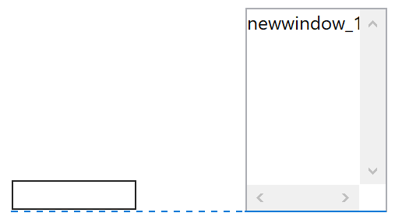 Bottom alignment
 Left alignment
 Right alignment
Positioning for Paged Panes (Container fields)
Assistance is provided to help you align fields inside a container field, such as a Paged Pane. In addition to the left/right, top/bottom positioning, when you move an object inside and near to the center of a container, a line across either the vertical or horizontal center of the container is drawn and the object will snap to the line.
When positioning objects inside a Paged Pane (or any container), Position Assistance is only provided for the controls within the Paged Pane itself, so objects outside the Paged Pane are not included in the current object grouping. Similarly, if you are positioning objects outside, but near to a Paged Pane, the objects inside the Paged Pane are not included in the current grouping.
Position for dropping objects
Information about the drop destination is shown when dragging objects on a remote form design window into a Complex grid or Paged pane (shown in addition to the x-y coordinates). For example, as you drop a field into a Complex grid section, the position assistance will display the section type, such as ‘Header’, ‘Horizontal header’, or ‘Row’, as shown below.
Group Selection & Object Properties
When you select a group of objects, Omnis shows a colored line around the group and a single set of selection handles for the group (this also applies to objects in a window or report class). If the objects share any properties these are shown in the Property Manager allowing you to set the properties for all the objects in the group.
If you click on an object inside the group of selected objects, Omnis shows selection handles around just this object and shows the properties of the selected object in the Property Manager, but retains the selection line around the group, as shown below as a gray line:
You can click on another object within the group selection, and in this case selection handles are shown on the new selected object and its properties are shown in the Property Manager. If you want to restore the state where the properties reflect all the selected objects in the group, you can Shift-click on the currently selected object.
Note that when clicking, properties are not shown until you release the mouse. This allows you to drag the selected objects without changing the properties displayed in the Property Manager.
The color of the selection rectangle shown around a group of objects is one of two colors in the ‘IDEGeneral’ section of appearance.json:
designselectedgroupoutlinecolor
the color of the rectangle around a selected group (when no single object is selected)
designselectedgroupoutlinesinglecolor
the color of the rectangle around a selected group when a single object is selected inside the group
Design Guides
You can add guides to a Remote Form to help you design and layout the form (design guides are also available for window classes). The Show Position Assistance option on the form (window) context menu must be enabled to use design guides.
To add a Design Guide to a form, hold down the Ctrl/Cmnd key and click the red ‘+’ box at the top or left side of the form. Clicking the ‘+’ creates a new guide at the default location of 50 pixels. If a guide already exists at the default location a new guide is added 20 pixels from the existing guide, e.g. at 70 pixels, then at 90 pixels, and so on.
To move the guide, hold down the Ctrl/Cmnd key and drag the guide into position; a guideline will highlight in red if you hold down the Ctrl/Cmnd key and hover the pointer over the guide, allowing you to move it. To remove a guide, drag it off the form beyond the top or left edge. When you move a guide towards the right or bottom edge of the form, it will become a right- or bottom-aligned guide.
When design guides are set and an object is moved or resized, it will snap to the nearest guide or where vertical and horizontal guides intersect.
The $designguides property stores the set of guides for the form as a comma separated list. Each guide is expressed as a letter and number defining its type (TOP, LEFT, RIGHT, or BOTTOM) and its position (in pixels) from the edge of the form. For example, T35,L25,R35 represents the guides TOP 35px, LEFT 25px, and RIGHT 35px. The value of $designguides is set as you place the guides in the remote form, or you can set it in the Property Manager.
Guides can be inherited, so when they are added to a super class all sub-classes will use the same design guides.
In addition to design guides, you can see the space between a selected object and the objects around it. When an object is selected and the Ctrl/Cmnd key is held down, as you move the pointer over other objects, containers or the remote form background (or window), distance measurements are shown in blue around the selected object.
Activity Control
| Other |
|
Activity |
Animated image to display during a long process or Omnis Server activity |
The Activity Control provides an animated image to show some activity on the client, for example, during a long list calculation or search operation on the Omnis Server.
There is an example app called JS Activity under the Samples option in the Studio Browser showing the different activity controls available and how to set a custom animated Gif; the same app is available in the Omnis Components app on the Omnis website.
The Activity Control has the following custom properties:
| $activitystyle |
The style of the indicator, a constant as below, or kJSActivityCustomLink to specify your own image |
| $customlink |
The path of an animated GIF which can be displayed when $activitystyle is set to kJSActivityCustomLink |
The $activitystyle property specifies the style of the control, one of the following constants:
| kJSActivityBar |
 |
| kJSActivityBlock |
 |
| kJSActivityCircular |
 |
| kJSActivityLinear |
 |
| kJSActivityLinearDots |
 |
| kJSActivitySmallSpinner |
 |
| kJSActivityCustomLink |
the image in $customlink is used |
Custom Link
The following code assigns a custom link to the activity control:
Calculate iCustomLink as 'http://www.mywebsite.com/images/animated1.gif'\
Do $cinst.$objs.Activity.$customlink.$assign(iCustomLink)
As an alternative to using the Activity Control you could consider using the showloadingoverlay client command to show a loading indicator (animated image) over a remote form or specific control: see Custom Loading Indicator.
Background Shape
| Shapes |
|
Background Shape |
Object you can set to Rectangle, Line, Triangle, or Image |
The Background Shape allows you to draw various shapes in your remote forms: you assign the shape to the object by setting the $::shape property to one of the kJSBack... constants. It can be assigned one of a number of shapes including: Ellipse/Circle, Rectangle/Square, Rounded rectangle/Square, Triangle, Horizontal Line, Vertical Line, and Image.
You can assign a solid color or gradient fill to a background component by setting its $backpattern, $forecolor and $backcolor. You can also assign the stroke (border) thickness and color by setting $strokewidth and $bordercolor.
There is a sample app called JS Background under the Samples option in the Studio Browser showing the various background shapes; the same app is in the Omnis Components app on the Omnis website.
Background Images
You can create a background image by setting $::shape to kJSBackImage, and setting $imagepath to a URL relative to the Omnis tree during development or your web server for deployment; you can click on the $imagepath property to select an image.
You can drop an image from your system / desktop on to a Remote Form to create a background image. In this case, the $imagepath property is set to the path of the image, which is copied automatically to the folder ‘images/libs/<libname>’ in the html folder in the Omnis tree. The image can be a PNG, JPG, JPEG or SVG.
The $keepaspectratio property is set to kTrue by default which ensures the image will keep its aspect ratio.
Animations and Changing Attributes
The Background Control has the $animation and $attr properties which allow various animations or effects to be assigned to the object, such as fading the object in or out, or for $attr various attributes of the object to be changed. The $animation and $attr properties must be assigned at runtime and accept a string containing various parameters depending on the function or attribute.
There is an example app called JS Animations under the Samples option in the Studio Browser showing how can use animations to move and fade objects to create a richer UI; the same app in the Omnis Components app on the Omnis website.
Apart from the scale attribute, the browser must support the Raphael JavaScript library to allow animations and attribute changes (more details about the parameters you can use are available from http://raphaeljs.com).
The $animation property follows the general format:
function( newvalue, time(milliseconds), ease(optional), complete_context(optional) )
The functions available in $animation are:
- scale
increases and decreases the size of the object
scale( newvalue, time(milliseconds), ease(optional), complete_context(optional) )
- alpha
changes the transparency of the object
alpha( newvalue, time(milliseconds), ease(optional) , complete_context(optional) )
- rotate
rotates the object
rotate( newvalue, time(milliseconds), ease(optional) , complete_context(optional) )
For example:
Calculate $cinst.$objs.backgroundobject.$animation as "alpha(0,500,<>,fade_complete)"
fades the object to alpha value 0 over 500 milliseconds using a ‘slow, faster, slow’ easing method (see below) and when complete calls evAnimComplete with a parameter "complete_context".
You can use the complete event to chain the next animation, therefore to pulse an object you could use:
Calculate $cinst.$objs.backgroundobject.$animation as "alpha(0,500,<>,fade_off)"
You could use the event handling method:
On evAnimComplete
  If ( pAnimContext="fade_off" )
    Calculate $cwind.$objs.backgroundobject.$animation as "alpha(0,500,<>,fade_on)"
  Else if ( pAnimContext="fade\_on" )
    Calculate $cwind.$objs.backgroundobject.$animation as "alpha(0,500,<>,fade_off)"
End If
Ease transition effects
The following ease transition effects or “eases” are supported for animations:
| = |
linear and default if not specified |
| > |
fast then slowing |
| < |
slow then faster |
| <> |
slow, faster, slow |
| bounce |
object bounces |
| elastic |
object stretches |
| backIn |
object backs in |
| backOut |
object backs out |
Changing Background Attributes
The $attr property allows you to change various attributes of the object, such as their transparency. For example, you can assign an alpha gradient to an object using the following method:
Do $cinst.$objs.backgroundobject.$attr.$assign('attr(gradient, 0-\#FFFFFF:10-\#FFFFFF)')
Do $cinst.$objs.backgroundobject.$attr.$assign('attr(opacity,0.0)')
Bar Chart Control
| Visualization |
|
Bar Chart |
Displays a bar chart based on a list of values |
The Bar Chart control allows you to display a simple dataset contained in a list variable as a bar chart. Omnis Studio provides two chart controls: a Bar Chart control and a Pie Chart control. The data to be represented in both these controls is contained in a list variable which is assigned to the $dataname property of the control.
There is a sample app for both the JS Bar chart and JS Pie chart under the Samples option in the Studio Browser, and in the Omnis Components app on the Omnis website.
There are various properties (on the Appearance tab in the Property Manager) that allow you to control the appearance of a Bar or Pie chart. The bars and segments use a set of default colors, but you can specify your own colors at runtime.
For Bar charts you can set $chartdirection to vertical (the default) or horizontal bars, the style of the bar ends as the $barends property (kJSBarEndSharp is shown below), and you can display data values when the end user’s mouse hovers over the bar by setting $showvalue to True (the default).
Specific properties for Pie charts are described under the PieChart Control section.
List data structure
To draw a simple bar or pie chart, the list variable assigned to the $dataname property of the chart component needs to contain at least two columns. The first column contains the value for the data point, and the second column contains the label or name for the data point. For example, to construct a simple bar chart showing a list of figures for sales agents, you could use the following method:
Do bar_data.$define(amount,nam)
Do bar_data.$add(120,'Steve')
Do bar_data.$add(230,'Dave')
Do bar_data.$add(245,'Anita')
Do bar_data.$add(125,'Claire')
Do bar_data.$add(280,'Ben')
With the $showvalue property enabled (a value is displayed when the end user passes the pointer over each bar), the method produces the following chart.
When $showvalue=kTrue, the popup label will use $backcolor for the text and $textcolor for the background of the label so that it can be seen against the background of the control.
Main and Axis Titles
There are a number of properties in the Bar Chart to allow you to add a main title, as well as titles for the x and y axis. In addition, there are properties to show (the default) or hide the x and y axis details or units.
| $maintitle |
The main title for the chart |
| $xtitle |
title for the x axis |
| $ytitle |
title for the y axis |
| $showxaxis |
if kTrue the chart shows x-axis details |
| $showyaxis |
if kTrue the chart shows y-axis details |
The following chart shows all the titles and axis details.
Text and Axis Colors
The $textcolor and $axiscolor properties allow you to set the color for text and axis, including theme colors; $textcolor applies to the color of the title, labels, axis text, and legend in the chart, where applicable.
The $axiscolor property for a Bar chart applies to the color of the both axes lines, and the unit lines which run across the bar chart.
When set to kColorDefault, both properties will set their color dynamically according to the color of $backcolor.
Bar & Segment Color
You can specify your own colors for the bars or segments in a Bar or Pie chart using the runtime-only property $colorlist, rather than using the default colors. You need to create a list of strings representing CSS colors and assign the list to the $colorlist property, for example:
 Do iColorList.$define(iColor)
 Do iColorList.$add("\#CE3D3D")
 Do iColorList.$add("rgb(81, 206, 61)")
 Do iColorList.$add("hsl(230, 60%, 52%)")
 Do iColorList.$add("Gold")
 Do $cinst.$objs.PieChart.$colorlist.$assign(iColorList)
The accepted color formats are: Hex Code RGB, Decimal Code RGB, HSL, or Color Name, and the formats can be mixed throughout the list as in the example above.
If there are not enough colors available in the color list for the number of segments in the chart, then Omnis will repeat the colors in $colorlist. Therefore, if you want to avoid repeating colors, create a color list containing more colors than you will generally need to cater to the number of data points in your chart.
Theme Colors
The $colorlist property can contain kJSThemeColor... constants to allow you to match the colors in the current JS theme. Note you cannot use standard Omnis color constants (such as kRed, etc.) in this context, since these are taken as literal text on the JS client.
Bar Chart Events
Bar charts report the evBarClicked event with the bar clicked in the pBar parameter. Similarly, Pie charts report the evSegmentClicked event with the segment clicked reported in pPieSegment.
On evBarClicked
Calculate message as con("Bar clicked: ",pBar)
On evSegmentClicked
Calculate message as con("Segment clicked: ",pPieSegment)
| Buttons |
|
Button |
Standard pushbutton which reacts to clicks |
The Button control is a basic pushbutton that the end user can click with the pointer or tap on a mobile device to confirm something or initiate a process, such as an OK or Cancel button, or a Print or Send button. Alternatively, you can use a Split button which combines a button and droplist of preset options. Many of the sample apps in the Omnis Components app on the Omnis website contain buttons, including plain text buttons or ones with icons.
The text is specified in $text as a single line of plain text, unless $textishtml is set to true and the text is treated as HTML; see below. A button can display an icon, specified in the $iconid property (under the Appearance tab), which can be an SVG or PNG image file from an Icon set chosen from the Select Icon dialog. See earlier in this chapter about Component Icons and specifically SVG Icons.
In addition to the icon you can assign to a button, you can add ‘Icon Badges’ to button icons to provide additional information, such as a number count, a notification, or an alert: see Icon Badges.
The Button control has the following text and appearance properties:
| $align |
The alignment of the text inside the button; centered by default |
| $buttonbackiconid |
The icon id of background image for the button. To use the default system button, set $buttonbackiconid to zero and $buttoncolor to kColorDefault |
| $buttoncolor |
The color of the button. To use the default system button, set $buttonbackiconid to zero and $buttoncolor to kColorDefault |
| $borderwidth |
The border width in pixels (the default is 0 or no border) |
| $bordercolor |
Sets the border color when $borderwidth is set >0 |
| $textbeforeicon |
If true, and the control has both text and an icon, and the text is displayed to the left of the icon |
| $::vertical |
If true, the text and icon are arranged vertically |
| $textishtml |
Specifies that the text entered in $text is treated as HTML |
| $isflat |
If true, the button has a flat appearance |
Text Position
In addition to $align, there are several layout properties that give you greater control over the positioning of the text and icon on the button (also applies to the text for the Trans button and Split button components):
| $vertalign |
The vertical alignment or justification of the text and icon within the button, a constant: kJstVertTop, kJstVertMiddle and kJstVertBottom |
| $vertpadding |
The top and bottom padding of the text and icon within the button (default is 4 pixels); only applies when $vertalign is kJstVertTop or kJstVertBottom |
| $spliticonandtext |
If true, the icon and text are separated so that the text can be aligned independently (default is kFalse) |
| $icontextspacing |
The gap between the icon and the text when they are positioned together (default is 4 pixels) |
When $spliticonandtext is kTrue, the icon is positioned at the edge of the button (on the left by default). The text can be aligned in the remaining space with the $align or $vertalign property.
You can enter negative values for the properties requiring a number of pixels, which may be required in some circumstances.
You can use the existing $::vertical property to arrange the icon and text vertically, and $textbeforeicon to display the text before the icon; after setting these to kTrue, you can use the align and padding properties to position the text.
The flat style of a button is controlled using the $isflat property. The style for all new buttons (and buttons in converted libraries) is flat (from Studio 10.2 onwards), so $isflat is set to true. In addition, if the value of $buttonborderradius in converted libraries is set to 0, it will now be changed to the new default of 4; any other value will be retained on conversion.
When $isflat is disabled a button has a small drop shadow and when the button has the focus a larger difused drop shadow is displayed around the button.
Disabled Appearance
The appearance for flat buttons when they are disabled ($active = kfalse) is as follows: if $isflat is kTrue (the default), the button back color will become transparent (if it isn't already) and the text color will take on the disabledText color. If $isflat is kFalse, the button back color will take on the disabled color and the button text color will take on the disabledText color.
In addition, if $bordercolor for buttons is set to kColorDefault the color will match $textcolor. When disabled ($active = kFalse), the border will match the disabled text color to maintain a consistent disabled appearance.
HTML Button Text
When set to kTrue the $textishtml property specifies that the text for the button (entered in $text) is treated as HTML, therefore any HTML can be used to style the text. For example, you can insert a line break by setting this property to kTrue, and using <br> in $text for the button wherever a line break is required.
The $textishtml property also allows other styling of the button text using various character and color attributes. Note that design mode does not render the HTML (the raw HTML code is displayed), and if you use attributes in the HTML they must be enclosed in single quotes.
When a Button is clicked an evClick event is triggered which you can handle in the event handling method behind the button.
On evClick
  Do something…
The sample apps in the Applets section in the Studio Browser have an About window which is loaded into a subform and displayed using an animation; see the Animations section for the About button code. The Close button on the About windows simply closes the About form by sending a message to the main remote form to run a method; it has the following code:
On evClick
  Do $cwind.$closeAbout()
In this case, $cwind is a reference to the main parent form which contains a method called $closeAbout which contains code to fade out the About form and reset various buttons on the main form.
Camera Control
| Media |
|
Camera |
Allows the end user to capture images, scan QR codes or barcodes |
The Camera control allows the end user to capture images or scan QR codes and barcodes from within your application; this could be the camera on a mobile phone, tablet, or laptop, or a video cam attached to a desktop PC.
You can set the capture mode by setting the $cameraaction property to one of the kJSCameraAction… constants. When returning an image, the $dataname property must be set to a Character or Binary type instance variable to receive the image (not required for barcode scanning); for both variable types, the captured image is stored as base64 encoded data.
Camera Actions
The $cameraaction property allows you to set the action or mode on the current device for the camera to capture an image, QR code or barcode. $cameraaction is a runtime only property that should be assigned a row with 1 to 3 columns as row(action [,mode, deviceId]), where action is a kJSCameraAction… constant, mode is a kJSCameraFacingMode… constant, and deviceId is a character string of the device ID.
| kJSCameraActionGetDevices |
Gets a list of camera devices attached to the user’s device, sent to evGetDevices. Requires only action column, other values will be ignored. |
| kJSCameraActionStartCamera |
Starts the camera and shows viewfinder to prepare to capture an image; note this is not required for scanning codes. Requires at least 2 columns, with column 2 (mode) set to one of the following: kJSCameraFacingModeDeviceId uses a specific camera on the end user’s device, specified by deviceId required in column 3; kJSCameraFacingModeUser selects the user facing camera on the device; kJSCameraFacingModeEnvironment selects the environment facing camera on the device. |
| kJSCameraActionCaptureImage |
Captures a still image from the camera after kJSCameraActionStartCamera. It is recommended to assign this action in response to a client executed method for best performance and user experience. Resulting image data will be assigned to the variable in $dataname. Requires only action column, other values will be ignored. |
| kJSCameraActionStartBarcodeScanner |
Starts the camera in QR code/barcode scanner mode. evBarcodeScanned will be fired upon detection of a code. Requires at least 2 columns, with column 2 (mode) set to kJSCameraFacingModeUser. |
| kJSCameraActionStop |
Stops the current camera feed (both in image capture or barcode scanning mode). Requires only action column, other values will be ignored. |
Camera UI
The $showui property allows you to show the appropriate UI for using the Camera, Barcode scanner, and to switch between the front and back camera.
The $showui property takes a kJSCameraUI… constant (or sum of constants) to specify which UIs are shown in the control: kJSCameraUINone displays no UI in the control (the default), kJSCameraUICamera shows the UI for using the camera (Start Camera, Take photo and Stop camera buttons), kJSCameraUIBarcode shows the UI for scanning barcodes (Start and Stop Scanner buttons), and kJSCameraUISwitchCamera shows a button to allow the end user to switch between the front and back cameras.
The $iconid property can be used to specify an icon to be shown in the control to indicate which mode the camera is in; the icon is not shown when the camera is in video mode. For example, you could show the photo-camera icon if the control is in camera mode, or you could show the qr-code-scanner icon if the control is in scanner mode; both these icons are available in the material icon set.
Barcode Scanning
The Camera component supports the scanning of the majority of QR code formats across all supported browsers, but support for Barcode formats may be limited by the web browser you or your end users are using. The library used to create the scanning functionality in the Camera component should support these formats.
Support for barcode scanning differs across different browsers, with Chrome having the best support. Therefore, if you wish to support barcode scanning, including the formats on the above list, you should thoroughly test your app across different browsers including Safari and Firefox.
Note that support for different barcode formats is generally better using the Device control (with the kJSDeviceActionGetBarcode action), but this must be run inside one on the JS wrappers on a mobile device, so this is not an option if your app is running inside a web browser.
Camera Permission and Testing
Use of the Camera requires the end user to accept a prompt which is popped up automatically when trying to access the camera for the first time. This cannot be bypassed, so if the end user denies access to the device Camera, the actions will not work.
In addition, camera access using a mobile device is only possible when serving over HTTPS. Therefore, you will not be able to access the camera on a mobile device connected to the same network, as Omnis only serves over HTTP for testing. However, you can test a remote form that uses the Camera control locally on your development machine. A utility to serve your localhost server over the internet using HTTPS can be used as a workaround, such as ngrok.
Image Aspect Ratio
If specified, the $aspectratio property forces the Camera control to maintain the aspect ratio of the image. You need to specify a number representing the aspect ratio, such as:
| 0 |
Uses device default |
| 1 |
A square ratio, 1:1 |
| 1.333334 |
Standard camera ratio, 4:3 |
| 1.777778 |
Wide ratio, 16:9 |
Providing a non-standard aspect ratio may lead to unexpected results, such as the camera feed not showing at all. Note that the orientation of the camera is set by the device, therefore a desktop/laptop camera will tend to display in landscape orientation, while a mobile camera will show in portrait orientation.
Capture Size
The $capturesize property should be an integer and forces the size of the captured image; if empty, the image is captured at the size specified on the device camera. The value specifies the size of the longest edge of the image using the $aspectratio to set the other edge. For example, if a standard ratio of 4:3 is used, and the users device captures at 1024 x 768, a $capturesize value of 640 will produce an image of 640 x 480.
Image Type & Quality
The $imagetype property should be set to a constant to indicate the type of image to be captured. Due to limited support across browsers, only PNG or JPEG (kJSCameraImageTypePNG or kJSCameraImageTypeJPEG) are supported.
If $imagetype is set to JPEG, you can specify a quality level in $imagequality to reduce the data size, on a scale of 0-100 with 100 being the maximum quality.
Camera Events
The Camera control reports the following events:
| evGetDevices |
Fired in response to kJSCameraActionGetDevices being assigned to $cameraaction. Returns pCameraList, a list containing 2 columns, DeviceId and DeviceDescription. The value in DeviceId can be used for specifying a specific camera to use when starting the camera or barcode scanner |
| evImageCaptured |
Fired when an image has been captured and the instance variable in $dataname has been updated. Returns pImageType, the image data type as an integer |
| evBarccodeScanned |
Fired in response to scanning a valid code, with pValue containing character data of the read code, and pCodeFormat containing a character representation of the code format, e.g. QR_CODE or CODE_128 |
Due to the web browsers required only to support PNG files we include an integer parameter, pImageType, to state the image data type, in case the selected type was not supported by the browser. In the case that a browser does not support the selected type, it will always use PNG. Most modern browsers support JPEG, which is why we have included JPEG support, but it is best to check for your own use case before using JPEG over PNG.
All JS Camera events have an additional pError param which reports any possible errors. The pError parameter is a row containing two columns: the errorCode column will contain a kJSCameraError... constant, and errorDescription will contain the error information from the browser. The error constants are:
| kJSCameraErrorAbort |
An Abort error has occurred |
| kJSCameraErrorNotAllowed |
A Not allowed error has occurred |
| kJSCameraErrorNotFound |
A Not found error has occurred |
| kJSCameraErrorNotReadable |
A Not readable error has occurred |
| kJSCameraErrorOverconstrained |
An Over constrained error has occurred |
| kJSCameraErrorSecurity |
A Security error has occurred |
| kJSCameraErrorType |
A Type error has occurred |
| kJSCameraErrorUnknown |
An Unknown error has occurred |
Chart Control
| Visualization |
|
Chart |
Displays different chart types including Line, Bar, Radar, Pie, Doughnut, Polar Area, Scatter and Bubble |
The Chart component allows you to create different types of charts from list data to display in a remote form. It uses the Chart.js JavaScript library, an open source library available under the MIT license, which you can use in your applications (with the correct license attribution). The JS Chart control provides you with a wider range of chart types than the individual Bar chart and Pie chart JS components, and provides a modern interface for displaying charts, with scalable, vector based shapes and animated transitions.
The $charttype property sets the basic chart type, a kJSChartType... constant, and the following types of chart are available.
Line
Bar
Radar |
Line, Bar, and Radar type charts (or Labelled charts) use a label (e.g. a month) for the X axis (horizontal), and a value for the Y axis (vertical). |
Pie
Doughnut
PolarArea |
Pie, Doughnut, PolarArea charts (or Area type charts) use the same list definition as the labelled charts, but each data point has a different color and its value is represented by area.
With pie charts, the angle of a segment represents its value (individual values are taken as a percentage of the sum of values in the dataset).
Doughnut charts are the same as pies but have an area cutout of the center of the circular chart.
PolarArea charts are similar to pie charts, but the radius of a segment represents its value (in this case, each segment has the same angle). |
Scatter
Bubble |
Scatter charts use X and Y values to plot points on the chart.
Bubble charts use X and Y values to plot the position of a data point, with an additional R value used as the radius or size of the bubble, giving a visual indication of the magnitude of the data point. |
All chart types can handle multiple datasets, although in practice some chart types are more suited to certain types of data than others. For bar charts, multiple datasets are stacked next to each other, while in most other chart types, multiple datasets are overlaid each other.
There is an example application called JS Charts under the Samples option in the Studio Browser demonstrating all the types of chart available. The following image is a Labelled Bar chart in the example app:
The following is a Labelled Line chart in the example; note the data is displayed in a popup when you pass the pointer over a data point (e.g. Dataset 2 for April is shown).
The following is a Labelled XYR Bubble chart; in this case, each data point is plotted using X,Y coordinates and a third value is shown as the Radius (R value) of the bubble indicating the magnitude of the value.
The following shows two Pie types, a Doughnut where values are represented as percentages of the total pie (the same as a pie chart but has an area cutout of the center), and Polar Area where the radius (area) of a segment indicates its value.
Chart Data
As with other chart types in Omnis, the Chart control gets its data from an Omnis list variable, and the structure or contents of the list needs to match the type of chart you wish to draw. The chart list should contain 2 columns, with each row in the list representing a dataset: Column 1 is the data (a list of values for each dataset), and Column 2 is a list of display options relating to that dataset, such as bar or segment colors.
| Dataset line 1 |
List of Values for dataset 1 |
Options for dataset 1 |
| Dataset line 2 |
List of Values for dataset 2 |
Options for dataset 2 |
| Dataset line 3 |
List of Values for dataset 3 |
Options for dataset 3 |
| Etc |
… |
… |
The Data list for the chart (in column 1) will vary depending on the chart type as follows:
The data list variable for Labelled and Area chart types (e.g. Bar and Pie) requires 2 columns, usually with a Label and a Value:
Column 1, X axis: Label type data, such as months, exam grades, etc.
Column 2, Y axis: Value, such as average temperature, number of students, etc.
The data list variable for Scatter (XY) and Bubble (XYR) charts requires 2 or 3 columns, respectively, and are in effect points (coordinates) on the chart:
Column 1, X axis value.
Column 2, Y axis value.
Column 3, R value: Bubbles have a Radius, which is given in pixel size.
In the JS Chart example library in the Studio Browser, the chart list for the Labelled Bar chart has the following structure; the main chart list has 2 columns, iData and iOptions. The Data list in column 1 has 2 columns, Label and Value (Y), as shown:
The Options list in Column 2 of the main chart list must be a list of 2 columns containing key-value pairs of Options to apply to that dataset, which are generally display options (colors/rounding on bars/etc).
Looking at the Labelled chart in the JS Chart example library, the Options list in column 2 of the main chart list has the following structure: Key and Value, with entries for label, backgroundColor, and borderColor:
You can examine the code in the example library to see how the chart data is constructed, for example, look at the $getDatasetOptions class method in jsCharts. The Data and Options data in the example library produces the following chart:
Any options described in the Chart.js documentation should work, however the following are the most useful:
| backgroundColor |
Valid CSS colors (e.g. #FF0000, rgba(255,0,0,0.5), or theme colors can be used, e.g. kJSThemeColorPrimary. Multiple values can be specified, separated by commas. |
Sets the background color of the chart elements in that dataset, i.e. the bars, pie segments etc. If multiple values are supplied these will be applied in order to each element, i.e. 1st bar uses 1st color, 2nd bar uses 2nd color, etc. If there are not enough colors for the data points it will loop back through the given colors. |
| borderColor |
As above |
Sets the border color of the chart elements, same as the above. |
| borderWidth |
A number in pixels |
Border or line width of the chart elements |
| borderRadius |
A number in pixels |
Radius of all corners of the rectangle elements except corners touching the axis or base of chart. |
| pointStyle |
One of: circle, cross, crossRot, dash, line, rect, rectRounded, rectRot, star, triangle |
Sets the style of the point in Scatter and Line charts |
More options can be found in the Chart.js documentation at: https://www.chartjs.org/docs/latest/charts/. You can look in the Chart Types section to find out which options apply to each chart type, e.g. under ‘Styling’ https://www.chartjs.org/docs/latest/axes/styling.html.
Any options that can accept arrays of values should be supplied as comma separated values, for example, to have three different background colors you could assign the following line as a value for the backgroundColor key:
'rgb(255,0,0),rgb(0,255,0),rgb(0,0,255)'
Chart Properties
In addition to controlling the contents of a chart by setting up the list data, you can set various properties for the different chart types. The Chart component has the following properties (some properties may not apply to all chart types).
| $dataname |
The name of the list instance variable, as described above |
| $charttype |
Sets the basic chart type, a constant: kJSChartTypeLine, kJSChartTypeBar, kJSChartTypeRadar, kJSChartTypePie, kJSChartTypeDoughnut, kJSChartTypePolarArea, kJSChartTypeScatter, kJSChartTypeBubble |
$titletext
$subtitletext |
The title and subtitle text for the chart |
$xtitletext
$ytitletext |
The X and Y title text for Scatter and Bubble (XY) charts |
$titleposition
$subtitleposition
$legendposition |
The position of the title, subtitle, and legend, a constant: kJSChartElementPositionTop, kJSChartElementPositionRight, kJSChartElementPositionBottom, kJSChartElementPositionLeft |
| $legendalign |
Aligns the legend element relative to its position, a constant: kJSChartElementAlignStart, kJSChartElementAlignCenter, kJSChartElementAlignEnd |
| $showlegend |
If true, shows the legend |
| $showdatatooltips |
If true, shows tooltips when the pointer is hovered over chart elements |
| $swapaxes |
If true, swaps the X and Y axes; only applies to Bar charts |
| $disableanimations |
If true, prevents the chart from animating |
| $legendclickhidesdata |
If true, the data is hidden from the chart when the user clicks an item in the legend; clicking again will show the data |
| $xlabelpadding |
Extra padding to add between labels on the X axis to improve the display of the X axis labels on the chart. May result in uneven label distribution. As a special case set to > 9999 to force only the first and last labels to be shown |
| $ylabelpadding |
Extra padding to add between labels on the Y axis to improve the display of the Y axis labels on the chart. May result in uneven label distribution |
Label Padding
The $xlabelpadding and $ylabelpadding properties allow you to specify the amount of extra space between labels on the X or Y axes, to allow you to improve the display of chart labels when you have a lot of data points and the labels would otherwise be very cramped. The properties are specified as a number of pixels, but the number is used in conjunction with the default label spacing to arrive at a “best fit” arrangement of the labels.
As labels must be associated with a discrete data point, adding padding by setting $xlabelpadding and $ylabelpadding may result in an uneven distribution of labels, for example, labels may be placed at positions "0, 3, 6, 10, 13" and so on.
In most cases the X axis will always show the first and last label, so the full extent of the range of data points can be seen. However, when using a large value for setting the X axis label padding, the last label may not be shown, so as a special case you can set $xlabelpadding to > 9999 to force only the first and last label to be shown.
Chart Events
The Chart control sends the evClick and evLegendClick events with the following event parameters:
| evClick |
Triggered when the user clicks on a data element such as a bar in a bar chart. There are 2 parameters:
pDatasetIndex - The dataset line number in the main list
pDataIndex - The data index within the dataset. So for those supplied in rows, it will be the column number, and those supplied in lists, it will be the row number |
| evLegendClick |
Triggered when the user clicks on a legend item. There are 3 parameters:
pDataIndex - The data index of the data in the dataset (only for Pie, Doughnut and Polar Area)
pDatasetIndex - The dataset line number in the main list (For all except Pie, Doughnut and Polar Area)
pHidden - True, if the related data is now hidden |
If $legendclickhidesdata is true (the default), when you click on an item in the legend it is toggled on/off and the dataset in the chart is hidden or shown; its state is reported in the pHidden parameter for evLegendClick.
Mixing Chart Types
In some cases you can mix chart types. A good use case of this is to show a line of best fit on a scatter chart. You can do this by setting the 'type' on the dataset which you wish to be different to your charts $charttype property. Here is an example of how you could achieve this:
Do iData.$define(lTemp,lSales)
Do iOptions.$define(Key,Value)
Do iChartList.$define(iData,iOptions)
Do iData.$add(14.2,215)

Do iData.$add(16.4,325)
Do iData.$add(11.9,185)
Do iData.$add(15.2,332)
Do iData.$add(18.5,406)
Do iData.$add(22.1,522)
Do iData.$add(19.4,412)
Do iData.$add(25.1,614)
Do iData.$add(23.4,544)
Do iData.$add(18.1,421)
Do iData.$add(22.6,445)
Do iData.$add(17.2,408)

Do iOptions.$add("backgroundColor",kJSThemeColorPrimary)
Do iChartList.$add(iData,iOptions)

Do iData.$clear()
Do iOptions.$clear()

Do iData.$add(11,150)
Do iData.$add(26,650)
Do iOptions.$add("type","line")
Do iOptions.$add("borderColor",kJSThemeColorSecondary)
Do iChartList.$add(iData,iOptions)
Note how the second dataset, used to portray a line of best fit, is calculated manually, i.e. there is no function to calculate an actual line of best fit.
Custom Chart Options
The $customchartoptions client-executed method allows you to add custom options to charts, such as adding tick options to chart axes, as shown below. The custom options are documented on the ChartJS website: www.chartjs.org
The $customchartoptions client-executed method should return a set of custom ChartJS options, expressed as either JSON text, a JS Object, or an Omnis Row.
As JSON Text:
Begin text block
Line:{
Line:    "scales": {
Line:        "y": {
Line:          "beginAtZero": true,
Line:          "ticks": {
Line:            "stepSize": 0.5
Line:          }
Line:        }
Line:    }
Line:}
End text block
Get text block lText
Quit method lText
As a JS Object:
JavaScript: return {
JavaScript: scales: {
JavaScript: y: {
JavaScript: beginAtZero: true,
JavaScript: ticks: {
JavaScript: stepSize: 0.5
JavaScript: }
JavaScript: }
JavaScript: }
JavaScript: };
Or an Omnis Row:
Do lRow.$define()
Do lEmptyRow.$define()
Do lRow.$cols.$add("scales",kRow)
Do lRow.$assigncols(lEmptyRow)
Do lRow.scales.$cols.$add("y",kRow)
Do lRow.scales.$assigncols(lEmptyRow)
Do lRow.scales.y.$cols.$add("ticks",kRow)
Do lRow.scales.y.$assigncols(lEmptyRow)
Do lRow.scales.y.ticks.$cols.$add("stepSize",kNumber,k2dp)
Calculate lRow.scales.y.ticks.stepSize as 0.3
Quit method lRow
Check Box Control
| Buttons |
|
Check Box |
Check box for on/off values |
The Check Box control can represent On / Off or Yes / No values and is typically used to allow the end user to turn an option on or off, or accept or decline a preference. Several of the sample apps in the Omnis Components app on the Omnis website feature check boxes, such as the Map example.
The variable you specify in the $dataname property of a Checkbox should be a Number or Boolean variable. The $text property specifies the label text for the Checkbox. The $checkboxcolor property specifies the color for the Checkbox (and check boxes when they appear in Lists, Data grids & Tree lists).
When a Checkbox is clicked an evClick event is triggered with the current value reported in the pNewVal parameter.
Check Box Example
There is an example app called JS Radio and Checkbox under the Samples option in the Studio Browser to show how you can use a check box (and a Radiogroup); the same app is in the Omnis Components app on the Omnis website. The example uses a series of check boxes and a radio button group to filter a list of people based on their gender and age group. The group of controls on the remote form could look like this (the following screen shows the ‘professional’ JS Theme in use):
The $dataname for each of the check boxes is iAgeRange1, iAgeRange2, and iAgeRange3 respectively. These are all Boolean variables defined in the remote form, and the $dataname of the Radio button group is iFilter, which is defined as a Short integer. Each separate check box and the Radio group has a simple event method, which is:
On evClick
  Do method filter
which will call the ‘filter’ class method when any of these objects is clicked. The filter method filters the contents of the list called iList based on the selection of the check boxes and radio buttons, and has the following code:
Do iList.$unfilter(0)

If not(iAgeRange1)
  Do iList.$filter(not(iAge<=20))
End If

If not(iAgeRange2)
  Do iList.$filter(not(iAge>=21&iAge<=40))
End If

If not(iAgeRange3)
  Do iList.$filter(not(iAge>40))
End If

Switch iFilter
  Case 1
    Do iList.$filter(iGender='F')
  Case 2
    Do iList.$filter(iGender='M')
End Switch
Note the ‘Smart list’ capability has to be enabled on the iList variable to allow the built-in filtering using the $filter method; this is done in the $construct method of the form in the example, using the following code:
Do iList.$smartlist.$assign(kTrue)
Color Picker
| Other |
|
Color Picker |
Allows the end user to select a color from a color palette, or RGB, HSL, or HEX number |
The Color Picker component allows the end user to select a color either by sliding a color slider and clicking on the color palette, or by entering a color number in RGB, HSL, or HEX format; an alpha slider can be shown to allow the end user to select the alpha setting (transparency) for the color.
You would typically open the Color Picker in a subform or palette window, to allow the end user to select a color, then close the subform returning the selected color value to the main form to assign to an object or property. Otherwise, you could add a color picker to a general settings panel in your app, such as a side panel. The following screenshot shows the color picker with the color preview swatch, alpha slider and the format entry fields for specifying an RGBA color.
The color selected in the color picker is returned to the instance variable specified in $dataname of the control, which must be a 64-bit integer if you want to include the alpha channel, otherwise you can use a 32-bit integer if the alpha channel is not required.
There is an example application called JS Color Picker under the Samples option in the Studio Browser showing the Color Picker control, including the different color number formats and the predefined color swatches.
Color Picker Properties
The Color Picker has the following properties to set up the appearance and behavior, such as showing a color swatch preview, showing the alpha slider, or controlling which color number formats are shown (RGB, HSL, or HEX).
| $colorformats |
The color formats shown in the list of color formats; if empty, the color format list is hidden so the end user cannot enter a color number. One or more of the constants: kJSColorPickerFormatRGB, kJSColorPickerFormatHex, kJSColorPickerFormatHSL (selected via a check list in the Property Manager). If multiple formats are selected, a button is shown allowing the end user to cycle through the color formats; see the example app in the Studio Browser |
| $currentcolorformat |
The initial color format displayed to the user; ignored if $colorformats is empty or does not include the specified format |
| $copybutton |
If kTrue, a copy button is shown allowing the end user to copy the currently displayed color to the clipboard |
| $previewcolor |
If kTrue, a swatch preview of the selected color is shown; if $copybutton is also kTrue, the end user can click on the color swatch to copy the color to the clipboard |
| $swatchlist |
A list instance variable containing a single column list of colors which are added as color swatches to the bottom of the picker; if blank no swatches are added, see below |
| $usealpha |
If kTrue (and the variable in $dataname is capable of storing a 64-bit integer), the control displays the alpha slider and value, in the range 0 (transparent) to 1 (opaque) |
Color Picker Events
The evColorPicked event is triggered when the user has selected a color, that is, when they let go of the pointer after selecting a color, or when they tab out of a color number input field. pColor contains a 64-bit integer representing the selected color.
The evColorChanged event is triggered each time the color is changed; pColor contains a 64-bit integer representing the selected color. If you wish to trap this event, it is recommended you use only a client-executed event handler since this will fire a lot of events as the user drags on a color slider.
The example app in the Studio Browser uses the evColorPicked and evColorChanged events and the new $clientevent method. The $event method for the color picker control handles the evColorPicked event as follows:
On evColorPicked
  Calculate iColorPicked as pColor
While the $clientevent method for the control (which is set to execute on the client) handles the evColorChanged event, which changes rapidly as you click and drag inside the color palette of the control.
On evColorChange
  Calculate iColorChange as pColor
Predefined Color Swatches
You can add a number of predefined color swatches to the color picker to allow the end user to select a preset color; the color swatches could be colors defined in your corporate branding or colors that are in constant use in your app. The colors are specified in a list instance variable containing a single column list of colors which is assigned to the $swatchlist property; if empty, no swatches are added to the picker. For example, you could define the list in the $construct method of the form and assign the iswatches list to $swatchlist.
Do iswatches.$define(lcolor)
Do iswatches.$add(rgb(0,142,214))
Do iswatches.$add(rgb(15,108,177))
Do iswatches.$add(rgb(255,155,0))
Do iswatches.$add(rgb(0,54,200))
Do iswatches.$add(rgb(225,216,29))
Do iswatches.$add(rgb(205,00,105))
The following screenshot shows the color picker with a set of predefined color swatches displayed at the bottom, defined in the iswatches list and assigned to $swatchlist.
Combo Box Control
| Lists |
|
Combo Box |
Field combining entry box and droplist |
The Combo Box control is a combination of a data field and a dropdown list from which the end user can make a selection or enter their own value into the field. There is an example app under the Samples option in the Studio Browser (called JS Droplist, Combo, Popup); the same app is available in the Omnis Components app on the Omnis website. The following screen shows a Combo Box using the Soft JS Theme.
The variable for the data field part is specified in the $dataname property. You can specify a default list of options in the $defaulttext property, which is a comma-separated list of options, or build the list dynamically (with $::listname, see below). When $defaulttext is specified, $defaultline specifies the list line which is selected when the form is opened (set to 1 by default). The $::listheight property specifies the height of the droplist. The Combo Box has the $negallowed property which means it can display negative numbers.
Rather than using a default list specified in $defaulttext, you can assign the name of a list variable to the $::listname property to assign the contents of the list to the droplist part of the combo box. $listcolumn specifies which column of the list variable is used to populate the droplist part of the combo box.
Rather than using a default list specified in $defaulttext, you can assign the name of a list variable to the $::listname property to assign the contents of the list to the droplist part of the combo box. $listcolumn specifies which column of the list variable is used to populate the droplist part of the combo box; you can use a column number or column name to specify $listcolumn.
When the list in a Combo Box is clicked an evClick is generated with the selected list line reported in the pLineNumber parameter.
Content Tips
The Combo box control has the $::contenttip property which is a text string which is displayed in the edit field part of the combo box when it is empty to help the user understand what content should be entered into the field. For example, for a Last name field you could enter ‘Enter your last name’ into $::contenttip to prompt the end user for their last name.
Auto correction and capitalization
Combo boxes have the $autocorrect and $autocapitalize properties, which when enabled means that any text entered into the edit field section of the control is corrected for spelling and capitalization automatically.
Combo Box Example
The maintenance screen in the Webshop sample app allows the user to enter new products or delete existing ones: specifically, the data in the Webshop app contains food and drink items, but it could be any type of products. When the user enters a new product, they can select the product type from a Combo control; this allows the user to select from a list of given product types or enter a new one.
The $dataname of the combo control is set to iDataRow.product_group, and the $::listname is iGroupList. The evAfter event is enabled in the $events property of the control. In the $construct method of the form, the iDataRow row variable is defined from the T_Products table class, as follows:
Do iDataRow.$definefromsqlclass($tables.T_Products)
Do $cinst.$objs.$sendall($ref.$construct())
The last line of code triggers all the field specific $construct methods which in this case includes the Combo box control; the code defines the iGroupList from the product_group column in the T_Products table class, performs a select on the data, and fetches all the data back into the iGroupList variable.
Do iGroupList.$definefromsqlclass($tables.T_Products,'product_group')\

Do iGroupList.$selectdistinct()
Do iGroupList.$fetch(kFetchAll)
When the user selects an item in the list or enters a new item into the entry part of the combo box, an evAfter event is triggered and the $event method behind the combo control is called, as follows:
On evAfter
Do method newItem
Do $cinst.$setcurfield('product_name')
The newItem method is placed behind the Combo box control itself and contains the following code:
Do iGroupList.$search($ref.product_group=iDataRow.product_group, kTrue, kFalse, kFalse,kFalse)
If iGroupList.$line=0
Do iGroupList.$add().product_group.$assign(iDataRow.product_group)
End If
Complex Grid
| Lists |
|
Complex Grid |
Grid which can display all types of data and formatting |
A Complex Grid can display multiple rows and columns of data taken from a list variable specified in the $dataname property of the control. You can use a $construct method behind the grid control itself to build the list data to populate the fields in the complex grid. To create a complex grid, you can place other controls in the row and header sections of the grid control, including standard entry fields, droplists, buttons, and check boxes: these controls are duplicated for every row in the grid, displaying each row of data from the data list. A complex grid is a container field having its own $objs group containing the objects inside the grid control.
There is an example app called JS Complex Grid under the Samples option in the Studio Browser; the same app is available in the Omnis Components app on the Omnis website.
In addition, there is a Webshop app that uses complex grids under the Applets option in the Studio Browser which is described later in this section.
Dataname for Grid Controls
The $dataname of each component you place in the grid must correspond to a column in your list variable supplying the data to the grid, whether it is expressed as a column name only, such as iHeading, or in the format LISTNAME.COLNAME, such as iList.iHeading.
Alternatively, if $allowtopleveldatanames is set to kTrue, the $dataname of a control within the complex grid can bind to a top-level instance variable in the remote form, and not a variable in the list, when using a variable name only. If its $dataname is expressed in the format iList.iHeading then the control will bind to the list column variable.
Complex Grid Events
You can place event methods behind the embedded controls to react to user input and clicks within individual fields/cells in the grid. For example, you can have a button in each row of the grid which when clicked triggers an evClick event which runs the $event method for the button that performs an action based on the row clicked.
The Complex Grid itself can have evClick & evDoubleClick events. When clicking on the background of a complex grid row, or a control within the grid which does not have a click event enabled, the evClick or evDoubleClick will be fired. Both of these events receive pLineNumber parameters indicating the line number which was clicked. If no line was clicked (the end user has clicked on empty space), pLineNumber will be 0.
The Complex Grid control has the $pagesize property that allows you to display the lines in the grid as separate pages: see the List Control section for more details.
Tabbing inside a grid
When tabbing through controls on a form, the Complex grid is treated as a single tab stop (pressing Tab while the grid has focus will move the focus to the next control on the form). Pressing Enter while the grid has the focus will move the focus inside the grid. Tab and Shift+Tab can then be used to move between controls in the grid. Pressing Escape will return focus to the grid.
The complex grid has the properties $vscroll and $hscroll to allow you to scroll a grid dynamically. The $vscroll property takes the row number in the grid to scroll to. The $hscroll property takes the absolute horizontal pixel position to scroll to in relation to the left edge of the grid control, that is, the grid will not scroll by a specified amount, rather the grid will scroll to the absolute position in the grid specified by $hscroll.
You can use the property $vscrolltips to display a scroll tip when a complex grid scrolls vertically. If $vscrolltips is kTrue, the default scroll tip is the contents of column 1 of the list for the first fully displayed row. To override this default scroll tip, implement a client-executed method for the complex grid object, called $getscrolltip. $getscrolltip accepts a single parameter (the row number for which the scroll tip is required), and returns the scroll tip text.
A complex grid can include a scrollable footer section similar to the existing scrolling header section. To enable a scrollable horizontal footer, you need to set $showhorzfooter to true. The complex grid has the following properties to control the appearance of the footer:
$horzfooterheight
The height of the grid horizontal footer
$horzfooterfillcolor
The fill color for the grid horizontal footer
$horzfooterborder
The border style for the grid horizontal footer
$horzfooterlinestyle
The line style for the grid horizontal footer
Row divider line style and Field Styles
The $rowdividerlinestyle is assignable at runtime and by $fieldstyle. As $rowdividerlinestyle is a custom field in a $fieldstyle it gets assigned at runtime, and is treated like any other runtime property change, therefore it is assignable at runtime. Note that $rowdividerlinestyle changes just the border between each row in a Complex grid, unless $rowborder is set to kJSborderPlain, in which case it also effects the border around the client, i.e. the section of the complex grid which contains the rows.
The $extraspace property can be used to add extra space to the line content in the grid. If $extraspace is zero, the height of each row is the default height of the row content. If $extraspace is greater than zero, the height of each row is the font height + $extraspace.
Dropping data onto a grid
The end user can drag data from a remote form field and drop it onto a cell in the grid. Complex grids have the evCanDrop and evDrop events, and the $dropmode property to enable drop support. The pDropRow event parameter is available for evCanDrop, evWillDrop and evDrop events, and reports the row of the complex grid on which the drop is to occur (zero if the control does not belong to a complex grid).
It is possible to drop data onto a single control in the grid (a cell) in any row in the grid, as long as it has its $dropmode enabled. If not, the complex grid itself will receive the drop.
Exceptions
You can format individual cells in a complex grid by applying “exceptions” to those cells: you can then apply different formatting to those cells. For example:
Calculate $cinst.$objs.Products.$objs.Product.6.$backcolor as kBlue
or using indirection:
Calculate lNum as 4

Calculate lProp as "$backcolor"
Calculate $cinst.$objs.Products.$objs.Product.[lNum].[lProp] as kBlue
You can attempt to set an exception for any property, although in practice this may not be satisfactory for some properties. Appearance properties, and button text for example should however all work as expected.
You can set exceptions in both server and client executed code.
In addition, the method $clearexceptions() can be used to clear exceptions. For example (Products is a complex grid object):
Do $cinst.$objs.Products.$objs.Product.$clearexceptions()
$cinst.$objs.Products.$objs.Product.$clearexceptions(4)
Do $cinst.$objs.Products.$clearexceptions()
Do $cinst.$objs.Products.$clearexceptions(4)
You can execute $clearexceptions() in both server and client executed code.
Existing users should note: Prior to the implementation of exceptions, objects in the row section could lose property values set at runtime, when updating the grid data. This issue has been resolved as part of the exception implementation.
Complex Grid Restrictions
A complex grid cannot contain another complex grid as a member, in any section. A complex grid cannot contain a subform in the row section. These restrictions apply to controls that would be direct members of the section, or indirect members that are children of a paged pane. Omnis enforces this by preventing you from dropping these controls into the relevant section(s).
Note: the $add() method for remote form class objects has not been updated to enforce this restriction, therefore using $add() to place controls in a section which does not support them could lead to undesirable results.
Complex Grid Example
The Webshop sample app, available in the Studio Browser, uses a Complex grid in the main product remote form to display a list of products. Individual fields for the picture, name, description, price/size of the product are added to the first line of the complex grid; when the form is opened on the client and the data is loaded into the grid, these fields and are repeated for each row in the data list (one row per product).
The $dataname of the complex grid is set to iProductList which is built from a table class T_Products which is linked to a schema class sProducts. A $construct method is placed behind the complex grid that builds the list needed for the complex grid data.
Do iProductList.$definefromsqlclass($tables.T_Products)
Calculate whereClause as con('WHERE product_group = ',kSq,'Appetizers',kSq)
Do $cfield.$build(whereClause)
Do iProductList.$select(pWhereClause,' ORDER BY product_isfood desc')
Do iProductList.$fetch(kFetchAll)
When the form is opened, the $construct method is run and the product list is built from the database, while the data itself is displayed in the various fields embedded in the complex grid with each product shown on a separate line in the complex grid.
There are three order buttons placed in the row of the complex grid; they are repeated for each product in the list and allow the end user to order different sizes of product, such as a small, medium, or large drink or pizza. Each of the buttons has a simple method behind it that passes a number to the process_order class method; the first button sends value 1, the second button value 2, and the third button value 3.
On evClick
Do method process_order (1)
See the Data Grid section for the process_order method which updates the iOrderList and the Orders data grid accordingly.
Data Grid Control
| Lists |
|
Data Grid |
Simple grid for text and numerical data display |
The Data Grid is a powerful and versatile control that can display character and numeric data in a grid like structure, much like a table or spreadsheet format, allowing you to create compact, data-rich UIs for your web and mobile applications.
There is an example app called JS Data Grid under the Samples option in the Studio Browser; the same app is available in the Omnis Components app on the Omnis website, showing how to use Data grids, including how to use custom cell formatting; the following screen shows the Vintage JS Theme in use.
In addition, the Webshop example under the Applets section in the Studio Browser uses a data grid which is described later in this section.
Setting up a Data Grid
The content for a data grid is supplied from a list variable specified in the $dataname property. The number of columns in your grid would normally correspond to the number of columns in your data list, while the number of columns in the grid object itself in set by $designcols. For each column in the grid (under the Column tab in the Property Manager) you need to assign $columndatacol to map the grid column to a column in your data list: you can use the column name or number in $columndatacol. Setting $columndatacol to zero for a grid column will hide the column at runtime.
The $hasheader property specifies whether or not the grid has a main header, while $columnheaderheight is the height in pixels of the column header; if set to 0 (the default) the header height will be the same as $::rowheight. The $headertext property specifies the text for the header, $::boldheader lets you specify a bold header and $columnheadersbold allows you to display the headers in bold.
The $columnnames property lets you specify the heading text for each column in the grid (a comma separated list of names), which do not have to be the same names as the column names in your data list variable. You can use \n in the text for $columnnames to create a line break.
The $currentcolumn property is the current grid column for which properties are being displayed under the Column tab in the Property Manager. The $movecolumn property allows you to move a column to the specified position in the grid during design mode.
The end user can enter data into the cells of the grid if $enterable is enabled, and as the end user tabs the grid can grow by adding more lines to accommodate more data if $extendable is enabled. If $autoedit is true, and a cell is editable, it will automatically go into edit mode when it is selected (and $hcell or $vcell are set).
The height of the rows in a data grid adjusts to fit the height of the font size specified in $fontsize, unless you specify a fixed height in pixels in $::rowheight (which is set to 44 by default). In addition, the height of the header area is adjusted automatically according to the font, but you can fix the height in $::headerheight.
Data Grid Events
Along with the standard evClick and evDoubleClick events the Data Grid reports a number of events which you can detect in the event handling method behind the grid control.
evClick and evDoubleClick
sent after the data grid has been clicked or double-clicked
pHorzCell - The column number of the new current cell.
pVertCell - The row number of the new current cell.
pDataColumnName - the data list column name (or number) when the event is triggered
evCellChanged
sent when the current cell has changed, e.g. when navigating between cells with the arrow keys or clicking a cell that isn't the current cell.
pHorzCell - The column number of the new current cell.
pVertCell - The row number of the new current cell.
pDataColumnName - the data list column name (or number) when the event is triggered
- evCellValueChanged
sent when the user has changed the value of a cell
pHorzCell - The column number of the cell in the grid that has changed (not the column of the data list belonging to the data grid)
pVertCell - The row number of the cell in the grid that has changed
pDataColumnName - the data list column name (or number) when the event is triggered
pIsNewRow - if true, the cell belongs to a new row
- evColumnsResized
sent when the user has resized a column.
pColumnWidths - a comma separated list of the new column widths
The Data Grid also supports the standard drag and drop events including evDrag, evDragFinished, evCanDrop, evDrop, evWillDrop: see Drag and Drop Data.
evCellChanged
When evCellChanged is triggered, pVertCell will be the next line number in the list, but at the point when the event is triggered, pVertCell will reference a line which does not exist yet, which may cause an issue in the code in your event method. To mitigate this, you should check pVertCell is valid before executing the other list code.
pDataColumnName
The pDataColumnName event parameter contains the data list column name (or number) when the event is triggered. This is useful when columns in the data list do not map directly to the columns of the form data grid, that is, if $columndatacol is used to set the column order. If the list column does not have a name, the parameter contains 'C1', 'C2', etc, so it can be used notationally. The value of the cell can be obtained with: iDataList.[pVertCell].[pDataColumnName].
Sorting Grid Columns
The data in a data grid is not sorted by default – initially the order of the data in a data grid is the same as set by the data list specified in $dataname, and depends on how and in what order the data is compiled. However, you can use the $sort() method to sort the data on a specified column in the data list, for example, you can include $sort in your method that builds the data list. The syntax of the $sort() method is:
Do list.$sort(calculation | sort field[,bDescending=kFalse]...)
The calculation or sort field can use a colname, $ref.colname or listname.colname to reference the column in the data list to be sorted. The data is sorted in ascending order by default, but you can pass the bDescending parameter as kTrue to sort the data in descending order. You can specify up to nine sort fields, including the sort order flag.
The end user can sort the data in a grid by clicking on a column header, when $cansortcolumns is set to kTrue (the default for new data grids). The grid data is sorted in ascending order, and an arrow icon is displayed in the column header to indicate the sort order; clicking again on the same column header will reverse the sort order on that column, so after a second click the sort order will be descending. Clicking on a different column header will sort the grid on that column, and the icon will move to that column.
The $cansortcolumns property enables the ability to sort all columns in the grid, but you can use the $columncansort property (under the Column tab in the Property Manager) to enable or disable sorting for each column (when $cansortcolumns is kTrue); note you have to set $currentcolumn to apply properties to specific columns.
Customizing the sort order
If you wish to customize or override the default sort order when the end user clicks the header of a sortable column, you can use the client method $sortgrid(pColumnNumber,pDescending), which can be added to the control methods for the data grid and must be client executed. The method has two parameters:
pColumnNumber
the number of the column in the $dataname list which should be sorted
pDescending
True if the sort should be in descending order, false for ascending
This method will be called whenever the user clicks on a column header to sort the list, and so can contain any code to implement your own sort. The method should return kTrue to indicate that you have performed a custom sort. Returning kFalse (or nothing), will trigger the default sort order to be used.
Enter Key Behavior
When $entertodoubleclick is true, the Enter key is interpreted as a double-click on the data grid. In this case, a double-click event is sent when the focus is on the grid and the Enter key is pressed, allowing more control from the keyboard for the lists and grid controls. The property is available for Data grids, as well as Lists, Tree lists, and the Date picker control.
The property is set to kFalse by default (to maintain backwards compatibility), other than for JS Lists, which defaults to kTrue which interpreted Enter as a double-click in previous versions.
Column Width
The $::columnwidths property allows you to set up the widths of the columns, which is a comma separated list of integer values representing each column width in pixels. In order for the data grid to cater for multiple screen sizes, the $columnwidthsarepercentage property allows you to switch to using a percentage in the $::columnwidths property. If true, the column widths in the data grid specify a percentage of the width of the control rather than a specific number of pixels. This affects the properties $columnwidth, $::columnwidths, and $columnminwidth.
The $resizecolumn property allows you to specify the column number of the column that is resized when the width of a data grid changes: zero means the last column extends if necessary to fill the control width, -1 means no column is resized. The property does not apply if $columnwidthsarepercentage is kTrue.
You can add a Footer Row to a Data Grid which would allow you to display column totals, for example, or any other data. The $hasfooter property enables the footer row for the data grid, which is a fixed, non-scrolling row at the bottom of the grid. For numeric columns, the total for each column is shown in the footer row automatically.
The $hasfooter property enables the footer row for a Data grid. You can set the properties of the footer row on the Footer tab in the Property Manager using the following properties:
| $footerbackalpha |
The footer background alpha |
| $footerbackcolor |
The footer background colo |
| $footerdateformat |
The footer date format |
| $footerdateformatcustom |
The footer custom date format |
| $footerfontstyle |
The footer text style |
| $footerheight |
The footer height |
| $footerjst |
The footer text justification |
| $footerlabel |
The default label shown in each footer cell; there is an option to pass in a placeholder |
| $footernumberformat |
The footer number format |
| $footertextcolor |
The footer text color |
| $footertype |
Footer type, a kJSDataGridFooterType… constant:
kJSDataGridFooterTypeTotal (the default), kJSDataGridFooterTypeMean (average), kJSDataGridFooterTypeMedian, kJSDataGridFooterTypeFooterColumnValue, kJSDataGridFooterTypeCustom, kJSDataGridFooterTypeNone |
| $footerzeroshownempty |
If true, show as empty for zero values |
The following are properties for a column in the footer row, shown under the Column tab in the Property Manager. You can set $currentcolumn (a design property) or click on a column in design mode to set the properties for each footer column.
| $footercolumnbackalpha |
The footer column background alpha |
| $footercolumnbackcolor |
The footer column background color |
| $footercolumndateformat |
The footer column date format |
| $footercolumndateformatcustom |
The footer column custom data format |
| $footercolumnfontstyle |
The footer column font style |
| $footercolumnhidden |
If true, the column is hidden |
| $footercolumnjst |
The footer column text justification |
| $footercolumnlabel |
The default label shown in the footer cell |
| $footercolumnnumberformat |
The footer column number format |
| $footercolumntextcolor |
The footer column text color |
| $footercolumntype |
The default is to use setting in $footertype, otherwise an individual column can be set to a kJSDataGridFooterType… constant; see $footertype above |
| $footercolumnvalue |
If the $footercolumntype is set to kJSDataGridFooterTypeFooterColumnValue, it will use the value in $footercolumnvalue property, with the $footercolumnlabel prefix, if used. Otherwise, this property could be read (on the client) for any footer type |
| $footercolumnzeroshownempty |
If true, the footer column is shown as empty for zero value |
If a List Pager is used or a filter is applied to the list, the automatic totals are for only the data that is currently displayed; specifically for a list pager, the column totals are for the current page only.
When $footertype is set to kJSDataGridFooterTypeCustom, you can use the $updatefooterrow() client method to update the contents of the footer row. The method is called to notify of the footer data changing/requiring a change for every footer column type except kJSDataGridFooterTypeNone (as there is no footer data to be displayed). It is also called on initialization, and whenever any of the data in the grid changes.
Where applicable, a column’s $footercolumnvalue property will be updated before calling into $updatefooterrow() so that this value can be read and used elsewhere, i.e. when the footer type is kJSDataGridFooterTypeTotal or kJSDataGridFooterTypeMean.
The pColumn parameter is the column number in the data grid list variable (assigned to $dataname), ignoring the display order; the pDataColumnName is the column name in the list data.
If Character data is returned, it will be displayed as-is, and will ignore $footerlabel. If Number data or a Date is returned, it will be displayed with the $footerlabel and formatted according to $footercolumnnumberformat or $footercolumndateformat.
The evFooterClick event is triggered if the end user clicks a cell in the footer row, passing the column number clicked.
The evFooterUpdated event is triggered when a footer or multiple footers have changed. pUpdatedColumns is a list of column numbers that have been updated. The event is triggered after footers have updated so you can receive the value of $footercolumnvalue if required.
You can apply your own formatting to individual cells in a Data Grid. For user-defined Data Grids (where $userdefined is set to true) and where a column has its columnmode set to kJSDataGridModeCustomFormat, you can customize the HTML used to layout or format an individual cell in the grid.
When the grid is rendered (this occurs on demand, e.g. when scrolling to make new data visible), it calls the object client method:
$formatcell(pListLineNumber, pDesignGridColumnNumber, pDataColumnNumber, pDataColumnName)
which you implement to return html for the formatted cell contents. The parameters pDataColumnNumber and pDataColumnName allow you to locate the correct data in the underlying list by directly referencing the column in that list, instead of the displayed datagrid.
The HTML can, within reason, be anything you like: you can also just return a text string. To assist this, there are two new calls you can make:
styledtohtml(text)
the styledtohtml(text) function returns the HTML representing the text string containing embedded styles inserted using style() function. This is a built-in function, under the General tab of the Catalog, which must be run in a client-executed method in the JavaScript Client only.
$addcolorcss(cClassName,iRgbColor,iAlpha)
is a method of the data grid object (as such it can only be executed in client-executed methods). Call this in $init to add your own background color class to use with the html returned by kJSDataGridModeCustomFormat.This class takes browser specific issues with transparency into account.
For example, you can use the following method:
Do $cinst.$objs.dat.$addcolorcss("myclass",rgb(255,0,0),128)
in $init, and then do the following in $formatcell:
Calculate columnvalue as iList.[row].[col]
If (columnvalue = "bad")
  Quit method con('<div class="myclass" style="padding:0;margin:0;height:16px">',columnvalue,' ','</div>')
End If

Quit method columnvalue
Using transparency in the CSS background allows the selection color to show through the formatted cell.
There is an example app called Data Grid Formatting under the option in the Studio Browser to show how you can use the grid formatting; the same app is available in the Omnis Components app on the Omnis website.
Data Grid Filter
You can add a filter to a data grid by enabling the $hasfilerarea property. When true, the grid has a filter area which can be opened by clicking on a ‘spyglass’ button in the data grid header; the search filter will be applied to the current column (the Product column in the screen shown below). The end user can type into the filter entry box to filter the contents displayed in the column. The following image shows the filter enabled for column 1:
The other properties to set up the filter include:
$filtercol
The grid column to which the filter will apply; this can be changed at runtime in a client method, see below
$filterareaheight
The height of the filter area (when $hasfilerarea is enabled); if zero, the height is calculated automatically
$filterlabel
The text label for the filter entry field
$filtervalue
The name of an instance variable that contains the value used for filtering
$multifilters
Enables a filter for all the columns in the data grid; see below
- $filteronkeypress
If true, the filtering takes place on every keypress. If false, it takes place when Enter is pressed or when focus leaves the field
The following code is the $event method for a data grid, set to execute on the client:
On evCellChanged
Calculate iHorzCell as pHorzCell
Calculate iVertCell as pVertCell
On evHeaderClick
Calculate $cobj.$filtercol as pHorzCell
Calculate lColNames as $cobj.$columnnames
Calculate lColIndex as pHorzCell-1
JavaScript: lFilterName = lColNames.split(",")[lColIndex]
Calculate $cobj.$filterlabel as con(lFilterName,": ")
Filter control method
You can implement the $filtergrid control method on a data grid, which will be called whenever the user types text into the filter box for a single filter enabled grid (if enabled); this control method does not apply when $multifilters is enabled.
The $filtergrid data grid method should be set to execute on the client.
$filtergrid(Column dat, Filter String)
The $filtergrid method receives two parameters: ColumnData & FilterString, the data in the filtered column for the row in question and the current filter string.
You can return true to say that the row should be included, or false to exclude it. If you return null (or nothing), the default handling will be applied to determine if the row should be shown.
Open filter method
The $openfilter client-executed method can be called from $init to allow you to open the filter area in the grid when the form is opened.
- $openfilter([bOpen])
opens or closes the filter area if the grid has one, and returns kTrue if the operation was completed. bOpen: Use kTrue to open the filter area or kFalse to close it. Defaults to kTrue if unspecified.
Multiple filters
In addition to being able to set a single filter for any column, you can enable a filter for all the columns in the grid by enabling the $multifilters property (and in this case $filtercol is ignored). When $multifilters is enabled, a default filter is added to each column in the grid (when the spyglass is clicked).
The filter has a number of operators to allow the end user to select the search type; the list of operators in the filter menu is determined by the data type of the column. When a search type is selected, a search field is displayed allowing the end user to add a search string; for date columns a date picker is also displayed.
The end user can use various keys to navigate the filter menus.
Tab or Shift Tab will jump to the next or previous column filters.
Space or Return on a filter type button will reveal the context menu.
Up or Down arrow to move up and down the filter menu items.
Escape closes the filter menu, returning to filter button.
Space or Return on a filter menu item will select the item.
By default a column will show a full set of filter types based on the column data type. You can override this and only show a subset, or remove the filter from the column altogether. You can do this using a client method called $multifiltermenu(pCol), which is called before a popup filter menu is shown for a column. You can assign the filter types for each column using the pCol parameter; the filter types can be summed for multiple filter types, for example:
If pCol=6
  Quit method kJSDataGridFilterContains + kJSDataGridFilterNotContains
Else If pCol=7
  Quit method kJSDataGridFilterHidden
End If
Quit method kJSDataGridFilterDefault
If you assign any filter types that are not supported by the column data type, the filter types will be ignored. You can use the following filter type constants:
| kJSDataGridFilterContains |
Include contains (case insensitive) |
| kJSDataGridFilterDefault |
Include all filter types for the column data type |
| kJSDataGridFilterEmpty |
Include must be empty |
| kJSDataGridFilterEquals |
Include equals (case insensitive) |
| kJSDataGridFilterHidden |
Hide the column filter at runtime |
| kJSDataGridFilterLessThan |
Include less than |
| kJSDataGridFilterLessThanEqual |
Include less than or equal |
| kJSDataGridFilterMoreThan |
Include more than |
| kJSDataGridFilterMoreThanEqual |
Include more than or equal |
| kJSDataGridFilterNotContains |
Include does not contain (case insensitive) |
| kJSDataGridFilterNotEmpty |
Include must not be empty |
| kJSDataGridFilterNotEquals |
Include does not equal (case insensitive) |
Localization
The filter menu name and filter text signs can be localized (e.g. == for equals) and are stored in the Omnis omnisloc.js. The menu name and sign are separated with a “:” colon character and both parts are required.
"ctl_dgrd_filter_none": "No Filter:?",

"ctl_dgrd_filter_equals": "Equals:==",

"ctl_dgrd_filter_notequals": "Not Equals:!==",
Dynamic Filters
You can set or read the filters in a Data grid dynamically in your code using the $::filters property. The evFilterChanged event reports when data grid filters change.
The $::filters property (runtime only) allows you to manage the current filters for a data grid. When reading the property, the property returns a list in the same format as pFilters in evFilterUpdated (see below). Setting the property should be done using a list in the same format, that is, a single column list containing rows of data to change the filter values. The only difference for setting the filter is that only three columns are required in each row, either colNumber or colName can be supplied. If both are supplied, colName will take precedence over colNumber in the case that they reference different columns. The columns in the row can be in any order, but their names must match the format (i.e. colNumber/colName, filterType and value).
The evFilterUpdated event is fired every time the filter in the data grid changes. The event is fired for both types of filter ($multifilter can be kTrue or kFalse). It receives one parameter, pFilters, which contains a single column list of rows. Each row contains four columns:
colNumber or colName
The list column number or name.
filterType
The filter type, a kJSDataGridFilter… constant.
value
The value for the filter. The data type of this should be determined by the column data type.
When $multifilter is kFalse, pFilters is in the same format, but will only contain one row entry.
The following example filters the data grid by product and price:
Do lFiltersList.$define(lFilterRow)
Do lFilterRow.$define()
Do lFilterRow.$addcols("colName", kCharacter, kSimplechar, 100, "filterType", kInteger, k32bitint,, "value", kCharacter, kSimplechar, 100)
Do lFilterRow.$assigncols("iProduct",kJSDataGridFilterContains,"ba")
Do lFiltersList.$add(lFilterRow)
Do lFilterRow.$define()
Do lFilterRow.$addcols("colNumber", kInteger, k32bitint,, "filterType", kInteger, k32bitint,, "value", kInteger, k32bitint,)
Do lFilterRow.$assigncols(3,kJSDataGridFilterMoreThan,10)
Do lFiltersList.$add(lFilterRow)
Do $cinst.$objs.DataGrid.$::filters.$assign(lFiltersList)
The $setlineheight property allows you to center text vertically in the rows in the data grid. If true, the grid sets the line height so that text is vertically centered in each row (the default is kFalse).
You can create your own formatting for column headers by adding a client-side method called $formatheader which takes two parameters:
The return value is HTML to use for the header, for example, for a bold header:
<b>Param 1</b>
For red text:
<span style="color:red">Param 1</span>
You can reassign the column name to force a call to recalculate the HTML for the column header, even if the text has not changed.
The Data Grid control has the $pagesize property that allows you to display the lines in the grid as separate pages: see the List Pager section in the List Control for more details.
Pick Lists
You can add a dropdown list or “picklist” to one of the columns in your data grid to allow the end user to select a value from a list of preset values. You must create another list containing the list of preset values and specify its name in the $columnpicklist property for the column in which you want to add the picklist. The datatype of the column in your main data list variable corresponding to the picklist column must be an integer, and $columnmode for the grid column itself must be set to kJSDataGridModeDropList. The integer value stored in this column will correspond to the line number of the selected line in the picklist.
For example, if you want to list a product in your main grid field that has only four possible colors, you could create a sublist containing those color values and assign this sublist to a column in your grid field corresponding to an integer column in your main data list: this would allow the end user to choose a color from a preset list of colors.
The $getpicklist() client method allows picklist columns to be specified dynamically. It is called for every row in the main list for the data grid, allowing you to return a custom list for each row in a Data Grid, if required. It contains three parameters: pHorzCell, pVertCell and pDataColumnName to assist with generating the required list. The return should be a single column list, with each row being an option in the picklist. In the case of multiple column lists returned, it will only use the first column. Note that you must still specify an instance variable list in $columnpicklist, otherwise the column will not be set up as a picklist type column.
The $picklistrowheight property allows you to set the row height in pick lists. You could set this to the same value as the row height for the data grid, e.g. 44 which is the default grid row height. The pick list row height will not be less than the font height.
Row Styles
The $rowcsscol property allows you to specify CSS styles for a row in a data grid. The $rowcsscol property specifies the column number in the $dataname list for specifying custom CSS class names to apply to individual rows. Multiple class names can be assigned with a space separated list.
The CSS rules for classes can be added to user.css: it may be necessary to use !important to override existing styles. For example, in user.css:
.omnis-datagrid .highlight {

  background: red !important;

  color: white !important;

}
Horizontal Padding
The $horzpadding and $columnhorzpadding properties allow you to set the horizontal padding for all the cells in the grid, or for individual user-defined columns. When $userdefined is kFalse for all columns in the grid, the value of $horzpadding is applied to every cell in the grid, including the grid title, data cells, column header cells, and footer row cells.
When $userdefined is kTrue for a column, the value in $columnhorzpadding is applied to the relevant datas cells, header cells, and footer cells for that column.
Both properties default to 2 for existing data grids in converted libraries to minimize appearance changes. While for new data grids, both properties default to 14 to match the horizontal padding for Edit fields.
Grid Line Visibility
The $gridlinesvisible property allows you to select which parts of a data grid will display grid lines; in previous versions you could turn all lines on or off. When using the Property Manager to change the $gridlinesvisible property, a checklist is displayed allowing you to check or uncheck the kJSDataGridVisibleGridLines... constants (see below) to specify which individual lines you want to be displayed.
| kJSDataGridVisibleGridLinesCellHorz |
Horizontal cell grid lines |
| kJSDataGridVisibleGridLinesCellVert |
Vertical cell grid lines |
| kJSDataGridVisibleGridLinesHeader |
Header grid line |
| kJSDataGridVisibleGridLinesColumnHeaderHorz |
Horizontal column header grid lines |
| kJSDataGridVisibleGridLinesColumnHeaderVert |
Vertical column header grid lines |
| kJSDataGridVisibleGridLinesFilter |
Filter grid line |
| kJSDataGridVisibleGridLinesFooterHorz |
Horizontal footer grid lines |
| kJSDataGridVisibleGridLinesFooterVert |
Vertical footer grid lines |
To set this property in your code, you can add the constant values together to get the desired result, for example:
Calculate $cinst.$objs.DataGrid.$gridlinesvisible as kJSDataGridVisibleGridLinesHeader + kJSDataGridVisibleGridLinesColumnHeaderHorz
For existing grids, those with $gridlinesvisible set to kTrue will have all values selected, and those set to kFalse will have no values selected, which means existing grids should see no change in appearance.
The $formatcell() client method is fired whenever the selection state of a row in a data grid changes. A new boolean parameter, pSelected, has been added to allow you to style cell values depending on whether the line is selected or not.
When you set $columnmode to kJSDataGridModeFormatted, the mode acts like kJSDataGridModeAuto, in that the data grid automatically handles the data based on its type. However, the grid formats the data using the properties $columndateformat, $columndateformatcustom, and $columnnumberformat, rather than the $js...format... properties.
You can use an integer column data type to represent a checkbox. To do this set $columnmode to kJSDataGridModeFormatted and set the $columnnumberformat to “bool”. This will cause integer data to be treated as Boolean, where non-zero means true, and zero means false. If the end user updates the grid using the check box, 1 will be stored in the list for true, and zero for false.
Highlighting Cells
The properties $hilitefocusedcell and $cellhilitecolor allow you to highlight the cell that has the focus.
$hilitefocusedcell
If true, the focused cell will be outlined in the color specified by $cellhilitecolor
$cellhilitecolor
The color of the focused cell's outline, provided $hilitefocusedcell is kTrue
You can display tooltips for individual cells in a Data Grid. The $gettooltip() client-executed method is called when a grid cell is hovered, and the returned string is displayed as the tooltip for the cell. The method has the following parameters pHorzCell, pVertCell, pDataColumnName to identify which cell has been hovered over.
JavaScript Data Grids have $vscroll and $hscroll properties which allow you to scroll a grid vertically or horizontally at runtime in the client browser; note these properties are write-only meaning that you cannot return their values at runtime.
The vertical scroll value assigned using $vscroll is the position of the scroll bar according to row number in the control. The horizontal scroll value assigned using $hscroll is the designed grid column number for a data grid.
Tabbing through cells
The property $tabthroughcells allows you to change the action of the tab key while the focus is on a data grid. If set to kTrue (default is kFalse), tabbing from a cell which is not being edited selects the next cell, or Shift+tab selects the previous cell. In addition, setting $hcell or $vcell triggers edit mode if $autoedit=kTrue.
Auto Correction and Capitalization
Data grids have the $autocorrect and $autocapitalize properties which means that text entered into the cells of a data grid are corrected for spelling and capitalization automatically.
Validating data
The $validate method allows you to validate the data entered into any cell in the grid. If present, the method is called when an edit is made to a grid cell, with the parameters pRow, pCol, pNewValue being passed to the method. The method returns true to indicate that the change is valid, depending on the validation code you add to the method, otherwise the value in the cell will revert to the previous value.
Numeric Data Validation
Data entered in grid columns with the numeric data type will be validated automatically, as it is entered. When the end user tries to enter invalid data into the grid column field, such as an alphabetic character, the data is rejected, and the field is highlighted momentarily to indicate an error (the default action is to show a red border).
When leaving the entry field, the value is normalized, that is, integer data is constrained to the valid range or for other numbers it is rounded to the correct number of decimal places; also, leading zeroes are removed, and so on.
Initial Row Values
When a Data grid has $enterable & $extendable enabled, the user can add a new row by entering data into the empty 'extendable' row at the bottom, and the remainder of the columns in that row are given default values.
However, if you want to override these defaults, you can now implement a method named $initextendrow on the data grid control. This method should return a row with column values set to the appropriate defaults you wish to use. The order and the data type of the columns must match the order and types of the columns of the list defining the Datagrid and specified in $dataname.
Inserting Dates as null values
Data Grid columns have the property $columnallownulldateinput to allow a null value to be added to a row of data when the end user tabs out of the last line of the grid to create a new line automatically.
If $columnallownulldateinput is true, and the datatype of the column is Date, cells in the column will default to a value of null when added through the UI. Additionally, if this property is enabled, the end user can change a date to be null by pressing Backspace or Delete while the cell has focus.
If false (the default), the behaviour is unchanged from previous versions. Note it is not possible for the end user to input null values into the grid, via the popup date picker, for example.
Data Grid Date Picker
The Data Grid uses the appropriate Date Picker according to the constant specified in $dateformat or $columndateformat. If this is set to kJSFormatCustom, then $dateformatcustom or $customdateformatcustom is used as above. If set to kJSFormatNone, then it will attempt to use the data subtype applied to the dataname of the column to determine which picker to use.
Data Grids have the $datepickermode and $datepickerpopupstyle properties, as well as $columndatepickermode and $columndatepickerpopupstyle. The latter two work in the same way, but on the given column when $userdefined = true. The following shows $datepickermode set to kJSDatePickerModeCalendar.
The Date picker will use the standard first day of the week from the client browser's locale when in the calendar view.
Entering Dates Manually
The properties $editdatetext and $columnallownulldateinput allow end users to enter a date manually via the keyboard rather than using the date picker. When set to true, $editdatetext (and $columneditdatetext when $userdefined=kTrue), allows keyboard entry of a date/time. If a date that cannot be parsed is entered, it will revert to the previously stored date, unless $columnallownulldateinput=kTrue, in which case the field data will become null.
Note this has no effect on the date picker popup control, so if you don’t want to use the picker you need to apply the following css rule to hide the picker:
.datetimepopup-button {

  visibility: hidden;

}
If $editdatetext or $columneditdatetext is true, the Date picker button is not treated as a separate tab stop. You can open the Date picker using Alt + Down arrow, or clicking on it. If however you want the Date picker to be a separate tab stop, you can set the JavaScript variable 'alwaysTabToDatePicker' to true on the datagrid. For example:
Calculate lDatGrid as $cinst.$objs.dat
JavaScript: lDataGrid.alwaysTabToDatePicker = true;
Fixed Columns
The $frozencolumns property allows you to fix or “freeze” a number of columns to the left of the grid, so they do not scroll when the other columns in the grid are scrolled horizontally. The property takes a number value from 1 upwards corresponding to the first column on the left of the grid. For example, you could specify a value of 1 to create row headings that are fixed to the left of the grid.
Column Header Justification
The following properties allow you to justify content in data grid column headers.
$headerjst
A kJSDataGridJst… constant that sets the alignment of the data grid header
$columnheadersjst
A kJSDataGridJst… constant that sets the alignment of all the column headers; overrides $columnheaderjst
$columnheaderjst
A kJSDataGridJst… constant that sets the alignment of all the current column’s header; $columnheadersjst must be set to kJSDataGridJstDefault
Color Picker
The kJSDataGridModeColorPicker column type displays a color picker in the data grid cell allowing the end user to select a color. The end user can click into the color palette on the picker to select a color, or the entry field accepts colors in the hex (the default), rgb or color name formats. You can navigate the color picker from the keyboard without the picker losing the focus.
A numeric color value is returned from the color picker, or a color function can be used to set the color of the column, such as truergb(kDarkGreen), or rgb(255,0,0).
For example, to set the colors for the first 3 lines in the second column, use the code:
Do iList.$add('Bag',truergb(kDarkGreen),'21/02/12','19.00',kTrue,'')
Do iList.$add('Balls',rgb(255,0,0),'20/02/12','4.55',kFalse,'Delivery next week')
Do iList.$add('Clubs',rgb(0,0,255),'20/12/11','299.99',kTrue,'')
You can specify the text for the OK and Cancel buttons on the color picker using $colorpickeroktext and $colorpickercanceltext.
You can localize the strings for the color entry field for the aria-label and aria-describedby accessibility properties, "ctl_dgrd_color_input" and "ctl_dgrd_color_input_desc" respectively.
Number Columns
Data grid columns with type Number have the property $columnzeroshownempty which specifies that values of zero are shown empty rather than displaying a 0 digit.
Hiding a column
The $columnhidden property allows you to hide the specified column at runtime. The default is false, meaning the column is visible.
Disabling Cells
The $enablecell(pRow,pCol,pDataColumnName) method is called before a cell is made editable, so return kFalse to disable editing for the cell. This method can be client or server executed.
Data Grid Example
The Webshop sample app, available under the Applets option in the Studio Browser, uses a data grid to display a list of products that have been ordered in the main product jsShop remote form. The data grid control is called ‘orderGrid’ and is seen here in design mode:
The $dataname of the data grid is set to iOrderList which is defined from a table class T_qOrders which is linked to a query class qOrders. When the product form is opened, the $construct method behind the data grid defines the list from the table class.
Do iOrderList.$definefromsqlclass($tables.T_qOrders)
When the end user clicks the ‘Order Now’ button in the product window, the data for the selected product and size/type is passed to the process_order method (as value 1, 2, or 3), which inserts the data into the list (after a check to see if the user has already ordered the same product) and the list is redrawn. The process_order method is as follows:
If iProductList.product_price_[pButtonNumber]>0
Do iOrderList.$search( $ref.order_product_id=iProductList.product_id &$ref.order_size=iProductList.product_size_[pButtonNumber],kTrue,kFalse,kFalse,kFalse)
If iOrderList.$line
Calculate iOrderList.order_amount as iOrderList.order_amount+1
Else
Do iOrderList.$add( #NULL,#D,iProductList.product_id,iProductList.product_name, iProductList.product_size_[pButtonNumber],1,0,iProductList.product_price_[pButtonNumber])
Do iOrderList.$line.$assign(iOrderList.$linecount())
End If
Calculate iOrderList.tot as iProductList.product_price_[pButtonNumber]*iOrderList.order_amount
Do $cinst.$objs.checkOutBtn.$enabled.$assign(iOrderList.$linecount()>0)
Do $cinst.$objs.orderGrid.$redraw()
Else
Do $cinst.$clientcommand('yesnomessage',row(con('Would you like to order >',iProductList.product_size_1,'< instead?'),'Not available','$orderYes'))
End If
The Omnis Components app on the Omnis website has a further example showing how you can use the Data grid component.
Date Picker Control
| Other |
|
Date Picker |
Date picker with touch selection |
The Date Picker Control allows the end user to select a single date, a date range, and/or a time, rather than having to enter a date or time from the keyboard; in this case, the UI is better and issues with formatting a date or time are avoided.
There is a sample app called JS Date Picker under the Samples option in the Studio Browser, and the same app is available in the Omnis Components app on the Omnis website.
You can assign a Date/Time instance variable to the $dataname property to load the date/time selected by the user, or you can assign a two column instance row variable to contain the date/time and time zone offset of the client in the respective columns (see below for info on the time zone offset).
You can assign an empty string to a Date variable on the client, in which case it will be treated as an 'empty' date. Assigning 0 to a Date variable on the client sets it to 31 Dec 1900, the same as on the Omnis Server.
Date Picker Style
The $datestyle property specifies the style or date/time content of the date picker control, which can be a combination of date & time, date only, time only, or a calendar view, as specified by a kJSDatePickerStyle… constant:
| kJSDatePickerStyleDate |
a date display only |
| kJSDatePickerStyleDateTime |
a date and time are displayed (right below) |
| kJSDatePickerStyleTime |
a time display only |
| kJSDatePickerStyleCalendar |
a calendar is displayed (left) |
| kJSDatePickerStyleCustom |
a custom format, see below |
The color of the Date Picker is specified with $datefacecolor while $datefacealpha sets the transparency (value 0-255).
There is an example app under the Samples option in the Studio Browser showing how you can use the Date picker to allow the end user to select a date; in addition, the Holidays example app under the Applets option uses the Date picker, which is described later in this section.
In addition to the $datestyle property, you can use the $datepickermode and $datepickerpopupstyle properties to control the mode and popup style of the date picker (also applies to data grid cells and columns).
$datepickermode
controls the type of picker to be displayed, one of the following constants:
kJSDatePickerModeAuto: Date picker type is assigned automatically based on $dateformat
kJSDatePickerModeCalendar: calendar type is displayed
kJSDatePickerModePicker: a picker type is displayed
$datepickerpopupstyle
controls how the popup is displayed, one of the following constants:
kJSDatePickerPopupStyleAuto: Popup style is determined by device type
kJSDatePickerPopupStyleInline: Popup style will always be displayed adjacent to the control
kJSDatePickerPopupStyleModal: Popup style will always be displayed modal
(Note that Internet Explorer does not correctly display the modal type, and so falls back to inline on these clients.)
The inline style picker will position itself underneath the parent control, but from the right so it is closer to the icon which opens it. If there is not enough space beneath the parent control, the picker will be placed above, where space permits.
Calendar Style Picker
The Date Picker control can be switched to display a calendar style date picker, by setting $datestyle to kJSDatePickerStyleCalendar. There are a number of properties that apply to the control when the date style is set to calendar.
Picker style on mobile devices
When $datestyle is set to kJSDatePickerStyleCalendar desktop browsers will display the calendar as expected. On mobile devices however, even when $datestyle is set to kJSDatePickerStyleCalendar, a calendar will be replaced with a date picker (same as kJSDatePickerStyleDate), since a picker style date selector is the preferred style on mobile devices. This can be overridden by setting the property $datestyleusepickeronmobile to kFalse.
Start and End dates
The following properties allow you to set the start and end dates (minimum and maximum):
| $mindate |
Only assignable at runtime, this is a Date to set the start date (minimum selectable limit in calendar mode only) |
| $maxdate |
Only assignable at runtime, this is a Date to set the end date (maximum selectable limit in calendar mode only) |
To allow the same functionality in a popup date picker (in the Data grid or Edit field) you can use the $getdisableddates() method, which defaults to client-executed, or it can also run on the server if required. This method must return a Row containing up to 4 columns, which should be named the same as the relevant properties which set disabled dates above but without the $, that is, datesdisabled, daysofweekdisabled, maxdate, mindate. They can be in any order, and not all need to be included. Their data type should be same as the properties above, apart from datesdisabled, which should be a list of dates (i.e. not just an instance variable name).
Week Number
You can display the week number in the calendar view of the Date Picker control by enabling the $showweeknumber property and setting the associated color properties. When set to kTrue, the $showweeknumber property displays the iso week number on the left side of the calendar style date picker (when $datestyle is set to kJSDatePickerStyleCalendar). The $weeknumbertextcolor property specifies the text color of the week numbers, and $weeknumbercolor controls the background color of the week number area.
Disabling Dates
The calendar style Date Picker allows you to disable specific dates using the following properties:
| $datesdisabled |
an instance variable containing a list with a single column of type Date. This is to disable individual dates on the calendar |
| $daysofweekdisabled |
an integer made up from flags to specify days of the week to disable (e.g. you might want to disable Saturdays and Sundays). This is presented as a check list in the Property Manager, but to assign via code there are new constants to use, kJSWeekDaySun through to kJSWeekDaySat. Assign kJSWeekDayNone (resolves to 0) to set this property to no disabled days |
| $disableddaycolor |
The color used for disabled days. This defaults to kDefault so that it just inherits the $daycolor or $otherdaycolor |
| $disableddaytextcolor |
The text color used for disabled days. This defaults to kJSThemeColorDisabledText |
In addition, disabled days have a strikethrough text appearance (equivalent to the line-through css attribute).
Custom Date Style
The $datestylecustom property can be used in conjunction with setting $datestyle to kJSDatePickerStyleCustom to set the style or format of the date shown. You can enter a string of characters to represent the columns required as per the Omnis date/time format strings, for example, "mdy" to specify Month, Day, Year columns in that order.
In addition, you can specify a grouped column by enclosing the date characters in parenthesis, for example, "(wdm)" will specify a single coumn containing Weekday, Day, Month. Note: this column will always alter the day by one by increasing or decreasing it, so it only makes sense to use this type of column if it includes a day or weekday. Time elements entered into a grouped column will be ignored. Repeated characters are ignored and only one group can be used (further groups are ignored). Groups take precedence over individual columns, therefore "d(wdm)y" will be treated as "(wdm)y".
Date pickers (other than custom) pick up the locale of the client and display the picker in their standard format. For example, the date picker will display Day, Month, Year in the UK, and Month, Day, Year in the USA (assuming their location settings are set correctly).
Selecting a Date Range
When specified, the properties $rangeselection and $rangeenddataname allow the end user to select a date range, that is, a start date and an end date. The first being a boolean to put the calendar into range selection mode. When true, the end user can select a range of dates by selecting one date after another. The $rangeenddataname property is the name of an instance variable to store the end of the data range and should be of type Date. The variable in $dataname will always hold the start date in range selection mode.
A boolean parameter, pInRangeSelection, will be passed as true with evDateClick when the end user has selected the first date, and false once they have selected the second. If $rangeselection is kFalse, this parameter is not passed, and therefore will return NULL if tested on evDateClick.
The evDateRangeChange fires every time a date range selection has been completed (and $rangeselection is kTrue). This passes two parameters: pStartDate and pEndDate. This means you can obtain a date range without using instance variables if you just need to react to the date range selected. evDateChange does not fire when $rangeselection is kTrue.
The $currdaycolor property applies to inside the current day indicator ring and not the whole cell. This ensures the type of cell is still understood by the end user. E.g. When $todayscolor is different to $daycolor, the end user can still see that it is today, even when they have selected it as the current day.
Date Picker Events
The following events are generated when the end user clicks on a Date Picker and/or selects a date: you can create an event handling method on the control allowing you to load the selected date.
evDateChange
Sent to the control when the current date is changed (not fired when $rangeselection is kTrue); see below
evDateClick
Sent to the control when the user clicks on a date; only applicable to Calendar type date pickers.
evDateDClick
Sent to the control when the end user double clicks on a date (not fired when $rangeselection is kTrue)
evDateRangeChange
Sent to the control when a date range has changed (only fired when $rangeselection is kTrue)
evCalendarViewChanged
Sent to the control when the view changes in the calendar mode of the date picker; see below
Time Zone Offset
You can return the time zone offset of a date value when it is passed back from the client by using a two column row variable in $dataname; the first column should be defined as a Date Time variable and the second of type Number. If the server passes a new value to the client, then only the first column is significant and should specify the new date to be sent to the client.
When evDateChange signals that there has been a change on the client then the updated date is passed back to the server in the first column of the row variable as a UTC/GMT date value and the time zone offset of that value in the client's current time zone is passed back in the second column. The time zone offset is the number of minutes from UTC/GMT, e.g. GMT+2 the time zone offset is 120. This can be used to calculate the date in the time zone of the client.
If time zone offset information is not required, $dataname can be specified as a Date Time instance variable only.
Calendar View Change Event
The evCalendarViewChange event is triggered when the view changes in the calendar mode of the date picker; the parameters will vary depending on the current view:
pView
will be one of kJSDatePickerCalendarViewDays, kJSDatePickerCalendarViewMonths, kJSDatePickerCalendarViewYears, kJSDatePickerCalendarViewDecades
pMonth
Integer 1-12 for the current month in view (only populated if pView = kJSDatePickerCalendarViewDays)
pYear
Integer for current year in view (only populated if pView = kJSDatePickerCalendarViewDays or kJSDatePickerCalendarViewMonths)
pStartYear
Integer for the first year in view (only populated if pView = kJSDatePickerCalendarViewYears or kJSDatePickerCalendarViewDecades)
pEndYear
Integer for the last year in view (only populated if pView = kJSDatePickerCalendarViewYears or kJSDatePickerCalendarViewDecades)
Date Picker Example
In the Holidays sample app uses the Date picker control set to kJSDatePickerStyleCalendar to allow users to select the dates for the holiday applications. The jsUserForm in the Holidays app has two buttons to allow the end user to select a “From” date or “To” date to specify the Begin and End dates for their holiday request. The “From” button has the following code:
On evClick
Calculate iUsingCalendar as kTrue
Calculate iSelectFrom as kTrue
Do method openCalendar
The openCalendar class method moves the calendarPane into view on the main form and has the following code:
Do method enableFields (kFalse)
Do $cinst.$objs.calendarPane.$top.$assign(90)
Do $cinst.$objs.calendarPane.$left.$assign(150)
Do $cinst.$objs.calendarPane.$visible.$assign(kTrue)
If you examine the Holidays app to look at the Date picker note that it is on a page pane field called calendarPane located on the jsUserForm. The $left property for the calendarPane is set to 990, to hide it from view, therefore you’ll need to select it using the Field List (right-click the remote form, select Field List and check the calendarPane) and set its $left property to 200 in the Property Manager in order to see it.
The $dataname of the Date picker control itself is set to iCalendarDate, an instance variable of type Date Time and subtype ‘D m y’; when the end user selects a date this variable is set to the selected date automatically.
The Date picker has a simple event method to detect when the end user double-clicks on a date cell; it has the following code:
On evDateDClick
  Do method closeCalendar
The closeCalendar class method passes the date from iCalendarDate into either the iFromDate or iToDate variable defined in the form; it has the following code:
If iSelectFrom
Calculate iFromDate as iCalendarDate
Else
Calculate iToDate as iCalendarDate
End If
Do $cinst.$objs.calendarPane.$left.$assign(1250)
Do method enableFields (kTrue)
The final two lines of the method move the calendarPane off to the right and enables the fields on the Name pane.
Date Picker Localization
The following strings are available in the JS localization string table to allow you to localize strings for the Date Picker. Note that some of the strings are now arrays of strings to simplify localization (e.g. for months, days of the week, etc).
Date picker specific strings
The following are specific to the date picker control:
"ctrl_date_increase": "Increase"

"ctrl_date_decrease": "Decrease,

"ctrl_date_time_button": "Open time picker"

"ctrl_date_calendar_button": "Open date picker"

"ctrl_date_header": ["Select a Month", "Select a Year", "Select a Decade", "Select a Time"]
Generic strings
The following strings are available for controls that refer to dates, including the date picker:
"month_names": ["January", "February", "March", "April", "May", "June", "July", "August",

"September", "October", "November", "December"]

"month_names_short": ["Jan", "Feb", "Mar", "Apr", "May", "Jun", "Jul", "Aug", "Sep", "Oct",

"Nov", "Dec"]

"day_names": ["Sunday", "Monday", "Tuesday", "Wednesday", "Thursday", "Friday",

"Saturday"]

"day_names_short": ["Sun", "Mon", "Tue", "Wed", "Thu", "Fri", "Sat"]

"date_units": ["Day", "Month", "Year", "Decade"]

"time_units": ["Hour", "Minute", "Second", "Millisecond"]
The following example applies Spanish text to the Calendar:
<script type="text/javascript">

  jOmnisStrings.es = {

    "month_names":      ["Enero", "Febrero", "Marzo", "Abril", "Mayo", "Junio", "Julio", "Agosto", "Septiembre", "Octubre", "Noviembre", "Diciembre"],

    "month_names_short":     ["enero", "feb.", "marzo", "abr.", "mayo", "jun.", "jul.", "agosto", "sept.", "oct.", "nov.", "dic."],

    "day_names":        ["Domingo", "Lunes", "Martes", "Miércoles", "Jueves", "Viernes", "Sábado"],

    "day_names_short":      ["DOM", "LUN", "MAR", "MIÉ", "JUE", "VIE", "SÁB"],

    "date_units":     ["Día", "Mes", "Año", "Década"],

    "time_units":        ["Horas", "Minutos", "Segundos"],

    "ctrl_date_header":      ["Selecciona un mes", "Seleccione un año", "Seleccione un década", "Seleccione una hora"]

};

</script>
See the Localization chapter for more information about setting the strings in the jOmnisStrings object.
Device Control
| Other |
|
Device |
Allows access to hardware and services on a mobile device using the JS wrapper |
The Device Control allows you to access features on a mobile device, such as getting the location of the end user’s device using GPS, retrieving the contacts information from the device, or returning images from either the camera or photo library on the device. Depending on the type of application you are creating, some or all these features may be useful to enhance the interactivity and functionality of your app for end users when they run your app on a mobile device, such as a phone or tablet.
The Device control itself is invisible and to enable access to the device functionality you need to add the Device Control to your remote form and assign an action to the $action property of the control at runtime using methods.
Running the Device Control and Compatibility
Important Note: most of the actions enabled via the Device Control only work in an application that is running inside one of the JavaScript Wrappers (or Omnis App Manager) on a mobile device. There are some exceptions to this, including the Email, Call, SMS and other actions, which will attempt to work if the app is running in a standard web browser, but it’s not guaranteed the actions will always work as expected. Check the Running Device Actions in the Browser section to see which actions work outside the wrapper.
Therefore, you will need to compile your app as a standalone mobile app using the JavaScript Wrappers (for iOS or Android), and test your app in a simulator or directly on a mobile device by running the native app, for the majority of the actions in the Device control to work. Alternatively, on iOS you can use the Omnis App Manager to test your mobile app and the functions of the Device Control, prior to compiling it into a standalone app using the iOS wrapper.
There is a Tech Note describing how you can use the Device control and a device’s camera to return the info from a barcode or QR code: see TNJC0013 “Reading a barcode or QR code in a mobile app”; this demonstrates how you use the Device control and the Omnis App Manager to test your app.
Testing Hardware Features
The Device control supports several hardware functions, some of which may not be available on specific devices or mobile operating systems. You should test your app thoroughly on the specific devices you wish to support with each of the device functions that you want end users to access.
For some of the hardware features, Omnis can detect if they are not present on the current mobile device running the app. For example, if a device does not have a hardware camera, then the action kJSDeviceActionTakePhoto will report an evPhotoFailed message.
Device Control Properties
Note the Device control is invisible, therefore some of the visual properties normally associated with JavaScript components may not be relevant, such as $alpha; the following properties are available.
| $action |
The “action” for the Device control which specifies which function on the client mobile device is accessed; this is assigned as a kJSDevice… constant: see below |
| $communicationaddress |
Character value determining the phone number when the Make Call and Send SMS device actions are used (for SMS only, can be a list of phone numbers), or email address when the Send Email device action is used.
Can only be assigned at runtime. |
| $communicationdata |
Character data to be sent as the message body when the Send SMS or Send Email device actions are used.
Can only be assigned at runtime. |
| $communicationsubject |
Character data to be sent as the subject when the Send Email device action is used.
Can only be assigned at runtime. |
| $dataname |
The name of a List instance variable for the Device control. It will be populated with contact details when using the Get Contacts device action. |
| $deviceimage |
Contains a Character/Binary instance variable name used for holding the image returned from the device. The image will be in base64 format. |
| $imageaspect |
Sets the aspect ratio of the image, a floating number, indicating width divided by height. A value of 0 no aspect ratio will be enforced, a value of 1 enforces a square image |
| $imagejpeglevel |
The JPEG quality of images returned (0-100). 100 being max quality, 0 being max compression. |
| $imagemegapixel |
A float value indicating the maximum Megapixel resolution of images returned. 0 means no limit. |
| $imagesizemenu |
If true, a dialog will be opened when using the device image actions, to allow the user to pick a size for the image, respecting $imagemegapixel. |
| $soundname |
Name of the sound sample to be played when the Beep device action is called. |
| $contact… |
The $contact… properties determine whether particular pieces of contact information are returned when using the Get Contacts device action, e.g. disabling $contactphotos can significantly reduce the time taken to fetch contacts. |
There are several properties that are only relevant when the device action is set to kJSDeviceActionGetContacts which allows you to obtain information from the contacts database on the device. By setting these properties you can control what information is returned from the Contacts data on the device. For example, if $contactname is set to kTrue the contact request will include name info, and so on.
Device Action Properties
The following list summarizes the actions available, and the constant needed for the $action property:
kJSDeviceActionBeep – Beep Device
forces the device to play the default beep
kJSDeviceActionGetBarcode – Get a Barcode or QR code
returns the output from Barcode/QR-code scanning function on the device (if available); the output is usually a string which can be a URL
kJSDeviceActionGetContacts – Get contact info
returns contact information from the device; note there are other properties to determine the content or extent of the contact information returned
kJSDeviceActionGetGps – Get the device location
returns the location data using the GPS function on the device
kJSDeviceActionGetImage – Get an Image
returns an image from the device’s image gallery
kJSDeviceActionGetUniqueID – Get Unique ID
returns the unique ID of the device
kJSDeviceActionMakeCall – Make a Phone Call
forces the device to make a phone call (if available)
kJSDeviceActionSendEmail | kJSDeviceActionSendSms – Send an Email or SMS
forces the device to send an Email or SMS / text message (if available)
kJSDeviceActionTakePhoto – Take a Photo
forces the device to take a photo (if a camera is available)
kJSDeviceActionVibrate – Vibrate the Device
forces the device to vibrate (if available)
The basic method to assign an action to the Device control is as follows:
Do $cinst.$objs.oDevice.$action.$assign(kJSDeviceAction…)
Device Control Events
| evBarcodeFailed |
Sent when no Barcode could be obtained from the device.
Parameters
pEventCode - The event code |
| evBarcodeReturned |
Sent to the device control when a Barcode is ready for processing.
Parameters
pDeviceBarcode - The Barcode data
pEventCode - The event code |
| evContactsFailed |
Sent when no contacts could be obtained from the device.
Parameters
pEventCode - The event code |
| evContactsReturned |
Sent to the device control when contacts info is ready for processing.
Parameters
pEventCode - The event code |
| evGpsReturned |
Sent to the device control when Location Data is ready for processing.
Parameters
pDeviceGps - The GPS location
pEventCode - The event code |
| evImageFailed |
Sent when the device failed to return an image.
Parameters
pEventCode - The event code |
| evImageReturned |
Sent to the device control when an image is ready for processing.
Parameters
pEventCode - The event code |
| evPhotoFailed |
Sent when the device failed to take a photo.
Parameters
pEventCode - The event code |
| evPhotoReturned |
Sent when an image is returned from camera ready for processing.
Parameters
pEventCode - The event code |
| evUniqueIDReturned |
Sent when a unique ID is returned from the device.
Parameters
pDeviceUniqueID - The unique ID
pEventCode - The event code |
| Standard |
evExecuteContextMenu evOpenContextMenu |
Beep Device Action
To make the device play a given sound sample, you need to assign the constant kJSDeviceActionBeep to the $action property. This is one-way communication with the device which will result in the device playing a sound sample. To specify which sound to play, you need to set the $soundname property to the name of the sound sample to be played which must be compiled into the wrapper application. The wrapper contains a default sound called “notify”.
Example
On evClick
  Calculate $cinst.$objs.oDevice.$soundname as "notify"
  Do $cinst.$objs.oDevice.$action.$assign(kJSDeviceActionBeep)
Get Barcode Device Action
You can return a Barcode or QR code by assigning the constant kJSDeviceActionGetBarcode to the $action property. If the action is successful an evBarcodeReturned event is sent to the Device Control and the barcode data is returned in the pDeviceBarcode event parameter; the barcode data is usually a string containing Alphanumeric characters, such as a product number or name, or in the case of a QR code it could be a website URL.
Example
On evClick
Do $cinst.$objs.oDevice.$action.$assign(kJSDeviceActionGetBarcode)
The event method for the Device Control could be:
On evBarcodeReturned
Do iProducts.$search(iProducts.iProdQrCode=pDeviceBarcode,kTrue,kFalse,kFalse,kFalse)
If iProducts.$line=0
Do iProducts.$line.$assign(iProducts.$linecount)
End If
Do iProducts.$loadcols()
Calculate iAmount as 1
If iProdName='Other'
Calculate iProdName as pDeviceBarcode
End If
There is a Tech note describing how you can return the info from a barcode or QR code using the Device control and the Omnis App Manager to test the Device control: see TNJC0013 “Reading a barcode or QR code in a mobile app”.
Vibrate Device Action
To make the device vibrate you need to assign the constant kJSDeviceActionVibrate to the $action property. This is one way communication with the device which will result in the device vibrating for a short period of time.
Example
On evClick
  Do $cinst.$objs.oDevice.$action.$assign(kJSDeviceActionVibrate)
Get GPS Device Action
To receive location (GPS) data from the device you need to assign the constant kJSDeviceActionGetGps to the $action property. The evGpsReturned event is sent when the location data has successfully been returned. The event parameter pDeviceGps will contain the returned data which is formatted as a string containing longitude and latitude data separated by a colon “:”. If the device fails to obtain location data or the device does not support location tracking, the returned data will be a longitude and latitude of zero, i.e. “0.0:0.0”.
Example
On evClick
  Do $cinst.$objs.oDevice.$action.$assign(kJSDeviceActionGetGps)
On evGpsReturned
  Calculate $cinst.$objs.oMap.$latlong as pDeviceGps
Take Photo / Get Image Device Action
To take a photo with the device (if a camera is present) or to return an image from the device’s gallery the kJSDeviceActionTakePhoto or kJSDeviceActionGetImage constants need to be assigned to the $action property. The $deviceimage property of the Device component needs to be assigned to an Instance Variable of type Binary or Character to hold the incoming image data from the device. If the device is successful in returning an image, the event evPhotoReturned or evImageReturned will be called to indicate that an image was returned, whereupon the instance variable specified in $deviceimage will be populated with the base64 encoded image data. In the event of the device failing to return an image or the user cancels the request, the event evPhotoFailed or evImageFailed will be sent.
Example
On evClick
  Do $cinst.$objs.oDevice.$action.$assign(kJSDeviceActionTakePhoto)
In this case the instance variable iImage is a Binary variable. The $deviceimage property is set to iImage. There is another Binary variable called ipic which is associated to a picture component. By copying the returned image in iImage into the picture component variable you can display the image returned from the device.
On evPhotoReturned
  Calculate iPic as iImage
In addition to the TakePhoto action, the device control has the client-executed method, $takephoto(iWidth, iHeight) which provides a shorthand way of taking a photo with specific dimensions.
Image Aspect Ratio
The $imageaspect property allows you to specify the aspect ratio of a photo; it only affects images taken with the TakePhoto device action, not the GetImage action. This functionality is only available in the iOS and Android wrappers - version 3.1.0 & later.
The $imageaspect property takes a floating number, indicating width divided by height. If set to 0, no aspect ratio will be enforced, and the standard camera application will be used for taking photos. If greater than zero, a custom camera view within the app will be used, which shows the preview stream in the specified aspect ratio, and an image of the specified aspect will be returned. A value of 1 will enforce a square image.
The $imageaspect property can be used in conjunction with $imagemegapixel to take an image of specific dimensions, that is:
$imageaspect = targetWidth / targetHeight
$imagemegapixel = (targetWidth * targetHeight) / 1,000,000
To obtain information from the contacts database on the device the kJSDeviceActionGetContacts constant must be assigned to the $action property. To accommodate the contact database the $dataname property needs to be assigned to an Instance Variable of type List. The properties starting with $contact... determine which contact fields will be obtained from the device: setting these properties to true or false will determine if that specific field is returned from the device.
The evContactsReturned event is triggered when the contact database has been returned, and in the case of the device failing to obtain the contact database the evContactsFailed event is triggered.
Example
On evClick
Do $cinst.$objs.oDevice.$action.$assign(kJSDeviceActionGetContacts)
On evContactsReturned
Set reference lNameRow to iDeviceList.nam.1
Calculate iNameRow.FirstName as lNameRow.givenName
Calculate iNameRow.MiddleName as lNameRow.mid
Calculate iNameRow.Surname as lNameRow.familyName
Calculate iNameRow.Prefix as lNameRow.honorificPrefix
Calculate iNameRow.Suffix as lNameRow.honorificSuffix
Calculate iNameRow.Nickname as iDeviceList.nickName
displayName: The name of this Contact, suitable for display to end-users (String).
name: A row containing all components of a contact’s name.
formatted: The complete name of the contact (String).
familyName: The contact’s family name (String).
givenName: The contact’s given/first name (String).
middleName: The contact’s middle name (String).
honorificPrefix: The contact’s prefix (example Mr. or Dr.) (String).
honorificSuffix: The contact’s suffix (example Esq.) (String).
nickname: A casual name to address the contact by (String).
phoneNumbers: A list of all the contact's phone numbers.
type: A string that tells you what type of phone number this is (example: 'home') (String).
value: The phone number (String).
pref: Set to true if this is the user's preferred value (Boolean).
emails: A list of all the contact's email addresses.
type: A string that tells you what type of email this is (example: 'home') (String).
value: The email address (String).
pref: Set to true if this is the user's preferred value (Boolean).
addresses: A list of all the contact's addresses.
pref: Set to true if this is the user's preferred value (Boolean).
type: A string that tells you what type of address this is (example: 'home') (String).
formatted: The full address formatted for display (String).
streetAddress: The full street address (String).
locality: The city or locality (String).
region: The state or region (String).
postalCode: The zip code or postal code (String).
country: The country name (String).
ims: A list of all the contact's IM addresses.
type: A string that tells you what type of IM this is (example: 'home') (String).
value: The IM username (String).
pref: Set to true if this is the user's preferred value (Boolean).
organizations: A list of all the contact's organizations.
pref: Set to true if this is the user's preferred value (Boolean).
type: A string that tells you what type of organization this is (example: ‘work’) (String).
name: The name of the organization (String).
department: The department the contact works for (String).
title: The contacts title at the organization (String).
birthday: The birthday of the contact (Character).
note: A note about the contact (String).
photos: A list of the contact's photos. In general, there will be only one row.
type: A string that tells you what type of field this is (example: 'home') (String).
value: The photo data, encoded as base64. These are small, thumbnail photos. (String).
pref: Set to true if this is the user's preferred value (Boolean).
categories: A list of all the contacts user defined categories.
type: A string that tells you what type of category this is (example: 'home') (String).
value: The value of the field (such as a phone number or email address) (String).
pref: Set to true if this is the user's preferred value (Boolean).
urls: A list of web pages associated with the contact.
type: A string that tells you what type of web page this is
(example: 'home') (String).
value: The website URL (String).
pref: Set to true if this is the user's preferred value (Boolean).
Make a Call Device Action
To make a phone call from the device the kJSDeviceActionMakeCall constant is used. Before assigning this action the phone number for the call should be specified in the $communicationaddress property.
Example
Do $cinst.$objs.oDevice.$communicationaddress.$assign("0123456789")
Do $cinst.$objs.oDevice.$action.$assign(kJSDeviceActionMakeCall)
Send an SMS or Email Device Action
To send an SMS (text message) or Email from the device the kJSDeviceActionSendSMS or kJSDeviceActionSendEmail constant is used. Before assigning this action the phone number or list of numbers (for the SMS action) or the email address (for Email) should be specified in the $communicationaddress property. The message body of the SMS or email can be specified in $communicationdata. The subject of the email can be specified in $communicationsubject.
Example
Do $cinst.$objs.oDevice.$communicationaddress.$assign("0123456789")
Do $cinst.$objs.oDevice.$communicationdata.$assign("A message")
Do $cinst.$objs.oDevice.$action.$assign(kJSDeviceActionSendSMS)
You can send a SMS to multiple recipients by assigning a comma-separated list of phone numbers to $communicationaddress. For example:
Do cinst.$objs.oDevice.$communicationaddress.$assign("0123456789,0987654321,0192837465")
Getting the Unique ID Action
You can return the unique ID of the device running your standalone app using the kJSDeviceActionGetUniqueID action.
Do $cinst.$objs.oDevice.$action.$assign(kJSDeviceActionGetUniqueID)
The ID is unique to each JS wrapper installation and changes when the app is re-installed.
If successful, the action triggers the evUniqueIDReturned event with pDeviceUniqueID containing the ID. You can use the $event method of the device control to return the ID:
On evUniqueIDReturned
    Calculate iDeviceID as pDeviceUniqueID
Running Device Actions in the Browser
Some of the Device actions (those listed below) may work in your application when running in a standard desktop web browser, that is, outside one of the JavaScript wrappers. However, the results of running any of these actions in a web browser are very unpredictable, mainly due to the great variation among different web browsers and operating systems, therefore we do not support apps using these actions in a web browser. If you do use them however, you should test these actions thoroughly.
Call, SMS, and Email actions
You can use the Call, SMS, and Email actions in an application running in a browser, and not in a wrapper, and the web browser on the client will attempt to execute the relevant action. For example, if you run the Email action in a web browser, it will attempt to initiate an email in the email program on the client.
Vibrate and Location actions
When run outside the wrapper the Vibrate action is not currently supported on iOS Safari, and hence other iOS browsers, as they are all based on Apple's WebKit.
The Location action only works over HTTPS in recent browsers.
Take Photo and Get Image
The Take Photo and Get Image Device actions may work in a web browser if a camera is available or access to the image gallery is available on the client, and only in a secure context using HTTPS.
Droplist Control
| Lists |
|
Droplist |
List that drops down when clicked |
The Droplist Control displays a dropdown list from which the end user can make a selection; the contents of the list can be supplied from a default list or a list variable which can be built dynamically.
There is an example app under the Samples option in the Studio Browser (called JS Droplist, Combo, Popup), and the same app is available in the Omnis Components app on the Omnis website. The following screen shows the Vintage JS Theme in use.
You can specify a default list of options in the $defaulttext property, which is a comma-separated list of options; $defaultline is the default line (set to 1) which is selected when the form is opened (only when $defaulttext is used). Alternatively, you can assign the name of a list instance variable to $dataname to populate the list. $listcolumn specifies which column of the list variable is used to display the list. The $::listheight property specifies the height of the droplist.
You can specify a default list of options in the $defaulttext property, which is a comma-separated list of options; $defaultline is the default line (set to 1) which is selected when the form is opened (only when $defaulttext is used). Alternatively, you can assign the name of a list instance variable to $dataname to populate the list. $listcolumn specifies which column of the list variable is used to display the list; you can use a column number or column name to specify $listcolumn. The $::listheight property specifies the height of the droplist.
The $seldataname property allows you to specify the name of an instance variable, which will be populated automatically with the selected value from the droplist.
Droplist Style
The Droplist and Combo Box controls have the $dropliststyle property to allow you to apply a rounded style to the list part of the control. The style of the droplist is a kJSDropListStyle... constant:
- kJSDropListStyleDefault
The default droplist style (shown below on Windows)
- kJSDropListStyleRounded
The $borderradius property is applied to the combined field and list part of the control when it is dropped; if the dropped list is wider than the field, its width is temporarily increased to match (shown below on macOS)
The Droplist and Combo Box controls have the $horzpadding property to allow you to add extra horizontal padding, in pixels, to the text in the list part of the control. This property has also been added to Combo boxes.
The $extraspace property can be used to add extra space to the line content in the list. If $extraspace is zero, the height of each row is the default height of the row content. If $extraspace is greater than zero, the height of each row is the font height + $extraspace.
Selected Line
The $selectonopen property allows you to manage whether or not the first line is selected when a droplist is opened. When $selectonopen is true (the default) and no line has been set, the first line in the droplist will be selected when it is opened, and the evClick event will be sent. The property is set to kTrue for droplists in existing libraries, to maintain behavior as in previous versions, whereby the first line was selected and evClick sent when no line was set. You can set $selectonopen to false to stop the first line in the droplist being selected when the form is opened.
Selected Line
The $selectonopen property allows you to manage whether or not the first line is selected when a droplist is opened. When $selectonopen is set to false (the default) the first line in the droplist is not selected when the form is opened and evClick is not generated. When $selectonopen is set to true and no line has been set, the first line in the droplist will be selected when it is opened, and the evClick event will be sent. The property is set to kTrue for droplists in converted libraries, to maintain behavior as in previous versions, whereby the first line was selected and evClick sent when no line was set.
Droplist Events
When a line in a Droplist is selected an evClick is generated with the selected list line reported in pLineNumber.
Droplist Example
The jsUserForm in the Holidays sample app uses a Droplist to allow users to select an employee to view their holiday leave requests. The $dataname of the empList Droplist control is set to iEmployeeList which is built via the $construct method when the form is opened.
Do iEmployeeList.$definefromsqlclass('sEmployee')
Do iEmployeeList.$sessionobject.$assign(iSQLObjRef)
Do iEmployeeList.$select()
Do iEmployeeList.$fetch(kFetchAll)
Do iEmployeeList.$cols.$add(iEmpFullName)
Calculate lTotal as iEmployeeList.$linecount
For lNum from 1 to iEmployeeList.$linecount step 1
Calculate iEmpFullName as con(iEmployeeList.[lNum].FirstName,kSp,iEmployeeList.[lNum].LastName)
Do iEmployeeList.[lNum].$assigncols(,,,,,iEmpFullName)
End For
Do iEmployeeList.$line.$assign(1)
Calculate iName as iEmployeeList.iEmpFullName
The droplist control contains a $event method which is triggered when the user selects a line in the list; the code in the event method redraws the holiday list for the selected employee:
On evClick
  Do method buildHolidayList
  Calculate iName as iEmployeeList.[pLineNumber].iEmpFullName
  Do $cinst.$objs.pagePane.$objs.holidayList.$redraw()
  Do $cinst.$objs.pagePane.$objs.empName.$redraw()
The buildHolidayList class method builds the list of holiday requests for the selected employee and redraws the form.
Entry Field
| Entry Fields |
|
Entry Field |
Standard edit field for data entry or display |
The JavaScript Entry Field (or Edit control) is a standard Single Line Entry field which you can use to display data or allow the end user to enter data into a Remote Form, such as the Name and Address fields on a Contact form. You can add a text label to each Entry field on the form, to identify its purpose, or you can use the $label property to add a dynamic label. You can add a content tip to each entry field to help the end user fill out the form. The following screenshot shows entry fields with standard label objects and content tips.
Many of the example apps under the Samples option in the Studio Browser use entry fields, as well as the apps in the Omnis Components app on the Omnis website, including the JS Input Border and Button Styles example app. You can examine these apps and code to see how entry fields can be used.
Dataname: $dataname
The Entry field can handle all types of character or numeric data stored in the instance variable specified in $dataname: the type of data the edit control can handle will depend on the data type of the instance or column variable assigned to the control. To create an Entry field, you need to drag the Entry field from the Component Store and drop it onto your remote form. You can enter a suitable name in the $name property in the Property Manager, and then you can assign a variable in the $dataname property, that is, it must be an instance variable for a remote form edit control. You can enter the name of an existing variable, or you can enter a new variable name in the $dataname property in the Property Manager, then press Return and the New Variable Name dialog will open allowing you to define the new instance variable; in this case the instance variable is added to the current remote form class (visible in the Method Editor under the Instance tab in the Variables pane).
If you use one of the wizards to create a remote form, the edit controls are added to the form and the required variables are assigned to their $dataname properties automatically.
Single or Multi-line Fields
When the $issingleline property is kTrue (the default), the edit control only allows data entry on a single line, so longer text entries will scroll the entry field to the right. You can create a Multi-line Entry field by setting $issingleline to kFalse, and resizing the height of the field downward to allow data to be entered on multiple lines, using standard line-wrap.
Text Properties and Field Styles
You can set the text style or font of an Entry field using the properties under the Text tab in the Property Manager (when the Advanced option is enabled). The text or font properties are:
| $font |
The font for the text inside the entry field, either a single font name, or more typically, a list of fonts from which a font is selected depending on the fonts that are installed on the client, e.g. Verdana, Arial, Helvetica, Sans-serif. The fonts will be different for each platform providing a native appearance for each platform |
| $fontsize |
The font size for the entry field, an integer, e.g. 10 to represent 10pt font |
| $fontstyle |
The font style for the entry field: kPlain (the default), kBold, kItalic, kUnderline, kLineThrough, kSemiBold |
| $textcolor |
The text color of the text inside the entry field, either kColorDefault or another color from the current JS Theme, or a specific color specified in the color picker |
| $align |
The alignment or justification of the text inside the entry field: kCenterJst, kLeftJst (the default), kRightJst |
See below for content tips and dynamic text label properties.
As an alternative to controlling the font or text of an Entry field using the text properties, you can use a pre-defined Field Style specified in the $fieldstyle property. The field styles are set up in the #STYLES system table in the library and are available for many control types, and can contain settings for: $font, $fontsize, $fontstyle, and $textcolor. Setting up field styles for JS Entry fields is the same as for Window class Entry fields which is described here: Field Styles.
Dynamic Labels
You can add a dynamic or “floating” label to Edit fields (and droplists, or the editable part of combo boxes), rather than using separate text labels for the fields in a form. The following properties are available to support dynamic labels:
| $label |
The label text |
| $labeliscontenttip |
If true, the label is shown as the content tip while the control is not focused and does not have any text content |
| $labelfontsize |
The font size for the minimized label text |
| $labeltextcolor |
The label text color. By default, this is the border color tinted with the text color |
| $labelhottextcolor |
The label text color when the control is focused. By default, this is the same as the focused border color |
| $labelposition |
The position of the label when not shown as the content tip inside the field, a constant: kJSLabelPosBorder (the default), kJSLabelPosAbove, kJSLabelPosLeft |
| $labelposition |
The position of the label when not shown as the content tip inside the field, a constant: kJSLabelPosBorder (the default), kJSLabelPosAbove, kJSLabelPosLeft, kJSLabelPosInside |
To enable a dynamic label, you need to add the label text to the $label property for the control. Once you have added text to the $label property, you can double-click on the label to edit the label text (pressing Return confirms an update). By default, the text label is inset into the top border of the control ($labelposition = kJSLabelPosBorder), unless $labeliscontenttip is true, but $labelposition can be changed to above or left of the control.
If $labeliscontenttip is true, and the field does not have the focus or any content, the text in $label is displayed inside the field like a content tip (see Lastname below). In this case, when the focus passes to the field, the label will jump from within the field area to above the field (see Firstname below). You can use this method of adding content tips to fields as an alternative to using the $::contenttip property.
By default, $inputborderstyle is set to kJSInputBorderStyleOutlined and the label is displayed above the field inset into the border. However, you can set $inputborderstyle to kJSInputBorderStyleUnderline, in which case the field is displayed with underline only (the border is hidden). When the field gets the focus, the label will jump to above the field (see Email field).
Content Tips
If you are not using the $label and $labeliscontenttip properties, you can use separate label objects and the $::contenttip property to add descriptive text to entry controls. For example, for a Last name field you could enter ‘Enter your last name’ into $::contenttip to prompt the end user for their last name. As soon as the end user starts to type something into the field the content tip will disappear.
The $contenttiptextcolor property is the text color used for the content tip text, or the text in $label when displayed as a content tip, for an edit field, droplist, or the editable part of a combo box. This property applies when using the $::contenttip property or $labeliscontenttip in conjunction with $label.
Field Border Icons
You can add icons to the left and right border of Entry fields to provide a visual hint or feedback, adding to the ease of use for the end user. For example, you could show an email icon in a field to visually prompt the end user to enter an email address.
Field border icons can be added to Entry fields (as well as Combo boxes and Drop lists in the left border only) using the $bordericonstyle property, which only applies when the field border style in $effect is set to kJSborderPlain.
You can set the color of the icon (if using an SVG), the background color of the icon area, and the vertical alignment. By default the background color is the same as the control. The content area of the edit field is adjusted inside the frame to accommodate icons if set. If the control is below 20 pixels in height the icon will scale down.
The $bordericonstyle property stores the left and right icon configurations for an Entry field, including the iconid of the left and right icon (which can be a SVG or PNG specified by character or integer iconid), plus the icon color and background color (e.g. kColorDefault or a RGB value). The single property stores the settings for the left and right icons, which you can specify in the Property Manager:
When setting $bordericonstyle you can also set the Aria accessibility label for the right and left icons.
Border icon method
The $setbordericonstyle method allows you to set the left or right icon for an entry field, or clear the icon(s); the method has the following syntax:
- $setbordericonstyle(bLeftIcon[,cIcnIDName,iIcnTintColor,iBackTintColor,iAlign])
bLeftIcon should be kTrue to enable a Left icon, or kFalse for a Right icon
cIcnIDName is the name ID of the icon (can be a string for a SVG icon)
iIcnTintColor and iBackTintColor are the colors for the icon and background
iAlign is the vertical alignment of the icon in the field, a kJstVert... constant, either Top, Middle (the default), or Bottom
cAriaLabel is the aria accessibility label used if the icon is clickable
To clear an icon, you pass bLeftIcon as either kTrue (left icon) or kFalse (right icon) with no value for cIcnIDName, as follows:
Do $cinst.$objs.FIELD.$setbordericonstyle(kTrue)
Do $cinst.$objs.FIELD.$setbordericonstyle(kFalse)
Border icon events
You can enable the evBorderIconClicked event to make the border icons active. If evBorderIconClicked is enabled (in the $events property for the field), border icons can be clicked and tabbed to, otherwise they are inactive and for display only. The event has the parameter pLeftBorderIcon. If true, the left border icon was clicked, or if false, the right border icon was clicked. For example:
On evBorderIconClicked
If pLeftBorderIcon
Else
End If
The pEvAfterFired parameter is kTrue if clicking the border icon triggered evAfter for the field.
Password Fields
When kTrue, the $ispassword property ensures a place-holder character is displayed when the end user enters something in the field (only applies when $issingleline is kTrue).
Borders
The $effect property lets you set the type of border for the edit control and its value is one of the kJSborder… constants. The kJSborderDefault setting means the control has the default border type as specified by the current client operating system and browser type. For some clients the border may change when the state of the control changes.
The $borderradius property lets you add rounded corners to the edit control. A single value specifies the radius for all four corners, but you can specify a different value for each corner by specifying four-pixel values separated by – (hyphen), in the order topleft, topright, bottomright, bottomleft. If bottomleft is omitted, the topright value is used. If bottomright is omitted, the topleft value is used. If topright is omitted, the topleft value is used.
Horizontal and Vertical Padding
The property $horzpadding allows you to add extra horizontal padding, in pixels, inside the control; when applied this property adds padding on the left and right of the text within the edit control.
Existing users should note: when a library is converted to Studio 10.2, the $horzpadding property for all JS Entry fields will be set to 4 automatically if they were previously set to 0, which is the default for all new Entry fields; if $horzpadding is set to any other value it is not changed. After conversion, you can change the value of $horzpadding.
The $vertpadding property allows you to add vertical padding above and below the text inside the control’s border; the property only applies when $issingleline=kFalse as single line edit controls are vertically centered.
Field Events
The Entry Field reports the evBefore and evAfter events, so you can detect when the focus is about to enter or leave a field in the $event method and process the event accordingly: note evAfter is only reported if the data in the control has changed. You must enable any of the events for the Entry field in its $events property before any of the events are reported.
The evInput event allows you to detect any change in the field content without any key presses, such as pasting in content. The evInput event is fired every time the value of the control changes as a direct result of a user action, such as, when the user has pressed a key, or cut or pasted text in the field. This is different from the evKeyPress event, which is triggered when the end user has pressed a key or keys.
Detecting Key Presses
The evKeyPress event is reported when the user has pressed a key or keys, allowing you (amongst other things) to create a “Linked List”. See the Linked Lists section.
The evKeyPress event has a single event parameter, pKeyList, which is a three column list containing the keys entered since the last evKeyPress event (or since typing started) with a row for each key in the order the keys were pressed.
Each key in the list is either a data character or one of a limited set of system keys (note that not all keyboard keys are supported, such as function keys are not supported). Transitions in shift state, ctrl state, and so on, do not result in a key in the list, so if the user types Shift+a, the character in the list will be A. The supported system keys are:
The columns in the list are as follows:
Colum 1: If the key is a system key, column 1 is the keyboard constant value representing the key, such as kEscape. Otherwise column 1 is #NULL.
Colum 2: If the key is a data key, column 2 is the character data for the key. Otherwise column 1 is #NULL.
Colum 3: Is the sum of the following keyboard modifier constants, representing the state of these modifiers at the point the key was added to the list: kJSModShift, kJSModCtrl, kJSModAltOrOption, kJSModCmd.
In addition, there are some properties which control when evKeyPress events are generated.
The entry field property $keyeventdelay is the minimum number of milliseconds (0-2000) between evKeyPress events. The first evKeyPress will also be delayed for this duration. This allows you to throttle keyboard events in the case where they will be executed on the server, and therefore reduce the load on the server.
The entry field property $keyeventdelay is the number of milliseconds (0-2000) after which evKeyPress is called AFTER the user has paused typing. In effect, the timeout is reset on each keypress, so that it only fires once the user has paused typing for the specified time. The evKeyPress event allows you to throttle keyboard events in the case where they will be executed on the server, and therefore reduce the load on the server.
If true, the $systemkeys property specifies that evKeyPress events include system keys which do not change the value of the data. If false, only system keys such as backspace are included as they potentially change the data.
While the user is typing, the edit control in the user interface remains enabled (unlike normal event processing where the entire user interface is usually disabled). The value of the instance variable associated with the edit control reflects the current content of the entry field when evKeyPress is generated.
The following method is the $event() method for the Edit field linked to a list of names (from the example app in the Studio Browser):
On evKeyPress
  Calculate iKeyList as pKeyList
  Do iLinkedList.$search(mid(low(iLinkedListCol),1,len(iEditVar))=low(iEditVar))
Many iOS and Android devices have different software keypad layouts which are displayed depending on the type of data required, that is, the keypad content and layout adapts to the content required. For example, if numeric content is required, a numeric keypad is displayed. The $inputtype property allows you to specify which keypad is displayed on touch devices depending on what type of content you wish the end user to enter into the edit control. This property only applies to touch devices and in this case $inputtypetouchonly is set to kTrue by default, and it only applies if $ispassword is false (if true the default keypad is shown).
$inputtypetouchonly
When true (the default for touch devices) the specified $inputtype is applied on touch devices, otherwise it is ignored
$inputtype
The HTML input type used by the edit field. The browser may give this special handling, e.g. by popping up a specific software keypad. (The property is ignored if $ispassword is enabled.) The input type is specified using a constant:
kJSInputTypeDefault: the standard Qwerty keypad (in most cases)
kJSInputTypeNumber: the standard Qwerty keypad flipped to numbers
kJSInputTypeTelephone: the telephone number keypad
kJSInputTypeEmail: the Qwerty keypad plus the @ and dot keys
kJSInputTypeUrl: the Qwerty keypad plus dot, forward-slash, and ‘.com’ keys
kJSInputTypeDate: shows a date picker; see below
If $negallowed is true, the 'number' type is not selected as this does not guarantee the presence of a minus key. You should note that a touch device's virtual keyboard is more likely to use a numeric keyboard if $negallowed is false.
You can control the format of the data entered into an Entry field by defining an input mask using the $inputmask property. If the user enters an invalid character, the control will briefly become highlighted and the input will be rejected. For edit fields of character type, the data variable will contain mask characters. For number/integer fields, the data is the unmasked number value.
The #JSMASKS system table stores the input masks for JS Entry fields for the library, which are also accessible in the $javascriptinputmasks notation group.
There are a number of differences between the existing Masked entry field on the thick client and input masks for JS Entry fields:
On the thick client, the user must complete the masked entry field before focus can leave the field. This is not the case with JS masked edit fields - fields can be left partially filled.
JS input masks do not support any of the 'control characters' which can be used on the thick client.
The JS edit control does not have a $formatstring property (like the thick client masked entry field).
The JS edit control has two unique properties: $inputmaskguide and $maskvaluevalid.
JS input masks can be changed dynamically as the user types using the $processmask client method.
There is visual feedback when entering invalid characters in a masked JS edit field.
Incompatible input types are prevented from being used with input masks. For example, the kJSInputTypeNumber and kJSInputTypeEmail values of $inputtypes are incompatible with input masks. If $inputtype is one of these values, and $inputmask is set, the input element will use the text type (effectively kJSInputTypeDefault).
The value of $inputmask may contain a combination of fixed and special characters. Note that underscores cannot be used as these are used as placeholders.
| # |
Any digit |
| @ |
Any character |
| a |
Any letter |
| A |
Any uppercase letter |
| n |
Alphanumeric |
| N |
Alphanumeric, uppercase |
| “ABC" |
Any character from list |
| “A-D" |
Any character from A to D inclusive |
| \ |
(back slash) Escape character (next character is displayed literally, use to escape special mask characters, double quotes or backslash) |
The $inputmaskguide boolean property controls whether or not a guide is shown. If true, placeholder and non-placeholder mask characters are always displayed. If false, placeholder characters are hidden, and mask characters are only shown when the user reaches them as they type. The property is false by default.
$maskvaluevalid
The $maskvaluevalid property is a boolean, read only, runtime only property. A value of kTrue indicates that the field is completed, and therefore valid.
$processmask
A client method named $processmask can optionally be added to an edit control. This allows the mask to be changed as the user types. The method is called any time the value in the field changes, and receives a parameter pInput which contains the user input. Note that the user input parameter could contain anything as the event is sent before mask validation occurs (the mask needs to be updated before it can validate input). As a general use case, $processmask could be used to create the effect of optional characters.
Entry Field Date Picker
The constant kJSInputTypeDate can be assigned to the $inputtype property to allow the end user to select a date using the Date Picker, which pops up over the field. When $inputtype is set to kJSInputTypeDate, and $inputtypetouchonly is set to false, a date/time picker will be used to pick the value for the Entry field. $dataname must be set when using kJSInputTypeDate and other input types such as kJSInputTypeNumber.
The format of the date picker should be calculated from $dateformat ($dateformatcustom if $dateformat == kJSFormatCustom). If $dateformat is kJSFormatNone, then the control attempts to fall back to the dataname subtype.
The $datepickeroptions property allows you to customize display options in a calendar style popup date picker, plus the ability to display the isoweek number has been added. $datepickeroptions (and $columndatepickeroptions in the datagrid) is an integer type property with the ability to switch on/off the $showheading, $showmonthnav, $showweeknumber properties in the popup date picker in Entry fields and Data grids. The constants for $datepickeroptions are: kJSDatePickerOptionsShowHeading, kJSDatePickerOptionsShowMonthNav, kJSDatePickerOptionsShowWeekNumber, which can be selected in the Property Manager or added together to set the options in your code. The kJSDatePickerOptionsShowWeekNumber option shows the isoweek number down the left-hand side of the calendar layout.
By default, kJSDatePickerOptionsShowHeading and kJSDatePickerOptionsShowMonthNav are set to true and kJSDatePickerOptionsShowWeekNumber is set to false to maintain behavior in previous versions.
The Date picker will use the standard first day of the week from the client browser's locale when in the calendar view.
You can specify multiple date formats in the $dateformatcustom property for entry fields in a remote form, which allows end users to input a date using one of a number of possible formats, rather than being limited to a single date format. The multiple date formats can be entered into $dateformatcustom separated using “|” (the pipe character), for example:
D/M/y|D m y|d-m-y|D/M/Y|D/m/y|D-M-y|D M y
When parsing data entered by the user, the client uses each format in order, until one successfully matches the user input. The client uses the first format in the list to format the data for display.
Numeric Data Entry Validation
Entry fields (and data grids) validate numeric data as it is entered, for JavaScript remote form variables with a numeric data type. When the end user tries to enter invalid data into the field, such as an alphabetic character, the data is rejected, i.e. it cannot be entered into the field, and the field is highlighted momentarily to indicate an error (the default action is to show a red border).
When leaving the entry field, the value is normalized: so for integer data it is constrained to the valid range or for other numbers it is rounded to the correct number of decimal places; also, leading zeroes are removed, and so on.
Negative Numbers and Uppercase
The $negallowed property for Entry fields allows for the display of negative number values. If this is kFalse and the end user tries to enter a negative sign, the sign will be rejected.
When set to kTrue, the $uppercase property forces all character data to be shown in uppercase.
Zero Values
When the $zeroempty property is set to kFalse (the default), a zero character is shown in a numeric type entry field. Otherwise, you can set $zeroempty to kTrue to ensure a numeric edit field is empty when the variable value is zero. You can have greater control over the display of numbers using Input masks.
Text wrapping for the Multiline Edit field is prevented if the $horzscroll property is enabled (kTrue). However, if $autoscroll is true, then text wrapping does occur (since $autoscroll is on by default).
Shortcut Keys
There are a number of shortcut keys defined in the Entry field that allow end users to select text and move the insertion point within the control (the shortcuts also apply to Window class Entry fields).
The shortcut keys are stored in the Omnis preference $keys which can be edited in the Property Manager (click on the Prefs option in the top level of the Studio Browser). The shortcut keys for Entry fields are stored in a configuration file called ‘keys.json’ and located in the Studio folder (this is the same file containing the shortcut keys for the Method Editor). The file is created the first time you edit the shortcuts in the Property Manager and click OK.
| Alt+End |
End of Text Alternative |
| Alt+Home |
Start of Text Alternative |
| Ctrl+Alt+DownArrow |
Scroll Down |
| Ctrl+Alt+LeftArrow |
Scroll Left |
| Ctrl+Alt+RightArrow |
Scroll Right |
| Ctrl+Alt+UpArrow |
Scroll Up |
| Ctrl+DownArrow |
Paragraph Down |
| Ctrl+End |
End of Text |
| Ctrl+Home |
Start of Text |
| Ctrl+LeftArrow |
Backwards Word |
| Ctrl+RightArrow |
Forwards Word |
| Ctrl+UpArrow |
Paragraph Up |
| End |
End of Line |
| Home |
Start of Line |
| PageDown |
Page Down |
| PageUp |
Page Up |
Auto Correction, Capitalization, Completion
You can control the Automatic Correction, Capitalization And Completion of text entered by the end user into an edit control. This functionality is built into the browser whereby text is ‘corrected’ or updated automatically: note that not all browsers support all of these functions, so you should check support in individual browsers on different platforms.
You should note that Auto correction, Auto capitalization and Auto completion (the properties $autocorrect, $autocapitalize & $autocomplete) only work in Omnis when they are enabled on the client Mac computer. Note also that $autocapitalize only applies when using a virtual keyboard on a device.
Auto Correction
If true, the $autocorrect property specifies that text entered into a JavaScript Entry field is auto-corrected, as the end user types into the field. Currently this feature is only implemented in Safari and iOS browsers (note some browsers, such as Chrome, will highlight incorrectly spelled words, but not correct them automatically). This property defaults to kTrue for backwards compatibility.
Auto Capitalization
The $autocapitalize property controls whether or not text typed into an edit field is capitalized, as appropriate, automatically. Possible values include:
kJSAutoCapitalizeSentences
Automatically capitalize the first character of new sentences (default and previous behaviour)
kJSAutoCapitalizeWords
Automatically capitalize the first character of each word
kJSAutoCapitalizeNone
No automatic capitalization
Auto Completion
The $autocomplete property controls whether or not text is completed automatically. If true, the browser will attempt to complete text based on content previously entered into this type of field (e.g. name type fields will display a list of names based on the first letter typed): the browser will display a list of suggested text for the end user to select from. There may be many possible values for some types of field, which will be based on values previously entered into any website for a field with the same 'autocomplete' value, e.g. 'email'.
Content Selection
The $setselection method allows you to select a range of characters within the Entry field; note the method only works on the client.
- $setselection(iFirstSel[,iLastsel]))
Sets the focus on and selection range of the content in an Entry field. If iLastSel is omitted selection will occur to the end of the edit field. Returns the selected text.
$setselection has two parameters, both Integer, iFirstSel and iLastSel to set position of the characters to be selected within the edit control. iLastSel selects up to, but not including, the character specified, and if omitted the content in the edit field is selected to the end. The method returns the content selected.
You can also use $cinst.$setcurfield(vNameOrIdentOrItemref [,bSelect=kFalse]) to put the focus in the specified field, and if bSelect is kTrue and the client supports it, the contents is selected. This can be used on the client or in a server method; see Remote Form Methods for more info.
Dictation Text Entry
You can enter text into an edit field using the built-in Dictation feature on macOS, which tries to convert audible speech into meaningful text. To allow dictation to occur the focus must be in the edit field, which must itself be editable, i.e. not disabled, and dictation must be enabled on the client computer. Dictation is available in Single- and Multi-line edit fields, the edit part of Combo boxes, and edit fields in Complex grids in remote forms (and window classes), that is, wherever text input is required.
Enabling Dictation
Support for Dictation is turned on in Omnis by default, but you can change it in the config.json file. There is a “useDictation" item in a “macOS" section of the config.json file, which is set to true to enable dictation; note you have to quit Omnis to change the config.json file, and any change will be effective when you restart Omnis.
"macOS": {

  "useDictation": true

  }
Using Dictation in Edit fields
To enter dictation mode, place the cursor in the edit field and select the Start Dictation option from the Edit menu on macOS, or press the Function (Fn) key twice. This will open the dictation popup (usually in the center of the screen, depending on space) and put the computer in listening mode. Dictation can be stopped or cancelled by clicking on Done in the popup, or using the Stop Dictation menu option.
Dictation Levels
There are two levels of dictation provided by macOS: Standard or Enhanced. These can be enabled from System Preferences->Keyboard->Dictation, or on older systems System Preferences->Dictation & Speech.
Standard dictation (the default) requires an internet connection and provides speech to text translation using Apple’s servers. On older systems, the text is not translated until the Done button is pressed on the popup. On newer systems text is translated and placed into the field while the end user is speaking. Dictation will end automatically when text is entered from the keyboard or the field loses the focus.
Enhanced dictation requires the enhanced dictation engine to be downloaded, which is approximately 500MB for each language pack. This will then provide local machine based translation. Features of enhanced dictation are live feedback and offline support. With live feedback the text is rewritten while speaking. Enhanced dictation also provides spoken dictation commands such as “Select All”, “Cut that”, “Move left”, and so on. When enhanced dictation has been started it is possible to change the currently focused edit field and move the popup to the new field and continue to dictate. It is also possible to type and dictate at the same time.
Text in tooltips will wrap if it contains a carriage return character or other wrapping characters when the text width of the tip would exceed a third of the screen width. In previous versions, tooltips only used CR to line wrap when the width of the tip was greater than half the screen width.
In addition, the CR character is no longer displayed. However, any other control characters (characters less than space, or the character 0x7f) are displayed using the Unicode control character page.
This change also applies to tooltips for window class controls.
File Control
| Media |
|
File Control |
Allows end users to upload or download files |
The File Control allows end users to upload or download files inside a remote form: from Studio 10 the control allows multiple files to be uploaded. The control itself is invisible and to enable the upload or download functions, you need to assign an action at runtime, to the $action property. The Upload and Download actions are represented by the constants kJSFileActionUpload and kJSFileActionDownload.
There is an example app called JS File Upload/Download under the Samples option in the Studio Browser showing how you can upload and download files, and the same app is available in the Omnis Components app on the Omnis website. In addition, the Contacts example app, under the Applets option in the Studio Browser, uses the file control to upload a contact photo.
When in Upload mode the File control opens a standard Upload dialog to allow the end user to select a local file or files to upload. There are various properties to allow you to change the text and error messages on the Upload dialog, including $choosefilesbuttontext that allows you to specify the text on the ‘Choose Files’ button. In addition, you can setup the File control to receive files that are dropped onto the File control in the remote form itself.
When in Download mode, the File control can provide a standard hyperlink pointing to the file to be downloaded, or you can assign a row variable to the $dataname of the control containing the binary data of the file to download, or a list for multiple file downloads. The download function is supported for mobile devices, and if the browser can interpret the contents of the file it is shown in a new browser window or tab.
The $maincolor property is the main color used throughout the control (upload area, upload button, progress bars, completion indicators, upload spinner).
Mobile limitations or issues
Support for the Upload or Download function on mobile devices depends very much on the device itself and the mobile operating system. Therefore, if you intend to include an upload or download function in your app, you should test your app thoroughly on all devices you wish to support. With this in mind, we are aware of the following limitations or issues regarding different mobile operating systems.
Upload does not work on iOS because the input element to select a file does not become enabled since iOS does not support it. Download works via the hyperlink because mobile Safari has been implemented to support hyperlinks. However, the other download mechanism does not work: on iOS for example, the download actually transfers the data to the client, but then the browser does not carry out any action with the data, so the downloaded file is lost.
Uploading Files
To enable the upload function, you need to set up a list to receive the uploaded files and you must set the $action property to kJSFileActionUpload. In addition to using the File control to allow the end user to select files by clicking an Upload button, you can switch the control to receive files that are dropped onto the control; see Dropping Files.
Setting up the file list
The $dataname property of the File component needs to be set to a two-column row variable: Column1 should be of type List, and column2 should be of type Character ($dataname should be set before the upload action is triggered). The value assigned to column2 should be the name of a task variable of Binary type which will receive the binary data when the upload is complete. Column1 will receive MIME header list information when the upload is complete.
Setting the Upload action
To trigger the upload dialog, you need to assign kJSFileActionUpload to the $action property. This action opens a file upload dialog which has two formats: one for recent web browsers, and the other for browsers which do not support XMLHttpRequest2, i.e. Internet Explorer and Opera. When a file has uploaded an evFileUploaded event is generated and the List and Binary task variable assigned to $dataname are populated. When the dialog closes the control generates evFileUploadDialogClosed.
The $maxfileuploadsize specifies the maximum size in bytes of a file to be uploaded to the server. Zero means no limit. Some clients (IE and Opera) cannot enforce this limit. See example below for details on how to upload a file.
While the Upload dialog is open, you can close it by assigning kJSFileActionCloseUpload to the $action property (note this does not generate evFileUploadDialogClosed).
On the upload dialog the file name is displayed above the progress bar, to the left, the percentage is shown above to the right, and file upload size information shown below as before. File sizes displayed to the user are in shown in the appropriate unit so when 1000 bytes is exceeded it changes to kB, 1000 kB changes to MB and 1000 MB changes to GB.
The $clearsfileselection property clears the last uploaded file. When set to true, the current file selection is cleared automatically after an upload has completed.
Upload File Type
The $uploadtypes property allows you to filter the file types that can be uploaded. The property accepts a comma-separated list of file extensions or MIME types, for example, the string '.png, .jpg, .jpeg' would allow PNG or JPG files, or 'image/*' to allow any image files.
Uploading Multiple Files
The File control allows multiple files to be selected for uploading by setting $allowmultiple to kTrue. It is not supported by some browsers, just like $maxfileuploadsize (IE9 and below, Opera).
The properties $maxbatchuploadsize and $maxbatchuploadsizeerrortext work similarly to $maxfileuploadsize to impose a limit of the total amount of data to be uploaded. This works independently of $maxfileuploadsize so you can impose a limit on single or multiple file uploads. In addition, $uploadedprogresstextbatch has been added to show the progress of the batch of files, and works similarly to $uploadprogresstext.
Error messages shown when file sizes are exceeded, for single or batches of files, give the user feedback on what the size limits are and lists the offending files exceeding the limit.
Multiple file upload dialogs display the same information for each single file, while another progress bar shows progress through the batch of files, including how many files have uploaded out of the total.
Using Timer and File controls
Note that if a Timer control is present on the page, timer events will not occur while a file upload dialog is open, or while file download is in progress.
Localization
All the text and labels in the File control can be translated via the jOmnisStrings object in the JavaScript client. See the main Localization section for more info.
Upload UI
The $choosefilesbuttontextpos property allows you to position the text label in the Upload UI. It can be assigned a kJSFileUploadLabelPos... constant to specify whether the label is shown at the Top, Right, Bottom, or Left of the icon, or it can be set to None to hide the label (the constants are kJSFileUploadLabelPosTop, kJSFileUploadLabelPosRight, kJSFileUploadLabelPosBottom, kJSFileUploadLabelPosLeft and kJSFileUploadLabelPosNone).
The $choosefilesiconid property allows you to specify an icon in the Upload UI; the default is the file_upload icon from the material iconset set to 48x48 size. If a themed SVG is used, it will take on the same color as $maincolor. Note that if this icon is cleared, there will be no indeterminate spinner shown while uploading files.
Dropping Files
You can setup the File control to receive files that are dropped onto the File control to upload them. In this case, the input area is larger, and a generic progress spinner is displayed, which replaces the choose files icon while uploading. This may be useful if you wish to opt for a simpler interface by switching off the progress details (see $hideuploadprogress and $hideuploadprogressbatch below). In addition, you can use the file control as an upload area inline on the form, and files upload automatically instead of the end user having to click another button once the files have been chosen.
To allow files to be dropped the $showinline property must be set to true. If true, $hyperlinktext and $hyperlinkurl will be ignored, and kJSFileActionUpload assigned to $action (used to open the file dialog) will also be ignored. If $autoupload is true, no Upload button will be shown, and instead files will be uploaded as soon as they are chosen.
If $hideuploadprogress is true, the upload progress area is hidden. Plus $hideuploadprogressbatch allows you to hide the total batch upload progress area. The spinner is displayed if both upload progress areas are switched off.
The $uploadprogresstextcolor property is the color for the text in the progress elements.
Downloading Files
URL downloads
In its simplest form, the File control can provide a hyperlink to allow the end user to download a file located on the internet. In this case, you would set the $visible property of the control set to kTrue, set $hyperlinkurl to the URL of the file, and $hyperlinktext to the text for the hyperlink. The URL does not have to be a file download URL, it can be any file on the internet and will open in a new browser window or tab. The File control will display the download as a standard hyperlink on the remote form.
Single File downloads
You can also use the File control to download a file from a binary file or one stored in your database. To enable this functionality, you need to assign kJSFileActionDownload to the $action property. To download a single file, the $dataname property of the File control is set to a row variable, with Column1 as the file name, Column2 the media type (e.g. text/plain;charset=utf8), Column3 the name of a remote task variable which should be a binary containing the file data or character containing a file path, and Column4 is an 'Identifier' column (Character type) containing a name for the file.
Multiple File downloads
You can specify a list in $dataname, instead of a row, to provide a list of files to be downloaded. The definition of this list is identical to the row, with each line in the list representing each file to be downloaded. The optional fourth 'Identifier' column can contain a unique name for each file.
You can use the evDownloadSent event in the $event method for the File control to loop through the file list to download each file. This method is in the JS File example under the Samples option in the Studio Browser.
On evDownloadSent
Do iFiles.$next(iFileLineRef,kTrue,kFalse) Returns iFileLineRef
If iFileLineRef
Do method downloadFile
End If
The downloadFile method is:
Do iFiles.$loadcols()
Calculate tJSFileBinData as iFileBinary
Do iJSFileRow.$define(iJSFileName,iJSMediaType,iJSVariableName)
Do iJSFileRow.$assigncols(iFileName,'application/octet-stream','tJSFileBinData')
Do $cinst.$objs.JSFormFile.$action.$assign(kJSFileActionDownload) Returns #F
evDownloadSent Event
The evDownloadSent event indicates if the download was successful and identifies the file that was downloaded. The event receives two parameters:
pSuccess
Whether or not the download was successsfully sent.
pIdentifier
The value of the Identifier column (the fourth column, if provided) in the download list/row which was assigned to $dataname to initiate the download which has now been sent.
The evDownloadSent event will be triggered when the server has sent all of the data for a file to the client. Note that Omnis sends the data in a single chunk, so the client may still be processing the data at this point. However, at the point that the event is fired, the server has sent all of the data, and the task variable containing the binary data (or file path) can now be re-used.
File Control Example
A File control is used in the jsContacts form in the Contacts sample app to allow end users to upload a photo of their contacts. The File control is placed somewhere on the form, its $dataname is set to iFileRow, an instance row variable, and the evFileUploaded and evFileUploadDialogClosed events are enabled in the $events property of the control. The iFileRow variable is setup in the $construct method of the form, as follows:
Do iFileRow.$define(MimeList,"Binary Variable")
Calculate iFileRow.C2 as "tData"
MimeList is a local list variable, and tData is a task variable of type Binary – it’s important to note that the second column of iFileRow is of type Character, and is set to the Name of the binary task variable. Elsewhere on the form is a picture control to display the photo, its $dataname is iPicture, and a button to allow the end user to select an image file and initiate the upload process. The code for the button is:
On evClick
  Do $cinst.$objs.fileControl.$action.$assign(kJSFileActionUpload)
This assigns the kJSFileActionUpload action to the fileControl object which opens the Browse/Upload dialog. The File control has an $event method which detects when a file has been uploaded and the upload dialog has been closed:
On evFileUploaded
Calculate iPicture as tData
On evFileUploadDialogClosed
Do method setPicBtnTitle (kHavePic)
When an image is selected by the end user and the file is uploaded the image data is loaded into the tData task variable, as defined in the second column of the iFileRow row variable, which is then transferred to the iPicture variable assigned to the picture field on the form. The Save button saves the contact record including the image file uploaded by the user.
| Buttons |
|
Floating Action Button |
A round button that pops up a list of actions when tapped or hovered over |
The Floating Action Button (FAB) component features a round button that pops up a list of actions when tapped or hovered over, with the first option being a default action. For example, in a form displaying a list of contacts, you could use a FAB to provide options to add a contact (the default action), with further options to edit, call, or email a contact.
The FAB is displayed as a circular button containing a ‘+’ icon prompting the end user to tap it or hover over it; the default icon can be replaced by setting $iconid of the button control. In its expanded state, the actions in the list appear to “float” on top of the other content in the form.
Defining the FAB data list
To create an expanded list of actions, the $dataname of the FAB can be assigned a list instance variable with the following columns:
| Icon |
Character |
The URL of the image, generated by calling iconurl(iconid); iconid is the name of an SVG image in an icon set, such as an icon in the material icon set |
| Action ID |
Integer |
This should be a unique integer. This will be the value of pActionId in the evClick event, e.g. IDs could be 1, 2, 3, etc. |
| Label |
Character |
The label text (this is used as the accessible name of the action if labels are hidden) |
There is an example application called JS Floating Action Button under the Samples option in the Studio Browser which displays a FAB in the bottom right corner of a remote form. Each line represents an action with the first line, in this case Create, representing the main button in its expanded state.
In the FAB example, a list instance variable iList is assigned to $dataname of the control, which has 3 columns: Icon, ActionID, and Label. The following code is added to $construct of the form, which creates the options shown in the expanded button:
Do iList.$define(lIcon,lActionId,lLabel)
Do iList.$add(iconurl("create"),1,"Create")
Do iList.$add(iconurl("save"),2,"Save")
Do iList.$add(iconurl("content_copy"),3,"Copy")
Do iList.$add(iconurl("print"),4,"Print")
Do iList.$add(iconurl("download"),5,"Download")
The Floating Action Button has the following properties.
| $dataname |
The name of the list instance variable that defines the expanded actions |
| $iconid |
The icon on the main button in its non-expanded state which replaces the default plus icon; no icon is shown when $iconid is empty |
| $text |
The optional text on the main button. A FAB with text will use the full control area. Without text, it will be circular |
| $textcolor |
The color of text and SVG icon on the main button in its default (non-expanded) state |
| $textbeforeicon |
If true, and the control has both text and an icon, the text is drawn before the icon |
| $opendirection |
The direction in which the expanded actions open, a constant: kFabDirectionUp (the default) or kFabDirectionDown |
| $expandedappearance |
The appearance of the FAB in its expanded state, a constant:
kFabAppearanceIconOnly icons only, no labels
kFabAppearanceLabels (the default) displays the labels for all actions in the list
kFabAppearanceHoveredLabels each label is displayed when the action is hovered or focused with the keyboard |
| $labelside |
The side on which action labels are displayed, a constant:
kFabLabelSideLeft (the default) or kFabLabelSideRight |
| $expandedlabelbackground |
If true, expanded action labels have a background (default is false) |
| $expandedmainbackcolor |
The background color of the main button when the FAB is expanded. kColorDefault means use $backcolor |
| $expandedmaintextcolor |
The color of text and SVG icon on the main button when the FAB is expanded |
| $actionbackcolor |
The background color of expanded actions |
| $actioniconcolor |
The color of SVG icons on expanded actions |
| $modalbackcolor |
The color and alpha of the modal background when the FAB is expanded; the color picker includes a slider to set the alpha value (0-255), or you can use rgba() at runtime* |
| $labelbackcolor |
The label background color used if $expandedlabelbackground is kTrue |
| $labeltextcolor |
The text color of action labels |
*In order to allow $modalbackcolor to be set on the client, the rgba() function can now be executed on the client, which allows you to set the color and alpha value of the property.
The following example FAB has the following properties set (and uses the ice JS theme):
$expandedappearance = kFabAppearanceHoveredLabels
$expandedlabelbackground = kTrue
$labelside = kFabLabelSideRight
$opendirection = kFabDirectionDown
The Floating Action Button reports the evClick event, sent when the main button or an expanded action icon is clicked. The pActionId parameter contains the value of the clicked action as defined in the second column of the data list. If the main button was clicked in its default state, the value of pActionId is null.
Gauge Control
| Visualization |
|
Gauge |
Displays numerical values on a circular or linear scale |
The Gauge component provides a way to display numerical values on a circular or linear scale, with options to customize the appearance and behavior. The Gauge control type can be Circular, Horizontal or Vertical.
There is an example application called JS Gauge under the Samples option in the Studio Browser demonstrating the types of gauge available, including the Circular and Vertical gauge types, as shown:
A gauge consists of:
A circular or linear scale with tick marks and labels that can be customized
A needle or marker style pointer to indicate the current value
A range or multiple ranges with customizable colors, widths and start/end points; the range is a colored band inside or outside (above or below) of the scale
A display value showing the current value in a formattable string, so you can display units, for example
The current value shown on the gauge is stored in the $dataname, which is shown if $alwaysshowdisplayvalue is true, otherwise if false, the value is only shown when the end user hovers their pointer over the needle or marker, or the needle or marker is dragged to change its value. You can format the value by setting $displayvalue using a ‘sprintf’ formatted string. If the $clicktosetvalue property is true, the end user can change the value by clicking on the gauge, otherwise if false, the value can only be changed by dragging the pointer.
You can set the Scale and Range for the gauge control, including the start and end values (e.g. 0 to 100), the position of the start and end values (i.e. the angle in a circular gauge), as well as the colors and settings for the tick marks on the scale using various properties; see below for more details about the customizing the Scale and Range.
Gauge Properties
The following properties are available for the Gauge control (the range properties are shown after this table).
| $dataname |
The name of the instance variable that holds the current value. Must be of Number or Integer type |
| $gaugetype |
The type of gauge (Circular, Horizontal or Vertical),
a kJSGaugeType… constant:
kJSGaugeTypeCircular
kJSGaugeTypeHorizontal
kJSGaugeTypeVertical |
| $scalevaluestart |
The start value of the scale |
| $scalevalueend |
The end value of the scale |
| $scaleanglestart |
The angle of the start of the scale in degrees where zero is the top. Only applies when $gaugetype is kJSGaugeTypeCircular |
| $scaleangleend |
The angle of the end of the scale in degrees where zero is the top. Only applies when $gaugetype is kJSGaugeTypeCircular |
| $tickintervalmajor |
The interval between major tick lines. Zero means the interval is calculated automatically |
| $tickintervalminor |
The interval between minor tick lines. Zero means the interval is half of the major tick interval |
| $ticklineheight |
The height of major tick lines in pixels, which must be set to make the tick lines visible. Minor tick lines are half of this height |
| $minstep |
The minimum step size on the scale, e.g. set to 5 to allow value to step in multiples of 5. If this is zero or greater than or equal to the scale's range, the major tick interval is used as the minimum step |
| $clicktosetvalue |
If true, the user can change the value by clicking on the gauge. If false, the value can only be changed by dragging the pointer |
| $reversedirection |
If true, the positive direction is reversed |
| $displayvalue |
A formatted string used to display the current value. sprintf syntax with a single % format tag for the number, e.g. %f km/h; use f and d for a floating and integer number respectively, or F and D in upper case to insert a thousand separator |
| $alwaysshowdisplayvalue |
If true, the current value is always displayed. If false, it is only shown when the pointer is hovered or dragged |
| $circularpointertype |
The style of pointer used when $gaugetype is kJSGaugeTypeCircular, a kJSGaugePointerType… constant: kJSGaugePointerTypeDefault
kJSGaugePointerTypeNeedle
kJSGaugePointerTypeMarker |
| $opposeaxis |
If true, the position of the axis is opposed, e.g. scale on circular gauge is shown on the outside |
| $opposeranges |
If true, the position of the ranges is opposed |
| $padding |
The padding from the scale line to the edge in pixels.
1 to 4 pixel values separated by -. Possible values: [all sides], [vertical]-[horizontal], [top]-[horizontal]-[bottom], [top]-[right]-[bottom]-[left] |
| $markeroffset |
The offset in pixels of the marker-type pointer from its default position |
| $rangeoffset |
The offset in pixels of the range from the scale line |
| $animatechanges |
If true, the pointer and display value will animate when the value changes |
| $hidescaleline |
If true, the scale line is hidden |
| $hideticklines |
If true, the tick lines are hidden |
| $hidescalelabels |
If true, the scale labels are hidden |
| $scalelabelfontsize |
The font size for the scale labels |
| $blendrangecolors |
If true, the range colors are blended together, to create a color gradient |
| $pointercolor |
The color of the pointer |
| $scalecolor |
The color of the scale and tick lines |
| $scalelabelcolor |
The color of the scale labels |
| $hidescaleline |
If true, the scale line is hidden |
| $hidescalelabels |
If true, the scale labels are hidden |
Gauge Events
The evValueChange event is triggered when the value is changed by the user clicking on the gauge area or dragging the pointer (needle or marker). The pNewValue parameter holds the new value.
Customizing the Scale and Range
The properties under the Range tab in the Property Manager control the range values and appearance.
| $currentrange |
The current range; set this to access properties for each range section |
| $rangecount |
The number of range sections |
| $rangecolor |
The color of the current range |
| $rangevalueend |
The end value of the current range |
| $rangevaluestart |
The start value of the current range |
| $rangewidthend |
The width of the end of the current range |
| $rangewidthstart |
The width of the start of the current range |
To show how you can customize the scale and range for a gauge control, consider the following example that displays temperature values in the range 0 to 100.
The following properties have been set:
On the General tab in the Property Manger, $scalevaluestart and $scalevalueend are set to 1 and 100, respectively.
On the Appearance tab, $gaugetype is set to kJSGaugeTypeHorizontal, $displayvalue is set to %dC, $padding is set to 100-10 (100 at the top to display the customized range, 10 for each side), $rangeoffset is -2 (which provides a gap between the range and scale baseline), and $tickintervalmajor is set to 20.
You can customize the range on the Range tab in the Property Manager. The range is not shown by default, so to show a simple range you can set $rangecount to 1 and $rangevalueend to the same value as $scalevalueend, e.g. 100. However, to specify different colors and widths on the range, like the above example, you need to set $rangecount to 4 and specify each range in turn by setting $currentrange (a design property) from 1 to 4. The following property values are set for each range section:
| $rangecolor (r,g,b) |
Green (0,202,53) |
Yellow (206,202,55) |
Orange (213,131,35) |
Red (209,1,8) |
| $rangevaluestart |
0 |
25 |
50 |
75 |
| $rangevalueend |
25 |
50 |
75 |
100 |
| $rangewidthstart |
10 |
20 |
30 |
40 |
| $rangewidthend |
20 |
30 |
40 |
50 |
In the example, the distinct colors for the ranges are blended automatically by setting $blendrangecolors to kTrue, providing a smooth gradation of colors.
You can experiment with the display properties to achieve the gauge appearance you want, including flipping the scale or range using the $opposeaxis and $opposeranges properties. For example, the circular gauge, shown below left, has $opposeaxis set to kTrue to display the scale and labels on the outside. For the gauge shown on the right, its scale and tick lines are hidden, the pointer type is set to marker (a small arrow), $markeroffset is set to the same value as the range width, while $scalevaluestart and $scalevalueend values are 270 and 90, respectively.
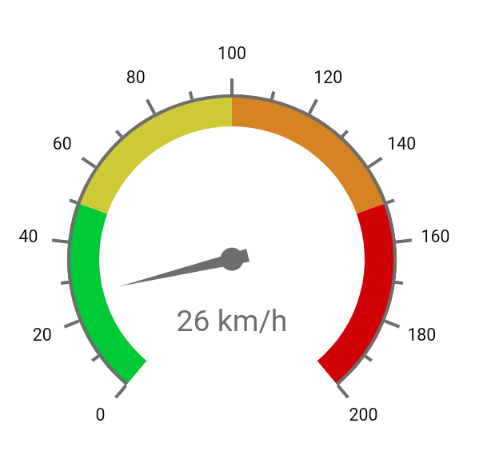 |
 |
Html Link
| Navigation |
|
Html Link |
Control opens an external link or jumps to another control |
The Html Link control lets you add an HTML link to your remote form, which would typically be a website or some other external resource outside your application. By default, the link will open in a new browser tab or window. You can also use the Link Control to jump to a specified control on the same Remote form or within a Subform.
External Links
The URL for an external link is assigned in the $linkurl property as a string. Alternatively, the URL can be assigned using an instance variable named in the $linkurlname property, which if specified will take precedence over $linkurl.
If $linkopensinnewtab is kTrue (the default) the link will open in a new browser tab or window, leaving the remote form open on the original tab or window. If $linkopensinnewtab is set to kFalse, the link will open in the current tab or window, which will take the browser focus away from the current remote form which could have unintended consequences, such as losing any unsaved data in the form.
The text for the link is entered into the $text property. Alternatively, you can assign text using an instance variable specified in the $dataname property, which if specified takes precedence over $text.
If the $linkurl or $linkurlname properties (or $linkedobject, see below) are empty, then the URL for the Html Link control defaults to the text from $text or $dataname, provided they have a valid URL format (http://... or https://...).
Internal Links
The Link Control can also be used to link to another control on the same Remote form, or within a Subform, which is analogous to a page anchor in HTML where the focus jumps to another place in the form. To link to a control on the same form, enter the name of the control in the $linkedobject property; if specified, this will take precedence over $linkurlname. A select box will appear as you start typing a control name into $linkedobject in the Property Manager. When the link is clicked, the form focus will jump to the specified control, scrolling the form if necessary.
To link to a control within a subform, enter the name of the subform followed by the name of the control separated by a dot. Controls within nested subforms can be chained using dot notation. For example, a label "label1" within subform "subformInner" within subform "subformOuter" can be accessed as: "subformOuter.subformInner.label1". Note that there is no select box help for linking to controls within subforms. When the link is clicked, the form focus will jump to the specified control inside the subform, scrolling the main form and subform if necessary.
Link Colors
The default colors for the different link states follow the HTML standard, that is, blue for unvisited, hovered, and focused links, purple for visited links and red for active links, but these can be overridden by setting the link color properties under the Text tab in the Property Manager, which are initially set to kColorDefault.
| $linkactivecolor |
The color of active links |
| $textcolor |
The color of unvisited links |
| $linkvisitedcolor |
The color of visited links |
| $linkhovercolor |
The color of hovered and focused links |
The default color of an unvisited link can be changed in the $textcolor property. If $linkhovercolor is set to kColorDefault, the hovered and focused states will use the same value as $textcolor.
The link underlining can be controlled using $linkisunderlined. In the hover and focus states underlining is removed by default.
Html Link Events
The Html Link Control reports the evClick event which needs to be enabled in the $events property.
The default event behavior for evClick can be overridden in the $event method using the Quit event handler (Discard event) command.
Html Object
| Media |
|
Html Object |
Object to display HTML content |
The Html Object lets you display an HTML page or fragment in a remote form, such as an HTML link or formatted paragraph. The $html property contains the HTML content for the control. There is an example app called JS HTML under the Samples option in the Studio Browser, and the same app is available in the Omnis Components app on the Omnis website.
The HTML content for the control must start with an element declaration such as <div...> or <style>. The $wraptext property is set to true by default meaning that the content in the control will wrap (set it to kFalse to stop wrapping): this property sets white-space for the control to 'normal' if true, and 'no-wrap' if false.
HTML Preview
The HTML control has a property, $showruntimepreview, which defaults to kTrue, which ensures the HTML is rendered in the remote form rather than showing the HTML code text. If $showruntimepreview is false, the HTML code text is shown, but it cannot be scrolled inside the control in the design window.
Custom JavaScript Controls (Deprecated)
Note: This technique using $ctrlname to add custom controls to a remote form is deprecated. You should instead use JSON-defined controls: see the JSON Components chapter.
You can use a custom JavaScript control on a remote form by embedding it in an HTML Object. To do this, the JavaScript file defining the custom control must be placed in the html/scripts folder and referenced in the HTML file containing your remote form (this can be added to the jsctempl.htm file or the specific HTML page containing your remote form). The name of the custom control class (as defined in its JavaScript file) must then be added to the $ctrlname property of the HTML Object.
If you want your custom control to inherit the HTML control's specific functionality (such as the use of $html and its placeholders feature), your custom control must inherit from ctrl_html, rather than ctrl_base (and do not override this.superclass, instead use a different variable to reference the ctrl_html immediate parent class).
HTML Examples
The example library (under the Samples option in the Studio Browser) shows how you can use HTML to format text using tages and styles, and embed the content into a Remote form.
The same app contains a more complex example showing how you can format HTML for an email. In addition to the HTML example app, there are also two examples in the Samples section in the Studio Browser (and in the Component Gallery) to display a Twitter button and a Twitter Timeline that use the HTML component to embed the necessary HTML into a remote form.
The following HTML is used to create the initial Twitter button:
<div><a href="https://twitter.com/intent/tweet?screen_name=omnisstudio&text=I love Omnis" class="twitter-mention-button" data-size="large">Tweet to @omnisstudio</a></div>
Building an HTML block
You can use the Text: or Sta: command to build up the HTML content. The following method constructs some HTML and assigns it to $html of an HTML control called HTML.
Begin statement
Sta: <style>
Sta: p {color: #00F; margin: 0 2em; padding: 1em; background-color: #fff; border: #DDD solid 2px;}
Sta: h1, h2 { color: #666; margin-left: 0.5em;}
Sta: img {margin: 5px 0 5px 50px;}
Sta: </style
Sta: <div>
Sta: <h1>HTML Control</h1>
Sta: <p>
Sta: You can display HTML in the HTML con.<br />
Sta: This is the Second line of con.<br /><br />
Sta: <i>And you can do italic etc!</i>
Sta: </p>
Sta: <h2>Pictures</h2>
Sta: <p>You can embed pictures.</p>
Sta: <img src="/images/cat.jpg" width="200" height="176" alt="cat" />
Sta: </div>
End statement
Get statement lHTML
Calculate $cinst.$objs.HTML.$html as lHTML
You can embed any of the standard HTML tags into the $html property, including links, styles, and tables. The following text could be added to an HTML control which is placed next to a check box control on a remote form to allow end users to popup a window containing competition rules that are stored in a static html page:
<p>I have read and agree to the <a href="rules.html" target="_blank">competition rules</a></p>
HTML Control Events
The HTML Control reports the evBefore and evAfter events, as well as evClick and evDoubleClick.
Style and Attribute Placeholders
You can inherit the effects and font attributes that you set for the HTML object in the Property Manager in design mode by inserting various placeholders in the $html property. The placeholders take the format %<letter>, for example, insert %f to inherit the font specified in $font, or %t to inherit the text color set in $textcolor. Most of the placeholders should be inserted into an html element using the style tag, while others are attributes and can be inserted directly into an HTML element.
| %b |
attribute |
back color and alpha |
$backcolor and $alpha |
| %f |
style |
font |
$font |
| %z |
style |
font size |
$fontsize |
| %s |
style |
font style |
$fontstyle |
| %j |
style |
font align |
$align |
| %t |
style |
text color |
$textcolor |
| %e |
attribute |
effect |
$effect |
| %p |
style |
position |
coordinates of omnisobject |
| %v |
style |
vert scroll |
$vertscroll must be kTrue |
| %h |
style |
horz scroll |
$horzscroll must be kTrue |
For example, you can set $html to <div %e></div> and the text in the control will take on the effect from $effect (or $linestyle or $bordercolor, as these are effect properties).
To use the font specified in the HTML object in a paragraph in your HTML insert: <div><p style="%f">SOME TEXT</p></div>. For example, the following HTML produces some text rendered in plain or default HTML paragraph style and second paragraph of text that uses the font setting specified in $font in the HTML object, which in this case is set to “Verdana,Arial,Helvetica,Sans-serif”:
<div><p>PLAIN TEXT</p><p style="%f”>STYLED TEXT</p></div>
HTML object in Paged Panes and Subforms
If the HTML object appears in a Paged Pane or Subform (i.e. inside any container field), you will need to add the “white-space:normal” parameter to the <div> tag containing your Html to allow the text to wrap correctly inside the object. For example, the following <div> tag will contain text etc within a 300px width:
<div style="width:300px; white-space:normal">

# your HTML

</div>
Hyperlink Control
| Navigation |
|
Hyperlink |
List containing hyperlink style options |
The Hyperlink Control allows you to present a list of options to the end user, where each option in the list is displayed as a web-style hyperlink; each link option corresponds to a line in the underlying list variable used to populate the list. If the whole list does not fit inside the control, the list will “pop up” when the end user passes the mouse over the control. The $extraspace property specifies extra spacing between links. The Hyperlink control is used in the Studio Browser and is very similar to the JavaScript version of the control.
The options or list contents in the Hyperlink control are based on the contents of a list variable specified in $dataname. The first column in the list should be the text displayed for each option listed in the control, unless $listcolumn is specified which is the column of the list variable used to populate the control. Subsequent columns in the list can be used to specify other values.
When the end user clicks on the list an evClick is triggered with the selected line reported in pLineNumber. You can use the value of pLineNumber in your event method to trigger an action. You can create an empty line by putting ”-“ (hyphen) in the first column.
If $isvertical is kTrue the list pops up vertically, and if $shouldunderline is kTrue the links are underlined. The $selectedtextcolor property specifies the color of the text when the mouse is over it.
Hyperlink Example
There is an example library called JS Hyperlink under the Samples option in the Studio Browser showing how you can build a dynamic hierarchical list using the Hyperlink control; the same app is available in the Omnis Components app on the Omnis website.
The following method is the $event() method for the Hyperlink control:
On evClick
Do iHyperLinks.$line.$assign(pLineNumber)
Do iHyperLinks.$loadcols()
If iHyperGrp=0
Do method getHyperLinks (iHyperCmd)
Else
If iHyperCmd=99
Do method getHyperLinks (0)
Else
Calculate iMsg as con('HyperLink ',iHyperCmd,' of Group ',pick(iHyperGrp,'','A','B','C','D'),' Clicked')
End If
End If
Label Object
| Labels |
|
Label Object |
Basic label object |
The Label Object lets you add standard text labels to your remote form. The text for the label is entered into the $text property in the Property Manager, or you can double-click on the text for the label to edit it. Alternatively, you can assign some text to the $text property in your code.
The font and alignment of the label is setup under the Text tab in the Property Manager.
If $issingleline is true, the text will not wrap and will show ellipses if it does not fit in the control's bounds.
You can use the style() function to style parts of the text assigned to $text, for example:
Calculate $cinst.$objs.label1.$text as con('Mellow ',style(kEscColor,kYellow),"Yellow")
Styled text is only supported if $textishtml is false. When set to true, the $textishtml property means the text in $text is interpreted as HTML, so in this case you can use any HTML tags and styling to format the text. For example:
Calculate $cinst.$objs.labelhtml1.$text as 'This is <span style="color:#ff0000;">RED</span>'
Labels have the $dataname property which means you can assign the text from a variable. In this case, the value in $dataname overrides the value in the $text property, and actually sets $text. You can assign a Date variable to $dataname, in which case the label takes its display format from #FDT, #FD, or #FT depending on whether the variable has a date/time component.
List Control
| Lists |
|
List |
Standard list field for displaying list variable data |
The standard List Control allows you to display a single column list on your remote form allowing end users to select a particular line; the following screen shows a simple product list using the ‘ice’ JS Theme.
If the $ischecklist property is kTrue in the standard List control, each list line has a checkbox which allows the end user to select or de-select the line, which is useful for multi-select lists or checklists.
There are several example apps showing different types of list control under the Samples option in the Studio Browser (see JS List, JS Linked List, JS List Pager), and the same apps are available in the Omnis Components app on the Omnis website.
For lists with many columns, you may prefer to use a Data Grid Control, or for a more compact single-column list you can use a Droplist Control. If you want to include an icon next to the text in each list line you can use a Tree List Control by including your data and icon references at the top-level of the list data without using any child data. For a further alternative to the standard List box, you can use the Native List to display list data but with a native appearance on each OS.
List data variable
The contents of a standard List is taken from the instance variable (of List type) specified in the $dataname of the control. In this case, the first column of the list contents is used to populate the list control; you can specify an alternative column for the data in $listcolumn. You can build the list using an instance variable of List type in the $construct method of the remote form so it is available to all instances; the list can be built from your database or from a number of static values.
The JS List example app in the Studio Browser uses a simple check list ($ischecklist = kTrue) and a standard List control; the check list is built in the $construct method of the form, as follows:
Do iCheckList.$define(iCheckListValue)
Do iCheckList.$add('Milk')
Do iCheckList.$add('Tea')
Do iCheckList.$add('Coffee')
Do iCheckList.$add('Sugar')
Do iCheckList.$sort(iCheckListValue)
Do iListvar.$line.$assign(1)
The example app provides a button to merge the selected lines in the check list into the other list. The code behind the button is:
On evClick
Do iList.$merge(iCheckList,kFalse,kTrue,kTrue)
See the ‘Programming Lists’ chapter in the Omnis Programming manual for more information about using list variables in your code.
Selected Line Color
You can control the color for selected lines by setting $selectedlinecolor; use kColorDefault for the default selected line color for the client OS, or the current JS theme. The $evenrowcolor property sets the background color of even numbered rows displayed in the list; kColorDefault means use the same color as the odd numbered rows ($backcolor).
List Events
When the user selects a line the evClick event is reported with the pLineNumber parameter reporting the selected line number. You can also set the evDoubleClick event for a list control to detect when the end user double clicks on a list line. List events will retuen the pLineNumber parameter containing the number of the line clicked, and you can use this in your event method behind the list to trigger an action.
A double-click event is sent to a List control if the Enter or Space key is pressed while the focus is in the List and if evDoubleClick is enabled on the list. Otherwise, if the control has an evClick event enabled, Enter/Space sends an evClick. If the control does not have the evClick or evDoubleClick enabled, then Enter triggers the okkeyobject (if there is one), as long as the state of the list has not changed, i.e. the current line has not changed, and no checkbox has been toggled.
Lists and Client Methods
Searching Lists
You need to prefix the column name with $ref for a search to work in a client method. For example:
Do iList.$search($ref.iCol="ABC")
Smart Lists and the JavaScript Client
The JavaScript Client does not support smart lists in client executed methods, insofar as if you change the list in some way on the client, it will no longer be a smart list when the updated data is sent from the client back to the server. Smart lists work as expected in server executed methods.
Lists have the $vscroll and $hscroll properties which allow you to scroll a list vertically or horizontally at runtime in the client browser; note these properties are write-only meaning that you cannot return their values at runtime. The vertical or horizontal scroll value assigned using $vscroll or $hscroll is the row number for a list.
Changing Current Line from the Keyboard
The $keyboardchangesline property determines whether or not the the current line in the list changes when the end user navigates the list using the keyboard; the property is available in the standard JS List, Native lists, Tree lists, and Data grids, and only takes effect when $multipleselect is kTrue. This allows multiple rows to be selected while also having the keyboard change the current line. To enable users to select non-adjacent lines with the keyboard, $keyboardchangesline can be set to kFalse.
When the list only allows a single line to be selected ($multipleselect is kFalse), navigating the list with the keyboard always uses a focus line and the user has to manually select a current line with the Space or Enter key, at which point evClick is fired.
Linked Lists
You can link a List control to an Entry field to create a "Linked List", so that when the end user types into the edit field the contents of the list is updated dynamically.
There is an example app called JS Linked List under the Samples option in the Studio Browser to show the use of a Linked list; the same app is available in the Omnis Components app on the Omnis website.
The combination of an Entry field with key presses enabled and a List control allow you to create a dynamic list that has the ability to update in response to what the end user types into the edit box. A Linked List is in effect like a Combo box, but with the extra ability to update itself as the user types. To enable this feature, edit controls can detect certain key presses and can be linked to a list control, while for lists themselves there is a property to display selected lines only.
Creating a Linked List
The Edit Control has the $linkedobject property which is the name of a list control on the current remote form used to display suggestions to the user if the Entry field enables the evKeyPress event. You need to add the code to populate the list in response to evKeyPress, based on the current value of the instance variable specified for the Entry field.
When the end user types into the Entry field, the linked list will appear automatically. It is not necessary to process any events for the list control, since the dynamic list behavior is determined automatically by being linked in this way. Therefore, you would expect the following to happen when end users are using a dynamic linked list:
Clicking on a line in the open list will set the edit control to the value of the clicked line.
Pressing up or down arrow when the focus is on the list control will set the value of the edit control to the new current line of the list.
Pressing the down or up arrow when the edit control has the focus and when the list is not visible will open the list, set the edit control value to the selected line in the list, and move focus to the list.
Typing into the edit control when the list is closed will open the list and keep focus on the edit control.
All the following will close the list: pressing return when the list has focus; pressing escape, or clicking away from the list or the edit control.
Optimizing the Linked List
The list property $selectedlinesonly specifies that only the selected lines in a list will be displayed (this only applies when $ischecklist is false), which in the context of Linked lists allows you to filter the content of a list that is linked to an Entry field. You should optimize the $event method for the edit control in the following way:
Make the $event method for the Entry field execute on the client.
On evKeyPress, if the list of suggestions is empty (or no longer suitable for the data), call a server method to build the list (with lines selected based on the value of the edit control).
In subsequent evKeyPress events that can use the pre-built list, perform a list $search to change the selected lines to the ones which are suitable for the new value of the edit control.
In this way, the list of suggestions is cached on the client, and updates simply by changing the selected lines with a search in your code.
When $selectedlinesonly is true, the processing involving the usual click events and so on all use the line number of the data in the list, not the lines displayed in the list.
Note that if you use the $evenrowcolor property when $selectedlinesonly is true, the even row color applies to the numbers obtained by counting the displayed lines, rather than using the line numbers of the data in the list.
See Field Events for more information about using evKeyPress and other events in Entry Fields.
Detecting clicks on the list
You can capture the value returned from the linked list by detecting the evClick event in the $event method of the list. For example, you could override the value that is being returned from the linked list to the edit control using the following code in the $event method of the list:
On evClick
  Calculate iEditVar as con(iLinkedList.iLinkedListCol,' selected')
The $pagesize property allows you to display the lines in a list or data grid as separate pages, to improve the user experience when navigating lists or grids with a large number of lines; the default value is zero which means no list pager is displayed. The $pagesize property is available for the JS List, Data Grid, Complex Grid, and Native List (when not using grouped lists).
There is an example app showing the List pager for all these list types under the Samples option in the Studio Browser.
When assigned an integer value, the $pagesize property forces the contents of the list or grid to be sub-divided into a number of scrollable pages, and a set of page number buttons (as well as forward and back buttons) are displayed under the list or grid box, which allows the end user to “page through” each group of lines in the list or grid.
The value assigned to $pagesize specifies the number of list lines displayed in each page, and therefore the total number of lines in the list, divided by the value of $pagesize determines the number of pages in the list or grid field, as well as the number of buttons displayed in the pager panel. The $pagerpage property allows you to set the page to be displayed, with the first page as the default.
Note that setting $pagesize does not reduce the amount of data sent to or fetched from the server – the full list data is sent to the client, and the setting of $pagesize is only used for displaying the list or grid with the pager element.
End users can long press on the Previous or Next arrow buttons on a List pager to jump to the Start or End of the pages displayed in the list control. The timer for the long press is hard coded to 700ms.
The appearance of the pager, such as the color of the buttons, numbers, and arrows, cannot be controlled using standard component properties. However, if you wish to customize the appearance of the pager, you can do so by overriding the associated CSS classes. These classes are named ‘omnis-pager<-xxx>’ and are listed in the core.css file. Note that this file is minified, so you may want to use a prettifier tool to make it more human-legible. Do not edit the classes in core.css, rather you should override the classes by adding your own version in the user.css file found in the html\css folder in your Omnis development tree.
Map Control
| Other |
|
Map |
Displays a Google map for specified location(s) |
The Map Control allows you to place a Google Map® on your remote form; this provides many of the functions available in a Google map as provided by the Google Maps API, such as placing your own markers or customizing the markers.
There is an example app called JS Map under the Samples option in the Studio Browser showing the full capability of the Map control; the same app is available in the Omnis Components app on the Omnis website, to see many of its capabilities, but you will need a Google API key to run the example app in development mode.
The JS Map sample app prompts you to enter a Google Map API key when it is opened. The Map API key you enter is stored in the "mapsApiKey" entry in "jsclient" section of config.json and is loaded each time the sample app is opened. When you deploy your app you can add your Map API key to config.json on the Omnis Server.
The Map control has the standard properties to control its appearance including $edgefloat, for example, so you can fit the map to the current client area or container, as well as $borderradius allowing you to set a border radius.
Activation and API Key
In order to use the Map control, you need to register with Google Cloud Platform to obtain a Map API key, which can be entered in the $apikey property of the Omnis Map control; the Map control will not work without the API key. Specifically, you need to:
Create and activate a Google Cloud Platform account (a free trial is available with credits)
In the console under Credentials, create a new API key; copy this API key and add it to the $apikey property of the Omnis Map control in your remote form
Under APIs, navigate to Map APIs and enable the “Maps JavaScript API”. In addition, if you want to use the Geocode function, you need to enable “Geocoding API” (there are other APIs which you may be able to use).
Important Note: By signing up to Google Maps API via the Google Cloud Platform and using Google Maps in your deployed Omnis application, you and your end users must agree to the general “Terms of Use” for Google Maps: there is a link to these Terms of use on the map displayed in the Map control. Omnis Software cannot be held responsible for any third-party products or services and will not be liable for any damage or loss resulting from your use of the Google Maps content or the products.
Apart from the $apikey property, there is no further configuration needed to display a basic Google map in your remote form, however, to make the map useful you will probably want to display specific locations, add markers on the map, or allow end users to interact with the map: all of these are possible with the JS Map control and are described below.
Map Location and Zoom Level
The $latlong property allows you to specify the center location of the map as “latitude:longitude”, for example, a value of 40.749305:-73.985775 will center the map on New York. If you do not set $latlong initially (by setting the property in the Property Manager in design mode or in the $construct method of the form), the map will open at some unspecified location, usually the default location setup in Google on the client device.
The $::zoom property lets you set the zoom level of the map: the range is 0 to 21, with zero showing the largest area (the whole world) and 21 the smallest possible area. The default zoom level is 8 which shows a reasonable amount of detail for the current center location of the map.
Finding the Latitude:Longitude
The Map component supports Google Geocoding which allows you to convert a street address into a geographic coordinate like latitude and longitude, which you can use to place a marker on a map, or center the map.
To use the Geocoding function, you need to access the Geocoding API which itself requires a separate API Key, in addition to the Maps API key, which you can obtain from Google.
There is a Search button in the JS Map example available in the Studio Browser to show how you can convert a street address to a latitude:longitude coordinate which can be applied to the $latlong map property. Note the example app places the Geocoding API key in the $userinfo property which is then sent to Google.
Alternatively, you can find the latitude:longitude coordinate manually. To do this, Right-click somewhere on a standard browser-based Google map (not the Omnis map control), select the ‘What’s here’ option and the latitude:longitude value of that position is shown on the popup. You need to replace the comma with a colon to be used as a parameter in Omnis, e.g. 52.223460:1.492379.
Map Type and Controls
The $maptype property lets you set the type of map – this can be set to a constant: kJSMapTypeRoad (default), kJSMapTypeSatellite, kJSMapTypeHybrid, and kJSMapTypeTerrain. The end user can change the map type using the map type control shown on the map, assuming the $maptypecontrol property is enabled.
The other standard map controls, including the pan control, scale control, and the street view control are enabled using the properties $pancontrol, $scalecontrol, and $streetviewcontrol, respectively (these are all enabled by default): note you can only change these properties at runtime if the map control itself is enabled ($enable = kTrue).
The zoom control can be further controlled by setting the $zoomcontrol property: it can be set to kJSMapZoomOff, kJSMapZoomDefault (the default), kJSMapZoomSmall, and kJSMapZoomLarge. The latter two settings correspond to a simple Plus|Minus button (Small) or the same button with a vertical slider control (Large) for finer adjustment of the map zoom level.
Map Markers
You can place a marker or set of markers on the map by assigning a row or list containing marker information to the $mapmarkers property. For each marker you must define the latitude and longitude of the marker location in the first column of the setup list in the format latitude:longitude (e.g. “40.749305:-73.985775”), and in subsequent columns you can specify the marker title (shown when you hover over the marker), the tag or title for the popup (shown when you click on the marker), and html content for the popup. An optional fifth parameter can specify an icon for the marker to replace the default map marker (see below). If the third and fourth columns are empty for any marker defined in the list, the marker will not popup when clicked. (See the Events section about how to add markers via user clicks.)
The following code adds markers to a map indicating the Empire State Building and Central Park in New York, it then centers the map on the Empire State Building, and sets a zoom level of 12 which shows a reasonable level of detail in this case:
Do map_markers.$define(marker_latlong,marker_title,marker_tag,marker_html)
Do map_markers.$add("40.749305:-73.985775","Empire State Building","Empire State Building",>"<div id='content'><h3 id='firstHeading'>Empire State Building</h3><div id='bodyContent'><p><b><img src='http://nyc-architecture.com/MID/esb1.jpg'></b></p></div></div>")
Do map_markers.$add("40.766225:-73.972514","Central Park","NY Central Park","<div id='content'><h3 id='firstHeading'>Central Park</h3><div id='bodyContent'><p><b>Central Park Info</b></p></div></div>")
Do $cinst.$objs.map.$mapmarkers.$assign("map_markers")
Do $cinst.$objs.map.$latlong.$assign("40.749305:-73.985775")
Do $cinst.$objs.map.$::zoom.$assign(12)
Map Marker Icons
The marker list assigned to $mapmarkers can have an optional fifth column which you can use to specify the icon URL for an image for the map marker. An empty string in this column (or a missing column altogether) means that the marker will use the default marker icon. You can use an SVG icon for a map marker in which case it will scale as the map is scaled.
The value for the marker icon is an icon URL which you set using the iconurl() function. Since the marker image has to be set for each row in your list you can specify a different image for each marker in the marker list, but if you want the same image for each map marker you have to set the marker image for every row in your marker list.
When an SVG icon is used, you can add an additional column to the list to specify the color to apply to that SVG icon, which must be themed using the JS Themer tool. The color should either be a JS Theme constant, such as kJSThemeColorPrimary, or an RGB integer.
Custom Markers
You can assign an alternative marker icon or symbol, including map markers from the Google maps API, by adding a sixth column to the marker list: in this case the fifth column should be omitted.
The definition for the markers list in the JavaScript Map control can be:
Do iMapMarkers.$define(iMarkerLatLong, iMarkerTitle, iMarkerTag, iMarkerHtml, iMarkerIcon, iMarkerCustom)
where iMarkerCustom is a new string column (column 6) specifying a custom marker. When a marker is defined in the marker list, and the iMarkerIcon (column 5) is empty, iMarkerCustom can be included with the following attributes, separated with a ‘|’ character (you only need to specify the attributes required). An example custom string would be:
"path:google.maps.SymbolPath.BACKWARD_CLOSED_ARROW | fillColor: red | fillOpacity:0.8 | scale: 4 | strokeColor:black | strokeWeight: 1"
Or to draw a five-pointed star marker:
"path:M 125,5 155,90 245,90 175,145 200,230 125,180 50,230 75,145 5,90 95,90 z | fillColor: red |

fillOpacity:0.8 |  scale: 0.1|strokeColor:black | strokeWeight: 1 | anchor:122,115"
Or to draw a circle marker:
"path:google.maps.SymbolPath.CIRCLE | fillColor: red | fillOpacity:0.8 | scale: 4"
Where the custom marker parameters are defined as:
path can either be a map symbol, or an SVG notation path, as defined below
fillColor the color used to fill the marker object, an html css color name or value e.g. #FF0000
fillOpacity the opacity of the fill color, a value from 0 to 1, e.g. 0.5 is 50% transparent fill
scale a scaling factor for the object
strokeColor the color used to outline the object, an html css color name or value e.g. #FF0000
strokeWeight the thickness of the stroke line
anchor allows you to set the anchor position or offset the shape. By default, shapes are aligned to the top left of the marker relative to its lat:long
 |
CIRCLE |
A circle |
 |
BACKWARD_CLOSED_ARROW |
A backward-pointing arrow that is closed on all sides |
 |
FORWARD_CLOSED_ARROW |
A forward-pointing arrow that is closed on all sides |
 |
BACKWARD_OPEN_ARROW |
A backward-pointing arrow that is open on one side |
 |
FORWARD_OPEN_ARROW |
A forward-pointing arrow that is open on one side |
For example:
Do iMapMarkers.$define(iMarkerLatLong,iMarkerTitle,iMarkerTag,iMarkerHtml, ,iMarkerCustom)
Do iMapMarkers.$add("52.223460:1.492379","Omnis UK","Omnis UK","","","path:google.maps.SymbolPath.BACKWARD_CLOSED_ARROW|fillColor: red|fillOpacity:0.8| scale: 8|strokeColor:black|strokeWeight: 1")
The Map example app includes the use of markers and polygons, and is available in the Omnis Components app on the Omnis website. The following image shows the location of the European Omnis offices using the “Backward-pointing Closed Arrow”.
The map control has a property $fitmaptomarkers that can be assigned value 1 at runtime to force the map to zoom in or out to allow all the map markers to be shown.
Polygon Objects
In addition to icons and standard map markers, you can add polygon objects or irregular shapes to maps in the JavaScript Map control. The $mappolys property specifies the data name of a list which contains the definition of each polygon or shape as follows:
Do iPolyMarkers.$define(iPolyLatLong,iPolyStroke,iPolyOpacity,iPolyWeight,iPolyFill,iPolyFillOpacity,iPolyTag)
iPolyLatLong the latitude:longitude values for each of the the points of the polygon, so a triangle would have 3 points: the lat:long settings are separated with the ‘|’ character, e.g. 25.774,-80.190|18.466,-66.118|32.321,-64.757|25.774,-80.190
iPolyStroke the color used to outline the polygon, which is an html css color name or value e.g. #FF0000
iPolyOpacity the opacity of the stroke color, a value from 0 to 1, e.g. 0.5 is 50% transparent
iPolyWeight the thickness of the stroke line
iPolyFill the fill color of the polygon object, an html css color name or value e.g. #FF0000
iPolyFillOpacity the opacity of the fill color, a value from 0 to 1, e.g. 0.5 is 50% transparent
iPolyTag the tag name or label for the polygon, which is sent to the evPolygonClicked event method in pPoly
For example, the following code draws the Bermuda Triangle on the map (see the JS Map example app):
Do iPolyMarkers.$add("25.774,-80.190|18.466,-66.118|32.321,-64.757|25.774,-80.190","#FF0000","0.8","3","#FF0000","0.35","Bermuda Triangle")
The evPolygonClicked event with the parameter pPoly is called when a polygon on the map is clicked, and pPoly will be set to the polygon tag as defined in the list.
Map Events
There are various events available in the Map control to allow you to detect when and where the map was clicked (evMapClicked, reports latitude and longitude of the click), when the map is dragged by the end user (evMapMoved, reports the latitude and longitude of the new center location), when the map is zoomed using the zoom control (evMapZoomed), or when a map marker is clicked (evMarkerClicked). None of these events are enabled by default, so you have to enable them in the $events property for the control using the Property Manager.
The following $event method could be placed behind a map control to detect when the map is clicked, or when a marker is clicked (assuming a marker has been added), or if the map is moved or zoomed. The add_markers Boolean variable is linked to a checkbox on the window to allow the end user to enable or disable the ability to add markers. When the map is clicked, the evMapClicked event reports the position in pLatlong, and a marker definition is added to the map_markers list. The message variable is assigned to a field on the form to show either the new center of the map, the new zoom level, or which marker has been clicked.
On evMapClicked
If add_markers
Calculate marker_no as marker_no+1
Do map_markers.$define(marker_latlong,marker_title,marker_tag,marker_html)
Do map_markers.$add(pLatlong,con("Marker ",marker_no),con("Marker ",marker_no),con("This is marker ",marker_no))
Do $cinst.$objs.map.$mapmarkers.$assign("map_markers")
End If
Calculate message as con(pick(add_markers,"Map clicked here: ","Marker added here: "),pLatlong)
On evMapMoved
Calculate message as con("Center is now: ",pNewCenter)
On evMapZoomed
Calculate message as con("New zoom level: ",pNewZoom)
On evMarkerClicked
Calculate message as con("Marker clicked: ",pMarker)
Markdown Object
| Media |
|
Markdown Object |
Object to display Markdown content |
The Markdown Object allows you to render markdown content in a remote form. The markdown content should be loaded into a character instance variable which is specified in the $dataname property.
There is an example app called JS Markdown under the Samples option in the Studio Browser showing how markdown can be rendered in a remote form.
Markdown Syntax Support
The Markdown Object supports the Basic markdown syntax elements, including headings, italics, bold text, blockquotes, lists, tables, images, links, horizontal rules and code. Note that most Extended syntax elements are not supported. For further information on the Markdown language, including how markdown elements are structured, see the Markdown Guide.
All the Basic markdown syntax elements are supported, as per the Markdown Guide cheat sheet, together with the following Extended elements: Heading ids (custom ids), Tables, Fenced code blocks and Strikethrough.
Extended syntax elements that are not supported include: Footnotes, Definition Lists, Emoji shortcodes, Highlight, Subscript, and Superscript. Tasklists (checkbox lists) will be parsed as defined in the markdown, but cannot be toggled on and off in the Markdown object.
Building the Markdown Block
Markdown content can be constructed as a text block using the Begin text block and End text block commands, and using the Line: command to create each line of markdown content. For example:
Begin text block
Line:# A **Markdown** example
Line:
Line:An unordered List:
Line:- item 1
Line:- item 2
Line:- item 3
End text block
Get text block iMarkdown
If you are using square brackets in an Omnis text block to create certain elements in the markdown content (such as links, see below), you need to include two opening square brackets to stop Omnis trying to evaluate the contents. You can examine the getMarkdown method in the sample app to see how markdown content can be built up and for examples of the supported syntax elements.
Blockquotes can be added by starting a line with “>”. Blockquotes are distinguished from normal text by indentation and by background color.
Horizontal ruling lines can be drawn using three or more asterisks (***), hyphens (---), or underscores (___).
Hyperlinks
In basic markdown, hyperlinks are denoted by the link text in square brackets followed by the URL in parentheses: [link-text](url.com), however, to be recognized in Omnis block text you must use two open square brackets to start the link text. For example, use the following to define a link: [[Omnis](https://www.omnis.net).
Links to local elements in the same page will open in the same browser tab or window, whereas external links will open in a new browser tab or window.
Code blocks
Code blocks can be added to Markdown content by enclosing multi-line text in three backticks ```Content``` (backtick can be found above the Tab key on a Windows keyboard, or next to the Shift key on a mac). For example:
Line:```

Line:{

Line: "firstName": "John",

Line: "lastName": "Smith",

Line: "age": 25,

Line: "code": "This is a short piece of code"

Line:}

Line:```
The display style used for code blocks is the default code highlighting on a dark background, which is specified in the highlight-theme.css file (the same styling rules are used in the Rich Text Editor control).
Inline code can be added to markdown content by enclosing text in single backticks.
Markdown Object Properties
The Markdown Object has the following properties to change the appearance of rendered markdown elements:
| $headingcolor |
The text color of all headings |
| $imagemaxheight |
The maximum height of images: 0 means no maximum height |
| $imagemaxwidth |
The maximum width of images: 0 means no maximum width |
| $inlinecodebackcolor |
The background color of inline code |
| $inlinecodetextcolor |
The text color of inline code |
| $linkcolor |
The color of link text |
| $linkvisitedcolor |
The color of visited links |
| $quotebackcolor |
The background color of blockquotes |
| $quotetextcolor |
The color of blockquote text |
| $rulecolor |
The color of horizontal rules |
| $scrolltoposition |
The position to which the control should scroll when this property is set and as new data is added, a constant: kJSMarkdownMaintainScroll (the default), kJSMarkdownScrollToTop, or kJSMarkdownScrollToBottom |
| $tablebordercolor |
The color of table borders |
| $tablemaxwidth |
The maximum width of tables: 0 means no maximum width |
| $tableminwidth |
The minimum width of tables: 0 means no maximum width |
In addition to the above properties, the Markdown Object has various standard properties that you can use to change the appearance of some elements, including: $textcolor, $backcolor, $fontsize, $vertpadding and $horzpadding (the padding properties set the padding around the whole markdown content block).
Markdown Object Events
The evLinkClick event is triggered when the user clicks on a link. The pLinkUrl parameter holds the url of the clicked link, and the pLinkText parameter holds the text associated with the link. The default event behavior can be overridden in your event method using Quit event handler (Discard event).
Native List
| Native |
|
Native List |
List control with platform dependent appearance |
About the Native Controls
The Native group in the Component Store contains components that have a more familiar or “native” appearance when they are displayed on different mobile platforms, that is, iOS and Android – their appearance is rendered in the JavaScript Client using CSS customized for each platform. The different appearance for each platform is handled by Omnis automatically, therefore you only need to setup the component once in design mode. See also: Native Slider and Native Switch.
When running on a supported device, these controls will render and work in a manner close to a device’s native versions. For example, a Native Switch control will look like an iOS switch on an iOS device, an Android switch on an Android device, and so on, while using a single control and set of methods in design mode in your remote form.
JavaScript Remote forms have an Appearance property called $defaultappearance which determines both how a native control is displayed in the design window, and how it would render on non-supported clients (e.g. Desktop browsers). The property is either kAppearanceiOS or kAppearanceAndroid.
The $defaultappearance property can also be switched using the ‘Native Components Display As’ context menu option of a JavaScript Remote Form (right-click on the form to open the context menu). You can also cycle through the values using the keyboard shortcut Ctrl-Shift-N on Windows or Cmd-Shift-N on macOS when the remote form is the top window.
It is recommended that you set $disablesystemfocus property to kTrue for any native controls, to prevent the focus ring being drawn around a control when it is selected – otherwise the focus ring may interfere with the native appearance.
Creating a Native List
The Native List control provides a list control that has a native appearance on different platforms, that is, it has a different appearance on iOS and Android. You can customize the accessories in the list by adding your own HTML content and CSS styling, and therefore provide a very rich UI in a single list format.
In keeping with this philosophy, the JS Native List exposes many appearance properties to allow you to customize the list how you wish. If you leave any of the values as kColorDefault, they will revert to the platform-specific default.
The native list has been designed along the same lines as the iTableView component of iOS forms. The list can either be a standard flat list or a grouped list, using nested lists.
To increase efficiency, the list only draws the displayed rows, along with several more in a buffer zone around them, at any one time. This provides smooth scrolling, and means that the size of the list has very little impact on performance. As a side-effect of this, when scrolling quickly, you will see that the rows may not be rendered immediately.
There is an example app called JS Native List under the Samples option in the Studio Browser showing how you can customize the accessories in a native list; the same app is available in the Omnis Components app on the Omnis website. Examine the $construct method in the example app to see how the data list is constructed for the Native list.
Defining the data for a Native list
The structure of the List instance variable used for the $dataname of the Native List control differs based on how you wish the list to display.
The Data tab in the Property Manager allows you to assign column numbers for each row part, i.e. $text1col allows you to specify which column in your list contains the the data to display as the main text of the row. If you do not wish to make use of a particular row part, leave its column set to 0.
You need to define and populate your list in accordance with the column numbers you have set in the Data tab of the Property Manager. The content of these columns should be as follows:
text1col: This should be Character data, to display as the main text for the row.
text2col: This should be Character data, to display as the secondary text for the row.
imagecol: This should be Character data, a URL to an image to display in the row: see below.
accessorytypecol: This should be a kJSNativeListAccessoryType… integer value. It determines the type of accessory to display on the right edge of the row.
Use kJSNativeListAccessoryTypeNone for no accessory
accessoryvaluecol: Contains the current value of the row’s accessory.
This is currently only used by the Checklist accessory, to represent the checkbox’s state
accessorycontentcol: This should be Character data, and should describe the content for some accesssory types. The Accessory types which make use of this are:
Button: For rows with a button accessory, the content should be the text for the button.
Custom: For rows with a custom accessory, this should be HTML to describe the contents of your custom accessory.
CustomWithEvent: see below.
Row Icons
The imagecol column in the data list must contain a URL to an image to display in the row. The image will be scaled to fit the size of the row’s image area, but this can be customized using $imageheight and $imagewidth, e.g. set them to 48 to limit the image size.
The image specified in imagecol can be a themed SVG in which case it will be colored in line with the current theme. SVG images are scaled to fit the size of the row’s image area.
The image specified in imagecol can be a PNG. The URL can make use of Omnis’ support for pixel-density-aware image selection by passing the URL in the format: “<URL to 1x image>;<Name of 1.5x image>;<Name of 2x image>” (where all 3 PNG images are in the same location). This means that on a Retina device it will use the 2x image, but on a standard display device it will use the 1x image. As the image is scaled anyway, you could just always use the 2x image, but this method reduces unnecessary bandwidth usage and processing of larger images.
Custom Accessories
You can add your own custom row accessories by setting the accessorycontentcol list column to: kJSNativeListAccessoryTypeCustom, kJSNativeListAccessoryTypeCustomWithEvent or kJSNativeListAccessoryTypeMenu (see below).
kJSNativeListAccessoryTypeCustomWithEvent works in the same way as kJSNativeListAccessoryTypeCustom but will trigger a different click event when you click on the accessory (evClick will be called with pWhat equal to kJSNativeListPartAccessory instead of kJSNativeListPartRow).
When accessorycontentcol is set to a custom accessory, its value should be the HTML content of your custom accessory, encapsulated within a single parent element.
You can set your accessory to a particular size (rather than fill the available space in the row) by providing width & height values in the style tag of your top-level HTML element.
If a size is defined in this way, the native list control will attempt to center the accessory. If this does not work, you may also need to set "position: absolute;" in your style tag. For example:
'<div style="position: absolute; width: 50px; height:25px; background-color: #FF0000;" />'
The kJSNativeListAccessoryTypeMenu accessory adds a menu button to a native list row. The menu can be defined either with the $menulistname property, or a method of the native list called $populatemenu.
The $menulistname property can be assigned a list to define the rows in the menu, which will be used for the menu in all rows in the native list, unless it is overridden by $populatemenu, in which case, menus can be assigned on a per row basis. The $populatemenu method is called when the user selects a menu button which should return a list. The first parameter is the group ID, the second is the row ID. This method can be client or server executed.
Menu lists should have the following columns:
Text (Character): The menu line text
Enabled (Boolean) [optional]: Whether the line is enabled or disabled
CommandID (Integer) [optional]: The command ID
BackColor (Integer) [optional]: The line's background color. Zero means use the default color
TextColor (Integer) [optional]: The line's text color. Zero means use the default color. If lBackColor is a theme constant and lTextColor is null, the text will use the corresponding theme text color
When the user selects a menu line, evClick is sent with pWhat=kJSNativeListPartMenuLine. The parameters pMenuLineNumber and pMenuCommandID can be used to identify the line that was clicked.
You can add icons to menu rows by adding the following columns to the list defining the menu (specified in $menulistname):
Creating a Grouped list
If you wish your Native List control to display its data as a Grouped list, you need to change the structure of the list assigned to $dataname. The main list should comprise two columns:
Column 1: Should be defined as being of type “List”, and each row should contain a list structured as defined above (adhering to the columns specified in the Datatab of the property inspector). All of the rows defined in this sub-list become part of a single group.
Column 2: A Character column, defining the name of the group.
You can add buttons to the group headings, plus button accessories can take an icon (or image) URL as their content. Native Lists have two new properties: $groupaccessorytypecol and $groupaccessorycontentcol, which can be set to column numbers in your main (grouped) list which contain values for the group heading's accessory type, and its content, respectively (these cannot have the value 1 or 2, as they are reserved for the group name and item list).
You can set $groupaccessorytypecol to kJSNativeListAccessoryTypeButton to add a button to the group heading (no other accessory type is currently supported).
$groupaccessorycontentcol can be set to text or an icon/image URL, the image being detected by the URL ending with a .png/.jpg/.jpeg/.svg extension.
If you are not using a URL generated using the iconurl() function, you can specify a size to render the image at by including a URL parameter specifying this with the format _<w>x<h>. For example:
https://omnis.net/developers/resources/favicon.png?_20x20
You can specify a separate tint color for themed SVG icons by including a "color" URL parameter, e.g. con(iconurl("add+24x24"),"&color=red"). Otherwise, the icons will use the color resolved as the $buttontextcolor.
When a group heading accessory is clicked, evClick will be fired. The pWhat parameter will be kJSNativeListPartGroupAccessory, and pGroup will be the group number.
The $extrascrollheight property specifies the extra scroll height added to the end of a Native list. This could be useful to allow space for a Floating Action Button to be displayed over the top of a Native list, for example.
When you set $vscroll (to an integer), a Native List will scroll to the specified row number. For grouped lists, group headers are counted as rows, so to scroll to the 5th row of the 2nd group, you would set $vscroll to 1 + [no. rows in group 1] + 1 + 5.
Row Display Style
The $rowdisplaystyle property determines how the row is displayed. Its value is a kJSNativeListDisplayXXX constant, allowing you to change between displaying the two text fields in a vertical or horizontal orientation.
The $dateformat, $dateformatcustom and $numberformat properties allow you to set the date and number format for a Native list.
Reordering Rows
The $reordermode property can be set to a kJSReorderMode... constant to specify whether rows in a Native list can be reordered. When enabled, a drag icon is added to each row on the left or the right side of the list to allow you to drag individual rows. The constant values are:
| kJSReorderModeNone |
Reordering is disabled (draggable regions are hidden) |
| kJSReorderModeLeft |
Reordering is enabled with draggable regions on the left side of the list |
| kJSReorderModeRight |
Reordering is enabled with draggable regions on the right side of the list |
When $reorderbetweengroups is set to kTrue (the default), end users are able to drag a row into a different group, otherwise if kFalse, rows can only be dragged within their own group.
The evReorder event reports the old and the new position (and group, if applicable) of the row that has been reordered:
- evReorder
Sent when the list is reordered, with the parameters:
pFromGroup: The old group of the moved row
pFromRow: The old position of the moved row
pToGroup: The new group of the moved row
pToRow: The new position of the moved row
Advanced Customization
If you wish to change the default appearance of the Native list for a particular platform, or wish to change something which is not exposed as a property, it is recommended that you extend any relevant CSS styles in your user.css file.
When extending the CSS used by any controls in Omnis, there is the possibility that you may change how a control appears or behaves (especially if you alter sizes), so you do so at your own risk.
Native Slider
| Native |
|
Native Slider |
Slider control with platform dependent appearance |
The Native Slider control works, for the most part, in the same way as the standard Slider component but has a more familiar appearance when running on different platforms, that is, it has a different appearance on iOS and Android.
There is an example app called JS Native Slider under the Samples option in the Studio Browser, and the same app is available in the Omnis Components app on the Omnis website. See also Native List for general information about using the Native controls.
The current value of the slider is reported in the property $val according to where the slider is positioned. You can specify the range for the slider in the $::min and $::max properties. The $usessteps property is a Boolean determining whether or not the slider should snap to discrete step values specified in $step.
The Slider reports three events: evStartSlider (when the control is starting to track), evEndSlider (when the control has finished tracking), and evNewValue (when the value has changed). You can detect these events in the $event method for the component. These events all pass the current value of the Slider in the pSliderValue parameter. As the user drags the Slider thumb the evNewValue event is triggered and pSliderValue is sent to the $event method for the Slider.
If you do use evNewValue, you should mark your $event method as client-executed and consider enabling the $usessteps property and setting $step to limit the number of events being triggered as the user moves the slider. Alternatively, you could use the evEndSlider event to report the final value since for most purposes this will be the value selected by the user.
Native Switch
| Native |
|
Native Switch |
Switch control with platform dependent appearance |
The Native Switch control works, for the most part, in the same way as the standard Switch component but has a more familiar appearance when running on different platforms, that is, it has a different appearance on iOS and Android.
There is an example app called JS Native Switch under the Samples option in the Studio Browser, and the same app is available in the Omnis Components app on the Omnis website. See also Native List for general information about using the Native controls.
The Switch has a $dataname property, to which you can assign a Boolean instance variable. This will be kept up to date with the state of the switch, as the end user clicks or taps on the control.
The Switch has $justifyhoriz and $justifyvert properties. For some platforms (e.g. iOS) the switch maintains a specific aspect ratio. These properties determine how the switch is positioned inside the control in these circumstances.
The text displayed on the Native Switch is controlled by two members in the built-in strings object jOmnisStrings in the JavaScript Client. You can use the members "switch_on" and "switch_off" to replace the default text with your own text, for example, if you wish to provide different language equivalents to the default text.
Information about how to change or localise these strings can be found in this manual, under "Localizing Built-in Strings".
If you wish to override the base text, you could use the following code in a separate JavaScript file loaded in your form's html file after omjsclnt.js:
  jOmnisStrings.base.switch_on = "I";

  jOmnisStrings.base.switch_off = "0";
Navigation Bar Control
| Navigation |
|
Navigation Bar |
Navigation bar with page selection |
The Navigation Bar control (or Nav Bar) provides a standard navigation bar which end users can use to navigate to different parts of your application.
There is an example app called JS Nav Bar under the Samples option in the Studio Browser, and the same app is available in the Omnis Components app on the Omnis website; the following screen shows the example Nav Bar using the ‘sky’ theme.
The Navigation Bar has a main title in the middle of the control, and it can have a left and/or right button which respond(s) to user clicks; see above, Page 2 is displayed, with ‘back’ and ‘forward’ buttons displayed on the left and right, respectively.
The Nav bar can be linked to a Paged Pane via the $linkedobject property to allow you to display different panes in your form in response to clicks in the Nav bar. Actions for the Nav bar can be stacked up using the $push property: see the example below.
The Nav Bar has a number of properties for setting the color, fonts and style of the bar and buttons ($button.. properties), together with the following properties:
| $disableanimation |
Disables the animation when moving between pages. This property can only be set in design mode (not at runtime using the notation) |
| $initiallefticonid |
If this is not zero, and $initiallefttext is empty, the first navigation bar item has a button on the left hand side, displaying this icon |
| $initiallefttext |
If this is not empty, the first navigation bar item has a button on the left hand side, displaying this text |
| $initialrighticonid |
The icon for the initial navigation bar button on the right |
| $initialrighttext |
The text for the initial navigation bar button on the right |
| $initialtitle |
The initial title displayed on the navigation bar |
| $lefthidden |
If true, the left hand (back) button is hidden for the current navigation bar stack item |
| $linkedobject |
The name a paged pane on the current remote form, used in conjunction with the $push property |
| $push |
At runtime, allows you to assign a 2-6 column row to the paged pane referenced in $linkedobject:
col1 is the page number of the paged pane
col2 is the title for pushed item
col3 is the text for right button (pass empty for no right button)
col4 is the or icon id for the image for right button
col5 can be non-zero to hide the left button
col6 is the text for left or ’Back’ button (pass empty to display the title of the previous pane by default).
The path to the icon referenced in col4 must be obtained in a server method using the iconurl(icon-id) function since icon ids cannot be resolved on the client |
| $pop |
Removes a specified number of items off the navigation stack: see below |
| $righticonid |
If this is not zero, and $righttext is empty, the current navigation bar item has a button on the right hand side, displaying this icon |
| $righttext |
If this is not empty, the current navigation bar item has a button on the right hand side, displaying this text |
| $::title |
The title for the current navigation bar stack item |
Setting $disableanimation to kTrue disables the animation when moving between pages: this property was added to fix a problem when using the built-in VoiceOver screen reader on an iPad in conjunction with a Nav Bar linked to Page Pane: the problem is avoided by disabling the animation effect on the Nav Bar.
Navigation Stack
You can use the $pop property to “pop” or remove a specified number of items off the navigation stack: it is analogous to clicking on the left or back button, since it allows you to step back in the navigation stack a specified number of times.
The $pop property can only be assigned at runtime. If you try to pop more items off the stack than exist, it will pop everything except the first item. If you assign to $pop, note that the evUserChangedPage event of a linked paged pane will not be triggered.
In addition, you can set the text or title for the left (back) button for a navbar. If provided, the 6th col in the row assigned to $push allows you to specify the left button text. This can be set to an empty string to default to the previous page's title.
Nav Bar Events
The Nav Bar reports evClickInitialLeftButton when the initial left button has been clicked, and evClickRightButton when the right button has been clicked.
The events evPushFinished and evPopFinished are triggered when the push or pop animations complete. Both events have one event parameter which is the associated page number that has been pushed or popped.
The evWillPop event is sent before an item is popped from the navigation bar stack, for example, when the user clicks on a left button. It has one parameter, pPageNumber, which is the number of the page that will be popped. It is a client-only event. For example, this event can be used to prevent the pop from occurring by discarding the event with:
Quit event handler (Discard event)
Navigation Bar Example
The following Navigation Bar has a main title and a button on the right which is used to display some information on the second pane of a paged pane.
The Nav Bar is placed across the top of the form and its various properties under the General and Appearance tabs in the Property Manager are set, as follows:
| $events |
set to receive evClickRightButton events |
| $linkedobject |
set to pPane, the name of the paged pane |
| $push |
can only be assigned at runtime; see below |
| $initialtitle |
set to “Main Page” |
| $initialrighticonid |
set to 1794, the id of an icon in Omnispic |
| $initialrighttext |
set to “Info” |
The $event method for the Nav Bar ($name = oNav) traps a user click on the right button, and has the following event code:
On evClickRightButton
  Do $cinst.$doPush(2,'Info','','','')
The $doPush method is a class method in the remote form and has the following parameters, variables, and code.
Do lRow.$define('New class','Title','text for right btn','icon url for right btn','no left btn','text for left btn')
Do lRow.$assigncols(PaneNo,Title,RightBtnText,RightBtnIcon,NoLeftBtn,LeftBtnText)
Do $cinst.$objs.oNav.$push.$assign(lRow)
The effect of assigning to the $push property is to change the pane number in the paged pane specified in the $linkedobject property which, in this case, displays some information for the end user on the second pane. Assigning to $push adds a left or ‘Back’ button to the navbar which the end user can use to go back to the previous pane; the default text for this button is the name of the previous pane, or you can pass your own text in the 6th column of the row passed to $push.
| Navigation |
|
Navigation Menu |
Dropdown menu with hierarchical options |
The Navigation Menu Object (or Nav Menu) allows you to build interactive cascading menus within your remote forms, providing a navigation method similar to that found on many websites. Such menus typically comprise a number of hot text links, which cause further menus to open below the top level. In addition, each menu option can have an image as a background or link. The nav menu can also operate as a breadcrumb, with a hierarchical set of text links, similar to the folder selection mechanism found in Windows Explorer.
The Nav Menu control has been implemented for both the JavaScript client (remote form class) and the fat client (window class), and the two controls have almost identical properties, with the same look and feel. Unless otherwise stated, the descriptions here apply to both the JavaScript Client and fat client types of control.
There is an example app called JS Navigation Menu under the Samples option in the Studio Browser, and the same app is available in the Omnis Components app on the Omnis website.
The Navigation Menu control uses a list specified by $dataname to define its content. The list should have seven columns with each line of the list corresponding to a single entry in the menu. The columns in the list are defined as follows:
| Type |
Integer |
The menu entry type, a kNavMenuType… constant. See below. |
| Text |
Char |
The text for the menu entry. This can include styles embedded using the style() function, and embedded kCr characters in order to split the text over multiple lines. |
| Desc |
Char |
Optional text describing the menu entry. This can include styles embedded using the style() function, and embedded kCr characters in order to split the description over multiple lines. |
| Flags |
Integer |
Sum of one or more constants that indicate how the menu entry behaves. See table below. |
| Ident |
Integer |
A unique integer value that identifies the menu entry. Note that the control does not enforce uniqueness. |
| Tag |
Char |
A unique string value that identifies the menu entry. Note that the control does not enforce uniqueness. In fact, developers may choose to just use the tag or just use the ident, or make the combination of tag and ident unique. |
| Info |
Row |
A row that contains further information required for the menu entry. Not used for all entry types. E.g. contains the content for a cascaded menu, see kNavMenuTypeCascade. |
The flags column can be zero, or a sum of one or more of the following flag values and specifies how the menu entry behaves:
| kNavMenuFlagHorizontalLayout |
Only applies to the first line of a menu (or cascaded menu) list. If not set, entries are laid out vertically; if set, entries are laid out horizontally. |
| kNavMenuFlagEndOfRowOrColumn |
If set, the menu entry for this line is the last entry in the current row or column in the layout for the menu (row or column depends on whether layout is horizontal or vertical respectively) |
| kNavMenuFlagDisabled |
If set, the menu entry is disabled. This means it will not accept clicks, and it will not hot-track. |
| kNavMenuFlagBreadcrumb |
Only applies to line 1 of the $dataname menu list. If set, the menu is a breadcrumb control, and for the $dataname list, kNavMenuFlagHorizontalLayout is turned on and kNavMenuFlagEndOfRowOrColumn is ignored. |
| kNavMenuFlagBreadcrumbSeparator |
If set and kNavMenuFlagBreadcrumb is set and applies to line 1, the entry draws the breadcrumb separator. Note that the control uses the description text color ($descriptiontextcolor ) as the color of the separator. |
The first column of your data list sets the type of menu control, using one of the following kNavMenuType... constants:
Used as a heading to group other menu entries. Typically, this would be a disabled entry, but it can accept clicks if desired. The info column is not used for this type.
A normal menu entry, typically used to accept a click and generate an event.
A menu (or cascaded menu) list can only have a single image entry (others are ignored). You use the info column to provide an image that will be displayed as a background of the menu, and which will also accept clicks. The control will place the image at the “end” of the menu, irrespective of where the entry is placed in the list. The info column for an image entry is a row with the following columns. Note that only the icon column is mandatory.
| Icon |
Character or Integer |
For the JavaScript Client, the character URL of the image, generated by calling iconurl(iconid). For the fat client, the integer icon id of the image. |
| Horizontal offset |
Integer |
You can adjust the horizontal position of the image in the menu by supplying a value here. Defaults to zero. |
| Vertical offset |
Integer |
You can adjust the vertical position of the image in the menu by supplying a value here. Defaults to zero. |
An entry representing another menu which cascades from the entry when either the mouse is over the entry, or when the entry is clicked (this depends on the $openwhenmouseover property described below). Note that the control supports a cascade nesting depth of 15.
The info column for a cascaded menu entry is a row with the following columns (note: when you understand how the properties and events for the control work, you will see that the info row does not always need to be fully specified for a cascaded menu - in many cases only column 1 is required, and in fact, in some cases, the info row is not required at all for a cascaded menu):
| List |
List |
A menu list defining the entries in the cascaded menu. |
| Cascade flags |
Integer |
Zero, or a sum of kNavMenuCascadeFlag… flags, see below. Defaults to $defaultcascadeflags. |
| Open side |
Integer |
The side from which the cascaded menu will open. Either kNavMenuSideLeft, kMenuSideRight, kMenuSideBottom or kMenuSideTop. Defaults to $defaultcascadeopenside. |
| Border edges |
Integer |
A sum of kNavMenuSide… constants that specifies the edges of the cascaded menu that are to have a border. Defaults to $defaultcascadeborderedges. |
| Border color |
Integer |
The color of the border of the cascaded menu. Defaults to $defaultcascadebordercolor. For the JavaScript Client control, you must set this column to the result of truergb(color) if the color you are using is a color constant. |
| Border width |
Integer |
The width of the border of the cascaded menu (1-16). Defaults to $defaultcascadeborderwidth. |
| Background color |
Integer |
The background color of the cascaded menu. Defaults to $defaultcascadebackcolor. For the JavaScript Client control, you must set this column to the result of truergb(color) if the color you are using is a color constant. |
| Background alpha or foreground color |
Integer |
For the JavaScript Client, the background alpha value for the cascaded menu (0-255). Defaults to $defaultcascadebackalpha. For the fat client, the foreground color of the cascaded menu. Defaults to $defaultcascadeforecolor. |
| Background pattern |
Integer |
Only applies to the fat client. The background pattern of the cascaded menu. One of the standard pattern constants. Defaults to $defaultcascadebackpattern. |
Cascade Flags
The cascade flags are as follows:
| kNavMenuCascadeFlagUseEventToPopulate |
If set, the control sends evLoadCascade in order to populate the cascaded menu |
| kNavMenuCascadeFlagUseEventWhenRequired |
If set, and kNavMenuCascadeFlagUseEventToPopulate is also set, only send evLoadCascade when data is required again for some reason,rather than each time the menu opens |
| kNavMenuCascadeFlagOpenOnParentEdge |
If set,the cascaded menu opens on the relevant edge of the parent menu, rather than opening on the relevant edge of the parent entry. |
| kNavMenuCascadeFlagExpand |
If set, and kNavMenuCascadeFlagOpenOnParentEdge is also set, the cascaded menu expands if necessary to the width or height of the parent. |
| kNavMenuCascadeFlagUseDefault |
If set, use the default cascaded menu flags for the control ($defaultcascadeflags) and ignore any other flags. This allows you to use default cascade flags, and then override other properties using the info row. |
In addition to the standard control properties, the Nav Menu control has the following properties:
| $borderedges |
A sum of kNavMenuSide… constants that specifies the edges of the control that are to have a border. |
| $borderwidth |
The width of the border of the control (1-16). |
| $closeboxiconid |
The icon id of the close box for cascaded menus (only relevant when $openwhenmouseover is kFalse, and the control is not in breadcrumb mode). Note that when $openwhenmouseover is kFalse, on a non-touch device, menus still close automatically when the mouse leaves the control or its open cascaded menus. If you do not want a close box, set this to zero.
On a touch device you can close all open cascaded menus by touching an area away from the control and its open cascaded menus. |
| $defaultcascade… |
Default properties for cascaded menus (see the description of the info row for cascaded menus). These eliminate the need to repeat this information for every cascaded menu. |
| $horizontalcascadeiconid |
The id of the icon used to represent an entry that cascades to the left or right. |
| $horizontalspacing |
Horizontal spacing used when laying out entries. |
| $hotcloseboxiconid |
The icon id of the close box for cascaded menus, used when $openwhenmouseover is kFalse, and the mouse is over the close box. |
| $verticalcascadeiconid |
The id of the icon used to represent an entry that cascades to the top or bottom. |
| $verticalspacing |
Vertical spacing used when laying out entries. |
| $font… properties |
Used to control the font and colour of entry text: $font, $fontsize, $fontstyle, $textcolor, $hotfontstyle, $hottextcolor |
| $descriptionfont… properties |
Used to control the font and colour of description text: $descriptionfont, $descriptionfontsize, $descriptionfontstyle, $descriptiontextcolor |
| $headingfont… properties |
Used to control the font and colour of heading text: $headingfont, $headingfontsize, $headingfontstyle, $headingtextcolor, $hotheadingfontstyle, $hotheadingtextcolor |
| $openwhenmouseover |
If true, cascaded menus open when the mouse is over the relevant part of the control. Otherwise, the user needs to click in order to open a cascaded menu. On a mobile device, the value of this property is ignored and treated as kFalse, because there is no mouse. |
| $::iconcolor |
The color of the SVG icon on the top level menu specified in $verticalcascadeiconid. |
| $cascadeiconcolor |
The color of the SVG icons on the cascaded menus, specified in $horizontalcascadeiconid, $closeboxiconid and $hotcloseboxiconid. |
When an entry is selected in the Nav Menu an event is triggered, one of the the following events:
| evLoadCascade |
The control sends this event when it needs to populate a cascaded menu (i.e. kNavMenuCascadeFlagUseEventToPopulate is set for the menu). The application code processing this event builds a list for the cascaded menu, and assigns it to the runtime-only property $cascadecontents. |
| evMenuEntryClicked |
The control sends this event when the user clicks on a menu entry. |
| evEmptySpaceClicked |
The user has clicked in empty space to the right or bottom of the menu (generated for top-level menu page only). |
evLoadCascade and evMenuEntryClicked have 2 event parameters, pLineIdent and pLineTag, which are the ident and tag of the menu list line for which the event was generated. These events and their parameters can be trapped in the $event method for the control.
If the initial menu (set with the list content in $dataname) is too wide to fit the control, the control uses scroll arrows at the left and right to allow its content to be scrolled – ideally you should fit your content to the width of the control, so no scroll arrows are required. The scroll arrows are displayed in this case to support the breadcrumb mode which uses a single row of entries for the initial page.
On a touch device, the scroll arrows are not displayed but you can scroll the control horizontally by touch-dragging. The scroll arrows are the same ones used for the tab control which are specified in core.css (img.ctrl-arrow-left-dis & img.ctrl-arrow-right-dis) and the images folder, so you can change their appearance if required. Note that the core.css file is minified, so you may want to use a prettifier tool to make it more human-legible. Do not edit the classes in core.css, rather you should override the classes by adding your own version in the user.css file found in the html\css folder in your Omnis development tree.
The following methods define the Nav Menu for a fictional online shop (they are contained in an object class and called via an object variable in the remote form). An example containing a similar Nav menu is available in the Omnis Components app on the Omnis website, and under the Samples option in the Studio Browser.
First the content list for the Nav Menu is defined (with seven columns), then the second-level items are created, in this case the shop departments, and the top-level for the menu is added. The list built here is added to the list specified in $dataname for the Nav Menu object in a remote form.
Do method defineMenuList (lDepartmentList)
Do lDepartmentList.$add(kNavMenuTypeCascade, "Books", "", 0, 100, "books")
Do lDepartmentList.$add(kNavMenuTypeCascade, "CDs", "", 0, 101, "cds")
Do lDepartmentList.$add(kNavMenuTypeCascade, "Digital music", "", 0, 102, "digimusic")
Do method defineMenuList (lOmniShop)
Do lOmniShop.$add(kNavMenuTypeCascade, con("Shop by",kCr,"Department"),"",0,1,"", row(lDepartmentList,kNavMenuCascadeFlagOpenOnParentEdge + kNavMenuCascadeFlagExpand,kNavMenuSideBottom, kNavMenuSideTop+kNavMenuSideBottom + kNavMenuSideRight))
Quit method lOmniShop
The defineMenuList method is a generic method to define the list of the menu content:
Do pMenuList.$define(lType,lText,lDescText,lFlags,lIdent,lTag,lInfo)
The $events property for the Nav Menu object has two events specified: evLoadCascade and evMenuEntryClicked. The menu object itself has the following event method:
On evLoadCascade
  Do iNavMenuObject.$shopLoadCascade($cfield,pLineTag)
On evMenuEntryClicked
  If not(iNavMenuObject.$handleclick($cfield,pLineTag))
End If
The $shopLoadCascade method builds the content for the cascaded menu:
Do method defineMenuList (lCascadeList)
Switch pTag
Case "books"
Do lCascadeList.$add(kNavMenuTypeHeading,"Books","",kNavMenuFlagDisabled)
Do lCascadeList.$add(kNavMenuTypeEntry,"Best sellers","Top 1000 books",0,200)
Do lCascadeList.$add(kNavMenuTypeEntry,"eBooks","For kindle and tablets",0,201)
Do lCascadeList.$add(kNavMenuTypeImage,"Pre-order","",0,202,"",row(iIcon10001))
Case "cds"
Do lCascadeList.$add(kNavMenuTypeHeading,"CDs","",kNavMenuFlagDisabled)
Do lCascadeList.$add(kNavMenuTypeEntry,"CD store","Over 3m CDs",0,300)
Do lCascadeList.$add(kNavMenuTypeImage,"Rock store","",0,301,"",row(iIcon10002))
Case "digimusic"
Do lCascadeList.$add(kNavMenuTypeHeading,"Digital music","",kNavMenuFlagDisabled)
Do lCascadeList.$add(kNavMenuTypeEntry,"Music store","Over 30m songs",0,400)
Do lCascadeList.$add(kNavMenuTypeEntry,"Your music library","Play online",0,401)
Do lCascadeList.$add(kNavMenuTypeImage,"Pre-order","this new album",0,402,"",row(iIcon10000,-200,-50))
End Switch
Calculate pControl.$cascadecontents as lCascadeList
The menu will look something like this:
Page Selector
| Navigation |
|
Page Selector |
Allows selection of page pane using touch |
The Page Selector (or Page control) links to a Paged pane on a remote form and allows the end user to change the current page in the linked paged pane by swiping over the Page selector or clicking for non-touch screens. The Page selector also gives the end user a visual clue as to the current selected pane in the linked page pane object, since the highlighted dot in the control changes to reflect the current page in the linked paged pane.
There is an example app called JS Page control under the Samples option in the Studio Browser, and the same app is available in the Omnis Components app on the Omnis website.
The paged pane linked to the Page selector is specified in the $linkedobject property. In this case, when the page control is clicked or swiped the linked paged pane control will select the next available pane automatically.
| $::currentpage |
the current page number |
| $linkedobject |
the name of a paged pane object on the current remote form that links to the iPage control |
| $::pagecount |
the number of pages |
| $pageindicatorcolor |
the color for the current page indicator |
| $currentpageindicatorcolor |
the color for all the pages except the current page indicator |
When the page indicator changes in the Page selector an evPageChanged is triggered containing the number of the new page in pValue.
Paged Pane
| Containers |
|
Paged Pane |
Can contain fields & other objects on multiple panes |
The Paged Pane provides a very convenient method to show a number of fields or controls grouped together on separate panes, or to break down an entry form into more manageable parts whereby each pane contains a small number of fields.
The JS Page Control example app under the Samples option in the Studio Browser uses the Paged Pane; the same app is available in the Omnis Components app on the Omnis website.
The $pagecount property specifies the number of panes, and $currentpage specifies the current pane. In design mode, you have to set $currentpage to the number of the pane you wish to add fields to, or you can right-click the background of the paged pane and select the number of the pane you want to edit. You can set $effect to select different border effects for the control (a kJSborder... constant).
You can link a paged pane to a Navigation Bar, Page Selector, or Tab Bar control so when the nav bar, page or tab changes the current pane of the paged pane changes accordingly. To link a paged pane to one of these controls, set the $linkedobject property of the Nav bar, Page Selector or Tab bar to the name of the paged pane.
By setting $scrolltochangepage to kTrue the pages are laid out horizontally, and the end user can change the current page by scrolling horizontally (for touch devices the end user can change panes by tapping on the current pane).
Paged Pane Events
An evUserChangedPage event is triggered when the pane changes and the new page number reported in pPageNumber.
When a Paged Pane is linked to a Nav bar or Tab bar control, the evUserChangedPage event is triggered when the nav button or tab is clicked to change the pane.
Rounded Corners
The $borderradius property lets you add rounded corners to the Paged pane. The radius can be specified by a single value, so all corners are the same radius, or up to four hyphen-separated pixel values, in the order topleft, topright, bottomright, bottomleft, e.g. 4-4-0-0 to add rounded corners to just the top of the paged pane. If the bottomleft value is omitted the topright value is used. If bottomright is omitted the topleft value is used. If topright is omitted the topleft value is used.
Note: If a border radius is set, the rounded corners are not drawn in design mode: they are only rendered when the app is run on the client. The rounded corners are not drawn in design mode to allow the full use of the available space within the page pane control while designing the form.
Using $dataname
The Page Pane control has a $dataname property which you can use to set the value of $currentpage. When the form is opened or redrawn the numeric value of $dataname is used to set the current page. If $dataname is empty or returns an invalid page number, the control uses the page number in $currentpage.
Page Panes in Complex grids
You can use a page pane in a complex grid. You can set the value of $currentpage by assigning a column in the complex grid list to $dataname of the page pane. Therefore each row in the complex grid could display a different page in the page pane control.
In this case, controls within the page pane control will also get their data from the complex grid control, if their $dataname refers to a column in the list used to build the complex grid.
Group Boxes
There is no Group box JS component, but you can create one “on the fly” using the $makegroupbox() method to change a Paged pane into something that simulates the behavior and appearance of a group box.
The method PagePaneName.$makegroupbox(cLabel[,cFont,cFontSize,cTextColor]) converts a Paged pane into a Group box with the specified label, as well as the optional CSS font, font size, and text color. The method must be executed on the client, and can be called from $init in the remote form.
Animated Transitions
If enabled, the $animatetransitions property ensures that the transition between pages is animated when the current page is changed. The property cannot be changed at runtime (the same as $scrolltochangepage).
If used in conjunction with $scrolltochangepage, when the user stops scrolling, the pane will smoothly animate into position, rather than jumping instantly.
The animation time is set to 500ms, which should be fine for most purposes, but if you wish to change this, you can use JavaScript to change the Paged Pane control's (or its prototype's) ANIMATION_TIME property.
Page Styling
Page panes have a default CSS classname ‘omnis-pagedpane-page’. This allows you to apply CSS styling or behavior to each page of the paged pane control.
In addition, a CSS rule (-webkit-overflow-scrolling: touch;) enables momentum scrolling on iOS, i.e. for touch iOS devices, scrolling slows down before stopping.
Picture Control
| Media |
|
Picture |
Standard field for displaying images |
The Picture Control allows you to display an image in your form: you can display an image file in a folder, an image from a database, or an icon (including an SVG icon), depending on the combination of settings of $dataname, $mediatype and $iconid. If $mediatype is empty (and $iconid is zero), the $dataname of the Picture control is a URL to the image to be displayed, relative to your html page containing your remote form (i.e. the JavaScript Client). If $mediatype is specified, then $dataname is the name of a binary instance variable containing the image data: in this case, $mediatype can be set to one of the standard image types, e.g. image/png, image/jpeg or image/gif. Alternatively, $iconid can be set to a URL referencing an image file in the ‘html/icons’ folder, overriding the $dataname and $mediatype properties. For backwards compatibility, the picture control can display an icon in an icon data file (Omnispic) or #ICONS by setting $iconid to a numeric icon ID.
The $tintcolor property allows you to apply a tint color to themed SVG icons, that is, any SVG icons that have been themed using the JS Themer tool (available in the Tools>>Add ons menu). $tintcolor is ignored for all other image formats.
There is an example app called JS Picture under the Samples option in the Studio Browser, and the same app is available in the Omnis Components app on the Omnis website.
Image Alignment and Scaling
The $picturealign property specifies where the picture will be positioned in the control and is a kPAL... constant. The $noscale property determines whether or not the images displayed in the control are scaled. The $keepaspectratio property determines whether or not the images displayed in the control keep their aspect ratio when scaled: if true, and $noscale is false, the aspect ratio of pictures is maintained when they are scaled.
The property $keepaspectratiomode controls how the image in the Picture control is scaled and positioned when $keepaspectratio is true and $noscale is false. The value of $keepaspectratiomode is a kKAR... constant with the possible values:
kKARtopLeft
The image is scaled to fit the control and anchored at the top-left corner. This is the default value (and maintains compatibility with existing libraries)
kKARcenter
The image is scaled to fit the control and centered, so background may be visible at the top and bottom or the left and right of the image, depending on the shape of the image control and the orientation of the image
kKARfill
The image is scaled to fill the control and centered, so no margin (background) is shown. This can result in the image being cropped at the top and bottom, or the left and right, depending on the shape of the image control and the orientation of the image
Picture Control Example
In the Webshop sample app, the product images are shown in a Picture control embedded in the Complex grid control on the main jsShop remote form. In this case, $mediatype is set to JPG and the $dataname of the control is iProductList.product_picture which holds the image data for each product.
Pie Chart Control
| Visualization |
|
Pie Chart |
Displays a pie chart based on a list of values |
The Pie Chart control allows you to display a simple dataset contained in a list variable as a pie chart. See the description for the Bar Chart Control for information about defining the list variable structure for pie and bar charts, plus chart events, as well as information about setting the bar/segment colors for charts, including the use of theme colors and the $colorlist runtime property to set the segment colors.
Each value in a Pie chart is shown as a segment, and its angle indicates a percentage of the total of all the values in your list, that is, the angle in degrees is calculated as the proportion of the individual value when compared to the total of all values in the list.
There is an example app JS Pie Chart under the Samples option in the Studio Browser showing you how to set up a Pie chart using a simple list of data, and the same app is available in the Omnis Components app on the Omnis website.
Main and Legend Titles
There are a number of properties in the Pie Chart component to allow you to add a legend title and have some control over the appearance and positioning of the legend.
| $maintitle |
The legend title |
| $legendnames |
If true the legend shows the value names ( column 2 ) and not values ( column 1 ). The list data structure is same as bar chart |
| $legendcolumns |
The number of columns the legend is split into |
| $legendpos |
Changes the position of the legend: can be above, below, left or right of the pie, or use kJSPieLegendOff to hide the legend |
| $flyout |
Enables the pie segments to move or “fly out” when the end user’s pointer hovers over the segment (kFalse by default) |
The following pie chart has $legendnames = kTrue, $legendcolumns = 2 and $flyout = kTrue. 
Two positioning constants are available for the $legendpos property (which in practice are only appropriate for mobile devices), whereby as the device is rotated and the screen orientation changes, the legend is repositioned automatically either “before” (left or above) the pie or “after” (right or below) the pie. The constant values are:
kJSPieLegendAutoBefore
the legend is placed before the pie chart, either above or to the left of the chart.
kJSPieLegendAutoAfter
the legend is placed after the pie chart, either below or to the right of the chart.
| Menus |
|
Popup Menu |
A menu that pops up when clicked |
The Popup Menu Control is a menu that pops up when the user clicks on the header of the control, or when $hotwhenmouseover is true the menu will pop up when the end user’s pointer hovers over the control. The contents of the popup menu can be:
a list variable specified in $::listname
a remote menu class specified in the $::menuname property, or
When specifying one of these properties, the other property must be empty; the properties are on the Data tab in the Property Manager.
There are two example apps that use the Popup menu under the Samples option in the Studio Browser: the first is named JS Droplist, Combo, Popup and uses a popup built from the list; the second uses a Remote menu to display a popup menu. The same apps are available in the Omnis Components app on the Omnis website; the following screen shows the ‘red night’ JS Theme in use.
When using a list variable to populate a Popup menu, the data in the column specified in $coltext is used for the menu options. The $colenabled property is the column name for the menu line enabled state, and $colcommandid is the column name holding the menu line command id.
You can add an icon to the popup menu by setting $iconid to the ID of an icon in an icon file or #ICONS. You can place the icon before or after the menu title by setting $textbeforeicon.
The menu will normally popup when the user clicks on the control, but you can make the menu popup when the end user’s pointer passes over the control (it is “hot”) by setting $hotwhenmouseover to kTrue.
You can control the position of the popup by setting $menupos to one of the constants: kJSPopMenuPosBottom, kJSPopMenuPosRight, or kJSPopMenuPosTop.
When the menu is clicked the evClick event is triggered with the selected line reported in pLinenumber. You can use the following $event method to trap the line number:
On evClick
If pLineNumber>0
End If
You can use an HTML <select> tag for the user interface by setting $usehtmlselect to kTrue.
The $menulineheight remote form property allows you to set the line height for all the menus in a remote form, including Popup menus and any Context menus for the form, as well as menus belonging to Tab strip and Splitbutton controls.
For pre-Studio 10.2 converted applications, the value of $menulineheight will be zero, meaning the font size will determine the line height, as previous versions. For new applications, this will be a touch-friendly value to give enough space for each menu option.
Progress Bar Control
| Other |
|
Progress Bar |
Shows progress of server process or calculation |
The Progress Bar Control lets you display a progress bar in your remote form, to indicate the progress of some process in your application; this could be a static value, or a value that changes dynamically.
There is an example app called JS Progress under the Samples option in the Studio Browser, and the same app is available in the Omnis Components app on the Omnis website.
The current value of the progress bar is reported in the $::value property which is a value between 0 and the value of $max inclusive. The color of the bar representing the completed amount can be set in $progresscolor, which only applies when the standard HTML5 progress control is not available. The following screen is when $usesystemappearance is kTrue on Windows:
The $sendcarryon property provides a mechanism to send an evCarryOn event to the progress control. To generate an evCarryOn event, assign kTrue to $sendcarryon. The event processing code for evCarryOn can assign $sendcarryon to kTrue again, to generate the next evCarryOn.
You can add a Cancel button to your form to allow the end user to break a long process, but the Cancel button itself must be named in the $alwaysenabledobject remote form property so it remains enabled during the long process.
System Appearance
When set to true (the default), the $usesystemappearance forces the progress control to use the <progress> HTML5 element (if it’s supported by the browser). If $usesystemappearance is set to false, the progress control uses two <div> elements, and the following additional properties apply: $secondarycolor sets the color of the stripes of the progress bar, and $progressanimation (true by default) animates the progress bar. The following progress bar has $usesystemappearance set to false (and using the ‘red night’ JS Theme):
Progress Bar Example
The following example code (from the example app in the Studio Browser) assumes the progress control has been added to a remote form and a button is used to initiate some process and send a carryon event to the progress itself; note the ‘lockui’ client command is used to stop any clicks on the UI once the progress is initiated (except for the Cancel button). The initial values for $::value and $::max of the progress control are 0 and 100 respectively. The following code could be behind a button:
On evClick
  Do $cinst.$clientcommand("lockui",row(kTrue))
  Calculate iCancelled as kFalse
  Calculate iValue as 1
  Do $cinst.$objs.ProgressBar.$sendcarryon.$assign(kTrue)
The evCarryOn event is sent to the progress bar which has the following event method:
On evCarryOn
If not(iCancelled)
Calculate iValue as iValue+5
Do $cinst.$objs.ProgressBar.$::value.$assign(iValue)
If iValue<100
Do $cinst.$objs.ProgressBar.$sendcarryon.$assign(kTrue)
Else
Do $cinst.$clientcommand("lockui",row())
End If
End If
| Buttons |
|
Radio Button Group |
Displays a group of radio buttons for exclusive selection |
The Radio Button Group control presents a number of mutually exclusive Radio buttons that can be either on or off: selecting one of the radio buttons deselects all other buttons in that group. The variable you assign to a radio group should be numeric (e.g. Integer). Its value is within the range $minvalue and $maxvalue inclusive and directly corresponds to which button in the group is selected, that is, the first button selects the first value in the range, the second button the second value, and so on. The Radio button group has the following properties:
| $dataname |
a numeric variable |
| $::horizontal |
If true, the radio column order is horizontal |
| $columncount |
The number of columns shown for the radio group |
| $minvalue |
The minimum value for the radio group |
| $maxvalue |
The maximum value for the radio group |
| $text |
Comma-separated list of labels assigned to the buttons, or double comma to include a comma in any label text |
| $radiobuttoncolor |
The color for the Radio group control |
The labels for the buttons are assigned in $text which is a comma-separated list (e.g. All,Female,Male). You can include a comma in the text for any label by adding a second comma. For example, when $text is set to: Option 1,, extra text,Option 2,Option 3 (and $::horizontal = kFalse, $colcount = 1), the following radio button group is displayed:
When a button in the Radio button group is clicked the evClick event is reported with pNewValue containing the value of the selected button.
The JS Radio and Checkbox example app under the Samples option in the Studio Browser uses a Radio button group to select Gender, and the same app is available in the Omnis Components app on the Omnis website; the following screen shows the ‘health’ JS Theme in use.
The Webshop app uses a Radio button group control to allow the end user to select a group or category of products to be shown in the main product list. (To examine this control and its properties and methods, open the webshop library and the jsShop remote form.) The $minvalue and $maxvalue of the Radio button group are set to 0 and 8, respectively (although the groups are generated dynamically in the form), and the numeric variable iRadioGroup with an initial value of 1 is assigned to $dataname. When the form is opened, the $construct() method behind the Radio button group calls a $build method.
Do iGroupList.$definefromsqlclass($tables.T_qGroups)
Do $cfield.$build()
The $build method generates a list of product groups from the database, which is then concatenated into a single comma-separated list and assigned to the $text property of the Radio button group.
Do iGroupList.$selectdistinct()
Do iGroupList.$fetch(kFetchAll)
For iGroupList.$line from 1 to iGroupList.$linecount() step 1
Calculate text as con(text,mid($prefs.$separators,3,1),iGroupList.product_group)
End For
Calculate text as mid(text,2,len(text))
Do $cfield.$minvalue.$assign(1)
Do $cfield.$maxvalue.$assign(iGroupList.$linecount())
Do $cfield.$text.$assign(text)
When the form is opened the main product list is built using a method behind the product list itself (also called $build) and the list initially contains the Appetizers only. A group of radio buttons is created, each item representing a different group or category of food or drink; the initial value of the Radio button group is set to 1 selecting the first item in the group.
When the end user clicks on the Radio button group, to select another product type, the click is detected in the $event method in the radio button group control, the number of the radio button clicked is passed in pNewVal, and the product list is rebuilt based on the selected product group; note a Where clause is created based on the selected group and sent to the $build method behind the main productList control.
On evClick
Calculate whereClause as con(
'WHERE product_group =
',kSq,iGroupList.[pNewVal].product_group,kSq)
Do $cinst.$objs.productList.$build(whereClause)
Rich Text Editor
| Entry Fields |
|
Rich Text Editor |
Rich text editor allowing end users to edit and format text |
The Rich Text Editor can be used instead of a regular Edit or Multi-line edit field, which adds the ability for end users to edit the text using a text editor UI and to apply “rich” formatting such as bold, italic, and simple bullets.
There is an example app called JS Rich Text Editor under the Samples option in the Studio Browser, and the same app is available in the Omnis Components app on the Omnis website.
The Rich text editor control uses the Quill open source text editor which relies on modern browser technologies and, as such, some older mobile operating systems (iOS < 6.0 & Android < 4.0) may have compatibility issues.
The Rich text editor is based on Quill 1.0, which allows Code Blocks with syntax highlighting, Undo/redo shortcut keys, Sub/Superscript, In/Outdent, Block Quotes, Image uploads, content tips, and so on.
The Rich text editor is based on Quill 1.0, which allows Code Blocks with syntax highlighting, Undo/redo shortcut keys, Sub/Superscript, In/Outdent, Block Quotes, Image uploads, and content tips. You can insert a table into the content using the table button on the editor's toolbar.
The text data for the control is stored in the instance variable assigned to $dataname: see below for properties to format the data content. You can allow text editing in the control by setting $showcontrols to kTrue where upon the text content in the field will become editable: on mobile devices this places the cursor in the field and opens the soft keypad ready for typing.
The text editing controls in the field will appear at the top of the control and will allow the end user to format the text, including bold, italic, underline, and so on. The text data in the control is HTML markup and can include formatted text such as ordered (numbered) and unordered lists (bullets). End users can also insert images using the Paste option.
The standard evBefore and evAfter control events are generated as the focus enters and leaves the Rich text editor, however evAfter will only be triggered if the contents has changed.
Dynamically Loaded Resources
The control dynamically loads the necessary JavaScript & CSS files when it is used. There are some files in the Studio tree to support the text editor:
html/scripts/

    quill.js

    highlight.pack.js

html/css/

    quill.snow.css

    highlight-theme.css
html/scripts/

    quill.js

    highlight.pack.js

    quill-table-better.js

html/css/

    quill.snow.css

    highlight-theme.css

    quill-table-better.css
When deploying to a web server, you must make sure to also copy these files over.
Rich Text Editor Properties
Together with the standard component properties, the Rich Text Editor Control has the following properties:
| $dataname |
The name of an instance variable to store the HTML formatted text, or a column in an instance row variable |
| $dataformat |
Controls the format of the document data stored in $dataname for the control, a constant: kJSRichTextDataFormatJSON, kJSRichTextDataFormatHTML, or kJSRichTextDataFormatPlain |
| $showcontrols |
Set this to kTrue to switch the control to edit mode and to display text editing toolbar controls |
| $plaintextname |
Specifies the name of a variable that automatically receives the plain text equivalent of the data stored in the variable named in $dataname (just the plain text without any HTML formatting); this property is optional |
| $contenttip |
Allows you to specify some text to be displayed in the editor when it has no content |
| $removedtoolbaritems |
A bitmask of kJSRichText… values, allowing you to specify toolbar items to hide in your Rich Text Editor instance |
Setting Text Properties
You can specify the default value of the font, size and text color shown in the editor’s controls by assigning values to the component’s text properties, as follows:
$font
maps directly to the editor’s font droplist and will set the default value accordingly.
$textcolor
will attempt to set the default text color to one of the colors in the toolbar’s color palette. If there is not an exact match, it will add the color as another tile in the palette.
$fontsize
will set the default font size to the closest match. Set to 13 for the ‘Normal’ font size as default.
The $dataformat property controls the format of the document data stored in $dataname for the control. It can be one of the following constants:
kJSRichTextDataFormatJSON
The document data will be stored in the $dataname as JSON, as a Quill 'Delta' object. This is the best option for restoring the data later, as it preserves all formatting.
When setting the data, you can assign JSON (Delta), HTML or plain text: this should be detected and converted as necessary.
kJSRichTextDataFormatHTML
The document data will be stored in the $dataname as HTML. This may lose some minor formatting. This format is suitable to use if you are going to use the data elsewhere in your code, but not for storing the document data and restoring into the Rich Text Editor.
When setting the data, you can assign HTML only.
kJSRichTextDataFormatPlain
The document data will be stored in the $dataname as Plain text. This will lose most formatting.
When setting the data, you can assign Plain Text only.
The $dataformat property can be changed in your code to populate the $dataname with data of the specified format. Note that if you do this in a server-executed method, the $dataname won't be updated until the client next contacts the server.
Inserting Data
The $appenddata(cData, bNewLine) and $prependdata(cData, bNewLine) methods allow you to insert data in cData at the end (append) or beginning (prepend) of the content in $dataname. If you pass bNewLine as kTrue, the data will be added on a separate line. These methods can only be executed on the client.
The data format of the passed data depends on the value of the $dataformat property. If $dataformat is JSON, the data could be sent as plain text, HTML or JSON (a Quill Delta object).
The $insertatcursor(cData) method allows you to insert the supplied text data in cData at the position of the caret within the Rich Text Editor the last time it had focus. The data can be plain text, HTML, or JSON (depending on the setting of $dataformat), and like the methods $appenddata() and $prependdata(), it must be executed on the client.
Getting Html
The $gethtmlwithstyles() client method returns the HTML from the Rich Text Editor and applies some inline styles to the elements, which when viewed externally, such as in a web browser, should closely represent the styles written in the Rich Text Editor. Note that there may be circumstances where the style is not exactly matched due to the limitations of inline vs stylesheet styling.
Code Blocks
The Rich Text Editor allows you to insert Code Blocks. These allow you to insert syntax-highlighted code. The syntax highlighting is achieved using highlight.js and by default includes highlight support for several popular languages.
If the language(s) you require is/are not supported out of the box, you can create a 'Custom Package' on the highlight.js download page, and replace the highlight.pack.js in your Omnis tree/web server with the one you download.
Similarly, if you want to change the code block’s appearance, you can take any of the theme css files from your highlight.js download, rename it highlight-theme.css and replace the supplied file with your own.
Drag and Drop
End users can drag data from a Rich Text Editor and drop it elsewhere in the form, or users can drag data and drop data into the Rich Text Editor; in the latter case the evDrop event is generated in the control. If some text is selected and dragged out of the Rich Text Editor, then only the selected text is dropped at the cursor position.
End users can also drag external content and drop it onto the Rich Text Editor, e.g. text or an image from another browser pane or a different application, but in this special case the evDrop event is not generated in the control.
Localizing the Rich Text Editor
There are various strings in the Rich Text Edit control that can be localized in the string table for the remote form containing the control. You must use the following string table ids to replace the default text for the controls in the text editor.
| rt_backgroundcolor |
rt_insertorderedlist |
rt_print |
| rt_blockquote |
rt_insertunorderedlist |
rt_removeformat |
| rt_bold |
rt_italic |
rt_strikethrough |
| rt_clearformat |
rt_justifycenter |
rt_subscript |
| rt_codeblock |
rt_justifyfull |
rt_superscript |
| rt_decrease_indent |
rt_justifyleft |
rt_textalign |
| rt_image |
rt_justifyright |
rt_textcolor |
| rt_increase_indent |
rt_link |
rt_underline |
| rt_indent |
rt_outdent |
rt_video |
Text displayed on controls
| rt_fontsize |
rt_fontfamily |
rt_sansserif |
| rt_serif |
rt_monospace |
|
Printing the Text Contents
End users can print the contents of the editor control using a print button on the editor's toolbar, which when clicked opens a window for printing. The $printcontents lets you print the contents.
- $printcontents(cTitle)
Opens a new window to print the editor's current contents. cTitle is the title of the document to print.
You enable the new print button by setting $removedtoolbaritems to kJSRichTextPrint. In addition, the Omnis string table item with ID: rt_print lets you edit the tooltip of the button.
| Containers |
|
Scroll Box |
Allows you to group other controls with the option to display a scroll bar if the content does not fit |
The Scroll Box component allows you to group together other controls on your remote form with the option to display a scroll bar if the content does not fit the visible area.
To enable the scrolling behavior, scroll boxes have the $autoscroll property. If true, and the client is displayed in a desktop browser, the client displays scroll bars permanently when the content does not fit the box area (see below left). On mobile devices, the scroll bar will be shown automatically when the content needs to scroll or as the control is dragged by the end user (see below right).
Scroll boxes are container fields so you can access the fields inside the box in your code using the container notation. A Scroll box can contain methods including a $event() method to detect events, but not evClick.
A Scroll box can act as a side panel by enabling the $sidepanel property and setting $sidepanelmode (see the section about Side Panels), or it can contain other controls configured as side panels.
Scroll boxes have the $borderradius property, plus you can set $effect to add a border style, such as kJSborderPlain.
You can use a Scroll box as the parent of a subform set, by specifying the scroll box name as the parent parameter when creating the subform set. In addition, you can add a new object to a scroll box using $cinst.$objs.$add with the scroll box name as the parent of the new control.
Group Box
You can convert a Scroll box into a Group box using the $makegroupbox() method, which must be executed on the client, and can be called from $init for the form.
- Scrollbox.$makegroupbox(cLabel[,cFont,cFontSize,cTextColor])
turns a Scroll box into a Group box with the specified cLabel.
You can specify the font, size, and color in the cFont, cFontSize and cTextColor parameters (you can use CSS syntax). (Note the same method can currently be used to turn a Paged pane into a Group box.)
Alternatively, you can use the new properties $label, $labelfontsize, $labeltextcolor & $font to turn a scroll box into a group box at runtime, rather than using the $makegroupbox() client-executed method.
Setting the $label property for a Scroll box adds the label inside the border at the top of the control, effectively moving the top edge of the border down so that the label appears within the bounds of the control.
As with other controls with the $label property, you can double-click on the label text in design mode to edit the text.
Segmented Bar
| Navigation |
|
Segmented Bar |
Navigation control with different buttons or “segments” |
The Segmented Bar control displays a number of buttons or “segments” that you can use for navigation (like a tab bar or toolbar) within your web or mobile app, or you can use it with only two segments to create a switch. You can assign an icon and text to each segment, and you can detect which segment has been clicked in the $event method of the control.
The Segmented control provides a series of ‘segments’ or buttons arranged horizontally, each of which can contain an icon and/or text. You can optionally show the selected segment in a highlighted state, by setting $showselectedsegment to kTrue, which is useful if you are using the segmented control as a navigation control. You can further show the current segment by the setting the color of the current segment indicator in the $focusedsegmentindicatorcolor property.
You can use the segmented control as a toolbar, docking it to the top or bottom of its container by setting its $edgefloat property to one of the kEFposn… values, such as kEFposnMenuBar or kEFposnTopToolBar.
There is an example app called JS Segmented Control under the Samples option in the Studio Browser, showing how you can use the Segmented control as a toolbar and switch (the second image below); the same app is available in the Omnis Components app on the Omnis website. The following images show the 'professional' JS Theme in use.
Segmented Control Properties
The Segmented control has the following properties, together with the standard properties for a JavaScript control.
| $currentsegment |
The number (1 - $segmentcount) of the current segment (this specifies the segment affected by segment specific properties).
This can also be changed in a design view by clicking on a segment of the design component. The current segment will be shown with a red outline while the component is selected |
| $hidedisabledsegments |
Hides any disabled segments |
| $movesegment |
Lets you move a segment (in design mode only) |
| $segmentcount |
The number of segments (must be at least one) |
| $segmentenabled |
If true, the segment is enabled and generates a click event when the user presses it. |
| $segmenticonid |
The icon displayed on the current segment. Set to 0 for no icon |
| $segmenttext |
The text displayed on the current segment |
| $segmenttooltip |
The tooltip for the current segment |
| $displaystyle |
A kJSSegmentStyle… controls whether the text is above or below the icon |
| $showselectedsegment |
If true, the currently selected segment will be shown in a highlighted state. See $selectedcolor & $selectedtextcolor. If false, the highlighted appearance will still be shown while segments are being clicked, to give the user feedback of the click |
| $focusedsegmentindicatorcolor |
Specifies the color of the current segment indicator |
| $segmentbordercolor |
The colour that applies to borders / dividers of segments |
| $segmentborderradius |
Single value border radius that applies to segments. If $segmentspacing is zero, this applies to only the outer edges of the outer segments. Otherwise, it applies to all segments |
| $segmenteffect |
Determines whether borders / dividers are applied to segments, either kBorderNone or kBorderPlain |
| $segmentenabled |
Set to kFalse to disable a segment |
| $segmentspacing |
The space between the segments in pixels. The behavior can be affected by $segmentwidth (see below). If zero, dividers are drawn between segments. Otherwise, borders are drawn around the segments |
| $segmentwidth |
The width applied to all the segments in pixels. By default, this is zero, in which case the width of the segments is determined by the total width of the control and $segmentspacing. If this value is small enough, the segments will be centred in the control |
| $selectedsegment |
The number (0 - $segmentcount) of the currently selected segment. If 0 no segment will be selected |
| $selectedcolor |
The background color of the currently selected segment, or of the segment currently being clicked |
| $selectedtextcolor |
The text color of the currently selected segment, or of the segment currently being clicked |
| $bordercolor |
Controls the color of the segment divider lines, as well as the control’s border |
| $backcolor |
Controls the background color of the segments |
Segment size and spacing
If $segmentwidth and $segmentspacing are set so that the segments extend beyond the width of the control, the overflowing content will be scrollable. However, if $segmentwidth is zero (the default), the segments will always fit inside the container.
In the extreme case where $segmentspacing is very high, as long as $segmentwidth is zero, the spacing will be limited to prevent the segments becoming too small or the content overflowing.
Hiding Disabled Segments
You can set $segmentenabled for a segment to false to disable it. The property $hidedisabledsegments allows you to hide any segments that have been disabled.
Moving Segments in Design mode
The $movesegment property lets you move a segment: you need to set it to a number corresponding to the new position (the property works in the same way as the Data Grid's $movecolumn property).
Segmented Events
An evClick event is generated when one of the segments is clicked and the pClickedSegment event parameter returns the number of the segment clicked.
Slider Control
| Other |
|
Slider |
Slider component for setting values |
The Slider Control provides a graphical slider component to set the value of a variable, such as a volume control, or to control the value of another component in your form. You can change the thumb icon if required. As an alternative, you can use the Native Slider to control variable numeric values.
There is an example app called JS Slider under the Samples option in the Studio Browser, and the same app is available in the Omnis Components app on the Omnis website.
Slider Properties
The current value of the slider is reported in the property $val according to where the slider is positioned. You can specify the range for the slider in the $min and $max properties, while $step is the size of each step the slider takes between the min and max values.
When true, the $reversescale property swaps the $::max and $::min values on the scale of the slider. Therefore, when $::vertical is false (the default horizontal state), the min and max values on the slider are swapped left to right. When $reversescale and $::vertical are true, the min value is at the bottom, the max value is at the top.
The slider also has these properties:
| $::vertical |
If kFalse (the default) the slider is horizontal with $min and $max values shown left to right. If true, the slider is vertical |
| $sliderhorziconid |
The id of the icon to use for a horizontal slider handle |
| $sliderverticonid |
The id of the icon to use for a vertical slider handle |
| $horzmargin |
The horizontal margin |
| $vertmargin |
The vertical margin |
Slider Events
The Slider reports three events: evStartSlider (when the control is starting to track), evEndSlider (when the control has finished tracking), and evNewValue (when the value has changed). You can detect these events in the $event method for the component. These events all pass the current value of the Slider in the pSliderValue parameter. As the user drags the Slider thumb the evNewValue event is triggered and pSliderValue is sent to the $event method for the Slider.
To use the values of the slider in your remote form you can trap the slider events in the $event method of the slider control (which must execute on the client), and transfer the current values to instance variables in your form, as follows:
On evStartSlider
  Calculate iStartValue as pSliderValue
On evEndSlider
  Calculate iEndValue as pSliderValue
On evNewValue
  Calculate iNewValue as pSliderValue
| Buttons |
|
Split Button |
A button with a droplist of alternative options |
The Split Button control combines a standard button with a dropdown menu, allowing you to provide multiple, alternate actions grouped together in a single button control. The Split Button is like the Send button in gmail as it provides two options in one control: a default Send option on the button and a Schedule send option via the menu.
The component is available for JavaScript remote forms as well as window classes, but there are some additional properties for the JavaScript control (the window version is an external component that must be loaded via the Component Store).
The menu for the control is specified in the $menuname property and must be a Remote Menu class for the JavaScript component, or a menu class for the Window class control.
The following example Split button has a Print option and a printer icon on the main button part, and it has options for printing to a Preview, PDF or File specified in a Remote menu class, specified in the $menuname property of the button control. In this case, a single click on the button would activate the Print to printer option, while clicking on the down arrow provides the other options (the image uses the ‘professional’ JS Theme).
The following properties are available for the Split Button.
| $hotbackcolor |
The background color of the control when hovered |
| $activebackcolor |
The background color of the control while pressed; active color is generated automatically if $activebackcolor is kColorDefault |
| $buttonborderradius |
The radius in pixels of the corners |
| $borderwidth |
The width (0-7) of the edges drawn as the border of the control |
| $arrowside |
The position of the dropdown button on the control |
| $textbeforeicon |
If true, and the control has both text and an icon, the text is drawn before the icon |
| $vertical |
If true, the text and icon are arranged vertically |
| $menuname |
The name of the menu class, a Remote Menu class for the JS control, or a Menu class for the Window control |
| $menubackcolor |
The background color of menu lines (JS only) |
| $menuhotbackcolor |
The background color of menu lines when hovered (JS only) |
| $menutextcolor |
The text color of menu lines (JS only) |
| $menuhottextcolor |
The text color of menu lines when hovered (JS only) |
| $menudisabledtextcolor |
The text color of disabled menu lines (JS only) |
An evClick event is triggered when the main button area is pressed. In addition, for the JavaScript client only, the evOpenContextMenu and evExecuteContextMenu events are generated when the menu is pressed, and in this case, the pControlMenu event parameter is kTrue (when a Context menu is opened pControlMenu will be kFalse), and the pCommandID parameter contains the command ID of the selected menu line, e.g. 1002 for line 2.
There is an example app called JS Split Button under the Samples option in the Studio Browser, and the same app is available in the Omnis Components app on the Omnis website. The example library contains a JS remote form and remote menu class (plus a window class and menu to show the thick client split button). The following image shows the JS Split button example using the ‘default’ theme.
The $event method behind the split button control traps the evClick and evCCC events corresponding to clicks on the button or the menu part of the control.
On evClick
Do method buttonClicked
On evExecuteContextMenu
Do method menuClicked (pCommandID)
Do $cinst.$showmessage('Button Clicked!','Split Button')
Do $cinst.$showmessage(con('Remote Menu Clicked!//pCommandID=',pMenuLineCommandID),'Split Button')
The pCommandID parameter is passed to the menuClicked method which contains the command ID for the selected menu line ($commandid is a menu line property which stores IDs 1001, 1002, etc for successive menu lines).
| Subforms |
|
Subform |
Allows you to display another remote form class as a subform in the main form |
The Subform control allows you to place another remote form class inside the main remote form. The concept of the subform is similar to embedding an iframe into an HTML page where you can embed another page or form or inside the main page. You could, for example, create a single “main” form and a number of other remote forms loaded at runtime into a subform control, to create a powerful and interactive web application with many subforms. For example, the Omnis Components app on the Omnis website is implemented using a main gallery form and each example component is loaded in a separate form using the subform control.
When you have placed the subform control on your remote form, you specify the initial remote form to appear in the subform in the $classname property. Alternatively, you can switch subforms at runtime by assigning a new remote form name to $classname to switch the current form displayed in the subform control, as follows:
Calculate $cinst.$objs.oSub.$classname as NewFormName
Note: you can also create a group of subforms dynamically in your code using a Subform Set, which is described in the Subform Sets section.
There are a few example apps showing how you can use subforms or subform sets under the Samples option in the Studio Browser (called JS Subform, JS Subform Set, JS Subform Set Panels), and the same apps are available in the Omnis Components app on the Omnis website.
Opening a remote form containing a subform field or any number of subform objects creates an instance of each form, which belong to the same task as the parent remote form instance. Omnis calls the $construct() method of the parent form instance first, then the $construct() methods of all the subform classes in tabbing order are called. The reverse happens on closing the parent form, with the subforms being destructed before the parent form instance. Note that the $construct() of a subform on a hidden page of a Paged Pane will not be called until the page is shown.
You can send parameters to the subform’s $construct() method by including a comma-separated list of parameter values in the $parameters property when you create the subform field. The $parameters property can only be assigned in the remote form editor, and it has no effect at runtime. If you attempt to set it at runtime in your code, the error "$parameters cannot be assigned at runtime" will be displayed on the client.
When changing subform instances you can send parameters to the new target subform instance. To do this you can assign a comma-separated list of values to the $userinfo property of a subform and this can be parsed and sent as parameters to the client-executed $init method in the new subform instance. Each token in the comma-separated list will be a separate parameter, and can be a quoted string (including spaces and commas) or a numeric value. For example, when changing subform:
Calculate $cinst.$objs.subform1.$userinfo as "'Davy Jones',123,0"
Calculate $cinst.$objs.subform1.$classname as "jsSubform1"
In the $init method in the new subform jsSubform1, three parameters will be populated: p1: "Davy Jones", p2: 123, p3: 0.
The $loadfinished client-executed method allows you to check when all subforms of a form have been loaded. The method is called after all the subforms that belong to the parent remote form instance have finished loading and their $init methods have been called.
The $multipleclasses property tells Omnis to keep a set of remote form instances open for use in the subform object, rather than constructing a new instance each time the subform class is changed. When you assign a new remote form name to $classname at runtime, the new remote form is downloaded to the client and displayed in the client’s browser. If the $multipleclasses property is enabled, the previous remote form is cached and hidden on the client, otherwise the remote form instance is destroyed. If any previous remote forms have been cached in this way using $multipleclasses, you can switch back to them instantaneously, otherwise they have to be reloaded each time you assign to $classname of the subform object.
You can destroy a subform instance when $multipleclasses is true by assigning the $classname to the name of the form you wish to destroy prefixed with "~". E.g:
Calculate $cinst.$objs.subform1.$classname as "~jsSubform1"
Layout Breakpoints
It is not required that all subforms within the inheritance hierarchy of a set of Remote forms have the same layout breakpoints. In other words, a subform can have different layout breakpoints to its superclass.
A subform control has the $subinst property (object) which is the instance contained within the subform control. You can use this property to get a reference to the instance in a subform object and therefore change properties within the instance. If the subform property $multipleclasses is set to kTrue, you must use $subinst(cClassName) to get a reference for the appropriate instance. For example, where a subform control has a single subform class the following code will return a reference to the form instance in the subform:
Set reference item to $cinst.$objs.subfrm.$subinst
Do item.$setcolor(kRed)
or when you may have assigned multiple classes to the subform control ($multipleclasses is set to kTrue):
Set reference item to $cinst.$objs.subfrm.$subinst("classname")
Do item.$setcolor(kRed)
Note that the item returned will be null if the instance does not exist.
You can use $cinst.$container to obtain the instance containing a subform instance, where in the current context $cinst is a subform. The $container property returns the object containing the referenced object, for example:
Set reference item to $cinst.$container
Do item.$getList() Returns iList
Calculate $cinst.$container().iSelected as iList.C1
This notation will work in server methods (for all clients), and client-side methods for the JavaScript Client only.
You can also use $container to reference the subform object in the parent form, for example:
Do $cinst.$container().$objs.subform
You can return a promise from client-side assignments to subform $classname. The promise will be resolved when the form is loaded, after its $init has run. When assigning the $classname of a subform at runtime you can return a promise, e.g.
Do $cinst.$objs.sf1.$classname.$assign("sub2") Returns lPromise
JavaScript: lPromise.then(() => {
Do $cinst.$objs.sf1.$subinst().$whatever()
JavaScript: });
Rather than rejecting the promises when an error occurs, an error message is passed as the first parameter to the resolve function. If this is populated, you can treat it as an error.
The evSubformLoaded event is triggered when the form instance in a subform control changes, after the $init method in the form instance has been called. The event is also triggered if $multipleclasses is true and an existing form is being switched back to.
The evSubformLoaded event receives two parameters:
pFormName
The name of the Remote Form class which has just loaded.
pInitialLoad
True if the form instance has just been constructed. It may be false if $multipleclasses is true, and an existing Remote Form is coming back to the front.
The Holidays sample app (under the Applets option in the Studio Browser) uses a Subform to display either the User or Admin form. When the main jsHolidays remote form is loaded, its $construct() method calls a class method to setup the initial subform to be shown which, in this case, is the User form. In addition, there are buttons on the main Holidays form to allow the end user to switch forms; for example, the code behind the User button is:
On evClick
Do method setSubForm (kUserForm)
Calculate iAdminBtnState as kTrue
Calculate iUserBtnState as kFalse
Do $cinst.$objs.adminBtn.$enabled.$assign(kTrue)
Do $cobj.$enabled.$assign(kFalse)
The setSubForm method has the following code to switch forms:
If pOption=kAdminForm
Do $cinst.$objs.subForm.$classname.$assign("jsAdminForm")
Else
Do $cinst.$objs.subForm.$classname.$assign("jsUserForm")
End If
| Subforms |
|
Subformset Panel |
Displays a number of exapandable subforms in a vertical panel |
The Subformset Panel Control allows a set of subforms to be displayed as a group of expandible and collapsible panels within its border. Each panel consists of a title bar, with optional expand/collapse and close buttons, and an associated subform arranged vertically within the control.
The end user can expand and collapse each panel to view or hide the content of its subform by clicking on the minimize icon (drop arrow) or by double-clicking the title bar, and panels can be removed by clicking on the close icon. Individual panels can be dragged by the user to change their order on the screen.
To create a Subformset Panel and setup its panels, set the $panelcount property under the Panel tab in the Property Manager to the number of panels you want to include in the control. To setup each panel, set the $currentpanel property to each panel in turn and for each panel enter the name of a subform class (remote form) in the $panelclassname property.
To ensure all the panels stretch to fit the width of the control, you can set $parentwidth to kTrue; this overrides widths set for individual panels in $panelwidth.
You need to set $minbutton to kTrue to add a button to expand and collapse the content of each panel. If you want the end user to be able to remove subforms, you can add a close button to each panel by setting $closebutton to kTrue.
The Subformset Panel Control has some properties that are generic to all the panels, including:
| $closebuttoniconid |
if selected, the default close button icon will be replaced with the selected icon |
| $font |
the font of the title text of each panel title bar |
| $fontsize |
the font size of the title text of each panel title bar. The size of the button icons in the title bar will be proportional to the size of the title text |
| $minbuttoniconid |
if selected, the default minimize / restore button icon will be replaced with the selected icon |
| $restoreiconid |
if selected, and the $minbuttoniconid property is also selected, the minimize icon will be replaced by the restore icon when a panel is collapsed |
| $textcolor |
the text color for the title text of all the panels. This value can be overridden for individual panels by means of the $paneltextcolor property in the Panels tab |
| $titlebackcolor |
the default background color for the title text of all the panels. This value can be overridden for individual panels by means of the $paneltitlecolor property in the Panels tab |
| $titlebarheight |
overrides the default titlebar height of 24 pixels (0 in the Property Manager) |
| $tooltipsactive |
if true, any tooltips which have been defined for individual panels will be displayed when the panel titlebar is hovered |
The following properties in the Action tab in the Property Manager determine the behavior of the panels:
| $closebutton |
if true a close button is shown on the panel title. If the user clicks the close button the panel and subform are removed. |
| $esctoclose |
if true the panels in the set can be closed by pressing the Escape key. |
| $minbutton |
if true a minimize button is shown on the panel title. The user can flip the expanded / collapsed status of the panel by clicking on the button. Alternatively, the user can double-click on the titlebar to achieve the same functionality. |
| $minbuttonistitle |
if true the minimize button icon is removed and the whole title bar becomes the minimize button. |
| $openmax |
if true $panelheight is ignored and open panels expand to the full height of the control. The title bars of any collapsed panels will not show until the open panel has been collapsed. |
| $openmin |
if true the subform panels in the set are initially opened in the minimized state. |
| $parentwidth |
if true the individual $panelwidth for each panel is overridden, and its width is set to fill the width of the control. |
| $preventdrag |
if true the user will not be able to drag the panels to re-order them. |
| $scrollable |
if true allows subforms to scroll. Only affects non-responsive subforms as responsive subforms are scrollable by default. |
| $singleopen |
if true the panels are initially displayed with the first panel only expanded. $openmin must be set to false |
Panel Properties
The ‘Panel’ tab in the Property Manager contains properties that apply to the panel specified in $currentpanel. First set $panelcount to specify the number of panels in the control.
| $currentpanel |
panel specific properties are assigned to the current panel; set this in design mode to assign panel properties |
| $movepanel |
allows you to move a panel in design mode; the current panel moves to the position specified by the number entered and the panels after this are bumped down |
| $panelclassname |
the classname of the subform (remote form) |
| $panelcount |
the number of panels in the control |
| $panelheight |
the height of the subform panel when it is in the expanded state |
| $panelid |
an optional unique ID character string used to identify the panel |
| $panelsubformparams |
an optional comma-separated list of parameters that can be passed to a subform |
| $paneltitle |
the title text of the panel |
| $paneltitletooltip |
an optional character string displayed when the title bar is hovered. The $tooltipsactive property must be set to true |
| $panelwidth |
the width of the subform panel if $parentwidth is set to false |
Colors and Icons
The colors of the panel title text and panel title background are determined by the general $textcolor and $titlebackcolor properties. To assign colors to individual panels, the colors can be overridden by the specific color properties $paneltextcolor and $paneltitlecolor in the ‘Panel’ tab.
The default minimize and close button icons can be overridden by selecting an icon in the $minbuttoniconid and $closebuttoniconid properties.
Passing Parameters
The Subformset Panel Control has the facility to pass a set of parameters to its subforms. The $panelsubformparams property is a comma-separated list of parameters that can be passed to each subform.
The Subformset Panel control reports the following events. The evPanelOpened event reports the panel that has been expanded from the collapsed state, while the evPanelCollapsed event reports the panel that has been collapsed from the open state. The evPanelRemoved event reports the panel that has been removed from the set.
For each of these events the pPanelID parameter returns the unique ID of the panel, and the pPanelPosition parameter returns the position of the panel in the set.
Methods
The Subformset Panel control has the following methods:
$addpanel(cPanelID, cPaneltitle, cPanelclassname, cPanelsubformparams, iPaneltextcolor, iPaneltitlecolor) adds a new panel at the end of the subform set.
$removepanel(cPanelID)
removes the panel denoted by cPanelID.
$openpanel(cPanelID)
opens the panel denoted by cPanelID.
$collapsepanel(cPanelID)
collapses the panel denoted by cPanelID.
The methods that require cPanelID use the IDs assigned to each panel in $panelid.
In addition, the Subformset Panel control has the $showpanel() method which can be used when the control is enabled as a Side Panel ($sidepanel is kTrue).
Switch Control
| Buttons |
|
Switch |
Allows on/off selection; you can specify an icon for on/off state |
The Switch Control is like a check box insofar as it represents an On / Off value (1 or zero), but it can display alternative images for the On or Off states. When the end user clicks the switch the value of the control’s variable alternates between 1 and zero, so the control is useful for representing preferences which can be Enabled or Disabled, or items that can be turned On and Off, like a switch.
The variable you specify in the $dataname property should be a Number or Boolean variable. The $switchon and $switchoff properties let you specify an icon ID for the images to be used when the switch is either On or Off. The properties $justifyhoriz and $justifyvert allow you to justify the contents in the control horizontally or vertically.
The $switchcolor property specifies the color for the Switch control when it is switched on (set to value 1), assuming no on/off icons have been set.
Alternatively, you can use the Native Switch component to display on/off values.
Switch Control Example
There is an example app called JS Switch under the Samples option in the Studio Browser, showing the Switch control with a range of different ON/ OFF images; the same app is available in the Omnis Components app on the Omnis website.
Tab Bar Control
| Navigation |
|
Tab Bar |
Multiple tabs to control the selection of page pane |
The Tab Bar control (or Tabbar) allows the end user to select a tab which can correspond to a specific option in your application; the tab control can also be linked to a Paged Pane by setting $linkedobject. The $tabcount property specifies the number of tabs; it can be set to zero in design mode, and the number of tabs assigned at runtime using the notation. The following screen shows the Tab control using the ‘health’ JS Theme.
In design mode, you can specify the properties for a particular tab by making it the “selected tab” in the $selectedtab property, under the “Tab” tab in the Property Manager. The text for a tab is specified in the $tabtext property: you can add a line break by inserting //. The size of the tab (i.e. the width for horizontal tabs) is determined by the width of the text on the tab. However, you can set $fixedtabsize to kTrue to fix the size of the tabs, and set $maxfixedtabsize to set the tab width or height. You can hide or show a tab using the $tabvisible property, and you can disable or enable a tab using $tabenabled; for example, you can set these properties for individual tabs to kFalse in design mode and at runtime set these properties to kTrue to show and enable the tabs.
The $currenttab property specifies which tab is highlighted and its value will change as the end user selects a tab. This is set to 1 by default so the first tab is selected when the form is opened. Assigning a new value to $currenttab at runtime will change the highlighted tab.
The $currenttab property specifies which tab is highlighted and its value will change as the end user selects a tab. This is set to 1 by default so the first tab is selected when the form is opened. Assigning a new value to $currenttab at runtime will change the highlighted tab. You can set $currenttab to 0, which has the effect of deselecting all tabs.
There are many properties under the Appearance tab in the Property Manager to control the general appearance of the Tab Control and the tabs themselves. The tabs have angular corners by default, but you can round the corners by setting $tabborderradius. You can create a vertical aligned set of tabs by setting the $side property: you can orient the tabs on the left or right. The $tabsjst property determines the position of the tabs within the control. The $currenttabindicatorcolor property specifies the color of the current tab indicator.
The $tabbackstyle property controls the style or color of the background of the tabs and is a kJSTabsBackStyle… constant: kJSTabsBackStyleDefault shows a default appearance for the current platform, kJSTabsBackStyleColor shows a flat background color specified in $tabbackcolor, and kJSTabsBackStyleImage displays an image specified in $tabbackiconid.
There is an example app called JS Tab bar under the Samples option in the Studio Browser showing how you can link a tab control to a paged pane, as well as using a tab control to display a menu; the same app is available in the Omnis Components app on the Omnis website.
Tab Icons
You can specify an icon for a tab under the Tab tab in the Property Manager (shown when the Advanced option is enabled); you can set the $selectedtab property to select a tab in design mode. You can set the position of the icon relative to the text by setting $tablayout. For example, you can set $tablayout to kJSTabsLayoutIconLeft to add an icon to the left of the tab text, and then set $tabiconsize to set the width of the space allowed for the icons.
In addition to the icon you can assign to a tab, you can add ‘Icon Badges’ to a tab icon to provide additional information, such as a number count, a notification, or an alert: see Icon Badges.
Reordering Tabs
In design mode, you can move or re-order the tabs in the control by entering a number into the $movetab property; in effect, the number of the selected tab will become the number you entered, and the other tabs are shuffled along. This is useful if you have setup multiple tabs and need to move a tab easily without having to redefine each tab again.
Tab Pane
There is a Tab Pane control in the Containers group in the Component Store that is a compound object containing a Tab Control and a Paged pane linked together, as described below.
Linking Tabs to Panes
The Tab Control can be linked to a Paged Pane by setting $linkedobject to the name of a Paged Pane control, so when different tabs are clicked, the pane in the linked Paged Pane is changed automatically. Assigning a new value to the $currenttab tab property of the Tab control at runtime will also change the current pane in the linked Paged Pane control.
The base edge of the tab control does not normally have a border, and when the tabs are linked to a paged pane the tab control updates the paged pane border so that there is the appearance of a gap below the current tab. If you want to add a border under the tabs you need to set $baseedgewidth to 1 or more.
The Tab Control can also be linked to a Remote Menu class; clicking on a tab will trigger the corresponding line in the menu. To implement this, the $trackmenus property must be kTrue, and the $tabmenu property set to the name of a remote menu class for the selected tab (the tab with number $selectedtab). If assigned at runtime, the menu instance must already be present on the client (via a $tabmenu or $contextmenu property in the class data when the form was loaded).
You can control the color of the menu lines and text using the $tabmenu… properties under the Appearance and Text tabs in the Property Manager, or in your code for the control.
Tab Bar Events
When the end user clicks on a tab the value of $currenttab will change and an evTabSelected event is triggered, with the new tab number reported in pTabNumber. This event needs to be enabled in the $events property for the control to be reported.
The $canclickselectedtab property can be enabled so a click on the selected tab generates evTabSelected (provided that evTabSelected is specified in $events). This allows you to detect a click on the currently selected tab (which was not possible in previous versions).
Tab Bar Example
The Contacts sample app users a Tab control in the main jsContacts remote form to allow the end user to switch from viewing a list of contacts to a form showing details of individual contacts. In this case, the Tab control is linked to a page pane which displays the contact list or contact details view. The $linkedobject property of the contactTabStrip control is set to ‘pagePane’ (the name of the page pane) and the $tabtext for each tab is defined as ‘Contacts’ and ‘Details’ respectively. In addition, the evTabSelected event is enabled in the $events property of the Tab control. The code for the Tab control $event method is:
On evTabSelected
If pTabNumber=2
Do method loadRecord (iContactList.$line)
Do $cinst.$objs.saveBtn.$enabled.$assign(kTrue)
Else If pTabNumber=1
Calculate iNewContact as kFalse
Do $cinst.$objs.saveBtn.$enabled.$assign(kFalse)
End If
If the Details tab is clicked, the second tab, the second pane in the page pane is displayed and the details for the currently selected contact are loaded using the loadRecord class method.
Tile Grid
| Lists |
|
Tile Grid |
Displays a scrollable grid of tiles which can be configured to show images, text and buttons |
The Tile Grid component displays a scrollable grid of tiles which can be configured to show images, text and buttons. The layout of the grid and the visual attributes for the tiles are specified in a list variable which is assigned to $dataname of the control; each line in the list provides the definition for a single tile in the grid. At runtime, the tiles are loaded and unloaded dynamically as the grid is scrolled, to improve the UX and performance.
There is an example application called JS Tile Grid under the Samples option in the Studio Browser which displays a number of tiles using images from the webshop example app, as follows:
Tile Grid Properties
The Tile grid has the following properties.
| $dataname |
List instance variable defining the tiles, see below |
| $centertiles |
If true, and $tilefixedwidth is such that tiles do not use the full width, tiles will be centered. |
| $tilefixedwidth |
The fixed width of tiles in pixels (default is 0). Takes priority over $tileminwidth and $columncount. |
| $columncount |
The number of grid columns (default is 2); set to 0 for column count to be set automatically. Only applied when $tileminwidth and $tilefixedwidth are zero |
| $tileminwidth |
The minimum width of tiles in pixels (default is 0); applied when $tilefixedwidth is zero |
| $tileheight |
The height of tiles in pixels (default is 140) |
| $tilegap |
The gap between tiles in pixels (default is 5) |
| $tileborderradius |
The border radius used for tiles (default is 4) |
| $titlebarposition |
The position of the title bar on the tile, a constant:
kJSTileGridTitleBarPositionBottom (the default)
kJSTileGridTitleBarPositionTop
kJSTileGridTitleBarPositionNone |
| $titlebarlayout |
The layout of the title bar and background image, a constant:
kJSTileGridTitleCoversImage: Title bar covers the image (the default)
kJSTileGridTitleBesideImage: Title bar is beside the image
kJSTileGridTitleBesideImageAndBackground: Title bar is beside the image and background |
| $imagescaling |
The scaling type for tile images, a constant:
kJSTileGridScalingCover: Size image to cover the available space, maintaining its aspect ratio (the default)
kJSTileGridScalingContain: Size image to fit inside the available space, maintaining its aspect ratio
kJSTileGridScalingFill: Stretch image to fill the available space
kJSTileGridScalingNone: Do not resize image |
| $titlebarheight |
The height of the title bar in pixels (default is 60) |
| $titlebarcolor |
The color of the title bar |
| $buttoncolor |
The color of tile action buttons |
| $tilecolor |
The default tile background color; can be overridden for individual tiles in the data list using the BackgroundColor parameter |
| $tilehotcolor |
The default hovered tile background color; can be overridden for individual tiles in the data list using the HotBackgroundColor parameter |
| $tileshadow |
Adds a shadow to the tiles in the grid |
| $tilegrowonhover |
enables tiles to grow when the user’s pointer hovers a tile |
| $tileimagezoom |
zooms the image of a hovered tile, specified as the percentage by which the image expands |
| $horzpadding |
specifies the left and right padding inside the tiles in the grid |
| $vertpadding |
specifies the top and bottom padding inside the tiles in the grid |
| $text1align |
The text alignment for the primary text field in the tiles |
| $text1color |
The color used for the primary text field in the tiles |
| $text1font |
The font used for the primary text field in the tiles |
| $text1size |
The point size used for the primary text field in the tiles |
| $text1style |
The font style used for the primary text field in the tiles |
| $text2align |
The text alignment for the second text field in the tiles |
| $text2color |
The color used for the second text field in the tiles |
| $text2font |
The font used for the second text field in the tiles |
| $text2size |
The point size used for the second text field in the tiles |
| $text2style |
The font style used for the second text field in the tiles |
Configuring the grid layout
The tiles are arranged in the Tile Grid control from left to right across the grid, wrapping onto successive lines according to the total number of lines in the source list and thereby the number of tiles to be displayed. You can set $columncount to specify a fixed number of columns across the grid, and in this case, the width of the tiles is adjusted automatically to fit the width of the grid control. Alternatively, you can set $columncount to zero and use $tileminwidth to specify the minimum width of the tiles (columns), so that the number of columns is set automatically depending on the overall width of the control, i.e. the number of columns is adjusted automatically as the control is resized in a responsive form. If both properties are used, $tileminwidth takes priority.
Each tile in the grid can have an action button, which can be clicked by the end user, as well as primary text (e.g. a title) and secondary text (e.g. a description), which are placed inside a title bar positioned at the bottom or top of the tile. The tile background also responds to end user clicks.
When the whole tile grid has the focus after being tabbed to it, pressing the Enter key will put the focus on an element within the grid. From there, clickable elements can be tabbed through and activated with the Enter or Space keys. Pressing Escape will return the focus to the whole grid.
Setting the current line in the list will set the current tile and scroll the grid to that tile. The current tile is assigned a CSS class “ctrl-tg-current” to which you can apply custom styling in user.css, if required.
Setting the tile width
The width of the tiles in the grid can be specified by setting the $tilefixedwidth property; if specified, this takes priority over $tileminwidth and $columncount. In this case, the number of tiles (columns) that fit into the width of the control is calculated automatically from the value of $tilefixedwidth.
Alternatively, when $tilefixedwidth is set to zero, you can use $tileminwidth to set a minimum width for tiles, or when $tileminwidth and $tilefixedwidth are zero, you can use $columncount to specify the number of columns across the grid and in this case each tile will stretch to fit the available column width.
If $tilefixedwidth, $tileminwidth and $columncount are all zero, all tiles will fit into a single row.
The height of the tiles is set in $tileheight (the default is 140 pixels), while the gap between tiles is set in $tilegap (the default is 5 pixels).
Defining the data list
The list instance variable assigned to $dataname contains tile specific information, with each row in the list representing a single tile. The order of columns does not matter, and all columns are optional, but they must have the following names:
ImagePath: The URL of the background image for the tile. If not specified or null, the tile’s background color $tilecolor will be visible.
Text1: The primary text or title to display on the title bar. Also used as the “aria-label” accessibility attribute, and the “alt” attribute of the image.
Text2: The secondary text or description to display on the title bar.
ButtonPath: The URL of the image for the action button. If not specified or null, no button will be added. iconurl() can be used to reference an icon in an icon set, e.g. iconurl("info") to show an info icon
ButtonDescription: A description of the action button. If specified, this is the tooltip text, and “aria-label” accessibility attribute for the button.
BackgroundColor: The background color of the tile.
HotBackgroundColor: The background color of the tile when it is hovered.
For example, the following code from the example app (in the Studio Browser) defines the list and adds a number of tiles:
Do iData.$define(ImagePath, Text1, Text2, ButtonPath, ButtonDescription, BackgroundColor)
Do iData.$add("images/webshop/BuffaloWings.jpg", "Chicken", "Buffalo wings", iconurl("info"), "Info", kJSThemeColorPrimary)
Do iData.$add("images/webshop/Caesar_Salad.jpg", "Salad", "Caesar salad", iconurl("info"), "Info", kJSThemeColorPrimary)
Do iData.$add("images/webshop/Cheesecake.jpg", "Cake", "Cheesecake", iconurl("info"), "Info", kJSThemeColorPrimary)
In addition to using bitmap images (JPG or PNG), you can add an an SVG image from an icon set to the background of a tile. In this case, you can use the iconurl() function to reference the SVG image.
Tile Grid Events
The Tile Grid has two events: evButtonClick is sent when the action button for a tile is clicked, while evTileClick is sent when a tile is clicked anywhere except on the action button. The tile displays a ripple effect when it is clicked. For both events, the pClickedTile event parameter returns the index of the tile that was clicked, starting at 1 for the first tile in the grid.
Timer Control
| Other |
|
Timer |
Timer object triggers an event at a specified interval |
The Timer Control is an invisible component that triggers an evTimer event after a specified time while $running is set to kTrue. You can specify a $timervalue, which is interpreted as an interval in seconds or milliseconds according to $useseconds, which should be set to kTrue for seconds or kFalse for milliseconds (the default).
There is an example app called JS Timer under the Samples option in the Studio Browser, and the same app is available in the Omnis Components app on the Omnis website.
Timer Example
In the Webshop sample app (available under the Applets option in the Studio Browser), it would be possible to use a Timer control to rebuild the Orders list periodically; in this case, you could use the Timer object to run a method at a given interval to rebuild the Orders list in the jsShopOwner remote form. In reality, the Orders list is rebuilt every time a new order is placed, but a Timer object could be used to regulate the rebuilding of the Orders list.
To implement a Timer in the Webshop app, you would need to enable the evTimer event in the $events property of the Timer control. The $useseconds property is set to kTrue and $timervalue is set to 2 (to give an interval of 2 seconds). The $construct() method of the Orders list (a data grid) includes a line of code to start the timer:
Do iOrderList.$definefromsqlclass($tables.T_qOrders)
Do $cinst.$objs.tim.$running.$assign(kTrue)
Do $cfield.$build()
The $build() method behind the Orders list builds the list when the form is opened, but when used with the Timer object it can be used to rebuild the list as well. The $event method for the Timer object is run every 2 seconds, and has the following code:
On evTimer
  Do $cinst.$objs.dat.$build()
Timer Worker Object
The timer component contains a Worker Object. This has the advantage over the other timer objects in that it can be used with remote tasks in the multi-threaded server. It has the following properties:
$timervalue and $useseconds
These work as for the current timer objects
$repeat
If true, then after calling $starttimer() the timer will fire until $stoptimer() is called or the object is deleted;otherwise the timer will fire at most once for each call to $starttimer().A change to $repeat is ignored until the timer is started again
The timer component supports the methods $starttimer() and $stoptimer(). Just like $repeat, changes to $useseconds or $timervalue do not take effect if the timer is already running.
When the timer fires (or the timer is cancelled), Omnis calls the $completed or $cancelled method in the object, just like other worker objects. This occurs in the context of the task that owns the object, and interrupts any code running for that task (after a complete method command has executed).
| Navigation |
|
Toolbar |
Toolbar with custom buttons (icons and text), auto overflow and optional side menu |
The Toolbar control allows you to add a series of buttons and an optional menu at the top or side of a remote form that the end user can click on or tap to perform an action. Each toolbar button can be assigned an icon and text, as well as a different action. When a button is clicked, the item number is reported to the event handling method allowing you to run the appropriate code.
The toolbar is displayed horizontally, by default, but can also be displayed vertically. You can use $edgefloat properties to ‘stick’ the toolbar to the top or side of the remote form. If items do not fit on the toolbar, they are added to an overflow menu automatically (shown by three vertical dots on the right or bottom of the toolbar), or items can be forced to appear on the overflow menu.
A toolbar can have a “side menu”, displayed at the beginning (left or top) of the toolbar, by setting $sidemenu to true and adding a list variable name to $dataname containing the menu items. Items in the side menu can have a 'selected' state as well as a 'focused' state. Selecting a line in the side menu sets the current line in the list. The selected line will remain highlighted until another line is selected. When the side menu is opened, the selected line will get the focus.
To set the properties of each button or item, such as the text or icon, you can click on the button and set its properties under the Item tab in the Property Manager (shown when the Advanced option is enabled), or you can set the $currentitem property to select an item in design mode.
In addition to the icon you can assign to a toolbar button, you can add ‘Icon Badges’ to toolbar button icons to provide additional information, such as a number count, a notification, or an alert: see Icon Badges.
There is an example app called JS Toolbar under the Samples option in the Studio Browser showing a Toolbar with overflow and a side menu; the same app is available in the Omnis Components app on the Omnis website.
The example Toolbar has four items or buttons defined, each with an icon and text, the main title ‘Toolbar’ on the left, and an overflow menu on the right.
Items can be forced to always appear in the overflow, regardless of the width of the main toolbar, shown on the right of the toolbar by the three vertical dots, and shown dropped here:
As the browser window is resized, or the remote form (the app) is displayed on a mobile device, the main toolbar width will shrink, and the button items are added to the overflow menu automatically, as shown (note the icons are not displayed when the item is in the overflow menu):
The following image shows the same Toolbar with the side menu added and in the dropped state:
The following image shows the same Toolbar using the ‘lemonade’ JS Theme; the material icons used in the toolbar are themed so will change color depending on the theme:
The custom properties for the Toolbar control are described below. The ‘Item’ tab in the Property Manager (shown when the Advanced option is enabled) contains item specific properties that apply to the $currentitem.
| $itemcount |
The number of toolbar items/buttons |
| $currentitem |
Item specific properties are assigned to the current item |
| $moveitem |
Allows you to move an item in design mode; the current item moves to the position specified by the number entered |
| $itemiconid |
The icon for the current item (item specific property); note $showitemicons needs to be enabled to display icons |
| $itemtext |
The text for current item (item specific property); note $showitemtext needs to be enabled to display text |
| $itemoverflow |
Force the item to be appear in the overflow menu (item specific property) |
| $itemenabled |
If kTrue (the default) the item is enabled (item specific property); if kFalse the item is greyed and cannot be selected with the pointer or keyboard; applies to items whether they are on the toolbar itself or the overflow menu |
| $sidemenu |
Add a side menu to the toolbar. The $dataname must be a list containing the menu data |
| $dataname |
Name of a list variable containing the menu data, to display a menu when $sidemenu is set to true |
| $verticaltoolbar |
If kTrue, the toolbar is in a vertical orientation |
| $menudirection |
A kJSToolbarMenuDirection… constant which sets the direction the menu should open. Different values are available depending on the $verticaltoolbar property: Down or Up for horizontal toolbars, Right or Left for vertical toolbars |
| $toolbartitle |
The optional title to display on the toolbar; leave this blank for no title |
| $titlefontsize |
The font size applied to the toolbar title |
| $itemwidth |
The width of items on the toolbar; without a value items have a variable width and are forced to fit the length of the toolbar |
| $displaystyle |
A kJSToolbarStyle... constant determining the position of the icon text relative to the icon: either Above, Below, Left of, or Right of the icon |
| $showitemicons |
If true, any item with an $itemiconid will display an icon on the toolbar |
| $showitemtext |
If true, any item with $itemtext will display text on the toolbar |
| $showoverflowicons |
If true, item icons are displayed on the overflow menu |
| $toolbariconcolor |
The color of toolbar item icons. If set to kColorDefault, the icons will match the text color in the toolbar, otherwise the specified color is used |
| $showtooltips |
Show tooltips on toolbar items; $showitemtext must be set to false |
| $showdividers |
If true, dividers will be shown between toolbar items |
| $showselecteditem |
If true, the item will have its background color set to $selectedcolor and its text colour set to |
| $selecteditem |
The number of the selected item |
| $clippopuptocontainer |
If kTrue (the default), the Side menu and Overflow menu are clipped to the toolbar's container. If false, they can extend outside its bounds |
| $backbutton |
If true, the toolbar shows a back button. Replaces the hamburger menu if $sidemenu is kTrue |
Clicking on a toolbar item will make that item selected, and $selecteditem is set to the selected item number. If $showselecteditem is true, the item will have its background color set to $selectedcolor and its text color set to $selectedtextcolor.
The following properties control the color of toolbar items.
| $dividercolor |
The color of the dividers between items if $showdividers is true |
| $iconcolor |
The color of standard icons such as the hamburger icon |
| $sidemenucolor |
The background color of the side menu |
| $overflowcolor |
The background color of the overflow menu |
| $toolbaractivecolor |
The color of toolbar items when clicked |
| $toolbarhovercolor |
Hover color for toolbar items |
| $sidemenuhovercolor |
Hover color for side menu items |
| $overflowhovercolor |
Hover color for overflow items |
| $selectedcolor |
The background color of the selected item |
| $selectedtextcolor |
The text color of the selected item |
| $selectedlinecolor |
The color used for the background of the selected line in the side menu |
| $toolbarhovertextcolor |
Text color of toolbar items when hovered |
| $sidemenutextcolor |
Text color of side menu items |
| $sidemenuhovertextcolor |
Text color of side menu items when hovered |
| $overflowtextcolor |
Text color of overflow menu items |
| $overflowhovertextcolor |
Text color of overflow menu items when hovered |
Disabling Items
The $itemenabled property allows you to disable specific items. When $itemenabled is set to kFalse for an item it is greyed and cannot be selected with the pointer or keyboard. This property applies to items whether they are on the toolbar itself or the overflow menu.
To enable the side menu, you need to set $sidemenu to kTrue and specify a list variable name in $dataname containing the contents of the menu. The $dataname can generate either a grouped or an ungrouped menu.
Ungrouped list columns with each row representing an item:
Text (Character): The text of the menu item.
IconPath (Character): A URL of an image to display. The image will be scaled to fit. You can use the iconurl() function to return a URL for an icon in an icon set, e.g. iconurl('apps+32x32') will return the relative URL for the apps icon at 32x32 pixels
Grouped list columns with each row representing a group:
SubList (List): A list with columns matching the ungrouped list above. Contains data for the group.
GroupName (Character): The text displayed on the group header.
Fixed (Boolean): Optional column. If true, the group is always expanded. False by default.
Collapsed (Boolean): Optional column. If true, the group is collapsed by default. False by default.
You can add a 'back' button to the left side of the toolbar by setting $backbutton to kTrue. In this case, if the side menu is visible ($sidemenu is kTrue), the hamburger menu is replaced by the back button. When the back button is visible and is clicked, the evBackClick event is triggered.
You could use this property and event to add a “back” function to the side menu in a toolbar. For example, you could use an option in the side menu to navigate to a different form, change the hamburger menu to show the back button by setting $backbutton, then when this is clicked return to the original form and hide the back button.
The Toolbar reports the following events: evClick reports the toolbar item that was clicked, with pClickedItem returning the item number; and evNavigationClick reports true if an item on the side menu was clicked, with the group number reported in pClickedMenuGroup (zero if the data is ungrouped) and the item number in pClickedMenuItem.
You can write event handling code in the $event for the toolbar to trap these events and branch according to the value of pClickedItem or pClickedMenuItem.
When the back button is visible ($backbutton is kTrue) and is clicked, the evBackClick event is triggered.
| Buttons |
|
Trans Button |
Interactive button with alternate hover image |
The Trans Button control (or TransButton) is like a standard button, but it can display a different icon and/or background color when the end user’s pointer hovers over the control, or when the button is tapped on touch devices. In all other respects the Trans button is like a standard push button control, insofar as it generates a single evClick event when the button is clicked which can be used as confirmation or to initiate an action in your code using the $event method. Note the evClick event must be enabled in the $events property for the control for it to be reported.
There is an example app called JS Trans Button under the Samples option in the Studio Browser showing how you can use the Trans button, and the same app is available in the Omnis Components app on the Omnis website.
The following image shows the JS Trans button example app using the ‘soft’ theme; the material icons used in the buttons are themed so will change color depending on the theme:
Hover Action
The Trans button has several properties prefixed “$hot” that relate to the appearance of the button for the hover action. You can specify two icons for the Trans button: one to represent the “off” state which is specified in $iconid, and the other to represent the “over” state which is specified in $hoticonid: if no $hoticonid is specified the icon in $iconid is used which will not provide a hover effect. You can also specify a different background color for the hover action in $hotbackcolor, and an alternative border color in $hotbordercolor.
Icons
The icons used in $iconid and $hoticonid can be from an icon set, or #ICONS, or an icon datafile. You can use the standard icon sizes (16x16, 32x32, 48x48 and their 2x equivalents for hi-def support), but you can also use non-standard sized images as well, but in this case, they can only be sourced from an icon set (and the size should be specified in the file name according to the usual naming). The Trans button will not draw or position icons from standalone pages in #ICONS or icon datafiles (e.g. omnispic.df1) correctly in the client, since the client cannot determine the icon size from its URL.
You can set $vertical to true to center the button’s content vertically: $align also affects the placement of the icon when $vertical is true. The $horzpadding property allows you to set the left and right padding.
HTML Button Text
You can specify a label for the button using the $text property which is a single line of plain text. When set to kTrue the $textishtml property specifies that the text in $text is treated as HTML, and therefore any HTML, including character and color attributes, can be used to style the text. For example, you can insert a line break by setting $textishtml to kTrue, and using <br> in $text for the button wherever a line break is required.
The HTML needs to be valid for it to be rendered in the form, including when used as the contents of a <p> element; so for example, you cannot use a <p> element inside another <p> element.
Tree List Control
| Lists |
|
Tree List |
List for displaying hierarchical data or list of options |
The Tree List Control (or Tree Control) provides a graphical way of displaying a list of items in a hierarchical format. Each node can have a check box or its own icon. The $dataname property for a tree list is the name of a list variable containing the content (data) and structure of tree list. The list can contain the entire data for a tree list when the form is opened, or the content can be built as nodes are expanded when a tree list is in “dynamic” mode.
There are two example apps under the Samples option in the Studio Browser showing how you can create a Tree list with check boxes (left) and a Dynamic tree structure (right); the same apps are available in the Omnis Components app on the Omnis website. The following images show the 'vintage' JS Theme in use.
Tree List Properties
Tree lists have the following properties:
| $checkbox |
If true, and $multipleselect is also true, the tree control has check boxes that can be used to select nodes |
| $currentnodeident |
The current node ident for Dynamic tree lists only: see below |
| $datamode |
Controls how the list content is used to structure the tree list, a constant: kJSTreeFlatList, kJSTreeFlatListWithTags, kJSTreeFlatListOld, kJSTreeFlatListOldWithTags |
| $evenrowcolor |
Specifies the color to be used for every even row in the list of nodes. The kColorDefault setting means use the same color as odd numbered rows ($backcolor). |
| $extraspace |
Adds extra space in between the lines in the list; it is the number of pixels added to the normal font height of a row in the list, or zero for no extra space |
| $iconurlprefix |
All icons used in the tree (as a result of $showicons being true) must come from a single icon directory, the default is _icons/omnispic/ – note this is redundant after the introduction of icon sets, although it will continue to work in existing libraries |
| $lineborder |
If true, a row border is added between each node |
| $linebordercolor |
Specifies the color of the line when $lineborder is true; it uses the value of $bordercolor when set to kColorDefault |
| $multipleselect |
If kTrue allows the end user to select more than one line; should be enabled for tree lists with $checkbox enabled |
| $nodeaction |
Performs an action on the tree node, only for Dynamic mode: see below |
| $nodedata |
List for tree node when building dynamically: see below |
| $showicons |
If true, the tree control shows node icons from location in $iconurlprefix |
| $::iconcolor |
The color of SVG icons shown on the nodes in the tree; does not apply to PNG icons |
| $icontextspacing |
The spacing between the node icon and the text; the default is 4 pixels |
| $showlines |
If true, the tree control displays dotted lines connecting nodes |
| $twostate |
If true, and the tree control has checkboxes (see $checkbox), selection of each node is independent |
The format or mode of the data is set in the $datamode property which controls how the list content is used to structure the contents of the tree list. There are several different data modes to format a tree list, as well as the Dynamic mode, represented by the following constants:
kJSTreeFlatList
The first N columns represent a node in a tree of depth N. The last 5 columns are node properties: iconid,ident(int),expanded(bool),textcolor(zero means $textcolor),tooltip
kJSTreeFlatListWithTags
The first N columns represent a node in a tree of depth N. The last 7 columns are node properties: iconid,ident(int),expanded(bool),textcolor(zero means $textcolor), tooltip, tag(char), enterable(bool)
kJSTreeDynamicLoad
the tree list content can be built dynamically; see below
kJSTreeFlatListOld
A list with the same structure as the plug-in web client tree kTreeDataFlatList (deprecated - do not use)
kJSTreeFlatListOldWithTags
A list compatible with the plug-in web client kTreeDataFlatListWithTags (deprecated - do not use)
Tree List Icons
For the Tree List control, the iconid column is an iconurl column, which should be defined to be of type character, and populated using a server-only function, iconurl(iconid), which returns a URL string containing the name of the image file or a semi-colon separated list of file names if an icon exists in more than one resolution (when using PNG files). This enables the client to pick the correct icon for its resolution. Otherwise, to pick a specific size use iconurl(iconid+k32x32). For SVG images you can use iconurl('apps+32x32') to return the relative URL for the icon plus you can specify a size, e.g. the 'apps' icon at 32x32 pixels.
The $::iconcolor property allows you to set the color of SVG icons shown on the nodes in the tree. When set to kColorDefault (the default), the icons are the same color as the node text, assuming the icons are themed using the SVG Themer tool.
Tree Events
When the user selects a node the evClick event is reported, while a double-click reports an evDoubleClick. In both cases, the id and tag of the selected node is reported in the pNodeIdent and pNodeTag parameters. Note you cannot get click or double-click events for nodes which are enterable, as the click puts them into edit mode.
For enterable nodes, the evRenamed event is reported if the end user has renamed the node. evRenamed has node ident, node tag, old name and new name as event parameters.
The evExpandNode event is fired after the user has expanded a node, every time that node is expanded (unlike evLoadNode which is only triggered if the node has no children). This applies to both dynamic and non-dynamic tree lists; see below for dynamic tree lists.
You cannot use $nodedata to load data into the tree list with evExpandNode, it is just a notification and includes the parameters pNodeIdent and pNodeTag. If evLoadNode and evExpandNode are both active, evLoadNode will be fired first, as evExpandNode is fired after the node is expanded.
Tree lists scroll to view the current line in the list, and any parents opened as necessary, whenever the current line changes or the $currentnodeident property is set. In a non-multiple select tree lists, setting either the current line in the list or the $currentnodeident will select the line and scroll to it. This applies to flat list trees only.
In multiple select tree lists, setting the current line will scroll to that line but will not select it. Setting $currentnodeident notationally will set both the current line and select the node. Tree lists without checkboxes will clear any current selection, but tree lists with checkboxes will not. This behavior mimics the user behaviour of clicking a node.
In multiple select tree lists, the $currentnodeident and the current line in the list can reference different nodes; however, in single select tree lists, they will always reference the same nodes.
Dynamic Tree Lists
The content inside a Tree List Control can be built dynamically as the end user expands a node. In previous versions, the entire contents of the tree list had to be built and sent to the client, including the contents for all unexpanded nodes, which for large lists created quite an overhead. Building the tree list data and displaying content in a tree list can be optimized with the ability to build node contents as required, by setting the tree list data mode to “dynamic”; note there is an example app under the Samples option in the Studio Browser and in the Omnis Components app on the Omnis website.
Creating Dynamic Trees
To use a Tree Control in dynamic mode you need to set its $datamode property to kJSTreeDynamicLoad. Note that dynamic mode can only be used for ‘single-select’ trees, and attempting to assign kJSTreeDynamicLoad to $datamode will fail if $multipleselect or $checkbox for the tree control is kTrue.
A dynamic tree still requires a list to be identified by $dataname, but the list need only contain the initial content of the tree, that is, the content for the root or parent nodes. After the list content is changed, the tree reloads its content from the list.
Dynamic trees also use lists to set the content of expanded nodes and to add nodes programmatically to the tree. The lists all have the same structure: each list represents an ordered set of nodes with the same parent (or no parent in the case of the $dataname list), and the columns are as follows:
Column 1: Text. The text displayed for the node.
Column 2: Icon. Only used when $showicons is set to kTrue. This is a line number in the list identified by $nodeiconlist, or zero if the node does not have an icon. $nodeiconlist is described below.
Column 3: Ident. A unique positive integer that identifies the node. Cannot be the same as the ident of any other node in the tree. The tree control throws an exception (resulting in a message box displayed on the client) if you try to use a duplicate ident.
Column 4: Tag. A string associated with the node. Any value that is useful to the developer. Need not be unique.
Column 5: Tooltip. The tooltip string for the node, displayed when the user hovers the mouse over the node. Leave empty for no tooltip, although on some browsers nodes may inherit their tooltip from their parent node if the tooltip is empty.
Column 6: Text color. The text color for the node (an integer RGB value). Zero means use the $textcolor of the tree.
Column 7: Flags. Integer flags. A sum of zero or more of the following constants:
kJSTreeFlagEnterable. The node text can be edited (this works with the existing evRenamed event).
kJSTreeFlagHasChildren. The node has children.
kJSTreeFlagExpanded. The node will be immediately expanded. If you set this flag you must supply the child nodes using a node list supplied as the children column.
kJSTreeFlagDiscardOnCollapse. If set, when the user collapses the node, the tree deletes the node contents. This means that the next time the user expands the node, the tree will generate an evLoadNode event; evLoadNode is described later in this document.
Column 8: Children. If the kJSTreeFlagHasChildren is present, you can pre-populate the node content by using a nested list to specify the children. If you do not supply any children using this list, then you can supply them later by using the evLoadNode event (see below). The content of this column is ignored if the kJSTreeFlagHasChildren is not present. You can nest children lists arbitrarily deep (within reason).
$nodeiconlist allows you to specify the icons to be used with the tree. These must be available when the tree is updated from the dataname list. $nodeiconlist must be the name of an instance variable list with at least one column which must be a character column containing icon URLs. You can populate each URL in the node icon list using the iconurl() function, for example:
Do iNodeIcons.$define(iNodeIcon)
Do iNodeIcons.$add(iconurl(1710))
Do iNodeIcons.$add(iconurl(1711))
Do iNodeIcons.$add(iconurl(1712))
Populating Expanded Nodes
Dynamic trees have the event evLoadNode which allows you to populate the tree on demand, by only populating node content when a node is expanded. When using the kJSTreeDynamicLoad mode for $datamode, evLoadNode is generated so that you can set the content of the node by setting the $nodedata property which is the name of a list containing the expanded node content. For other settings of $datamode, evLoadNode is generated when the user expands a tree node.
The evLoadNode event has two parameters, pNodeIdent and pNodeTag, corresponding to the node that is being expanded. In the event processing for evLoadNode, you can set the $nodedata property to a node list representing the content of the node (with the above column format); if the event processing fails to set this property, the tree control sets the node content to empty.
The list assigned to $nodedata can specify nested children if desired.
$nodedata is a runtime-only property that can only be set.
Manipulating Tree Nodes
Dynamic tree lists support ‘node actions’ to allow you to manipulate the nodes in a Tree List programmatically. For example, you can expand or collapse a node, and you can add, delete or rename nodes. You execute a node action by assigning a row variable to the $nodeaction property of the tree; this is a runtime-only property that can only be set. The supported actions are as follows:
| kJSTreeActionExpand |
row(kJSTreeActionExpand, ident). Expands the node with the specified ident if it is not already expanded |
| kJSTreeActionCollapse |
row(kJSTreeActionCollapse, ident). Collapses the node with the specified ident if it is not already collapsed |
| kJSTreeActionRename |
row(kJSTreeActionRename, ident, newname). Renames the node with the specified ident to the new name |
| kJSTreeActionDelete |
row(kJSTreeActionDelete, ident). Deletes the node with the specified ident (also recursively deletes node children). If the current node is deleted, an evClick event will be generated to inform the application of the new current node |
| kJSTreeActionAdd |
row(kJSTreeActionAdd, ident, position, nodelist). Adds the nodes in the nodelist to the tree, where ident specifies the parent node of the nodes in nodelist; to add a new root nodes specify ident as zero. The position parameter can be one of:
-1 to add the new nodes before any existing children of the node specified by ident
0 to add the new nodes after any existing children of the node specified by ident
a child node ident. New nodes are added after the child node with this ident. If no such node exists, the new nodes are added after any existing children |
| kJSTreeActionUpdateIcon |
row(kJSTreeActionUpdateIcon, ident, newicon) updates the icon of a node. Extra parameter is the line number in the list identified by $nodeiconlist, or zero for no icon |
| kJSTreeActionMove |
row(kJSTreeActionMove, ident, position) moves the node to a new position, where ident specifies the new parent node; to move to the root, specify ident as zero. The position parameter can be one of:
-1 to move before any existing children of the node specified by ident
0 to move after any existing children of the node specified by ident
a child node ident. The node is moved after the child node with this ident. If no such node exists, the node is moved after any existing children. |
| kJSTreeActionCollapseAndDiscard |
row(kJSTreeActionCollapseAndDiscard, ident) collapses the node and discards all child nodes |
| kJSTreeActionReload |
row(kJSTreeActionReload, ident). Reloads the node, generating an evLoadNode event |
Collapsing a Node
The tree control generates evCollapseNode when the user collapses a node. This applies to all trees, not just dynamic trees.
The Current Node
The property $currentnodeident applies to dynamic trees; in previous versions the current (selected) node was represented by a list line. When the end user clicks on a node, the value of $currentnodeident changes, and the control generates evClick. In addition, the developer can assign $currentnodeident (and read its value in client-executed methods). $currentnodeident is a runtime-only property.
Video Player
| Media |
|
Video Player |
Plays a YouTube or other hosted video |
The Video Player control allows you to play a video within your remote form. The video can be hosted on YouTube or you can play a video via the HTML5 video support in the browser.
There is an example app called JS Video under the Samples option in the Studio Browser showing how you can embed a YouTube video in your remote form; the same app is available in the Omnis Components app on the Omnis website.
The JS Video control has the following properties:
| $dataname |
If $youtube=kFalse, this is a 2 columned list containing the location and type of the videos to be played: Column 1 is the URL of the video file; Column 2 is the media types
If $youtube=kTrue, this is a list containing the IDs of the YouTube videos to be played; only Column 1 of the list is used and contains the ID of the YouTube video. |
| $showcontrols |
If true, the control displays video controls such as the Play and Pause buttons |
| $youtube |
If true, the control will play a movie from youtube.com; column 1 of the $dataname list is the YouTube video id.
If false, the control will use HTML5 video to play video files from URLs. |
| $startposition |
The time (in seconds) at which the video should start when played. |
| $currentposition |
(Runtime only) The current time (in seconds) of the current position in the video. Assign to this to ‘seek’ to a particular time. |
| $duration |
(Runtime only) The duration of the current video (in seconds). Read-only (in a client-exec method). |
| $poster |
A URL to an image to display before the first frame of the video is ready. HTML5 video only ($youtube=kFalse). |
| $playing |
Whether the video is currently playing. Assign to this in order to play or pause the video. Note that many mobile devices prevent the playing of videos if not in direct response to a user action. |
| $volume |
The volume level of the video player (0-100). Assigning 0 will mute the player. |
| $playbackrate |
The video's playback speed, with 1.0 being default speed. Youtube will round down to the closest supported rate of the particular video. |
| $requestcaptions |
If true, closed captions will be turned on (when available, attempting to use the client's language) for Youtube videos. Note that even if disabled, captions may be enabled through the video controls, or through the user’s account settings in Youtube (if they are signed in). |
Properties relating to the current video player ($currentposition, $duration, $volume) will return -1 if queried before a video is ‘ready’ (see evVideoReady).
YouTube
If you set the $youtube property to kTrue, the $dataname for the video control should be a list containing YouTube ids: the data in the first column of the first row in the list is used to reference the video on YouTube. Note the YouTube id is not the full URL on youtube.com, but just the id on the end of the URL, e.g. 'Ff-qlTlSkc0'.
Playlists
If the list assigned to a Youtube video control ($youtube = ktrue) has more than one line, a YouTube playlist will be created, using the video IDs supplied in each line of the list. The videos in the playlist will be played successively.
If $showcontrols is true, the playlist can be accessed via the video controls in the UI. You could notationally skip to the next video by skipping to the end of the current video. For example, using the client-executed method:
Calculate $cinst.$objs.youtubeVideo.$currentposition as $cinst.$objs.youtubeVideo.$duration
HTML5
If you set $youtube to kFalse, the $dataname should be a 2 column list. The first column should contain URLs to the video files, located somewhere on the internet or the Omnis App Server, and the second column should state the media type. For example:
Do iList.$define('VideoURL','VideoType')
Do iList.$add('videos/myVideo.mp4','video/mp4')
Do iList.$add('videos/myVideo.ogv','video/ogg')
Do iList.$add('videos/myVideo.webm','video/webm')
Not all browsers are able to play all video file types, so you should provide the video in multiple formats and populate the list with the URL to each file and type. When the client connects, the browser will play the first video file it is able to play from the list.
Video Control Events
The JS Video control has the following events:
evVideoReady
Sent when the video is ready to be played, and can be interacted with.
evVideoEnded
Sent when the video has finished playing (i.e. it has played to the end).
Both events receive a pVideoURL parameter, describing the currently playing video. For HTML5 videos ($youtube = kFalse), this will be a URL to the video file. For Youtube videos ($youtube = kTrue), this will be the Youtube video ID. These should correspond to a value in the list assigned to the control’s $dataname.
External Components
iCalendar
The iCalendar external component (or Calendar Control) allows you to load and manage calendar events: it is a non-visual External Component that you can use in your Remote Forms (or window classes). iCalendar allows you to read, write and modify objects based on the standard iCalendar format, which is supported by many third-party calendar products.
The iCalendar model is based on four object types:
Component: A group containing Properties which represent, for example, an event. Components can contain other Components (sub-components).
Property: Used to communicate information about a Component, such as a description or a location.
Value: Properties have a value associated with them. For example, a DTSTART Property will have a date or datetime value.
Parameter: A modifier for a Property. Properties may have more than one Parameter (or none).
There are two types of objects in the Omnis iCalendar external component:
Creating a Calendar Object
To access the iCalendar object and its methods, you need to create an instance variable in your remote form (or window class), choose Object as its Type, under Subtype drop down the Select object dialog, open the ‘iCalendar Objects’ group and select ‘Document’ object.
Working with iCalendar files
iCalendar Documents can be initialized with character data, or built up with the Omnis iCalendar methods.
To load an iCalendar file into a Document object, use FileOps to read in the character data. Then use $initwithdata() to initialise the document.
Do FileOps.$getfilename(lPath,"Select ics file","*.ics")
    Do lFileOps.$openfile(lPath,kTrue)
    Do lFileOps.$readcharacter(kUniTypeUTF8,iCalText)
    Do lFileOps.$closefile()
    Do lDoc.$initwithdata(iCalText)
To output the character data, use $getdata() on the Document or a single Component. To save the data into a file, use FileOps.
Calculate lDocText as iNewDoc.$getdata()
    Do FileOps.$putfilename(lPath,,"*.ics")
    Do lFileOps.$createfile(lPath)
    Do lFileOps.$openfile(lPath)
    Do lFileOps.$writecharacter(kUniTypeUTF8,lDocText)
    Do lFileOps.$closefile()
Updating sub-components
The functions $getcomponent() and $getsubcomponent() return a copy of a Component. Therefore, modifying the returned Component will not affect the parent (the Component or Document that the method was called on). In order to update the parent, Component copy will need to be saved back to the parent with $replacerootcomponent() or $replacesubcomponent().
Custom Calendar Properties
As well as the standard Property types, custom Properties can be added to Components. These must be prefixed with “X-”, e.g. “X-PROPERTY”. By default, the data type of a custom Property is character. When adding a Property to a Component with $addproperty(), the optional iDataType Parameter can be used to override the default data type. Doing so will set the “VALUE” Parameter to the data type associated with the constant. The data type cannot be changed after it has been created.
Custom Calendar Parameters
Like custom Properties, custom Parameters can be applied to Properties. Similarly, they must also have “X-” as a prefix.
Calendar Error Properties
When a Document is initialised with $initwithdata(), the character data is parsed. If there are any syntactic or semantic errors in the data, such as a misspelt Property name or a Property without a value, an X-LIC- error Property will be inserted. For example, the following error is caused by misspelling the ATTENDEE Property:
X-LIC-ERROR;X-LIC-ERRORTYPE=PROPERTY-PARSE-ERROR:Parse error in property name: ATENDEE
Special Values
These values contain multiple parts and are therefore represented as rows. The static $createrow() helper method can be used to build these rows, which can be used to create a new Property or update a value.
Recur
The “RECUR” value type in the iCalendar model denotes a recurring event. It is commonly used with the “RRULE” Property. Its value may contain several parts, separated by semicolons. The parts contain key value pairs separated by the equals sign. The example shows a Recurrence Rule property.
RRULE:FREQ=MONTHLY;BYMONTHDAY=1;UNTIL=19980901T210000Z
A Component’s $propertylist will store an RRULE Property as a rows containing columns relating to each keyword. To create an RRULE Property with $addproperty(), the vValue parameter can take either a character or row argument. To create a recurrence type row, use $createrow(kICalendarRowTypeRecur).
Duration
The “DURATION” value type is represented in a component’s $propertylist as a row. The columns are: IS_NEGATIVE, DAYS, WEEKS, HOURS, MINUTES and SECONDS. To add a Property with a duration type, a row containing these column names can be used. The column values are all Integers, with the exception of IS_NEGATIVE, which is a Boolean. Alternatively, a string can passed. For example, P15DT5H0M20S denotes a duration of 15 days, 5 hours, and 20 seconds. See the RFC 5545 iCalendar specification for details on this format (https://tools.ietf.org/html/rfc5545#section-3.3.6).
Period
“PERIOD” value types have two parts: The first is the start time (date time). The second can either be the end of the period (date time), or a duration. Period is the default value type of the Free/Busy Property. In the $propertylist, period values are displayed as a row containing a START date time and either a DURATION or an END date time.
19970101T180000Z/19970102T070000Z date time “/” date time (Explicit)
19970101T180000Z/PT5H30M date time “/” duration (Start)
Geo
“GEO” Properties hold geographic coordinates, represented as two floats separated by a semicolon. The values are latitude and longitude respectively, e.g. 37.386013;-122.082932.
In the $propertylist of a Component, they are displayed as a row containing a LAT and a LONG column with float values.
Static Methods
$createcomponent()
OmnisICalendar.$createcomponent(iType)
Creates a new iCalendar Component object using one of the kICalendarComponent... constants. Returns an iCalendar component object.
- iType: A kICalendarComponent... constant to specify the Component type.
$createrow()
OmnisICalendar.$createrow(iType)
Returns a row which can be used to add or update certain Properties. iType can be one of the kICalendarRowType... constants.
- iType: A kICalendarRowType... constant to specify the type of row.
Document Object Methods
$initwithdata()
$initwithdata(cData)
Initializes the object with the Character contents of an iCalendar file. Returns true if successful.
- cData: The character data containing the contents of an iCalendar file.
$getdata()
$getdata() - no parameters
Returns character data representing the Document that can be saved as an iCalendar file.
$getcomponent()
$getcomponent(iComponentId)
Returns a copy of the root Component object with the specified ID.
- iComponentId: The ID of the root Component to find.
$addrootcomponent()
$addrootcomponent(oComponent)
Adds a Component to the root of the Document. Returns the ID of the new Component.
- oComponent: The Component to be added to the root.
$deleterootcomponent()
$deleterootcomponent(iComponentId)
Removes the Component with the specified ID from the root. Returns true if the Component was deleted.
- iComponentId: The ID of the Component to delete.
$replacerootcomponent()
$replacerootcomponent(iComponentId, oComponent)
Replaces the Component at the specified ID with oComponent. Returns true if successful.
Document Object Properties
$componentlist
A list of root-level Component info for the Document. The columns for this list are: ID, Type and TypeName.
Component Object Methods
$getdata()
$getdata() - no parameters
Returns character data representing the Component and its children, that can be saved as an iCalendar file.
$isvalidcalendar()
$isvalidcalendar() - no parameters
Returns true if the VCALENDAR Component meets the RFC 5546 iCalendar specification standards.
$getsubcomponent()
$getsubcomponent(iComponentId)
Returns a copy of the sub-component object with the specified ID.
- iComponentId: The ID of the sub-component to find.
$addsubcomponent()
$addsubcomponent(oComponent)
Adds a sub-component to the Component. Returns the ID of the new Component.
- oComponent: The sub-component to be added to the Component.
$deletesubcomponent()
$deletesubcomponent(iComponentId)
Removes the sub-component with the specified ID from the component. Returns true if the sub-component was deleted.
- iComponentId: The ID of the Component to delete.
$replacesubcomponent()
$replacesubcomponent(iComponentId, oComponent)
Replaces the Component at the specified ID with oComponent. Returns true if successful.
$addproperty()
$addproperty(cName, vValue, [wParameters, iDataType])
Adds a new Property to the Component. Returns the Property ID.
cName: The name of the Property. Must be a valid Property type.
vValue: The value to assign to the Property. The type can be Character, Integer, Date Time, Float, Boolean or Row.
wParameters: A row of Parameters to add to the Property.
iDataType: A kICalendarDataType... constant. Sets the 'VALUE' Parameter which overrides the default data type for the Property. Can be used to specify the type of a custom Property.
$deleteproperty()
$deleteproperty(iPropertyId)
Delete the Property with the specified ID. Returns true if the Property was deleted.
- iPropertyId: The ID of the Property to delete.
$setparameter()
$setparameter(iPropertyId, cName, cValue)
Sets the Parameter of the Property. If there is an existing Parameter with the same name, it will be overwritten. Returns true if successful.
iPropertyId: The ID of the Property associated with the Parameter.
cName: The name of the Parameter to set.
cValue: The value to set the Parameter to.
$updateproperty()
$updateproperty(iPropertyId, vValue, [wParameters])
Updates the Property with the specified ID. Providing Parameters will overwrite any existing ones. Returns true if successful.
iPropertyId: The ID of the Property to update.
vValue: The new value to assign to the Property. The type can be Character, Integer, Date Time, Float, Boolean or Row.
wParameters: A row of Parameters to add to the Property.
$deleteparameter()
$deleteparameter(iPropertyId, cName)
Removes the Parameter with the name cParamName from the Property. Returns true if the Parameter was deleted.
Component Object Properties
$componentlist
A list of sub-component info for the Component. The columns for this list are: ID, Type and TypeName.
$propertylist
A list of iCalendar Properties held by this Component. The columns for this list are: ID, PropertyName and PropertyValue. The PropertyValue column contains a row for each Property. Each row has a “_VALUE” column containing the Property value (the type of this depends on the Property), and columns for any Parameters that the Property has.
$typename
The type name of the Component.
$typenumber
The type number of the Component.