Hyperlinks control
By David Swain
Polymath Business Systems
I am so pleased that Omnis Studio
version 4 has been released! I have been waiting for months
to tell you about some amazing new features, but had to hold off
until the official announcement of the new product. Now is one of
those times when it's too bad that Tech News only comes out once
a month...
With all the new features to choose from, it was a bit difficult
to select a starting point, but the first item that I wanted to
do an article about months ago is the Hyperlinks control
- so here we go!
What Is It?
The Hyperlinks control is a field that presents a collection
of clickable strings that look and act like hypertext links (like
on a web page or in some other hpyertext document). When configured
in the "normal" way, a link will "highlight"
in a different color as the mouse passes over it and the mouse icon
changes to a pointing finger - just like in a web browser. If we
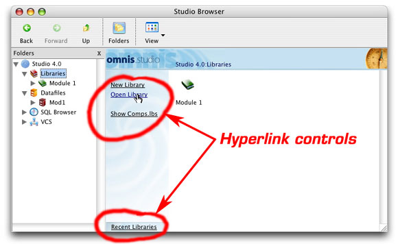
click on a link, some action occurs. The Browser window in the Omnis
Studio 4 IDE makes liberal use of this control. There are two separate
cases of its use in the Library Browser, for example:
But this is only the surface appearance of this control. That is,
it only looks like a group of hypertext links. In fact,
it is yet another way to display contents from a list variable used
for navigation (or operational) purposes - much like a Sidebar control.
The structure of the list variable used with this control is even
very similar to the structure of a list variable used with a Sidebar.
But we're getting a little ahead of ourselves...
A New Xcomp
First, we have to understand that this is an external component
and it can only be placed on a Window class. It is not a "normal"
window field, so we will find it under "External Components"
in the Component Store window when we are editing the window class.
Next we need to make sure that the component is loaded. (It should
be after all because the IDE uses it extensively, but it's good
practice to check!) There are a couple of ways we can access the
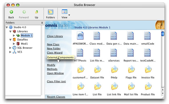
External Components window in Studio 4. The first is to use the
Browser hyperlink for a given library. This provides an "External
Components" hyperlink:
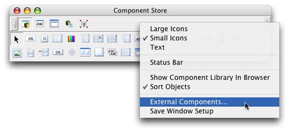
The other way is to use the context menu of the Component Store
window. The context menu provides a menu line for opening the External
Components Browser:
By the way, the Component Store can now only be open when we are
editing a GUI class (like a window) and not for creating new classes
with the Browser (a change in Studio 4). Instead, there are separate
hyperlink options for creating a new class from a class default
or for using a class wizard.
We then find the "HYPLINKS Library" within the "External
Components" group in the "External components" browser
window that appears. Note that there is only one control (seen in
the upper right panel of this window) and that it is the type for
use on a window class.
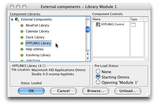
There should already be a green icon next to the "HYPLINKS
Library" entry in the list on the left. But if there is a red
icon instead, go ahead and set the "Pre-Load Status" of
this component library to "Starting Omnis". You may find
yourself using this control a lot!
Structure of the List Variable
As with any other field, we drag a Hyperlinks control to our window
class from the Component Store window and size it as we need. We
then assign appropriate values to various properties. The trick
is knowing what to assign to which properties to achieve the desired
look and functionality. Let's begin with the basics.
This field requires a list with a special format to even function.
The list variable must have at least three columns in its
definition and those must have certain characteristics. The first
two must be numeric (I use Long integer type for
flexibility, but any numeric type will do - even Character
as long as only numerals are placed in these columns) and the third
must be Character (although a Date column can
be used if appropriate - and if we don't get too fancy with other
techniques to be detailed later). We can supply additional columns
if we wish, but these three are essential. Here is what they are
for:
Column 1 is the group ID column. This allows us to "cluster"
lines if we wish. We will see how this can be used when we examine
event handling for this control type.
Column 2 is the item ID column. Again, we can employ various
schemes for numbering each line - either sequentially with a group
or uniquely within the control. There are many options!
Column 3 is the label column. The contents of this column determines
what will be displayed as the link label for each line. There are
many intriguing possibilities here too.
These columns can have any names we wish, but their contents must
follow the rules listed here or the control will not work. For this
article, let us name our list variable linkList and the
columns groupID, itemID and labelText.
(I've made them all instance variables as well.) So to
define linkList, we would use the command:
Do linkList.$define(groupID,itemID,labelText)
Remember that column order is significant here!
How Does It Work?
This control reacts to a click on a link label (line of the list
display). An event named evLinkClicked is generated by
this action and is sent to the $event method of the field.
The event is accompanied by two event parameters: pLinkGroup
and pLinkid. That is, the values from columns 1 and 2 associated
with the clicked link are returned. These two parameters each return
numeric values, so creating columns of other data types
and then populating them with non-numeric values will not work (although
Character columns with strictly numeric values will
work - if you insist!).
The current line ($line) property of the list variable
is not affected (although we can change that with a bit of code
if we need to), so only these two event parameters give us any indication
of which line was clicked. We can use either the groupID
or itemID value or a combination of the two to identify
a line - and, therefore, an action to be taken.
This two-tiered structure suggests the following technique (verified
by a recent memo I received that originated with Peter Kelly of
the Omnis engineering team). We could set up our list with groupID
and itemID values like this:
Do linkList.$add(1,1,"first choice - group
1")
Do linkList.$add(1,2,"second choice - group 1")
Do linkList.$add(0,0,"") ;; generates an empty line
Do linkList.$add(2,1,"first choice - group 2")
Do linkList.$add(2,2,"second choice - group 2") |
Notice that there is no unique identifier for a line - only unique
combinations of groupID and itemID. This would
require code like the following in $event:
On evLinkClicked
Switch pLinkgroup
Case 1
;; group 1
; group 1 setup
Switch pLinkid
Case 1
Case 2
End
Switch
; group 1 cleanup
Case
2 ;; group 2
; group 2 setup
Switch pLinkid
Case 1
Case 2
End Switch
; group 2 cleanup
End Switch |
This allows us to do some optional pre- or post-processing work
for each group in addition to executing specific lines of code for
individual links. But this is not the only way we could structure
our list contents.
For example, we may not need to cluster our links into groups.
We may only need one (unique) ID value for a linkList line.
If this is the case, we could use either the groupID or
the itemID column to hold the ID value. (We just have to
remember which one we're using.) So our setup may look like this:
Do linkList.$add(0,1001,"first choice")
Do linkList.$add(0,1002,"second choice")
Do linkList.$add(0,1003,"third choice")
Do linkList.$add(0,1004,"fourth choice") |
and the code in the $event method for this field that
handles a click on a link could be simply:
On evLinkClicked
Switch pLinkid
Case 1
Case 2
Case 3
Case 4
End Switch |
We could even couple this with additional content on the selected
line of our link list (which does not become "selected"
in the usual sense...). Suppose that we define a fourth column (named
otherColumn) that also contains Character values.
For example, perhaps we want to present a list of reports from which
the user can choose, but we want to display nice, real-world names
in column 3 for the link labels. So we put the actual names of the
associated report classes in column 4. Our setup for this case may
look like:
Do linkList.$add(0,1001,"Customer labels","customerLabels")
Do linkList.$add(0,1002,"Address listing","customerAddresses")
Do linkList.$add(0,1003,"Telephone listing","customerPhones") |
and our event handling method could look like:
On evLinkClicked
Do linkList.$search(itemID=pLinkid,1,0,0,0)
Set report name [linkList.otherColumn]
Print report |
Here we use the pLinkid event parameter to set the $line
value for linkList and then use the notational shortcut
for a cell on the current line of a list (<listname>.<columnname>)
to specify the name of the report the user wishes to print. We could
even use additional columns to preset parameters to pass to the
$construct method of the report. There are plenty of potentially
useful variations!
Basic Properties
The Hyperlinks control contains a number of properties. In fact,
there are six groups of them to be found in the Property Manager
(including runtime methods).
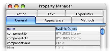
Perhaps the most important property is the dataname property.
This contains the name of the list variable to be used with the
Hyperlinks control. It is found under the "General" tab.
Most other "General" properties of the Hyperlinks control
are typical of most fields (name, height, width,
etc.), but there is also a disablefocus property (which
defaults to kFalse) that can be set so that this object
cannot receive the focus.
The properties available under most of the other tabs are typical
of most fields - we could even call them "minimal" in
some ways. For example, there is no special property for switching
the underline on for our links. This is simply done using the fontstyle
property under the "Text" tab. The control does support
the fieldstyle property, so we can use this powerful Omnis
Studio feature with it.
But the bulk of the important properties for this control are found
under the "Hyperlinks" tab of the Property manager. Here
are brief descriptions of them.
The hilitecolor property is used to set the text color
that a link will display when the mouse passes over it. If this
is set to the same color as the textcolor property, no
visual change will take place as the mouse moves over the links.
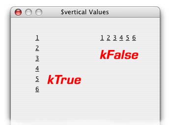
The value of the vertical property determines how the
links are arranged within the Hyperlinks control with regard to
the list lines that contain them. If the value is set to kTrue,
then the links are arranged down a column. If kFalse, they
are spread out along a horizontal line.
The ::leftmargin and ::topmargin properties (note
the double colons that begin the names) are used to set an additional
buffer between the edge of the control and the link text. By default
(zero values for these properties), the text butts right up to the
edge of the control. In a similar way, the extraspace property
is used to provide an additional buffer between lines. All three
properties treat all lines equally. There is no property that sets
a different margin for a specific line, for example.
As with lists for other uses in Omnis Studio, link lists could
sometimes become too long to display all at once on a window. The
showarrows property is used to display a set of scroll
arrows if the link list becomes too long for the control. If one
of the lines becomes too wide for the control, the link
will turn into a "tooltip" if the mouse pointer pauses
over it.
The Skin
In Omnis Studio version 4, windows, reports and remote forms can
be assigned a background graphic called a "skin". This
is implemented differently for the different kinds of class (windows
and remote forms are assigned an icon which can be aligned in many
ways - including "tiling" the icon - while reports get
a picture pasted in from some outside source), but the idea is the
same.
A Hyperlink control can also be given a skin. Like windows and
remote forms, a Hyperlink controls can be assigned an icon to act
as a background graphic. But unlike those classes, the icon assigned
to a Hyperlink control can only be aligned to the upper left of
the field or stretched to fit the entire field. The icon is assigned
using the ::iconid property and the choice between using
the normal size of the icon or stretching it to fit the whole field
is made by the value of the ::scale property. By our not
being able to tile this icon, making a background that 'blends in"
with a textured window background can be somewhat trying, but satisfactory
results can be achieved.
For example, in the image above, I have placed two Hyperlink controls
onto a textured Mac OS X window.and made them appear "transparent".
This was done by performing a screen capture of the window background
itself (large enough to be used for a large control), copying it
in Photoshop and pasting it into the Omnis Studio Icon Editor as
an "image page". The ID of this icon was then assigned
to the ::iconid property of each control and the controls were arranged
so that their patterns blended in with the window background.
Special Mouse Event
Besides the evLinkClicked event, the Hyperlink control
also recognizes an event named evMousePos. This event is
reported to the $event method of the field each time the
mouse pointer crosses the field boundary. The event parameter pEntered
is used to determine whether the mouse has just entered or just
left the field. There is no indication given, however, as to which
link the mouse is over. The mouseover() function using
the kMLine mouse position constant gives us no additional
information (at least not as it does for "normal" list
display fields).
Style Techniques
Consider the Hyperlink control shown here:
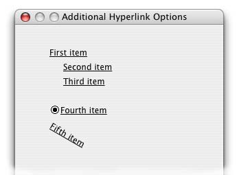
Notice anything unusual? We have two lines indented below the first
line, the fourth item is shown with an icon and the fifth item is
tilting at a 30 degree angle downward. These are all effects that
can be achieved because the Hyperlink control also supports styled
text! Let's examine the idea of indenting lines first.
It would seem that we could indent lines just by placing a few
spaces at the beginning of the text value to be displayed. This
will certainly indent the visible characters in the line, but it
will also cause the spaces to be underlined - so the underscore
will begin at the far left edge of the column. If we try to inject
a tab character, the line vanishes completely!
Fortunately, we can use the kEscLTab constant with the
style() function and inject a viable tab that way. In fact,
we now have two ways to do this in Studio 4. Line two above was
indented using:
Do linkList.$add(1,1002,con(style(kEscLTab,20),"Second
item"))
But the same 20 pixel indentation can now be created using the
kEscAdjustPos escape constant and appropriate X and Y offsets
(as shown in line 3):
Do linkList.$add(1,1003,con(style(kEscAdjustPos,20,0),"Third
item"))
Note that the style() function requires 3 parameters in
this case, since we have to provide both an X and a Y offset
(in pixels).
The icon was injected using the style() function as well,
along with an icon I developed for displaying radio buttons on reports
(although any icon will work). I covered this use of the function
in Omnis Tech News many months ago, but here is the code used in
this case:
Do linkList.$add(2,2001,con(style(kEscBmp,11004+k16x16),"Fourth
item"))
A new use of the style() function introduced by Studio
4 is "text on an angle". This requires two parameters:
kEscAngle to indicate that we want the following characters
to print on a slanted baseline and a number of degrees (counted
counterclockwise while pivoting the text on the left end of the
baseline). There are also some constants (kAngle0, kAngle90 and
kAngle270) that make certain adjustments to the baseline in addition
to angling the text. Here is the code for the example shown above:
Do linkList.$add(2,2002,con(style(kEscAngle,330),"Fifth
item"))
There are some problems with the angled text, though. The mouse
pointer still reacts as though the text had not been put on an angle
- and even the highlight color is only applied to that part of the
text that falls within the horizontal rectangle that would have
held it in that case.
Dynamic Link Lines
One final technique for now: We can also add and remove lines from
our link list dynamically without actually changing the contents
of the list variable itself ... well, maybe just a little change.
We can make link lines appear and disappear by changing the value
of the $rowpresent property of the associated line in the
history list if we turn on the $smartlist property
of our linkList variable. For example, if we want to make
lines 3 and 4 disappear, we could perform the following:
Calculate linkList.$history.3.$rowpresent as kFalse
Calculate linkList.$history.4.$rowpresent as kFalse |
In Conclusion
I hope you find this new control as interesting as I have. Hyperlinks
are something that most users are very familiar with and this control
is a welcome addition to our toolset.
|
 Please logon or create a free account to download this file.