Tech News Back Issues Issue: 022803
|
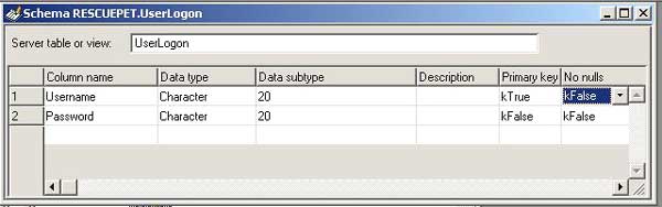
Introduction to the Omnis Web Client: Part 10, Log on to Webclient using HTML interface - Validation By Dr Caroline Wilkins Last time, we covered some of the basics of html and forms and we got as far as creating an html logon page which calls a remote task within an Omnis application, passing in a username and password. The next thing to do is to validate that username and password against a database. First, we create a database table to hold username and password for users. 44. Creating user table 44.1 Create a new schema called UserLogon
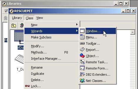
44.4 Open the SQL browser and drill down to the tables. 45. Creating a window to set user account data Use the window wizard to create a window called wUserLogon that interfaces with the UserLogon table you have just created:
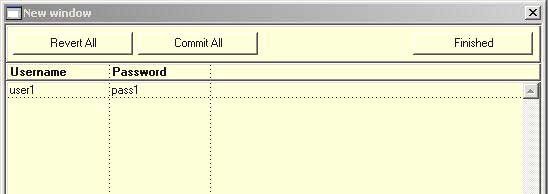
45.1 Choose the SQL Form Wizard The wizard should have generated you a window. Run it (Ctrl-T) and enter some data to set up a user account you can use to test with. For this example, we use Username= user1 and Password=pass1.
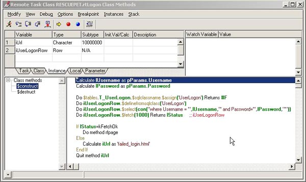
46. Validating user logon data Now that we have a user account, we can add validation code to our HTML logon interface. 46.1 Open up rtLogon (remote task) Calculate lUsername as pParams.Username Do $tables.T_UserLogon.$sqlclassname.$assign('UserLogon')
Returns #F If lStatus=kFetchOk
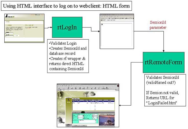
The purpose of this code is to see whether there is a row in the UserLogon table that matches the Username and Password supplied by the user from the HTML logon interface. This is a good point to test the interface. Place a breakpoint on the first line of the $construct method and then open up the HTML logon page you created in the previous tutorial. Enter the username and password (we took the example of user1, pass1) in the HTML form, click Submit and then step through the code in rtLogon. You should find that lStatus is returned as kTrue, indicating that the user account was found in the UserLogon table. This as far as we need to go right now, so click Stack - Clear Method Stack, so we can carry on coding. If you don't get as far as calling rtLogon from your HTML page, then go back to the previous newsletter which takes you through the stages involved in achieving this. If you do get as far as rtLogon, but find that lStatus is not being returned as kTrue, then check that the username and password you are entering in the HTML page matches the account you set up in the UserLogon table. Also check that you created the T_UserLogon table class as described in 44.6. 47. Responding to the user Assuming that all has gone to plan, you have created an interface that accepts a username and password from an html logon page, have validated it against a UserLogon table and are now ready to respond to the user accordingly. There are various options, with varying degrees of security, that can be followed at this point. Option 1: Point user to a standard webclient resource with an obscure URL that public users would be unlikely to stumble across on your webserver. This is very simple but pretty weak option in terms of security. It may serve on some occasions, particularly if there is a further logon within the webclient application itself. A second logon is not very user-friendly however. Option 2: Dynamically create, from a template page of html, an html page containing a webclient application object and feed it back to the user. You can embed a parameter to indicate the user ID so that, when the remote form is instantiated, it can determine which user they are serving. This is a little more secure. If someone wanted to break into this interface, they would have to create their own page of html with appropriate ActiveX/Netscape plug-in parameters and guess how you are setting the user account information in the parameters. This method is an improvement on Option 1, but still unacceptable for a secure interface. Option 3: After validating the user, create a UserSession record with a unique and randomly generated SessionID and a timestamp. Then dynamically create a page of html, from a template, that contains a webclient application object with an additional parameter containing the Session ID. You can then place a method in the remote task that corresponds to the remote form containing your application, which validates the SessionID and either allows the remote form to construct or redirects the user to a 'DontTryAndHackMe.html' page....or the polite equivalent thereof....:) This method is easily the most secure and worth the additional effort if your data needs to be protected.
If all has gone to plan, you should have a library that looks something like RPLogon2.zip (libraries and datafiles may need to be converted in Omnis) and an HTML page which passes data to a remote task within it. Next time, we will explore Option 3, as illustrated in the graphic above, which provides a reasonably secure and elegant means of logging on to a webclient application from an html form.
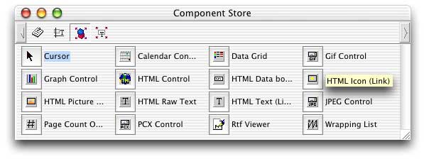
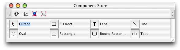
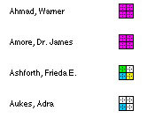
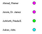
Checkboxes, Radio buttons and other Icons in reportsBy David Swain Have you ever wanted to put graphical symbols that represent data values in the body of a report? More specifically, have you ever wished you could represent Omnis Studio controls like radio buttons and checkboxes as part of a reported record? This article demonstrates three techniques to solve these and similar problems. Reports are not interactive in Omnis Studio, so there are no special fields like radio buttons or checkboxes available for display in a Report class. The people who created Omnis Studio rightly consider these field types to be "controls" (interactive fields that respond to user actions) rather than simple data display devices, so they are not in our report tool box. But sometimes it would be nice if we could display certain kinds of data in reports in a way that mimics such fields. To do so, we must consider the types of fields that we do have in Report classes and see if there is a way to use one of the existing field types to display these values in a graphical manner. Since icons are used to display the different "states" of "multistate" fields like check boxes and radio buttons, we know that the images for these items are contained somewhere in our icon libraries. We may also wish to create similar icons that are "cleaner" for printed output on typical black-and-white laser printers – or even completely new icons to use as symbols for coded data values. For any of these purposes, an "icon display" field of some sort in a Report class would be helpful. Direct Display of "Static" Icons We do have such a component in the "HTML Device" external library. Its name is "HTML Icon (Link)". If we have opened the proper external library where this item is located, we can find it in the "External Components" group for Report component objects in the Component Store:
This field type is the "obvious" choice for simply displaying certain kinds of icon we might wish to associate with some data element, but it has a few limitations we should be aware of. First, it is designed to associate a static, predetermined icon with a hypertext link to a URL (when the report is printed to the HTML output device), so it has no calculation property that would allow us to easily emulate a multistate field. Nor does it have any "multistate" features (as far as I know) that allow it to access the "checked" state of a multistate icon from our icon library. In fact, all three of the objects detailed in this article lack access to all but the first icon in a "multistate" series, so we must create our own icons with separate icon IDs for the "states" we wish to display. Assuming that we have an appropriate set of icons, we could then modify the value of the $::iconid property of this field (yes, the colon characters after the "$" are required) from a $print method of the section (or of some other field that precedes the icon field in print order) to conditionally display the appropriate icon for a specific record. But this requires some additional programming outside the field itself and is not as desireable a solution (to me, at least) as would be a self-modifying field. Suppose we wish to represent the Boolean variable "memberFile.activeFlag" with a checkbox icon using an "HTML Icon (Link)" report field named "iconFldHTML" in the Record section of our report. Further suppose that we have constructed two special 16x16 pixel icons (see the next section) to depict an unchecked (icon ID "10000") and a checked (icon ID "10001") check box. We could put the following command lines in the $print method of the Record section to determine which icon will be displayed for each record:
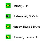
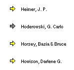
Since we can affect any object within the section with command lines that precede the "Do default" command in a sections $print method, this will properly set the icon for our "HTML Icon (Link)" field. But there are a few other issues with this field type that we must consider: This field type does not acknowledge a "transparent" color used in an icon (at least not in Omnis Studio version 3.2.1 running on Mac OSX version 10.2.4). If an icon with the "transparent" color is used with this field type, the "transparency indicator" color (used by the Icon Editor to indicate which pixels are intended to be transparent – in my case, a bright green) will appear in the output. In the illustration below, the yellow and gray arrow icons appear with their "transparent" color in full view!
An "HTML Icon (Link)" report field scales the icon image it displays to fit the size of the field. There is no property option to switch off this scaling, so care must be taken to make the field the proper size for the icon. Fortunately, there are only three sizes from which to choose! Use 0.222 inches (0.564 cm) for a 16x16 icon, 0.444 inches (1.128 cm) for a 32x32 icon and 0.667 inches (1.693 cm) for a 48x48 icon. If we are not careful about this, we may end up with output that looks like:
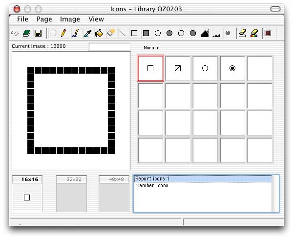
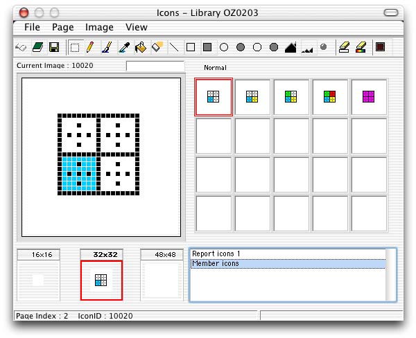
If we assign a default icon ID to the field, it sets the proper size (height and width property values) for that icon. But if we reassign the $::iconid property value from a method and include an icon size constant for a different size from the default, the field does not adjust. The best way to set up and use such a field is to a) declare a default icon ID for purposes of sizing and b) only use icons of the same size when modifying the value of the $::iconid property from a method. A point in its favor: an "HTML Icon (Link)" report field is automatically "floating". In fact, there is no property option to switch this off. This is not a bad thing, though, in that it allows us to more precisely align the icon image with the rest of the report line. The "HTML Icon (Link)" report field type has possibilities for our intended use as stated at the beginning of this article, but the limitations demonstrated above caused me to seek out alternatives – especially the problem with transparency, which severly limits which "built-in" icons we can use. Before looking at the other options I discovered, let’s briefly discuss the work-around for the fact that none of these techniques can make use of "multistate" icons. Separate Icons for Emulating "States" of a Multistate Field If we need to represent the various "states" of a multistate icon in a report using the techniques in this article, we can only do so by creating separate icons (with separate icon ID numbers) for this purpose. There are two reasons for this: 1) we don’t have access to any "state" beyond the "unchecked" state (which access appears to be reserved for multistate control fields on Window and Remote Form classes) and 2) even if we did, the icons used for these controls within our applications are designed for display on a computer monitor, not for output to the printers we commonly use. Even if we print to a color printer, the resulting icon images are not very "crisp". But they are further muddied when printing to a black-and-white laser printer, which many businesses still routinely use for a variety of reasons. Color can still be used in icons that might appear in black and white, but care should be taken that the color areas will still be meaningful and distinguishable when printed in shades of gray – especially if there are only two shades available! I created the following two sets of icons for report demonstration purposes. The first set contains the "printer safe" icons I use for emulating checkbox (icon IDs 10000 and 10001 for unchecked and checked respectively) and radio button (icon IDs 10002 and 10003 for unchecked and checked respectively) fields in reports:
The other group was created to demonstrate the use of "symbol" icons (I hope that terminology is not overly redundant...) as alternatives to batteries of radio buttons for representing certain kinds of "coded" variable values. In this case, there are five symbols used to represent the five "Member Types" (Freshman, Sophomore, Junior, Senior and Advisor) used in my example application:
The "Text" Object Alternative
A "Text" background object on a report (found in the "Background Objects" group of the Component Store for Report component objects – and not to be confused with the "Label" object!) can also contain an icon, but only by embedding a calculation expression within square brackets in the $text property value. This is because a "Text" background object supports "styled" text. The icon must be specified using a style() function that sets a "text escape" for a "bitmap" (the first parameter of style()). This function then specifies the icon ID number plus icon size constant (the second parameter of style()) to generate the ultimate icon image. All this must be contained within square brackets so the expression will be evaluated. Here is the expression for the checkbox icons I used for the "HTML Icon (Link)" report field above, now properly cast for a "Text" background object:
This object has some advantages over the "HTML Icon (Link)" report field, not the least of which is that it properly supports transparency so that we can use it with any icon in any Omnis Studio icon repository. Here is how the same transparency-supporting icons used above in an "HTML Icon (Link)" report field look when specified in the "Text" object type:
Since we must use a calculation expression to insert an icon into this object anyway, we can use an expression that "encapsulates" all possible values of icon ID needed for the data values the object is to represent. This is a distinct advantage of the "Text" object over the "HTML Icon (Link)" field. Another advantage of the "Text" object is that while the combination of font and fontsize property values for the object determines the objects height property value, the icon will extend beyond the lower boundary if necessary. So sizing of the "Text" object is not an issue. A potential disadvantage is that we cannot make this object invisible through a simple property value modification. That is, there is no visible property for this object type. If we need to make such an object invisible for some reason, we must first name the object (technique described briefly below), give it a $print method (which we can do with named background objects in reports!) and then use the "Do default" command within that method to conditionally (within an "If..." block) make the object invisible (by virtue of the fact that it doesn’t print if the "Do default" command of its $print method is not executed). This make seem clumsy and convoluted as described above, but it requires very few lines of code and is quite quick. To name a background object in a Report class, follow these five simple steps:
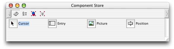
The next time the Method Editor is opened for this Report class, the name of this object will appear in the "Method Names" pane on the left side of the Method Editor window. The object can now be given methods. We must set the objects floating property value to "kTrue" for proper positioning. Most of our icons will need to be placed slightly higher than the line to which they refer, which may mean an additional line may be required in our section. (This actually applies to all three techniques in this article, not just this one.) The result is an object that can conditionally display one of a number of icons based on a data value. The object is self-contained, but perhaps a bit messy for some optional uses. But we still have one more option... Picture Fields Can Also Display Icons – Really! My usual choice when placing icons in a report is to use a "Picture" field, but I wanted to explore the other options for you so as not to "push" you into my personal preference (at least, not too hard...). This is a basic Report component object found in the "Report Fields" group of the Component Store (which is open by default when we switch to modifying a Report class from some other use of the Component Store). I find that using this field type for placing icons in reports gives me additional flexibility beyond the other two techniques.
"But wait!" I hear you say. "Picture fields don’t have either an iconid property or a text property that supports styled text." This is very true. But while it doesn’t natively support icons, a "Picture" field does have the ability to be populated using a calculation. It has both a calculated property (used to indicate that the value displayed by the field will be derived from an expression) and an associated text property (used to hold that expression if the calculated property value is set to "kTrue"). We just need to know what kind of calculation can convert an icon in one of our icon libraries into a Picture value for use with this field. We do this by using the $getpict() function of the "OmnisIcn Library" external component (which we must have loaded in order to use it). This function requires two parameters: an icon ID (complete with the size constant) and the background color for the resulting picture value (expressed either as a color constant or using the rgb() function). For "modern" Omnis Studio icons that support transparency, the background color replaces the "transparent" color. For "old style" icons that do not support transparency, it replaces the de facto background color (white). So to place an icon in our report, we can create a small picture field with the noscale and calculated property values set to "kTrue". We must then supply an appropriate expression as the fields text property value. To reproduce the basic example for this article (checkbox icons to represent the state of the memberFile.activeFlag variable), the text property value will contain this expression:
Notice that we didn't even have to declare an instance variable of "Picture" type! Just as with "Entry" fields, if we calculate a value it will simply be displayed. We only need a dataname value if we intend to populate a variable with a value for use elsewhere. A background color of "kWhite" was used to indicate "no background color" for printing purposes, since it is assumed that we would be printing onto white paper. (But this would not create a white box if we were to print onto colored paper...) There are no centering options with this field type like there are with a "Picture" field on a Window class. The Picture value is always placed in the upper left corner of the field. We can use the same size considerations as we did for the "HTML Icon (Link)" field mentioned earlier, but the value of an unscaled "Picture" field on a report will display properly no matter how large or small we make the field itself. The noscale property value allows us to switch off scaling the icon to the size of the field (by switching the property value on...). this is a distinct advantage over the "HTML Icon (Link)" field, but gives us a scaling option in case we need it (which is an advantage over the "Text" object as well). We also have a visible property, unlike the "Text" object. A "Picture" field is automatically floating (with no recourse) just like the "HTML Icon (Link)" field. There is no floating property to set – it just is. One advantage of the "Picture" field over either of the other two object types is that the color parameter of the $getpict() function can be used as an indicator in its own right. That is, we can use the exact same icon for all states, but use the background color to indicate the state of the associated variable. This color replaces the "transparent" color in icons that support transparency, but it also replaces the white (unspecified) background color of older style icons (those that do not support transparency). If taking advantage of this, it is a good idea to provide a legend of some kind to explain what the colors mean – like the legend on a graph or chart. A Few More Examples So far, we have only seen how to emulate checkbox fields. What about radio buttons? What about other uses of icons? While I can’t possibly begin to demonstrate all the potential uses of icons in reports, let us examine two or three more to get some idea of the variations we can use. You can take it from there... Radio Button Emulation Suppose we have an integer variable used to store a value determined by a set of radio buttons on an entry window. In my example, this variable is named memberFile.memberType and it takes on values in the range or 0-4 that correspond to the real-world labels Freshman, Sophomore, Junior, Senior and Advisor respectively. We can create a report (named "iconReportRadio" in my example library) that shows these categories as column headings above radio buttons as follows:
This requires a lot of real estate for the display of each record, but sometimes this is the most appropriate and readable format for such information. To create such an array, we need to place five "Picture" fields into our Record section. (I spaced them an inch apart.) Each field has its calculated property value set to "kTrue" and contains a text property value like the following:
This determines whether to place the open or filled radio button icon in the "Picture" field based on the truth of the expression in the first parameter of the pick() function. Each of the five fields is identical except for the comparison value used in this expression (so we can drag-duplicate the second through the fifth one from the completed original) – and each is mutually exclusive. That is, only one expression can be true for a given record, so only one icon on a line will be the filled radio button image. State Icon In Place Of Radio Button Group Those radio buttons certainly require a lot of space! Perhaps we could reduce this sprawl a little by using a series of icons instead of a binary pair and replace our five images with a single one. As shown earllier in the section on creating custom icons for this purpose, I have made five icons to represent the different member types. They are numbered 10020 through 10024. perhaps we could read into them incremental levels of achievement or some such meaning, but the basic idea is that we need a consistent set of symbols to represent the different values of our variable. Here is how that same section of our report now looks:
To create this report, we first duplicate the "iconReportRadio" report class and name the new one "iconReportSymbol". We then remove all but one of the "Picture" fields and change the text property value to contain this expression:
The first parameter of the $getpict() function generates a value from 10020 to 10024 based on the value of memberFile.memberType and adds the appropriate icon size constant to it. (These are 32x32 pixel icons.) We use a background color of "kWhite" because these icons do not support transparency and we don’t want the white areas of the icons to be filled with some other color. There is no default value for this second parameter – it is required. The result is a condensed version of the radio button report above. It offers much more room for other fields, but requires that the reader be able to decipher the symbols used. Color Used As An Indicator Of State Rather than using a complex symbol, we could use a simpler icon and color it using the second parameter of the $getpict() function. While some special arrangements must be made with the construction of the icon itself, the result would look like this:
To create these icons – excuse me, this icon – I simply copied the open radio button icon used earlier, created a new icon page that supports transparency, pasted the radio button image into the first icon slot, gave it the icon ID number 10040 and then filled the circle with the "transparent" color. I then duplicated the report named "iconReportSymbol" and gave the new one the name "iconReportColor". I resized the "Picture" field to an appropriate size for a 16x16 pixel icon and gave it the following expression in its text property value:
Notice that the icon ID number is now fixed. The "background" color specified in the second parameter of the $getpict() function becomes the "fill color" for the button images because it is used to replace the "transparent" color. This changes depending on the value of memberFile.memberType. The actual background remains white. While most of the other reports could be generated by one or both of the other techniques introduced in this article, this one can only be accomplished using a "Picture" field with the $getpict() function. This should give you a few ideas. I will get the example library completed and posted to my web site as soon as possible!
|
|
| © 2002-2003 Copyright
of the text and images herein remains with the respective author. No part
of this newsletter may be reproduced, transmitted, stored in a retrieval
system or translated into any language in any form by any means without
the written permission of the author or Omnis Software. Omnis® and Omnis Studio® are registered trademarks, and Omnis 7™ is a trademark of Omnis Software Ltd. Other products mentioned are trademarks or registered trademarks of their corporations. All rights reserved. |


 Please logon or create a free account to download this file.
