The Icon Array Field
By David Swain
Polymath Business Systems
In the past few years we have examined
most types of list display field in Omnis Studio, but there is one
significant type we have overlooked until now: the Icon Array field
for a Window Class. (Actually, we haven't dealt with the Complex
Grid either, but there's always next month!) This field is found
under the Standard Fields heading in the Component Store.
It is used to differentiate among list lines by assigning an icon
id and optional labeling text to each line and then
displaying these items in a scrolling grid. For some situations,
this specialized display can be quite effective and useful.
For example, we see such a field when we first open our development
copy of Omnis Studio. The Browser window uses it for two
of its three display modes (Large icons and Small icons
selections from the View menu) to present a list of the various
components associated with our application:
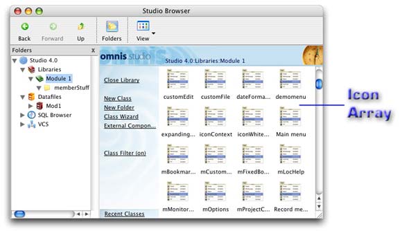
The icons are used make it easier for us to identify types
of class in this case. All of the other Browser tools provide
similar displays of the application design or database elements
they control. The circumstances of our own applications will suggest
which features of list content we may wish to emphasize or highlight
using icons in a field like this.
There have also been a few improvements made to this control in
Omnis Studio Version 4, so it fits very nicely with this series
of new features in the new version. But before getting to the new
items, let's examine some of the basics...
Basic Setup
As with any list display field, the dataname property
of an Icon Array field requires the name of a list variable. Some
care must be taken in defining and populating this list variable
to work properly with an Icon Array field.
In earlier versions of Omnis Studio, the Icon Array required that
the first column in its associated list variable contain the icon
id and that the second column contain the text to be displayed.
This is similar to the setup for Sidebar and Hyperlink fields. (For
those field types, certain other columns are also required in the
associated list variable for proper function of the field.) But
the order of these columns is no longer important for the Icon Array
because of some new Studio 4 properties (I guess we got to some
new items pretty quickly):
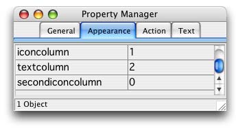
iconcolumn property
This property is used to specify which column in the associated
list variable contains the required icon ID value. This is done
by entering the number of the column, not the
name, as the property value. (The unwary programmer will soon learn
this!) When a library is converted to Studio 4 from earlier versions
or when a new Icon Array field is introduced from an unmodified
Studio 4 Component Store, this property's value defaults to 1. The
corresponding column in the list variable should be of Long
integer type, although any numeric type that can contain the
necessary range of values will work. The name of this column is
irrelevant as far as the Icon Array field is concerned.
If the value for this column is "empty" (zero) for a
specific line, that line will not display an icon in the Icon Array
field. This does not mean that the line is invisible, though, as
a gap will still appear in the Icon Array display. (Kind of like
the invisible man becoming visible in the fog...) It is also important
to use icons that have both a k16x16 and a k48x48 size - and to
not include the icon size constant to specify
the icon ID. Omnis Studio will automatically use the 48x48 pixel
icons for large icon view and the 16x16 pixel icons for
the small icon view. If 48x48 is not available but 32x32
is, then the medium sized icon will be used in large icons
mode. If a size larger than 16x16 is "forced" by using
an icon size constant when specifying the main icon ID, the small
icon view will simply crop that icon to 16x16 pixels.
textcolumn property
This property is used to specify the column in the associated list
variable that contains the optional text to be displayed with the
icon. Again this is done by entering the number of the
column, not the name. The value of this property defaults
to 2 for backward compatability with libraries built using earlier
versions of Omnis Studio.
There is a showtext property (detailed below) that must
also be switched on for this text column to be used in this way.
So three conditions must be met to display text in an Icon
Array: 1) showtext must be switched on, 2) textcolumn
must point to a colum in the list (it can't be zero) and 3) that
column in the list variable must contain a value that can be displayed
as a string. (This can include dates and numbers as well as character
strings.)
Since icons are used to indicate categories of lines (and not thumbnails
of the records represented by those lines), it is usually good practice
to use text labels to better identify the data associated with the
icon. There will be exceptions to this, but we would not generally
support enough icons in an application to cover, say, all the records
in a photo album.
secondiconcolumn property
This is a completely new feature in Omnis Studio version 4. For
this reason, the value of this property defaults to 0. It is used
to indicate the column in the associated list variable that contains
the ID number for a secondary icon. "Why two icons?",
I hear you say. A good question like this calls for a "good
news" answer!
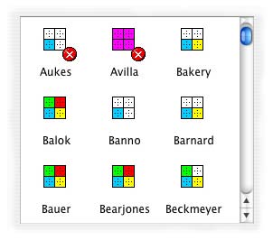
The secondary icon is used as an overlay on the first. It is positioned
over the lower right corner of the main icon and is usually used
to indicate some state of the record. For example, in the
Omnis Studio Class Browser, a padlock icon is superposed on any
class icon where the class is derived from a Version Control System
and not checked out. So the padlock icon indicates a "read-only"
class:

There are other cases where a pair of keys indicates a class that
has been made "private":

These are just a couple of examples of uses for the secondary icon.
Note that there is no System-Table-with-a-lock or Window-with-a-set-of-keys
icon in our icon store. Instead, we can superimpose any 16x16 pixel
icon over any 48x48 pixel icon (or whatever sizes of icon we choose
to use). So we could have icons in an accounting application for
30, 60 and 90 days past due (yellow, orange and red dots perhaps).
Or we could have various kinds and colors of check marks or X's
to indicate various states of the records we choose to display.
This new feature opens up all kinds of new possibilities!
Be sure to use an icon that has a 16x16 pixel version for this
status icon. If there is no icon of that size for the specified
icon ID, Omnis Studio will use only the upper left 16x16 pixel section
of that icon. That could result in a completely empty (and completely
invisible!) overlay if a 48x48 pixel icon contains only a 16x16
pixel image centered in its canvas.
Ideas for Building List Content
We would not normally store an icon ID in a record of a database
since this value is only related to the display functions of our
library and not to the data itself. This means that we have to generate
an additional column for this value whenever we need to create a
list for display with an Icon Array field. We must also populate
that column for each record with an appropriate value based upon
other content found within the record. These are not difficult things
to do, but they benefit from a bit of planning.
The icons we use with an Icon Array field are most likely to reflect
type or status column values from the original
record, which will usually be of either Short integer or
Boolean datatype. (Occasionally the more verbose programmer
will store such items as strings.) This means that we can usually
specify the icon ID required for an individual list line using a
simple calculation, perhaps involving the pick() function,
the mid() function or just a straightforward arithmetic expression.
(More complex logic involving Switch/Case statements and
many lines of code are required to deal with such values stored
as strings.)
So there are two issues we must face in building our list for use
with an Icon Array field: 1) how to create the additional columns
required for primary and secondary icon IDs and 2) how to populate
those cells with appropriate (numeric) icon ID values. The techniques
we can use vary depending on whether we use the native Omnis Studio
database techniques or an SQL RDBMS as our data repository.
Native Omnis Database
There are two ways we can add our icon ID column(s) when using
a native Omnis database. One way is to simply create additional
variables of appropriate scope and then include them in the definition
of our list. Whether we use the Define list command or
the $define() notational method to do this does not matter.
The other way is to first define the data columns of the list with
existing variables from our File Class(es) and then use either the
$add(), $addbefore() or $addafter() method
of the $cols group of our list variable to add the other
columns. Here are some simple examples:
Begin reversible block  ;; iconID
              and statusID are instance variables

                Set current list iconList

                Set main file {memberFile}

              End reversible block

              Define list {iconID,statusID,memberFile.lastName,memberFile.firstName,memberFile.seqNumber,

                    memberFile.memberType,memberFile.activeFlag}

              ...
or
Begin reversible block  ;; using
              standalone columns

                Set main file {memberFile}

              End reversible block

              Do iconList.$define(memberFile.lastName,memberFile.firstName,memberFile.seqNumber,

                    memberFile.memberType,memberFile.activeFlag)

              Do iconList.$cols.$addbefore(1,'mainID',kInteger,kLongint)

              Do iconList.$cols.$addbefore(2,'subID',kInteger,kLongint)

              ...
The first technique gives the additional columns dataname
property values while the second technique does not. Our choice
here helps determine or direction in developing techniques for populating
those columns.
There are also two basic ways of populating these columns: as
the lines are added to the list or after the lines are
added to the list. In the first technique, we could add the list
lines in a repetitive loop and generate the value(s) required for
each line as part of the process. If we have used variables for
defining the additional columns, we can calculate values for those
variables and then use either the Add line to list command
or the $add() method for the list variable and add both
icon IDs and record contents in a single step. If we created additional
columns with no datanames, the line must either be created first
(by one of the two techniques mentioned - with each column value
being calculated with the actual list cell as the target rather
than using a variable outside of the list as a transfer vehicle)
or the values must be generated as part of the Add line to list
command or $add() method with each value for the
entire line being specified as a parameter.
These examples continue on from either of those above:
Find first on memberFile.lastName ;; using
              variables

              Repeat

                Calculate iconID as memberFile.memberType+11021

                Calculate statusID as 10009*not(memberFile.activeFlag)

                Add line to list

                Next on memberFile.lastName

              Until flag false
or
Build list from file on memberFile.lastName
              ;; using variables

              Do iconList.$sendall($ref.iconID.$assign(iconList.memberType+11021)+

                    $ref.statusID.$assign(10009*not(iconList.activeFlag)))

              Calculate iconList.$line as 0
or even
Find first on memberFile.lastName ;; using
              standalone columns

              Repeat

                Do iconList.$add(memberFile.memberType+11021,10009*not(memberFile.activeFlag),

                      memberFile.lastName,memberFile.firstName,memberFile.seqNumber,

                      memberFile.memberType,memberFile.activeFlag)

                Next on memberFile.lastName

              Until flag false
Also remember that if we use the $sendall() technique
shown here, it is good form to then set the current line of the
list to zero. Otherwise the last line in the list will be selected
and our Icon Array field will appear to "jump" to the
last entry. Use code similar to this:
Calculate iconList.$line as 0
Our results might look like this:
Here the different main icons represent different types of member
while the red circle with the white "X" indicates an inactive
member.
There are other variations that work as well. For the techniques
that make a second pass through the list to fill in the cell values,
it is important to include the variables needed to derive the icon
ID column values in the definition of the list (the memberType
and activeFlag variables in these examples). Those techniques
that derive the icon ID cell values directly from the CRB do not
have this requirement.
SQL Database
Again we have a number of techniques from which to choose. We can
add new columns to a pre-definedfromsqlclass list using the $cols.$add()
method (or its cousins $addbefore() and $addafter()).
But SQL also allows us to create columns with derived values within
our select statement and we can even make decisions within the expression.
We just have to make sure the columns in our target list variable
match those derived in the select statement!
If we follow a parallel path to the techniques described for the
native database above, we would first define the list variable from
an appropriate SQL class and populate it using a standard technique.
We may already have such a technique established in a Table Class
or Object Class in our library. We can then add new columns as needed
and populate them using a technique like one of those shown above.
For example:
Do memberObj.$listbuild() ;; list defined
              and data gathered in the object

              Calculate iconList as memberObj.recordlist

              Do iconList.$cols.$add('mainIcon',kInteger,kLongint)

              Do iconList.$cols.$add('statusIcon',kInteger,kLongint)

              Do iconList.$sendall($ref.mainIcon.$assign(11021+iconList.memberType)+

                      $ref.statusIcon.$assign(pick(iconList.activeFlag,10009,0)))

              Calculate iconList.$line as 0
Note that the order of these columns does not matter as long as
the proper column numbers are used for the iconcolumn and
secondiconcolumn property values.
If we want to avoid using a secondary pass through the list to
set the icon ID values, we can have our SQL database do this job
for us. For large result tables, this is preferable, since the RDBMS
is much better suited than Omnis for this work. In preparation,
we must define our list variable and add the columns for the icon
IDs (making sure they are in the right places), execute a select
statement that generates the values we need and then fetch the resulting
select table into our list variable. Here is an example:
Do iconList.$definefromsqlclass('members','idNumber','firstName','lastName','activeFlag','memberType')

              Do iconList.$cols.$add('mainIcon',kInteger,kLongint)

              Do iconList.$cols.$add('statusIcon',kInteger,kLongint)

              Begin statement

                Sta: select idNumber,firstName,lastName,activeFlag,memberType,

                Sta: memberType+11021,case activeFlag

                Sta: when true then 0

                Sta: else 10009 end

                Sta: from members where upper(lastname) >= [kSq][firstLetter][kSq]

                Sta: and upper(lastname) <= [kSq][lastLetter]zzz[kSq]

                Sta: order by upper(lastname),upper(firstname);

              End statement

              Get statement sqlText

              Do statement.$execdirect(sqlText)

              If statement.$state=kStatementExecDirectFailed

                OK message {Error: [sessionObj.$errorcode]//[sessionObj.$errortext]}

                Quit method

              End If

              Do statement.$fetch(iconList,kFetchAll,kFalse)
Here we are selecting all the members whose last name initial letters
fall within a range of letters of the alphabet. These letters are
passed as parameters to the method from the $event method
of the tab strip shown in the illustration below:
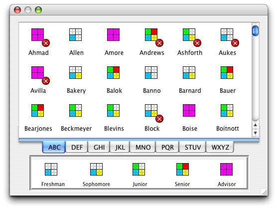
Notice that on this more finished window I included a legend so
the end user can make more sense of the icons. (And no, your eyes
aren't playing tricks on you. The "tab strip" is actually
a Tab Pane field using the kBottomTabs options of its taborient
property with the default style for OS X.)
The main icon ID is derived using a simple addition expression
and the status icon ID is derived using a case statement. Note that
the list definition must match the columns retrieved from the select
table. If too few columns exist when the fetch is performed, values
will be lost. For this reason, the extra columns must be added early
in the method.
Display Modes
Once we have content in our list variable, there are a number of
ways we can display the resulting list in an Icon Array field. First,
there are two display modes that we have already mentioned for the
main icons: large and small icons. These are managed
using the smallicons property of the Icon Array field.
If it is set to a value of kFalse (the default value),
large icons will be presented. If set to kTrue,
the small icon display is used.
The position of the secondary icon is changed a bit by the setting
of smallicons. It is still 16x16 pixels in size, but it
is now placed over the left side of the main icon and vertically
aligned with it. Since both icons are now the same size, this change
of position makes sense. Here is one of the items shown earlier
with a secondary icon, now displayed in small icon mode:

There is another difference in the way that display elements are
arranged in these two views as well. In large icon view,
any text associated with an icon is displayed below the
icon. In small icon view, the associated text is displayed
to the right of the icon. This makes small icon view very
crowded if we retain the default column width from large icon view
as the icon and the text are now on the same line. For this reason,
we are also given the smalltextwidth property. The value
we supply to this property is used as the number of pixels for the
width of the text column exclusive of the icon associated with it.
The icon requires another 16 pixels in width, plus Omnis Studio
also provides for a small "gutter" between the text and
the icon and another between icon-text columns. So for a two-column
display in this mode with a 100 pixel value for smalltextwidth,
an Icon Array field must be at least 285 pixels wide.
Switching on the buttonbackground property adds a visible
3D "button border" around the main icon. In small
icon mode, this adds another 7 pixels to the width requirement
for a column. The "button border" requires both more width
and more height for the icon in this display mode, which contributes
to also increasing the space between lines of text when "normal"
font sizes are used in small icon mode. To support a two-column
list with the same specifications as above, but with the buttonbackground
property switched on, the field must be at least 309 pixels wide.
There appears to be no effect on line and column spacing in large
icon mode, but in small icon mode the change is very
dramatic.
As with other fields, we can supply various forms of floating edges
for an Icon Array field. (Another topic to explore in detail at
another time!) If we resize a window and in turn resize an Icon
Array field, the contents displayed in the field are not rearranged
unless we have switched on the autoarrange property. This property
resets the number of columns displayed in the field if its width
is changed and it can accommodate more or fewer columns. The default
value for this property is kFalse, so be sure to switch
it on if there is a chance the field could become wider or narrower.
Showing Text
The showtext property value also affects the layout of
the grid in an Icon Array field. If it is switched off (set to kFalse),
more icons can be placed across the width of the field than when
it is switched on. While not showing the text associated with the
lines in the list variable may make it more difficult to identify
a specific line, the distribution of the icons themselves on the
grid may hold significant visual information. A great number of
them can be fit into a rather small space in small icon
mode. But even in large icon mode, twice as many icons
can be placed across the field when showtext equals kFalse.
The showtext property also seems to override the buttonbackground
property. Even if buttonbackground is switched on, button
backgrounds will not appear in either size mode if showtext
is switched off.
Avoiding the Spotlight
Many list display fields, as well as Picture and Multiline
entry fields, have historically had the annoying habit of grabbing
the focus when their window is not in data entry mode or when they
are otherwise disabled. In earlier generations of Omnis we had the
dreaded "block caret" that appeared in such fields. Today
we have various platform-specific forms of highlighting that are
not appropriate under these circumstances by most interface standards.
In Omnis Studio version 4, the remedy for this problem has been
supplied to us! We have been given the disablefocus property
for all fields that exhibit this behavior (which includes the Icon
Array field). When this property is switched on for a field, it
cannot possibly get the focus - yet it is still fully enabled (as
long as its enabled and active property values
are kTrue). This is certainly a welcome addition to the
Omnis Studio toolkit!
Line Deletion
Here is a feature of the Icon Array field that might be nice to
have in other list display fields. We can indicate that we would
like to empower the user with the ability to delete the selected
list lines in this field by switching on its enabledeletekey
property. (More than one line at a time can be selected by the user
if the multipleselect property value is set to kTrue.)
The more cautious programmer reading this might be saying, "Why
would we want to allow them to do that?"
The answer is that it offers a simpler interface than alternatives
without our relinquishing any control (once we learn to use it correctly).
You see, the user can't simply delete the selected lines through
the keyboard wantonly - unless that is what we allow. We have the
ability to detect and react to this action by the user as an event.
In fact, there are two different parts to this event, as we shall
shortly see.
By the way, it is the forward delete key that can cause
line deletions, not the backspace key. At least this is
the case on my OS X Macintosh.
Line Deletion Events
This is a good place to begin discussing the various specialized
events we can react to in the $event method of an Icon
Array field. If the enabledeletekey property is switched
on, we can detect line deletion events. A line deletion actually
comes in two parts: the deletion is about to happen and
the deletion has happened. This is an important distinction
and one that we see with certain other events in Omnis Studio.
When the user presses the forward delete key, the evIconDeleteStarting
event is triggered. If we do not trap for this event, the selected
line will be removed from the list variable (and therefore the display)
summarily. Trapping this event allows our code to perform checks
to determine whether the deletion should be allowed. For example,
if we only want to allow inactive members to be deleted
in our example database, we might include lines like these in the
$event method of our Icon Array field:
On evIconDeleteStarting

                If iconList.activeFlag

                  OK message {Only inactive members may be
              removed.}

                  Quit event handler (Discard event)

                End If
If the test is passed, we might also want to retain enough information
outside the list (in instance variables or the CRB) to be able to
locate the record for actual removal from the database in the cycle
to be discussed below. We don't want to delete that record right
now even though our field's $event method would seem to
allow it because there may be a $control method further
up the chain of authority that could still disallow the removal
from the list in this event cycle (assuming that we pass the event
up to the next handler). The usual purpose of the evIconDeleteStarting
event (at least in my work) is to test whether the removal from
the list should be allowed an, if so, to prepare for eventual
removal of the actual record from the database.
There are no special event parameters that accompany this
event. The event simply affects all selected lines in the list variable.
If more than one line is selected and the code decides to allow
the deletion, this event is a great opportunity to merge the content
from all those selected lines into a temporary list for further
processing (cyclic deletion) because their images in the icon list
are about to disappear!
By the time the evIconDeleteFinished event is detected,
it is too late to prevent the removal of the formerly selected line(s)
from the list. Any such lines are now gone from the original list
variable. What this event tells us is that no $control
method decided to disallow the removal of those lines in the previous
event cycle, so they are truly gone - and perhaps so should be the
records from which they were derived.
Or there may be other "cleanup" work to be performed
for which the stage was set during the preceding evIconDeleteStarting
event. At this point under normal circumstances, no lines remaining
in the icon list variable should be selected. If the Icon Array
field is redrawn at this point, it will automatically scroll back
up to expose its top line. If we desire a different behavior (like
having the line following the last line removed now being selected
or set as the current line), then we must prepare for that in the
first cycle (by temporarily storing identifying information about
the target line) and then follow through on it in this one (by selecting
that line through a search or some other means). Your specific needs
will determine what you do at which stage in this process.
Text Editing
Text editing in an Icon Array field is dealt with in a similar
way to line deletion. We switch on the ability for the user to edit
the labeling text by putting a non-zero value into the maxeditcharacters
property for the field. Since it is the value for the column specified
in the textcolumn property that will, in fact, be edited,
it is a good idea to set maxeditcharacters to the maximum
width of this column (assuming that the column has a Character datatype
and not Date-Time or Number). If this property value is set higher
than the maximum length of the column, some characters entered by
the user could be lost. If it is set lower than the maximum, the
column itself is wasting space - or so it seems to me.
The text for an icon can only be edited if that line is already
selected and the user clicks again on the text portion
of the grid space for that line. This is not a double-click,
but a second click - and it must be on the labeling
text (although the initial selection click can be on the icon).
If these conditions are met, the labeling text can be edited. This
is true whether the window is modeless or modal.
Again, the user can wantonly edit these labels unless we control
the situation with some event management code.
Text Editing Events
As with line deletions, there are stages in the editing of label
text - and we can exercise control over the process and any of these
stages. For label editing, there are three stages:
The first stage is when the user first attempts to edit a label
by making a second click on the label portion of a selected line.
This is the evIconEditStarting event. This event is accompanied
by the pLineNumber event parameter which contains the line
number of the line whose text is about to be edited. The phrase
"about to be edited" is key here. The edit has not yet
begun. The user has simply indicated the desire to edit
the label. Access can still be denied. This is the primary purpose
of the evIconEditStarting event: to allow our code to test
whether to let the user proceed with an actual edit. Knowing the
line number, we can examine the contents of that line - and even
retrieve the original record from the database if need be - to ascertain
whether an edit should even be allowed on this bit of text.
In our example, if we want to disallow changes to the labels for
inactive users, we could use the following code to enforce this
rule:
On evIconEditStarting

                If not(iconList.[pLineNumber].activeFlag)

                  OK message {Inactive members cannot be edited.}

                  Quit event handler (Discard event)

                End If
If the code decides to drop the event, processing goes on as if
the event never happened. But if the $event method of the field
(and the $control methods of all containers as well) allows the
event to survive, the user can type in new text and processing continues
to the next step.
When the user presses the Return/Enter key or clicks on
another location after being given permission to edit an Icon Array
label, the next event is triggered. This is the evIconEditFinishing
event. It indicates that the user is done typing and would like
the change to take effect. This event is accompanied by two specialized
event parameters: pLineNumber as before and pNewText,
which contains the string typed by the user. As with an evAfter
event on a standard Entry field, the contents of the entry area
have not yet been transferred to the associated variable (the corresponding
cell in the list variable in this case). Our code can still test
to see whether the text entered is appropriate and can reject the
change at this point if there is a problem. So if for some reason
we did not want to allow names beginning with "Q" in our
database, we could prevent this with the following code:
On evIconEditFinishing

                If mid(pNewText,1,1)='Q'

                  OK message {Names beginning with "Q"
              are not allowed.}

                  Quit event handler (Discard event)

                End If
If all is well, processing continues to the final stage. This is
again the "cleanup" stage - the event known as the evIconEditFinished
event. It is too late to stop the change from occurring, but there
may still be work to perform as a result of the change.
This event is again accompanied by the pLineNumber event
parameter. One thing that we may want to do at this stage is to
sort the list. After all, our list may have been originally sorted
alphabetically on the very label text that has now been altered.
We need to maintain order in the Array, so sorting may be required.
But if sorting is indeed required, the the contents of the current
line will end up in a different place in the list. It is good practice
in such cases to re-locate that content and make its new home the
current line for consistency's sake. We could do that with code
similar to this:
On evIconEditFinished

                Calculate currSeqno as lst(memberFile.seqNumber)

                Set search as calculation {memberFile.seqNumber=currSeqno}

                Sort list

                Search list

                Redraw {iconArray}
This can be done notationally as well - and has to be for SQL-based
lists. The point here is that this step must be performed after
we are certain the change was allowed.
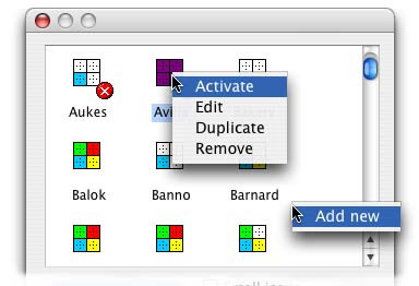
Context Menus
As with some other list display fields, the contextmenu
property of an Icon Array field allows us to specify two
context menus. The first is the "normal" context
menu, which appears when we context-click on one of the displayed
icons. The second is the context menu that will
appear if we context-click on the white space in the field
- either after the last icon or between the icons.
Why would we want two different context menus for a single field?
In the case of a list display field, a context menu for a list line
(or an icon, in the case of our Icon Array field) would offer operations
the user can perform on that line. A context menu for the white
space might offer operations like adding a new line, clearing the
entire list, or changing from large to small icon view, etc. The
second context menu is completely optional, though, so don't feel
pressed to use it!
We specify the menu classes we wish to use for these purposes by
including both names (separated by a comma) in the contextmenu
property value field in the Property Manager. If we want only a
single context menu to serve for the entire field, we only need
to specify one menu class (and no comma). The first menu class name
can be selected from the list provided in the Property Manager.
The second must be manually entered.
Context Menu Events
We may occasionally need to modify a context menu instance as it
is about to be used. For example, we might wish to include a menu
line that toggles the icon between "Active" and "Inactive".
This is a simple enough calculation and the process can be carried
out with a single line of code (after the line that detected the
event, that is). But if we are using a separate context menu for
the white space, our code needs to be a bit more elaborate. In either
event, we need to detect that a context menu is about to be opened.
That is the job of the evOpenContextMenu event for this field.
We discussed this event in an earlier article entirely devoted to
context menus, so we don't need to repeat the bulk of that article.
There are two specialized event parameters that accompany this event:
pClickedField,which is a notational reference to the field that
received the context click and pContextMenu, which is a notational
reference to the menu instance that is about to be opened. It is
the second of these parameters that is useful to us here. We can
use it to determine which of our two context menus is about to open
and only modify the appropriate line on the one that needs this
assistance. Here is an example of how this might be done:
On evOpenContextMenu

                If pContextMenu.$class().$name='iconContext'

                  Calculate pContextMenu.$objs.1.$text as
              pick(iconList.activeFlag,'Activate','Deactivate')

                End If
This changes the text on the first line of a context menu instance
spawned from the Menu Class named "iconContext", but does
nothing to a context menu spawned from "iconWhiteContext"
(the name of the menu for the white space). The text displayed on
the menu is derived from the value of activeFlag on the
line of the list that received the context click.
What About the List View?
Some readers may be wondering how we manage to get the "list
view" or "detail view" out of an Icon Array field.
The answer is quite simple: we don't. The way that Omnis Studio
does this in the Browser, the Component Store, etc. is to put an
Icon Array on one page of a Paged Pane field and put a Headed List
Box field on another page. Both the Icon Array and the Headed List
Box have the same dataname value. That is, they both represent
the same list variable. These fields are then given "compensating
code" to allow them to be treated in the same way (like detecting
a forward delete keystroke in the $event method of the
Headed List Box field to emulate the enabledeletekey property
of the Icon Array, for example). When the detail view is called
for by the user, the current page of the Paged Pane is simply changed.
When an icon view is requested, the current page is changed back
and the appropriate icon size mode is set.
Or it could just be magic... |
 Please logon or create a free account to download this file.