Button, Button - Which
Kind Of Button?
By David Swain
Polymath Business Systems
Well, it had to happen sooner or
later. We now have a choice to make when we want to place a set
of radio buttons onto the face of a Window class. Omnis Studio version
4.3 now supplies both traditional Radio Button fields and a new
field type called a Radio Group. We have seen this "new"
control on remote forms for quite some time, but this is
a new field type for a window class.
There are some definite advantages to using a Radio Group rather
than a cluster of our traditional Radio Button fields. The most
obvious advantage is that we don't have to worry about keeping all
those radio buttons in data entry order or about making sure that
they all reference the same variable in their dataname
property values. All the buttons are in one field control, so there
is only one dataname property to concern us. They can be
copied, pasted and dragged around as though they were grouped together
(or were contained in a borderless group or scroll box field) since
they are, in fact, the same field. We also don't have to worry about
aligning them with one another - if we, indeed, want to line them
up. And we can even manage events that happen to them in one place
- like the technique I have long demonstrated in classes of enclosing
a collection of Radio Button fields inside a Group Box field and
using the $control method of the Group Box to handle events
for those buttons. So a number of setup and operational processes
would appear to be made simpler with the addition of this new field
type.
But is the Radio Group a replacement for a group of Radio
Button fields? Far from it! While a Radio Group field is a great
substitute for a simple set of basic radio buttons clustered together
in the same area on a window, it lacks the flexibility of a "complete"
radio button field. So we will also review some of those features
in this article while answering the question "When would we
want to use which kind of radio button on a window class?".
Radio Group Basics
Perhaps this is too basic, but let's begin with the purpose
of a radio button control in general. Such a control object is used
to make a mutually exclusive choice among a number
of options. There are usually more than two options when we use
this control type, since a simple binary choice (on or
off, for example) is generally better performed using a
Checkbox field. (A single Checkbox takes up less space than two
Radio Buttons...)
In desktop applications (and increasingly even on web pages where
the developer has done some additional coding), a click on either
the radio button or its associated label (or even on some
of the empty space after the label text) is recognized
as making the corresponding choice. This gives the user a larger
target than just the little button icon itself, making the control
easier to use.
Although the buttons are labeled, such a field generates (and the
database then stores in the variable associated with the buttons)
an integer number to indicate the choice made by the user
rather than the label string chosen. A Short integer value
stores more compactly that the indicated Character string
value and can be more easily manipulated or compared in other operations.
Such numeric values might also be mapped to ENUM columns (enumerated
string value lists - which are also stored as integers) in a SQL
database, although such data types usually begin counting options
with the value of 1 while Omnis Studio button controls of this nature
(and those of most other programming languages) begin generating
values with 0. So an offset of 1 (adding 1 to the button field output)
is required to keep the two in synch when using Radio Buttons with
ENUM values.
Setting up a Radio Group field is quite simple. There are relatively
few options compared to those we are given for individual Radio
Button fields. Many of the options are used, in fact, to simplify
the grouping of the buttons. But there are very few options for
modifying their appearance, layout or availability - and none of
those can be applied to individual buttons within the group. Here
are the basics:
Layout Properties
First, we determine the number of buttons for a Radio Group field
by simply specifying an integer quantity for the buttoncnt
property (too easy!). These buttons are then layed out in an orderly
rectangular grid by combining the values of the columncnt
and horizontal properties. (These three properties are
all found under the Appearance tab in the Property Manager
- and if we switch off the "Sort by Property Name"
option for the Property Manager, they are grouped together at the
bottom of the list of Appearance properties.)
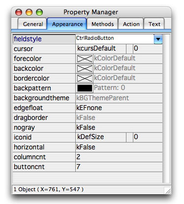
Fig. 1 - Appearance Properties In Natural Order
There are only a few configuration options available for our buttons.
We could have a single column of buttons (columncnt = 1,
horizontal = kFalse), a single row of buttons
(columncnt = buttoncnt, horizontal =
kTrue) or a grid with multiple columns and rows (with button
numbers increasing down the columns or across the columns depending
on the value of horizontal). Our biggest problem would
appear to be making sure that the field itself is high enough and
wide enough to accomodate all the buttons we have specified and
their labels - otherwise some of the content of the field will be
hidden.
Oh yes, the labels! We set the labels for the buttons by placing
a comma-separated list of label strings in the text property
(found on the General tab of the Property Manager). If
we provide too few labels, some of the buttons will simply remain
unlabeled. If we supply too many, the extras will simply not appear
(but the extra label strings do remain in the property value, so
they can be exposed by dynamically increasing the value of buttoncnt
at runtime).
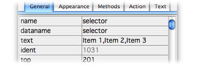
Fig. 2 - Text Property Under The General Tab
If necessary, we can dynamically change labels at runtime by reassigning
the entire text property string value. But there are other
things we can do with this property as well...
Label Text Options
By the way, the text property of a Radio Group, just like
that of a Radio Button, supports Square Bracket Notation. That is,
we can dynamically assign label text for the buttons in a Radio
Group using variables rather than reassigning the entire
text property value. This can be handy for multi-lingual
applications, but it can also be used for changing button labels
as we move from row to row in the database.
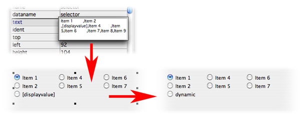
Fig. 3 - Square Bracket Notation In Radio Group Text Property Value
Just make sure that the value of each variable used in this way
is populated before redrawing the Radio Button field. If a variable
is NULL or empty, the buttons can really get messed up!
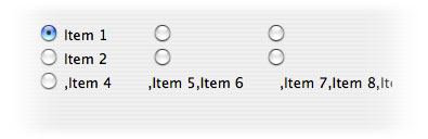
Fig. 4 - Effect Of Empty Value In Square Bracket Variable
But although we can use Square Bracket Notation here, we want to
keep it as simple as possible - preferably limiting ourselves to
using only (short - or appropriately long) variable names rather
than lengthy and complex expressions. This is because the length
of our square bracket expression is used to determine the spacing
for our labels - not the length of the resulting label string. There
are two possible problems with this:
If the value generated by our square bracket expression is significantly
shorter than the expression string itself, there could be an embarrassing
gap:
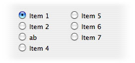
Fig. 5 - Gap Caused By Short Square Bracket Result
If the value generated by our square bracket expression is significantly
longer than the expression string, it will spill over into the next
column:
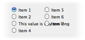
Fig. 6 - Overprint Caused By Long Square Bracket Result
But if we are careful, by doing this only with an "orphan"
button, we can take advantage of this "feature":
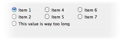
Fig. 7 - Long Result In Orphan Button
Although a Radio Group field can evaluate expressions placed within
square brackets, it does not support styled text. If we
were to place the style() function in square brackets within
the text property value, we would see the 11 character escape string
the function generates (remember, some of the characters may not
be printable) rather than a style effect on our window instance:
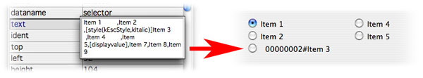
Fig. 8 - Style Function Escape String In Radio Group Label Text
And we might also see some stranger behavior on the window design
class associated with this (due to the comma character in the parameter
list of the style() function - which could apply to any
expression that uses functions, really):
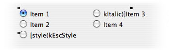
Fig. 9 - Effect Of Comma In Function Parameter List On Design Window
Radio Group Field
Spacing Issues
We have little control over the spacing of the buttons in a Radio
Group field. There are no properties for row height or column width
and we can't inject a tab to a specific position using the style()
function. Omnis Studio looks at the label strings we have chosen
to use (the strings in the text property value - including
any square bracket expressions) and adjusts the button widths accordingly.
Our choice of font - especially the font size - determines the row
height. On Mac OS X, it appears that using a "theme" font
yields a nice spacing automatically - especially the ThemeApplication
font. Using too small a font would cause a vertical group of buttons
to touch. So using a fieldstyle becomes even more important.
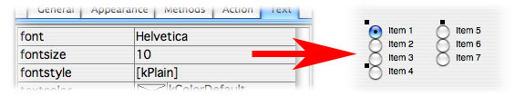
Fig. 10 - Effect Of Small Font Size On Radio Group Layout
We can make the labels a bit wider by adding trailing space characters
to each entry, but spaces are usually narrow in most fonts so it
may take quite a few to make a difference. Here I added eight spaces
to make the label space a little wider:
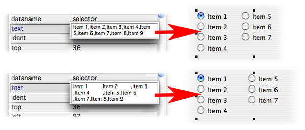
Fig. 11 - Effect of Adding Spaces To Radio Group Label Text
Button Order
The first button (the one that generates a value of 0) is always
in the upper left corner of this control. We cannot change this
anchor point for a Radio Group. The buttons will always be in a
logical order - and again, the order of the buttons is determined
by the combination of the columncnt and horizontal
property values. This is mainly of concern if there are multiple
rows and columns (columncnt is non-zero). In that case,
if horizontal is kFalse, the buttons are numbered
down the leftmost column and then down each subsequent column. But
if horizontal is kTrue, the buttons are numbered
across the top row from left to right and then across each subsequent
row. The label text is assigned based on this order.
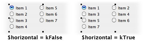
Fig. 12 - Effect Of $horizontal On Radio Group Button Order
Icon Options
As with Radio Button fields, a Radio Group field contains an iconid
property. This is used to change the icon used to display the state
of a given button in the group. But the icon used by a Radio Group
does not appear to change on Mac OS X (10.4.11 is all I have tested
so far), although changes to the iconid property on Windows
(XP) display the selected icon just fine. Radio Button field icons
change as expected when the iconid value is changed, though.
But a number of issues on the various versions of Mac OS X have
been reported (since Apple continues to change the rules that software
developers must follow - often without warning!) and an update to
Omnis Studio 4.3 is promised soon specifically to deal with Mac
OS X issues (and maybe a few new options...).
A couple of friendly notes of warning on changing the icon, though:
First, make certain that you have chosen the id number of a multi-state
icon. This will assure that a similar, but changed, icon will appear
when the button is in different states. Second, try to use an icon
that is reasonable for a radio button. Some of the multi-state icons
are designed for other things and may not give an intuitive signal
to the user. For example, icon number 613 (the plus/minus box for
Windows tree lists found on the Multistate 2 page of the
Omnispic icon datafile) shows a minus when selected and a plus when
not selected. Then again, it was designed for indicating actions
on exposing or hiding tree list node contents, not for use with
radio buttons.
Of course, we can always create our own icons if the ones provided
do not suit our particular needs. If we
want to make custom icons for use with Radio Group or Radio Button
fields, we must make certain that we create them on a multi-state
icon page - and then create the appropriate look for each of the
states specified on that page.
What's Missing From A Radio Group?
Did I say "missing"? Perhaps "different from a Radio
Button" would be a better turn of phrase. There are a number
of appearance options that we have had for Radio Button fields for
a long time that are not available currently for the Radio Group
field type. In addition, the freedom the Radio Button field type
offers us (along with a little more work) allows us to create much
more flexible interfaces involving choice buttons than a static
block of them. So the new Radio Group is great for setting up and
maintaining a simple set of buttons that we want to be
all on a block, but there are a number of layout scenarios where
we need more freedom of expression.
So the biggest thing "missing" (there's that word again)
from the Radio Group field type is the ability to apply certain
features to individual buttons. But that is why we continue to have
the Radio Button field type as well. For example, the visible,
active and enabled properties (as well as tooltip
and disablefocus) also are applied to all buttons
at once for a Radio Group field. Of course, this makes perfect sense
from one point of view, but this can be a disadvantage occasionally
(as is discussed below). Also, if the value of the associated variable
is changed, we only have to redraw the one Radio Group field rather
than remembering to draw a number of separate Radio Button fields
- so that is a feature "missing" from the Radio Button
field type in some sense.
The advantages of a Radio Group field are the even spacing and automatic
layout attributes, as well as unified event handling and the unified
dataname property. The disadvantages are that those advantageous features
limit us in a number of ways.
In addition, there are some options the Radio Group field type
just hasn't been given...
Radio Button Style Options
Just like with Pushbutton fields, we have a number of appearance
options for Radio Button fields with the buttonstyle property.
This is only a property of a Radio Button field, not
of a Radio Group field. Here is a brief description of
each option for this property:
kNoBorderButton is the built-in default buttonstyle
property value for a Radio Button field. This is the only style
option we have for a Radio Group, though, since there is no property
for changing this aspect of the fields appearance. If we switch
off the background pattern for such a field (or for a Radio Group
field), the field becomes transparent (except for the text it displays
- and the button icon, of course). This means that we can see the
background of the container through the field. We can even see background
skins if that feature is being utilized. (More about that some
other time!) Radio Button fields with this buttonstyle value will
generally not have a colored background. In fact, the forecolor,
backcolor and bordercolor properties are all greyed
out in the Property Manager. However, if we change this property
to one of the other options and then change it back, we will notice
that the Radio Button field now has a solid color background - even
though the color properties are disabled. This issue can be remedied
by removing and then reapplying the fieldstyle property value. (I
have tested this on both Mac OS X and Windows XP with the same results.)
But there are many other options for the style of a Radio Button
field. For the sake of completeness, let's briefly examine those
style options - options of which some Omnis developers may not be
aware...
kSystemButton is the first option past the default presented
in the dropdown list offered by the buttonstyle property
in the Property Manager. If we select that, our Radio Button field
looks like a standard pushbutton - complete with any "3D-ness"
applied by the operating system. Again, a button of this style cannot
be colored or patterned. When such a button is selected at runtime,
it displays appropriately for the given platform. On Windows, the
button is rectangular. When selected, it looks indented and shows
a dotted rectangle around the label text. On Mac OS X, the button
is lozenge-shaped with a 3D appearance. The selected button takes
on the standard aqua color while an unselected button remains greyish.
On either platform, this has a look reminiscent of the buttons on
an old car radio (if those buttons weren't round) with the text
of the label on top of the button. We cannot assign foreground or
background colors to this style of button.
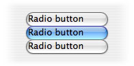
Fig. 13 - kSystemButton Radio Buttons On Mac OS X
We can include a multi-state icon on this button and it will further
indicate the state of the button. Or we could use a static icon
along with or as a substitute for the label text. The field alignment
for the button determines where the icon is located relative to
the label text.
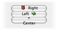
Fig. 14 - Effect Of Alignment On Icon And Label Positions
The "center" option would normally place the icon above
the text, but there is not enough vertical room on a system button
on Mac OS X to do so. This is because the height of a system button
is fixed at 22 pixels on this platform. On Windows XP, this style
of button can be given a greater height - and the icon is centered
above the text when the align property value (found under
the Text tab in the Property Manager) is set to kCenterJst.
We can also make any of the text-bearing button styles contain
multiple lines of label text - except for the default kNoBorderButton
option mentioned above. To do this, we indicate a line break using
a double forward-slash character string (//). (The text will not
automatically wrap onto multiple lines, so we have to help it a
little.) This usually looks best if the field is center-aligned.
If you were not aware, we can also use this technique for causing
line breaks in the text of dialog boxes. While we can perform this
feat on all platforms, the height limitation of a system button
style on Mac OS X makes this look a bit odd. On Windows, where we
can make the field taller, this works perfectly fine. The other
styles that display text labels work fine for this feature on Mac
OS X as well.
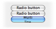
Fig. 15 - Multi-Line Label On kSystemButton Button
kHeadingButton is the next option. The Radio Button field
with this buttonstyle property value looks like the column heading
of a Headed List field. This button style displays a rectangular
button on all platforms with the label text again displayed within
the button. On Windows XP, the button is basically white, but displays
as "indented" when selected. On Mac OS X, the button has
a 3D quality and is darkened when selected. We cannot assign color
to this type of button either.
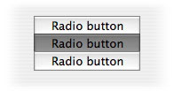
Fig. 16 - kHeadingButton Radio Buttons On Mac OS X
Oh yes, and we can make buttons of this style, or of the "user
button" style detailed below, any size we wish on all platforms.
A Radio Button field with the kComboButton option displays
as a pushbutton with a downward-pointing arrow on it. On Windows
XP, this button is the width of the field (we can adjust both the
height and width on that platform), has a slight 3D-ness to it and
a chevron-shaped arrow. The selected button of the set is a darker
grey. On Mac OS X, the button is 21 pixels square (no matter how
large the field is made), had a 3D aqua look and a solid triangular
arrow. The selected button in the set is a slightly darker aqua
color. And we still cannot assign color to this type of button.
I have added a checkbox icon into each of the Radio Button fields
shown here to help indicate which one is selected from the group.
this button style does not display label text, but does display
an icon (to the side) if we assign one.
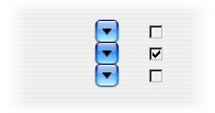
Fig. 17 - kComboButton Radio Buttons With Checkbox Icon On Mac OS
X
The kUserButton option yields a rectangular button with
a 3D look on all platforms - and one that can be colored if we wish.
The forecolor, backcolor and bordercolor
properties for the field become enabled when this option is selected.
The selected button becomes a dark grey no matter what color or
pattern of colors is applied to the field. The text retains whatever
color it had, so it might be wise to detect the change of which
button is selected and lighten the color of the selected button
so that it can be read more easily. (Or use a dark color with white
textcolor for all the buttons, allowing the dark grey to
indicate which is selected.) Any color selected while this option
is in force will be retained by the field and appear in the Property
Manager when another buttonstyle option is selected - even though
that color will not be realized on the field itself. This is the
only one we can make truly ugly on any platform!
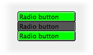
Fig. 18 - kUserButton Radio Buttons With Color Applied
The kRoundButton and kLargeRoundButton options
are primarily for the Mac OS X platform. (The large round button
style first appeared in Omnis Studio version 4.2) In fact, these
button types are not at all round on any other platform! On Windows
XP, they take on the same look as kSystemButton provided - but without
the label text. They can also be made any size and the vertical
gradient used to provide the 3D look is spread across the entire
height - although it is less convincing at larger sizes. But on
Mac OS X these appear as translucent round buttons with a diameter
of 19 or 27 pixels respectively. Making the fields area any larger
is pointless, but making it smaller clips the button image. These
buttons do not display text (on either platform). Rather, they are
used to display only an icon - but here we use a normal,
static icon for these instead of a multi-state icon. In fact, the
multi-state icons only statically display their default, unselected
image even when this kind of button is in its selected state. For
reasons of pure arithmetic, the k16x16 size is most appropriate
for this control - and even that can be a bit cramped on the smaller
of these buttons! Possible specialized use: Changing states of the
window (or some part of it, such as a page pane) where a tab strip
does not provide the proper look. In fact, even without an icon,
these button types (especially the smaller one) can be quite effective
when coupled with paragraph-sized multiline label text blocks (on
Mac OS X, at least).
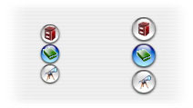
Fig. 19 - kRoundButton And kLargeRoundButton Radio Buttons On Mac
OS X
The Power of the Individual
With a Radio Group, all buttons in the group are enabled or disabled,
hidden or shown together. It is not possible to disable or hide
individual buttons within the group at this time. Yet there can
be occasions where one or more choices may not be appropriate given
other aspects of the current data or choices made on previous "screens"
(in a "wizard" scanario). Sets of Radio Button fields
do not have this limitation. An individual Radio Button can be disabled
or hidden without affecting the other buttons in the set. We do
not (yet) have a property or method for a Radio Group field that
allows us to change these aspects of individual buttons within a
Radio Group field (similar to our ability to change the alignment
of individual columns in a Headed List field at runtime using the
$setcolumnalign() method) - but perhaps we never will.
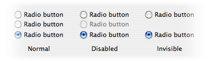
Fig. 20 - Disabled And Invisible Radio Buttons Within A Set
Another property not shared between Radio Group and Radio Button
fields is the local property. A Radio Group cannot be made
local to another field as can a Radio Button field. A properly created
set of Radio Button fields (where they are in contiguous field number
order and they address the same variable) are already "internally
local" amongst themselves when their local property
value is at its default setting of kFalse, but this property
allows us to make the first of these buttons (and, therefore,
the entire set) local to a field outside the group.
Advanced Radio Button Techniques
Then there is some design territory that is simply out of reach
for the Radio Group field type. So individual Radio Button fields
still have their place in the toolkit! Here are some additional
techniques to consider (by no means an exhaustive list!):
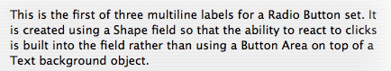
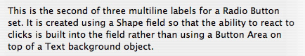
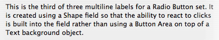
Sometimes we might have entire paragraphs of text that we must
use as the "labels" for a set of Radio Button fields.
Those fields cannot display multiline labels, so we must use separate
objects for that text. Since we also need to react to a click on
the label text to select a button, our best choice for the label
text object is probably a Shape field. this is a special field that
can take on the aspect of any background object, while having the
event handling features of a foreground object (like click detection
in a $event method). All we have to do is make sure that
the Radio Button fields themselves are in proper field number order
(the field numbers of the Shape fields can be anything) and then
queue a click on the corresponding Radio Button field when a click
is detected on one of the Shape fields. That code would look like
this:
On evClick

                 Queue click {choice1}
The "coverage" for a given button-label combination would
be as shown here (pass your mouse over the illustration):
Fig. 21 - Coverage Area When Using Shape Fields For Multi-Line Labels
With Radio Buttons
We can also do this if the choice description is a picture or some
combination of picture and text fields. Again, Shape fields are
good choices for large labels of any background object type.
Since each Radio Button field can be independently placed, we can
arrange them in such a way as to provide secondary choices with
Checkbox or additional sets of Radio Buttons (or Radio Groups).
This requires some fancier coding, but it may well come up in practice.
We could even make the main Radio Button fields move to expose the
sub-choices for the selected button:
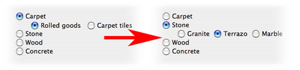
Fig. 22 - Radio Buttons With Dynamic Subchoices
Each situation will be different, but the advantage of having a
separate $event method for each button will be immediately
apparent if you find yourself needing to go down this road.
There will be times when something about the current row in one
table dictates that one or more button choices for a row in another
table should be disallowed. In such cases, we need the ability to
either disable (grey out) one or more buttons from a set of Radio
Buttons or simply make the temporarily inappropriate choices invisible.
Changing the enabled or visible property value
to kFalse for one of a set of Radio Button fields has no
affect on the operation of the group - beyond disallowing that one
button, of course. This was illustrated in Figure 20 above.
In addition, we might find ourselves in the position to spread
a set of Radio Buttons onto various locations on a window. No problem
if we are using Radio Buttons since we must place them individually
anyway. We just have to take extra precautions to make sure that
we do not accidentally interfere with their field order when manipulating
other objects in design mode. We can help prevent such problems
by first grouping those fields and then locking them once we feel
they are in the proper positions.
In Conclusion
As we can see, even something as overtly simple as a set of radio
buttons can offer a great deal of variety when we start poking around
and exploring its secrets. The new Radio Group field type is a welcome
addition to our toolkit fo the simple cases because it makes our
work even simpler. But the Radio Button field type is still there
for those special needs.
In The Next Issue
I hope you find what I have presented here to be useful. In the
next issue of Omnis Tech News I will revisit the Graph2 component
and highlight the new features that have been exposed in it with
Omnis Studio version 4.3. this component becomes more impressive
with each release!
|
 Please logon or create a free account to download this file.