Tech News Back Issues Issue: 050604
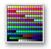
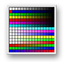
Colors in Omnis StudioBy David Swain Color can be an important and meaningful aspect of an application beyond being simply decorative. Besides the colors that we apply to objects within our applications, we may also need to allow our users to assign colors to items. Omnis Studio has always given us a fair degree of control over the colors we can assign to application features like backgrounds and text, but Omnis Studio 4.x or above has raised the bar again. There are some intriguing new features in this version that relate to how we can control color in our applications and how we allow our users to select colors. Before beginning, I want to apologize up front to those readers not used to American English. We spell the word here as c-o-l-o-r rather than c-o-l-o-u-r - and that works easier for me. Think of it as a form of compression... I'm just saving a few keystrokes! What We Already HadAs I mentioned in a previous article on button modes, we can set a pushbutton component on a window class to be a color picker by setting the buttonmode property of the pushbutton to a value of kBMcolorpicker. After the user selects a color with this object (which generates the evClick event for the pushbutton), we can access their color selection as the $contents value of the pushbutton field. This holds a Long integer numeric value which denotes either an RGB value or an Omnis Studio color constant. (A brief discussion on color values was given near the beginning of my Tech News article on the "style() Function" published 26 March, 2003.) In previous versions of Omnis Studio, our users (and we ourselves) needed to select colors from what is now known as the old standard palette - a swatch of which is shown here:
This palette is actually two palettes in one. The first is made up of gradients of six steps in arrays of six gradients for five arrays. This is followed by a sixth array whose last gradient only has five steps. There are then four gradients of ten steps - one from each of the primary colors and one from white, all descending to nearly black. The final cell is pure black (which is also the "missing" cell from the sixth gradient of the sixth array). Don't worry if you didn't follow that! If we regroup these a bit (as shown below) and imagine the top six squares stacked behind one another, we can see that they actually form a 3-dimensional color grid, six cells on an edge (with the final black cell missing) followed by a 2-dimensional RGB-to-Almost-Black and Almost-White-to-Very-Black gradient.
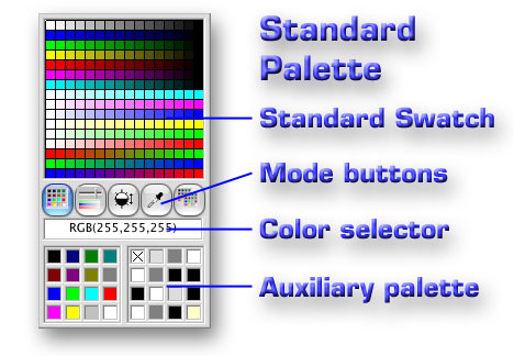
The first (cubic) palette was achieved by varying each rgb() parameter from 255 to 0 in steps of 51 (255, 204, 153, 102, 51 and 0) systematically. The RGB-to-Black gradients followed an interesting (though uneven) progression of values (238,221, 187, 170, 128, 119, 85, 68, 34 and 17) for each parameter, while the grayscale gradient follows an almost identical progression for all three parameters (with 136 substituted for 128 - just in case you really wanted to know...). This palette had the advantage of presenting a broad range of colors with no redundancy, but it was somewhat confusing to those who couldn't twist their perception to see its pattern. And it did not allow us to select colors other than those displayed. The pushbutton type of color picker still exists and the basic facts of how we use it to get a color value selection from the user (On evClick from the field's $contents property) have not changed. What has changed is the interface of this color picker itself (and the basic palette of colors it presents), the control we have over its presentation (in a new kind of field object) and the fact that we can now store a custom color palette within our libraries and use that as an alternative to the standard one. (In fact, we can modify the standard one if we need to...) These are each significant changes, so let's deal with them one at a time... New Color Picker OptionsIn previous generations of Omnis, the user of a color picker pushbutton was limited to a palette of 256 colors plus an additional assortment of "system" colors (which correspond to a few basic "named" colors and some specialized "theme-related" colors on some platforms). While the user was shown the RGB value of a selected color (if selected from the 256 color palette), the user was not allowed to specify an exact color value from the 16,777,216 possible colors in the 24-bit spectrum. Although it was possible for us to set up a collection of sliders for the red, green and blue components of a color and then apply these values using the rgb() function, this entailed more work (and took up more screen space) than most developers wanted to devote to user-selectible color management. This deficiency has now been addressed. In Omnis Studio Version 4, the user can now adjust the color selected from the color picker if the choices presented are not satisfactory. There are four new options available in the color picker in addition to the standard palette. Better still, we can exercise control over which ones our users can access, if need be. But besides a color picker mode for a pushbutton, we now have been given a first-class control just for selecting colors. While this object does require a bit of room on a window, it is a welcome addition to our toolbox! Color Palette ControlIt is a rare event that we are given a new, basic window component object to use in Omnis Studio. Sure, we are given new external components occasionally, but a new built-in component is cause for celebration! The Color Palette Control is a new built-in window component object that we can access through the "Standard Fields" panel of the Component Store window. It displays the same color picker as does a pushbutton object set to kBMColorPicker mode, but without the need for the user to click a pushbutton to open it. On the other hand, it does require more dedicated screen area than the color picker pushbutton since it is a "permanent" feature of a window. (Or we could use a pushbutton to show the control temporarily covering other fields on the window - there are always choices to make...) But however we choose to display this field, we have more control over it than we do with a color picker pushbutton - it just works a bit differently (at least, from the programming perspective). All that is missing is a bit of explanation... Let's first examine the features these two color picker items have in common. Parts of the Color Palette ControlThere are a number of identifiable parts of the color palette. If we give names to these, it will be easier to talk about them. Consider the following diagram:
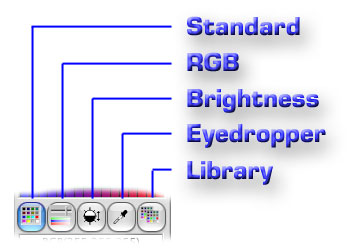
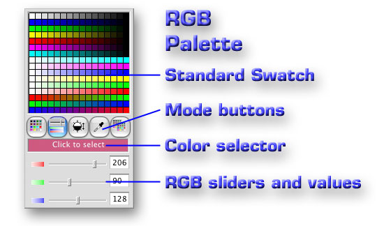
This shows the standard color palette. There are four distinguishable areas that have been labeled here. The topmost area is the swatch that displays the standard color palette. This contains the 256 "standard" colors available for easy selection. Each of these has its own separate cell identified by a number (ranging from 0 through 255) called its color index. Number 0 is in the upper left corner and the cells are numbered consecutively across each line (so 255 is the cell in the lower right of the swatch). The sixteen lines are organized in an interesting pattern that we shall explore in a moment. Underneath the swatch we find the mode buttons. There are five such buttons that the user (or developer) can click upon to change the mode of the color picker (to get at more colors by exposing different tools). Each mode presents further options for modifying the selected color. The selected color is displayed just below the mode buttons. This is where the $contents value of a color picker pushbutton is determined (although the Color Palette Control yields its current color value in a much different way). As the mouse pointer passes over the standard color palette, the selected color area changes color and displays the rgb() function with the parameter values that are needed to specify that color. Clicking on a color from the palette swatch simply fixes the color value displayed here and changes the text in this area to read "Click to select". So the user must still click on this area to actually select the final color value. While this may seem like an extra step, it allows the user to employ other tools (from other modes) to "fine tune" the color value before making the ultimate selection. The auxiliary area displays different content for different palette modes. In standard palette mode it contains additional palettes for selecting from among the color constants, as this control has in previous versions. But we will soon see that this area offers other tools that give us access to any color in 24-bit color space. Colors in the Standard PaletteMany colors in this palette appear multiple times. In fact, both white and black appear seven times, while the primary rgb colors (red, green and blue) appear four times each and the secondary rgb colors (yellow, cyan and magenta) each appear twice. This is no problem since we can generate any color that we need, but it does present a more orderly appearance than the old standard palette shown earlier. Each line in the new standard palette is actually a 16 step gradient from one color value to another. There are four "groups" of lines characterized by the organization of the colors on them and how the red, green and blue components of those colors are varied. The first line actually constitutes its own group. This is the achromatic, or grayscale, line. This line ranges from absolute white on the left to absolute black on the right. The red, green and blue components have equal values in each cell, yielding various levels of gray. The way the arithmetic works out, each rgb() parameter begins at 255 in the leftmost cell and then is decremented in steps of 17 until each reachs a value of 0 in the rightmost cell. We will see such a value progression for rgb() parameters in each of the other lines as well. Below this are six lines that each range from a primary or secondary RGB color to black. One or two rgb() parameters are held at 0 for the entire line while the remaining parameter(s) progress from 255 to 0 (together if more than one vary). For example, the second line varies only the blue (third) parameter of the rgb() function, while the fourth line varies both the red (first) and green (second) parameters together (yielding shades of yellow). The next group of six lines holds one or two rgb() parameters at 255 while decreasing the remaining parameter(s) from 255 to 0. This means that each line is a gradient from white to a primary or secondary RGB color (the opposite of the previous six lines). The final three lines contain gradients from one primary RGB color to another. That is, one parameter is increased from 0 to 255 while another is decreased from 255 to 0. The lines go from red to green, from green to blue and from blue to red. While this layout (coupled with the auxiliary palettes that access the color constants) gives the user an easy-to-understand color selector, it offers fewer colors than the old palette did. But that's where the other modes come in... Beyond the Standard ModeThe major benefits of the new color palette are found when we examine the other modes. We access these by clicking on the corresponding mode button on the control. When exposed from a color picker pushbutton, all mode buttons are available. But we have control over which buttons are displayed on the new Color palette window object. From the left, the mode buttons give us access to the Standard, RGB, Brightness, Eyedropper and Library palettes, as shown in the following diagram:
Here is a quick look at each of the non-Standard palettes: RGB PaletteThe RGB Palette is nearly identical to the Standard Palette, except that the Auxiliary Palette area at the bottom of the control contains three sliders and three matching entry fields.
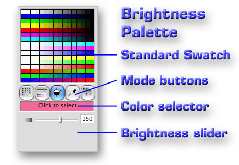
These additional controls are used to modify the red, green and blue components of the selected color, as indicated by the graphic to the left of each slider. The user can either drag the slider to set a value (good for exploring the effect of each component on the selected color) or enter a value directly into the entry field to the right of the slider. Brightness PaletteThe Brightness Palette is similar to the RGB Palette, except that it only contains one slider and accompanying entry field.
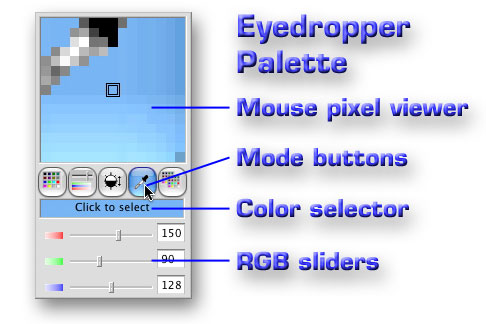
These controls are used to set the brightness level of the standard swatch and the selected color. Each time we click on the Brightness button, the level is reset to a value of 128 (mid-range). This also resets the brightness of the standard swatch, but does not affect the color already selected. Moving the slider or changing the value in the entry field modifies all three rgb() parameters equally between their current values and the ends of the range. While any color in the palette can be "darkened" to black, saturated colors (pure red, for example) cannot be made any "brighter", so not all colors can be "brightened" to white. Eyedropper PaletteThe Eyedropper Palette is very powerful! It allows us to "pick up" a color from anywhere in our monitor space - even from outside of Omnis Studio.
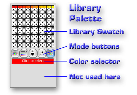
When this palette is selected, the swatch area becomes a magnified view of the area immediately surrounding the mouse pointer, with the central square representing the exact pixel over which the mouse is currently hovering. In the example shown here, notice that the mouse is still over the mode button for the eyedropper, so we are seeing a "blown up" view of a 16x16 pixel square centered on the pointer's hot spot. Like a real eyedropper that can draw up liquid into which its nozzle is placed when its compressed bulb is released, this control lets the user select whatever color is at the mouse pointer's hot spot when the user next clicks the left mouse button. When this occurs, the color of that pixel is applied to the selected color area and the palette reverts to RGB mode so we can further modify the color, if needed. Library Custom PaletteOmnis Studio version 4 allows us to create a custom palette of up to 256 colors that is stored with out library. (More on that process later in this article.) The rightmost mode button is used to substitute the library swatch for the standard one.
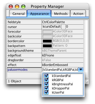
When this occurs, the auxiliary palette area is cleared, as there are no additional tools available in this mode. The user can only select from the colors presented, but any of those colors can be further modified if the user subsequently selects the RGB or Brightness palette. Any cell in the library swatch that has not been assigned a color displays an "X" instead of a color. Selecting such a cell assigns black (rgb(0,0,0)) to the selected color. Keyboard Control of the PaletteThe selection of a cell in a swatch is sensitive to the (unmodified) arrow keys on the keyboard. That is, the user can select a different color index using any of the arrow keys to move the selection to an adjacent cell. I have discovered no other keystrokes that affect the use of this control, however (like making the final selection) - but that doesn't mean there aren't any! Setting Up the Color Palette ControlThe new Color Palette field (objtype = kColorPalette) has the basic properties of any other window field (top, left, height, width, enabled, visible, etc.). There is really only one special property of this field type: the palusermodes property. This is used to set which of the mode buttons is avaiable to the user. By default (as shipped to us), all five modes are activated, but we can reduce this if we wish. We set the availability of each mode the same way we set text styles, by switching each one on with a check box in the Property Manager.
We can also set these on or off using Notation. The constants that represent the various modes are kStandardPal, kRGBPal, kBrightnessPal, kDropperPal and kUserPal. These have numeric equivalent values of 1, 2, 4, 8 and 16 respectively. We can notationally assign which mode buttons are visible by assigning the sum of the desired constants - again, just like assigning text styles. So if we only want to give the user access to the Standard, RGB and Brightness Palettes at some point (and we have a variable named colorPaletteRef of Item reference type that points to the field), we can set this using either:
or
There is also a new fieldstyle that comes with this field in the Component Library. Its name is "CtrlColorPalette". This style only has the hasbackgroundtheme property set to kTrue, with the backgroundtheme property value set to kBGThemeParent for all platforms. While that might not seem like much, remember that this theme also overrides forecolor, backcolor, bordercolor and backpattern. It is possible to resize this field to "crop out" some of its components. For example, we might want to only display the swatch area. However, we can only "crop" from the lower right corner of the field, so we can't display just the RGB sliders or just the mode buttons, etc. Color Palette MethodsThe Color Palette control operates by executing one of its two special methods. (It also contains a $redraw method like any other field). These methods can be used to set the palette mode ($setpalmode) and to get or set a color value within the field ($colorind). The $setpalmode MethodThis method is used to set which of the palette modes is the current one. This is completely independent of the modes that we have made visible to the user with the palusermodes property. That is, we can expose any palette mode using this method regardless of its display state. This method requires one parameter, which is an integer number that represents the mode to be set. The one thing that might be confusing about this is that the values we use are not the same as the ones we would use to modify the visibility of the corresponding mode buttons. (Although there is a mathematical relationship between them: constantValue = 2(parameterValue-1)) We use the following values for assigning the current mode using this method: 1 = Standard, 2 = RGB, 3 = Brightness, 4 = Eyedropper, 5 = Library So to set the mode of a Color Palette field to the Eyedropper Palette from outside the field, we could execute the following command line:
This method allows us to substitute a group of radio buttons or a dropdown list for the mode buttons while still using the Color Palette field (perhaps cropped down to just the swatch) for color selection. Or we could simply exercise more control over the mode offered to the user. The $colorind MethodThere is no $contents property of a Color Palette field like there is with a color picker pushbutton. This method is used to set or get a color value in various ways for various items within the Color Palette field. The method has two mandatory parameters and two optional parameters. It also returns a value for certain of its modes. The first parameter is the index (integer) parameter. It is used to specify a slot in the color palette on which the method will operate. Since there are 256 slots, it usually takes on a value between 0 and 255. However, we may occasionally need to deal with a color not in one of the palette slots. In such cases, we use a value of -1 for this parameter. The second parameter sets the mode for method execution. This method has three modes - not to be confused with the palette modes of the control itself. These modes determine how the method functions. If the mode value is given as 0, the method gets a color value based on the other parameters. If the mode value is 1, the method sets a color value for an item as indicated by the other parameters. And if the mode value is 2, the method retrieves the number of the current color index for the control. To summarize: 0 = get color, 1 = set color, 2 = get index The simplest thing we can do with this method is to get the current color from the Color Palette field. To get a color, we set the second parameter to 0. Since we want the selected color (which may have been significantly modified after being selected from a cell in the swatch) and not one directly from the swatch itself, we use -1 for the first parameter. In this mode, the $colorind method returns a color value (Long integer), so we can use it like this:
If we wish, we can retrieve the value of any cell in the displayed swatch by using its color index in the first parameter. So to get the value represented by the third cell in the fourth row (color index = 50), we would use:
But we can also set the color of a specific cell. To do so, we need to use the third parameter of the $colorind method: the color parameter. This parameter is used to designate the color value that is to be set when the mode value is 1. It requires an rgb() value (Long integer type). The color constants do not appear to work for this. (They each set a color value, but not the expected one.) To set the value of the currently selected color index (cell), we can specify -1 for the first parameter. To get the set value to actually display, we also need to include the fourth parameter: the redraw parameter. This parameter takes a Boolean value (kTrue being a good choice). So to set the value of cell number 16 (the first one in the second line) to red, we could use:
This use of the $colorind method affects whichever swatch is currently exposed. If we are in Library Palette mode, it modifies the custom swatch. If in the Standard, RGB or Brightness Palette mode, it modifies the standard swatch. It has no effect on the Eyedropper Palette mode - mainly because the first click of the mouse in that mode selects the pixel under the mouse pointer (so we'd have to invoke the method by some means other than a mouse click) and there is no swatch exposed while in that mode. The $colorind method returns a value in the set execution mode as well - but it always seems to return a 1, which probably just indicates successful execution of the method. (It even returns 1 when the execution does not appear to be successful...) Color Palette EventsNormally we would use the Color Palette field to select a color value and simultaneously assign that value to a property of some other field. The only event that we are concerned about is the evClick event. This is only triggered when the user clicks on the selected color area, having fully defined that color with all the necessary tools. We have not been given access (at least none that I can find so far) to detecting clicks on cells in the swatch, clicks on the mode buttons or changes in value of the RGB and Brightness sliders. The use of this field type for its main purpose is very simple then. If we have already populated an Item reference variable to point to an item whose forecolor (or backcolor or textcolor, etc.) value our user wishes to modify, the $event method for the field only needs:
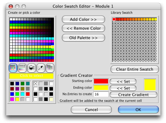
This field type otherwise has the normal events for a field. Library Color PaletteBesides being given a new foreground object for window classes, we have also been given a new System Table. This is the #COLORS System Table that contains a custom color palette for a library. Just like #STYLES or any other system table, we can copy #COLORS into other libraries once we have developed a custom Library Palette that suits our needs. To build the custom palette, we have been given a Color Palette Editor window. This window is presented when we open the #COLORS System Table:
We use the Color Palette field provided on the left to specify colors for each cell in the library swatch on the right. We also have the ability to create a gradient by defining a beginning and an ending color and a beginning position in the library swatch using the Gradient Creator. Clicking the selected color in the palette on the left changes the color value displayed on the right side of the Gradient Creator. We can then use the appropriate "Set" button to set either the Starting or Ending color. Once both of these are set, we can specify the number of steps for our gradient. Then all we need to do is select a cell in the Library Swatch and click the "Create Gradient" button. Omnis Studio does all the math and populates the number of cells we have specified with colors created by progressing the parameters of the rgb() function from those of the Starting color to those of the Ending color. We can also add colors to the Library Swatch one at a time. With the pushbutton at the top of this window, we can copy the selected color of the color palette directly into the current cell of the Library Swatch. We can clear the current cell in the Library Swatch using the "Remove Color" pushbutton. The third pushbutton places the entire old color palette into the Library Swatch, if we feel we need in our library that for backward compatability. We can even clear the entire Library Swatch and begin again using the button just below it. Into the SunsetThis should be enough to get you started using some of these new tools. I am still exploring all the possibilities of these features and will probably revisit this topic at some time in the future. (I have some ideas for storing multiple swatches in a library to go with different "color themes", for example.) I hope you have enjoyed this excursion into color tools and will soon find the information useful! |
|
| © 2004
Copyright of the text and images herein remains with the respective
author. No part of this newsletter may be reproduced, transmitted,
stored in a retrieval system or translated into any language in any
form by any means without the written permission of the author or
Omnis Software. Omnis® and Omnis Studio® are registered trademarks, and Omnis 7™ is a trademark of Omnis Software UK Ltd. Other products mentioned are trademarks or registered trademarks of their corporations. All rights reserved. |


 Please logon or create a free account to download this file.
