The HUB option contains many example apps under the Samples option and allows you to view the IDE Options.
The Omnis development environment contains all the tools you need to build enterprise, web, and mobile applications in a cross-platform, multi-developer environment. The Tutorial introduces you to some parts of the Omnis IDE, including the Studio Browser, Property Manager and the Catalog. This chapter goes into more detail about these tools and others in the Omnis Studio IDE. Some of the tools and development features in Omnis, such as the Omnis VCS and using the SQL Browser, are described in greater detail in their own respective chapters later in this manual.
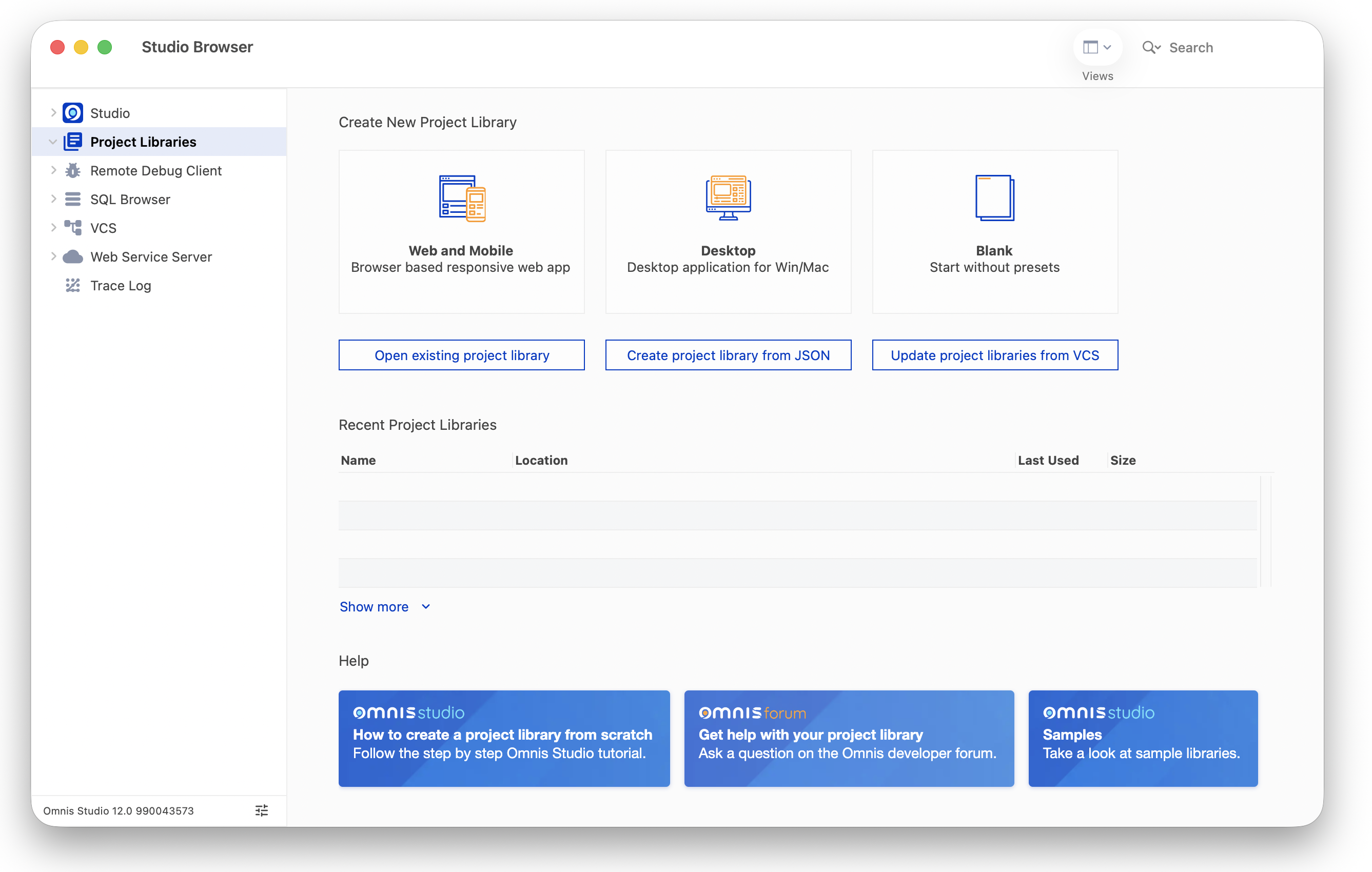
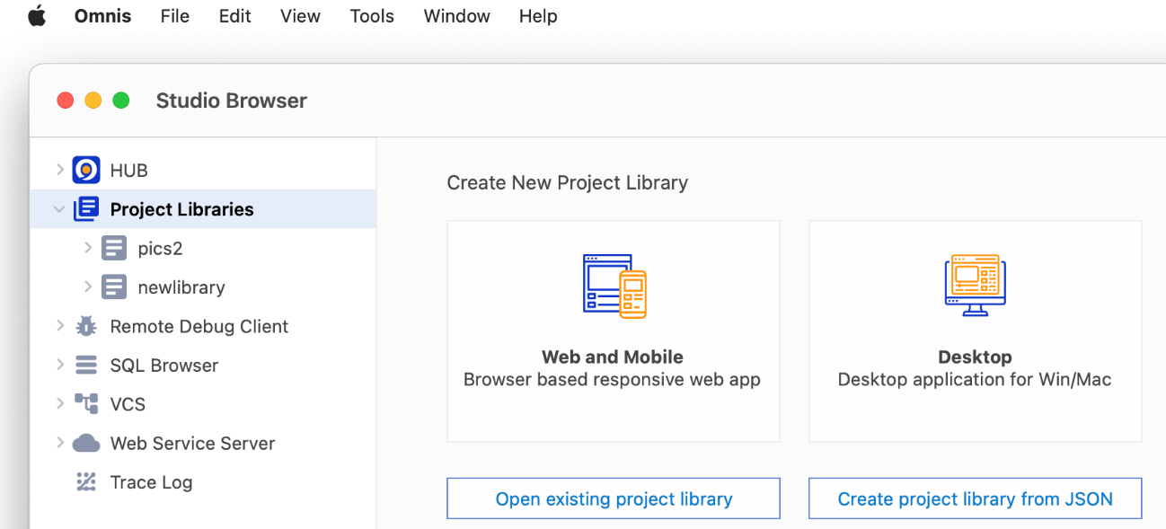
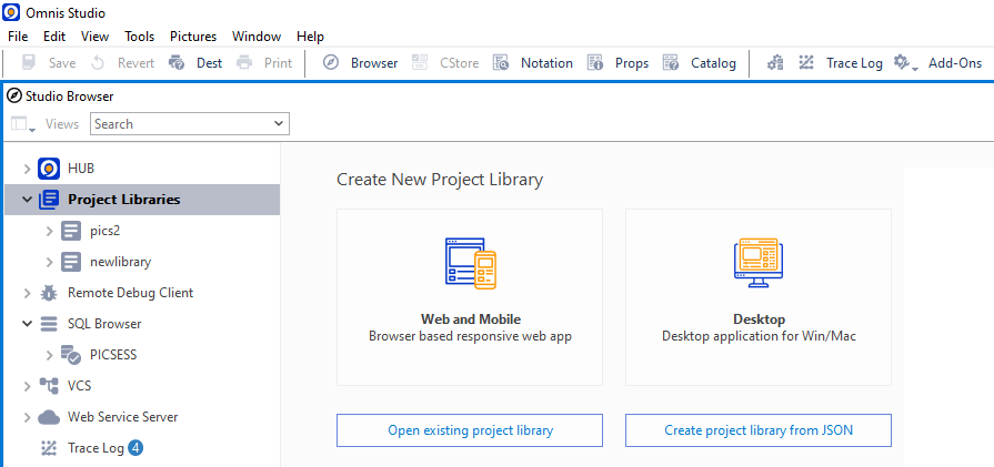
When you start Omnis Studio you will see the Project Libraries option in the Studio Browser, which allows you to create a new library or open an existing library.
If the Studio Browser window is not visible, you can press the F2 key on Windows, or Cmnd-2 (or Fn F2) on macOS, or you can select the Browser option from the View menu, or under Windows you can click on the Browser button (compass icon) on the main Omnis toolbar (on macOS, you can enable the toolbars via the View>>Toolbars option).
The list of options down the left-hand side of the Studio Browser gives you access to all the main tools for creating applications, including the Remote Debugger, the SQL Browser, the Omnis VCS, and the Trace Log.
The HUB option contains many example apps under the Samples option and allows you to view the IDE Options.
The Studio node provides information about your current license, access to the latest software updates, as well as example apps under the Samples option and the IDE Options.
Note that some features (and class types) in the Studio Browser are not available in the Community Edition, such as those relevant to developing desktop applications.
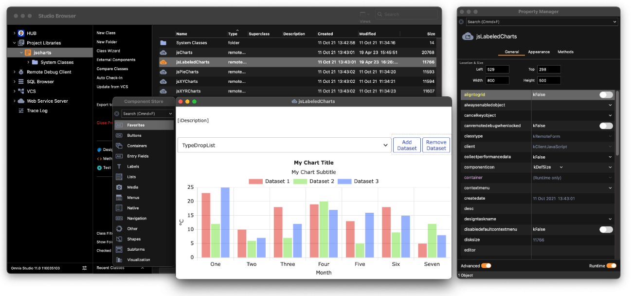
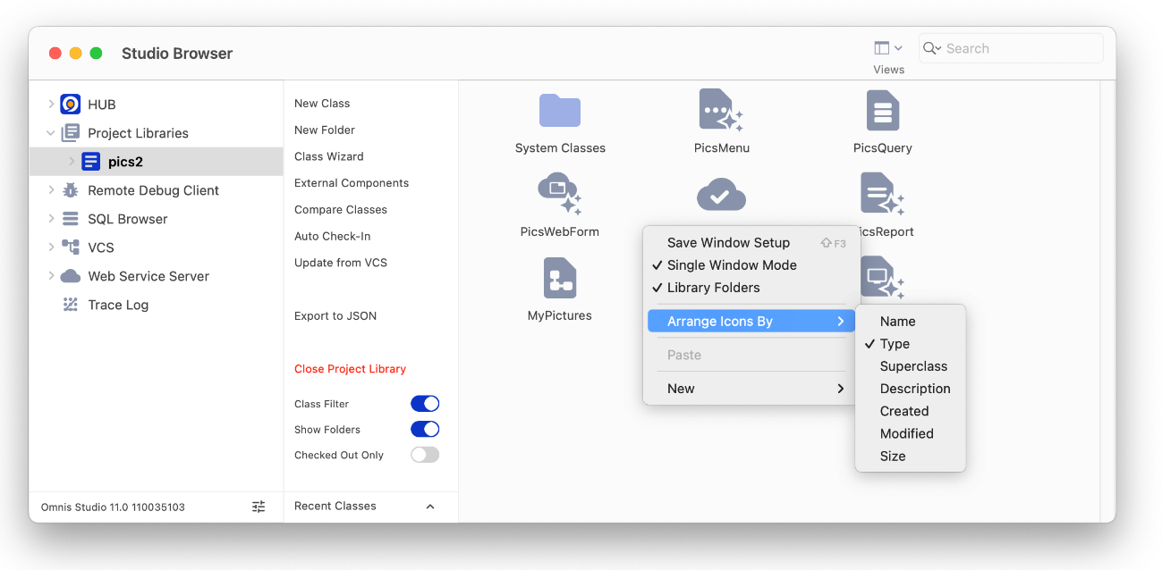
The Studio Browser is the main window in Omnis Studio for developing your applications and managing server database sessions. You can use the Views droplist on the window toolbar (title bar on macOS) to set the main view: this can be the Details view (the default), Large Icons, or Small Icons. The following screen shot shows the Studio Browser with the contents of a library in Large Icons view.
You can Right-click in the Studio Browser window to open its context menu, which contains options to set Single Window Mode, show or hide Library Folders, plus the Save Window Setup option lets you save the current settings including the size and position of the Studio Browser window. The context menu also lets you Arrange Icons by various criteria (including class Type or Name), plus the New option lets you create a new class or folder.
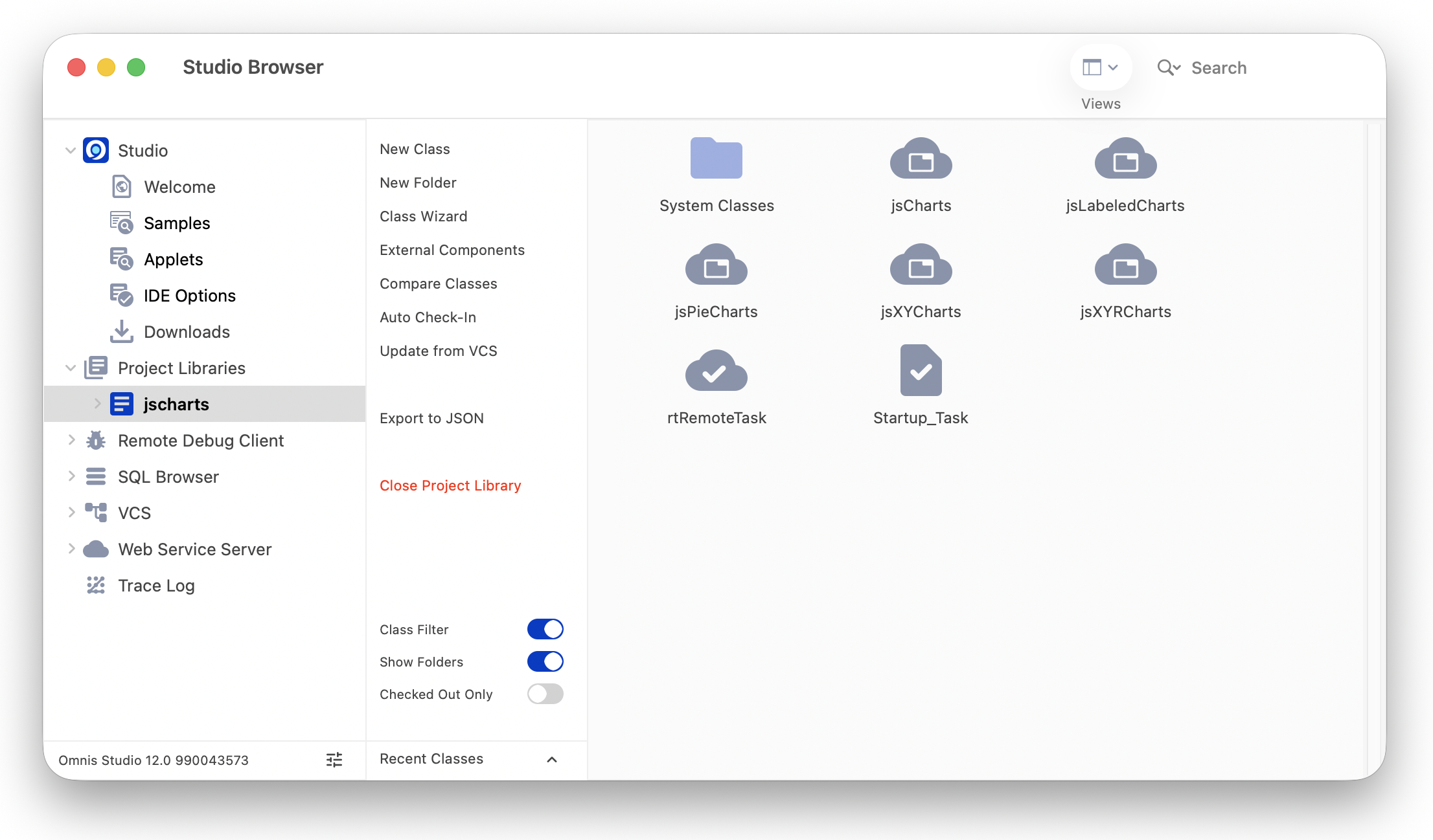
The hierarchical tree list down the left side of the Studio Browser contains the following options:
Project Libraries
allows you to open a library, or create a new one, and shows a list of all open libraries in your project or application; see Libraries and Classes
Remote Debug Client
allows you to debug your application on a remote server; see Remote Debugger
SQL Browser
allows you to open a SQL database session, manage server tables, and access your data on a remote database server; see SQL Browser
VCS
allows you to manage a project using the Omnis VCS; see the Version Control chapter; not available in the Community Edition
Web Service Server
allows you to setup Omnis to access third-party Web Services, or to setup your own web service using Omnis server code; see Web Services
Trace Log
allows you to trace and debug your Omnis code; see Debugging Methods
The right-hand pane in the Studio Browser displays a list of objects or files for the current folder or selected object under the main tree list on the left, e.g. it displays all the classes in a library when a library is selected in the tree list. The list of Options (list of hyperlinks in the center) will change depending on the object currently selected in the tree list or the file browser on the right and will always provide options and shortcuts to perform actions on the current object. For example, when a library is selected on the left, its classes are shown in the list on the right, and the hyperlink options relate to classes, such as creating a New Class, New Folder, or Class Wizard. The Class Filter option allows you to show or hide certain types of classes.
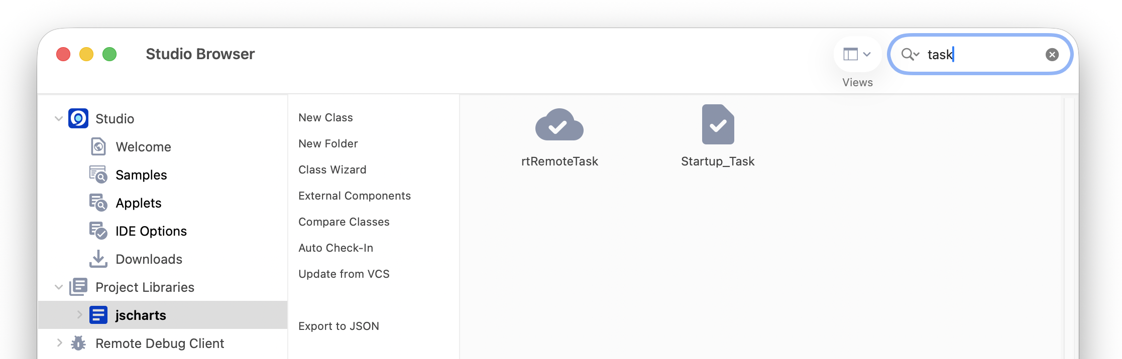
The Studio Browser has a Search box that allows you to filter the objects displayed in the library or class list allowing you to find objects more easily. The Search filter is available for most of views in the Studio Browser, including Libraries, Classes, SQL sessions, VCS projects, Sample apps and Faults; on Windows, the search box is on the left under the window title, but on newer macOS systems, the toolbar is integrated into the window title and the Search box may be over to the right.
To search for an item, navigate to the correct view in the Studio Browser (e.g. the class list view), type one or more characters, and the list will instantly redraw, displaying only those items that contain the character(s) you typed. For example, in the class list for a library, you could type “task” to find all the classes containing “task”, as shown:
The Search box has a dropdown list that stores the last few searches you typed, which you can select from with the pointer.
You can copy the name of a selected class to clipboard by pressing Ctrl-N or via the Copy Name option on the Class Browser context menu: for multiple selected classes the names are copied in a list.
The HUB option in the Studio Browser provides useful information for developers, such as the status of the most recent reported and fixed faults, together with information and tips for new Omnis developers. The HUB option itself contains information and news about Omnis Studio, including where to get help and online training, plus links to the Omnis Twitter feed.
The Studio node provides information about your current License(s) and Omnis ID account, the latest software Updates, as well as the most recent reported and fixed Faults. The Welcome option contains information about where to get help and online training, plus links to Omnis social media feeds.
The Applets option provides a number of example Omnis applications that show the full capabilities of Omnis Studio for building web and mobile applications. You can open each of the examples in a web browser (when you select an example it is opened in your browser automatically), and you can examine the code in the associated library under the Project Libraries option in the Studio Browser.
The Samples option provides a large range of sample Omnis libraries demonstrating specific components or programming techniques in Omnis. Once you have opened the sample library, you can examine its classes and underlying code under the Project Libraries option in the Studio Browser. When the Samples option is selected in the Studio Browser, you can use the Search option (at the top) to find specific examples, e.g. type ‘list’ to find all list examples.
You can use the filter under the Samples option to hide or show categories or types of examples, including a JS Client option for showing any examples that use Remote Forms, or the SQL option to show sample libraries that use the Omnis DAMs to connect to SQL databases. You can check and uncheck the Show All Examples option to hide all examples, then check one category to show only those examples.
You can use the example libraries under the Applets and Samples option as templates for your own libraries, or you can reuse individual classes or the Omnis code within the libraries.
The Faults option provides information about the latest Reported and Fixed faults in Omnis Studio – this is real-time information so you can check the most recent faults. If you have reported a fault in Omnis Studio you can check its status here.
The IDE Options allows you to configure the behavior, contents and appearance of the Studio Browser. The Options window is split into different tab sections:
Browser tab
The 'Order Project Libraries Alphabetically' option allows you to list libraries alphabetically in the Project Libraries node of the Studio Browser, rather than the order in which the libraries were opened.
The 'Add Samples to Recent Project Libraries' option allows you to control whether the sample libraries (available under the Samples option) are added to the Recent Project Libraries list. This is disabled by default so sample libraries are not added to the recent library list.
Themes tab
The theme settings under this tab relate to color themes used in the Omnis IDE or desktop window classes (not the JS Themes which are used to manage the colors in web and mobile apps).
Appearance Themes
The Appearance option allows you to change the theme used in the Omnis Studio IDE. Together with the Default theme, there are several other themes from which you can choose. See Color Themes and Appearance. You can create a custom theme, as well as import or export themes from this window. (Note the themes available in the IDE are not the same as those available for remote forms.)
Window Frame Theme
(Windows only) The ‘Window Frame Theme’ option allows you to set the color theme or style for the frame edge of windows and forms. The options are Default, Windows 7, 8, or 10.
Proxy Server tab
The ‘Use proxy server’ option allows you to access the faults information if you use a proxy for outgoing requests. Check the option and enter a hostname and service or port for your proxy server.
The Project Libraries option under the Studio Browser lets you create a new library, the main file where you store all the classes in your application, or open an existing library. See the Libraries and Classes chapter for more information about creating and opening libraries in the Studio Browser.
The Create project library from JSON option allows you to import a library from a JSON representation of an Omnis library (you can download JSON files from our GitHub). See Importing Libraries in the Libraries and Classes chapter for more information.
When you open a library created in a previous version of Omnis Studio it will be converted and can no longer be opened in the old version of Omnis Studio – THE LIBRARY CONVERSION PROCESS IS IRREVERSIBLE. Therefore, and in all cases, YOU SHOULD MAKE A SECURE BACKUP of all old Omnis libraries and datafiles BEFORE OPENING THEM in the latest version of Omnis Studio.
In order to enhance the integrity and security of deployed Omnis Studio libraries, the mechanism used to lock classes in a private library has changed in Omnis Studio Revision 35659.
Consequently, all libraries opened in Omnis Studio 11 revision 35659 WILL REQUIRE CONVERSION, INCLUDING LIBRARIES CREATED WITH ALL PRIOR REVISIONS OF OMNIS STUDIO 11 (as well as Studio 10 or earlier libraries). THE LIBRARY CONVERSION PROCESS IS IRREVERSIBLE.
THEREFORE, AND IN ALL CASES, YOU SHOULD MAKE A SECURE BACKUP of all existing Omnis Studio 11 libraries BEFORE OPENING THEM in Omnis Studio 11 Revision 35659.
When the Project Libraries option is selected in the Studio Browser, the Recent Project Libraries option (half way down the Studio Browser window) allows you to open a library that you have previously opened; this is a handy shortcut and saves you having to navigate to your library.
When a library is selected in the Studio Browser, the Recent Classes option (at the bottom of the Studio Browser window) allows you to open any classes that you have previously opened. You can open the method editor for a class (that is, a class that can contain methods) from the Recent Classes list by holding down the Shift key and selecting the class. To open the Interface Manager for a class, hold down the Control/Command key while selecting the class in the Recent classes list.
You can create folders in a library so you can organize the classes within each library. Folders are in fact Omnis classes, but for display only (they are visible during development only). Folders do not perform any function in your library, other than organizing your classes, and they are ignored at runtime.
To hide/show library folders within the Browser, select your library and click on the ‘Library Folders (on/off)’ option, or alternatively, right-click on the white space of the Studio Browser (when any library is selected) and select the ‘Library Folders’ option from the context menu. You can save the state of this option using the Save Window Setup option for the Studio Browser.
When the contents of a library are displayed in the Studio Browser, you can hide and show different types of class by pressing the Shift and Control/Command keys plus the appropriate letter key. For example, pressing Shift+Ctrl+I displays only the Remote Forms in the library, or Shift-Ctrl/Cmnd-A shows all classes. The following keyboard shortcuts are available:
| Class type | Shortcut - Shift + Ctrl/Cmnd + Letter key |
|---|---|
| Shows all | A |
| Code | C |
| File | L |
| Menu | M |
| Object | O |
| Query | Y |
| Remote form | I |
| Remote menu | N |
| Remote object | E |
| Remote task | K |
| Report | R |
| Schema | S |
| Search | H |
| Table | B |
| Task | J |
| Toolbar | T |
| User constants | U |
| Window | W |
The above key presses activate the Class Filter, which you can open and set manually by clicking on the Class Filter (on/off) option in the Studio Browser; you can check or uncheck options to show or hide specific class types.
Note that class types relevant to developing desktop applications are hidden in the Community Edition. Note also that when you show all classes using the Shift-Ctrl/Cmnd-A option, the #PASSWORDS system table is displayed and is only relevant to desktop apps and should not be used for web or mobile apps.
The Studio IDE will provide the diacritical character popup to allow you to enter diacritical characters wherever text entry is required. For example, you can enter diacritical characters in comments in the Method Editor or into a label on a form. To disable the feature for the IDE, remove or rename the Keyboard folder which is in the local folder.
You can move any of the design tools, such as the Property Manager and Method Editor, or any class editor window, to another screen using the Move Top To <screen> command in the Window menu (macOS only – 10.15 Catalina and later). The option will only appear when there is more than one screen connected to your Mac computer, and in this case will move the top window to the named additional screen.
The colors used throughout the Omnis Studio design environment (the IDE) are stored as a design theme which can be changed under the IDE Options>>Themes option under the Hub option in the Studio Browser.
The colors used throughout the Omnis Studio design environment (the IDE) are stored as a design theme which can be changed under the IDE Options>>Themes option under the Studio node in the Studio Browser.
Each theme contains a list of color settings for the objects and tools in the Omnis Studio IDE. Color themes are available on Windows and macOS only, but not for Linux. (Note the design themes available in the Omnis IDE are not the same as JS Themes available for Remote Forms.)
There are a number of themes for the Omnis IDE listed under the ‘Appearance Theme’ droplist, including the ‘Default’ theme which is intended to match the colors used on different platforms supported in Omnis.
You can change individual colors or settings within a theme (under the $appearance property, see below), and in this case, your modified theme will be saved as a ‘Custom’ theme alongside those provided. The themes for the IDE are stored as configuration files in the ‘Studio’ folder under the main Omnis folder.
You can create multiple custom themes, and you can export and import themes. There is a list of the custom themes currently installed (located in the folder /studio/themes/custom) underneath the themes droplist.
To create a custom theme, press the "Save Current Theme As" button. Once saved, the name you give the theme will then appear in the list of custom themes.
If you are setting a custom theme, you will need to select it first in the list and then press the "Apply Custom Theme" button, since you need to be able to select a custom theme without applying the theme when exporting.
To export custom themes, select the required themes in the list and press the "Export Themes" button. This allows you to select a folder to copy the themes into.
You can also import either a single theme or a folder of themes. Once imported they are copied to the /studio/themes/custom folder and will appear in the list.
For Windows only, you can also change the theme used for the outside edge or frame of windows used in the Studio IDE and your own windows, which can be set to match the style of the window frame displayed on various Windows platforms. These are shown under the ‘Window Frame Theme’ droplist.
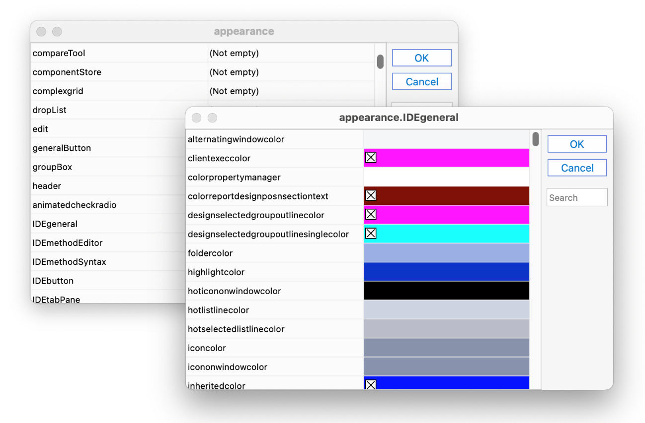
The current theme in the Omnis Studio IDE is stored in an Omnis preference called $appearance, which can be edited via the Property Manager. To edit this property, click on the Options button at the bottom-left of the Studio Browser, select the Preferences option, then select the Appearance tab in the Property Manager (if the Advanced option is on) and click on the droplist next to the $appearance property; alternatively, you can use the Search box to find $appearance in the Property Manager.
Note that when editing $appearance in the Property Manager, the default colors may not always draw correctly since the editor grid itself uses the configured colors, and therefore if a color is set to the default setting, there is a check mark icon (an X) to the left of the color.
In addition, there is an Omnis preference called $windowoptions that stores the current Window Frame theme which you can also edit via the Property Manager: this is described at the end of this section.
There is a search field on the $appearance preference dialog to help you find colors. As you type into the search box, Omnis will highlight any matching lines in the Property Manager and scroll to the first match. Tabbing from the search field sets the focus in the grid to the first match.
The color and appearance settings used in the Omnis Studio IDE, and displayed in $appearance via the Property Manager, are stored in a configuration file called ‘appearance.json’, which is located in the Studio folder in the main Omnis folder. This file contains the current color theme settings in $appearance which will either be the default theme, or one of the other themes provided, or a custom theme.
The Default and other themes (Blue, Green, etc) are stored in separate JSON files in the ‘studio/themes’ folder. As you change the theme setting under the Options setting, the appropriate JSON theme file is written to the appearance.json file in the Studio folder.
When Omnis loads, it will copy the appropriate theme file into /studio/appearance.json. If you alter one of the theme colors using $appearance in the Property Manager, Omnis will recognize that the default or one of the built-in themes has changed and therefore will create a custom theme 'appthemecustom.json' in the themes folder. In this case, when Omnis restarts, it will load the Custom theme and it will add it to the droplist in the Options setting.
When a theme has been changed, if you then try to switch to another theme, you will receive a Yes/No message asking you to confirm if you wish to overwrite the custom changes.
As well as changing a theme in the development version of Omnis, you can change theme in the Runtime (or Server) version of Omnis by loading the contents of a theme file and assigning it to the $appearance property. The theme files are stored in JSON format which needs to be converted to a row to be applied to $appearance.
For example, you could copy the theme folder 'studio/themes' containing the IDE themes to the runtime (or server) tree, or create your own themes and place them in the same folder, then load a theme and assign it to $appearance. The following code uses the Dark theme 'appthemeblack.json', which is in the 'studio/themes' folder, converts the theme file contents to a row using the OJSON.$jsontolistorrow() function, and assigns it to the $appearance property.
# create vars lThemePath (Char), lJSONRow (Row), lFileBin (Binary)
Calculate lThemePath as con(sys(115),'studio',sys(9),'themes',sys(9),'appthemeblack.json')

Do FileOps.$readfile(lThemePath,lFileBin)
Do OJSON.$jsontolistorrow(lFileBin) Returns lJSONRow
Do $prefs.$appearance.$assign(lJSONRow)
In this case, the change in theme colors is applied instantly and a restart is not necessary.
There is a file called appearance.desc.en.json in the 'local' folder under the main Omnis folder which contains a description of all the items in the $appearance property and appearance.json file: the descriptions in this file are used as helptips in the Property Manager when viewing the items in the $appearance property.
Colors are stored in appearance.json as a string, which can be either “#RRGGBB” or “kColorDefault” or one of the 16 standard colours: kBlack, kDarkBlue, kDarkGreen, kDarkCyan, kDarkRed, kDarkMagenta, kDarkYellow, kDarkGray, kBlue, kGreen, kCyan, kRed, kMagenta, kYellow, kGray, or kWhite.
The subgroups prefixed with IDE refer to colors in the IDE only, such as the Method Editor and Method Syntax, so any changes you make to colors in these groups are only visible in the IDE, not the Runtime. All other theme subgroups affect colors in the IDE and the Runtime version of Omnis Studio. When you edit the $appearance preference in the Property Manager you will see the subgroups, so to edit colors in the Method Editor syntax you can open the “IDEmethodSyntax” group.
Omnis Studio supports Dark and Light modes when using the default Omnis design theme (studio/themes/appthemedefault.json); the theme for design mode in Omnis is set via the Themes tab under the IDE Options option in the Studio Browser. You can change the system color mode via the System Preferences > General option on macOS, or Settings > Personalization > Colors option under Windows. Note dark mode is supported on macOS 10.14 and later or Windows 10/11 or above.
Dark mode is supported in the theme and appearance files using “[item].dark” items. For example, as well as a "tree" item in appearance.json, there is a "tree.dark" item which is used when the system is in dark mode; if there is no “.dark” entry, the normal entry is used in dark mode.
If an appearance.json file does not contain any “.dark” entries, Omnis will use the light system theme when determining any defaults that come from the system, although system dialogs will display in the current mode for the system.
User defined colors can be added to the appearance.json which can be used for theme colors for window class controls in desktop (fat client) apps. The colors are defined using the groups "user" and "user.dark" in the appearance.json theme file, using the names color1 to color16. They are represented by 16 new color constants kColorUser1 to kColorUser16.
You can specify dark mode colors for some of the IDE window colors defined in the $windowoptions Omnis preference; these only apply on Windows OS and are used automatically when dark mode is being used. The following colors can be defined:
titleactivecolor.dark

titleinactivecolor.dark

smalltitleactivecolor.dark

smalltitleinactivecolor.dark

borderactivecolor.dark

borderinactivecolor.dark

captionactivecolor.dark

captioninactivecolor.dark

smallcaptionactivecolor.dark

smallcaptioninactivecolor.dark

minmaxbuttonhotcolor.dark

minmaxbuttonhottrackingcolor.dark

closebuttonhotcolor.dark

closebuttonhottrackingcolor.darkSystem dialogs and Menus
System dialogs (file dialogs etc) do not use the theme colors.
Menus on macOS do not use the theme colors. On Windows, the colorlistlineselectedwin color is used to highlight menu lines.
JavaScript Client
The JavaScript client will use the system colors configured on the Omnis App Server running your app. Therefore if you want to use a specific theme for your deployed web and mobile apps, you need to copy your appearance.json file to the Omnis App Server.
macOS and Cocoa
The term system theme is a little loose for Cocoa. Omnis tries to match the system theme, but unlike Windows, there are not always APIs in the OS to perform the drawing (hence some system theme drawing on Cocoa is actually Omnis imitating the OS theme).
Some of the theme background colors have been rationalized (this does not apply to Carbon) as follows:
kBGThemeWindow, kBGThemeContainer and kBGThemeTabStrip now fill with kColorWindow on both platforms. Previously these used kColor3DFace on Windows.
kBGThemeTabPane now fills with the selected tab background (using either the system theme or colortabselected - the system theme applies with colortabselected is kColorDefault).
In addition to the color management outlined above, you can change the appearance of the frame edge of window classes in desktop apps (on Windows operating systems only), which allows you to comply with the latest style for window frame edges on Windows 8, 8.1 and 10. For most purposes you can accept the default settings for the current Windows platform, but you can change the frame theme if you want.
You can change window frame themes under the IDE Options option in the Studio Browser (Windows only). You can select Default, Windows 7, 8, or 10 which allows you to view how your application will appear on different Windows platforms.
In addition there is a new property in the Omnis preferences, $windowoptions, which allows you to edit the appearance of window frames in libraries running on Windows – note this preference is only editable on the Windows platform.
There is a file called ‘window.json’ in the Studio folder, which stores the values of the $windowoptions preference. The window.json file configures the appearance of the window frame, and also configures the operating systems for which the configured appearance will be used, including the old appearance for Windows 7, and the new configured appearance for later Windows operating systems. There are a number of theme files in the ‘studio/themes’ folder which are copied to window.json as appropriate.
useborderactivecolorfordefaultactivecaption
specifies the color of the active caption in Windows (stored in window.json). This is an integer with 3 possible values.
If it is zero, the behavior is as before (the active caption defaults to white if it is set tokColorDefault).
It it is one, and the active caption color is kColorDefault, then the active caption color is the same as the active border color.
If it is two (the default), then the default active caption color depends on the system setting on the accent color settings panel: "show colour on start, taskbar, action centre and title bar" - if the system setting is off, then this is equivalent to useborderactivecolorfordefaultactivecaption equal to zero - if the system setting is on, then this is equivalent to useborderactivecolorfordefaultactivecaption equal to one.
Note that this applies to both small and normal size captions, and only applies when the relevant caption colour is kColorDefault.
The Omnis Preferences control the behavior and appearance of the Omnis Studio IDE, rather than individual libraries or classes, and they can be viewed in the Property Manager. The Omnis preferences include groups (tabs) for: General options, Appearance, Devices, Page Setup, and Methods. The Omnis preferences are sometimes referred to as the Omnis “Root Preferences”, since they are properties of the $root object in the Omnis object hierarchy, and referenced in the notation as $root.$prefs.<property-name>.
To view the Omnis preferences
or
or
To view all the Omnis preferences, ensure the Advanced option is enabled (on) in the Property Manager; with the Advanced option disabled (off) only a small subset of Omnis preferences is shown. You can position your mouse over any property and view its description in a tooltip (e.g. collectperformancedata is shown and its help tip). If you are looking for a specific property or preference, you can find it using the Search box at the top of the Property Manager window; the Search box only appears when the Advanced option is enabled.
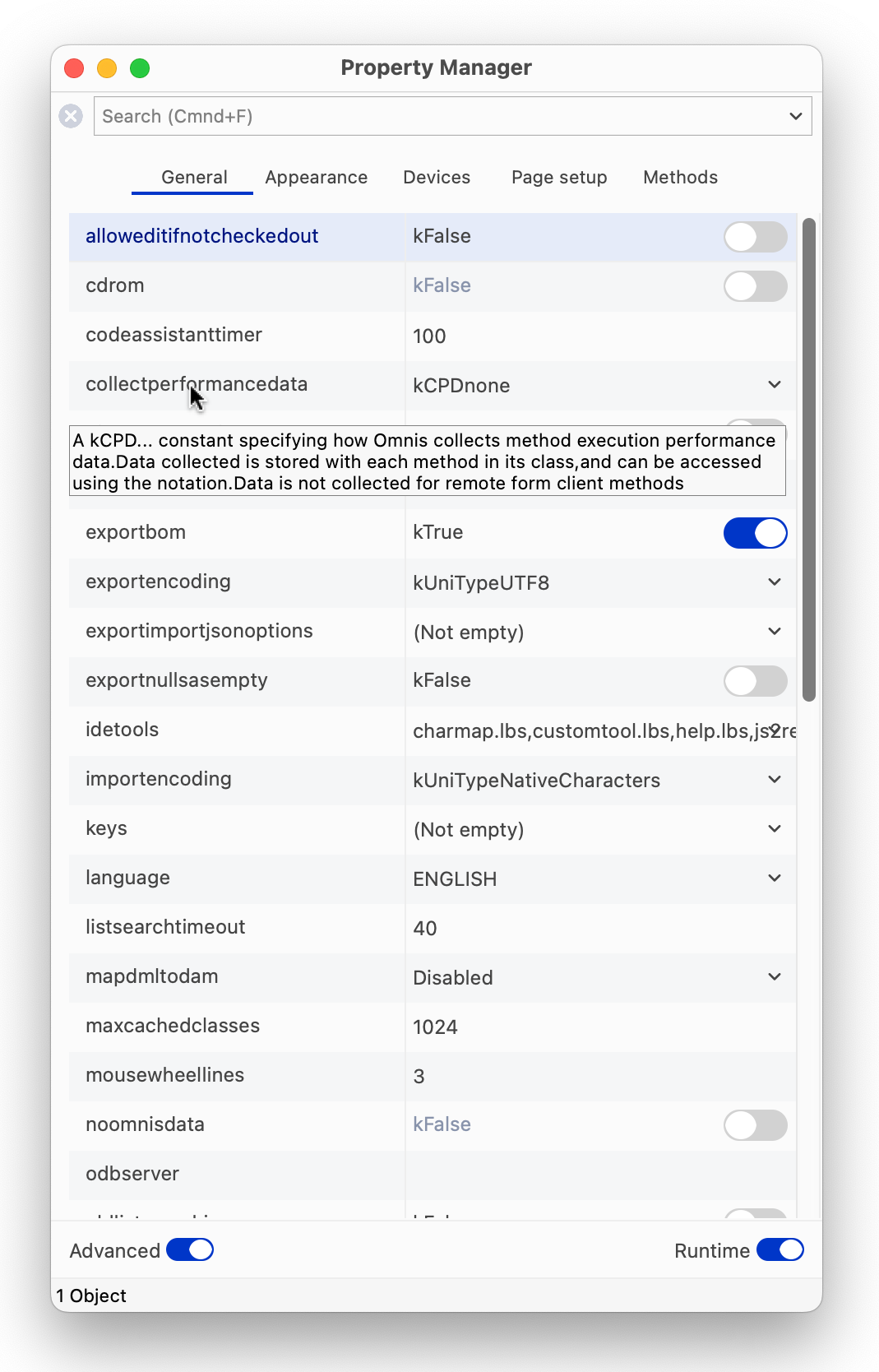
You can select a preference in the Property Manager and press the F1 key (Fn F1 on macOS) to open a Help window for that preference (or property); in this case, the page for $root.$prefs opens, listing all the Omnis Preferences.
On Windows only, you can display a task bar at the top or bottom of the Omnis Studio application window containing the names of all the currently open design windows, including the Studio Browser, Property Manager, and so on, as well as all open classes and method editor windows. You can select one of these to bring that window to the front.
To display the Omnis task bar you have to set the $taskbar property on the Appearance tab when displaying the Omnis preferences. You can set it to kTaskbarNone, kTaskbarBottom, or kTaskbarTop. Once the task bar is shown, you can right-click on the task bar to switch between top and bottom, or to hide it.
The context menu on the Omnis task bar includes an option Show Fullnames to show or hide the library part of class names. There is also an option taskBarShowsFullClassnames in the ‘windows’ section of the Omnis configuration file to set this option, which you can set in the Configuration Editor.
Some properties in the Omnis Preferences ($root.$prefs) are replicated in the "prefs" group in the Omnis configuration file (config.json), which means you can set their values in either the Property Manager or the Configuration Editor. See Omnis Configuration about editing config.json.
The Omnis preference $idelistpointsize specifies the font point size used for lists within the Property Manager and Catalog.
You can increase or decrease the font size used in many of the lists in the Omnis IDE using the Ctrl+ (increase) or Ctrl- (decrease) keyboard shortcuts. These shortcuts are only temporary, are not saved with the window setup, and will return to their respective default sizes when you close Omnis Studio.
Under Windows you can run multiple instances of Omnis Studio (this is not allowed under macOS). When the $singleinstance Omnis preference is set to kTrue only one instance of Omnis Studio is allowed. The “singleInstance” item in the “windows” section of the Omnis configuration file can be used to set the value of the Omnis preference $prefs.$singleinstance.
You can control the behavior of the Omnis executable and many other elements of the Omnis IDE by editing a configuration file called config.json, which is created when Omnis is first launched and is located in the ‘Studio’ folder under the main Omnis folder. The file is stored in JSON format and should be edited using the Configuration File Editor.
When you start developing your application you may not need to edit the Omnis configuration since it contains all the default settings for running Omnis Studio in development mode. Some options in the Omnis configuration file relate specifically to how the Omnis App Server is setup for deploying and running web or mobile apps: when you deploy your application you will need to edit the Omnis configuration in the Omnis App Server to configure your server settings, such as the server port number.
In addition to the Omnis configuration file (config.json), there is a configuration file called omnis.cfg in the 'studio' folder that contains information regarding the Omnis development environment and other internal settings, including specific settings saved with Save Window Setup, e.g. Show tree for the method editor window. This file is created when you first start Omnis and is updated when you shutdown. Note that you cannot edit omnis.cfg.
The positions.cfg configuration file, also located in the 'studio' folder, holds the position information saved for various screens in the IDE using the Save Window Setup option. This ensures that the IDE screens are returned to their saved size and position when you reopen Omnis. The information includes window positions and sizes, split bar positions, and so on, for each screen layout. Note that you cannot edit positions.cfg.
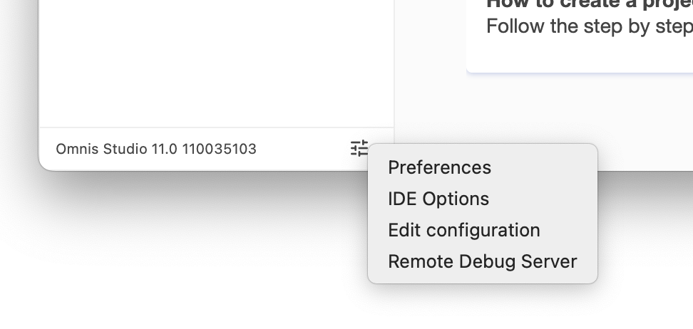
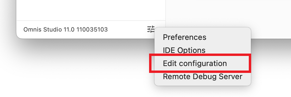
The Configuration File Editor allows you to edit the settings in the Omnis Configuration file (config.json) inside Omnis Studio. To open the editor, click on the Options button at the bottom-left of the Studio Browser (next to the revision number), and select the Edit Configuration option.
The Configuration Editor shows the main groups of items in the Omnis configuration file in the left hand list, such as ‘defaults’, ‘ide’, and ‘methodEditor’, and for each selected group the items within that group are shown on the right, for example, the ide group of items is shown below:
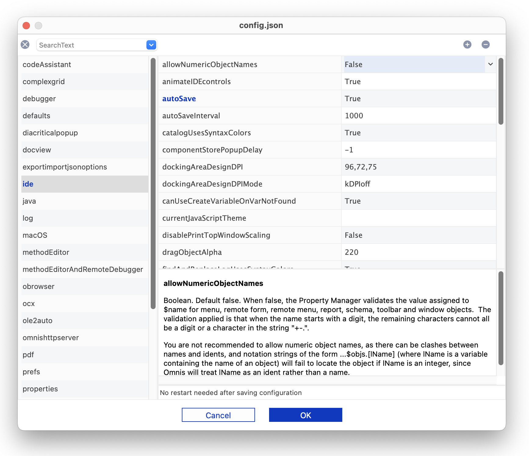
Some items require a string value, in which case you can click on the item and edit it directly in the text field, otherwise, when you click an item to edit it, a droplist may appear containing its possible values (such as True/False values), or some other kind of dialog will open, such as a file select dialog or a color picker.
When an item is selected, the Help panel below the configuration items grid provides a full description of the item. In addition, the status bar beneath the help panel indicates whether or not a restart is required after changing the item and saving the configuration file. The status bar is empty when the item is not relevant to the current platform.
The contents for the Help provided for the Configuration items are stored as HTML pages in a folder called ‘confighelp’ in the Studio folder; this folder is not present in the Headless Server version.
The Omnis configuration file contains all the settings required to run Omnnis Studio in development mode or the Omnis App Server (or Omnis Runtime). However, there may be specific items that are included in the documentation or provided by Technical Support, that are not included in the default Configuration file, which you can add using the Configuration editor.
The + and - icons at the top of the window allows you to add or remove items, however in general however, you should not delete items, rather just change their values; for example, for a Boolean item value which you want to disable, set the value to False to disable it rather than deleting the item.
To add an item, click on the + icon, enter the exact name of the Config item, and choose the type, which is one the following types:
Boolean
a True or False value
Character
a string
Integer
an integer value (usually in a specific range of values), or a constant value
List
For list items, enter the item name, then you can specify the list of items in a popup window; they are displayed as a comma-separated list
In addition, you can enter \t to mean tab, e.g. for log.conversionLogDelimiter.
Errors in the Omnis configuration file config.json are written to the Omnis trace log, which can be viewed from the Tools menu or in the Studio Browser. As Omnis is loaded, it parses the config.json file and if it fails, an error is written to the trace log.
Any changes or additions you make to the Omnis Configuration file using the Configuration Editor are saved into a separate file called userconfig.json, which is stored in the ‘Studio’ folder alongside config.json. This ensures that the default settings in config.json are retained and all your changes or additions are stored separately in userconfig.json. This also means that if you upgrade to a newer version of Omnis you can copy across your copy of userconfig.json to ensure all your settings are maintained in the new version.
Note that userconfig.json overrides settings in config.json, so if a setting is present in both config.json and userconfig.json, the userconfig.json value will be used.
It is recommended that you do not edit the config.json file externally using a text file editor (or using the $getconfigjson and $setconfigjson() methods), but you should use the Configuration Editor.
The Configuration file editor is available in the Development version of Omnis Studio, as well as the Runtime and Server versions (but not the Linux Headless server). To open the Configuration file editor in the Runtime or Server version, select the Edit Configuration… option from the File menu. You can hide this option in the Runtime or Server version by executing the sys(246) function, or sys(247) will show it again; the default setting is for it to be visible.
The “windows” section of the config.json file contains settings to control the visual appearance of Omnis or various Startup options when running under Windows.
"windows": {

    "highDPIaware": true,

    "readBorderActiveColorFromSystem": true,

    "scaleScreenCoordsUsingPhysicalSize": false,

    "pythonPath": "",

    "miniconid": 2033,

    "hideStudiorgMessage": false,

    "noAdmin": false,

    "updateFileAssociations": true

},
The visual appearance settings are:
highDPIaware
Defaults to true. If true, Omnis will tell Windows to operate in the system DPI, and it will scale pixel dimensions if necessary, by a factor of 2; if false, Omnis will operate at 96dpi
readBorderActiveColorFromSystem
Defaults to true. If true, Omnis attempts to read the default value for borderactivecolor (a color in window.json) from the operating system. If false, use a hard-coded default rgb(244, 112, 35).
scaleScreenCoordsUsingPhysicalSize
Defaults to false. Only applies when $clib.$screencoordinates is true. If false, screen coordinate scaling is based on the size of the main window; if true, it is based on the physical screen size.
pythonPath
Default is empty. Identifies the pathname of the python executable if installed (used for the Python Worker Object). Otherwise, if empty, defaults to python\App\python in the Omnis data folder.
miniconid
The icon id of the application icon. Default value is 2033.
In addition, you can specify the following Startup options under the windows group:
hideStudiorgMessage
If true, the message dialog about running Studiorg when Omnis starts up will not be displayed. If false (the default) or omitted, the message is shown.
noAdmin
If true, Omnis will run with the current user’s access level; consequently, it will not attempt to register file associations or event log, and this allows you to run updates (via update.bat) if required. If noAdmin=false Omnis will run as the Admin user (the default behavior, as in previous versions).
updateFileAssociation
If true (the default), Omnis will attempt to set file associations; if set to false Omnis will not attempt to set file associations.
Various parts of the Omnis IDE are animated, including the main tree list in the Studio Browser, and the Method names tree list in the Method Editor is animated when you open the editor or redraw the list.
The "animateIDEcontrols" option in the “ide” section of config.json controls whether or not animation is enabled in the IDE: it is set to True by default. Set this to false if you don’t want any objects in the IDE to be animated.
There are some methods in the Omnis Preferences that allow you get and set the contents of the Omnis configuration file. These would allow you, for example, to create your own userconfig.json from code which could be used for deployment of your app.
$getconfigjson()
Returns config.json as a row (empty if config.json could not be parsed)
$setconfigjson(wConfigJson)
Sets config.json to the supplied row wConfigJson
$getconfigjson([bBaseConfig=kFalse])
Returns userconfig.json as a row when bBaseConfig is kFalse or is omitted (the row is empty if userconfig.json could not be parsed). If bBaseConfig is kTrue, returns config.json.
$setconfigjson(wConfigJson[,bBaseConfig=kFalse]) Sets userconfig.json to the supplied row wConfigJson when bBaseConfig is kFalse or is omitted. If bBaseConfig is kTrue, sets config.json.
By default the $get and $set methods will operate on userconfig.json when bBaseConfig is set to kFalse or is omitted. However, you can operate on the base config.json by setting bBaseConfig to kTrue. However, you should avoid editing config.json directly, instead update userconfig.json.
These are methods of $root.$prefs, and they appear on the Methods tab of the Property Manager, but only when used with the Notation Inspector.
You can use them to modify existing items, or add new items. For example, the following code adds/modifies some items in the "obrowser" section of the userconfig.json file:
Do $prefs.$getconfigjson() Returns cRow
If isnull(cRow.obrowser.$cols.$findname("htmlcontrolsFolder"))
  Do cRow.obrowser.$cols.$add("htmlcontrolsFolder",kCharacter,kSimplechar,1000000)
End If
Calculate cRow.obrowser.htmlcontrolsFolder as "htmlcontrols"
If isnull(cRow.obrowser.$cols.$findname("clearCacheWhenLoaded"))
  Do cRow.obrowser.$cols.$add("clearCacheWhenLoaded",kBoolean)
End If
Calculate cRow.obrowser.clearCacheWhenLoaded as kTrue
If isnull(cRow.obrowser.$cols.$findname("remoteDebuggingPort"))
  Do cRow.obrowser.$cols.$add("remoteDebuggingPort",kInteger,0)
End If
Calculate cRow.obrowser.remoteDebuggingPort as 5989
Do $prefs.$setconfigjson(cRow)
Note that Omnis needs to be restarted after some items in the config.json file have been edited.
The monitorDockKeyEvents option in the "macOS" section of the config.json file allows you to disable the Keystroke Receiving dialog at startup on macOS. If set to false, Omnis does not attempt to monitor keyboard events from the Dock and the dialog will not be shown. The option is set to true by default for backwards compatibility.
On macOS, when first running a new version of Omnis Studio, the end user will be presented with a prompt: "Omnis Studio 11 would like to receive keystrokes from any application – Grant access to this application in Privacy & Security settings, located in System Settings."
This is required to provide full keyboard support to Omnis Studio for monitoring events from the macOS Dock and Mission Control. Access can be granted when prompted for Keystroke Receiving, or you can ensure there is an entry granting access in the Input Monitoring section of the Privacy system setting.
To show a one-time only prompt in Omnis Studio, prior to the system prompt, set the "monitorDockKeyEventsInfoPrompt" config entry to true (the default is false). The message can be customized by changing the entry for CORE_RES_19003 in /Contents/Resources/[LOCALE].lproj/Localizable.strings
Keystroke receiving and the access prompt can be disabled by changing the "monitorDockKeyEvents" to false in config.json. When Omnis Studio does not have full keyboard support, the order of windows displayed may not be correct after using Mission Control with the keyboard.
The main toolbar at the top of the Omnis application window provides access to all the development tools in Omnis, such as the Studio Browser, the Catalog, the Property Manager, and so on. The Standard, View, and Tools toolbars contain many of the same options as the File, View, and Tools menus, respectively. The Desktop toolbar (hidden by default) lets you switch between design and runtime environments.
You can drag any of the toolbars out of the docking area and place them anywhere in the Omnis application window (referred to as “floating”). You can place your pointer over any button to display its name or tooltip description.
The visibility of the main Omnis Toolbar and Menubar is different for Windows and macOS, as follows.
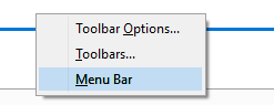
Under Windows, the main Omnis Toolbar is shown, but the main Menubar is not, by default. To hide or show any of the toolbars, or to install the main Omnis menu bar, under Windows, you can Right-click/Ctrl-click in the toolbar area of the main Omnis development window and select the Toolbar Options…, Toolbars… (see below) or Menu Bar option: in addition, you can double-click in the toolbar area to open the Toolbar Options, which allows you to enable Text labels and switch to Large icons. See Omnis Menu Bar.
On macOS, the main Omnis Menubar is shown by default, but the main Toolbar is not: the concept of an application toolbar is not present in macOS, but you can display the Omnis toolbars manually. To hide or show any of the toolbars on macOS, select the Toolbars… option from the View menu: this allows you to show or hide the Standard, View, or Tools toolbars which you may find useful for development.
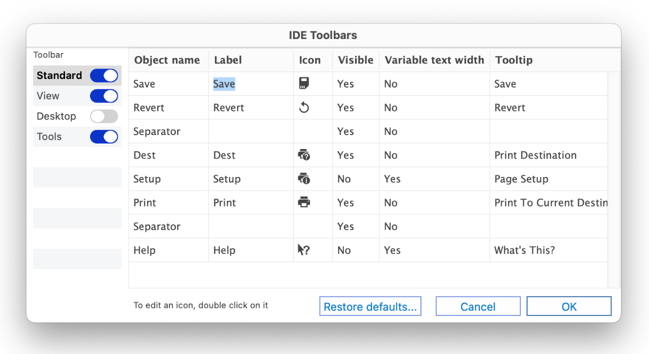
The IDE Toolbars dialog allows you to show or hide the main Omnis toolbars, as well as configure each toolbar, including to show or hide individual buttons.
On macOS, when Omnis starts to track menus, Omnis timers are suspended: in versions prior to Studio 10.2, there was an error whereby Timer execution did not interrupt when using a menu and clicks on the menu were being lost. You can override this behavior, allowing timers to run during tracking process by setting the "menuTrackingSuppressTimers" config.json item in the "macOS" group to false.
Note the screenshots here show all the options in each toolbar; you can enable the buttons in the Toolbars option, or change the text options in the Toolbar Options option in the View menu, or by right-clicking on the main Omnis toolbar.
The Standard toolbar has more-or-less the same options as the File menu. In addition, the File menu lets you create a New Library (blank other than system classes and Startup_Task) or Open an existing library.
The Save option (Ctrl/Cmnd-S) saves the class you are currently working on. If a class design window is not currently selected this option is grayed out.
The Revert option rolls back any changes you have made to the class you are currently working on. Note that if you close an Omnis class it will be saved automatically and therefore cannot be reverted. The Revert menu and toolbar command is not available when Auto Save is enabled.
When the Auto Save option in the File menu is enabled, Omnis will save all classes that are currently open in design mode automatically; the option defaults to disabled, meaning that you have to save a class manually or the class is saved when it is closed. The state of the Auto Save option is saved under the "autoSave" option in "ide" section of the config.json configuration file. The interval between each auto save can be configured in the "autoSaveInterval" option, also in the "ide" section of config.json: this is the number of milliseconds between each auto save, which is set to 1000 by default. Auto Save applies to all class and method editors except for system classes, provided that the class is not read-only, and the method editor is not in read-only mode.
The Dest option opens the Print Destination dialog (Shift-Ctrl/Cmnd-P) which lets you set the destination of the current output. Reports are sent to the Screen by default, but you can choose another destination from this dialog. See Report Destination Dialog.
On macOS, the print Setup button is available allowing you to configure the Print Setup for the current report.
The Print option (Ctrl/Cmnd-P) prints the current class or report to current destination, if applicable. For example, when you are working in the method editor the option prints the currently selected method or set of class methods.
The Help option changes the mouse to a Help pointer allowing you to click on any part of Omnis to get Help; the option opens the Help window at the relevant topic.
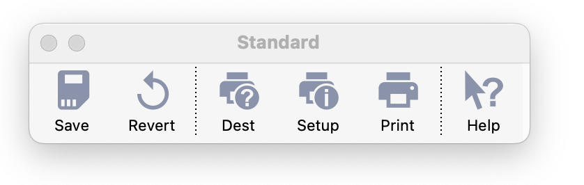
The View toolbar opens the main Studio Browser and other tools available in the Studio IDE and has the same options as the View menu. Many of these tools are described in greater detail in this chapter. (On macOS, you can use Cmnd-Number or the equivalent Fn key to open any tool instead, e.g, to open the Studio Browser you can use Cmnd-2 or Fn+F2.)
The Browser option (F2/Cmnd-2) opens the Studio Browser which lets you create and examine libraries and classes. If the Studio Browser is already open and in Single Window Mode, this option will bring it to the top. If the Browser allows multiple copies of itself, this option opens the initial Browser displaying the libraries. See Studio Browser.
The CStore option (F3/Cmnd-3) opens the Component Store, to allow you to build web forms, windows, and reports. This option will be disabled if there is no design window or report on top, or when a library is selected in Studio Browser. See Component Store.
The Notation option (F4/Cmnd-4) opens the Notation Inspector which lets you view the complete Omnis notation tree. If the Notation Inspector is already open and in Single Window Mode, this option will bring it to the top. If the Notation Inspector allows multiple copies of itself, this option opens a new instance of the Notation Inspector. When you open the Notation Inspector the Property Manager will also open. See Notation Inspector.
The Inh Tree option (F5/Cmnd-5) opens the Inheritance Tree which lets you view the inheritance or superclass/subclass hierarchy in the current library. If you select a class in the Browser and open the Inheritance Tree it shows the inheritance for that class.
The Props option (F6/Cmnd-6) opens the Property Manager which lets you view or change the properties of an object: the properties displayed in the Property Manager will depend on the object or window currently selected or on top in the Omnis development environment (the Advanced option must be checked to see all the properties for the current object). If the Property Manager is already open, this option will bring it to the top.
The Catalog option (F9/Cmnd-9) opens the Catalog which lists all the field names and variables in your library, together with the functions, constants and event messages. If the Catalog is already open this option will bring it to the top.
The View menu has the Toolbar Options… and Toolbars… options to allow you to hide or show and configure the main toolbars in the Omnis IDE; this is useful on macOS since the toolbars are not shown by default.
The JavaScript Theme option (Ctrl/Cmnd-J) allows you to change the color theme used in all JavaScript remote forms (only available in the View menu).
The View menu lists all the classes that have been opened recently, as does the Recent Classes option in the Studio Browser (at the bottom above the status bar). The maximum number of classes shown is limited to 9, but you can configure the number of classes shown by setting the "maxRecentClassEntries" in the "ide" section in config.json, which defaults to 9 (the value in earlier versions), but can be set to any value in the range 9 to 32 inclusive.
Note that this setting also affects the Recent Classes option in the Studio Browser, but since that only shows classes (or methods when the Shift key is pressed), there are typically fewer recent class items on the recent classes option than on the main View menu.
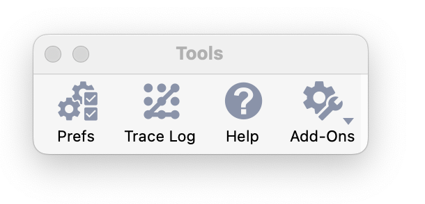
The Tools toolbar contains the following options (some may be hidden in your operating system but you can show then using the Toolbar Options… and Toolbars… options in the View menu):
The Prefs option opens the Omnis Preferences in the Property Manager.
The Trace Log option opens the Trace log in a separate window (it is also displayed in the Studio Browser). The Trace Log provides a record of the operations and commands you have carried out. If there is an error in Omnis, such as when you start it up, you can look in the trace log for information about possible causes of the error. Omnis code execution and errors are also reported in the trace log: see Debugging Methods for further details.
The Help option opens the Help Project Manager to allow you to create your own built-in Help system, similar to the Omnis Help system (F1).
The Add-Ons button (or sub-menu option on the Tools menu) lets you open various additional tools, including:
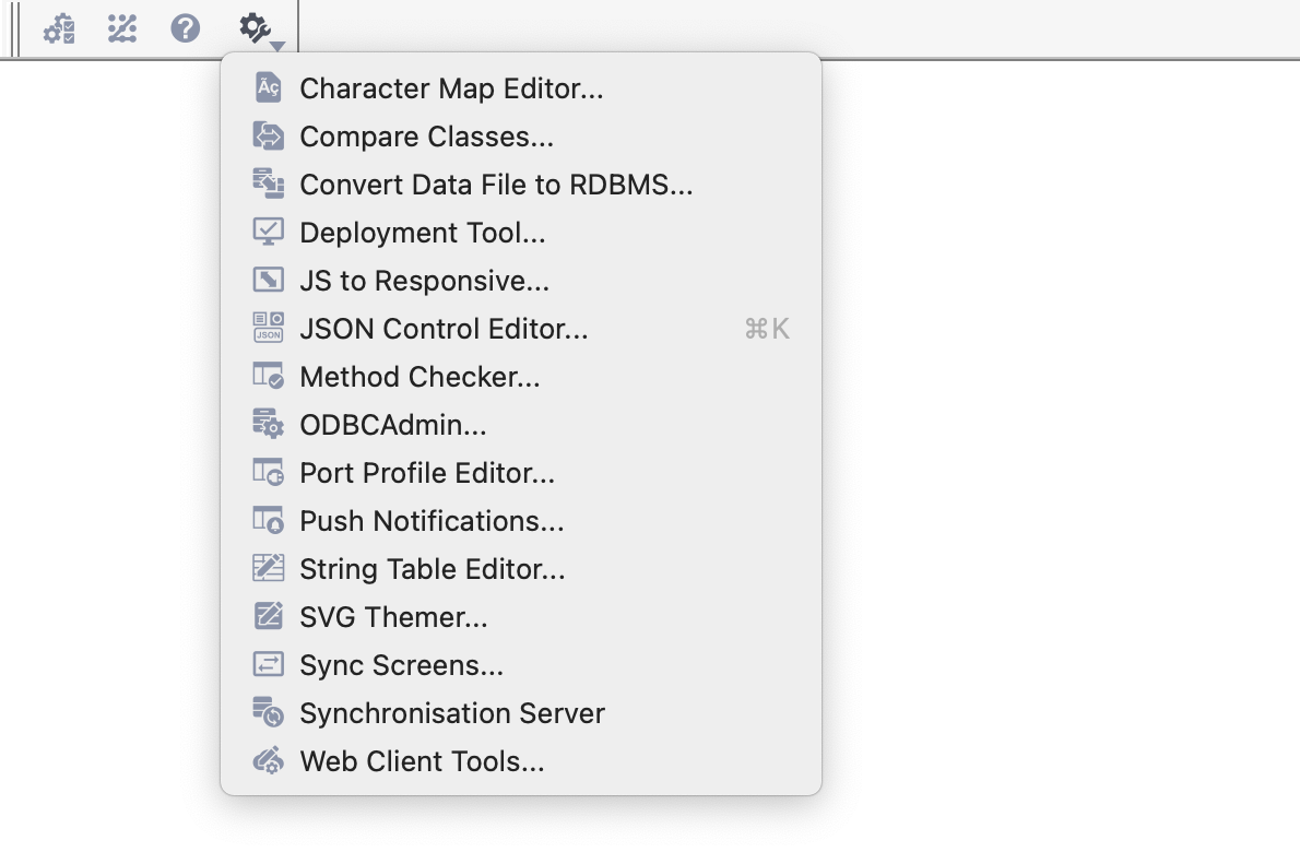
Character Map Editor for mapping local and server character data; see Non-Unicode Compatibility
Compare Classes tool for comparing the methods in classes and libraries; see Converting Omnis Data Files
Convert Data File to RDBMS for converting an Omnis datafile to SQLite or PostgreSQL
Deployment Tool allows you to build an application package including your application file(s) for deploying to end users on desktop only (not web or mobile); see Deployment Tool
JS to Responsive migrates $screensize based remote forms to responsive layout; see Remote Form Migration
JSON Control Editor lets you create JSON defined JavaScript components; see JSON Control Editor
Method Checker for checking methods in classes and libraries; see Checking Methods
ODBC Admin tool for setting up ODBC access to Omnis datafiles
Port Profile editor for setting up your ports; see Port Profiles
Push Notifications lets you setup notifications for mobile apps; see Push Notifications
String Table Editor for providing multi-languages in your application; see Localization
SVG Themer allows you to convert SVG icons to Omnis themed icons; see Themed Icons
Sync Screens for synchronizing layouts in old fixed screensize remote forms (not used for responsive forms)
Synchronization Server opens the Admin tool for the Sync Server; see Serverless Client
Web Client Tools provides access to the JS Icon Export tool, the Icon Set Renaming Tool, and the JavaScript Theme Editor; see Theme Editor.
The following options on the Tools toolbar are hidden by default and are not required for creating new applications:
The Icon Edit option opens the Icon Editor to allow you to manage PNG-based icons in an Omnis icon datafile or #ICONS; note this is not required to create icons sets including SVG icons; these must be edited in a separate image editor.
The Export and Import options allow you to export or import data from an Omnis datafile which are used for legacy desktop apps only.
The Desktop toolbar (hidden by default) is only relevant to running or testing desktop applications.* It lets you toggle between the Design environment and a simulated Runtime environment, so you can see your desktop application in user mode. You can also change the mode using the Desktop option in the File menu.
In Design mode the standard menus, such as File, Edit, View, and Tools toolbars are visible. In Runtime mode all these are hidden and only user menus, data entry windows and toolbars defined in your library are visible. Also in Runtime mode, there is a cut-down version of the File and Edit menus on the main menu bar. Being able to switch to Runtime mode lets you see exactly how your application will look when the user runs it. In Combined mode (the default) all design and user menus, windows, dialogs, and toolbars are visible. When you select the Runtime option, the Desktop toolbar is installed so you can get back to the Combined mode.
The main Omnis Menu Bar gives you access to various File operations (Save etc), the standard Edit menu functions (Undo/Redo, Copy, Paste, etc), as well as the View, Tools, Window, and Help menus. Many of the options in these menus appear on the main toolbars and are described in the previous sections: the other options are reasonably self-explanatory.
On macOS, the main Omnis menubar is always visible at the top of the screen when you start Omnis (see below). For macOS only, the Omnis menu contains additional options including the About Omnis option, Preferences (to open the Omnis preferences in the Property Manager), and the Quit Omnis option (Cmnd-Q).
On Windows, the main Omnis menu bar may not be visible, but you can press the Alt key to display it temporarily; it is located within the Omnis application window. The main Omnis toolbar is shown by default on Windows.
On Windows, to display the main Omnis menu bar permanently, Right-click on the main Omnis toolbar and select the Menu Bar option.
The other options on the Toolbar context menu let you configure the main toolbars in Omnis Studio. The Toolbar Options… option lets you install or remove the Standard, View, Tools and Desktop toolbars.
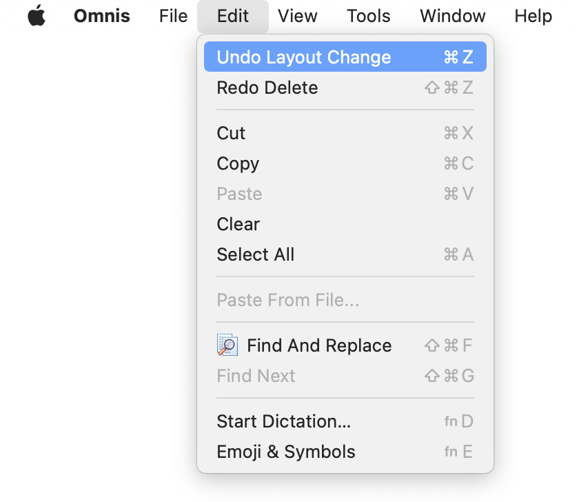
The Edit menu in Omnis supports the standard edit options including Undo, Redo, Cut, Copy, Paste, Clear, Select All and Paste from File. The Edit menu also lets you open the Find and Replace tool.
Omnis supports multiple Undo and Redo operations in the class design editors and the Method Editor. Omnis stores most operations on an Undo and Redo Stack which can be called using the Undo or Redo commands in the Edit menu, or using Ctrl-Z or Ctrl-Y key strokes on Windows, or Cmnd-Z or Shift-Cmnd-Z on macOS.
As you undo and redo operations in a class editor, or the method editor, the Undo and Redo commands will update in the Edit menu to reflect the next operation that can be undone or redone (see below). When there are no operations that can be undone or redone the corresponding option in the Edit menu will be grayed out.
In general, most operations that support (single) Undo support multiple Undo and Redo, including moving and resizing objects, adding and deleting controls (including Cut and Paste), object property changes (in the Property Manager), align menu operations, and changing or deleting layout breakpoints in remote forms.
In effect, a separate Undo stack is kept for each editor, so as you switch from one editor to another, e.g. between two remote forms, the Undo or Redo commands will apply to the stack for that class editor (this does not apply when opening the Method Editor, see below). There is currently no limit on the number of operations that can be stored on the Undo stack.
To enable multiple Undo and Redo, Omnis saves a copy of the class data before and after an operation. To support this, there is a new temporary folder named ‘undotemp’ created automatically in the ‘studio’ folder at startup, which contains temporary copies of class data associated with undo stack entries; these files are deleted automatically, but in case they are not, any stray files are deleted when Omnis starts up.
You can Undo a property change when the Property Manager has the focus, provided that the current line in the Property Manager does not itself have an Undo stack (this can apply when the edit field has the focus). When you undo a property change, Omnis tries to select the affected property in the Property Manager. Undo works for inheriting and overloading a property.
If you open the method editor for a class, while the design editor for the class is open, Omnis clears the undo stack of the class design editor (but only if something is changed in the method editor). This prevents Undo or Redo in the class editor overwriting the class and losing any method changes.
Undo works in the report editor for the following operations: moving a report section, inserting or deleting a report line, and editing the page setup. Note that the report editor does not support Undo or Redo for the sort fields dialog. When you open this dialog, Omnis clears the report editor undo and redo stacks.
Most operations within complex objects, such as a Complex grid or a Tab strip, support multi- Undo and Redo, such as, setting column widths in a Complex grid using the mouse or changing a grid line property.
The Help Project Manager lets you build help into your own libraries for the benefit of your own users.
The Add-Ons option lets you open various additional tools, described in the Tools toolbar section above.
The Export and Import options are only available for legacy apps using Omnis datafiles and should not be used for new apps. The Export Data option lets you export data from an Omnis data file (not a SQL database) using a number of different data formats. The Import Data option lets you import data into a data file from an existing export file or text file from another application.
The Icon Edit option opens the Icon Editor to allow you to manage PNG-based icons in an Omnis icon datafile or #ICONS; note this is not required to create icons sets including SVG icons; these must be edited in a separate image editor.
The Trace Log option displays the trace log which is a record of the operations and commands you have carried out. See Debugging Methods.
The Options option (available on Windows only) opens the Property Manager displaying the main Omnis Preferences, including settings for the Appearance of the Omnis environment, the Print devices for Omnis reports, and the main Page Setup. On macOS, the Preferences option in the Omnis menu (or Prefs on the Tools toolbar) opens the Omnis Preferences. See Omnis Preferences.
The Change Serial Number option which lets you re-serialize your copy of Omnis.
A context menu is a useful shortcut when you want to modify an object, or change the Omnis development environment. You can open a context menu from almost anywhere in Omnis by Right-clicking on an object or window background. On macOS, you can open a context menu by holding down the Ctrl key and clicking your pointer on the object; or you can use Right-click on your trackpad or mouse. The options in a context menu are context-sensitive and will depend on the object you right-clicked on. For example, if you Right-click on the Studio Browser its View menu will be opened containing options for changing its view and creating new classes.
The context menu on the Studio Browser lets you change the current view, or create a new class or folder when a library is visible in the Browser.
The context menu for most of the design tools in Omnis will have the Save Window Setup option which will save the settings or view for the current window: for example, the option will store the current setting for the Icons or Details (list) view in the Studio Browser.
The keyboard shortcut Shift+F3 executes the Save Window Setup command for the current design window; the shortcut applies to all built-in dialogs and design windows. The ‘saveWindowSetup’ option in the IDE section of the keys.json file stores the shortcut. Function key shortcuts in macOS menus are shown as Fn rather than Cmnd+<n>.
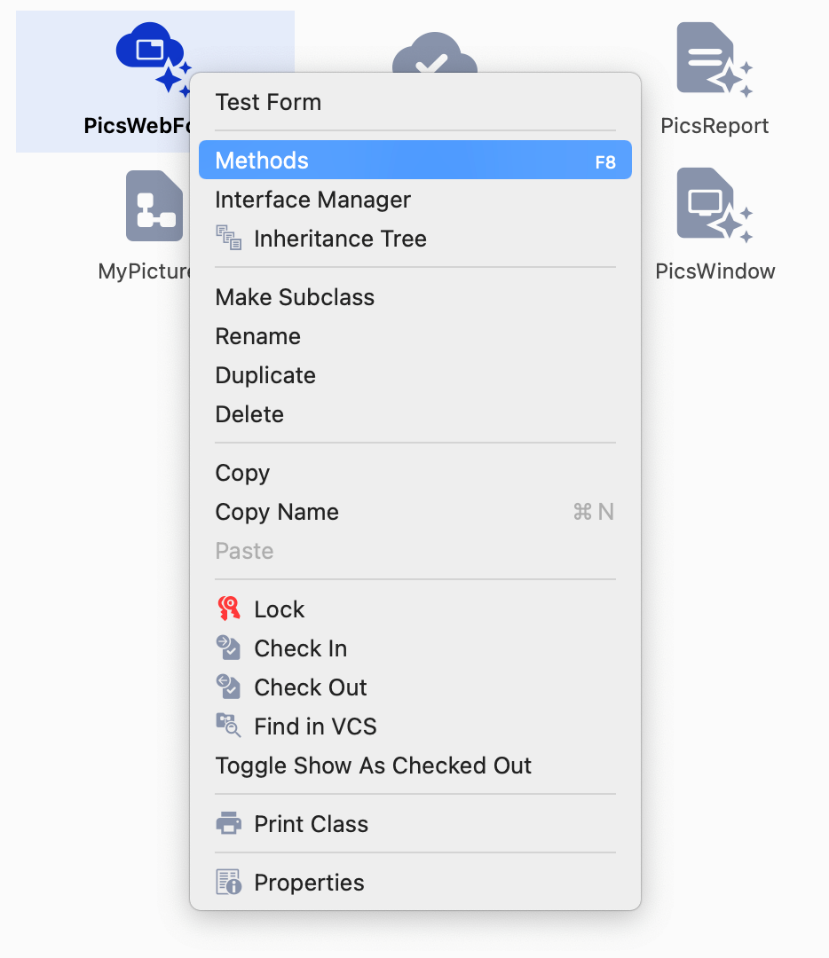
If you right-click or Ctrl-click on a class displayed in the Studio Browser the class context menu will open: the contents of the menu will depend on the type of class, but some options are available for all classes, e.g. options for the VCS. Classes that can contain methods will show the Methods option (F8) which lets you open the Method Editor for the class. UI classes like remote forms will have an option to Test Form (or Open for window classes) to open a class instance, or report classes have the Print Report option to print the report (to the Preview window by default).
In the Omnis Method Editor or Catalog, you can right-click on a variable name and get its current value. The Variable context menu shows the variable name, its value and its type and allows you to open the variable window showing its current value.
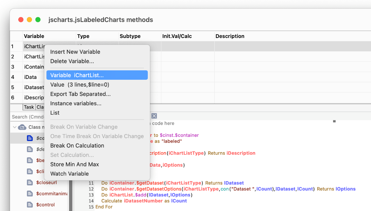
You can right-click in many parts of Omnis and open up a menu appropriate to the object or item under the mouse, like a variable displayed in the method editor, as above.
This section lists some useful shortcut keys and mouse/pointer usage that you can use to speed up development in the Omnis Studio IDE and Code Editor. Keyboard commands for the standard Omnis menu options are shown in the menus themselves and will vary across the different platforms.
In general, the Ctrl key under Windows corresponds to the Cmnd key under macOS, while F[number] keys under Windows correspond to Cmnd+[number] under macOS. For example, F9 corresponds to Cmnd+9, which opens the Catalog.
Note that the term Right-click is used throughout the Omnis docs and means you click with the Right mouse button under Windows, or hold down the Ctrl key and click the pointer under macOS.
| Action | Windows | macOS |
|---|---|---|
| Launch Omnis | Double-click on the Omnis icon | Double-click on the Omnis icon |
| Launch Omnis and open a library | Double-click on the Library icon | Double-click on the Library icon |
| Open a library (the Browser must be open) | Ctrl/Cmnd-O, or Library>>Open in Browser, or Drop the library's icon onto the Studio Browser from your Desktop or anywhere in your system | Ctrl/Cmnd-O, or Library>>Open in Browser, or Drop the library's icon onto the Studio Browser from your Desktop or anywhere in your system |
| Open library but do not run Startup task | Hold down Alt and open library | Hold down Option and open library |
| Close the selected library | Library>>Close in Browser | Library>>Close in Browser |
| Action | Windows | macOS |
|---|---|---|
| Open the Studio Browser | F2 | Cmnd+2 |
| Open the Component Store* | F3 | Cmnd+3 |
| Open the Notation Inspector | F4 | Cmnd+4 |
| Open the Inheritance Tree | F5 | Cmnd+5 |
| Open the Property Manager | F6 | Cmnd+6 |
| Open the Class Filter | F7 | Cmnd+7 |
| Open the Catalog | F9 | Cmnd+9 |
| Open Find and Replace | Ctrl+Shift+F | Cmnd+Shift+F |
These tools can also be opened via the View menu, or the Edit menu for Find and Replace.
*In Studio 11 or above, the Component Store is attached to the design window so it is generally always visible, and therefore F3/Cmnd+3 will put the focus on the Component Store which you can then navigate using the arrow keys if required.
When the contents of a library are displayed in the Studio Browser, you can show different class types by pressing the Shift + Control or Command keys plus a letter key. For example, pressing Shift+Ctrl/Cmnd+W causes only window classes to be displayed, or Shift-Ctrl/Cmnd-A shows all classes.
| Action | Windows | macOS |
|---|---|---|
| Code classes only | Shift + Ctrl + C | Shift + Cmnd + C |
| File classes only | Shift + Ctrl + L | Shift + Cmnd + L |
| Menu classes only | Shift + Ctrl + M | Shift + Cmnd + M |
| Object classes only | Shift + Ctrl + O | Shift + Cmnd + O |
| Remote form classes only | Shift + Ctrl + I | Shift + Cmnd + I |
| Remote menu classes only | Shift + Ctrl + N | Shift + Cmnd + N |
| Remote object classes only | Shift + Ctrl + E | Shift + Cmnd + E |
| Remote task classes only | Shift + Ctrl + K | Shift + Cmnd + K |
| Report classes only | Shift + Ctrl + R | Shift + Cmnd + R |
| Query classes only | Shift + Ctrl + Y | Shift + Cmnd + Y |
| Schema classes only | Shift + Ctrl + S | Shift + Cmnd + S |
| Search classes only | Shift + Ctrl + H | Shift + Cmnd + H |
| Table classes only | Shift + Ctrl + B | Shift + Cmnd + B |
| Task classes only | Shift + Ctrl + J | Shift + Cmnd + J |
| Toolbar classes only | Shift + Ctrl + T | Shift + Cmnd + T |
| UserConstants classes only | Shift + Ctrl + U | Shift + Cmnd + U |
| Window classes only | Shift + Ctrl + W | Shift + Cmnd + W |
| All classes | Shift + Ctrl + A | Shift + Cmnd + A |
The above key presses activate the Class Filter, but you can set the filter manually by pressing the F7 key or click on the Class Filter (on/off) option in the Studio Browser.
| Action | Windows | macOS |
|---|---|---|
| Save the current class | Ctrl+S | Cmnd-S |
| Open the Print Destination dialog | Shift-Ctrl-P | Shift-Cmnd-P |
| Print the current selected object (report, method, field, or class); e.g. prints list of properties and methods for a class | Ctrl-P | Cmnd-P |
| Close the top design window | Ctrl-W | Cmnd-W |
| Instantiate a class, e.g. test a remote form, print a report, install a menu or toolbar | Shift-select the class in View menu | Shift-select the class in View menu |
| Interrupt current processing, such as method execution, or report printing | Ctrl+Break (may require Fn) | Cmnd-. (period) |
| Exit/Quit Omnis | Alt+F4 | Cmnd-Q |
| Cycle forward through open windows; the Shift modifier will cycle backward | F11 | Cmnd-` (backtick) |
| Action | Windows | macOS |
|---|---|---|
| Get help on currently selected item | F1 | F1 |
| Get 'What's This?' cursor, then click on object to get help | Shift-F1 | Shift-F1 |
| Action | Windows | macOS |
|---|---|---|
| Switch between design and open window to test the form or window | Ctrl-T | Cmnd-T |
| Make an exact square, or circle, or set component Height and Width the same | Hold down Ctrl and resize the selected object | Hold down Cmnd and resize the selected object |
| Duplicate a selected object | Ctrl-drag | Option-drag |
| Select multiple objects for moving, grouping, locking, or cutting and pasting | Shift-click | Shift-click |
| Select all the objects on a form, window or report | Ctrl-A | Cmnd-A |
| Lock cursor movement in horizontal or vertical direction only when sizing or moving object or group of objects | Start to Move or Resize the object, then press Shift and continue moving or resizing object | Start to Move or Resize the object, then press Shift and continue moving or resizing object |
| Open the specified class or Method Editor for the current class | F8 | Cmnd-8 |
| Action | Windows | macOS |
|---|---|---|
| Move selected object by one pixel, or by grid amount if enabled | ˂ ˃ ˄ ˅ (arrow keys) | ˂ ˃ ˄ ˅ (arrow keys) |
| Move selected object by a greater amount; uses the current grid setting* | Shift- ˂ ˃ ˄ ˅ (arrow keys) | Shift- ˂ ˃ ˄ ˅ (arrow keys) |
| Resize selected object by one pixel on its right or bottom edge | Ctrl+ ˂ ˃ ˄ ˅ | Cmnd- ˂ ˃ ˄ ˅ |
| Resize an object by a larger amount on its right or bottom edge; uses the current grid setting* | Shift-Ctrl+ ˂ ˃ ˄ ˅ | Shift-Cmnd- ˂ ˃ ˄ ˅ |
* Uses current $horzgrid and $vertgrid properties (default is 8 pixels) regardless of $sizetogrid, $aligntogrid or $showgrid (grid is not shown for remote forms).
| Action | Windows | macOS |
|---|---|---|
| Select multiple non-consecutive lines | Ctrl-click | Cmnd-click |
| Deselect a selected line | Ctrl-click | Cmnd-click |
| Select multiple consecutive lines | Shift-click on start & end line | Shift-click on start & end line |
| Deselect all lines (user-defined lists only) | Click on white space at end of list | Click on white space at end of list |
You can find the next or previous line in a list when used with a search string, for example, type *cur then + or - to find all next or previous strings containing "current".
The lists key usage applies to most built-in Omnis lists, as well as your own lists.
Container fields are components that contain other fields, such as complex grids.
| Action | Windows | macOS |
|---|---|---|
| To select an object in a selected container field | Ctrl-click on object | Cmnd-click on object |
| To select all objects in a container field | First select all objects on the window using Ctrl-A, then Ctrl/Cmnd-click inside one of the objects inside the container field | First select all objects on the window using Cmnd-A, then Ctrl/Cmnd-click inside one of the objects inside the container field |
| To drag select a number of objects inside a container field | Ctrl & drag around objects inside the container field | Cmnd & drag around objects inside the container field |
| To copy a container field, including its internal fields | Ctrl-drag on empty part of container field | Option-drag on empty part of container field |
| Action | Windows | macOS |
|---|---|---|
| Open droplist (or dialog) in Property Manager | Alt-Down arrow when focus is on the list, use Up or Down keys to select, then Return key to confirm choice | Alt-Down arrow when focus is on the list, use Up or Down keys to select, then Return key to confirm choice |
| To toggle value of property in the Property Manager, e.g. to toggle true/false value or cycle through multiple values | Click on switch to toggle true/false value, or Double-click on value | Click on switch to toggle true/false value, or Double-click on value |
| Action | Windows | macOS |
|---|---|---|
| Set a go point on current method line | Shift+F2 | Shift+F2 |
| Set a breakpoint on current method line | Ctrl+Shift+B | Cmnd-Shift-B |
| Set a one-time breakpoint | Ctrl+Shift+O | Cmnd-Shift-O |
| Clear breakpoints | Ctrl+Shift+C | Cmnd-Shift-C |
| Clear field breakpoints | Ctrl+Shift+F | Cmnd-Shift-F |
| Stop debugger during execution | Pause (may require Fn key) | Cmnd-Alt- Backspace |
| Display the variable context menu for variable or field | Right-click on variable or field | Ctrl-click on variable or field |
| Comment or Uncomment the current or selected method line(s) | Ctrl+/ | Cmnd+/ |
| Add new line below current line in method | Ctrl+N | Cmnd-N |
| Insert line above current line in method | Ctrl+I | Cmnd-I |
| Open the remote form, window, or report design screen for the current method | F3 | Cmnd-3 |
| Open the method editor for a custom menu class installed on menu bar | Shift-select menu option | Shift-select menu option |
You can specify keystrokes for various parts of the IDE, including the Method Editor, in the $keys Omnis preference ($prefs), which can be edited in the Property Manager via the Preferences option in the Studio Browser.
Go to Keyboard Shortcuts for more shortcuts in the Method editor and Code editor.
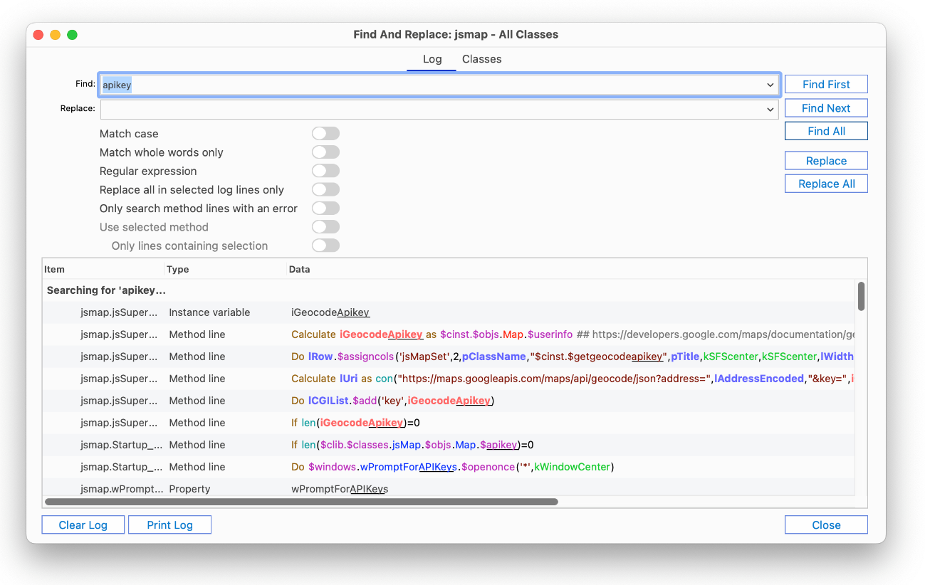
The Find and Replace tool lets you search through a class or library, or a number of classes or libraries, to find a particular text string. You can selectively replace occurrences of an item or replace all items. The Find And Replace option under the Edit menu opens the Find and Replace dialog, or you can press the Ctrl+Shift+F keys on Windows, or Cmnd+Shift+F on macOS.
If the Find and Replace dialog is already open and you bring it to the top, it selects the top-most open class ready to be searched (this is controlled by the 'findAndReplaceSelectsTopClass' item in the ‘ide’ section of the Omnis configuration file).
If you click on the Find First button Omnis will jump to the first occurrence of the text string in your selected classes or libraries. For example, if the specified item is found in a method, Omnis will open the class containing the method with the found item highlighted.
The Find Next button (or press Ctrl/Cmnd+Shift+G) will jump to the next occurrence of the text string, and so on, until the find list is exhausted.
The Find Next (>) button (or press Ctrl/Cmnd+Shift+G) will jump to the next occurrence of the text string, and so on until the find list is exhausted. The Find Previous (<) button lets you find the previous occurrence until the first item in the find list is reached.
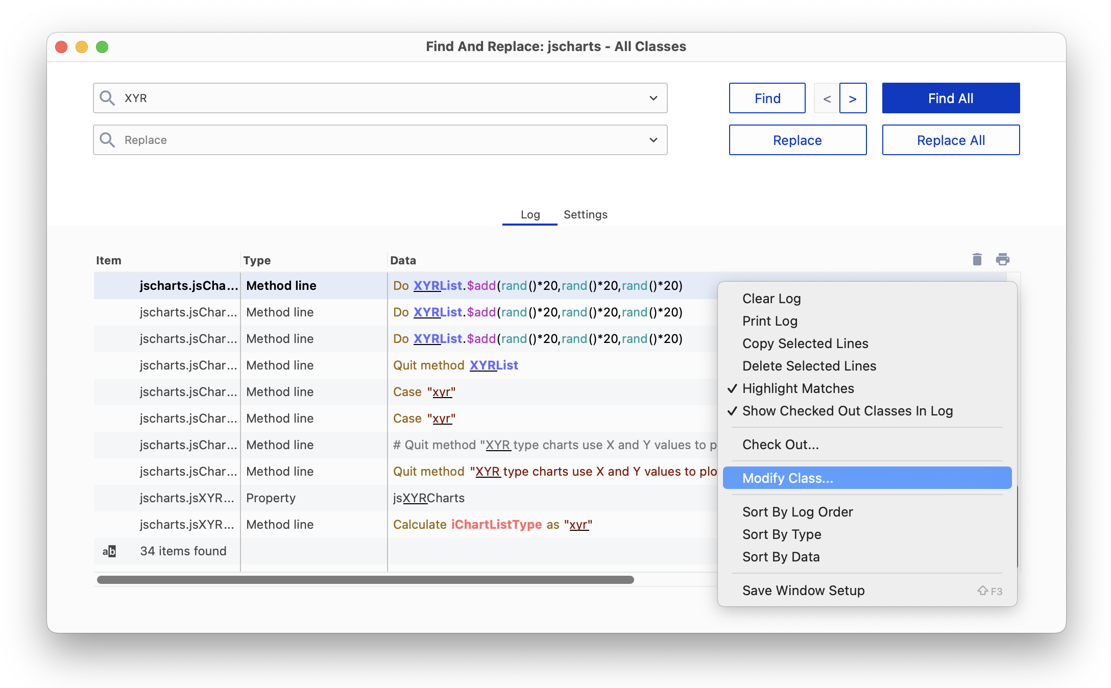
The Find All button finds all occurrences of the specified item in all the classes or libraries you selected and lists them in the Find log, and the found or replacement text is highlighted. The matched text is underlined if the Highlight Matches option in the context menu for the log is enabled (the default is on). If the text occurs more than once, up to the first 16 occurrences in the log are highlighted.
You can interrupt a find and replace operation at any time by pressing Ctrl-Break under Windows (may require the Fn key), Cmnd-period under macOS (or Ctrl-C under Linux).
The 30 most recent searches entered into the Find box are saved for re-use, which you can view by clicking on the drop arrow in the search box. Note that all droplists and combo boxes in the IDE, including the Find and Replace dialog, use the maxDisplayedDropListLines configuration item in the ‘ide’ section of config.json to specify their maximum number of displayed lines. This defaults to 30, and can be 5-50 inclusive.
The Show Checked Out Classes In Log option in the Find log context menu (right-click on the Find log) allows you to show which classes in the Find and Replace log are checked out of the VCS; the option is enabled by default and is saved in the Window Setup. Changing the option via the context menu does not cause lines already in the log to be updated.
The Modify Class... option in the Find log context menu allows you to open the editor for the class containing the method listed in the log; double-clicking a line in the Find log takes you to the method editor for the class.
On the Classes tab you can select the libraries and classes in which you want to perform the find and replace. For a single library you can select some or all of the classes in the library. If you select more than one library under the Classes tab, all classes in all selected libraries are searched.
On the Settings tab you can select the libraries and classes in which you want to perform the find and replace. For a single library you can select some or all of the classes in the library. If you select more than one library in the Libraries list, all classes in all selected libraries are searched.
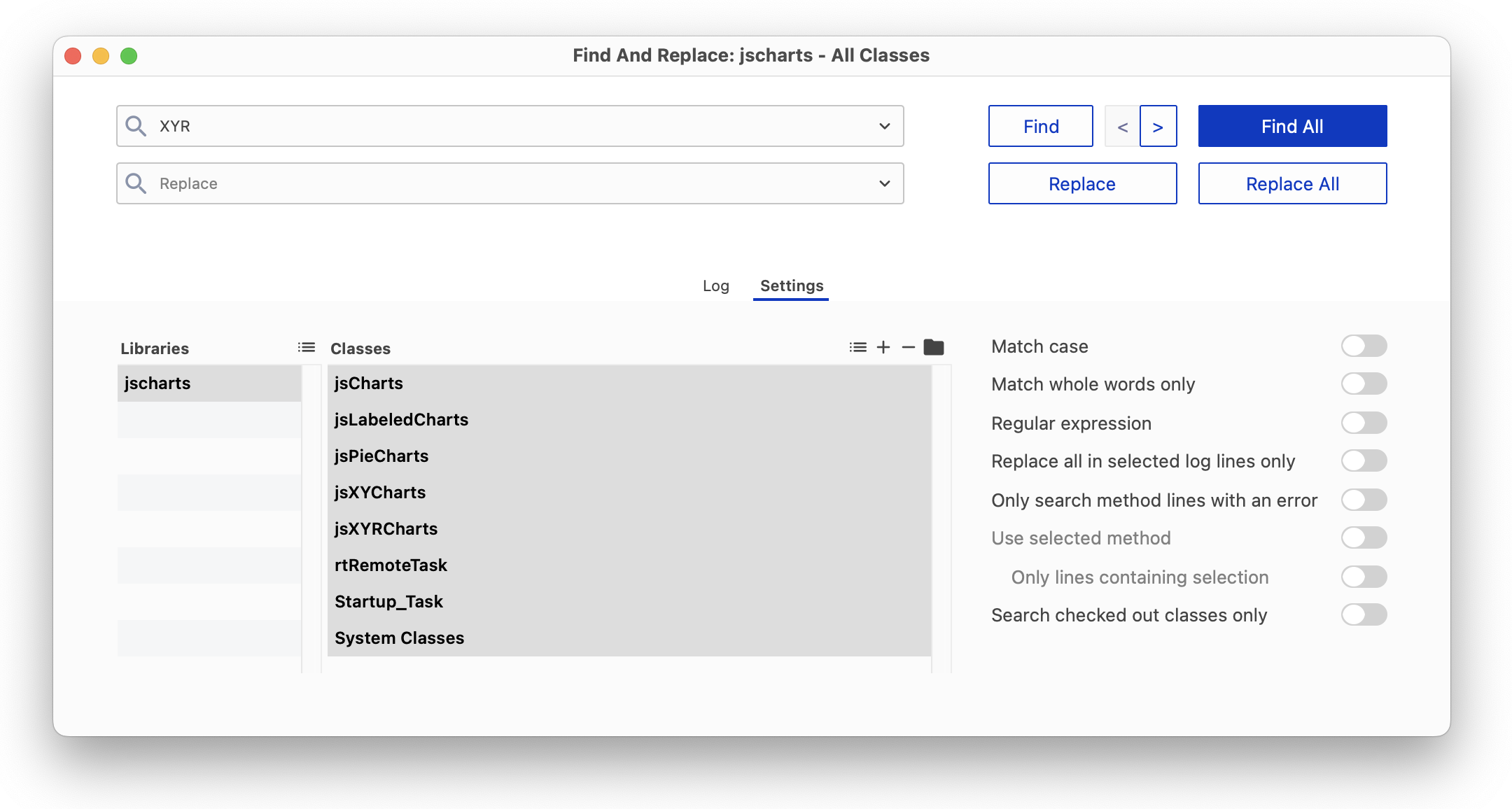
The Select All Libraries and Select All Classes buttons (at the top of each list) allow you to include all libraries and all classes in the search. The state of these options is saved in the ‘findAndReplaceSelectAllLibraries’ and ‘findAndReplaceSelectAllClasses’ items in the ‘ide’ section of the Omnis configuration file (config,json).
There is a button in the title of the class list (a folder icon, on the right) that allows you to search for parent folder(s) using a regular expression, and then select the classes contained in those folders in the class list.
The Match case and Match whole words only options can be used to find only those items that match the case of the search string or whole words only.
When the Regular expression option is enabled, Find & Replace supports PCRE2 compatible regular expressions which are sequences of literal characters and metacharacters that let you perform complex text search and modification. PCRE2 is an open source library of functions that provides syntax and semantics like Perl 5 for defining a search. See www.pcre.org for more information and full documentation about what metacharacters you can use.
PCRE2 provides improved error message reporting when there are problems with regular expression syntax, and these are reported where applicable. An error with the regular expression passed to the rxpos() function generates a debugger error with the specific error text rather than a generic invalid regular expression error.
However, when using the find field in the Code Editor, note that errors are not reported because the editor attempts to compile and use the regular expression on every keystroke.
Note for pre-version 10 users: If you want to use the old regex syntax, you can set the 'useOldRegularExpressionSyntax' configuration option to true (false is the default, so PCRE2 is used by default); this is in the ‘defaults’ section of the config.json file. When this is set to true, it only affects the rxpos() function.
The Replace all in selected log lines only option allows you to replace all occurrences of the search string in selected log lines only. The Only search method lines containing an error option restricts the search to only those method lines that contain an error.
The Use selected method and Only lines containing selection options help you find items while working in the Code Editor (the options are grayed if Find is opened from elsewhere). To use these options you need to select at least one character in a method in the Code Editor: Find and Replace searches all lines containing a part of the selection, and when it completes, it selects the text for the searched (and possibly replaced) lines.
The Search checked out classes only option allows you to search only those classes that are checked out of the Omnis VCS.
The code syntax colors used in the Code Editor are used to display method lines in the Find and Replace log (and the Trace log). You can set this using two entries in the ide section of config.json: findAndReplaceLogUsesSyntaxColors and traceLogUsesSyntaxColors, which are both enabled by default.
You can sort the Find log list by clicking on the header buttons, plus you can sort the list by either of the first two columns by using the Sort By options in the context menu. The context menu also has an item to sort the last column. Keyboard searching of the Find log list searches column one and two, which means you can locate entries of a particular type more easily in the Find log, by clicking on the Type header to sort the list, and then typing the type name to search the list.
The $findandreplace() method allows you to find and replace items within a class (it is a class method). The definition of the method is:
The $findandreplace() method allows you to find and replace items within a class, or all classes in a library (it is a class and library method). The definition of the method is:
The optional parameters bIgnCase, bWholeWord, bRegExp, and bClearLog replicate the options on the Find and Replace window. When bReturnLog is kTrue (the default is kFalse), the status row has an additional column named Log that contains the Find and Replace log; this has the same structure as the list returned by sys(241).
When you rename certain objects in your library, Omnis will replace all references to the object automatically. For example, if you rename a class variable in the method editor Omnis will replace all references to the variable within the class automatically. However, if you try to rename most other types of object, such as renaming a class in the Studio Browser, Omnis will prompt you to find and replace references to the object. If you answer Yes to the prompt, Omnis will open the Find & Replace tool and the Find log which lets you monitor the find and replace or control whether or not certain references are replaced.
Omnis checks spelling in text in end user apps, as it is entered in desktop forms (on the fat client), and in the Studio IDE during development; note this does not apply to JavaScript client remote forms. Spell checking allows words to be validated, based on the local language setting, and spelling suggestions are presented in the UI or used automatically, including the highlighting of misspelled words, and correcting misspelled words as they are entered.
Support for spell checking is provided by calling the Spell Checker API on the current operating system, including under Windows and macOS. Spell checking is enabled by default and will be used in the right context automatically, such as in Entry fields or in the Code editor, and there are various options or settings in the Studio IDE to manage spell checking.
There are two options for how Omnis chooses a language to use with the system Spell Checker APIs. Which of these two applies depends on the entry useSystemSettingsForSpelling in the ‘defaults’ section of the Omnis Configuration file (config.json).
If useSystemSettingsForSpelling is true (the default), Entry fields use the system settings to identify the current language or languages. For macOS, this means the settings in the Keyboard, Text panel in System Preferences. For Windows, this means the System Locale.
If useSystemSettingsForSpelling is false, Entry fields use the National sort ordering locale for the current language in the Omnis localization data file.
If Omnis fails to initialize the system Spell Checker API to use the required language it reports this failure to the Trace log.
The following Window class (fat client) controls allow spell checking: Single Line Entry field, Multi Line Entry field, Combo box, String grid, and Data grid. These controls have the following properties to control spell checking:
| Property | Description |
|---|---|
| $showspellingerrors | If true, the control underlines spelling errors using a dotted line |
| $autocorrectspelling | If true, and the user types a separator (e.g. space or comma) when no text is selected, the control replaces a misspelled word immediately before the selection with a correctly spelt word. Note that Undo allows you to revert to the originally entered text, and then continue typing without correcting it again |
These properties are kFalse in pre-Studio 11 (converted) apps to maintain previous behavior.
The dotted line used to underline spelling errors uses the color “colorspellingerror” in the system (and system.dark) section of appearance.json. The following screenshot shows an Entry field containing misspelled words:
When $showspellingerrors is true, and the currently selected text in an Entry field is a misspelled word, the default context menu for the edit field includes up to 10 spelling suggestions, before the normal menu commands, such as Cut, Copy and Paste. Selecting one of these suggestions from the menu replaces the currently selected word.
The context menu for Edit fields has the Learn Spelling menu item when the selected word is shown as a spelling error. If this menu item is selected the word will be added to the end user’s custom dictionary and will no longer show as a spelling error. Conversely, if a word has been added to the custom dictionary, the context menu will show the Unlearn Spelling menu item, which when selected will remove the word from the custom dictionary and the word will be shown as a spelling error. These menu items are also available in the Code Editor context menu.
Spell checking is also enabled in the Code Editor (Method editor); there is a new Show Spelling Errors option in the View menu that is enabled by default.
Misspelled words in strings entered into code are underlined in the same way as edit fields underline spelling errors when $showspellingerrors is true. In addition, misspelled words outside Square Brackets are underlined for certain commands, including OK message, Yes/No message, No/Yes message, Prompt for input, Text:, Line:, and Send to trace log.
In addition, when Show Spelling Errors is enabled in the Code Editor, you can change the spelling of a selected word (which need not be misspelled) in either of two ways, described below (this applies to a string or outside square brackets in the commands as listed above).
You can select a word, and from the Modify>>Selection submenu you can select the Change Spelling… option: note that this command is only present if there are some possible suggestions for the selected word. You can also use the keyboard shortcut Ctrl/Cmd+B to change a word (specified in the changeSpelling key in the methodEditorAndRemoteDebugger section of keys.json). After selecting the command, a popup appears from which an alternative spelling can be selected to replace the word.
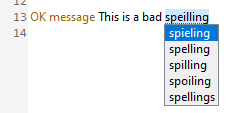
Alternatively, you can select a word, Right-click on it, and the context menu contains a new Change Spelling hierarchical menu, with up to 10 suggestions, that can be used to replace the selected word.
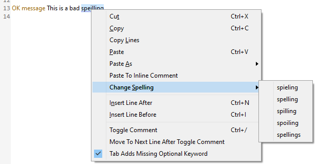
The Remote Debugger also supports spell checking, enabled using the the Show Spelling Errors option. When this is true, for an edit session, the context menu for the editor includes up to 10 suggestions when the selected text is a misspelled word (that is, it behaves like a normal Entry field with $showspellingerrors set to true).
The Component Store contains the objects and components you need to build the Remote forms and Reports in your web and mobile applications, plus Window and Toolbar components for desktop apps. When you create a new UI class or modify an existing one, the Component Store will open automatically. For example, when you create or modify a Remote Form in your application, the Component Store will display the JavaScript Components; the following screenshot shows a chart remote form (the JS Charts example app) with the Component Store docked to the left-hand side showing the Buttons group of components.
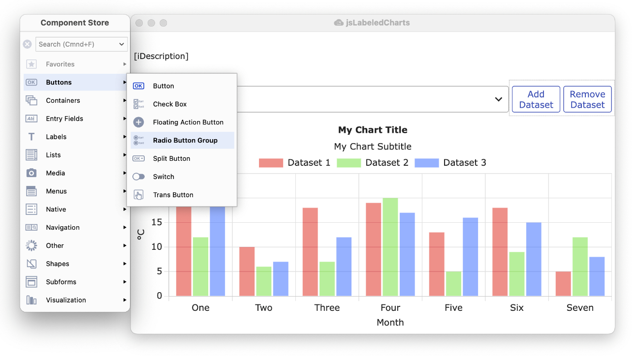
There are a number of components in each group, shown in the sub-menu that pops out when you click on a group, such as the Buttons group, which contains the standard Button, Check Box, Floating Action Button (a new component), Radio Button, and other types of button components. The Component Store is displayed using the current IDE theme, including default (light) and dark themes.
On the Component Store context menu, the Dock to Design Window allows you to set where the Component Store is docked, either Auto, Left (the default), Right, and No (not docked, but floating). In Auto mode, the Component Store will dock to the left side of a design window, but if there is insufficient space on the left, the Component Store will dock on the right.
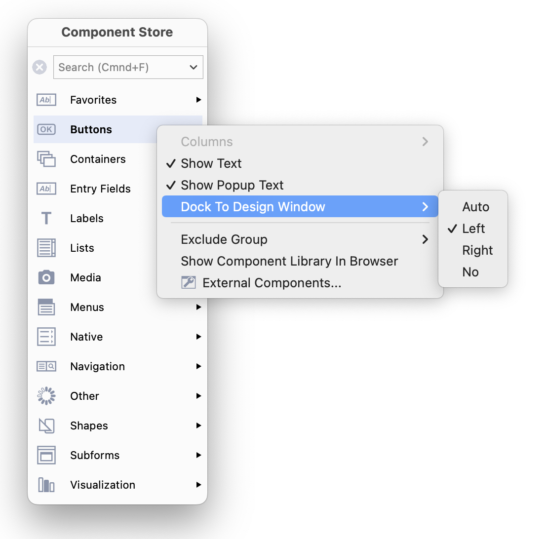
The initial view for the Component Store is to Show Text labels for the main groups and the components in the sub-menu popups, as shown above, but you can use its Context menu to change the appearance, e.g. hide the text or show it with 2 columns.
You can use the Search box to locate a component or a group of similar components. As you type a search string, the contents of the Component Store is filtered, displaying only those components that contain the search string in their name, and the groups are hidden while the search is active. For example, you could enter “grid” to find all the grid components, as shown below. When the focus is on the Component Store, you can type Ctrl/Cmnd-F to put the focus into the Search box ready to type your search string.
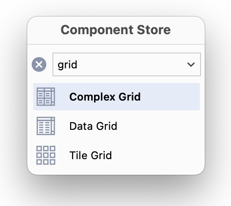
To select a component, and add it to your Remote Form (or Report, Window, or Toolbar class), you can do one of the following:
Click on the main group icon to open the sub-menu popup, then click and drag a component icon from the sub-menu, and drop it onto the form or window; as you drag the component out of the Component Store, the outline of the component is shown allowing you to place it precisely in the form or window.
Click and drag the icon shown in the main group to create a component of that type; for example, you can drag the Button icon from the Buttons group to create a button, which is initially the default icon in that group (note the group icon/default component will change as you select different components).
Double-click an icon in the main group or any sub-menu popup to add a component of that type; in this case, the component is added to the center of the form or window (double-clicking is not supported for report classes).
Press Return to add the currently selected component to the design window (not supported for report classes).
Alternatively, you can use the keyboard to select a component:
The most recently selected group is highlighted in a color, while the icon for the most recently chosen component from any sub-menu popup is shown as the initial/default icon for the group; therefore, as you select different components from different groups, the initial or default icons will change. For example, if you previously chose a Combo box from the Lists group, the Combo box icon is shown in the main Lists group, and you can then drag or double-click the Combo box icon from the Lists group without opening the sub-menu to create a Combo box in your form.
If you create any Compound Objects for Remote forms they will appear in their own group in the Component Store: you can define compound objects by editing the Component Store library; see below. For example, Window classes have the Labeled Fields group containing the Labeled Entry Field and Labeled Masked Entry fields.
You can change the appearance or layout of the Component Store using its Context menu. For example, you can Right-click/Ctrl-click anywhere on the Component Store and select or deselect the Show Text or Show Popup Text option to hide or show the text labels for the main groups or sub-menu popups, respectively.
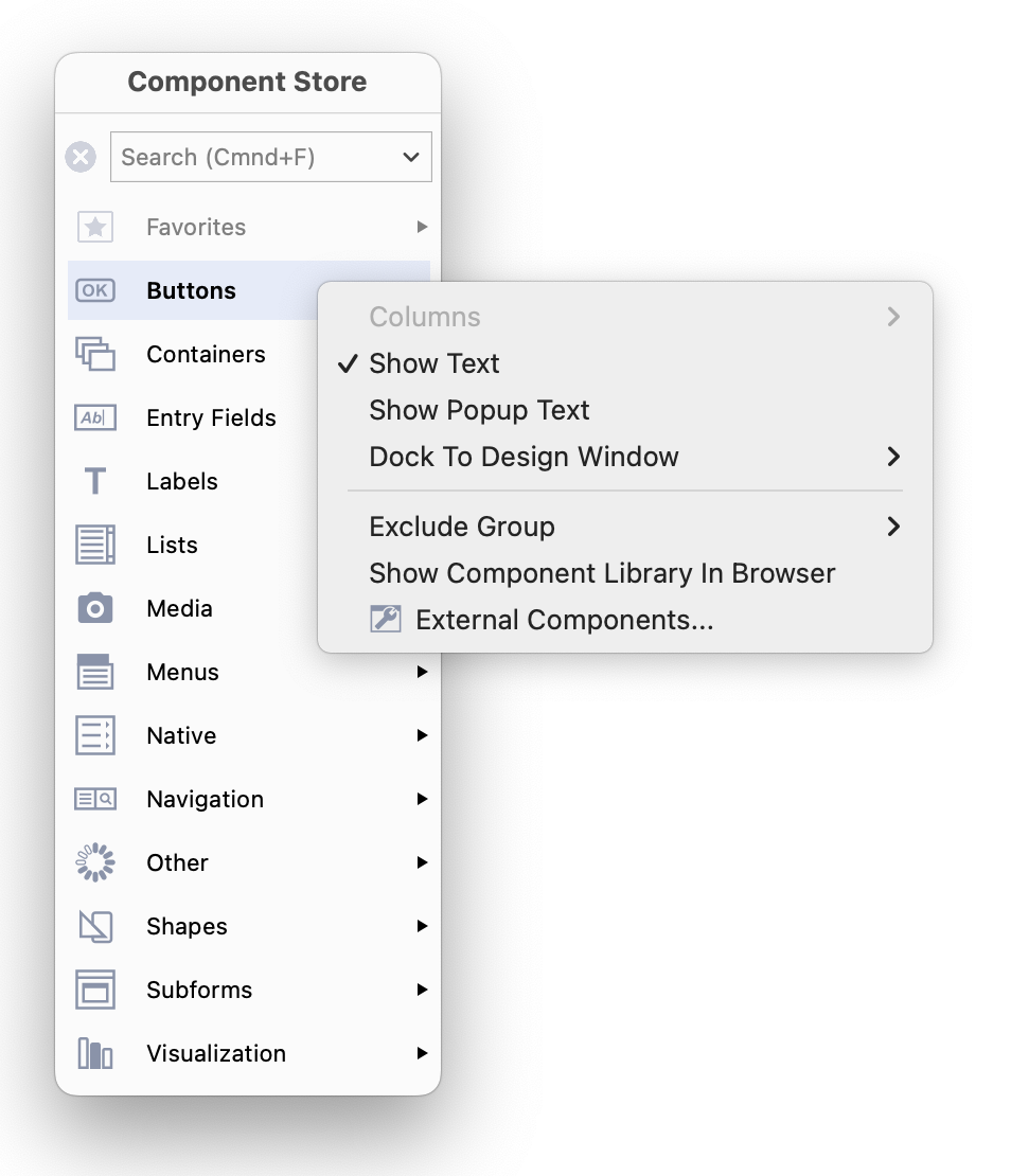
As you hide or show the Text labels, the icons will switch between Large or Small icons automatically (note the icons change automatically, so you cannot manually select large or small icons, as in previous versions). When the Text labels for the main groups or sub-groups are hidden, each icon has a tooltip that displays the component name or group name as you hover over the icon.
Note that there is no Save Window Setup command for the Component Store, since it saves its settings and current position automatically when it closes.
| When the Show Popup Text option is disabled, tooltips are displayed on the components i |
When both Show Text… options are disabled, large icons are shown and tooltips are displayed |
|---|---|
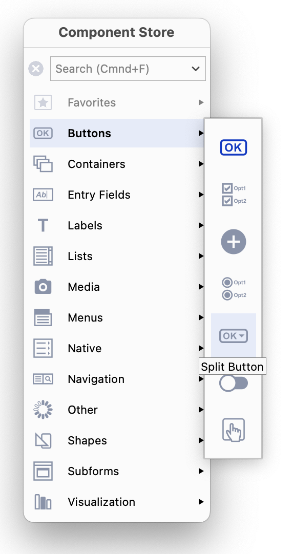 |
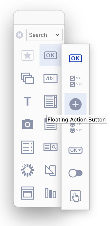 |
If the Dock To Design Window option is set to Auto, the Component Store is docked or “attached” to the left side of the current design window, or if there is not enough space to the left of the design window the Component Store is docked to the right side of the design window. If this option is set to No (not docked), you can drag or “tear” the Component Store from the design window and it will float within the Omnis application window, plus its last position is remembered automatically. The following image shows the Component Store floating next to a remote form:
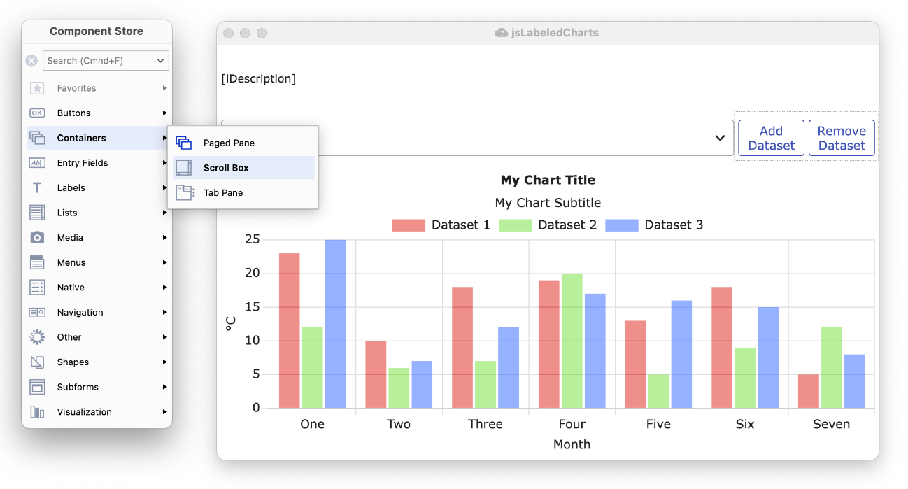
When the Dock To Design Window option is to Auto, Left or Right, you can temporarily drag or “tear” the Component Store away from the design window by dragging its title bar, but it will snap back and become docked again when you move or reopen the design window, or when you change the docking options from the context menu.
When the Text labels are hidden on the main groups (i.e. the Show Text option is unchecked), you can configure the main group icons in 1 or 2 columns using the Columns options on the context menu (the sub-menu text can be enabled or disabled in 2-column mode, as shown below). The Columns option is disabled (grayed) when the Text labels on the main component groups are shown, and therefore you cannot enable 2-column mode in this case. Note the Search box is hidden when the Component Store is in single-column mode without text labels.
| Single Column mode Plus Show Text and Show Popup Text are disabled |
Two Column mode Show Text is disabled, Show popup text is enabled |
|---|---|
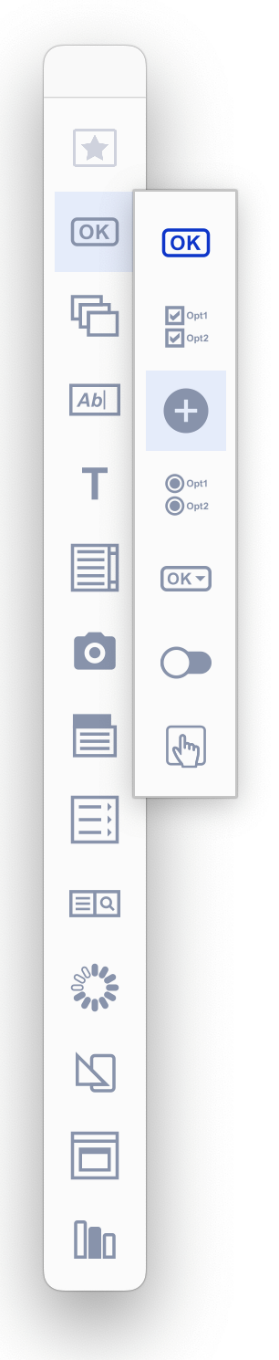 |
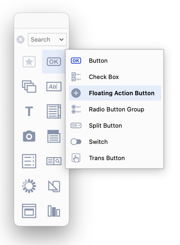 |
You can add any single component to the Favorites group at the top of the Component Store window (shown initially with a Star icon). To add a favorite, Right-click on the icon for the component in a sub-menu and select the Favorite option. Adding components to the Favorites group makes it easier or quicker for you to select any controls that you use constantly. For example, in the following screenshot the Button and Entry fields have been selected as favorites and are now shown together in the Favorites group at the top of the Component Store.
| Right-click a component, Select Favorite; in this case, Button is added to the Favo |
You can add components from different groups to the Favorites group; in this case, the |
|---|---|
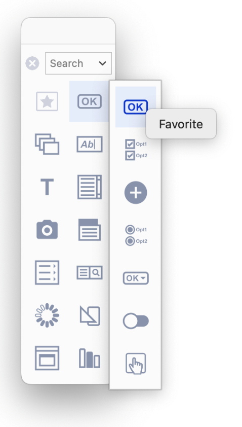 |
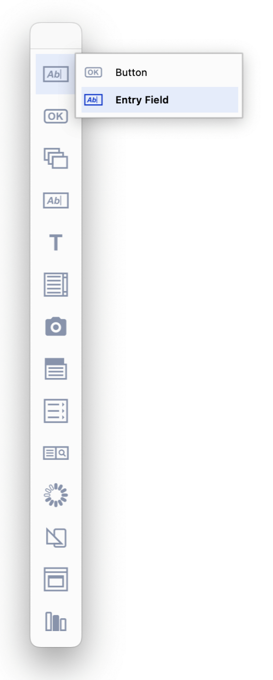 |
To remove a component from the Favorites group, you need to right-click
The options in the Exclude Group sub-menu in the Component Store context menu are checked by default, meaning that the Deprecated and Internal component groups are hidden or excluded by default; note that there are no Deprecated or Internal components for Remote forms, so these groups are only relevant for Window class controls at present. You are advised not to use the components in these groups, as they are included for backwards compatibility only, or for internal use, and should not be used for new applications.
The Show Component Library In Browser option allows you to change the contents of the Component Store and its groups; when selected, this option shows the Component Library (comps.lbs) in the Studio Browser, ready for you to edit it (as in previous versions). In general, you do not need to edit the Component Library, unless you want to add your own controls, compound objects, or class templates: see below.
The External Components… option opens the External Components dialog, allowing you to load external components (as in previous versions); this is only relevant for window and report classes, since all JavaScript components are loaded and displayed by default when designing remote forms. Note that all external components are shown in the Component Store even if they have not been marked in the External Components dialog to be loaded.
There are a number of options in the Omnis Configuration (config.json) and Appearance (appearance.json) files that control the behavior or appearance of the Component Store. The time taken for a group sub-menu to pop out can be set using the componentStorePopupDelay item in the ‘ide' section of config.json, an integer specifying the popup delay in milliseconds. The default is -1 meaning that Omnis calculates the delay to be just longer than the double click time, which means you can double click on an entry to add the corresponding default component to the design window without the popup appearing briefly.
There is a new ‘componentStore’ group in appearance.json containing the item colorgroupdefault that allows you to set the icon color for the default component in a group in the Component Store.
You can create and store your own components and wizards in a User Components Library, which is an Omnis Studio library called usercomps.lbs, and placed in the Studio folder in the Omnis tree. If such a library is present, Omnis will load its components and wizards immediately after those in the built-in Component Store library – so the Component Store displays the combined contents of comps.lbs and usercomps.lbs.
To add your own components, create a new library called usercomps.lbs in the Studio folder, alongside the existing comps.lbs. You must restart Omnis before Omnis will recognize this as a User Components library. Similarly, you must restart Omnis after copying usercomps.lbs into the Studio folder.
To show the component libraries, select the Show Component Library option from the Component Store context menu (Right-click or Ctrl-click on its background). Showing and hiding the component library shows both comps.lbs and usercomps.lbs (if it is present).
To create your own components in usercomps.lbs, you could copy existing components from the built-in comps.lbs into your usercomps.lbs, and amend those, to save time. For example, to do this for JS components, create a new Remote form in usercomps.lbs, open the remote form class JSFormComponents in comps.lbs, then drag an existing component from this remote form and drop it onto your new remote form in usercomps.lbs. Then adjust its properties as required including the name.
The type, name and Component store group of your own components need to be set. Classes and components in usercomps.lbs library have the $componenttype and $componentinfo properties (note these properties are only visible if the usercomps.lbs has been loaded using the Show Component Library option, not using the standard Open Library option). For further information about creating components and setting these properties, see below: Editing the Component Store Library.
If there are duplicate components, those in usercomps take precedence, and replace those in comps.lbs. A duplicate in this case is considered as follows: for objects, such as window objects, a duplicate is an object with the same group and name (where case is not significant). For classes, new class default is a duplicate if the class type is the same; otherwise, wizards and templates are duplicated if the class name is the same. Note that wizards and templates in usercomps.lbs are identified in the browser Class Wizard panel by having the library name prefix “User Component Library”.
Field styles in usercomps.lbs should have different names to those in comps.lbs – this only becomes an issue if a style in comps.lbs is different to one in usercomps.lbs, since when adding an object from the Component Store, Omnis only copies the object’s field style from the applicable component library into the destination library if the style is not present.
There is a hidden notation property, $modes.$usercompstore (similar to $modes.$compstore) that returns an item reference to the User Component Store library, or it returns null if no user component store library is present.
A class marked as kCompStoreNewClassDefault can contain a $setup() method that is called as the final step in creating a new class. The first parameter of this method is an item reference to comps.lbs or usercomps.lbs, depending on the library containing the new class template.
As usercomps.lbs is a separate library, you can store and manage it in the Omnis VCS, like any other Omnis library. You can also export it to JSON, including the value of $componenttype (it exports kCompStoreHidden for all non-component libraries); this was not possible with the existing comps.lbs.
IMPORTANT: You are advised not to change the properties of any of the existing components or class templates, but to duplicate an existing control and make any changes to the copy. In most cases, you do not need to edit the Component Store Library, except if you want to create your own class templates or compound objects, for example.
IMPORTANT: You are advised to add your own components to the usercomps.lbs library, as described above, rather than editing the built-in comps.lbs. This section contains information about editing component libraries and setting component properties which you will need for both component libraries.
The content of the Component Store window is driven by the classes in the Component Store library called ‘comps.lbs’. To open the component library, select the Show Component Library In Browser option from the Component Store context menu, or you can Right-click on the Libraries node in the Studio Browser and select the Show Component Library option (the latter is useful if you do not have a library open). The $componenttype property for all classes and templates that appear in the Component Store is set to kCompStoreDesignObjects.
All controls in the Component Store library have the property $componentinfo, which is a row of information that specifies which group the object appears under in the Component Store. The $componentinfo property is visible in the Property Manager when you are editing a component on a Remote Form, e.g. in the JSFormComponents remote form class (also for Window, Report, or Toolbar classes).
Click on the $componentinfo property in the Property Manager to edit it: it has three columns defining the group, icon, and default status for the object:
group
The name of the group to which the object belongs. Group names are case insensitive, for example: Lists, Buttons, Entry fields.
iconid
The icon used for the object in the Component Store, which should be an SVG image placed in the new icon set ‘componenticons’. Icons are displayed at 20x20 or 28x28 and SVG images will scale to fit the current size.
default
A Boolean that indicates if the object is the initial default in its group (the default object will change once a different object is chosen). If default is set to true for more than one object in the same group, the initial default will be the first object according to the case-insensitive ascending sort order of objects within the group by their name.
A Compound Object is comprised of two or more standard objects grouped together to make a single object that appears in the Component Store, such as the Labeled Entry Field available for Windows Classes. When you drag a compound object from the Component Store, all objects in the grouped object are created in the remote form (or window). The Tab Pane in the Containers group is a compound object, combining a Tab control and a Paged pane linked together.
You can create Compound Objects in the Component Store library, inside one of the Remote form or Window Component Store classes (or your own class but $componenttype must be set to kCompStoreDesignObjects). To create a Compound Object:
Open the Component Store Library by right-clicking on the background of the Component Store and select the Show Component Library In Browser option; comps.lbs will be shown in the Studio Browser
Open the Component Store class according to the type of Compound object (Remote form or Window class), then add the objects that will form the compound object, e.g. copy an Entry field and Label if you want to create a Labeled field; you are advised to create copies of the standard objects to form your compound objects. Note you cannot include line objects in a compound object
Assign a name to the first object; this will be the name of the Compound object in the Component Store
For a Remote form, the first object is the object that occurs first in the field list window. For a Window class, the first object is either the first background object in the field list window, or if there are no background objects in the compound object, the first foreground object.
Select all the objects that will form the Compound object, right click, and select Group
Set the $componentinfo property of the group of objects, including the control name, group name and icon id (all members of the group should have the same value)
Save the Component Store Library and close it
When the Component Store reloads in design mode, there will be a new Compound object with the specified name, group and icon id. The icon of a Compound object is shown in the Component Store with an additional … icon.
The dropped compound object has the same layout as its original objects, anchored at the top left of where you drop it.
You can use a responsive remote form to provide different layouts of the compound object for different breakpoints. Similarly, you can also set breakpoint-specific properties that will be set appropriately after dropping the compound object. Note that the Component Store Library may be using different breakpoints to your library, so the values used for each breakpoint in your library, after dropping a compound object, are the values for each nearest breakpoint, when comparing a Component Store breakpoint with a library breakpoint.
The Component Store also allows you to create compound components using a Container field, such as a scrollbox or paged pane, with other objects inside the container. For example, you could create a compound object comprising a Scroll box (now available for remote forms) with a tab strip as its top toolbar component and a paged pane as its client component.
There are a number of Class Templates or Wizards that appear in the Studio Browser that are defined in the Component Store Library (such as Net Classes available in previous versions). You can create your own class templates, but the way you define these has changed (although the way you created class templates in previous versions is still supported for backwards compatibility).
Each class template in the Component Store Library has the $componentinfo property, but for classes it has a single column named group. This allows a group to be specified for the class when it appears as a template or wizard in the Studio Browser. To use $componentinfo property to define a class template:
Select the class and set the group in $componentinfo for the class to the template name
Set $componenticon to an Icon ID, preferably an SVG icon image
Add a description for the class template in $desc
If you do not supply a group for a class template or wizard, it appears in a group named using its class type.
The Property Manager lets you display or change the Properties of the currently selected object in the Studio Browser or on a design window. This could be a library file or a Remote Form class selected in the Studio Browser, or a JavaScript component selected in a Remote Form. In addition, the Property Manager can be used to change the Omnis global preferences ($root.$prefs), and for specific classes or objects, the Property Manager will show the Methods for the currently selected object.
The Property Manager should appear automatically when needed, as soon as you click on a form or object that has properties. If it is not visible you can display it either by selecting the View>>Property Manager menu item from the main Omnis menu bar, or by pressing F6/Cmnd-6, in which case the properties for the class or currently selected object (library, class or object) will be shown in the Property Manager.
You can Right-click on a class or object, such as a remote form background or component, and select the Properties option from the context menu to display the properties for that class or currently selected object.
You can Right-click on a class or object, such as a remote form background or component, and select the Class Properties or Field Properties option from the context menu to display the properties for the current class or object under the mouse.
The properties for the current object are shown under a number of tabs (groups) such as General, Appearance, Text, and so on, unless you use the Search option (see below) or disable the Advanced filter, in which case the tabs are hidden. In addition, for some objects, the most common properties, such as $name and $dataname, are shown in a panel at the top. The following screenshot shows the Property Manager for a Remote form Entry field with the Advanced option enable (on).
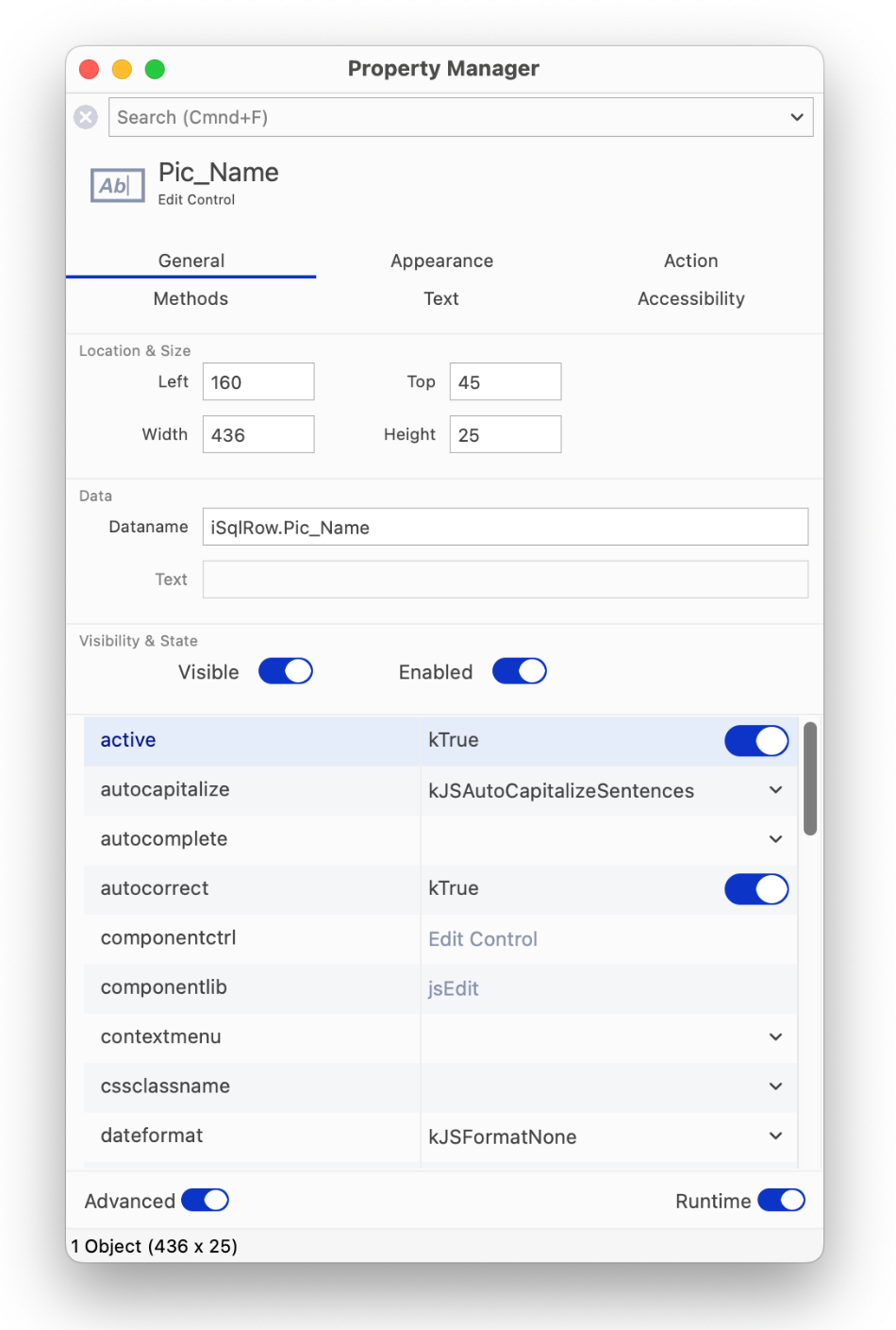
The Property Manager also shows the size of the currently selected object (see above) as width x height coordinates in the status bar at the bottom of the window, plus the position of the pointer is shown as X-Y coordinates relative to the top-left corner of the design window. When a group of objects is selected, the width x height of the area occupied by the group of selected objects is shown.
The Property Manager displays all the properties (and methods) for an object, or it can show a subset of properties. There is a switch at the bottom-left of the Property Manager window labelled Advanced, which either shows all properties for the current/selected object listed under separate tabs, or a single filtered list of "basic" properties (with no tabs) when the Advanced option is disabled (off): the latter is the default view for new installations of Omnis Studio and is intended for new users who may only need to access the basic properties.
When the Advanced option is disabled (off) the property list shows a basic subset of properties for the current object (selected library, form or component), or for the current context in the IDE, such as the Omnis preferences. For example, the following image shows the properties for a Remote Form when Advanced is disabled (off):
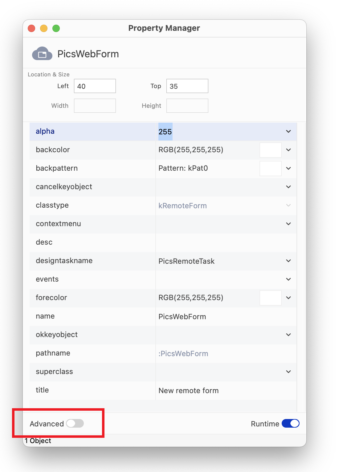
Note that if you use Find & Replace (on the Edit menu) and double-click on the find and replace log to select a property in the Property Manager, the Property Manager automatically switches to Advanced mode if the property is not part of the basic set.
The basic set of properties is defined in a file called basicproperties.json and stored in the Studio folder under the main Omnis folder. You can modify this file if you want to change the properties shown in the filtered state of the Property Manager. The file is in JSON format, and contains an array of property names which must be lower case, and include the :: prefix if the property name requires one (e.g. for some external component properties).
Omnis re-reads this file if it has changed when you uncheck the Advanced option: so checking and unchecking this box forces a re-read. If the file has invalid syntax and cannot be parsed, Omnis writes an error to the trace log, and no basic properties will be displayed.
There is a Search box at the top of the Property Manager window which allows you to search for a property: note the search box is only visible when the Advanced option is enabled. You can type a word or part of a word into the search box and the property list will update itself as you type.
The search results are property names that contain the string you entered, and they are shown in a single tab named ‘Search’. The search results are always sorted by property name, irrespective of the sort list option on the context menu. You can click on a property in the property list and update or set its value.
For example, entering ‘show’ into the property search for a remote form will provide a subset of properties containing the word ‘show’.
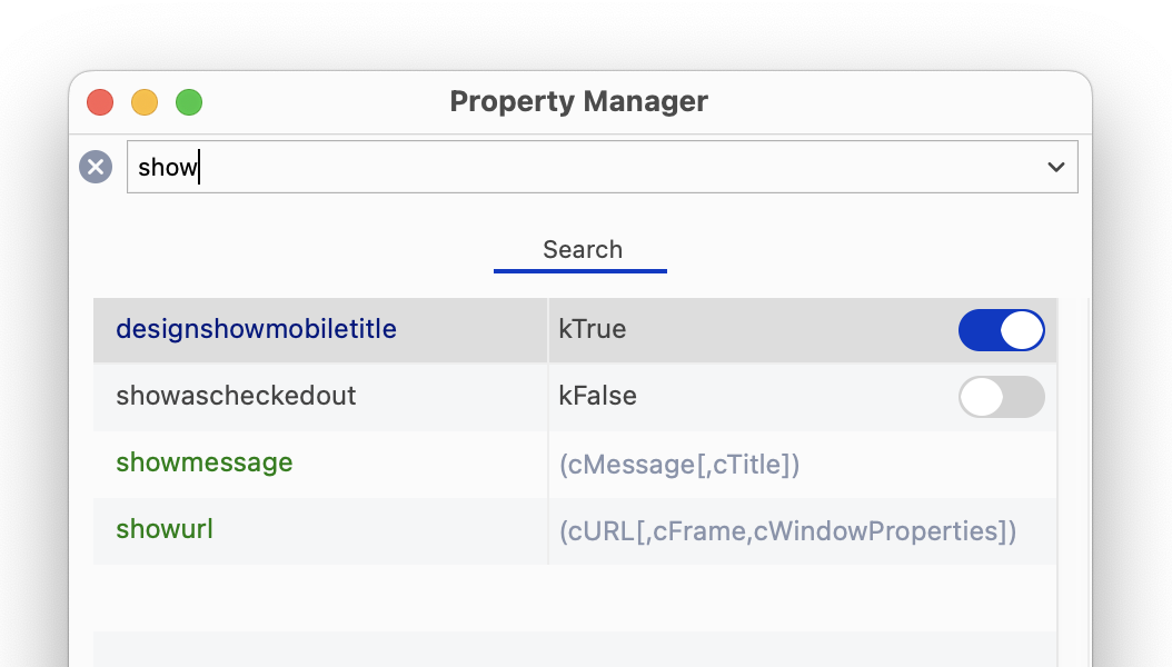
You can use the Backspace to clear a search string character by character, or you can click on the X icon to clear the whole string. The shortcut Ctrl/Cmnd+Shift+D moves the focus to the search box: you can press tab to return the focus to the property list. The 30 most recent searches are saved for re-use, which you can view by clicking on the drop arrow in the search box.
Each keystroke in the Search box performs a search, so there is a delay before a search is saved to the list: the delay defaults to 500ms, but you can change it in the config.json file in the “ide” group: “saveSearchDelay”.
If you use Find & Replace (on the Edit menu) and double-click on the find and replace log to select a property in the Property Manager, the Property Manager clears the search before selecting the property. For both the Basic mode, and the Advanced mode when search results are being displayed, copy and paste properties are disabled on the context menu.
The ‘search’ item in the keys.json file allows you to hide or show the Search box in the Property Manager, Catalog, and Interface Manager.
You can display all the properties for a class or object on a single tab by entering * in the search box (in effect, this matches and displays all properties).
After you have searched the property list, you can then Right-click on a property, select the Property Tab: <tab-name> option to jump to that property on the specified tab. When there is no active search, the menu option is disabled, but still indicates the tab for the property.
You can configure the Property Manager using its context menu, which you can open by right-clicking on its background. In addition, you can resize the window, and drag the column separator to resize the columns. When you have set up the Property Manager how you want it, you can save the layout using the Save Window Setup option in the context menu.
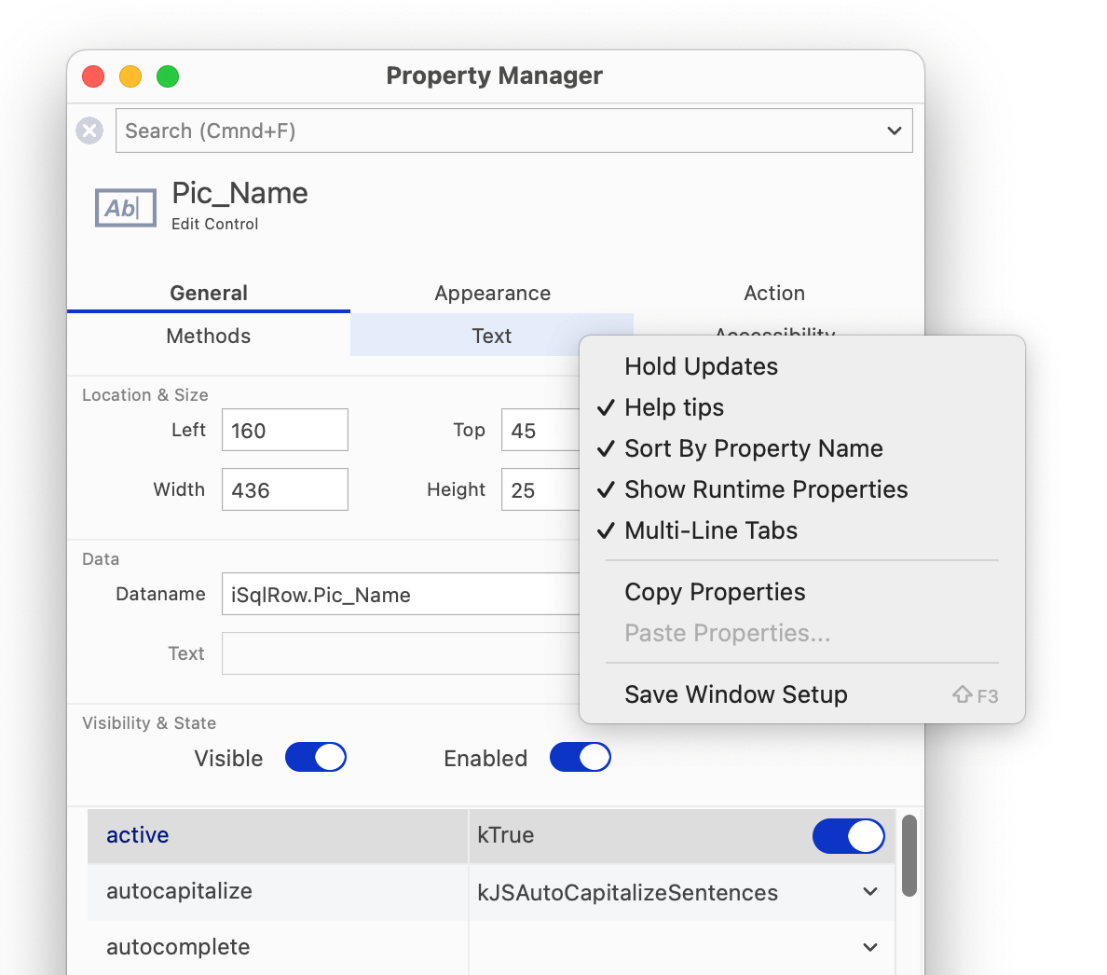
The properties of an object are shown in the Property Manager in alphabetical order by default, but you can list them functionally by unchecking the Sort by Property Name option in the Property Manager context menu.
The other options in the Property Manager context menu affect the behavior of the Property Manager. If set, the Hold Updates option stops the Property Manager updating its contents automatically when you click on another object. For example, you can click on a Remote form class to show its properties in the Property Manager, select the Hold Updates option, click on a field in the Remote form, and the Property Manager still displays the properties of the Remote form. Most of the time however you’ll want this option turned off so the Property Manager updates itself automatically.
The Help tips option in the Property Manager context menu (checked by default) displays short descriptive help messages for each property in the Property Manager: this is particularly useful for showing the parameters of a method. For example, the following screenshot shows the Help tip for the $designtaskname property for a remote form.
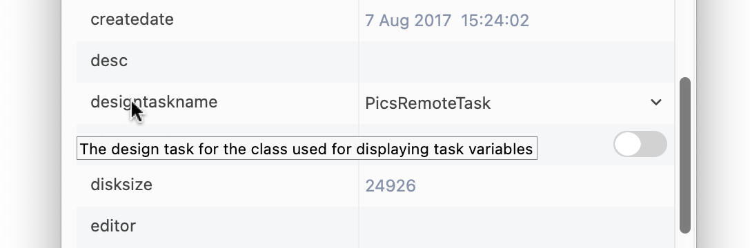
The Show Runtime Properties option lets you view properties that are normally available in runtime only, that is, properties of an instance rather than a design class. When runtime properties are visible in the Property Manager the methods for the instance are also shown. You cannot set runtime properties or run methods from the Property Manager itself, but you can drag references to them into your code in the method editor. The help tip for a method shows its parameters and description; for example, the following screenshot shows the Help tip for the $pushdata method for a remote form.
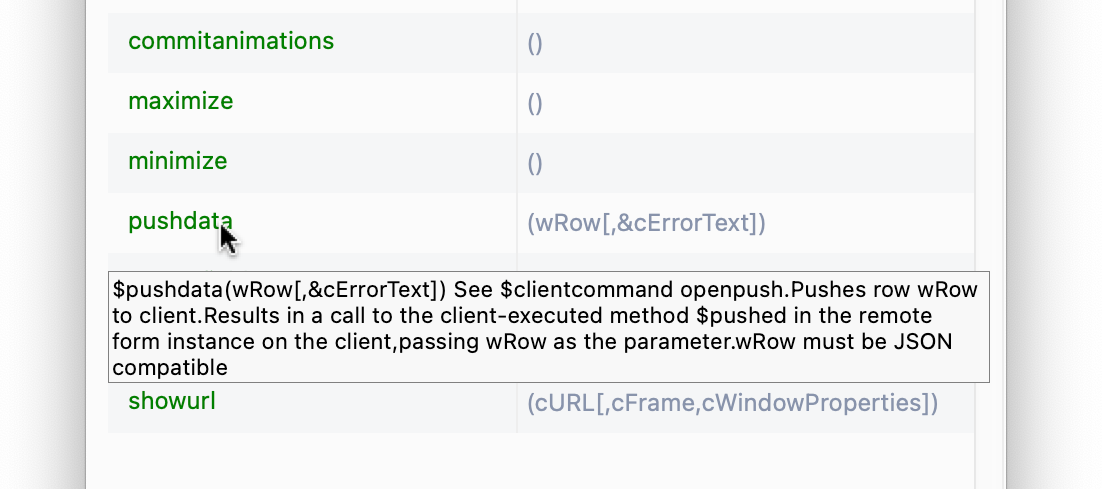
When methods are visible in the Property Manager, the help tips show a description and the parameters for each method.
Note you can drag a property or a method (and its parameters) from the Property Manager into the Method Editor when you are writing code: see ‘Dragging Methods’ below.
The Copy Properties option lets you copy all the properties of one object and paste or ‘apply’ them to another object of the same type: this is useful if you want to reproduce or duplicate a particular object, or even apply the properties of a built-in field to an external component. Only those generic properties that are contained in the source and target objects are copied.
The Copy Value option allows you to copy the value of a property, even if it is grayed out, such as when a class is not checked out of the VCS.
You can specify any built-in property to be displayed in the window or report field context menu by Right-clicking on the property in the Property Manager (when a field is selected) and selecting Show property using editor context menu. For example, the context menu for window and remote form editors shows ‘Show $order’, which allows you to display field ordering, but you can change it to most other properties. The field $ident is shown in the report editor context menu. This does not work for properties specific to external components, so for such properties the ‘Show property...’ option is grayed out.
The Save Window Setup option saves the selected property. A different property can be saved for each class editor.
The property value is displayed for background objects. If a property is not supported by an object, then nothing is displayed for that object.
Apart from displaying the properties and methods of classes and objects, the Property Manager lets you transfer a property or method and its notational path to your Omnis code in the Code Editor (Method Editor). You do this by dragging the property or method out of the Property Manager and dropping it onto your code in the method editor, for example, you could drag a method, such as the $pushdata() remote form method, and drop it onto the calculation part of the Do command.
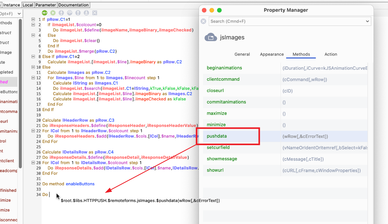
When you drag a method out of the Property Manager and drop it onto your code, its full path and parameters are copied as well. You can click in your code and edit the path and replace the parameters with your own variable names.
The location and size properties appear in the top panel of the Property Manager and include the $left, $top, $width, and $height properties. You can move an object or group of objects by changing the value of these properties, and in the case of a group of selected objects the absolute value is applied to all the objects in the group. You can enter a positive or negative number, and in the latter case, when a negative number is entered into the $left or $top properties, objects will move beyond the left or top border of the design window.
You can also change the value of the location and size properties for a group of selected objects by entering a calculation, which is applied to all the selected objects in the group. For example, you could append +20 to the current value of $left in the Property Manager, such as 100+20, to move all the objects in a group 20 pixels to the right. The following operators can be used:
| Key | Description | Example for $left |
|---|---|---|
| +n | Adds n pixels to property values | value+20 moves objects 20 pixels to the right |
| -n | Subtracts n pixels from property values | value-20 moves objects 20 pixels to the left |
| *n | Multiplies property values by n | value*2 doubles the value, moves objects to the right |
| /n | Divides property values by n | value/2 halves the value, moves objects to the left |
In a group of selected objects where the property values are different among the objects in the group, the word ‘mixed’ is displayed in the Property Manager. You can enter a calculation for such a group of objects, and in this case you can apply the calculation to the 'mixed' value. For example, you could append -20 to the ‘mixed’ value in the $top property for a group of selected objects, such as mixed-20, to move all the objects up by 20 pixels.
You can use the Shift+Up or Shift+Down Arrow keys to cycle through integer property values in the Property Manager, for example, when editing font sizes you can click into the property and use the Shift+Up/Down Arrow keys to increase or decrease the font size.
When increasing $fontsize in the Property Manager, labels and text objects in Remote forms and Window classes will increase their height, if necessary, in order to correctly display a single line of text using the increased font size.
You can double-click on a Boolean (kTrue/kFalse) property value in the Property Manager to toggle its value (as well as clicking the switch). No other properties can be changed in this way by double-clicking.
The Property Manager tries to restore (by searching for name) the last tab that you selected (this is reset when closing and re-opening the Property Manager window). In addition, you can use the tab key to give the tabbed pane the focus, and then use the Left and Right arrow keys to switch tabs. You can tab out of the tabbed pane using the tab key, and in the Property Manager you can also do this using the Up or Down arrow key.
The Method Editor is the main tool you use for programming or coding methods for the objects and classes in your application. It has a bulti-in free-type Code Editor, a powerful and comprehensive debugger that you can use to debug local and server code, as well as a useful method checker. See Method Editor in the Debugging Methods section.
The Interface Manager displays the public methods and properties for objects in Omnis Studio, that is, any class that can contain methods and can be instantiated, including remote form, remote task, report, table, and object classes (not available for code classes since they cannot be instantiated). For each class or object, the Interface Manager displays all built-in methods, including those that are available in the instance of the class, as well as any custom methods you have added to the object. For each method in the class or object, the Interface Manager displays the method name, its parameters, return types, and a description, if any are present.
Private methods, namely methods with a name that does not begin with a dollar sign, are not included in the Interface Manager since these methods are confined to the class or instance.
You can view the Interface Manager for a class via its context menu or the method editor.
To view the Interface Manager
or from the method editor
Open the method editor for the class
Select View>>Interface Manager from the method editor menubar
The Interface Manager contains a list of objects in the class, that is, for windows and reports a list of window or report fields, for toolbars a list of toolbar controls, and for menus a list of menu lines. For other types of class or instance that do not contain objects, such as object classes, the Interface Manager contains the class methods only. You can click on each object or field in the left-hand list to view its methods. Built-in methods are shown in the color specified in the $nosetpropertycolor preference. Inherited methods are shown in the color specified in the $inheritedcolor preference. The properties tab similarly shows the object’s properties.
The Details pane shows the parameters for the currently selected method. It also lets you add a description for your own custom methods. The status bar shows the return type for built-in methods, but not for your own methods since these can return any type.
The View menu on the Interface Manager menubar lets you open the method editor for the class, in addition to hiding or showing the built-in methods and details pane.
You can drag a method or property from the method list and drop it on to an edit field in the method editor, or you can use copy and paste to do the same thing. The method name is prefixed by a variable name, such as “var_name.$methodname()” if you opened the Interface Manager by right-clicking on a variable of type Object. Otherwise the method name is prefixed by a dot, such as “.$methodname()”, suitable to concatenate onto a variable name or some notation in the method editor. In all cases the parameters for the method are copied too, so they can be used as a template for the actual values you pass to the method.
The search box on the Interface Manager allows you to search for methods and properties in the class. The search results are all matching methods and properties (still associated with their class or field), together with any names in the field name list which match the search string.
The search function allows you to cycle through the results using some new keys (in the IDE section of keys.json), searchNext and searchPrev which are mapped to Ctrl+G and Ctrl+Shift+G, respectively. Using search next/previous in the Catalog cycles through all tabs and fields identified by the search that contain at least one matching item. So, for example, if field test has matches in both methods and properties, Ctrl+G will go to the methods first, and the next Ctrl+G will go to the properties. If a control has no methods, but it does have properties, Ctrl+G will go directly to the properties tab, and vice versa.
The ‘search’ item in the keys.json file allows you to hide or show the Search box in the Interface Manager, Catalog, and Property Manager.
Omnis structures its objects in an object tree, or hierarchical arrangement of objects and groups that contain other objects. The complete tree contains all the objects in Omnis itself, together with your design libraries, classes, and other objects created at runtime, such as remote form instances. You can view the complete object tree in the Notation Inspector, which you can open from the View menu, or by clicking on the icon in the main Omnis toolbar, or by pressing F3/Cmnd-3.
To facilitate a system of naming or referring to an object in the object tree, and its properties and methods, Omnis uses a system called the notation. The notation for an object is really the path to the object within the object tree. The full notation for an object is shown in the status bar of the Notation Inspector. You can use the notation to execute a method or to change the properties of an object in your Omnis code, and you can use a notation string anywhere you need to reference a variable or field name.
The Notation Inspector therefore lets you view the Omnis object tree from the $root object down. It is particularly useful for viewing the contents of your library and finding the right notation for a particular object or group of objects in your library. For example, you can get the notation for an object on a design form or remote form instance using the Notation Search tool on the Notation Inspector toolbar. When you click on an object or group in the Notation Inspector the Property Manager will display its properties and methods: note the Advanced option must be enabled to view all the properties for the current object.
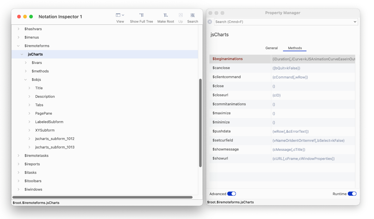
The Notation Inspector lets you drill down the hierarchy of objects within the Omnis tree: for example, you can view the object tree for an open remote form in the $iremoteforms group, shown above: when you click on an open remote form name, jsCharts in this case, the Property Manager displays the runtime properties and methods of the form.
When the Notation Inspector opens it shows the $root object which contains all the objects in the Omnis object tree including all your open libraries and their contents. It also includes all the objects and groups created at runtime when you run your application. You can expand each branch of the tree to show the contents of an object or group.
All the different types of class in your library are shown in Notation Inspector within their respective object group. For example, all the remote form classes in your library are contained in the $remoteforms group, while the $classes group contains all the classes in your library. Also note that a group may be empty if your library does not contain any classes of that type.
Having found the object you’re interested in, you can copy its full notation to the clipboard and paste anywhere in your library, or you can drag an item from the Notation Inspector and drop it onto your code in the method editor. For example, you can drag the item into the calculation part of the Do command in the Code Editor.
You can find the notation for a window or toolbar object in an instance of one of these classes. To do this, click on the Notation Search button (spyglass icon) on the Notation Inspector toolbar then click on the object in your open window or toolbar (this works for desktop apps only, not web-based remote forms). The Notation Inspector will refresh itself showing the notation for the object you clicked on. The object becomes the root of the tree, so you can expand the tree to view its contents.
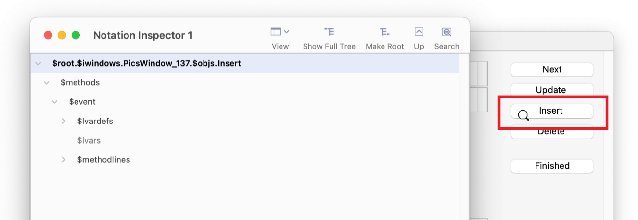
You can click the Search button, then click on a button or other object on an open window and view its notation in the Notation Inspector: the tree is redrawn and you can drill down to the view the contents of the object.
The Catalog lists all the Functions, Constants, Event codes, and Hash variables in Omnis, in addition to listing all the Variables, Schema class columns, Query class columns, User constants, and String tables in your library. The Catalog lists all the variables for the current object including Task, Class, Instance, Local, and Parameter variables, as well as Event parameters. For example, if you are working in a Remote Form class, the Catalog will show the class and instance variables for that class; for example, the screenshot below shows the Instance variables for a Remote form instance. In addition, when you select a particular method in the Method Editor, the Catalog will list the Local and Parameter variables for that method.
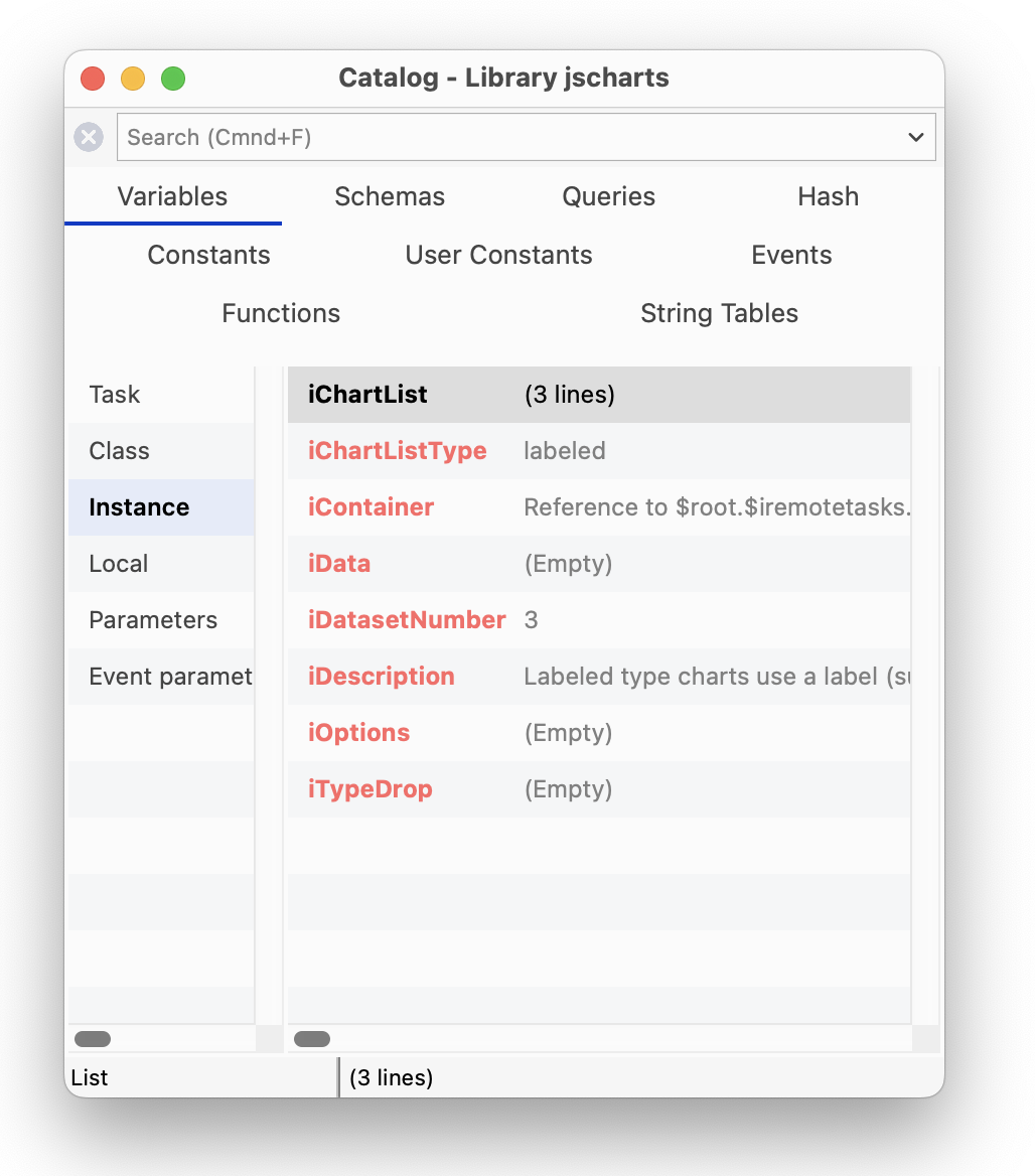
The values column is available for the Variables, Constants, Events, and Hash variable group tabs. For example, you can view the values for all instance variables under the Variables tab (assuming there is an instance open), as above. The values column is displayed as a third column on the right-hand side of the Catalog window, under each tab, and will show the current value of the variables or other items.
The Search box at the top of the Catalog window allows you to search for an item on the current tab. You can type a word or part of a word into the search box and the Catalog list will update itself as you type. For example, you can search for a function or any functions containing the word ‘text’ under the Functions tab; in this case, there are several functions under different sub-groups on the main Functions tab, as follows:
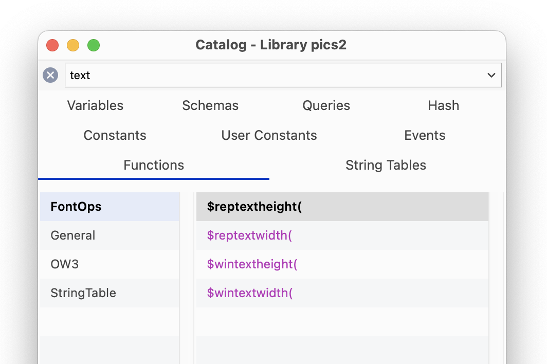
The search results are all matching items (still in their groups), together with groups that have no match where the group name matches.
You can cycle through the results using Ctrl+G and Ctrl+Shift+G for Next and Previous, respectively (these are stored as searchNext and searchPrev in the “ide” section of keys.json). Using search next/previous in the Catalog cycles through all tabs and fields identified by the search that contain at least one matching item.
The “search” item in the keys.json file allows you to hide or show the Search box in the Catalog, Property Manager, and Interface Manager.
The context menu on the Catalog lets you change its appearance and style of tabs. The Show status bar option hides or shows the Catalog status bar. The Show Values option in the context menu hides or shows the values column (default is on). The Help Tips option enables or disables popup Help tips for Functions, Events and Constants.
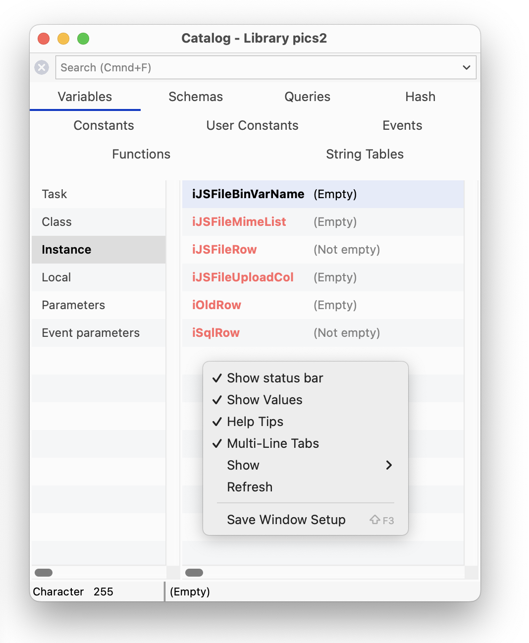 The Multi-Line Tabs option allows the tabs in the Catalog to wrap onto several lines; with this option unchecked, tabs are shown in a horizontal scrolling list. The Show option allows you to show or hide individual tabs in the Catalog. All these options are saved in the Save Window Setup option.
Items in the right-hand list of the Catalog are shown using the relevant syntax color, for variable types, constants, etc. The catalogUsesSyntaxColors item in the “ide” section of config.json can be used to control this behavior; the default is true.
You can Right-click on any Variable (or field name) to view its type, current value and other information (to view an instance variable, the instance has to be open); the first Variable option open a separate window showing the value for the variable, e.g. a list variable displays a grid of list values. The following screenshot shows the context menu for an instance variable in a remote form instance.
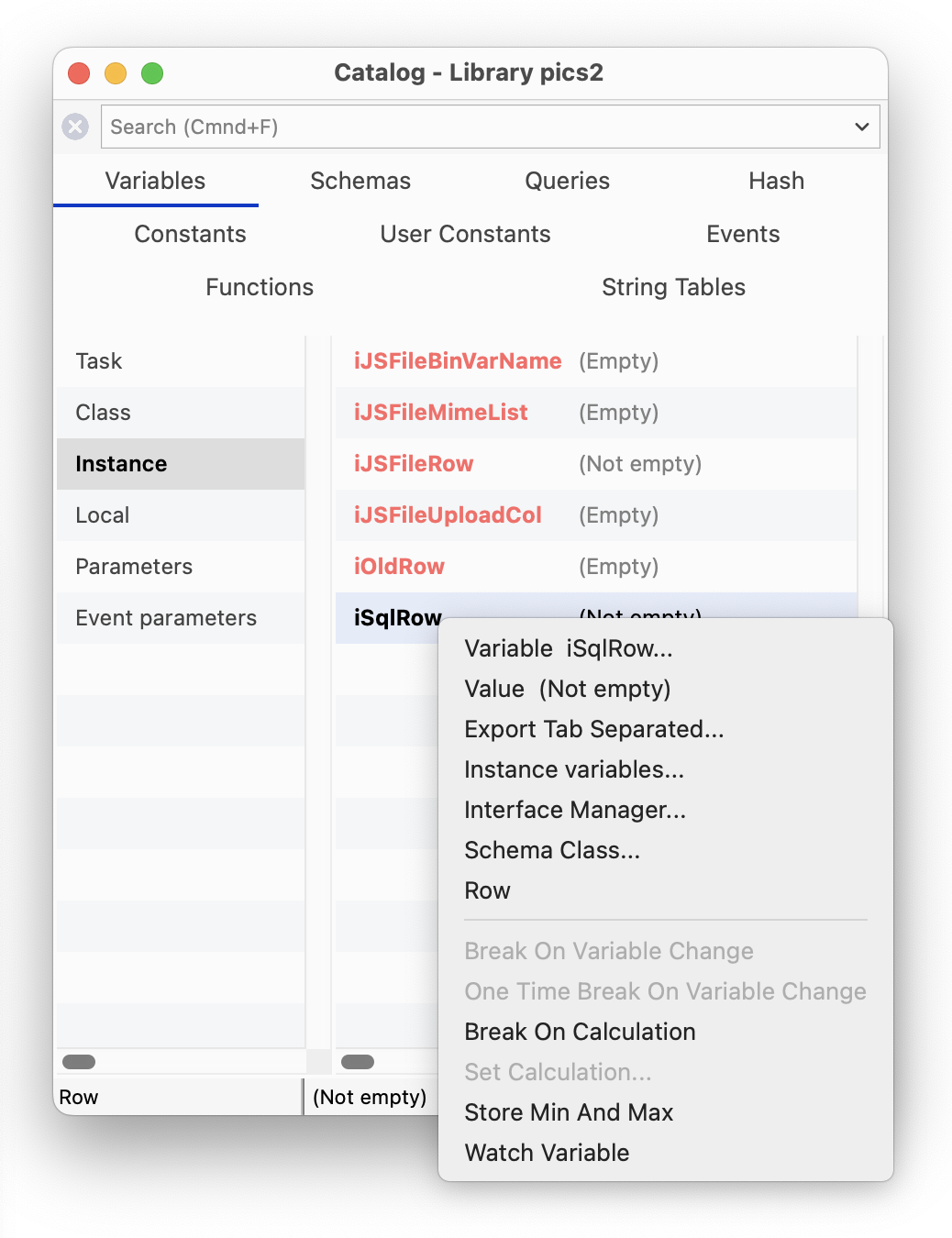
When you have found an item in the Catalog, such as a Variable name, or a Schema coumn name, you can enter its name into your code in the Code Editor by double-clicking on it (assuming the cursor is in the appropriate place) or by dragging it out of the Catalog and dropping the item in the appropriate place into your code.
When using the Code Editor, you can drag items from the Catalog to the Initial value and the Description fields in the Variable pane: for this to work, the focus must be on the initial value or description field before switching to the Catalog to select the item.
The SQL Browser lets you access and interact with many leading server databases or DBMSs, however specific database support will depend on the edition of Omnis Studio you are running: all versions give you access to PostgreSQL and SQLite, including the Community Edition, while other editions, including the Professional Edition, provide access to Oracle, MySQL, Sybase, and many other databases and data sources via ODBC.
Omnis Studio provides a separate Data Access Module (or DAM), or Object DAM, to connect directly to each server database, plus there is an ODBC DAM that allows you to access ODBC-compliant databases or data sources, such as MS SQL Server and SAP HANA.
Under the Session Manager option in the SQL Browser there will be a session template for each database supported in your version of Omnis Studio, and/or if you have the correct clientware installed on your computer; all versions should contain a template for PostgreSQL and SQLite.
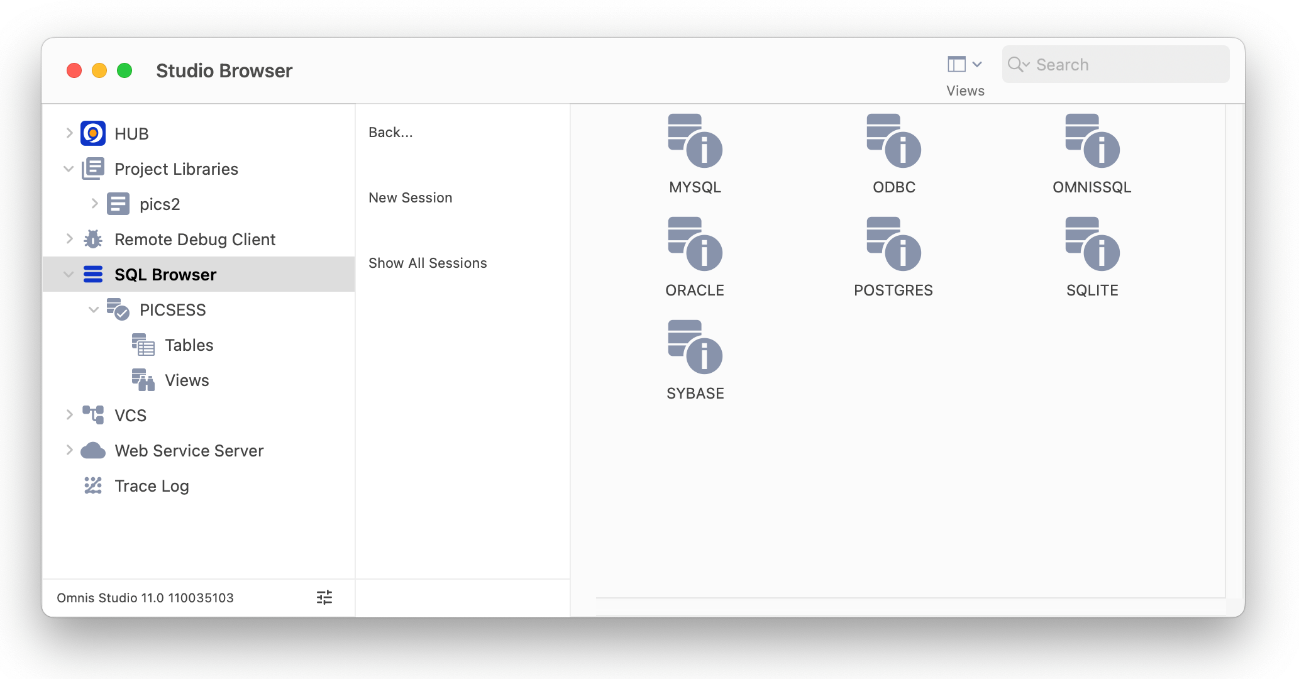
Your version of Omnis may also contain an Omnis SQL DAM that lets you access an Omnis data file using SQL methods rather than the Omnis Data Manipulation Language (DML), but this is only provided for backwards compatibility and for running legacy applications and should not be used for new applications.
In the SQL Browser, under the Session Manager option, you can create a new session, or duplicate an existing one and modify it adding your own connection parameters. For most purposes, the quickest and easiest way to create a new session is to duplicate an existing template and modify it.
To create a new session to your database
Click on the SQL Browser option in the Studio Browser, then click on the Session Manager option
Select the type of database you want to connect to and click the Duplicate Session option
Rename the session using a suitable name for your database or project
Double-click the session template and modify the parameters in the Modify Session dialog
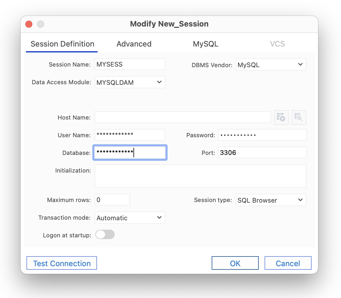
When you create or modify a database session you need to select the DBMS vendor, the Data Access Module (DAM) and version, as well as specifying the Username and Password for the session. The connection parameters required will vary depending on your database.
Having defined or modified your session template, you can open or log onto your database session in the SQL Browser.
To open a database session
Click on the SQL Browser option in the Studio Browser
Click on the Open Session option and then the session name, e.g. PICSESS
Double-click on the Tables object to view the tables on your database
Right-click on a table name (e.g. MyPictures) and select the Show Data option
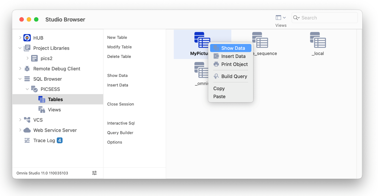
The Show Data option opens the Interactive SQL (iSQL) tool which submits a basic SELECT on your table to display the data.
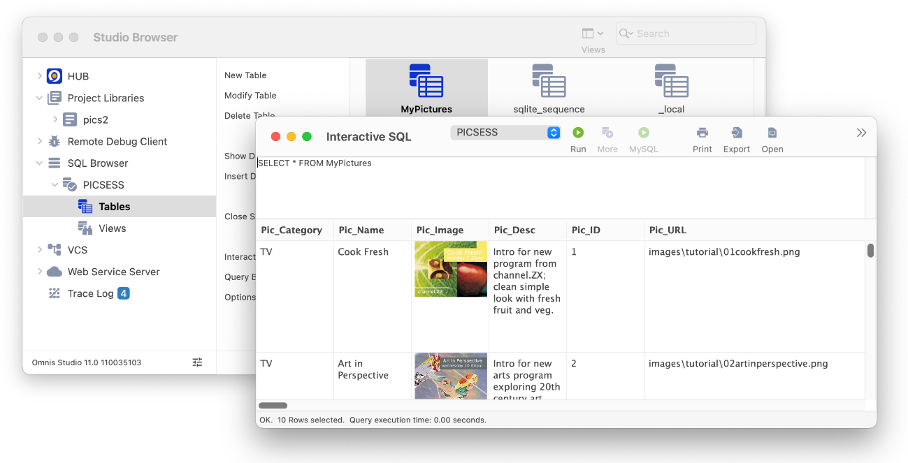
If you use the Show Data option on the SQLite database used in the tutorial, you can view the text and images in the database.
You can change the max line height in the result window using the context menu on the results grid; the setting is saved in the Save Window Setup.
Once you have created your database session you can view your data using the Interactive SQL tool, as above, or create windows and forms based on the session using the SQL Form Wizard. Note the Tutorial shows how you can build a SQL form to access data via a web browser on a desktop PC or mobile device.
You can resize the font in the iSQL (results pane) using the Ctrl+/Ctrl- shortcut keys.
To learn more about connecting to and interacting with a SQL database, see the SQL Programming chapter.
The Import File option in the SQL Browser allows you to import a file in comma- or tab-separated format (CSV or TSV) into an open session. Alternatively, you can drag a file from your desktop and drop it into the SQL Browser to start the import process; you can drop it into the SQL Browser node or a specific session.
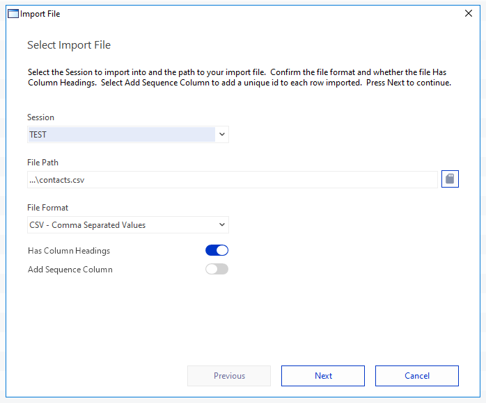
When you import a file, you are prompted to select the session and a file to import, if they are not already selected. In addition, you can select the file format, either Comma Separated Values (CSV) or Tab Separated Values (TSV), or the format is selected for you automatically based on the file extension. Next you can indicate if your file has column headings; if so, these are used as the column headings in the table created via the import. Finally, you can choose to create a sequence column which will add a unique ID to each row of the imported data; keep this unchecked if your import file already has an ID column or record number. When you are ready, click on Next to proceed.
When you import a file, a table is created for you automatically using the column headings in your imported file to create the column names in the new table. In the next screen you can modify the table name, column names, and data type for each column, or accept the default settings. Click on Import to complete the import process.
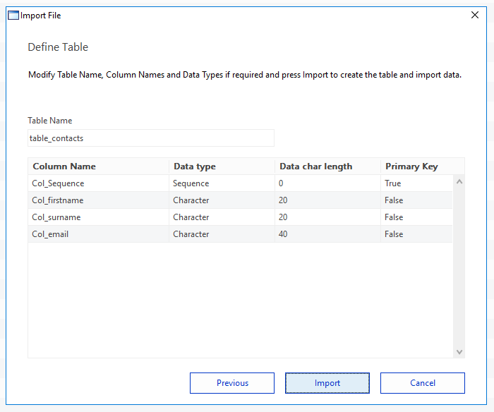
You can use the Show Data option to examine your new table and the data. Having imported the data, you could now use one of the form wizards to create a web form (remote form) to browse your data in a web browser.
The Options option allows you to set various options in the SQL Browser.
Query History
allows you to set the maximum number of queries that are stored (set to 50) and wether or not to store DBA queries.
Stored Queries
allows you to set the location of the stored queries which defaults to queries.df1 in the 'studio' folder, with the option to make this database private.
The SQL Query Builder lets you build, run and store SQL Queries quickly and easily using a graphical interface. The Query Builder is built into the Omnis Studio IDE and is easily accessed via the SQL Browser. The Query Builder supports the generation of both simple queries requiring little SQL knowledge and more advanced queries using different join types and clauses. You can save queries for later use and you can create Omnis query classes based on your queries to allow you to take advantage of the queries you build in the Query Builder in your applications.
Note that like the SQL Browser, the databases supported in the SQL Query Builder may depend on the version of Omnis Studio you are running.
You can open the SQL Query Builder by clicking on the ‘Query Builder’ option when the SQL Browser option is selected in the main Studio Browser window. The Query Builder window has three main panes: the table pane on the left showing all available tables, the main design area at the top-right showing the query in graphical format, and the lower tab pane for defining aliases, SQL clauses and expressions.
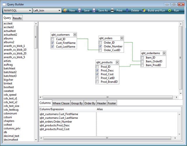
All panes in the Omnis Query Builder are resizable and can be saved via ‘Save Window Setup’ of the main context menu. The list of available tables may also be refreshed at any time via the table list context menu.
The SQL Query Builder allows you to construct most types of query simply using drag and drop and the context menus available as appropriate in each pane of the main Query Builder window. In order to construct a query, you must be logged on to a SQL session via the SQL Browser.
The first time you open the Query Builder the query list will be empty allowing you to create a new query. If an existing query is currently displayed pressing either the ‘New’ toolbar button or selecting ‘<new query>’ from the query dropdown list will clear the query from the screen.
All open sessions are shown in the droplist at the top-left of the Query Builder window. You can select a session to build your query by dropping down the session list and selecting a session.
Once a SQL session has been selected a list of tables for the current session is shown in the left hand pane. To include a table in a SQL Query simply drag the table into the main design area on the right.
You can remove a table from a query either by clicking on the ‘X’ icon for the table or by opening the context menu for the table and selecting ‘Remove Table’. You have to confirm if you want to remove a table from the current query.
If a table has been modified outside the Query Builder, you can refresh the table in the Query Builder by right-clicking on the table and selecting ‘Refresh Table’ from the context menu. This option will add any new columns or remove any deleted columns to reflect the current state of the server table.
Once a table has been added, you can select columns by selecting their names individually or by right-clicking on the table you can check or uncheck all the columns in the table. Alternatively, you can specify that the Query Builder checks all columns automatically when a table is added using the ‘Select all Columns on drop’ option within the ‘Options’ dialog (see the Options section).
You can add an alias for each selected column in the ‘Columns’ tab of the lower tab pane by clicking in the ‘Alias’ column of the current line.
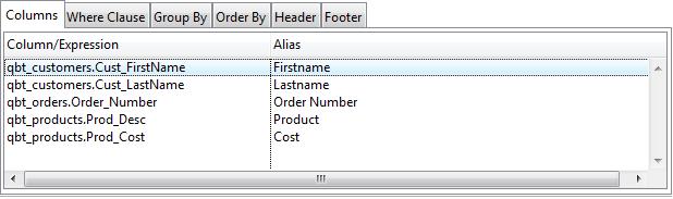
You can reorder columns in this pane by dragging and dropping column names in the list.
To construct your queries, you can create joins between tables either using drag and drop in the main Query Builder design area or using the Table Joins dialog. To create a join, drag a column name from one table and drop it onto the column name within the table you wish to join with. Alternatively, you can right-click on a table to open the ‘Table Joins’ dialog from the context menu.
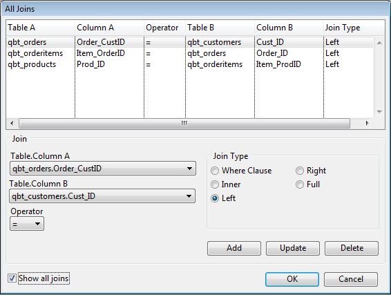
The ‘Table Joins’ dialog lets you modify joins, set the operator and type, re-order using drag and drop and switch columns using the context menu.
Joins may also be deleted via the context menu of the joined column in the main design area and Line and style preferences can be set via the ‘Options’ dialog.
You can set the default Join type for queries using 'Join Type' option in the Joins window, which can be opened by right-clicking on a Join and selecting ‘Joins’.
In addition to specifying aliases, the ‘Columns’ tab of the lower tab pane lets you add expressions to a query via the context menu. Selecting ‘Add Expression’ from the context menu opens a dialog where you can add common SQL expressions such as AVG, COUNT, MAX, MIN and SUM.
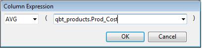
You can add a Where clause condition by dropping a column from a table onto the ‘Where Clause’ pane of the lower tab pane. When you drop a column the ‘Where Clause’ dialog is opened automatically and the column is pre-selected. You can also right-click on the Where Clause pane to Edit the column conditions for the current query.
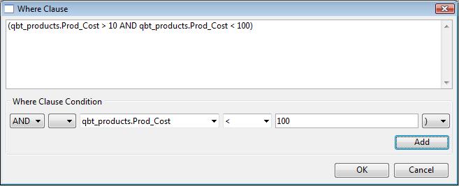
You can add a Group By clause, to group selected rows together to return a summary of information, by dropping a column name onto the ‘Group By’ pane of the lower tab pane. You can also add a Having Clause to restrict the rows used by the Group By clause either by dropping a column from a table or via the context menu.
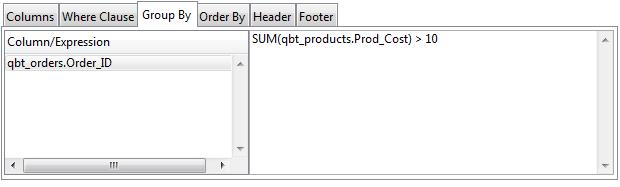
You can add an Order By clause by dropping columns onto the ‘Order By’ tab of the lower tab pane: when you drop a column Descending order is selected by default but you can change it to Ascending. You can add Expressions to the Order By clause using the context menu by right-clicking on the Order By pane.
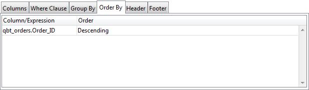
The ‘Header Tab’ in the lower tab pane lets you enter an alternative construct, such as ‘SELECT DISTINCT’ and where supported ‘SELECT TOP 100’. This tab also lets you add comments to precede the generated SQL Statement.
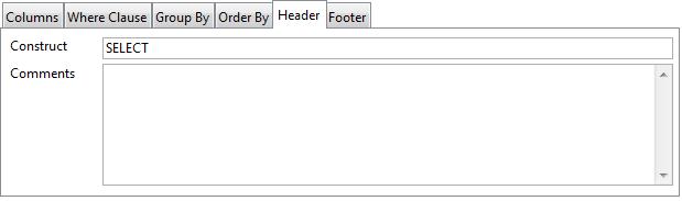
The ‘Footer Tab’ in the lower tab pane lets you add any additional query text to be appended to the generated SQL Statement.
You can run the current query from the main toolbar in the Query Builder window using the ‘Build and Run’ or ‘Run’ option. Both buttons switch the main pane to the ‘Results’ pane showing the SQL script and results generated by the Query. You can make changes to the SQL script generated if required and the query can be executed again using the ‘Run’ button. Note that using the ‘Build and Run’ option will rebuild the statement from the saved query text and therefore overwrite any changes you may have made.
Any errors which occur are reported in the status bar. If the full error text is not displayed, you can click on the status bar to open a dialog showing the full error text.
You can resize the font in the Query Builder results pane using the Ctrl+/Ctrl- shortcut keys.
You can change the max line height in the result window using the context menu on the results grid; the setting is saved in the Save Window Setup.
When you Run a query, the time taken to run the query is shown in the status bar of the Results window.
You can save a query using the ‘Save’ or ‘Save As’ toolbar option. When using ‘Save’ option for the first time, or the ‘Save As’ option, you can add a description for the query. The description is also available to view/edit via the ‘Query Info’ option of the main context menu. Once saved, a Query is added to the list of Queries available in the dropdown list in the main Query Builder toolbar.
The Delete button in the Query Builder toolbar button lets you delete the currently selected query (you must confirm the deletion).
There are two types of report available via the Print button on the main toolbar or the context menu opened by right-clicking on the Query design pane: both these options open the Print Query dialog that allows you to print either the Structure or the Results of the current query. In addition, you can include the generated SQL Script from the last executed SQL query in both reports.
The ’Query Structure’ report shows the tables and their joins where the selected columns are represented by an astrix ‘*’.
The ‘Query Results’ report shows the results of the last executed SQL query. Column widths reflect those of the results pane and may therefore be adjusted prior to printing.
The ‘Query Info’ dialog available from the main query context menu displays information about the current query. You can change the name and description of query.
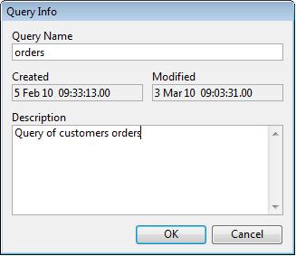
The Query Builder Manager lists the queries you have saved in the Query Builder and is accessed via a button next to the list of queries in the Query Builder toolbar. You can search for queries using the Find button, and you can amend a query’s description.
You can set various options for the SQL Query Builder in the ‘Options’ dialog which is available from the context menu on the main query window. You can specify the line and color styles for joins, and you can set preferences for dragging and dropping during table creation.
For databases where table names are prefixed by a username, the Omit Username option is particularly useful when running the same query against different databases where the username is different, but the table and column names are the same.
You can create an Omnis Query class based on the current query. To do this, you can drag the current query from the main query design window on the right and drop it on to an open library in the main Studio Browser. When you create a query class in this way, all the additional query text is added to the class, together with any associated Omnis Schema classes in order to map to the server tables in the query. Note that this feature is restricted by the same limitations as a query class and therefore only supports ‘Where Clause’ joins.
You can create a table class from the current query using the 'Create table class' option which is available on the 'Other' toolbar menu option: the option also gives you the option to create a window class and/or a remote form for viewing the data via the new table class.
You can create a DB View from the 'Other' menu.
You can export the results data using the 'Export Data' option available on the 'Other' toolbar menu option.
You can copy the generated SQL Script to the clipboard in a ‘Begin Statement’, ’Sta:’, ‘End Statement’ block by right-clicking on the ‘Results’ pane and selecting ‘Create Statement’ from the context menu. This option is also available on the Other menu option.
You can paste the statement into an Omnis method, providing an alternative method of executing your query in an Omnis Studio library where a query class is not appropriate.
A runtime or end user version of the SQL Query Builder application is available on request. Please contact your local Omnis sales or support office for details.
Note that some editions of Omnis Studio do not allow access to the Omnis VCS.
The Omnis Version Control System (VCS) lets you manage and revise Omnis libraries and other application components systematically. In a team environment, with several people working on the same application at the same time, you need to ensure that only one person can change a particular component at a time.
Using the Omnis VCS you can control the development of your Omnis applications, or any other project involving many different files such as Internet or Intranet applications. Specifically, the VCS can manage Omnis libraries or their classes, external components, DLLs or Code Fragments, Omnis data files, text or word processor files, Html and web server files, or any other types of file required in your Omnis application.
The Omnis VCS has an easy-to-use environment that allows you to check-in and check-out components, plus it had a useful tool that lets you compare different versions of the same library or different revisions of the same component.
The Omnis VCS is described in detail in a later section.
You can perform updates or any other changes to your Omnis desktop application or folder structure upon restarting Omnis by adding a script to the Omnis data folder. You can use the Auto Update feature to update any file in the Omnis Studio tree, including the Omnis executable or program file itself: however, the studiorg.exe file cannot be updated under Windows.
To enable the Auto Update feature, write a batch file under Windows called update.bat, or on macOS or Linux create a bash script called update.sh, and add it to the Omnis data folder, i.e. the folder containing the Studio, Startup, and Welcome folders.
When Omnis starts up it will execute the update script automatically at startup, before loading any external components, externals or libraries. If the call to run the script is successful, Omnis then deletes the update.bat/sh file.
When running on Windows, Omnis incorporates a request to run this as part of the existing UAC support implemented via studiorg.exe. In this case, you will get a UAC prompt if the update script needs to run, or if the registry needs updating for some reason, or if both updates and registry updates are required.
The Windows batch file or Unix script must have Execute permissions set in order to run. You can do this in the Properties of the file or via the file system. To do this in your code on macOS or Linux you can use the $setunixpermissions() fileops function:
If sys(6)= 'U' ## macOS or Linux
     Do fileops.$setunixpermissions( scriptPathName,'-rwxr--r--' ) ## set file to execute
End ifWhen running the auto update script some feedback that the script is running can be provided in a console window. To enable this, you must place a file (which can be empty) named ‘showconsole.txt’ in the same directory as update.bat. When this file is present, a console window is displayed while update.bat is running.
The following example shows typical commands that could be used in a batch script: the commands download two new xcomps from a server (xcomp1.dll and xcomp2.dll), and store them in a folder specified by con(sys(115),pathsep(),updates,pathsep(),xcomp):
copy /y <studio data folder path>\updates\xcomp\xcomp1.dll

<studio program folder path>\xcomp\xcomp1.dll

del <studio data folder path>\updates\xcomp\xcomp1.dll

copy /y <studio data folder path>\updates\xcomp\xcomp2.dll

<studio program folder path>\xcomp\xcomp2.dll

del <studio data folder path>\updates\xcomp\xcomp2.dll
When a path has a space or spaces in it, e.g. Program files, the path should be enclosed in quotes:
“C:\Program Files\Omnis Software\OS11\xcomp\Dummy.dll”$editor and $editordata are properties of all class types except system tables – in previous versions these properties were only available for object classes. The properties allow you to specify your own editor and to access the data for an Omnis class. The definitions of these properties are:
$editor
The name of the add-in tool library used to edit the class
$editordata
Editor data stored with the class. Typically used by the library identified by $editor
By default, these properties are not visible in the Property Manager, therefore to make them visible, edit the show_editor item under “properties” in the config.json file:
  "properties": {

    "show_editor": true

  },
In addition, you should note that $editordata will only appear in the Property Manager when used in conjunction with the Notation Inspector.
$editor overrides the default editor for a class. Omnis calls $exectool for the specified add-in library, passing it a single parameter which is an item reference to the class.
Note that the specified editor is not used when using find and replace – instead, the normal editor for the class opens.
There is a Tech Note TNID0007 on the Omnis website that shows how you can create an alternative schema editor.
In design mode, Omnis provides many different types of help: tooltips and helptips over toolbar controls: help text for the main menus shown in the status bar at the bottom of the Omnis application window: plus when you’re writing a method the Code Assistant will popup automatically to display the appropriate variable name, notation (property or method name), and the correct parameters for the current object or context in your code.
In addition to these types of help, there is a fully context-sensitive Help system, available by pressing F1 or via the Help menu. Omnis also provides ‘What’s This?’ help for individual functions and commands while you’re working in the Method Editor: ‘What’s This’ type help is not provided for the main tools in the Omnis IDE.
Under the Contents tab you can drill down to the topic or object type you’re looking for: you can double-click on an item in the tree to load the page.
Under the Search tab you can type a command, function, or method name and Omnis will provide a list of matching topics: you can double-click an item in the Topic list to load the page under the Topic tab (as shown below).
You can create your own Help system and add it to your own application using the Help Project Manager under the Tools menu. Note that the Omnis Help available in the development version of Omnis is located in the omnis\idehelp folder.
You can embed a Custom URL (link) in a PDF report that could, for example, launch Omnis, and call a method inside a specified library, which could perform an action. This is enabled via support for custom URL schemes. Omnis can support one or more custom URL schemes.
On macOS, the URL schemes must be defined in info.plist. The role for the URLs added to info.plist must be ‘Editor’, otherwise Omnis will not be invoked by the URL. If you add any URL schemes to info.plist you must re-codesign Omnis.
On Windows, the “customURLSchemes” item in the “windows” section of the Omnis configuration file (config.json) is a JSON array of strings. A scheme name can contain alphanumeric characters only and must start with an alpha character. By default, the customURLSchemes item contains the entry “studio%v”. When reading the schemes from config.json, Omnis replaces %v in each string with the appropriate value for NNN, where NNN represents the major version of Omnis. For example, the default scheme name will be studio111 in Studio 11.1, or studio120 in Studio 12.0 and so on.
The “customURLUUID” item in the “windows” section of config.json is a UUID that identifies the Omnis server to clients using custom URLs. This value is reserved for internal use and should not be changed.
The custom URL is made up of the scheme name plus any parameters you wish to pass into Omnis. The syntax for a custom URL is:
scheme://params/
In some cases, the optional trailing / is needed to make the client consider the URL syntax to be acceptable.
The params can be either query string parameters or JSON. Here is an example of custom URL protocol using query string parameters:
studio111://lib=test&test=10&value=another
Here is an example of a custom URL procotol using JSON parameters, before escaping them:
studio111://{"lib":"test","test":10,"value":"another"}
And after escaping them, for safety:
studio111://%7B%22lib%22%3A%22test%22%2C%22test%22%3A10%2C%22value%22%3A%22another%22%7D
When the custom URL arrives at Omnis, various characters must be escaped, e.g. { becomes %7B, } becomes %7D, : becomes %3A. Some clients, such as Chrome on Windows, automatically escape these characters, whereas on macOS, Safari does not, and you need to do this manually. It is therefore safer to escape all characters. You can use the OW3.$escapeuritext(cTextToEscape) function to escape URI/URL characters in order to render them safe.
You can create a custom link in a report by adding the URL to the $linkaddress property of a report Entry field. For example, you could add studio111://lib=testlib/ to create a link to launch Omnis and open a library called ‘testlib’. You can also use an Html Text (Link) report object, adding your custom link the $address property. When you print the report to an Omnis Preview window or a PDF, the custom link will be embedded into your report.
To open a custom link in a PDF, the end user must right-click the link and open the target in a new tab. Some PDF viewers/browsers may not allow such custom links to run for security reasons, so your custom links should be thoroughly tested for different PDF clients.
When you use a custom URL to run Omnis, Omnis will start up if necessary, and then it runs the $urlinvoked method in the Startup_Task of the specified library (identified by the lib column of the parameters). There must always be a column named lib to identify the startup task; if the lib column is missing, or the library is not open, Omnis writes a message to the trace log.
The $urlinvoked method is listed in the Method Editor under the Class methods for the Startup_Task, which you can override and then add your own code. The method has two parameters:
On Windows, there is an executable called omnisopenurl.exe, in the same directory as omnis.exe, which is used to open URLs, that opens Omnis if necessary, and then sends the request to Omnis. When Omnis starts up on Windows, it checks the registry to see if any of the custom URL schemes in config.json need to be registered – it will only register a scheme if it is not already present in the registry, or if the registry entry of an existing scheme looks like it was created by Omnis. When registering a scheme, the name of the executable used to open a URL, is the currently running core executable name, with openurl appended (the registry key is added to: HKEY_CLASSES_ROOT\studio<version>\shell\open\command).
Omnis can send notifications to the operating system on the end user’s computer, on both Windows 10/11 and macOS. You have control over the content of notifications and when they are sent via your Omnis code using a new ONOTIFY object. When sent, a notification will pop up on the end user’s screen and will be added to the Notification Center for the current operating system.
The end user can click on a notification and either start Omnis, or if Omnis is already running, bring Omnis to the front. In both of these cases, the method $localnotify() in the Startup_Task (in the library that sent the notification) receives parameters specific to the notification and the method can then process the click, or call another method, for example.
As well as sending notifications, there are additional functions that allow you to add a badge to the application icon to alert the end user about the notifications.
There are two interfaces provided to send a system notification:
An object, providing a way to encapsulate notification parameters.
A function, providing a simple interface to send a notification with a single line of Omnis code.
As with many features in Omnis, these interfaces provide a single, cross-platform method to interact with system notifications on both Windows and macOS.
The Notification Object provides a way to encapsulate notification parameters. To use the object, you need to set the Subtype of an Object variable to the LocalNotify external object. The object has the following properties:
| Property | Description |
|---|---|
| $action | A value that specifies up to 2 optional actions that are to be included in the notification; on Windows, this is via one or two buttons; on macOS, this is either via a button for a single action, or via an options popup for two actions. A ‘Specifying Actions’ section |
| $delay | The delay in seconds between the call to $sendlocal() and the notification being delivered. Omnis can quit before the notification is delivered, as the operating system takes care of deferred delivery |
| $messageimage | Image(s) to be displayed with the notification. See the ‘Specifying Images’ section |
| $messagetext | The text of the notification. This is the main notification message, displayed in a plain font. The operating system will truncate this if it occupies more than 4 lines, either due to word wrapping, or the presence of newline characters (kCr, lLf or kCr kLf) |
| $notifylib | See section ‘Handling Notification Clicks’ for details about this property |
| $title | The title of the notification. Some text, displayed in bold font above the main notification text. The operating system will truncate this if it is too long. Windows allows this to occupy two lines, if you separate the lines using either kCr, lLf or kCr kLf. macOS only allows a single line |
| $userinfo | A row containing user information that is passed to the $localnotify() method when the user clicks on the notification or a notification action. It must be possible to convert $userinfo to JSON. See section ‘Handling Notification Clicks’ |
To send a notification, created using the current property values, use the $send() method of the object.
Do Object.$send([&cErrorText])Sends a local operating system notification using the current property values. The parameters are as follows:
| Parameter | Description |
|---|---|
| cErrorText | A character variable that receives text describing an error if $send() fails |
If the call to $send() fails, it returns the value #NULL, and sets the cErrorText parameter if it is provided.
If the call to $send() succeeds, it returns a character string. This is a string that uniquely identifies the notification. You can use this string to remove the notification from the system Notification Center, if for example the notification is no longer relevant.
The ONOTIFY.$sendlocal() function sends a system notification.
Do ONOTIFY.$sendlocal(cTitle,cMessage,vImage,iAction,wUserInfo,[iDelay=0,&cErrorText])The parameters are as follows:
| Parameter | Description |
|---|---|
| cTitle | The title of the notification. Some text, displayed in bold font above the main notification text. The operating system will truncate this if it is too long. Windows allows this to occupy two lines, if you separate the lines using either kCr, lLf or kCr kLf. macOS only allows a single line |
| cMessage | The text of the notification. This is the main notification message, displayed in a plain font. The operating system will truncate this if it occupies more than 4 lines, either due to word wrapping, or the presence of newline characters (kCr, lLf or kCr kLf) |
| vImage | Image(s) to be displayed with the notification. See the ‘Specifying Images’ section |
| iAction | A value that specifies up to 2 optional actions that are to be included in the notification; on Windows, this is via one or two buttons; on macOS, this is either via a button for a single action, or via an options popup for two actions. A ‘Specifying Actions’ section |
| wUserInfo | A row containing user information that is passed to the $localnotify() method when the user clicks on the notification or a notification action. It must be possible to convert $userinfo to JSON. See section ‘Handling Notification Clicks’ |
| iDelay | The delay in seconds between the call to $sendlocal() and the notification being delivered (optional). Omnis can quit before the notification is delivered, as the operating system takes care of deferred delivery |
| cErrorText | A character variable that receives text describing an error if $sendlocal() fails |
If the call to $sendlocal() fails, it returns #NULL, and sets the cErrorText parameter if it is provided.
If the call to $sendlocal() succeeds, it returns a character string. This is a string that uniquely identifies the notification. You can use this string to remove the notification from the system Notification Center, if for example the notification is no longer relevant.
You can specify an image for the notification via the $messageimage property of the object, or vImage parameter of the function. macOS only allows a single image, whereas Windows allows up to three. The Windows images must each have an associated type, and there can only be one image of each type. The image types are identified by constants:
| Constant | Description |
|---|---|
| kONOTIFYimageTypeNormal | The image is to be displayed below the notification. |
| kONOTIFYimageTypeLogo | The image is to be used as the application logo. |
| kONOTIFYimageTypeHero | The image is to be used as the hero image (this is Windows terminology). This is an image displayed across the top of the notification, and it must have the size 364x180 (728x360 retina) to look good, otherwise the system resizes it and crops it. |
Images can be specified either using a character variable, or by using a list. To include no image in the notification, either use an empty character variable or value, or use a list with no lines and the correct number of columns (see below).
If you use a character variable, with a non-empty value, the notification has a single image; the character variable must contain the full pathname of an image file (typically PNG or JPEG), and on Windows it will have the type kONOTIFYimageTypeLogo.
If you use a list variable, then the list must have at least one column on macOS, and at least 2 columns on Windows. The number of rows is limited to 1 on macOS, and 3 on Windows (one for each type). Column 1 of the list contains the full pathname of an image file (typically PNG or JPEG), and column 2 contains a kONOTIFYimageType… constant.
The system is responsible for laying out the notification content (i.e. you have no control over layout), and you should avoid using very large images in a notification.
You can specify up to 2 actions to be included with the notification. To specify no actions, the action value can be either zero or kONOTIFYactionNone.
The actions are pre-defined, as macOS requires actions to be pre-defined. To specify one or more actions, use the following constants, which can be added together when specifying 2 actions:
| Constant | Description |
|---|---|
| kONOTIFYactionAccept | The notification displays the Accept action. |
| kONOTIFYactionClose | The notification displays the Close action. |
| kONOTIFYactionDecline | The notification displays the Decline action. |
| kONOTIFYactionDelete | The notification displays the Delete action. |
| kONOTIFYactionNo | The notification displays the No action. |
| kONOTIFYactionOpen | The notification displays the Open action. |
| kONOTIFYactionPrint | The notification displays the Print action. |
| kONOTIFYactionYes | The notification displays the Yes action. |
By default, when the user clicks on either a notification, or a notification action, Omnis executes the method $localnotify() in the Startup_Task of the library containing the code calling ONOTIFY.$sendlocal() or object.$send().
When using a LocalNotify object to send the notification, you can override the library using the $notifylib property; this property is the internal name of the library whose startup task is to receive the $localnotify() call. If you do not assign $notifylib, or set it to empty, the default behavior applies.
If Omnis is not running when the user clicks on either a notification or a notification action, the system starts Omnis. Omnis defers calling $localnotify() until the startup task has completed, to allow startup libraries to be opened and their initialization to complete.
If Omnis is running when the user clicks on either a notification or a notification action, the system brings Omnis to the front.
When the system calls Omnis to tell it about a notification, and the library in which $localnotify() is to be called is not open (after waiting for startup to complete if necessary), Omnis ignores the call.
$localnotify appears in the built-in methods of a task class, so you can override it. It has 2 parameters:
| Parameter | Description |
|---|---|
| pAction | A kONOTIFYaction… constant that identifies the action pressed by the user. kONOTIFYactionNone (zero) if the user clicks directly on the notification, rather than a button or popup. |
| pUserInfo | A row. The user info value that was supplied when sending the notification. |
$localnotify() is not required to return a value.
The notification object and function send methods (Object.$send() and ONOTIFY.$sendlocal()) both return a unique id to identify the notification that was sent. If you want to remove the notification from the Notification Center at some point later (possibly after restarting Omnis), you need to save the id somewhere, e.g. in a local SQLite database.
To remove one or more (or even all) notifications sent by Omnis, use the method:
Do ONOTIFY.$removelocal([vIDs,&cErrorText])The parameters are as follows:
| Parameter | Description |
|---|---|
| vIDs | Either a single character id, or a single column list of ids, to remove. To remove all local notifications sent by Omnis, pass an empty character string, a list with no lines, or omit the vIDs parameter. |
| cErrorText | A character variable that receives text describing an error, if $removelocal() fails. |
If the call to $removelocal() fails, it returns the Boolean value false, and sets the cErrorText parameter if it is provided. If the call to $removelocal() succeeds, it returns the Boolean value true.
ONOTIFY provides functions that allow a badge to be added to, or removed from, the application icon.
On Windows, this applies to the application icon in the taskbar. On macOS, this applies to the application icon in both the dock, and the task switcher. The two operating systems behave differently, because of the way their APIs work.
The badge is only displayed while Omnis is running.
ONOTIFY.$setbadgecount(iCount[,&cErrorText,iBadgeColor,iBadgeTextColor])
Sets the application icon badge to the specified count. The parameters are as follows:
| Parameter | Description |
|---|---|
| iCount | The count to display as the badge. Must be greater than zero. When running on Windows, a value greater than 99 is displayed as 99+. |
| cErrorText | A character variable that receives text describing an error, if $setbadgecount() fails |
| iBadgeColor | Windows only. The background color of the count badge. Defaults to styledbadgebackgroundcolor in the system section of appearance.json. |
| iBadgeTextColor | Windows only. The text color of the count badge. Defaults to styledbadgetextcolor in the system section of appearance.json. |
Note that the appearance.json items styledbadgebackgroundcolor and styledbadgetextcolor have been moved to the ‘system’ section of appearance.json.
If the call to $setbadgecount() fails, it returns the Boolean value false, and sets the cErrorText parameter if it is provided. If the call to $setbadgecount() succeeds, it returns the Boolean value true.
ONOTIFY.$setbadgeicon(vIconId[,&cErrorText,iBadgeColor=kColorHilight])
Sets the badge on the application icon to be the specified icon. Note this is available on Windows only. The parameters are as follows:
| Parameter | Description |
|---|---|
| vIconId | The icon id of the icon to display as the badge. The size component is ignored, as badges are always 16x16. |
| cErrorText | A character variable that receives text describing an error, if $setbadgeicon() fails |
| iBadgeColor | The color to be applied to the themed SVG; only applies if the icon is a themed SVG. Default kColorHilight. |
If the call to $setbadgeicon() fails, it returns the Boolean value false, and sets the cErrorText parameter if it is provided. If the call to $setbadgeicon() succeeds, it returns the Boolean value true.
ONOTIFY.$removebadge([&cErrorText])
Removes the badge from the application icon. The parameters are as follows:
| Parameter | Description |
|---|---|
| cErrorText | A character variable that receives text describing an error, if $setbadgecount() fails. |
If the call to $removebadge() fails, it returns the Boolean value false, and sets the cErrorText parameter if it is provided. If the call to $removebadge() succeeds, it returns the Boolean value true.
To receive notifications from Omnis, notifications have to be enabled for Omnis in the respective system settings. On Windows, you can enable System Notifications via the Settings >> System dialog, then the Notifications & Actions option. On macOS, you can use the System Preferences >> Notifications & Focus option. (See the Enabling Notifications section for platform considerations.)
The following describes how Omnis is identified by each operating system in order to initialize system notifications.
The macOS operating system identifies applications using their application bundle identifier, so if you install multiple versions of Omnis on the same macOS system, notification settings, such as those in the Notifications & Focus section of System Preferences, apply to all applications with that bundle identifier.
For Studio 11.0, the application bundle identifier now includes the version, that is, net.omnis.omnisStudio.11.0. In addition, the Development, Server, or Runtime versions of Omnis are identified by type. Therefore, the application bundle identifier is net.omnis.omnisStudio.<type>.11.0 where <type> can be Dev, Server, or Run, so these three executables can co-exist on the same macOS system. In addition, the deployment tool caters to the different types.
For notifications to work on Windows, and in particular to allow clicks on notifications to be passed to Omnis, Omnis needs to register an AppUserModelID and store the AppUserModelID in a shortcut to Omnis in the system Start menu.
There are two configuration entries in the ‘windows’ section of config.json:
| Entry | Description |
|---|---|
| initLocalNotifications | Boolean. Default true. If true, Omnis initialises the interfaces required to send notifications to the local Notification Center. |
| createShortcut | Boolean. Default true. If true, and there is no shortcut to itself in the Start menu, Omnis creates a shortcut to itself in the Start menu. It then modifies the shortcut to contain the AppUserModelID required for local notifications to work. |
Omnis uses core resource string 9 as the template for its AppUserModelID. This defaults to “OmnisSoftware.OmnisStudio.$.11”. To create the AppUserModelID, Omnis replaces $ with Dev, Server or Run to identify the Development, Server or Runtime version of Omnis.
The deployment tool (Windows only) allows you to customize resource 9. Note that if there is no $ placeholder in the resource, the resource value is not changed by the attempt to insert Dev, Server or Run.
Omnis Studio can receive sleep and wake notifications from the operating system to indicate power management changes: the following applies to macOS and Windows.
Requests from the system to go into idle sleep, when there is no user activity, can be denied on macOS or disabled on both macOS and Windows.
This allows the system to remain awake if Omnis Studio is busy.
Each task has a set of power management methods which can be overridden.
All library task instances receive a call to the $systemcansleep method when the system is requesting permission to go into idle sleep.
If all instances of this method return kTrue then sleep will be allowed to continue and there will be a subsequent call to $systemwillsleep.
If any instance returns kFalse from this method then sleep will be aborted.
The total time taken to return from all calls to this method must not exceed 30 seconds or the sleep will continue.
All library task instances receive a call to the $systemwillsleep method when the system is starting a sleep which cannot be cancelled, e.g. low battery or laptop lid is closed. This is delivered before any hardware is powered off.
The total time taken to return from all calls to this method must not exceed 30 seconds on macOS or 2 seconds on Windows otherwise the sleep will continue.
This call can be used by an application to save the state before the system sleeps.
Operations can be performed such as saving data to disk or disconnecting from databases.
All library task instances receive a call to the $systemwillwake method when the system is beginning to power on, i.e. most hardware has not been powered on. Attempts to access disk, network, the display, etc. may result in errors or blocking the process until those resources become available.
On Windows once user interaction is detected, e.g. mouse or keyboard input, then the system will send $systemdidwake.
All library task instances receive a call to the $systemdidwake method when wakeup has completed and the system is powered on. This call can be used by an application to resume the state which was saved when the system went to sleep. Operations can be performed such as loading data from disk or reconnecting to databases.
Typically the system will be setup to sleep after a set period of inactivity. An Omnis application can disable this by using the $disablesystemidlesleep root preference. If set to kTrue the system will be prevented from going into idle sleep.
An application will still receive a call to the method $systemwillsleep if the system is starting a sleep which cannot be cancelled.
On macOS the system will log a message to the system log to indicate the reason why the system is blocked from going into idle sleep.
A Studio application can set this log message by using the $disablesystemidlesleepreason root preference.
The default for this message is set to ‘Omnis Studio is busy’ but can be altered by editing the string for resource number 1835.
The message should describe the name of the application and the activity blocking the sleep, e.g. “MyApp is searching appointments“.