Omnis Technical Note TNJC0010Mar 2021
Using SVG Icons for your Omnis JavaScript apps
for Omnis Studio 10.2 or above
By Omnis Engineering
With the release of Omnis Studio 10.2 you can use SVG image files for icons with JavaScript Remote form and Window class components, while specifically for JS components, you can use ‘themed SVG icons’, which means the main color in the icon is changed automatically when the theme changes since it is linked to the control's text color. This tech note outlines how you can use SVG images for JS component icons and how you can “theme” them using a tool in Omnis. We have provided a number of sample icons and a library in a zip file: svgicons.zip
SVG images should now be used for component icons in your Omnis applications in preference to PNG images, as used in previous versions. The main benefit of using SVG icons is that they are vector based and are inherently scalable, so you only need to create one single SVG file to cater to multiple sizes for component icons – therefore as your app is displayed on different devices, such as desktop or mobile, any SVG icons will scale seamlessly (when using PNG, you had to create a separate image file for each icon size).
A further benefit of using SVG is that in Omnis you can “theme” an SVG icon, so the icon color will always match the current style. And yet another benefit of SVG support in Studio 10.2 is that you can use any of the thousands of freely available open source SVG icons in your apps (with the proper attribution in your product licensing), such as the ‘Material’ icons provided by Google – in fact, we have provided an icon set in Studio 10.2 comprising over 100 of the material icons which have also been themed (these are described in the online docs, link at the end of this tech note).
Using SVG icons
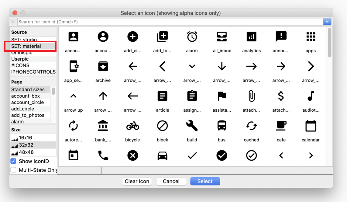
SVG icon files are stored in an iconset folder and a single icon is assigned to a component by setting its $iconid, the same as in previous versions. The file naming for SVG icon files is not as strict as for PNG files, since the file name does not require an integer ID or any information about the image size. When you assign an icon to a JS component, any SVG icons in Omnis (stored in the ‘iconsets’ folder) will appear in the Select an Icon dialog, alongside any existing iconsets containing PNG icon files (such as the ‘studio’ iconset).
In Studio 10.2 when you create or edit a remote form, the ‘material’ icon set will be available when you open the icon selection dialog – these are located in a special iconset folder in the html/icons folder, but you can add your own SVG icon sets to the ‘iconsets’ folder (note the ‘icons’ folder in the Omnis root folder is for legacy icon data files and should not be used for iconsets). If you want to use icons from your own iconset, you need to add the iconset name to the $iconsets library preference.
When you assign an SVG icon you can select one of the standard sizes (16x16, 32x32, 48x48) or create a custom size (see below), and an SVG image will always expand (scale) to fit to the specified icon size.
Using Themed SVG Icons
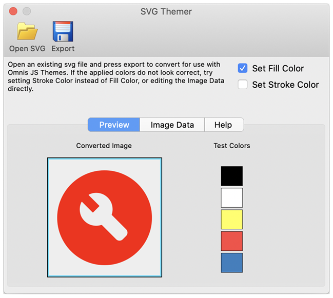
You are advised to use themed SVG icons for JavaScript remote forms and components in your web and mobile apps since they are scalable and will change color automatically as the JS theme is changed (the icon & component text color are linked). If you create or acquire a set of SVG icon files you can “theme” them using the SVG Themer tool available under the Tools > Add-Ons > Web Client Tools menu option. For your own purposes, you may like to download some SVG icons from the Google Material web site (https://material.io/resources/icons) or you can use the files from the svgicons.zip file which are material icons (some are named ‘themed’ but this is not a requirement since Omnis detects themed icons, so the naming is just to show you which have been themed). In the SVG Themer tool, you can experiment using the ‘Set Fill Color’ and ‘Set Stroke Color’ options to get the results you want, which will depend on how the vector image is drawn, i.e. using fill only, or stroke (outlines), or both. The following screen shot shows one of the non-themed icons (from the zip) in the Themer tool – the test colors are for display only:
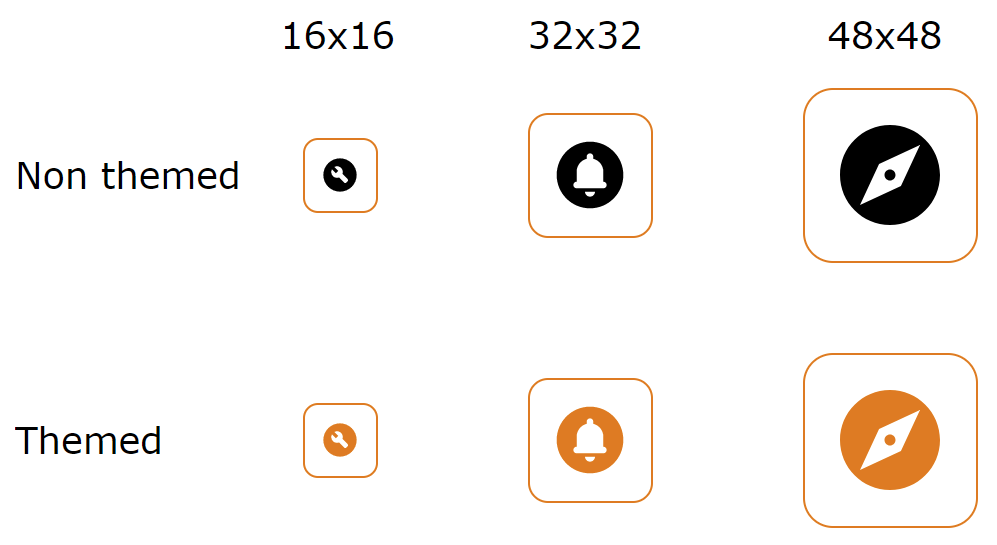
For this test using the sample libary from the zip file, you need to place any SVG files (your own or from the zip) in an iconset folder named ‘test’ inside the ‘iconsets’ folder in Omnis. Open the library (which has $iconsets library preference set to ‘test’), then open the ‘rf_svgicons’ remote form in design mode and you will see we have added some buttons to the form that use themed and non-themed icons, to show you the difference (you can use the non-themed icons for window components). You can change the JS theme using the Ctrl-J option when editing the remote form, and you will see the themed icons will change color (we selected the 'fall' theme in the screenshot below). You can open the remote form using Ctrl-T and scale the browser view (using +/-) to see the buttons and icons change size.
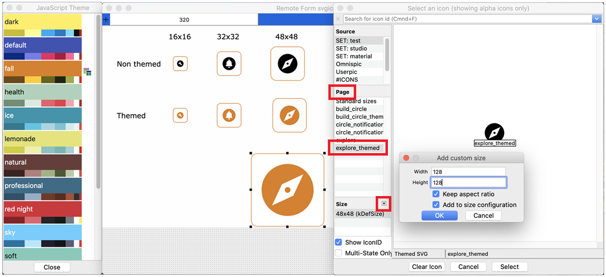
You can try adding a custom icon size (if you are using our form, you may like to copy one of the buttons and resize it before assigning a larger icon). To do this, open the Select an Icon dialog by assigning $iconid for the button, click on the icon name under the ‘Page’ list, click on the ‘+’ button in the ‘Size’ list header, enter a Width and Height size (e.g. 128x128), click on the ‘Keep aspect ratio’ and ‘Add to size configuration’ options, click on OK, and then click on Select to select the icon with the new size.
When you deploy your application, you need to remember to copy all your own icons (all iconset folders) to the Omnis Server tree, which you can manage in Studio 10.2 using the Deployment tool.
There is more information about creating or adding SVG icons to your JS components in the Omnis online docs:
https://omnis.net/developers/resources/onlinedocs/WebDev/03jscomps.html#javascript-component-icons
Specific information about using SVG icons is found here:
https://omnis.net/developers/resources/onlinedocs/WebDev/03jscomps.html#svg-icons
Or using Themed SVG icons is described here:
https://omnis.net/developers/resources/onlinedocs/WebDev/03jscomps.html#themed-icons

 Facebook
 Github
 Instagram
 Linkedin
 Twitter
 Youtube
 Please logon or create a free account to download this file.
